SmartMonitoring - monitoring business logic in Odnoklassniki

Now we have four geographically distributed data centers, Odnoklassniki, 11 thousand servers, more than 1 thousand network devices, 180 services. By services we mean photos, videos, music, tape, etc. Every day tens of millions of unique users visit the site. And it is necessary to keep an eye on all this economy, which is what they do:
- a team of engineers that installs hardware, changes disks, solves hardware incidents;
- the monitoring team, which is just looking for these incidents and gives the work to other teams;
- network administrators, they work with the network, configure the equipment;
- system administrators, they administer and configure the portal;
- developers.
We ourselves install and configure our servers, but since there are so many of them, it is inevitable that something breaks down every day. And our most important task in this case is to see the breakdown faster than users. Therefore, the entire monitoring team is responsible for the operation of the entire portal. They look at the charts, look for anomalies in them, start up incidents, distribute "auto incidents" that are created using the Zabbix + JIRA bundle. We do not just monitor the business logic, but also automatically analyze it. In more detail about it I also will tell further.
Let's stop on viewing of diagrams and search of anomalies. What are our graphics, what is an anomaly , what is an incident ?
')
This graph shows the duration of loading our tape, time in ns. The current day is shown in red. Skipped the duration of loading the activity tape. For us, this is an incident, that is, it is likely that users at some point in time slowly loaded the main part of the site - the activity tape. All big incidents begin with such jumps: first one, then two, but in the end everything breaks down. Therefore, the monitoring team must detect the jump and create a ticket in JIRA with all known information. Check all our services and databases to find the cause. While we do not know what is broken, we do not know what needs to be repaired. To manually find the reason for the jump in the graph, you need to view dozens and sometimes hundreds of other graphs.
Excursion into the past
Earlier, when the portal was much smaller in all respects, we made dashboards with graphs, which were few — only about 100-200 pieces. But Odnoklassniki grew and developed, more and more new services appeared, and there were more and more graphs.
Let's say a new service was launched. The programmer who made it was interested in the service being monitored from all sides. Therefore, he gave the monitoring team a lot of graphs and said: “Now you guys are watching all of them.” But at that time we could not view too many graphs. If there are a couple dozen of them for each service, then the task quickly becomes impossible. Therefore, we selected and monitored only the most important (according to the author of the service) graphics. But sometimes it happened that when starting the service the incident was noticeable only on “unimportant” charts that are not in the main dashboards. As a result, we missed the incidents.
At one o'clock, the monitoring team processed 650 graphs, divided into four dashboards, each of which was looked at by the guys from the team at a certain interval. Each dashboard has its own viewing interval (from 15 minutes to an hour). During the eight-hour shift, an average of 7 thousand schedules passed through the attendant, sometimes more. Lot. With that, something had to be done. After all, it was necessary not only to monitor thousands of graphs, but also to investigate incidents. It is really difficult and time consuming, because the solution of problems (and in a huge Odnoklassniki system, some problems with hardware or software arise all the time, it is an axiom of large systems) and developers and administrators also connected and connected. Moreover, with manual monitoring, willy-nilly, something was always missing.
When you watch 650 pictures for the first hour, you seem to react to everything, but when the second, third, fourth hour of the shift comes, the eye becomes blurred, the brain gets tired, and you start to miss the anomalies, which then you also have to investigate. As a result, we decided to make a system that would solve all the problems described above.
All Odnoklassniki services interact with each other. For example, the photo service refers to the services of classes, ratings, comments, etc .; this in brief, see here for more details. It is not the services that truly interact, but the servers that serve these services. We began to collect statistics on requests between two specific servers, namely:
- communication direction: which server accesses which one;
- number of requests;
- the number of requests that failed;
- query execution time;
- the method by which the servers communicate.
For example, this is how the graph of interaction between our regular web server and our typical business logic server looks like. The graph shows the number of requests between them:
Knowing how our servers communicate with each other, we could build a graph of the work of the entire portal, which could look something like this:
But there is one small problem: we have 11 thousand servers. Such a graph would be huge, it is difficult to build and clearly draw it. The decision suggests itself. Each server plays some role in the infrastructure, i.e. it has its own (micro) service, there are 280 of them in all: news feed, private messages, social graph (for example, friendship graph), etc. And to reduce the graph connections of the server infrastructure, we decided to group the physical servers by functionality, actually highlighting the clusters serving this or that subsystem in Odnoklassniki. We divided large microservices like web servers, caches and business logic servers into data centers.
As a result of such grouping by clusters, the graph has greatly decreased: there are about 300 vertices and 2.5 thousand edges between them. This helped build the graph of how the Odnoklassniki portal actually works:
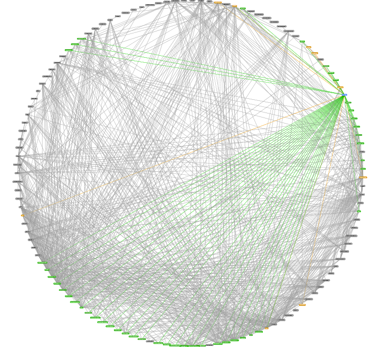
In a circle are microservices. Lines are interconnections. In this picture, one microservice is highlighted (top right). Green lines - where this microservice goes, and brown - who goes to it. We tried to arrange the graph vertices on a plane in different ways, because without a good visualization of the topology, the graph was difficult to use. We thought to make it dynamic and highlight problem connections, i.e., those with graphs that have anomalies, but this does not work: the graph is very large.
But why show the whole graph always ? We decided to return to the original problem and look at it at the time of the real incident. And in a few days, such a case presented itself - an anomaly appeared in the system of personal messages: the user wanted to write a message, but his correspondence history was loaded for a very long time. Great case! We decided to rebuild the graph, leaving only those connections that have an anomaly. Here's what we got:
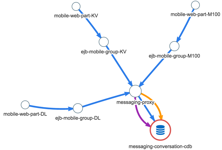
The blue color shows the time between two microservices (each microservice has a different number of servers), yellow is the number of requests, and purple is errors. It quickly became clear that this is not just a new view for the graph. The graph really pointed to the problem. The problem became clear ! If we speak the language of dry numbers, the duration of requests for mobile web servers to the servers of the message service at the time of the described incident has increased by about 0.5 ms. The response time from the business logic servers to the messaging proxy is 10 ms. And most importantly, the average latency of requests in the data warehouse increased by 40 ms. Errors appeared, calls to the database became less: probably, not all users waited for the end of downloading the message history, they closed the chat window. This column immediately showed where to dig - a messaging-conversation-cdb cluster that stores the history of correspondence. In other words, the reason is obvious: the last link of the graph, the growth of time is the most significant there.
After testing this approach a few more times, we realized that it works. We really liked the idea of building a graph of problem relationships, and we decided to develop the system further, without dwelling only on the statistics of server interaction. We also began to analyze the statistics of content delivery from web servers: time, errors, requests, traffic. We added monitoring of payments (money) - we often find out about problems with our payment aggregators faster than they do, and we inform them about them by sending "letters of happiness". In addition, we started monitoring logins by country in both mobile and web versions and added various technical graphs. As a result, we are currently monitoring 100 thousand graphs in real time. This is really a lot!
System architecture
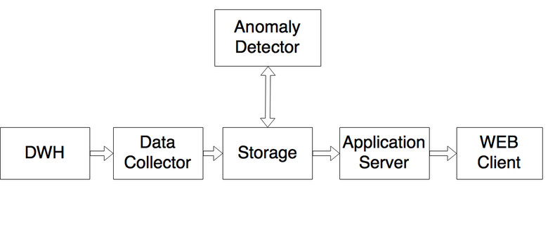
All logs are written in Data Warehouse. This is a centralized statistics storage system built on Druid 'e. During the day, 3 trillion events get there, which after aggregation are placed in 3 billion records, or about 600 GB. The Data Collector service, written in .NET, takes the data necessary for the system (we do not monitor all the graphs, some are created for other purposes) and puts them in the Storage - the MSSQL database, the storage prepared for data analysis. Anomaly Detector collects data and analyzes, helping to look for anomalies in numerical sequences. If he sees an anomaly, he marks and puts the result back to Storage. The Application Server (also written in .NET) goes to Storage for data about the anomalies found and to additional services (such as our JIRA, portal management system, LiveInternet - there we watch activity all over the Internet), prepares all the information and sends it to the web client.
The most interesting module here - Anomaly Detector - is a service written in .NET. Here is how it works.
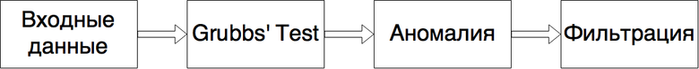
Input data is what we need to give the system for training.
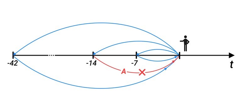
These are the values that were at the same time point 7, 14, ..., 42 days ago, we take six weeks (i.e., if today is Monday, then all Mondays go to the training set). We take values at that moment of time, which is being analyzed now, plus two adjacent values - both on the left and on the right. This is done for the normal distribution of the sample. If at that moment the system noted some values as anomalous, they are not included in the sample.
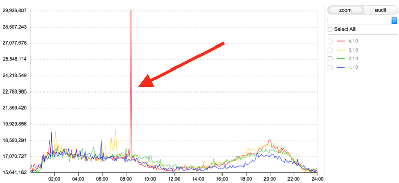
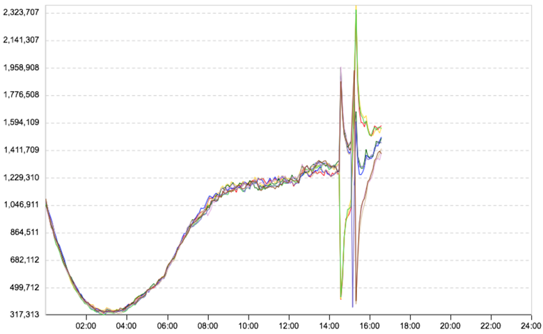
Next, we apply the Grubbs test : he looks for outliers in numerical sequences and says if this is an anomaly or not. Here is an example of an anomaly, this is a timeline for loading one of the Odnoklassniki components:

From the chart it follows that the anomaly occurred at 6:30 am. And this is how our system sees it on the basis of the Grubbs test:
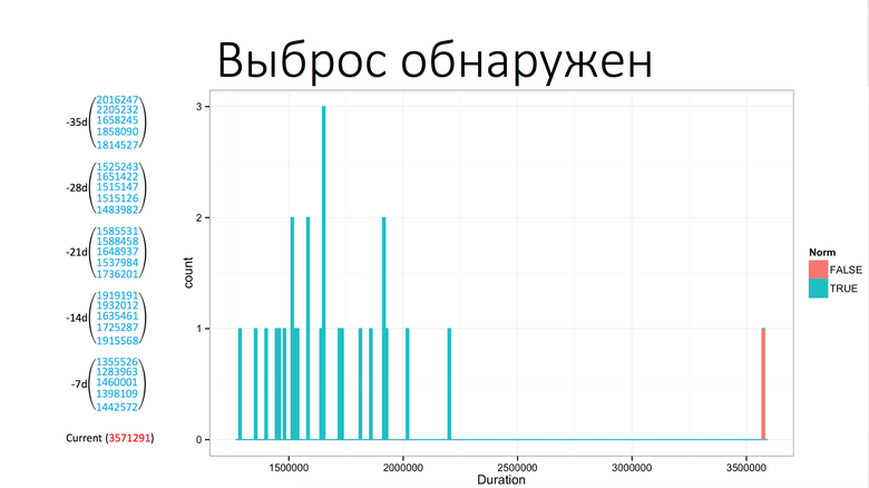
On the left, the values that were earlier in the same time interval, plus or minus two values on the left and on the right. Bottom current value. The Grubbs test says that this is an anomaly, and an outlier has been detected. Next we do the filtering. Filtering is a fight against false positives, because the Grubbs test finds everything, but for us it is not always an anomaly. These are the “false anomalies”.
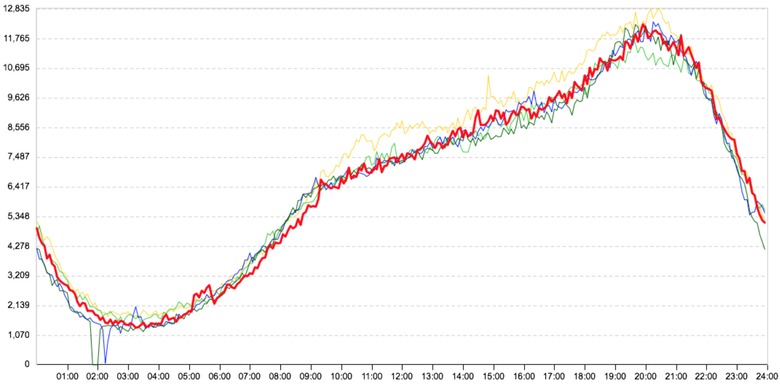
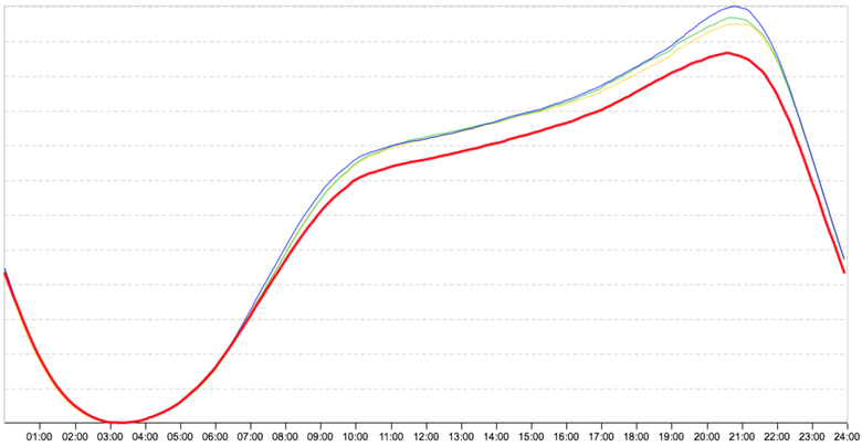
Slight deviation from the trend
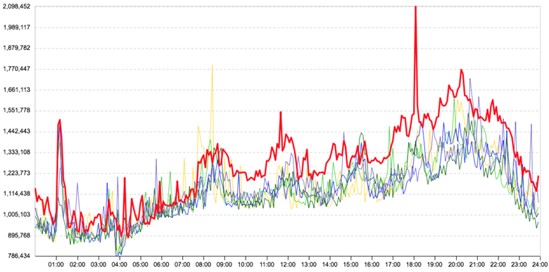
The graph shows the average time of requests for one of the communication microservices. The red line (the day in question) is slightly higher than the other days. There really is a deviation, and the Grubbs test will find it, but for us it is not critical. The situation is twofold: it is important for us to detect an anomaly, but without false positives. Experimentally, we came to the conclusion that for us the deviation is uncritical by 20% in time and by 15% upon requests. True, not on all connections, but only on the main ones. Therefore, in this case, the connection will not be marked as an anomaly. But again, if it were an important communication schedule, such as the time from web servers to business logic servers, it would be marked as an anomaly, since the effect on users is likely to be insignificant; need to understand, until he became noticeable.
Highly noisy graphics
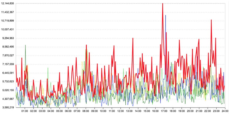
In heavily noisy graphs, we use data aggregation, i.e., the system will say that there is an anomaly in the graph only when the anomaly hits the radar several times in a row. Uncritically, we learn about the problem a little later, the main thing is that we learn and that this is exactly the problem. But if the jumps are significant enough, then the rule does not work, since it is important for us to catch not only a sharp change in the trend, but also short-term gaps: they often lead to serious problems.
Portal updates
During updates, some server group is taken out of rotation and stops. That is, requests from it and to it fall to zero, and the system shows such cases as anomalies (and does it right). False actuation, because it does not affect users. Suppose there are eight server groups, two are displayed. Two were brought out, and all loading passed to other groups. And so that there were no false positives, we made a switch: during updates we turn it on and look at the microservices that are disconnected from the data centers. Here is how (nicely) the graph of the number of requests broken down by such groups looks like:
Work with network
When working with a network, unicast storm often occurs, which clogs the network, and therefore the time of interaction between two microservices almost always briefly, but significantly jumps. Therefore, we track the occurrence of unicast storm in data centers (were many packages sent at once?). If a storm is detected, then we show the data center in which it occurred, and the attendants find out the reasons.
Seasonal fluctuation of activity
This picture is for April 30: before the big holidays, people dispersed to rest, and the red line from 8:00 went a little lower. And this is for all services. We understand that this is the effect of seasonality and we need to somehow rebuild the algorithm. Then we include another algorithm that knows the approximate deviations of user activity; it looks at online and other metrics, rethinks them and does not display such responses.
How does the system work?
A member of the monitoring team receives a graph, or simply a connection, and he can do four things with it:
- Mark as a known anomaly , so she left for a while. Suppose the user knows why it occurred. A certain programmer said: “I’ll turn on some functionality now, time will increase here, and I’ll turn it off in two hours.” A user with a calm soul describes everything in the required fields, and this event temporarily does not bother him.
- Create an incident . It starts in the system itself and automatically appears in JIRA (a JIRA ticket is created, where all the necessary information about the incident is transferred).
- Indicate as a new trend . Suppose a programmer completes his service with something and expects an increase in the duration of a request. From this point on, you need to analyze the chart differently, and the user indicates that a new trend has begun.
- Nothing can be done , if, say, a false alarm has slipped.
System features that facilitate the work with it:
- If problems have already arisen with some graph, the system will prompt what caused it. We store all the marks of users, which they mark the graphs.
- Connection with JIRA. Incidents are created in the monitoring system and automatically appear in JIRA. The system checks the status of incidents: it happens that the user has created an incident and forgets to update it, and if there is an incident on the connection without a completion time, then such connections are not shown. If at this moment the problem is exacerbated, then the system will say so. The same with the already known anomaly. If the person on duty hid the anomaly for a while, as known, but it got worse, the system will tell you what to look at here.
- Communication with system configuration. We have a portal configuration system with which programmers make changes to the portal. The user sees some graph and can see what changes were made on the portal at this moment. This allows you to understand exactly which programmer had a hand in the problem, which means it will help with the solution.
- If some admin or programmer is interested in what happened to his (micro) service, he can look, for example, what anomalies occurred at night or during the whole week.
- The system allows you to work remotely and jointly: if one user marks some connection as a known anomaly, another immediately sees who and why marked the outlier as an anomaly and what exactly happened.
- GUI. I attribute it to features.
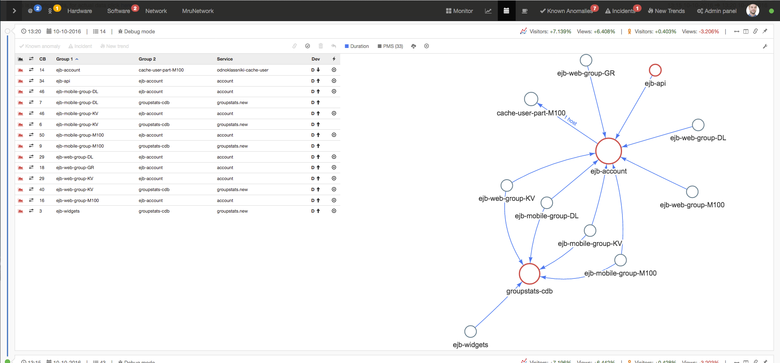
The picture is clickable
Left table, right graph, top cap. Tables and graph are duplicated in content. Above the graph shows the activity of the entire RuNet and Odnoklassniki. This is needed to track activity deviations. At the top left - the user sees how many open incidents are on it now. Also there are tabs on "autoincidents"; as already mentioned above, they are created using the Zabbix + JIRA bundle, on which the number of new incidents created by the system lights up: HardWare, SoftWare, Network. On the right are tabs where the processed links fall: Known Anomalies, Incidents, New Trends. The number of aggravated problems appears on them.
System Result
Now we are monitoring 100 thousand graphs, do not miss the incidents, spend much less time on the investigation. All new services are automatically put on monitoring. Increased team performance. Any admin or programmer can log in and see what is happening now, whether there are any problems, major or not. This helps both admins and programmers to enjoy life.
If any of you will create such a system, we have made a list of articles that will help you. You will find them by reference .
Source: https://habr.com/ru/post/321402/
All Articles