Visualization of data in the browser using D3.js

Mikhail Dunaev ( war_hol )
We encounter data visualization and various charts every day, these are some Google Analitics, Internet banks, this is Excel, etc.
')
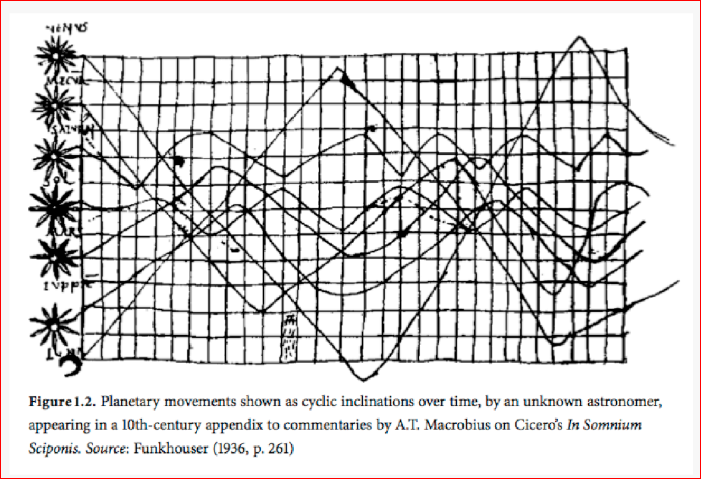
In fact, charts haunt humanity throughout our history. One of the first data visualizations is the 10th century AD. The unknown astronomer depicted the motion of celestial bodies using diagrams:
The following interesting work is the movement of sunspots through the sun, the 17th century:
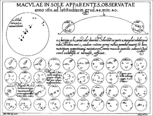
There is already visible some timeline, it appears from the birth of infographics.
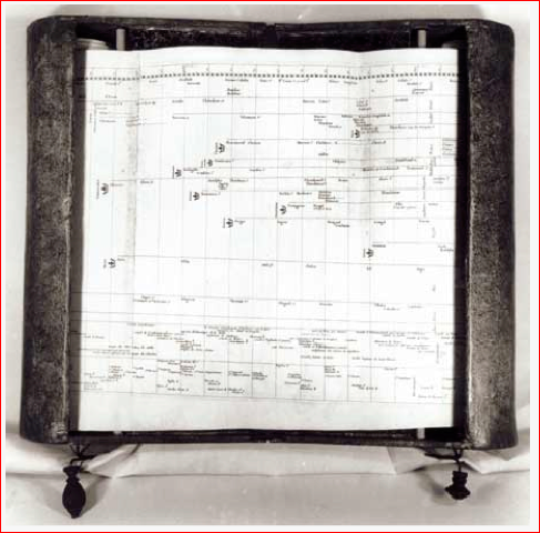
Following. In the 18th century, such devices appeared that allowed the creation of a mechanical timeline, i.e. scrolling the handles left and right, you can turn the scroll to the left and right side, and watch, learning the story from this document. Such an alternative to the book:
At the same time, such a beautiful instance of data visualization appears:
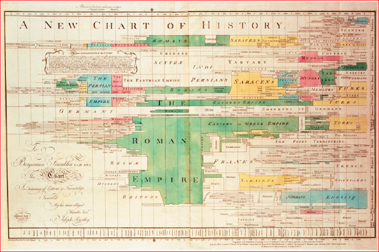
This is the story of human empires. Also timeline, the first quality color timeline, which appeared in humans.
And this is the most famous historical infographics:
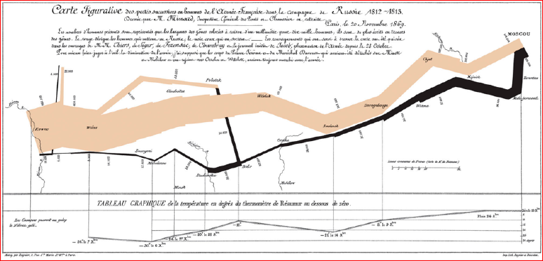
It shows the movement of Napoleon's troops from France to Moscow and back. Accordingly, the beige color is the movement to Moscow, the black color is the movement back. The thickness of the lines shows the number of troops at Napoleon. Marked specifically the river and we can see how when crossing the river Napoleon lost part of his troops. This kind of data presentation, which allows us to visually "see" the story.
This is our time:
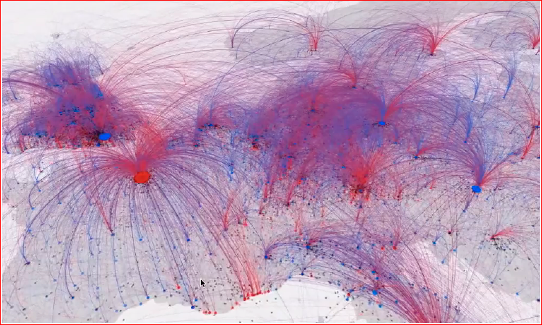
This is a visualization that shows the places of birth and death of culture carriers - the place where the person was born, the red color where he died is marked in blue. This guys have gathered all the historical some important figures for culture, scientists, artists. And it is clear that the process of urbanization took place during the entire existence of humanity, i.e. from the earliest times, people-bearers of culture sought in cultural centers, and with all this were born on the outskirts. Those. how now from all over Russia people are going to Moscow. It did not start now, it was always.
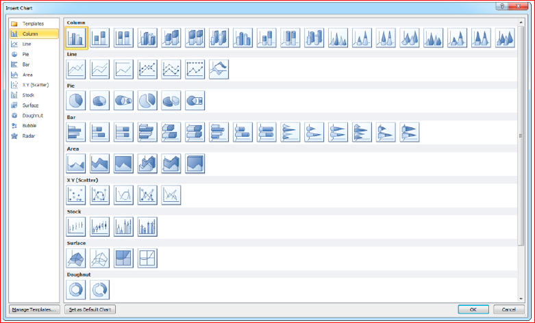
Unfortunately, with all the development of modern technologies and the development of infographics, most of the population of our planet uses standard graphics from EXCEL, and no one goes any further.
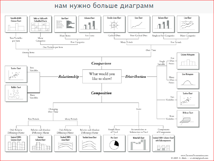
Actually, there are much more graphs, there is such a beautiful diagram that shows which graph you need to choose, depending on your data, i.e. if you need to show the relationship, distribution, comparison, composition:
Here is a good example of how you can beautifully present a classic schedule:
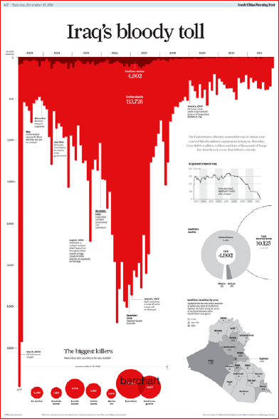
This is no longer Excel. This is the number of deaths in the war in Iraq - the New York Times shows bar charts with such bruises. First, it is beautiful, and secondly, it is immediately obvious how many and when people died.
In the same way, my former colleagues from the RIA Novosti infographic studio have depicted something here:
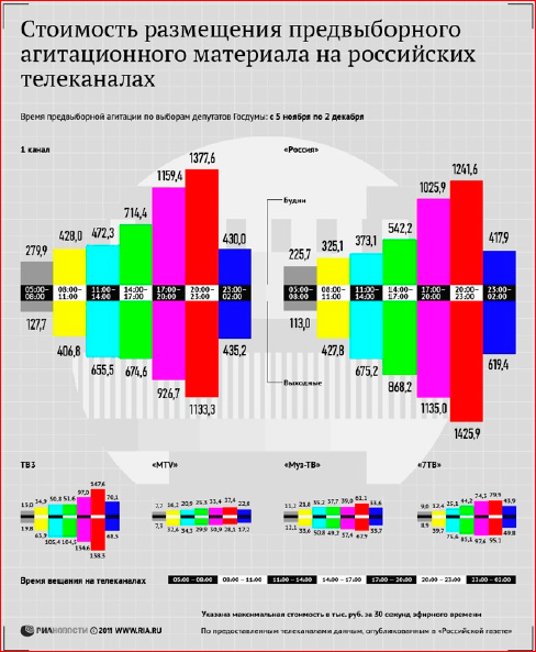
It can be seen how beautiful it is. Those. if we are not limited to graphs from Excel, then we immediately start to get beautiful and fashionable.
Another good example:
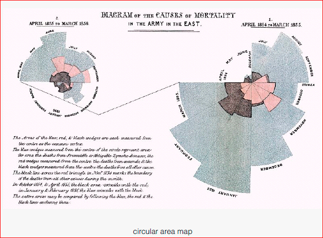
This is Florence Nightingale, the founder of the medical movement in the XIX century, depicted the causes of death in the British army. You see, the XIX century, and already what a beautiful graphics.
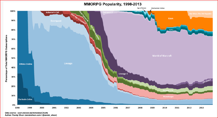
And this is already our time, the number and popularity of online games:
And my favorite example is my hard drive:
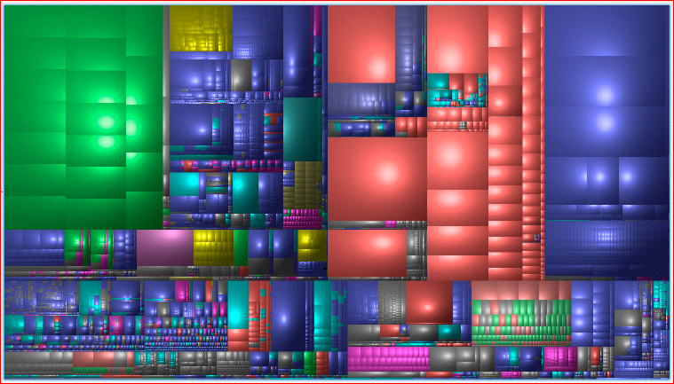
This kind of graph is called treemap. There is a program for Mac OS and Windows, which shows us the area of each rectangle - the file size. These are all files on my hard drive. It can be seen that green is a serial game that I watch, red is the Applications folder, blue is the swap files ... When you see your hard disk in this form, you can immediately understand where your place has gone, which file takes up a lot of space - very convenient and intuitive.
This is about how to submit data, and why it is needed. However, when interactive appears, interactive on the web, the whole thing changes. The number of graphs and charts has increased dramatically, and they are not amenable to any classification.
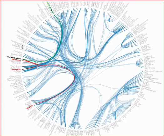
Here is a good example on D3, several types of diagrams are combined in it at once, and the result is, of course, fantastic:
In fact, infographics and data visualization for the web has a very short history. It all started in the 90s with the program "Macromedia Director".

This is a precursor of the flash, the first some types of data visualization for the web began to appear on it. Naturally, after the Macromedia Director came to the aid of the Adobe Flash Platform, it was beautiful. In fact, to visualize data, to cost graphics on a flash, not to invent a better tool.

RIA Novosti used flash as the main tool for infographics. Two years ago, they completely abandoned the flash, and until that time they had used it because it was convenient.
Naturally, these three guys replaced - html, javascript, css:

And we brought svg and WebGL, which allowed us to do almost all of the same things under the web as we could on flash.

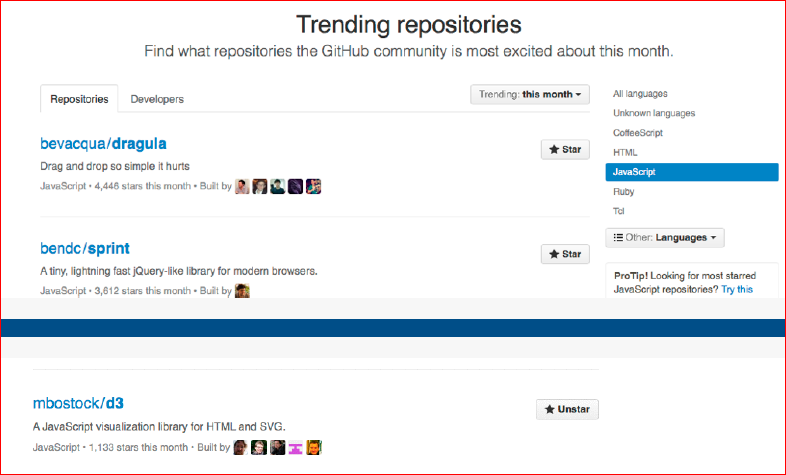
Much allows us to do D3. In the network, you can find examples of how it works online - everything works quickly (this is a vector), beautifully and without any brakes. D3 is one of the best libraries currently available for data visualization. We can see a screenshot from Github:
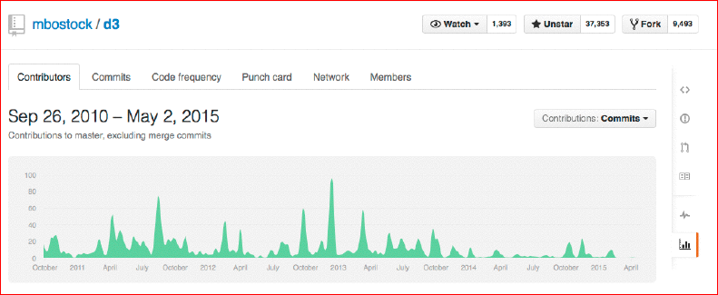
This library began its development in the 2010th year, it has been dynamically developing for the last five years, but not so much lately, but this is most likely due to the fact that the course has settled down and there are not so many new features to come up with . We can see that 37 thousand asterisks and almost 10 thousand forks indicate that the library is really good. It is in the top 20 of the most popular JavaScript libraries for Github.
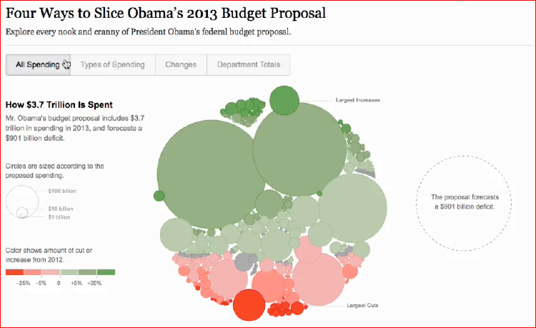
Here is a good example. Using the D3 library directly in our time. The New York Times is not important what they show, but how they show it:
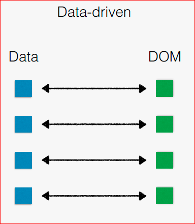
Here, the data-driving approach is very visible - each DOM element stores in itself some element, part of the data, and every time we choose a particular display method, we simply say how we need to display this data. This data is stored in the element, and you can see how D3 beautifully makes the animation, how it all works qualitatively, quickly and, most importantly, there are no problems in production.
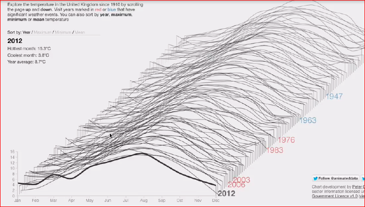
Here is also a good example, also D3:
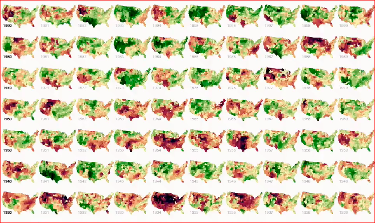
This is a visualization of the temperature in the United States in different years. It can be seen that the months are changing, fixated, and you can clearly see clearly what year was the drought, what year there was a lot of rain. Firstly, it’s really beautiful, you can just look at it for a long time, stick it, and it works, and it works well.
Or a third example:
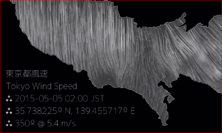
This is "Tokyo Wind Speed". You can find and watch right now in real time - the wind speed in Tokyo is being visualized. Very beautiful, every time you can see where, how, why ... Very popular service. We Gismeteo do not know whether it will soon come to such a conclusion.
Or here is another example:
This is also the New York Times. A visualization that is controlled by a scroll, i.e. at the moment when I was shooting this video, I scrolled with the mouse. The page is static, but the graphics are changing - everything is clear, beautiful and fast. This is a way that allows us to get away from stupid Excel-plates, from ordinary graphs and make some kind of project that has a great “wow” effect - the effect when the user looks and thinks: “Wow, how cool it is!”.
What do we have in Russia? In Russia, everything is also quite good.
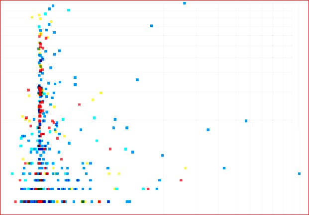
I'll tell you about a few of my projects, and how they are going. We start the project each time approximately from the following Excel file:
The editor gives some data, and together with the editor we start to decide what we want to do with this data.
What is this data? This is the population of Russia in different years, which is divided by age, i.e. Y axis - different years, X axis - age. Accordingly, at the intersection - how many people of a certain age lived in Russia in different years. Ultimately, we want to get a chart where the age will be shown along the X axis, and the population along the Y axis.

In different colors we will "paint" the male and female population. Already, even on a static slide, not on an interactive one, we can make out a story. The main thing why doing data visualization is to show people a story that they cannot see in Excel spreadsheets. Here we already see such a thing as an “echo of war”:
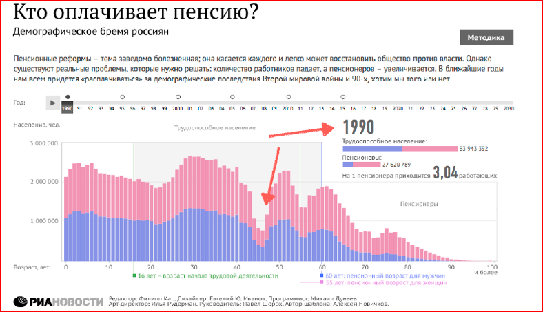
See this failure? These are children who were not born during the Second World War and, accordingly, the baby boom are children who were born after the Second World War.
Also on this chart we have marked the age of the working population, i.e. from 16 to 55-60 years, and calculated how much per one pensioner is the working population:
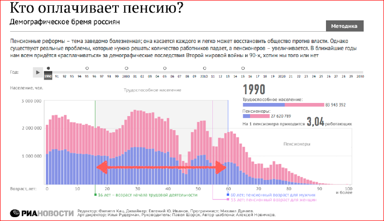
These are actually very important numbers. I'll show why they are.
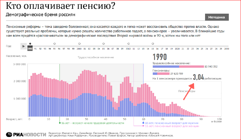
We see that in 1990, there were three working people per pensioner. We also added a timeline that you can drag left and right to change the year:
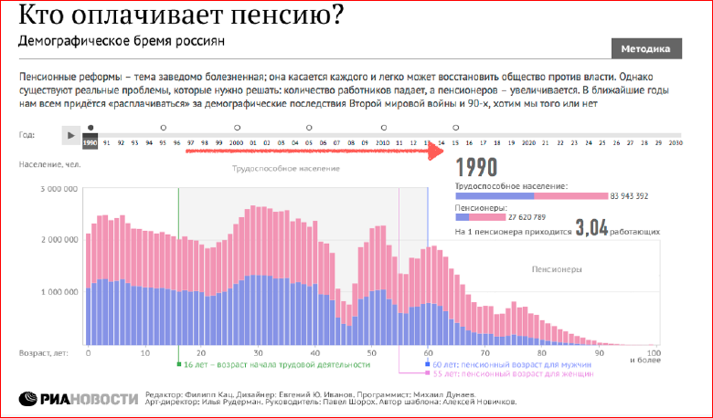
It works like this: we click on the “Play” button, and the years begin to change, D3 animates our schedules. We see how “Echo of War” is crawling, retiring, and that we now have about three working people per pensioner. But what happens behind this? Behind this, there is such an interesting thing: children who were born during a baby boom, retire and the number of pensioners in Russia increases dramatically, and the number of people working for people per pensioner drops sharply. In fact, we have such a situation in the country that every working person receives a salary for himself and for one pensioner. Do you understand that it turns out that in 2025 there will be less than two people per pensioner, and this will be a real pension crisis?
This is the kind of thing that shows us how history can be obtained from the data. For journalism, this is very important.
And at first it was just a “mess” of numbers:
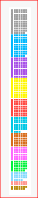
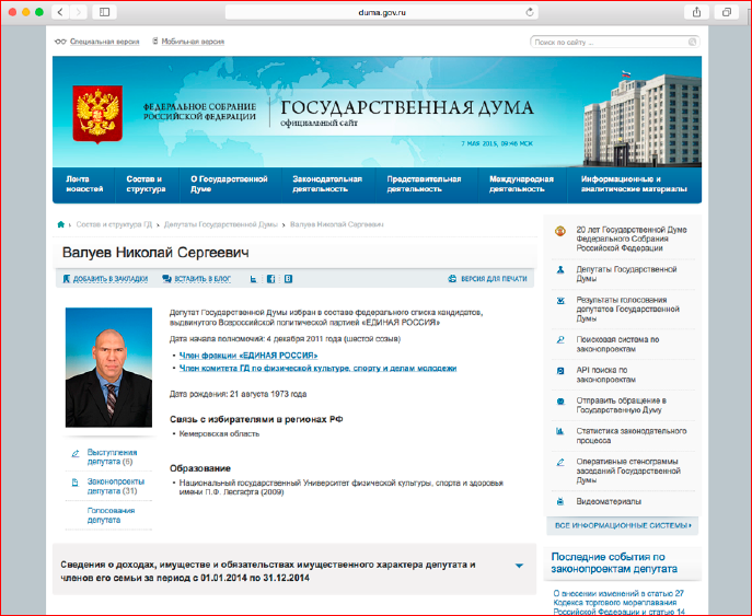
Next project We in the open sources found information about the deputies of the State Duma:
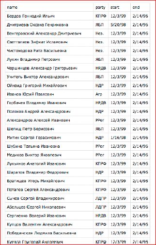
All deputies of the State Duma of all six convocations. We see the name, surname of the deputy, party affiliation and years - when he came to the State Duma and when he left the State Duma.
What can we do with this data? We will try to visualize them. First of all, we will take the first convocation, “paint” all the deputies in the color corresponding to their party affiliation, and build from a smaller party to a larger one:
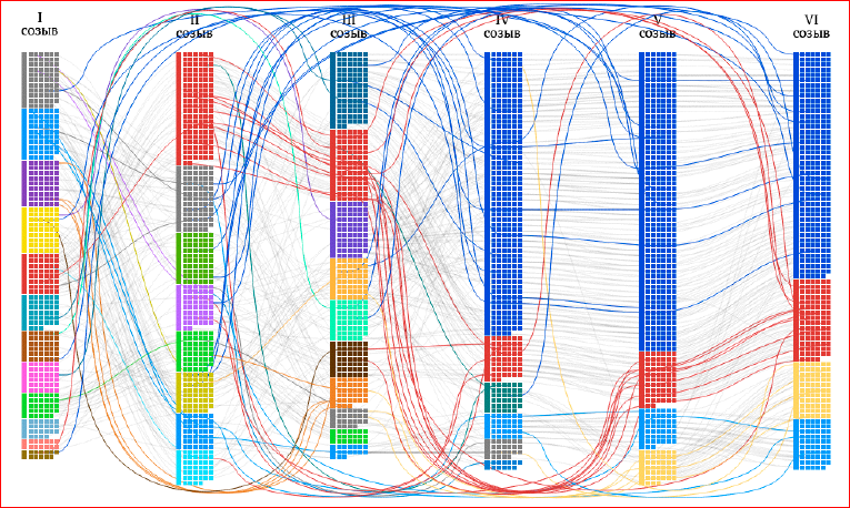
Already beautiful, but something is not right, there is no history. Let's go further. We visualize all six convocations:
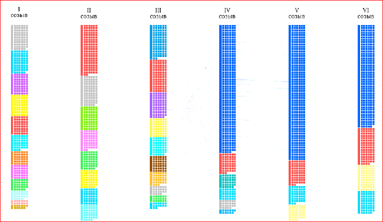
It's easy enough to do. Six convocations of the State Duma. We see how United Russia appeared, and how the Communist Party of the Russian Federation is losing its positions because of this.
It is also very interesting, but there is no history of anything. Let's add a story.
We know that the deputies passed from one convocation to another. Let's draw lines if the deputy has moved from the I-st convocation, for example, to the II-nd, and it turns out we have such a diagram, it is already beautiful:
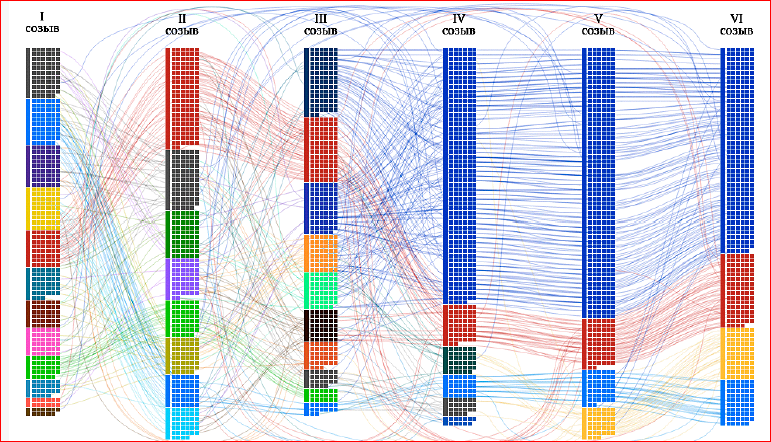
We see how the deputies passed from convocation to convocation, that, indeed, each convocation is not some new deputies, these are old deputies from previous convocations.
Let's add a bit of interactive to this scheme, and we get such a thing, when we can select individual parties, we can poke each deputy, and we can trace the history of some deputy. The history of the Communist Party, for example, see how people moved from one party to another. We will be able to see people who have missed some convocations - their line bypasses a particular convocation.
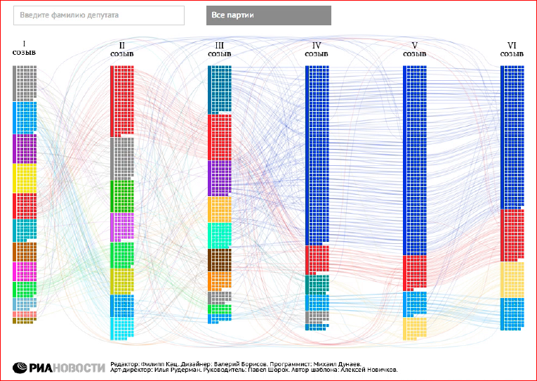
Already very interesting, the user can go to the site, poke ... It works, this is a vector, it is svg, it works well even on slow browsers. In fact, we initially wanted to make png-substrates, render them on a fast browser, and then, when I saw how well it works raw in svg, we decided to leave it that way, and I do not regret it at all.
What stories can we find here? Here we can find deputies who were in all six convocations, i.e. people "with history."
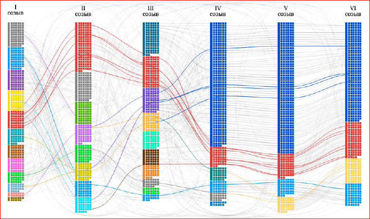
And we can see that most of these deputies from the Communist Party. The Communist Party of the Russian Federation "keeps" its people, does not let them go anywhere, because, probably, there are no new ones.
In the same way, we can single out all the deputies who missed some convocations. Also interesting, but it is not clear why.
But my favorite slide is the deputies who changed their political affiliation four or more times:
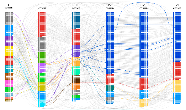
These are people who are in the State Duma not for political reasons, but for some other reason. Because a person cannot change his political convictions four times. Although, who knows ...
More examples can be found on the Mike Bostock website (this is the author of the D3 library):
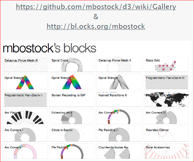
I must say that Mike Bostock is a big fan of examples, he collects them in huge numbers, and you scroll through the page with examples, but they don’t end or end. I never screwed it up to the "bottom", because there are so many of them ... And there are examples for every day. Examples with code, and everything is well written, i.e. You can find everything you need.
So, a little code.
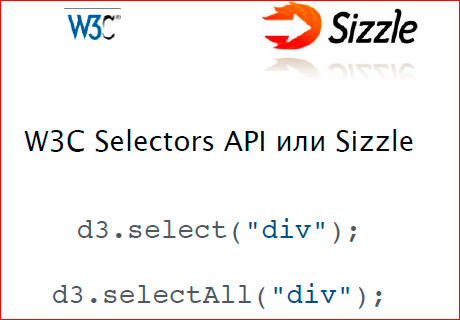
D3 library - like any other library for working with DOM elements. It all starts with selectors. Selectors work d3.select (“div”) or d3.selectAll (“div”). You can select only the first element, or all. Used by the W3C API selector, or Sizzle.
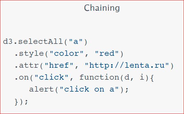
Sizzle is an engine selector that uses jQuery, i.e. if you have jQuery connected in parallel, then the selectors will work faster, or you can simply connect Sizzle separately.
Just like in D3, Chaining works, you can call methods in turn.
Let's do some kind of project, see how it is done, from beginning to end. Let's return to my beloved deputies. Why do I love deputies so much? Not because I am a politically active dude, the State Duma in Russia is just an excellent source of data, because all the data about the deputies are open, and we can find out about each deputy on the State Duma’s website, his name, party affiliation, salary , real estate in Russia, his wife’s salary and real estate, cars — his and his wife ... We can learn about each deputy up and down.
As an example, we can find out the number of speeches of a deputy, the number of bills that this deputy brought to the State Duma. Very good example:
Let's make such an assumption that the more a deputy earns, the less he acts. And check whether this is true or not.
We will add to our svg in this way each deputy. Each deputy will be displayed using the square. Let's paint each deputy in the color of his party. Imagine that we rassparsili State Duma website.
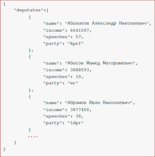
Now I just hammered in hands, the first three deputies, we in Json kept his name, his salary, the number of speeches and party affiliation. For now, we don't need anything else.
D3 connects like a regular library.
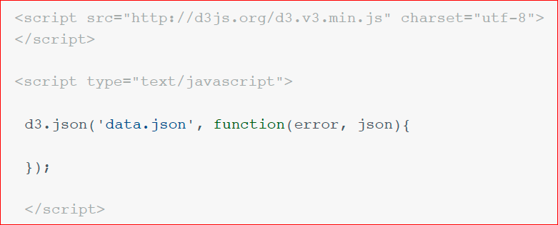
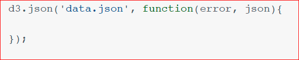
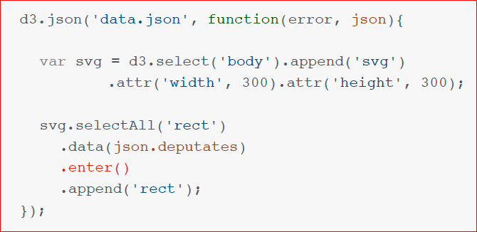
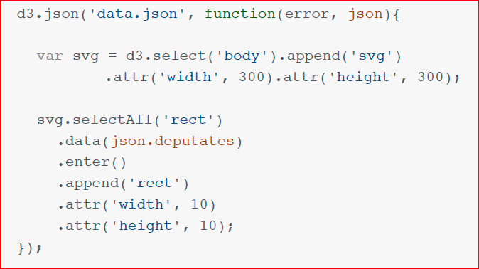
The first thing we do - we need to download this data. Anyone who is familiar with jQuery, everything is clear. d3.json ('datajson) and callback, which handles the error and returns the Json object to work.
The next thing we need to create is svg in our DOM tree, we write d3.select ('body'), append ('svg'), nothing new.
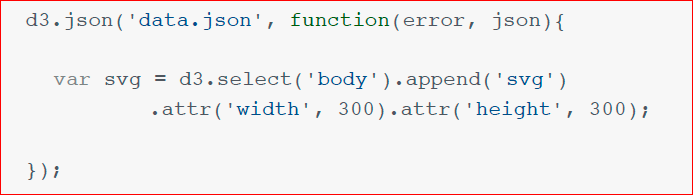
In the same way, we need to set additional attributes for width and height - attr ('width'), attr ('height'). Everything is simple, understandable, familiar.
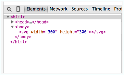
And we see that after executing this code, we get an svg element with the attributes we need.
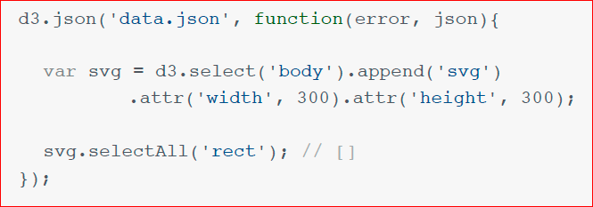
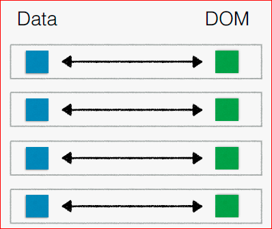
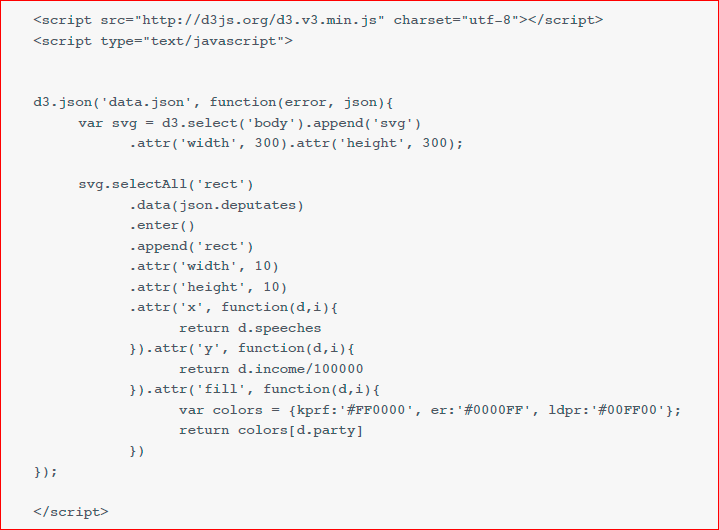
The next thing we do is very important. What is the D3 library? The main task of D3 is data binding. This is when you bind data to your DOM elements. This is a type of application, called a data-driven application, that is controlled by incoming data. What do we need to do? We need to bind our data to rectangles. We do svg.selectAll ('rect'), in return, we return an empty array, because we have just created svg, there are no rects, and we are doing such a strange manipulation with respect to our empty D3 array.
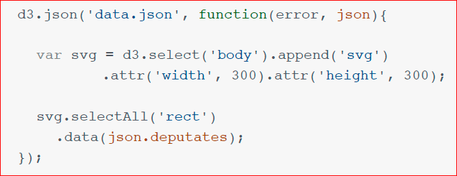
This is how D3 works, and when you start working with it for a very long time, this path becomes obvious. We use the .data method to assign this empty array our data json.deputates. And it turns out this scheme:
When we have a finished project, we have a data element for each DOM element, and they are connected together. In our project, now what is there?
We have data, but no DOM element is assigned to each of them.
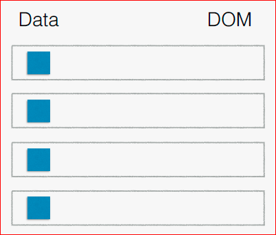
And we do the following.
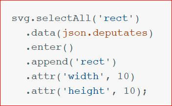
We use the .enter () method, it returns data items for which no DOM element is assigned. All data that does not have a DOM element is returned to us, and it seems to be iterating over these elements. For them, we call the append ('rect') method. Those. we say: "For each data element for which there is no DOM element, assign a new rect element". He, not only assigns him, binds them together, he also draws it in our DOM tree.
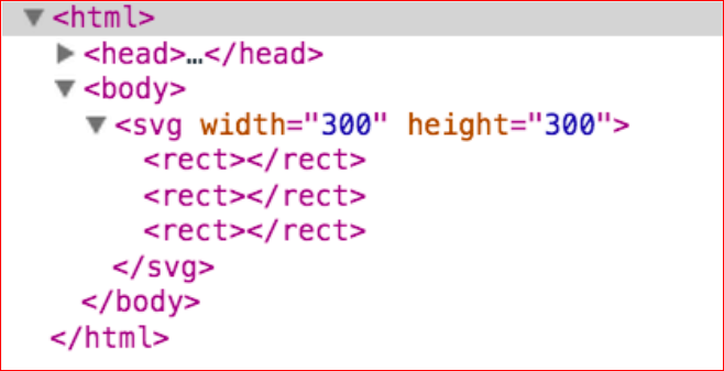
See, we already have 3 <rect> elements inside svg. In fact, this is the most important part of the D3 library.
If you understand this part, if you understand how it works, everything else works very simply. And in the same way for each rect, we will set the width and height.
What is the meaning of all this? Why did we all do this?
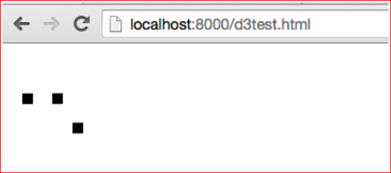
If we look at it now, we will see on the screen one small black rectangle 10x10 pixels, which consists of three - one on the other. We need to change each coordinate (X, Y), depending on the salary of the deputy and depending on the number of his speeches.
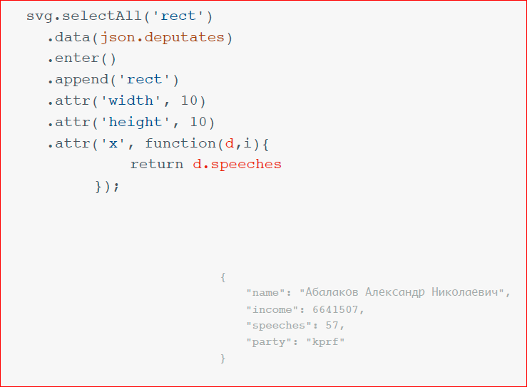
And we take the .attr method and pass the first attribute 'x', and then pass the function in which two parameters will be passed: d is the data element that corresponds to this DOM element, and the second is the iteration number. The iteration number is almost never needed, but we always need the data item, and in this function we return the processed data in such a way that we need to bind to our 'x' attribute.
There is a small reminder of what our data elements look like. Those. to 'x' we assign the number of speeches, the number of speeches.
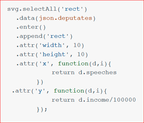
In the same way, we act with the Y coordinate - we bind to it the size of our deputy’s salary and divide it by 10,000. I took 10,000 abstractly, because, you know, the deputies' salaries are such that they never fit into any screen. And here we have in the browser three of our magic squares, which we drew with the help of D3. Nishtyak, very beautiful.
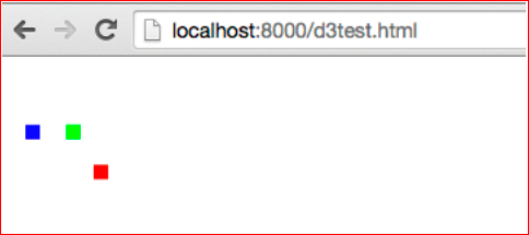
Farther. Naturally, we do not like it. And if we add a little color?We will “paint” the deputies in the color of their party, add the fill attribute and to the function based on which party it is in, return this or that color.
Everything is elementary. Such a thing we did.
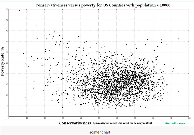
Let's imagine that we did write the script in Python normally, went around the entire State Duma website, saved everything from there, and that's what happened:
This is a real infographic based on real data, just what we did. And we see that on the x-axis we have a salary, on the y-axis we have the number of speeches. This scale is not fair, we do not see it, but it is a logarithmic scale, here from 0 to the first value is so, i.e. it is stretched, and we see that dependence is. The more a deputy earns, the less speeches he has. Those.There are, of course, some strange people, but most of the deputies who speak in the State Duma earn not so much, and the part that earns a lot, they just sit and are silent. Catch the mouse, eat slowly ...
This is the basic representation of D3, everything else is trivial.
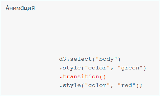
Animation is performed using the .transition () method, i.e. Initially, we assign some style, call the .transition () method and the next style. If we run this, then our body will smoothly, by default, be painted from one color to another for one second.
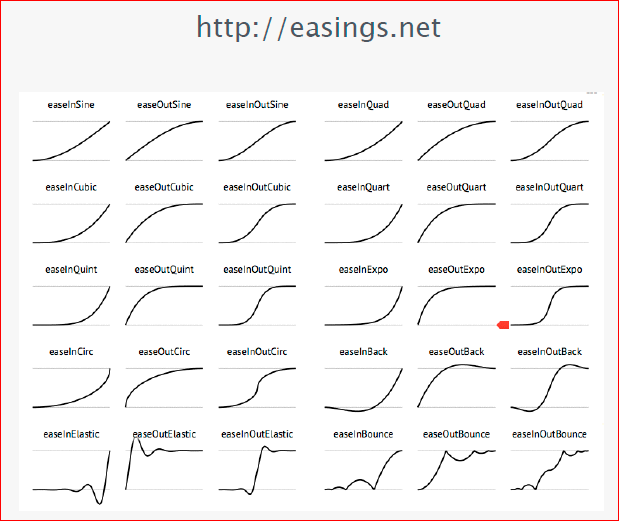
All traditional easings are supported. Easings is how your animation will occur, i.e. will it go linearly, or will it go first with deceleration, then with acceleration, or vice versa. I strongly advise you to go to this site and see how easings work. Easings are such a thing that even the simplest animation, if you add some kind of acceleration or deceleration to it, begins to look rich, beautiful, and so on. etc.
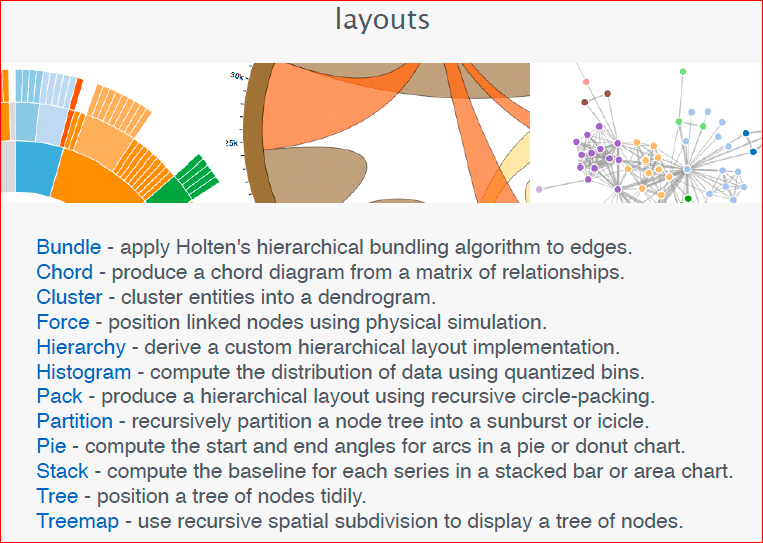
Back in D3 there are a large number of layouts. Layouts are pre-made templates for basic data visualizations.
I will show my favorite ones. Here, let's say, Streamgraph:
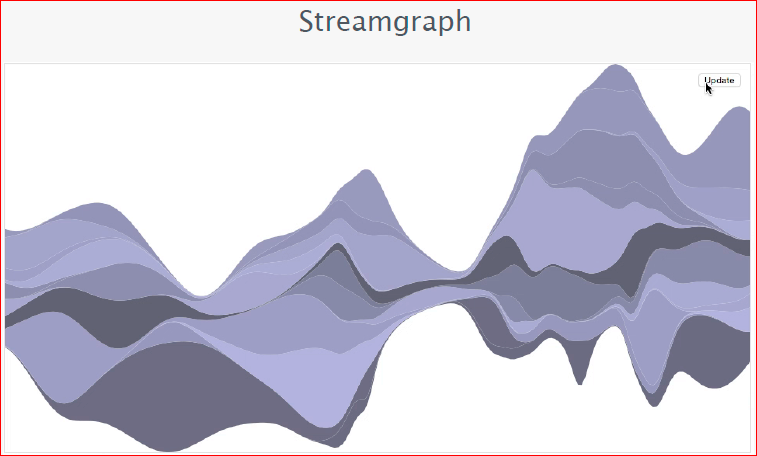
It shows various data in the form of a stream, here they randomly change. This is a video from a browser, it works everywhere and like this. Those.It works quickly, efficiently, and I really like it. I, as a person who moved to the frontend from a flash, who loves a vector, graphics, that all this works so well, I really liked it.
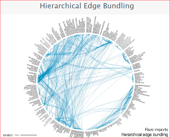
Or, let's say, such a layout, which is mathematically you are tired of calculating how you need to connect all the streams, because they are not easy to narrow, and they are connected into small groups, and you can control this tension. In D3, this is by default.
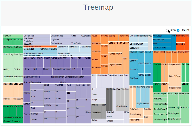
Or my favorite treemap. See how beautiful treemap redesigned with easing online in live mode.
Total: fast, easy and most importantly, what is beautiful.

Contacts
» War_hol
» Rambler & Co company blog
— - FrontendConf .
, . , Frontend Conf — , .
— " - ", , FrontendConf .
Source: https://habr.com/ru/post/320874/
All Articles