Recommendations for the use of Hero Images (UPD)
Despite the fact that the trend for the use of Hero Image is not so fresh, it is still relevant. The use of such images helps to make your product or page of the site more attractive and motivates the user to see what you offer him. Today we invite readers to familiarize themselves with the translation of Nick Babich's article on how to achieve the maximum effect using this technique.
From the article you will learn:
Any web page leaves a positive or negative user experience when visiting. This reaction is largely determined by what a person sees in front of him. Since the eyes are the strongest sense organ, with a bold, bright image, you can most quickly attract visitors. It instantly grabs attention and serves as the main information block for minimalistic websites and applications.
')
In this article, I will give you some tips on how to properly use the Hero Image technique.
Be picky when choosing photos
The visual component in the interface is everything. It is important to be able to choose images that correspond to the subject, goals and strategy of the project. Wrong picking up the image, you immediately lose all visitors to your site.

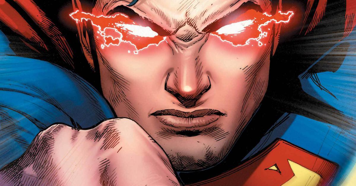
An example of a failed image
If you manage to find exactly what you need, the user will want to see what else you can offer him.
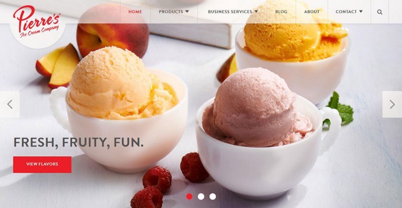
An example of a properly selected image.
Hero Images are perfect for succinctly transferring the most important information.
Strive to stand out and be different. The graphic block should motivate the user to stay on the site each time they visit and view it again.
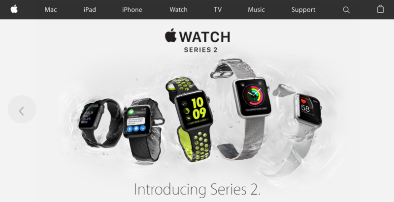
Apple is a pro hero in creating Hero Image.
Tip : this does not mean that the picture should transmit all information entirely. With the help of Hero Image, you can rather visually emphasize key points.
Embed emotions in design
Your images should inspire, have a psychological effect, strengthen the feelings that you are trying to appeal to the audience. In the end, emotions often override common sense when you need to make an important decision.

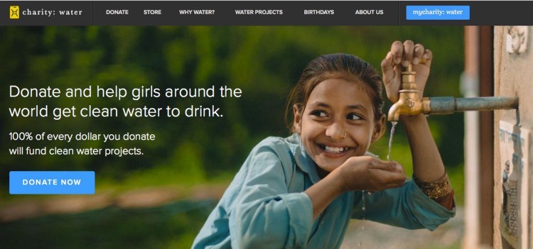
Positive emotions can lead to a sense of user interaction.
Images should not be blurred and fuzzy.
There is nothing worse than great low quality photos. The picture is your everything if you are going to use the Hero Image technique. It is very important to ensure that the user's first impression is positive. To do this, use only high-quality images.

Blurred image and a snapshot of a suitable size.
The call to action should not compete with the colorful image
Despite the fact that all the attention here is focused on the picture, one should not forget about other key elements of the interface - for example, “call to action” (CTA). When you try to focus the attention of the user is very important the right choice of color. Call-to-action buttons should immediately catch your eye.
Buttons should be in harmony with large images.
Make sure the text you put on top of the photo is easy to read.
Choose a bold, readable font that will be combined with the image, but at the same time stand out against its background. Having placed the text over the image, make sure that the main part of the image remains visible and understandable. Probably the easiest way to place text on a photo is overlay. If the original background is not dark enough, you can put a black translucent layer on top.

Alternatively, you can use scrim:
On the application of other effects, you can learn in the article " Design Tricks: Text on the photo "
The picture should look proportional to all devices.
Make sure that the image saves the desired measurements on displays of any size.
Optimize the visual elements for all platforms and devices, even if you need to resize or replace a large photo with a smaller one for small devices.

Author photo: themeforest
Tip : Use tools with which you can manage several sizes at once. One of them is Cloudinary, which allows you to set a set of control points for images.
Add personality
Because of their desire for originality, designers are increasingly opting for illustrations, not photos. A freehand drawing gives you greater control over both the content of the image and its technical details.

Dropbox shows the messaging process and explains complex ideas through easily understandable drawings
Tip : if you decide to use illustrations for your interface, make sure that they are combined with each other: as if they were taken from the same source and drawn by one person.
If you know how to choose interesting and high-quality images that work well in conjunction with content, this type of design is a great option for you. To use its capabilities to the maximum, do not forget about contrasts and clear calls to action.
Thanks for attention!
From the article you will learn:
- why the visual component plays a crucial role in attracting users;
- what functions are performed by the images on the sites;
- what to consider when selecting pictures.
Any web page leaves a positive or negative user experience when visiting. This reaction is largely determined by what a person sees in front of him. Since the eyes are the strongest sense organ, with a bold, bright image, you can most quickly attract visitors. It instantly grabs attention and serves as the main information block for minimalistic websites and applications.
')
Hero Image- this is not just a beautiful picture. It is a powerful communication tool.Hero image is the term most commonly used in web design. This implies a tendency to use large images or photographs. Hero image is usually placed at the top of the site, on the most conspicuous place of a web page or in the center. If such an image is used at the top of the page, it is called “hero header”.
In this article, I will give you some tips on how to properly use the Hero Image technique.
Choose successful images
Be picky when choosing photos
The visual component in the interface is everything. It is important to be able to choose images that correspond to the subject, goals and strategy of the project. Wrong picking up the image, you immediately lose all visitors to your site.
An example of a failed image
If you manage to find exactly what you need, the user will want to see what else you can offer him.
An example of a properly selected image.
Make the picture a compositional center
Hero Images are perfect for succinctly transferring the most important information.
Strive to stand out and be different. The graphic block should motivate the user to stay on the site each time they visit and view it again.
Apple is a pro hero in creating Hero Image.
Tip : this does not mean that the picture should transmit all information entirely. With the help of Hero Image, you can rather visually emphasize key points.
Look for images that evoke emotions.
Embed emotions in design
Your images should inspire, have a psychological effect, strengthen the feelings that you are trying to appeal to the audience. In the end, emotions often override common sense when you need to make an important decision.
Positive emotions can lead to a sense of user interaction.
Use high-quality images
Images should not be blurred and fuzzy.
There is nothing worse than great low quality photos. The picture is your everything if you are going to use the Hero Image technique. It is very important to ensure that the user's first impression is positive. To do this, use only high-quality images.
Blurred image and a snapshot of a suitable size.
Focus on the call-to-action buttons.
The call to action should not compete with the colorful image
Despite the fact that all the attention here is focused on the picture, one should not forget about other key elements of the interface - for example, “call to action” (CTA). When you try to focus the attention of the user is very important the right choice of color. Call-to-action buttons should immediately catch your eye.
Buttons should be in harmony with large images.
Maintain contrast in design
Make sure the text you put on top of the photo is easy to read.
Choose a bold, readable font that will be combined with the image, but at the same time stand out against its background. Having placed the text over the image, make sure that the main part of the image remains visible and understandable. Probably the easiest way to place text on a photo is overlay. If the original background is not dark enough, you can put a black translucent layer on top.
Alternatively, you can use scrim:
Scrim is a special visual design technique that softens the image so that the overlay text is more readable.
On the application of other effects, you can learn in the article " Design Tricks: Text on the photo "
Consider different screen sizes.
The picture should look proportional to all devices.
Make sure that the image saves the desired measurements on displays of any size.
Optimize the visual elements for all platforms and devices, even if you need to resize or replace a large photo with a smaller one for small devices.
Author photo: themeforest
Tip : Use tools with which you can manage several sizes at once. One of them is Cloudinary, which allows you to set a set of control points for images.
Use illustrations
Add personality
Because of their desire for originality, designers are increasingly opting for illustrations, not photos. A freehand drawing gives you greater control over both the content of the image and its technical details.
Dropbox shows the messaging process and explains complex ideas through easily understandable drawings
Tip : if you decide to use illustrations for your interface, make sure that they are combined with each other: as if they were taken from the same source and drawn by one person.
Conclusion
If you know how to choose interesting and high-quality images that work well in conjunction with content, this type of design is a great option for you. To use its capabilities to the maximum, do not forget about contrasts and clear calls to action.
Thanks for attention!
Source: https://habr.com/ru/post/320862/
All Articles