Review Knime Analytics Platform - open source data analysis systems
ABOUT KNIME
An overview of the Knime Analytics Platform - an open source framework for data analysis. This framework allows you to implement a full cycle of data analysis, including reading data from various sources, conversion and filtering, the actual analysis, visualization and export.
Download KNIME (eclipse-based desktop application) from here: www.knime.org
Who may be interested in this platform:
')
- Those who want to analyze data
- Those who want to analyze the data and do not have programming skills
- Those who want to delve into a good library of implemented algorithms and, perhaps, learn something new
Workflows
In Knime, the logic programming process is accomplished through the creation of a workflow. Workflow consists of nodes that perform a particular function (for example, reading data from a database, transformation, visualization). Nodes, respectively, are interconnected by arrows that show the direction of data movement.

(picture from the official site)
After the workflow is created, it can be launched for execution. After the workflow has been launched for execution, in the base scenario, the workflow nodes begin to work one by one, starting from the very first. If an error occurs during the execution of a node, the execution of the entire branch following it stops. It is possible to restart workflow not from the first, but from an arbitrary node.
The traffic light at each node reflects its current state — red — error, yellow — ready for execution, green — completed.
Nodes
Workflow consists of nodes (or "nodes"). Almost every node has a configuration dialog in which you can customize properties.
All nodes are divided into categories:
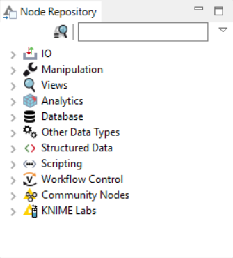
The following node types are supported: IO — data input / output (for example, reading CSV), Manipulation — data conversion (including filtering of rows, columns, sorting), Views — data visualization (plotting various graphs including Histogram, Pie Chart, Scatter Plot, etc) , Database - the ability to connect to the database, read / write, Workflow Control - create loops, iterate groups during the execution of workflow, and more.
Various statistical methods are available from nodes implementing data analysis (including linear correlation, hypothesis testing) as well as Data Mining methods (for example, neural networks, decision trees, cluster view).
On the official website there is a good diagram showing how you can assemble nodes of different types into a single flow:

Workflow Example # 1 Example: Building a Simple Scatter Plot
Consider an example of a simple workflow that pulls data, produces JOIN values for a certain ID field, filtering and visualizing the result on the Scatter Plot.
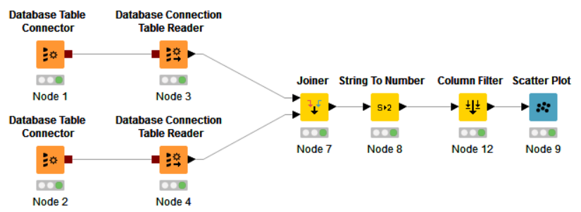
In this workflow, we create two connections to the database through the Database Table Connector. Inside the Database Table Connector, there are SQL queries pulling the required data. Using the Database Connection Table Reader, data is directly uploaded. After the data is read by the Readers, they come to the Joiner node, in which the operation is performed, respectively, JOIN. In the String to Number node, the string values are converted to numeric values, then extra columns are filtered, and finally the data comes to the Scatter Plot visualization node.
Further, after the successful execution of Flow, you can click on View Scatter Plot in the context menu and see the visualization result:
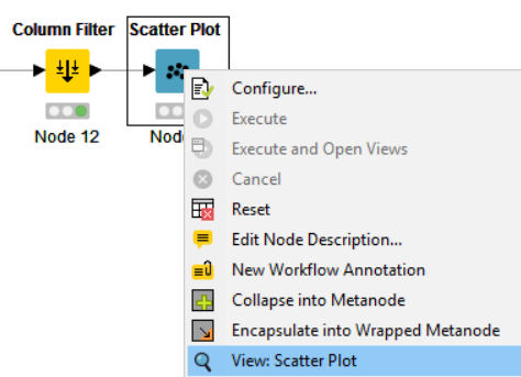
The plotted chart opens in a new window.
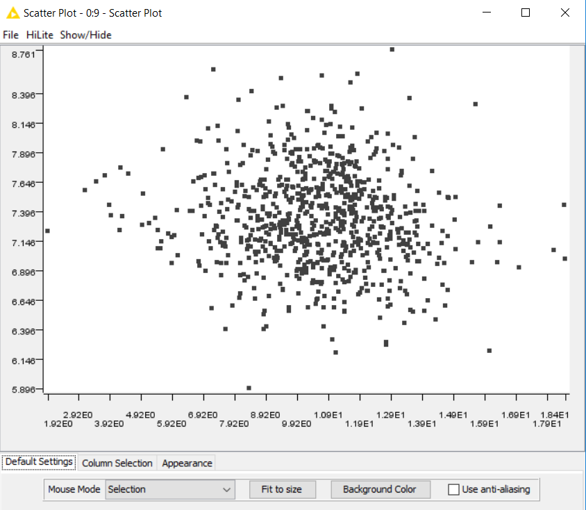
Thus, in a short time, without writing a single line of code, you can sample the required data from the source, apply various filtering, sorting and visualize the result.
Workflow Example # 2: Correlation Analysis
Consider another example. I would like to make a relatively large sample of data from the database, group the sample by the values of a certain field, and within each group find the correlation of values from this group and the target vector.
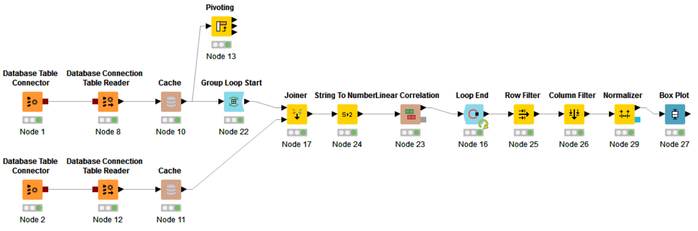
In this example, two connections to the database are opened. Through a single connection (Node 2), the SQL query draws a vector of several values. This will be the target vector to which we will look for a correlation.
Through a different connection (also by an SQL query) a relatively large sample of data is pulled. Next, the data falls into the Group Loop Start - Workflow Control operator that does GROUP BY, inside this loop, to the JOIN data, there is a target vector, the conversion of string values to numeric values is done and a linear correlation is considered. The results of the calculations are accumulated in the Loop End node. At the exit from this node, filtering by rows and columns, normalization of values and construction of a Box Plot are applied.
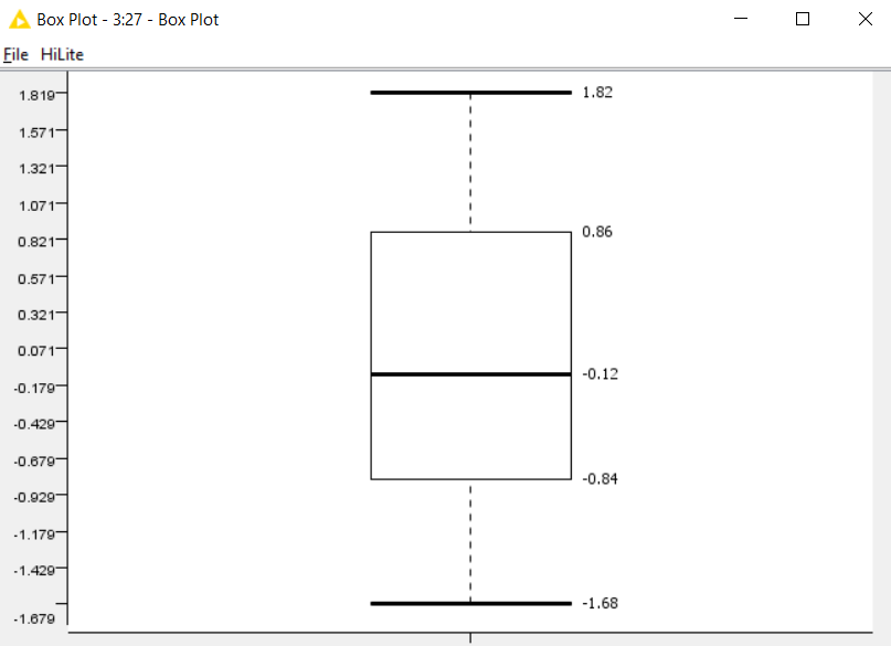
After execution of the entire workflow and clicking on View: Box Plot, a window opens with calculated values for Box Plot.
An alternative option is to apply the Pivot operation and add the target vector using JOIN, then iterate over the columns and read the correlation. At workflow, a blank is provided for an alternative option (in the form of a Pivot node), but the approach itself is not implemented.
Additional features
Of the interesting features that I noticed, the following can be highlighted:
- Execution of workflow on the server and providing access to the results of work through the REST API. This functionality is available with the purchase of KNIME-Server.
- The full KNIME distribution kit with all plug-ins weighs almost 2 gigabytes. This distribution includes a large number of third-party libraries (for example, JFreeChart), which become available as nodes
- Implemented the ability to make a Pivot operation directly on a database or on data loaded into a local cache.
- A large library of examples is available.
- Work with Hadoop and other BigData sources
Problems and conclusions
This system provides a fairly flexible approach to building algorithms for analyzing, transforming, and visualizing data, but still in complex workflows, in my opinion, you may encounter the following problems:
- Insufficiently flexible behavior of nodes - they work as they want and podtyunit some nuances of work can be quite difficult (if you do not fit into the code)
- Programming complex flow can result in a long and complex diagram with cycles, conditions that will lead to difficulty reading and debugging. In this case, writing code in R or Python might be a better choice.
This framework is well suited for people who are not very familiar with programming, with its help you can quickly create simple and medium complexity workflow and provide access to them through REST. This can be claimed in any organizations.
Data scientists may also find a lot of interesting things for themselves and may consider this system as an addition to R or Python.
This framework is also good for working with students, because you can clearly see everything that happens with the data, on which branches they move and how they are transformed. Students can study the implementation of existing nodes, add their components (nodes) and replenish their library.
Source: https://habr.com/ru/post/320500/
All Articles