Understanding the critical rendering path
The browser has to go through many steps before the HTML response from the server is converted to pixels on the screen. The sequence of these steps necessary for the first page display is called “Critical Rendering Path” (original. Critical Rendering Path).
Knowledge of CRP (Critical Rendering Path) is incredibly useful for understanding how to improve site performance.
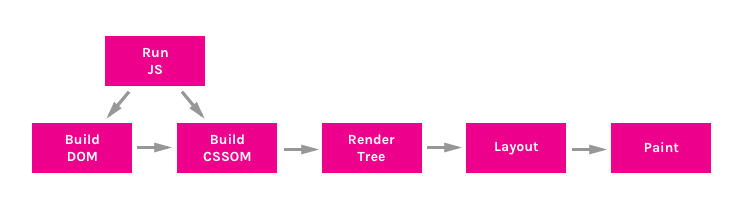
There are 6 stages of CRP:
- building a DOM tree
- building a CSSOM tree
- running javascript
- creating a render tree,
- layout generation
- drawing
Building a DOM tree
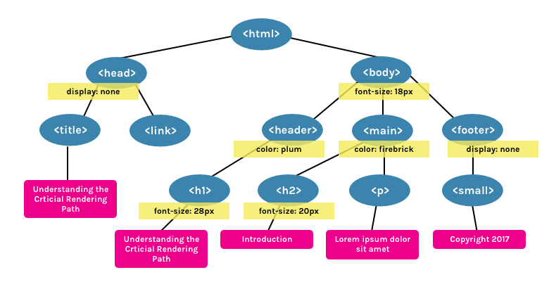
The DOM (Document Object Model) tree is an object that represents a completely parsed HTML page. Starting with the root <html> element, nodes are created for each element / text on the page. Elements nested in other elements are represented as child nodes, and each node contains a complete set of attributes for this element. For example, the <a> element will have an href attribute associated with the node.
Take for example the following document:
<html> <head> <title>Understanding the Critical Rendering Path</title> <link rel="stylesheet" href="style.css"> </head> <body> <header> <h1>Understanding the Critical Rendering Path</h1> </header> <main> <h2>Introduction</h2> <p>Lorem ipsum dolor sit amet</p> </main> <footer> <small>Copyright 2017</small> </footer> </body> </html> Such a DOM tree will be built from it:

The good news about HTML is that it can be executed in parts. The document should not be loaded completely so that the content starts to appear on the page. However, other resources, such as CSS and JavaScript, can block page rendering.
Building a CSSOM tree
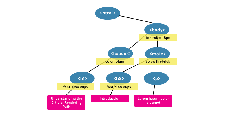
CSSOM (CSS object model) is an object representing the styles associated with the DOM. It looks just like a DOM, but with the appropriate styles for each node. It does not matter whether styles were explicitly declared or inherited.
In the style.css file that connects to the previously mentioned document, we have the following set of styles:
body { font-size: 18px; } header { color: plum; } h1 { font-size: 28px; } main { color: firebrick; } h2 { font-size: 20px; } footer { display: none; } It will produce the following CSSOM tree:
CSS is considered a “blocking resource”. This means that a Render tree (see below) cannot be built without a complete initial CSS parsing.
Unlike HTML, CSS cannot be used piece by piece due to its cascading nature. The styles described in the document below can override and change the styles defined earlier. So if we start using CSS styles before the style sheet is parsed, we may encounter a situation where the styles will not be applied correctly. This means that to go to the next step, you need to completely parse the CSS.
CSS files block rendering only if they are applied. <link rel="stylesheet"> can take a media attribute in which we can specify any media expression to which the styles nested inside will belong. If, for example, we have a style sheet with the orientation:landscape media attribute, and we are viewing the page in portrait mode, then this resource will not be considered blocking processing.
CSS can also be “blocking scripts,” because JavaScript files must wait for CSSOM to be built before being executed.
Running javascript
JavaScript is a blocking resource for the parser. This means that JavaScript blocks parsing of the HTML document itself.
When the parser reaches the <script> (whether it is internal or external), it stops, takes the file (if it is external), and starts it. That is why if we have a javascript file that refers to the elements of the document, we must put it after they appear.
JavaScript can be loaded asynchronously by specifying the async attribute in order to avoid blocking the parser.
<script async src="script.js"> Creating a Render Tree
A render tree is a collection of DOM and CSSOM. This tree, which gives an idea of what will eventually be displayed on the page. This means that it captures only visible content and does not include, for example, elements that were hidden using the display: none CSS rule.
Using the examples of DOM and CSSOM presented above, this Render-tree will be built:
Layout Generation
Layout is what determines the size of the visible area of the document ( viewport ), which provides context for CSS styles dependent on it, such as percentages or viewport units.
The size of the viewport is determined by the meta tag located in the <head> document or, if the tag is not presented, the standard value of the viewport with a width of 980 pixels will be used.
For example, the most frequent value for this metatag is the size corresponding to the width of the device.
<meta name="viewport" content="width=device-width,initial-scale=1"> If a user visits a web page from a device whose width is, for example, 1000 pixels, then the dimensions will be based on this value. Half of the visible area will be 500 pixels, 10 percent - 100 pixels, and so on.
Drawing
Finally, in the drawing step, the visible content of the page can be converted to pixels to appear on the screen.
The time that this stage takes will depend on both the size of the DOM and the styles that are applied. Some styles require more effort to be applied than others. For example, a complex gradient background image will take longer than a simple solid color on the background.
Putting it all together
To see how the critical rendering path happens, we can use the developer tools. In Chrome, this can be done in the Timeline tab (in Canary, as well as soon in the stable version of Chrome, the tab is renamed to Performance).
Take for example our HTML sample mentioned above (with the added <script> ).
<html> <head> <title>Understanding the Critical Rendering Path</title> <link rel="stylesheet" href="style.css"> </head> <body> <header> <h1>Understanding the Critical Rendering Path</h1> </header> <main> <h2>Introduction</h2> <p>Lorem ipsum dolor sit amet</p> </main> <footer> <small>Copyright 2017</small> </footer> <script src="main.js"></script> </body> </html> If we look at the Event Log for this page, we will see the following:
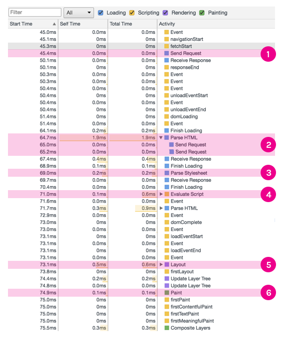
- Send Request - GET request sent for index.html;
- Parse HTML and Send Request - start parsing HTML and building a DOM. Send a GET request for style.css and main.js;
- Parse Stylesheet - CSSOM created for style.css;
- Evaluate Script - calculate (execute) main.js;
- Layout - generation of a layout based on the value of the viewport meta tag;
- Paint - drawing pixels in a document.
Based on this information, we can make decisions aimed at optimizing the critical rendering path. I will talk about some of these techniques in future publications.
')
Source: https://habr.com/ru/post/320430/
All Articles