Create templateable reusable components in Angular 2
 Many times I heard the statement that Angular 2 should be especially good in corporate applications, since it supposedly offers all the necessary (and not so) gadgets right out of the box (Dependency Injection, Routing, etc.). Well, maybe this statement has a basis, because instead of dozens of different libraries, developers need to master only one Angular 2, but let's see how well the basic (basic) functionality of this framework is suitable for corporate applications.
In my experience, a typical corporate application is hundreds (sometimes thousands) of almost identical pages that are only slightly different from each other. I think it’s not for me alone that it was a good idea to allocate repetitive functionality into a separate component, but to determine the specific behavior through parameters and implemented templates. Let's see what Angular 2 can offer us.
Simple option
The first thing that comes to mind is the reflection of the contents of the component declaration in its DOM using the special <ng-content select = "..."> tag .
')
I will try to demonstrate this approach on the example of a simple component “widget”.
First use example:
<widget> <div class="content"> <button> Just do my job... </button> </div> <div class="settings"> <select> <option selected="true">Faster</option> <option>Slower</option> </select> </div> </widget> And the way it looks:
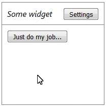
Inside the widget component, we define two elements:
- Marked with the class "content" - the main content of the widget;
- Marked with a class "settings" - some settings related to the widget;
The widget component itself is responsible for:
- Frame and title drawing;
- Switching logic between the main content display mode and the settings display mode.
Now let's take a look at the widget component itself:
@Component({ selector: "widget", template: ` <style> .. </style> <div class="hdr"> <span>Some widget</span> <button *ngIf="!settingMode" (click)="settingMode = true" class="wid_btn"> Settings </button> <button *ngIf="settingMode" (click)="settingMode = false" class="wid_btn"> Ok </button> </div> <div class="cnt"> <ng-content *ngIf="!settingMode" select=".content"> </ng-content> <div *ngIf="settingMode"> Settings: <ng-content select=".settings"> </ng-content> </div> <div> `}) export class Widget { protected settingMode: boolean = false; } Notice the two ng-content tags. Each of these tags contains a select attribute with the help of which it searches for elements intended to replace the original ng-content . For example, when displaying our widget:
<ng-content select=".settings" /> will be replaced by .. a <ng-content select=".content"/> by .. Naturally, the search for items is limited to the <widget> tag ... </ widget> in client markup. If the replacement was not found, then we simply will not see anything. If the sample condition is satisfied by several elements, then we will see them all.The option is more complicated
The approach described above can be successfully applied in many cases when you need to create a template component, but sometimes this approach is not enough. For example, if it is necessary for us that the template passed to the component be displayed several times in different contexts. In order to explain the problem, let's consider the following problem: in our corporate application there are several pages with lists of objects. Each page displays objects of one type (users, orders, whatever), but each page allows paging of objects (paging) and has the ability to mark some objects in order to perform a certain group operation, for example, “delete ". I would like to have a component that would be responsible for paging and selecting elements, but the method of displaying elements would remain the responsibility of a particular page, which is logical, since users and orders usually need to be displayed differently. In the case of such a task, ng-content is no longer appropriate, since it simply displays one object inside another, but we need not only to display, but also to put checkmarks in front of each object (individual context).
Looking ahead, I will immediately show a solution to this problem using the example of the “List Navigator” component, which I configured to display information about users (the source here ).
<list-navigator [dataSource]="dataSource" [(selectedItems)]="selectedUsers"> <div *list-navigator-item="let i, let isSelected = selected" class="item-container" [class.item-container-selected]="isSelected" > <div class="item-header">{{i.firstName}} {{i.lastName}}</div> <div class="item-details"> Id: {{i.id}}, Email: {{i.email}}, Gender: <span [ngClass]="'item-details-gender-'+ i.gender.toLowerCase()"> {{i.gender}} </span> </div> </div> </list-navigator> 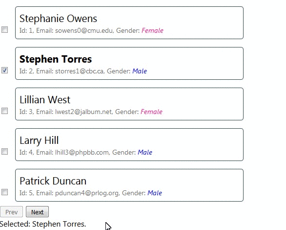
The idea is as follows: the component receives as a parameter a function reference that returns a range of objects by offset and page size (offset and pageSize):
[dataSource]="dataSource" this.dataSource = (o, p) => this._data.slice(o, o + p); as well as a template describing how to display these objects:
<div *list-navigator-item="let i, let isSelected = selected"… The * list-navigator-item argument is a kind of marker that allows our component to understand that the element it marks is a template (the '*' character tells the angular that we have not just an element, but a template) that should be used to draw the next object from the range returned by the dataSource . Using the list-navigator-item, we also set two variables:
- let i - link to another object from the range;
- let isSelected = selected - a boolean value indicating whether this item is checked
or not (we'll talk about what “= selected” means later).
In addition, the component receives as a parameter a list of “selected” elements (indicated by a check mark), and if the user changes the selection, the component returns an already updated list corresponding to the user choice:
[(selectedItems)]="selectedUsers" You can draw the following analogy: we pass a “factory” component, which creates a new interface element using the parameters passed by the component. Then our component places the interface element created by the factory inside where it is needed (opposite the tick in our case).
Let's finally see how to make such a component. For this we need the following ingredients:
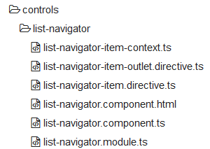
- list-navigator-item-outlet — the outlet directive, which is actually responsible for creating a new item using the template and the current context (the “factory” from the above analogy) (part of the component's internal implementation);
- list-navigator-item-ontext - Container class for transferring context data (part of the component's internal implementation);
- list-navigator-item is a marker directive with which the component accesses an element template;
- list-navigator is the actual component that implements the basic behavior, namely paging and selection of items.
list-navigator-item-outlet
The note. In fact, this directive is not needed because it duplicates the NgTemplateOutlet directive included in the standard library, but I decided to use my own version to better explain what is happening.
Just a small directive, so I’ll give its entire source code:
@Directive({ selector: "list-navigator-item-outlet" }) export class ListNavigatorItemOutlet { constructor(private readonly _viewContainer: ViewContainerRef){} @Input() public template: TemplateRef<ListNavigatorItemContext>; @Input() public context: ListNavigatorItemContext; public ngOnChanges(changes: SimpleChanges): void { const [, tmpl] = analyzeChanges(changes, () => this.template); const [, ctx] = analyzeChanges(changes, () => this.context); if (tmpl && ctx) { this._viewContainer.createEmbeddedView(tmpl, ctx); } } } In the constructor, we request from Angular 2 an object of type ViewContainerRef . With this object we can control the visual elements (View) (not to be confused with the elements of the DOM browser) in the parent component. Among all the capabilities of the ViewContainerRef, we are currently interested in the possibility of creating new visual elements, this can be done using the following two methods:
- createComponent (componentFactory: ComponentFactory <C>, ...)
- createEmbeddedView (templateRef: TemplateRef <C>, context ?: C, ...)
The first method is useful if we want to dynamically create a component with only its “class” in hand. For example, the Angulyarovsky router uses this method, but this topic deserves a separate post (if, of course, it will be interesting). Now let's pay attention to the second method createEmbeddedView , with which we create our users. As parameters, it takes a TemplateRef and some context.
A TemplateRef is a “factory” for creating new visual components, obtained by “compiling” the <template> tag in the component layout (the one that is template: '...' or templateUrl: “...”). But until now we have not seen this tag anywhere, so where did the TemplateRef come from? In fact, we had the <template> tag , we just implicitly defined it using the syntactic sugar in the form of the '*' symbol:
<div *list-navigator-item="let i, let isSelected = selected"… is equivalent to
<template [list-navigator-item]="let i, let isSelected = selected" <div … Angular 2 creates a TemplateRef for any <template> it finds in the component layout.
Let's go back to createEmbeddedView . The second argument this method gets some context . This object is quite important, because it is with the help of it that we can initialize the values of variables defined in the template:
"let i, let isSelected = selected" Here again, there is a small syntactic sugar, this record Angular 2 understands how:
"let i=$implicit, let isSelected = selected" That is, in our case, the context object should have two properties: $ implicit and selected . The way it is:
export class ListNavigatorItemContext { constructor( public $implicit: any, public selected: boolean ) { } } Now we have all the knowledge to understand how list-navigator-item-outlet works - as soon as both the template and context properties are set, the directive creates a new visual element in its container.
Here it is necessary to make the following disclaimer: in an amicable way, it would be necessary to delete the previously created visual component when you call ngOnChanges again, but in our case study this is not necessary.
list-navigator-item
It's all very simple:
@Directive({ selector: "[list-navigator-item]" }) export class ListNavigatorItem { constructor(@Optional() public readonly templateRef: TemplateRef<ListNavigatorItemContext>) { } } The sole purpose of this directive is to pass the compiled template through a public property.
list-navigator
Finally, our main component, for which everything was started. Let's start with its layout:
<div *ngFor="let i of itemsToDisplay"> <div> <input type="checkbox" [ngModel]="i.selected" (ngModelChange)="onSelectedChange(i, $event)"/> </div> <div class="item-wrapper"> <list-navigator-item-outlet [template]="templateOutlet.templateRef" [context]="i"> </list-navigator-item-outlet> </div> </div> <div> <button (click)="onPrev()">Prev</button> <button (click)="onNext()">Next</button> </div> Where:
this.itemsToDisplay = this .dataSource(offset, pageSize) .map(i => new ListNavigatorItemContext( i, this.selectedItems.indexOf(i) >= 0)); … @ContentChild(ListNavigatorItem) protected templateOutlet: ListNavigatorItem; Principle of operation:
- We get the next portion of objects using the link to the corresponding function ( dataSource ) and put it in itemsToDisplay
- We loop through all the objects from the chunk ( * ngFor = "let i of itemsToDisplay" ) and for each object we create a check mark plus the above - described list-navigator-item-outlet , which receives as parameters:
- A context consisting of an object and a flag selected;
- A link to a TemplateRef that the list-navigator-item directive kindly supplied us, which in turn was found by declaring the query @ContentChild (ListNavigatorItem)
- The list-navigator-item-outlet creates a visual element for the next object using the passed template and context (remember that in a real project it is advisable to use NgTemplateOutlet ).
A small addition.
The template for the list-navigator is quite interactive - we can add buttons, checkboxes, input fields and manage all of this from the parent page. Here is an example with the added “Archive” button, the handler of which is on the parent page and changes the user's state:
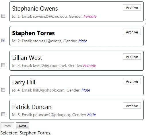
<list-navigator..> <div *list-navigator-item="let i..." > ... <button *ngIf="!i.archived" class="btn-arch" (click)="onArchive(i)">Archive</button> ... </div> </list-navigator> protected onArchive(user: User){ user.archived = true; } That's all. This article describes techniques that are slightly beyond the standard documentation for Angular 2, so I hope it will be useful to someone. Once again I specify the link to the source code of the examples described in the article. ( option with the Archive button ).
Source: https://habr.com/ru/post/320414/
All Articles