Design of multilingual applications
Imagine: for the first time you are introduced to a new application. In the reviews on Twitter, everyone goes crazy with him, they say that it is excellent, amazing, they have changed them all their lives.
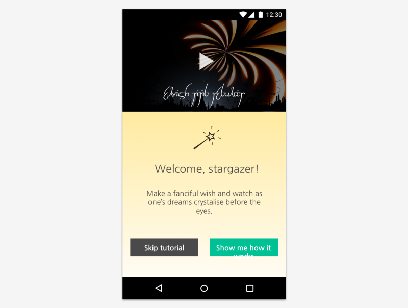
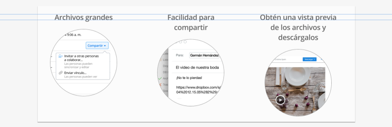
You run the application and see the following:
')
Hm Something is wrong here. A video is embedded on top, but the text in it is in a language you do not understand. The wording is somehow strange, and the inscription on the button does not even fit into the button itself. How can people like this?
It turns out that the thing is that the application was not originally created in your own language. It was developed in elvish, and then transferred. Most people use the elvish version and do not know what it all looks like in your language.
Believe it or not, users who do not speak English face such situations all the time. For many applications, the design is created with the expectation of only English, so some details of the interface may be lost if you do not show due care.
In order to avoid situations like the one described above, we offer several recommendations on what you need to remember when developing a multilingual application.
The most common problem of multilingual applications is not enough space for translations.
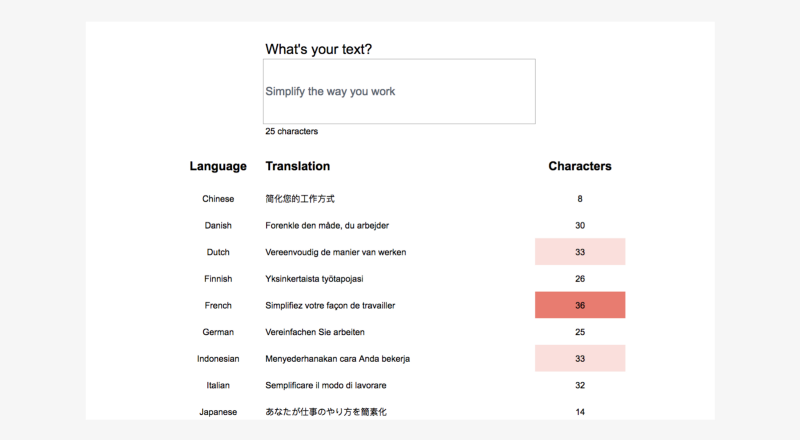
Take for example the label "New!". In English, it consists of four characters, including an exclamation mark. But in French in this inscription there will be already 9 symbols: “Nouveau!”, That is, the length will more than double. And yes, in French, this space before the exclamation mark is needed.
If your design contains text, make sure that there is enough space even if the translation is longer. Otherwise it may happen that the labels will overlap or cut off.
One way to estimate the length of the translation is to use Google Spreadsheets. Using the GoogleTranslate function, you can get machine translation of the text at once in a whole bunch of languages. Just a few seconds - and I have a general idea of how much each of the transfers will be in terms of volume.
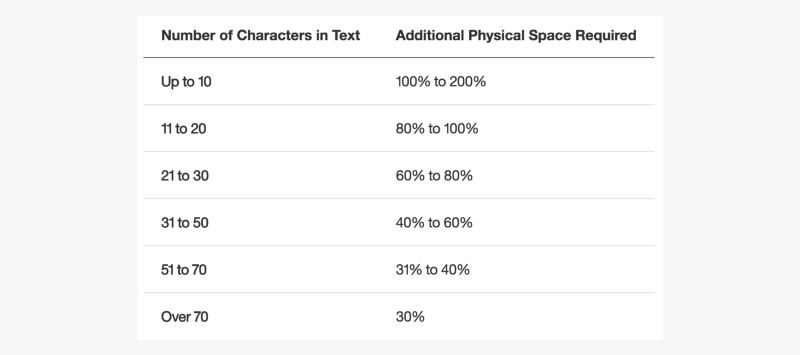
The IBM globalization site has a useful table that shows what additional volume you should expect when translating from English.
Columns are a great way to organize content. They bring balance, structure and rhythm and work well with your carefully constructed grid system.
But if the length of the text becomes unpredictable - what then? And this is exactly what happens when translating content. Headings that fit in one line can grow into two or three and break all your cute, perfectly adjusted design.
When the text is located in narrow columns, it is likely that some of the translations will take more lines than necessary. A more reliable option is wider rows that leave text space for growth without sacrificing the interface.
If there are pictures with inscriptions on your interface, the process of translating it into different languages can be a real torture.
Translators can add translations to each of the text layers of a Photoshop or Sketch file, but further confusion begins — you may have to customize the layout for each localization separately to fit long translations.
Here are a couple of more convenient options:
- Use instead of text lines. Sometimes, to convey a thought, words are not needed. It's amazing how much you can express with the help of several zagogulin.

- Overlay text via CSS. In the illustration below, the text in the green circle is not part of the image — it is placed on top of it with CSS.
For designers, moving items back and forth to find the best design option is common. “Let's put this text field right here, right. Let's move this drop-down menu to the left. ”
But when working with texts, you need to exercise extreme caution. If you try to make sentences from a combination of words with buttons, fields or menus, you can gain a lot of trouble.
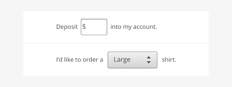
Localization of such structures is a headache for several reasons:
- Not the word order. In different languages, the words in sentences are placed differently. If you translate “Buy 3 shirts” into Japanese, the word “buy” will appear at the end of the sentence. If your design is designed for a specific word order, it is not suitable for all languages.
- Plural forms. In English, each noun has only two forms, singular and plural: “1 picture” and “__ pictures”. In Russian, however, three different forms can be combined with a numeral: “1 picture”, “3 pictures” and “7 pictures”. So, if you put in the middle of a sentence a field to specify the quantity, the user can enter a number for which the selected form will be grammatically incorrect.
- Generic endings. In some languages, nouns and adjectives tend by gender. For example, in French the word “large” can be translated as “grand,” “grande,” “grands,” or “grandes”, depending on what is being described. A drop-down menu in the middle of an application can lead to a grammatical discrepancy between words.
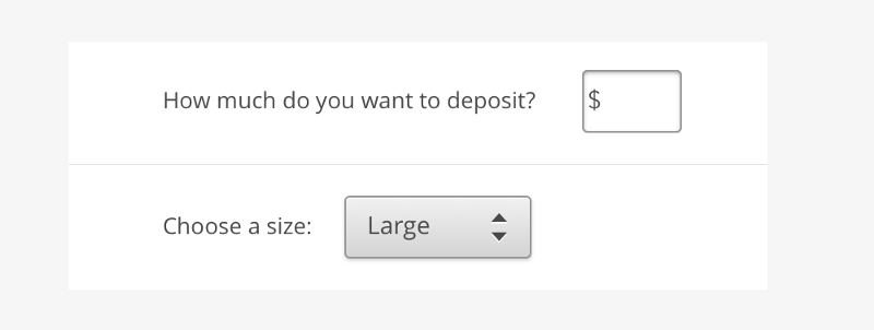
So what then to do? It would be better to move the UI element out of the sentence:
Product design is based on metaphors. Each icon, each button, each interaction is a metaphor in relation to an object or phenomenon from physical reality. Dropbox icon - storage box metaphor. Dragging with the mouse is a metaphor of the movement with which we pick up and move objects.
But metaphors can vary across cultures. The owl, which is a symbol of wisdom in the USA, is associated with stupidity in Finland and India.
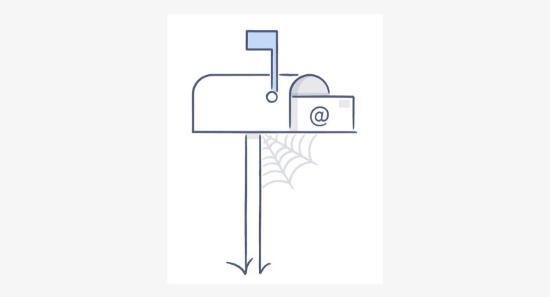
In addition, objects do not always look the same in different parts of the globe. Most Americans will immediately understand that the picture below shows a mailbox, but not everywhere are such mailboxes. Flags to boxes, for example, are rarely attached, so this metaphor will not be clear to everyone.
Whenever possible, it is not bad to look for information about the metaphors that you want to use before incorporating them into the design. In Dropbox, we usually refer to the localization team for feedback on icons and illustrations, when there are concerns about how they will be perceived abroad.
From a marketing point of view, it seems tempting to choose funny names for tools that will immediately attract attention. But these funny names are not so easy to translate, and in other languages they can lose their meaning.
A few years ago, Dropbox offered users a new feature - access to all previous versions of the file. Initially, we gave this feature the name "Packrat".
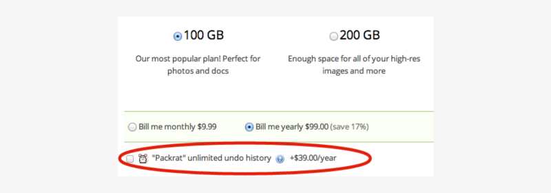
But, although the name might have seemed witty to an American audience, it would have sounded incomprehensible in other languages. And the icon with the image of a rat next to the signature would only be more confusing. Fortunately, we changed the name to “Extended version history”, which is much easier to translate.
To avoid problems with translation, be more careful will pick descriptive names for functions. They may be boring, but they benefit in terms of translation, and in terms of usability too.
In general, when you write text that will be translated, it is better to adhere to a clear, unambiguous and neutral style. But in some branding moments, you might want to take a more playful tone.
In such cases, we sometimes write two versions of the text: the original, for the English language, and the alternative, for all others.
You can arrange them in the form of comments for translators in those places where difficulties may arise. We are now captioning the stickers used in Dropbox. For the sticker below, we settled on the “OMG Cat” version.

While working on this task, translators will see a commentary that clarifies that the signature can also be translated as “surprised cat”. Thus, we give them the freedom to beat a ridiculous option, but at the same time leave the opportunity to resort to a literal translation, if necessary.
I hope that these tips will be useful to you. If you have your own recommendations regarding the localization of products, offer them in the comments - let's learn from each other. By actively discussing this topic, we will be able to contribute to the creation of higher quality products for people from all over the world.
You run the application and see the following:
')
Hm Something is wrong here. A video is embedded on top, but the text in it is in a language you do not understand. The wording is somehow strange, and the inscription on the button does not even fit into the button itself. How can people like this?
It turns out that the thing is that the application was not originally created in your own language. It was developed in elvish, and then transferred. Most people use the elvish version and do not know what it all looks like in your language.
Believe it or not, users who do not speak English face such situations all the time. For many applications, the design is created with the expectation of only English, so some details of the interface may be lost if you do not show due care.
In order to avoid situations like the one described above, we offer several recommendations on what you need to remember when developing a multilingual application.
1. Leave space for longer transfers.
The most common problem of multilingual applications is not enough space for translations.
Take for example the label "New!". In English, it consists of four characters, including an exclamation mark. But in French in this inscription there will be already 9 symbols: “Nouveau!”, That is, the length will more than double. And yes, in French, this space before the exclamation mark is needed.
If your design contains text, make sure that there is enough space even if the translation is longer. Otherwise it may happen that the labels will overlap or cut off.
One way to estimate the length of the translation is to use Google Spreadsheets. Using the GoogleTranslate function, you can get machine translation of the text at once in a whole bunch of languages. Just a few seconds - and I have a general idea of how much each of the transfers will be in terms of volume.
The IBM globalization site has a useful table that shows what additional volume you should expect when translating from English.
2. Do not place text in narrow columns.
Columns are a great way to organize content. They bring balance, structure and rhythm and work well with your carefully constructed grid system.
But if the length of the text becomes unpredictable - what then? And this is exactly what happens when translating content. Headings that fit in one line can grow into two or three and break all your cute, perfectly adjusted design.
When the text is located in narrow columns, it is likely that some of the translations will take more lines than necessary. A more reliable option is wider rows that leave text space for growth without sacrificing the interface.
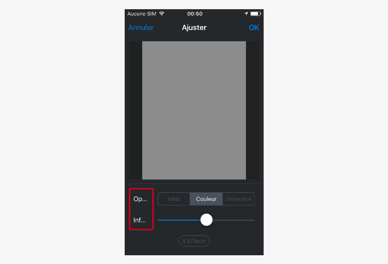
3. Do not overlay text on pictures.
If there are pictures with inscriptions on your interface, the process of translating it into different languages can be a real torture.
Translators can add translations to each of the text layers of a Photoshop or Sketch file, but further confusion begins — you may have to customize the layout for each localization separately to fit long translations.
Here are a couple of more convenient options:
- Use instead of text lines. Sometimes, to convey a thought, words are not needed. It's amazing how much you can express with the help of several zagogulin.
- Overlay text via CSS. In the illustration below, the text in the green circle is not part of the image — it is placed on top of it with CSS.
4. Do not embed UI elements in sentences.
For designers, moving items back and forth to find the best design option is common. “Let's put this text field right here, right. Let's move this drop-down menu to the left. ”
But when working with texts, you need to exercise extreme caution. If you try to make sentences from a combination of words with buttons, fields or menus, you can gain a lot of trouble.
Localization of such structures is a headache for several reasons:
- Not the word order. In different languages, the words in sentences are placed differently. If you translate “Buy 3 shirts” into Japanese, the word “buy” will appear at the end of the sentence. If your design is designed for a specific word order, it is not suitable for all languages.
- Plural forms. In English, each noun has only two forms, singular and plural: “1 picture” and “__ pictures”. In Russian, however, three different forms can be combined with a numeral: “1 picture”, “3 pictures” and “7 pictures”. So, if you put in the middle of a sentence a field to specify the quantity, the user can enter a number for which the selected form will be grammatically incorrect.
- Generic endings. In some languages, nouns and adjectives tend by gender. For example, in French the word “large” can be translated as “grand,” “grande,” “grands,” or “grandes”, depending on what is being described. A drop-down menu in the middle of an application can lead to a grammatical discrepancy between words.
So what then to do? It would be better to move the UI element out of the sentence:
5. Careful with metaphors
Product design is based on metaphors. Each icon, each button, each interaction is a metaphor in relation to an object or phenomenon from physical reality. Dropbox icon - storage box metaphor. Dragging with the mouse is a metaphor of the movement with which we pick up and move objects.
But metaphors can vary across cultures. The owl, which is a symbol of wisdom in the USA, is associated with stupidity in Finland and India.
In addition, objects do not always look the same in different parts of the globe. Most Americans will immediately understand that the picture below shows a mailbox, but not everywhere are such mailboxes. Flags to boxes, for example, are rarely attached, so this metaphor will not be clear to everyone.
Whenever possible, it is not bad to look for information about the metaphors that you want to use before incorporating them into the design. In Dropbox, we usually refer to the localization team for feedback on icons and illustrations, when there are concerns about how they will be perceived abroad.
6. Use descriptive names for functions.
From a marketing point of view, it seems tempting to choose funny names for tools that will immediately attract attention. But these funny names are not so easy to translate, and in other languages they can lose their meaning.
A few years ago, Dropbox offered users a new feature - access to all previous versions of the file. Initially, we gave this feature the name "Packrat".
But, although the name might have seemed witty to an American audience, it would have sounded incomprehensible in other languages. And the icon with the image of a rat next to the signature would only be more confusing. Fortunately, we changed the name to “Extended version history”, which is much easier to translate.
To avoid problems with translation, be more careful will pick descriptive names for functions. They may be boring, but they benefit in terms of translation, and in terms of usability too.
7. Offer alternatives for translation
In general, when you write text that will be translated, it is better to adhere to a clear, unambiguous and neutral style. But in some branding moments, you might want to take a more playful tone.
In such cases, we sometimes write two versions of the text: the original, for the English language, and the alternative, for all others.
You can arrange them in the form of comments for translators in those places where difficulties may arise. We are now captioning the stickers used in Dropbox. For the sticker below, we settled on the “OMG Cat” version.
While working on this task, translators will see a commentary that clarifies that the signature can also be translated as “surprised cat”. Thus, we give them the freedom to beat a ridiculous option, but at the same time leave the opportunity to resort to a literal translation, if necessary.
I hope that these tips will be useful to you. If you have your own recommendations regarding the localization of products, offer them in the comments - let's learn from each other. By actively discussing this topic, we will be able to contribute to the creation of higher quality products for people from all over the world.
Source: https://habr.com/ru/post/320376/
All Articles