Automatic visualization of python code using flowcharts
It will be a question of technology, which makes it possible to implement developer tools like the one shown in the picture below.

General view of the environment with alternative code views
')
Here the development environment window is divided into two parts. On the left is a familiar text editor, and on the right is an automatically generated diagram, as close as possible to traditional flowcharts of algorithms. Generation and redrawing of the diagram is made during typing. The development environment defines a pause in the developer’s actions and updates the diagram if the code remains correct. As a result, it is possible to work not only with the text of the program, but also with its graphic representation.
Do we need flowcharts at all?
My experience in software development shows that flowcharts are used and how they are used depends on the task. There are two typical scenarios of the developer:
I use flowcharts in both cases, albeit slightly differently.
In the case of new software, I usually use the top-down approach. First, the architecture is drawn in the form of abstract blocks and actors, then the individual subsystems are worked out in more detail, at some point reaching the level of the selected programming language. Of course, I do not draw in detail absolutely everything, but only those parts that are of difficulty or of particular interest. Tools like MS Visio on the market help me to draw diagrams, but only at a high level of abstraction. An ideal tool, if there was one, would have to help at the level of a programming language, preferably in two directions: generation of a diagram by code and vice versa, code by diagram.
In the case of support for existing projects, a typical - and causing sadness - is a situation where there is no documentation, which means that reverse engineering must first be carried out to understand the work. A bottom-up approach often works here. In the process of reading the code, at some point there comes an understanding of what a group of operators is doing, which means it is possible to draw - physically on a piece of paper or speculatively - a block with suitable text in it. Thus, one element appears instead of a group of statements. In the end, a diagram appears corresponding to the code. I would like to have a tool that supports such a scenario, but so far I have not found one.
For completeness, it makes sense to pay attention to large projects that are widely used diagrams in industrial software production. Are there any? The answer to this question is yes. Probably the largest project of this kind, known to me, is software for the reusable Buran spacecraft. Unlike the American reusable ships, the Soviet was not manned, which means that the entire management burden was placed on software that was developed using the language DRAGON . DRAGON used only graphical diagrams at all stages of design, and the developers did not work with traditional text at all. The project proved the high reliability of the software by successfully entering orbit and returning the spacecraft. The performance reports highlight the fact that high development speed and a small number of errors are due to the extensive use of diagrams. And now DRAGON is used to create software in the space industry. Unfortunately, some limitations of the technology make it impossible to use all the developments of DRAGON in the daily work of a developer writing in a popular programming language. However, a general conclusion can be made: diagrams similar to flowcharts of algorithms are useful and can provide significant benefits.
An example of a dragon language diagram (from drakon.su )
My understanding of the development process in the context of the topic of the article is that it is sometimes more convenient to work with the code as with text, and sometimes it is more convenient to analyze its graphical representation. Thus, an ideal tool should work with two views without giving preference to only one. The tool should also provide smooth integration between two views, the simplest example of which is the relationship between a particular line of code and the corresponding graphic element.
Alas, the finished tool, similar to the described one, has not yet been found. There are good packages for engineering graphics, such as Dia or MS Visio, which are very good in the area for which they were designed. They help at some stages, but they are very difficult to use when frequent changes are required. There are packages aimed at the design stage — for example, UML tools — but they are inconvenient to use at a low level. There are different code generators for various subject areas, but the generated code can hardly be called easily readable, if at all, intended to be read. There are graphic tools focused only on a specific subject area, but they are almost impossible to use in general-purpose projects, often the code is not available at all in such tools.
If there is no such tool, then it may be worthwhile to develop a technology that will allow it to be created? Further discussion will be about the technology and experimental environment that implements it. The environment allows you to look at existing projects as text and as a graphic with automatic synchronization between them. The implementation is made for the Python language and mainly in Python.
A good start to the discussion can be a set of graphic primitives that will be required to represent arbitrary Python code. Let's start with the transition from text to graphics: there is a Python code at the input, and at the output you need to get a diagram drawn using a set of graphic primitives, which are interconnected properly. The questions that need to be addressed here are the following. What elements of the language require recognition in the input stream? How should the recognized elements be drawn on the diagram?
Let's discuss all the necessary primitives in order.
Obviously, not all operators directly affect the flow of control. Such operators can be drawn as blocks of code.
Why blocks, not individual operators? For the most part, developers have a tendency to group related pieces of code consisting of several operators into larger pieces. Obviously, the purpose of such a grouping is to facilitate the understanding of the code during subsequent reading. A means of grouping are empty lines. The fact of such a grouping should be displayed on the chart.
As for the primitive, a simple rectangle seems reasonable. The examples below show one block of code and two blocks following one after the other with a difference in code of one empty line between operators (hereinafter: for all examples, the code snippet on Python Series 2 first follows, followed by the graphical representation).

One block of code

Two blocks of code one by one
The closest examination shows that at least three types of comments can be distinguished, depending on how the developer has placed them in the code. Blank lines, similar to how it was done for blocks of code, should also be taken into account, since they form meaningful fragments. So, the selected types of comments are:
Independent comments occupy one or more adjacent lines and are separated from the rest by at least one empty line. Independent comment lines contain nothing but comments.
Leading comments are like independent ones with one exception. The line following the last line of the leading comment contains the Python statement. In this case, the developer did not insert a blank line between the comment and the next block, which means, most likely, this was done intentionally - the comment is intended for the next block.
Side comments are located to the right of the operators. There are some important details here. Often a block of code takes up a few lines, while a developer can only give side comments to some of them. This circumstance when choosing graphics should be taken into account. Another detail concerns the last line of the code block: the developer may need more than one line of comments for it. Such a case must also be taken into account in the schedule.
Theoretically, one more type could be singled out - final comments. They would be similar to the leading comments with the difference that there would be no empty line between the last line of the code block and the first line of the final comment. Such a case, however, is more rare than common practice. Developers are more likely to comment on something going lower in the text, and not higher. Therefore, it was decided not to single out the final comments in a separate entity.
Now you can choose the right graphics for recognizable types of comments.

Independent comment
In this example, the independent comment consists of two lines. Obviously, the comment is between two blocks of code, and this position on the diagram corresponds to the line connecting the blocks. Appropriate graphics for this case seem to be a comment rectangle, resembling a note, with a horizontal connector leading to the line between the blocks.

Leading comment
This lead comment is for a block, so you can draw a comment rectangle above the block and add a connector leading to the block you want.

Side comment with a “tail”
In the case of a side comment, attention is required to a couple of points. First, there is a visual correspondence between the lines of code and comments. In the example above, there is no comment to the first line, and such situations should be taken into account in the chart. In other words, the lines in the comment rectangle should be vertically aligned exactly as they are aligned in the text. Secondly, sometimes the comment to the last line of the code takes more than one line. Signs of such a "tail" are taken as follows:
Imports bring dependencies with them. And managing dependencies in complex projects often becomes a difficult task. Therefore, the graphics for imports, preferably, should attract attention even at a cursory viewing of the chart. Based on this, a rectangle is selected with an icon placed on the left, as shown in the example below.
Import example
In the example, the second and third imports occupy more than one line, some of which are provided with side comments.
Let's discuss how the condition block should look on the chart. Traditional flowcharts offer a rhombus. A rhombus is great if the condition inscribed in it is short. In practice, however, conditions are often long and sometimes occupy more than one line, which makes it difficult for the entire condition to be written in a diamond of a reasonable size. Either the rhombus becomes too large and takes up a lot of valuable vertical space, or the font has to be made too small, or it is necessary to resort to abbreviations in the source text. The compromise solution proposed is: the left and right sides will be from the rhombus, and the upper and lower faces will be horizontal for the sake of maintaining vertical space. That is, the graphics will partially resemble a traditional rhombus. Such a graphic primitive can be easily scaled depending on the complexity of the condition.
The next discussion item is how to draw yes and no branches. One of the possible options to draw branches to the right and left of the condition block. This approach, unfortunately, can lead to a situation where the full diagram will be difficult to read and will not look beautiful. The problem is that the branches can be of arbitrary complexity, which leads to a large width of the branches and the horizontal displacement of the condition block. As a result, when viewing, you will need both vertical and horizontal scrolling, which we would like to avoid, if possible.
Another consideration relates to the design of the code so as to facilitate reading and understanding of the code over time. It would be good to have the opportunity to make all the main actions of the program located on the same vertical, and the inevitable error handling, rare or special cases, etc. located a little away. Then, if the original author took care of this, the understanding of the purpose of the code will come to followers faster. In order to support this style of development, branches are proposed to be placed on the graph in the following way: one of them, right below the block, conditions for the formation of the vertical, and the other to the right of the block.

A simple example of an if statement
Of course, the author can provide various parts of the code related to the if statement with comments. Consider a more complex example of code and the proposed graphics.
If statement with comments
In this example, there are side comments for the condition. As for code blocks, side comments for a condition can be given only for some lines, so the comment rectangle should be to the right of the condition and should be aligned vertically accordingly. Unfortunately, it was not possible to completely avoid the intersection of the comment connector and the branch of the condition, but there is also a mitigating problem: side comments for the conditions appear rarely in practice, programmers more often use the leading comments.
The last interesting point concerns the leading comment for else. There is no allocated primitive for else on the chart, it corresponds to the line of the execution branch. Therefore, on the graph, such a comment (also rarely used) begins to look exactly like an independent comment. Especially nothing terrible in this - the graphics are still exactly conveys what is happening.
A python file can contain many function definitions, as well as definitions of nested functions. Neither for this nor for the other flowcharts offer anything appropriate, therefore something new must be offered.
One of the ideas that comes to mind when thinking about graphics for functions concerns scopes. The field of view plays the role of a space with delineated boundaries. Any function obviously has quite definite points where it begins and ends. This means that the graphics for functions may resemble a closed area, inside of which there is a graphical representation of the function body. Taking a step a little to one side, you can remember that when you look at an unfamiliar Python code, the context is often not immediately clear: a specific line of code can be inside nested functions, and inside classes and within conditional structures. An idea with delineated scope bounds potentially allows for a quicker understanding of the context of actions performed.
We first look at a simple example of the proposed graphics.

Graphics for the function
The scope of the function is outlined by a rectangle with rounded edges and filled with the color selected for the functions. The title of the rectangle contains the name of the function and its arguments. The heading is separated from the body by a horizontal bar. To make obvious the specifics of the scope, a badge is added in the upper left corner, indicating that this is a function.
Now consider a more complex example in which the function has a leading comment, there is a line of documentation, and the parameters take up more than one line and are also commented.
Function with comments and documentation
The graphics of the lead commentary is obvious, while side commenting for arguments is a problem. Due to the fact that the lines of the side comment must be aligned vertically with the list of arguments, the most logical was to place the comment rectangle directly into the function header. I can not say that the proposed solution seems to me ideal, but it covers all cases of correct Python code and does not allow ambiguity.
For documentation, the scope header is expanded by another horizontal section, which immediately follows the function prototype section.
Traditional flowcharts offer good return graphics, which can be used with minor improvements. Take a simple example:

Simple return
The improvement is to add an icon with a left arrow. Since return operators have a strong influence on the flow of control, the icon serves the purpose of further drawing attention with a quick review of the code.
Of course, return statements can take more than one line and can have comments. Below is an example for such a case.

Multi-line return with comments
Once the idea of scope has been used for functions, its applicability to classes looks more than logical. Graphics for classes can be the same except for a different background color and badge. The example below illustrates a class with comments and a documentation line.
Class example
In the context of functions and classes in Python, decorators may appear. Essentially, decorators are wrappers, that is, you can use the same idea of scopes to visualize them. For quick identification, you can choose your own background color for them and place the @ symbol in the badge.
Decorator with comments
Python supports two types of cycles: for and while. Both types have a condition and inside there can be break and continue statements. The decision on the schedule for the cycles was not easy and it was based on the following reasoning.
Traditional flowcharts use graphics that are already used for an if statement, and this solution is better left in place, because there are no good alternatives for if graphics.
On the other hand, cycles, like scopes, have completely defined points of beginning and end. The condition of the loop is well suited to the role of the scope scope, the contents of the scope plays the role of the loop body. Another consideration is that in the case of using a scope, the idea of displaying the main actions of the program on one vertical is more clearly expressed, since there is a closed geometric figure. In addition, the connectors in the case of traditional flowcharts do not meet the principle “from top to bottom” - the exit from the cycle is to the right of the condition at the beginning. Another problem with traditional graphics is that it is completely incomprehensible what to do with the else part that may appear in Python cycles.
The last point concerns the break and continue statements. In the case of using the field of visibility, the points to which break and continue lead, become quite obvious - the lower and upper edges of the rectangle. Whereas in the case of traditional flowcharts, it is necessary to draw a connector, which in the case of complex branched code is difficult to draw (if at all possible) so that the diagram is obvious and there are no intersections with other connectors.
Using the idea of scope for cycles, the issue with the leading and side comments also becomes already solved.

Cycle for
In more complex cases, the loop may have comments and an else block. Consider the example below.

While loop with else block and comments
The else block is drawn as a separate scope to the right of the loop scope. Visibility areas are connected to each other by a dotted line in order to emphasize the close association between them. Comments are shown in a familiar way. And the badge of the scope of the else block is moved from the border to the header. Otherwise, the title is completely empty and does not look so elegant.
Traditional flowcharts do not offer any graphics for break and continue. They correspond to the connectors, which leads to several difficult to resolve issues. First, both operators can have leading and side comments, and in the case of connectors it is completely incomprehensible how to show comments so that their belonging to the operators is obvious. Secondly, connectors lead to the problem of clear wiring. The body of a loop can be complex and have many break and continue statements. In such cases, it is difficult (if possible at all) to achieve such a layout that there is a minimum of kinks and no intersections with other connectors.
In connection with these problems, it was decided to introduce a new schedule for break and continue. To emphasize that the operators actually represent a transition to a certain point, a graphic was chosen, resembling a tag and devoid of an output connector. The output connector seems redundant, since the person programming on Python surely knows which point the transition leads to.

Simple example break and continue
Of course, operators may have comments. The example below shows how they are rendered, unambiguously determining membership in the corresponding operator.

Break and continue statements with comments
This is probably the most complex construction in Python. In addition to the try block, it is possible to have a set of except blocks and optional else and finally blocks. Since each of these blocks has its own body, it was decided to use the graphics of the scope for each of them.

Example try - except - else - finally
The except blocks are designed to handle errors, and therefore lie outside the main line of execution. Therefore, they are located to the right of the try block. For the purpose of an additional emphasis on the close connection between try and except blocks, a dashed line has been drawn between them. If there were more than one except block, then the diagram would “grow” to the right, where except blocks would be located one by one.
The else and finally blocks are more likely to belong to the main line of program execution, so on the diagram they follow the try block.
It is obvious that each of the described elements can have both leading and side comments, which can be drawn in the same way as for other language operators.
The with statement defines the execution context, so the idea of scopes fits best for it.

Operator with
There is no doubt that the generation of an exception has the strongest effect on the control flow. Therefore, the schedule of the raise operator must be such as to attract attention even with a superficial glance. Another consideration that makes sense to take into account is that the raise statement has common properties with a return statement: both lead to exiting the current scope. Based on this, it was decided to use for raise the same schedule as for return with a modified icon on the left side - raise will have a striking red arrow.
As usual, the raise statement can span multiple lines and have leading and side comments.

Raise operator
The assert statement generates an exception conditionally, that is, it can affect the control flow in the same way as the raise operator. Based on this, on the chart for assert, I wanted to leave the icon with the red arrow as a raise, but emphasize the conventionality of the exception generation.

Example of two assert statements
The conditionality of the exclusion is shown by a diamond on the left, in which the familiar red arrow is drawn. Of course, the assert statement can have leading and side comments. This case is shown for the second statement in the example above.
Strictly speaking, the sys.exit () call is not part of the language, but the call has a direct effect on the control flow. Therefore, the idea of recognizing sys.exit () and displaying it in a suitable way seems attractive.
An interesting feature of the call is that, syntactically, it can look different, depending on how the import is made. The example below demonstrates the proposed graphics and various import options.

Example sys.exit ()
Of course, there is also the possibility to make a call to sys.exit () via eval (), and such options are difficult to recognize, but they are rare, and even traditional options are quite well covered.
Calling sys.exit () prematurely terminates the execution of the program, that is, is analogous to a return passing through all intermediate levels. Therefore, the graphics are borrowed from the operator return, and the icon is replaced with a reflective essence.
The last element for which you need graphics is a separate file. Python file has several attributes that need to be shown on the chart:
Naturally, the file forms the scope in which all other elements are located. The example below shows the placement of the above elements on a graph for a file.

Python file
Now, having a good idea of what elements of the language need to be recognized and how to display them on the graphical representation, you can start creating the tool. Obviously the important question here is this: how should the text and graphics interact with each other? One of the possible ways is to abandon the text in general and use only graphics. This approach was rejected immediately. I am convinced that, depending on the situation, either the text or the graphic may benefit in clarity.
Thus, the instrument must support both types of program presentation, without sacrificing any one. In a typical Python IDE, a text editor occupies the main place. It seems logical to divide this space equally between text and graphics.
Before starting a new project, an analysis of existing open source IDEs was carried out to develop an add-on that would support a graphical representation of the code. Unfortunately, nothing suitable was found. Therefore, a new experimental project called the Codimension Python IDE was launched .
General view of Codimension Python IDE
The development of the Codimension IDE did not start from scratch. Some ideas and part of the code were borrowed from another open source Python IDE: eric 4 .
Currently, Codimension implements automatic drawing of graphical representation for arbitrary Python (series 2) code. The environment determines a pause in the code packing and redraws the diagram to the right of the text. If at some point the code ceases to be syntactically correct, the diagram is not updated, and the indicator of the state of the diagram changes its color to red with respect to the text.
Also shown is the display of the path through the scopes to the one that is under the mouse cursor. Double clicking on an element in the diagram leads to a transition to the corresponding fragment in the text. And the key combination, pressed when the input focus is in the text part, on the contrary, leads to the transition and highlighting of the corresponding graphic element. Chart export functions in popular SVG, PNG and PDF formats are supported. Of course, not all the features of the IDE are listed here, but the plans for new functionality for graphical representation are even greater.
In the second part, the implementation of the Codimension IDE will be discussed, with an emphasis on the graphical component. New features that have not yet been realized, micro chart markup language, etc. will be described.
UPD: published the second part
General view of the environment with alternative code views
')
Here the development environment window is divided into two parts. On the left is a familiar text editor, and on the right is an automatically generated diagram, as close as possible to traditional flowcharts of algorithms. Generation and redrawing of the diagram is made during typing. The development environment defines a pause in the developer’s actions and updates the diagram if the code remains correct. As a result, it is possible to work not only with the text of the program, but also with its graphic representation.
Flowcharts in the wild
Do we need flowcharts at all?
My experience in software development shows that flowcharts are used and how they are used depends on the task. There are two typical scenarios of the developer:
- creating new software from scratch
- support and modification of existing software products
I use flowcharts in both cases, albeit slightly differently.
In the case of new software, I usually use the top-down approach. First, the architecture is drawn in the form of abstract blocks and actors, then the individual subsystems are worked out in more detail, at some point reaching the level of the selected programming language. Of course, I do not draw in detail absolutely everything, but only those parts that are of difficulty or of particular interest. Tools like MS Visio on the market help me to draw diagrams, but only at a high level of abstraction. An ideal tool, if there was one, would have to help at the level of a programming language, preferably in two directions: generation of a diagram by code and vice versa, code by diagram.
In the case of support for existing projects, a typical - and causing sadness - is a situation where there is no documentation, which means that reverse engineering must first be carried out to understand the work. A bottom-up approach often works here. In the process of reading the code, at some point there comes an understanding of what a group of operators is doing, which means it is possible to draw - physically on a piece of paper or speculatively - a block with suitable text in it. Thus, one element appears instead of a group of statements. In the end, a diagram appears corresponding to the code. I would like to have a tool that supports such a scenario, but so far I have not found one.
For completeness, it makes sense to pay attention to large projects that are widely used diagrams in industrial software production. Are there any? The answer to this question is yes. Probably the largest project of this kind, known to me, is software for the reusable Buran spacecraft. Unlike the American reusable ships, the Soviet was not manned, which means that the entire management burden was placed on software that was developed using the language DRAGON . DRAGON used only graphical diagrams at all stages of design, and the developers did not work with traditional text at all. The project proved the high reliability of the software by successfully entering orbit and returning the spacecraft. The performance reports highlight the fact that high development speed and a small number of errors are due to the extensive use of diagrams. And now DRAGON is used to create software in the space industry. Unfortunately, some limitations of the technology make it impossible to use all the developments of DRAGON in the daily work of a developer writing in a popular programming language. However, a general conclusion can be made: diagrams similar to flowcharts of algorithms are useful and can provide significant benefits.
An example of a dragon language diagram (from drakon.su )
Tools
My understanding of the development process in the context of the topic of the article is that it is sometimes more convenient to work with the code as with text, and sometimes it is more convenient to analyze its graphical representation. Thus, an ideal tool should work with two views without giving preference to only one. The tool should also provide smooth integration between two views, the simplest example of which is the relationship between a particular line of code and the corresponding graphic element.
Alas, the finished tool, similar to the described one, has not yet been found. There are good packages for engineering graphics, such as Dia or MS Visio, which are very good in the area for which they were designed. They help at some stages, but they are very difficult to use when frequent changes are required. There are packages aimed at the design stage — for example, UML tools — but they are inconvenient to use at a low level. There are different code generators for various subject areas, but the generated code can hardly be called easily readable, if at all, intended to be read. There are graphic tools focused only on a specific subject area, but they are almost impossible to use in general-purpose projects, often the code is not available at all in such tools.
If there is no such tool, then it may be worthwhile to develop a technology that will allow it to be created? Further discussion will be about the technology and experimental environment that implements it. The environment allows you to look at existing projects as text and as a graphic with automatic synchronization between them. The implementation is made for the Python language and mainly in Python.
Graphic primitives
A good start to the discussion can be a set of graphic primitives that will be required to represent arbitrary Python code. Let's start with the transition from text to graphics: there is a Python code at the input, and at the output you need to get a diagram drawn using a set of graphic primitives, which are interconnected properly. The questions that need to be addressed here are the following. What elements of the language require recognition in the input stream? How should the recognized elements be drawn on the diagram?
Let's discuss all the necessary primitives in order.
Code blocks
Obviously, not all operators directly affect the flow of control. Such operators can be drawn as blocks of code.
Why blocks, not individual operators? For the most part, developers have a tendency to group related pieces of code consisting of several operators into larger pieces. Obviously, the purpose of such a grouping is to facilitate the understanding of the code during subsequent reading. A means of grouping are empty lines. The fact of such a grouping should be displayed on the chart.
As for the primitive, a simple rectangle seems reasonable. The examples below show one block of code and two blocks following one after the other with a difference in code of one empty line between operators (hereinafter: for all examples, the code snippet on Python Series 2 first follows, followed by the graphical representation).
c = MyClass( 154 ) c.member = f( 17 ) c.doSomething() print c One block of code
c = MyClass( 154 ) c.member = f( 17 ) c.doSomething() print c Two blocks of code one by one
Comments
The closest examination shows that at least three types of comments can be distinguished, depending on how the developer has placed them in the code. Blank lines, similar to how it was done for blocks of code, should also be taken into account, since they form meaningful fragments. So, the selected types of comments are:
- independent
- leading
- lateral
Independent comments occupy one or more adjacent lines and are separated from the rest by at least one empty line. Independent comment lines contain nothing but comments.
Leading comments are like independent ones with one exception. The line following the last line of the leading comment contains the Python statement. In this case, the developer did not insert a blank line between the comment and the next block, which means, most likely, this was done intentionally - the comment is intended for the next block.
Side comments are located to the right of the operators. There are some important details here. Often a block of code takes up a few lines, while a developer can only give side comments to some of them. This circumstance when choosing graphics should be taken into account. Another detail concerns the last line of the code block: the developer may need more than one line of comments for it. Such a case must also be taken into account in the schedule.
Theoretically, one more type could be singled out - final comments. They would be similar to the leading comments with the difference that there would be no empty line between the last line of the code block and the first line of the final comment. Such a case, however, is more rare than common practice. Developers are more likely to comment on something going lower in the text, and not higher. Therefore, it was decided not to single out the final comments in a separate entity.
Now you can choose the right graphics for recognizable types of comments.
Independent comments
a = 154 # Line 1 # Line 2 b = a Independent comment
In this example, the independent comment consists of two lines. Obviously, the comment is between two blocks of code, and this position on the diagram corresponds to the line connecting the blocks. Appropriate graphics for this case seem to be a comment rectangle, resembling a note, with a horizontal connector leading to the line between the blocks.
Leading Comments
# Line 1 # Line 2 a = 154 b = a Leading comment
This lead comment is for a block, so you can draw a comment rectangle above the block and add a connector leading to the block you want.
Side comments
a = 154 b = a # No comment for the first line c = b + 1 # Comment for c # A tail -----^ Side comment with a “tail”
In the case of a side comment, attention is required to a couple of points. First, there is a visual correspondence between the lines of code and comments. In the example above, there is no comment to the first line, and such situations should be taken into account in the chart. In other words, the lines in the comment rectangle should be vertically aligned exactly as they are aligned in the text. Secondly, sometimes the comment to the last line of the code takes more than one line. Signs of such a "tail" are taken as follows:
- the tail comment line immediately follows the previous one (no empty lines)
- the # symbol is in the same position as in the previous line
Imports
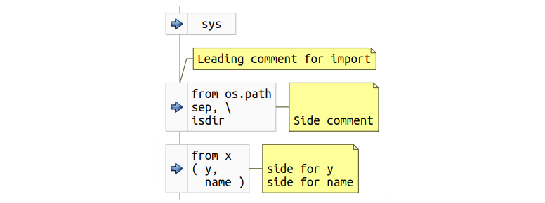
Imports bring dependencies with them. And managing dependencies in complex projects often becomes a difficult task. Therefore, the graphics for imports, preferably, should attract attention even at a cursory viewing of the chart. Based on this, a rectangle is selected with an icon placed on the left, as shown in the example below.
import sys # Leading comment for import from os.path import sep, \ isdir # Side comment from x import ( y, # side for y name ) # side for name Import example
In the example, the second and third imports occupy more than one line, some of which are provided with side comments.
If statement
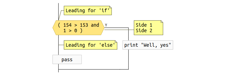
Let's discuss how the condition block should look on the chart. Traditional flowcharts offer a rhombus. A rhombus is great if the condition inscribed in it is short. In practice, however, conditions are often long and sometimes occupy more than one line, which makes it difficult for the entire condition to be written in a diamond of a reasonable size. Either the rhombus becomes too large and takes up a lot of valuable vertical space, or the font has to be made too small, or it is necessary to resort to abbreviations in the source text. The compromise solution proposed is: the left and right sides will be from the rhombus, and the upper and lower faces will be horizontal for the sake of maintaining vertical space. That is, the graphics will partially resemble a traditional rhombus. Such a graphic primitive can be easily scaled depending on the complexity of the condition.
The next discussion item is how to draw yes and no branches. One of the possible options to draw branches to the right and left of the condition block. This approach, unfortunately, can lead to a situation where the full diagram will be difficult to read and will not look beautiful. The problem is that the branches can be of arbitrary complexity, which leads to a large width of the branches and the horizontal displacement of the condition block. As a result, when viewing, you will need both vertical and horizontal scrolling, which we would like to avoid, if possible.
Another consideration relates to the design of the code so as to facilitate reading and understanding of the code over time. It would be good to have the opportunity to make all the main actions of the program located on the same vertical, and the inevitable error handling, rare or special cases, etc. located a little away. Then, if the original author took care of this, the understanding of the purpose of the code will come to followers faster. In order to support this style of development, branches are proposed to be placed on the graph in the following way: one of them, right below the block, conditions for the formation of the vertical, and the other to the right of the block.
if 154 > 153: print "Well, yes" else: pass A simple example of an if statement
Of course, the author can provide various parts of the code related to the if statement with comments. Consider a more complex example of code and the proposed graphics.
# Leading for 'if' if ( 154 > 153 and # Side 1 1 > 0 ): # Side 2 print "Well, yes" # Leading for 'else' else: pass If statement with comments
In this example, there are side comments for the condition. As for code blocks, side comments for a condition can be given only for some lines, so the comment rectangle should be to the right of the condition and should be aligned vertically accordingly. Unfortunately, it was not possible to completely avoid the intersection of the comment connector and the branch of the condition, but there is also a mitigating problem: side comments for the conditions appear rarely in practice, programmers more often use the leading comments.
The last interesting point concerns the leading comment for else. There is no allocated primitive for else on the chart, it corresponds to the line of the execution branch. Therefore, on the graph, such a comment (also rarely used) begins to look exactly like an independent comment. Especially nothing terrible in this - the graphics are still exactly conveys what is happening.
Functions
A python file can contain many function definitions, as well as definitions of nested functions. Neither for this nor for the other flowcharts offer anything appropriate, therefore something new must be offered.
One of the ideas that comes to mind when thinking about graphics for functions concerns scopes. The field of view plays the role of a space with delineated boundaries. Any function obviously has quite definite points where it begins and ends. This means that the graphics for functions may resemble a closed area, inside of which there is a graphical representation of the function body. Taking a step a little to one side, you can remember that when you look at an unfamiliar Python code, the context is often not immediately clear: a specific line of code can be inside nested functions, and inside classes and within conditional structures. An idea with delineated scope bounds potentially allows for a quicker understanding of the context of actions performed.
We first look at a simple example of the proposed graphics.
def f( x ): print "Function f( x )" Graphics for the function
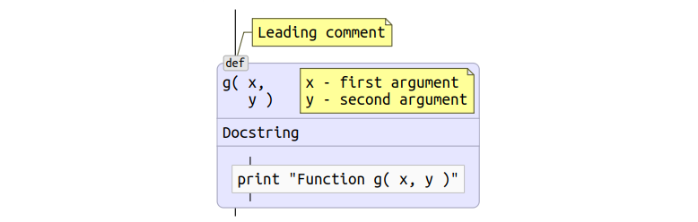
The scope of the function is outlined by a rectangle with rounded edges and filled with the color selected for the functions. The title of the rectangle contains the name of the function and its arguments. The heading is separated from the body by a horizontal bar. To make obvious the specifics of the scope, a badge is added in the upper left corner, indicating that this is a function.
Now consider a more complex example in which the function has a leading comment, there is a line of documentation, and the parameters take up more than one line and are also commented.
# Leading comment def g( x, # x - first argument y ): # y - second argument """ Docstring """ print "Function g( x, y )" Function with comments and documentation
The graphics of the lead commentary is obvious, while side commenting for arguments is a problem. Due to the fact that the lines of the side comment must be aligned vertically with the list of arguments, the most logical was to place the comment rectangle directly into the function header. I can not say that the proposed solution seems to me ideal, but it covers all cases of correct Python code and does not allow ambiguity.
For documentation, the scope header is expanded by another horizontal section, which immediately follows the function prototype section.
Operator return
Traditional flowcharts offer good return graphics, which can be used with minor improvements. Take a simple example:
def f( x ): return x * 154 Simple return
The improvement is to add an icon with a left arrow. Since return operators have a strong influence on the flow of control, the icon serves the purpose of further drawing attention with a quick review of the code.
Of course, return statements can take more than one line and can have comments. Below is an example for such a case.
def f( x ): # Return leading return ( x * 154 + # Side 1 X / 154 ) # Side 2 Multi-line return with comments
Classes
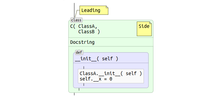
Once the idea of scope has been used for functions, its applicability to classes looks more than logical. Graphics for classes can be the same except for a different background color and badge. The example below illustrates a class with comments and a documentation line.
# Leading class C( ClassA, # Side ClassB ): "Docstring" def __init__( self ): ClassA.__init__( self ) self.__x = 0 Class example
Decorators
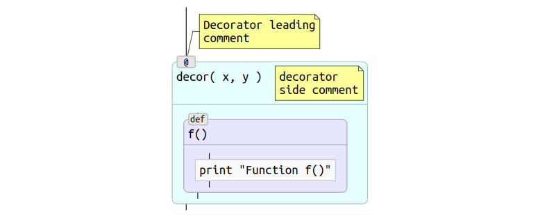
In the context of functions and classes in Python, decorators may appear. Essentially, decorators are wrappers, that is, you can use the same idea of scopes to visualize them. For quick identification, you can choose your own background color for them and place the @ symbol in the badge.
# Decorator leading # comment @decor( x, y ) # decorator # side comment def f(): print "Function f()" Decorator with comments
Cycles
Python supports two types of cycles: for and while. Both types have a condition and inside there can be break and continue statements. The decision on the schedule for the cycles was not easy and it was based on the following reasoning.
Traditional flowcharts use graphics that are already used for an if statement, and this solution is better left in place, because there are no good alternatives for if graphics.
On the other hand, cycles, like scopes, have completely defined points of beginning and end. The condition of the loop is well suited to the role of the scope scope, the contents of the scope plays the role of the loop body. Another consideration is that in the case of using a scope, the idea of displaying the main actions of the program on one vertical is more clearly expressed, since there is a closed geometric figure. In addition, the connectors in the case of traditional flowcharts do not meet the principle “from top to bottom” - the exit from the cycle is to the right of the condition at the beginning. Another problem with traditional graphics is that it is completely incomprehensible what to do with the else part that may appear in Python cycles.
The last point concerns the break and continue statements. In the case of using the field of visibility, the points to which break and continue lead, become quite obvious - the lower and upper edges of the rectangle. Whereas in the case of traditional flowcharts, it is necessary to draw a connector, which in the case of complex branched code is difficult to draw (if at all possible) so that the diagram is obvious and there are no intersections with other connectors.
Using the idea of scope for cycles, the issue with the leading and side comments also becomes already solved.
for x in [ 1, 17, 42, 154 ]: print x Cycle for
In more complex cases, the loop may have comments and an else block. Consider the example below.
x = 0 # While loop leading comment while x < 154: # while side # comment x += 1 # else leading comment else: # else side comment pass While loop with else block and comments
The else block is drawn as a separate scope to the right of the loop scope. Visibility areas are connected to each other by a dotted line in order to emphasize the close association between them. Comments are shown in a familiar way. And the badge of the scope of the else block is moved from the border to the header. Otherwise, the title is completely empty and does not look so elegant.
Break and continue statements
Traditional flowcharts do not offer any graphics for break and continue. They correspond to the connectors, which leads to several difficult to resolve issues. First, both operators can have leading and side comments, and in the case of connectors it is completely incomprehensible how to show comments so that their belonging to the operators is obvious. Secondly, connectors lead to the problem of clear wiring. The body of a loop can be complex and have many break and continue statements. In such cases, it is difficult (if possible at all) to achieve such a layout that there is a minimum of kinks and no intersections with other connectors.
In connection with these problems, it was decided to introduce a new schedule for break and continue. To emphasize that the operators actually represent a transition to a certain point, a graphic was chosen, resembling a tag and devoid of an output connector. The output connector seems redundant, since the person programming on Python surely knows which point the transition leads to.
while True: if True: continue else: break Simple example break and continue
Of course, operators may have comments. The example below shows how they are rendered, unambiguously determining membership in the corresponding operator.
while True: if True: # Leading 1 continue # Side 1 else: # Leading 2 break # Side 2 Break and continue statements with comments
Try, except, else, finally
This is probably the most complex construction in Python. In addition to the try block, it is possible to have a set of except blocks and optional else and finally blocks. Since each of these blocks has its own body, it was decided to use the graphics of the scope for each of them.
try: a = x / y except ZeroDivisionError: print "?" else: print "a = ", a finally: print "finally" Example try - except - else - finally
The except blocks are designed to handle errors, and therefore lie outside the main line of execution. Therefore, they are located to the right of the try block. For the purpose of an additional emphasis on the close connection between try and except blocks, a dashed line has been drawn between them. If there were more than one except block, then the diagram would “grow” to the right, where except blocks would be located one by one.
The else and finally blocks are more likely to belong to the main line of program execution, so on the diagram they follow the try block.
It is obvious that each of the described elements can have both leading and side comments, which can be drawn in the same way as for other language operators.
Operator with
The with statement defines the execution context, so the idea of scopes fits best for it.
# Leading with open( "my-data.txt" ) as f: # Side data = f.read() print data Operator with
Raise operator
There is no doubt that the generation of an exception has the strongest effect on the control flow. Therefore, the schedule of the raise operator must be such as to attract attention even with a superficial glance. Another consideration that makes sense to take into account is that the raise statement has common properties with a return statement: both lead to exiting the current scope. Based on this, it was decided to use for raise the same schedule as for return with a modified icon on the left side - raise will have a striking red arrow.
As usual, the raise statement can span multiple lines and have leading and side comments.
# Leading raise Exception( "first line " # Side 1 "Second line" ) # Side 2 Raise operator
Assert
The assert statement generates an exception conditionally, that is, it can affect the control flow in the same way as the raise operator. Based on this, on the chart for assert, I wanted to leave the icon with the red arrow as a raise, but emphasize the conventionality of the exception generation.
assert x == 97 # Leading assert type( x ) is IntType, \ "x is not an integer" # Side Example of two assert statements
The conditionality of the exclusion is shown by a diamond on the left, in which the familiar red arrow is drawn. Of course, the assert statement can have leading and side comments. This case is shown for the second statement in the example above.
sys.exit ()
Strictly speaking, the sys.exit () call is not part of the language, but the call has a direct effect on the control flow. Therefore, the idea of recognizing sys.exit () and displaying it in a suitable way seems attractive.
An interesting feature of the call is that, syntactically, it can look different, depending on how the import is made. The example below demonstrates the proposed graphics and various import options.
if True: import sys sys.exit( 1 ) from sys import exit exit( 2 ) else: from sys import exit as f f( 3 ) from sys import * # Leading exit( 4 ) # side Example sys.exit ()
Of course, there is also the possibility to make a call to sys.exit () via eval (), and such options are difficult to recognize, but they are rare, and even traditional options are quite well covered.
Calling sys.exit () prematurely terminates the execution of the program, that is, is analogous to a return passing through all intermediate levels. Therefore, the graphics are borrowed from the operator return, and the icon is replaced with a reflective essence.
File
The last element for which you need graphics is a separate file. Python file has several attributes that need to be shown on the chart:
- Doc string
- Encoding
- Startup Reference
Naturally, the file forms the scope in which all other elements are located. The example below shows the placement of the above elements on a graph for a file.
#!/usr/bin/env python # encoding: utf-8 """ A file docstring may occupy a few lines """ print "Hello flowcharts" Python file
Proof of concept: Codimension Python IDE
Now, having a good idea of what elements of the language need to be recognized and how to display them on the graphical representation, you can start creating the tool. Obviously the important question here is this: how should the text and graphics interact with each other? One of the possible ways is to abandon the text in general and use only graphics. This approach was rejected immediately. I am convinced that, depending on the situation, either the text or the graphic may benefit in clarity.
Thus, the instrument must support both types of program presentation, without sacrificing any one. In a typical Python IDE, a text editor occupies the main place. It seems logical to divide this space equally between text and graphics.
Before starting a new project, an analysis of existing open source IDEs was carried out to develop an add-on that would support a graphical representation of the code. Unfortunately, nothing suitable was found. Therefore, a new experimental project called the Codimension Python IDE was launched .
General view of Codimension Python IDE
The development of the Codimension IDE did not start from scratch. Some ideas and part of the code were borrowed from another open source Python IDE: eric 4 .
Currently, Codimension implements automatic drawing of graphical representation for arbitrary Python (series 2) code. The environment determines a pause in the code packing and redraws the diagram to the right of the text. If at some point the code ceases to be syntactically correct, the diagram is not updated, and the indicator of the state of the diagram changes its color to red with respect to the text.
Also shown is the display of the path through the scopes to the one that is under the mouse cursor. Double clicking on an element in the diagram leads to a transition to the corresponding fragment in the text. And the key combination, pressed when the input focus is in the text part, on the contrary, leads to the transition and highlighting of the corresponding graphic element. Chart export functions in popular SVG, PNG and PDF formats are supported. Of course, not all the features of the IDE are listed here, but the plans for new functionality for graphical representation are even greater.
In the second part, the implementation of the Codimension IDE will be discussed, with an emphasis on the graphical component. New features that have not yet been realized, micro chart markup language, etc. will be described.
UPD: published the second part
Source: https://habr.com/ru/post/320184/
All Articles