Stagnation: message format
The world of site design is developing in exorbitant leaps, trends are changing, new objects are emerging for presenting and managing information. In the midst of all this abundance, it seems to me unworthy of a deprived message output format. A message is an extremely important unit of any site, for which it is not dedicated, people want to announce their opinions, share experiences, ask questions and simply communicate. However, in the long run of general progression, the output format itself has not undergone significant changes.
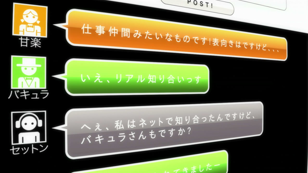
Back in 2004, when I just got the Internet and I registered on my first forum, the messages were rectangular blocks following one another.
')
Styles and objects of content changed, but the concept of displaying messages still remained rectangular blocks for the entire width of the site following one another. Until today, the most significant stage (in my opinion) was the design of the conclusion in the form of a tree, which allowed us to simplify the perception of the question-response relationship.
What is so bad about the established message output format?
vk.com
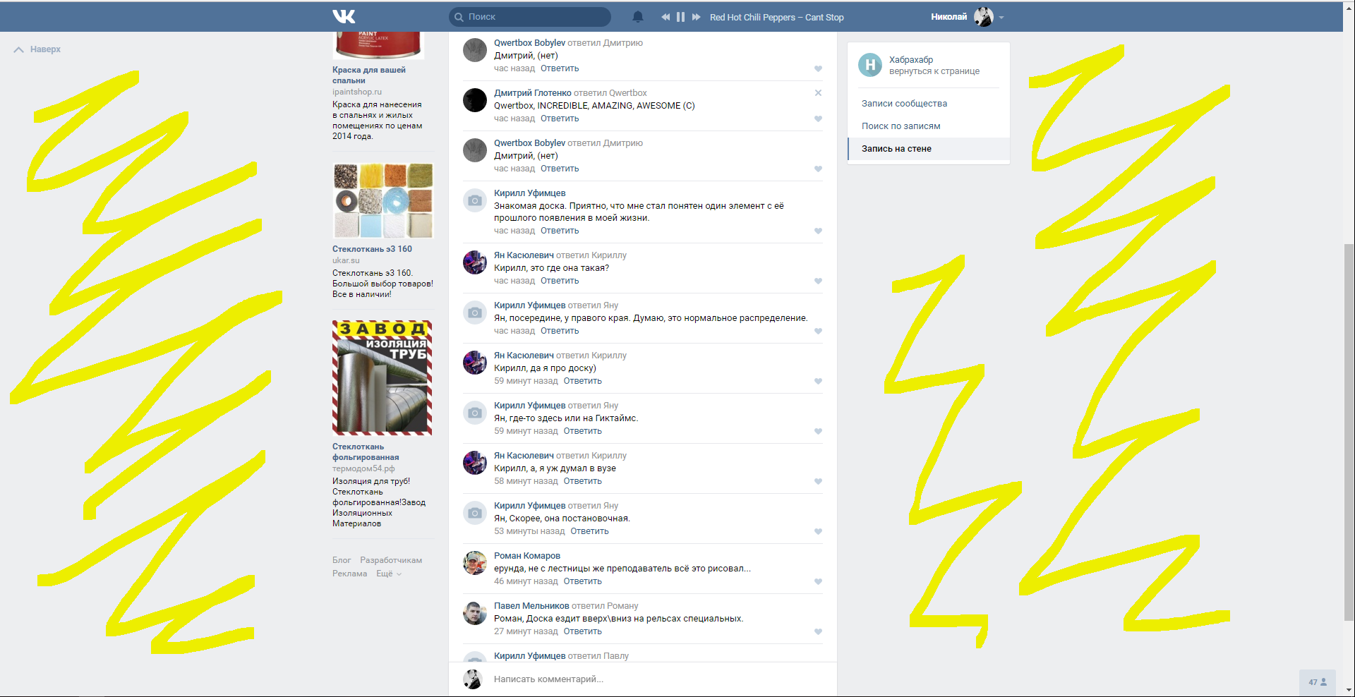
• Large empty areas on the sides and this is not minimalism or the removal of “noise”, this is dictated by the format of the message output.
• With active communication of a group of people, understanding of the question-response relationship becomes more complicated.
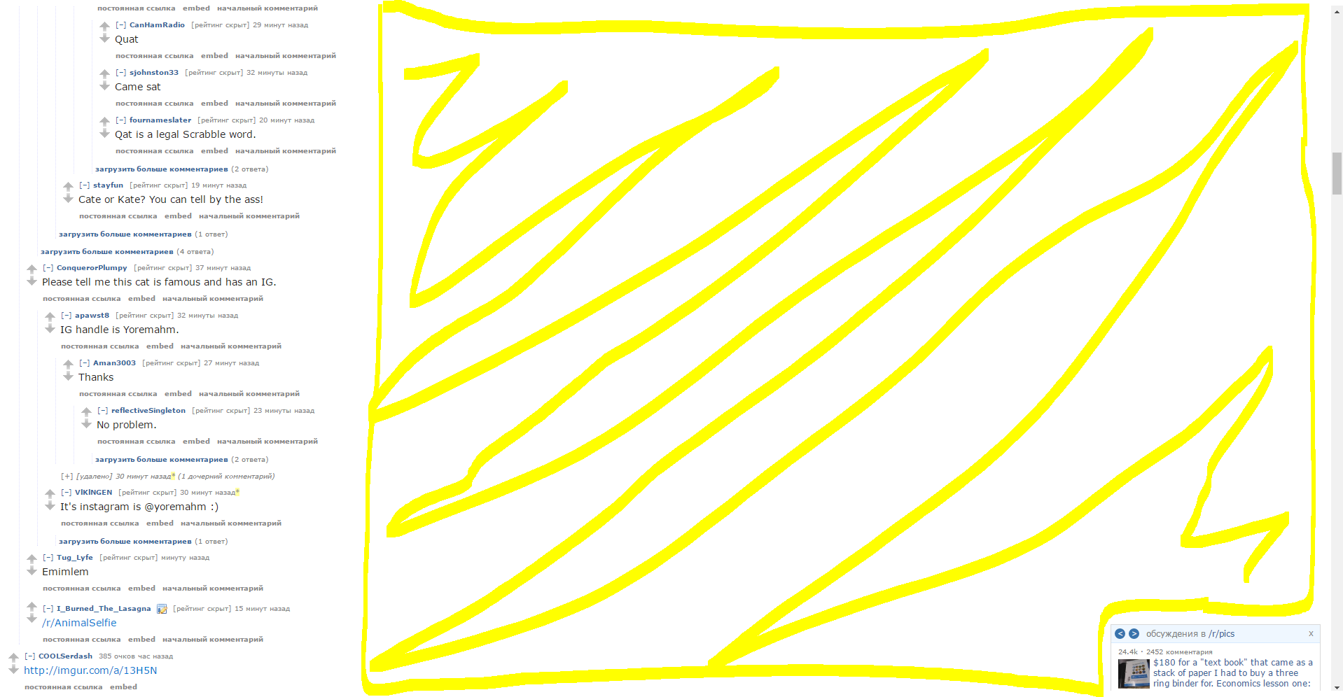
reddit.com
• Non-productive use of space (if a message with a size of one word still consumes the entire width of the site.
youtube.com
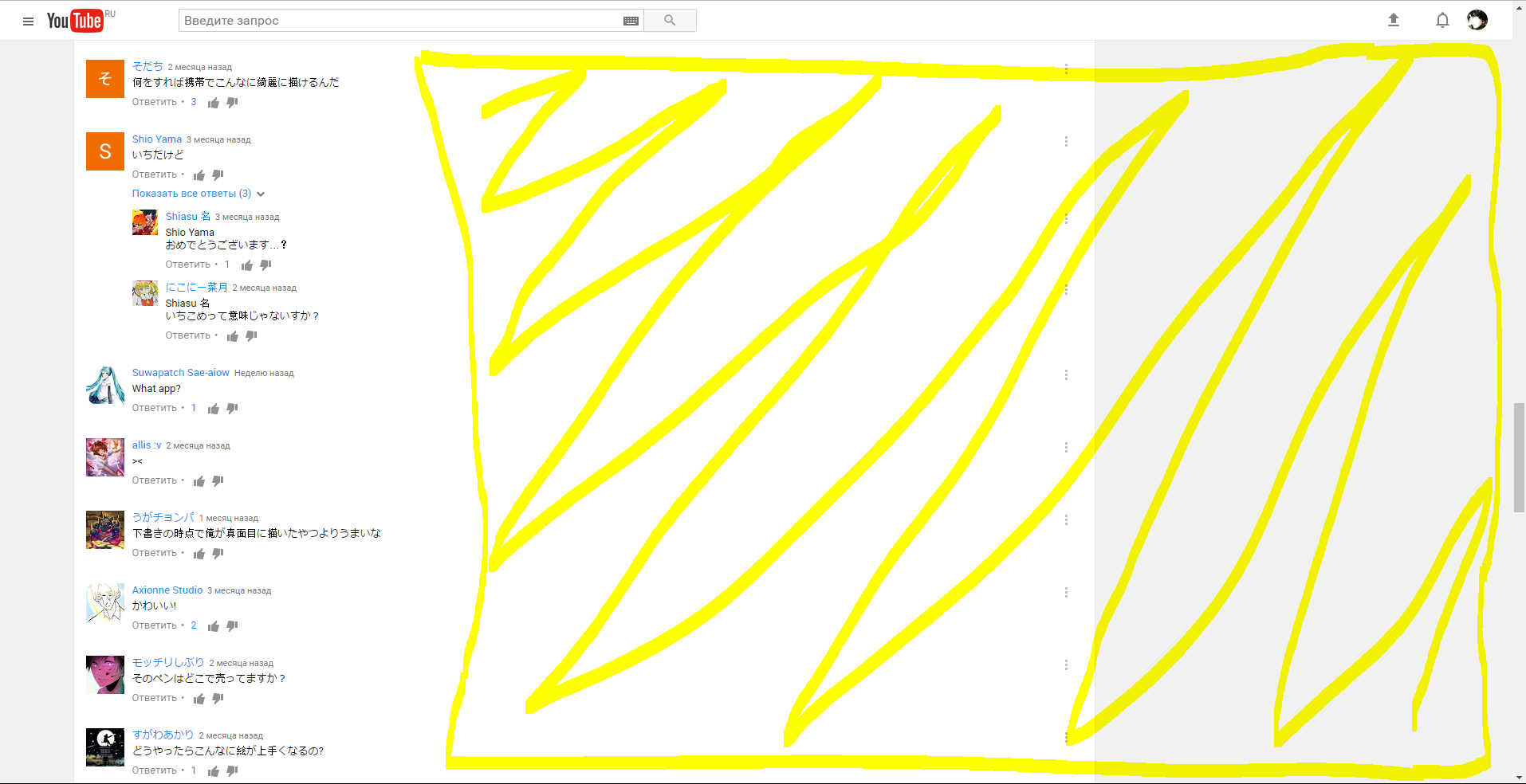
• Comment takes up the entire line.
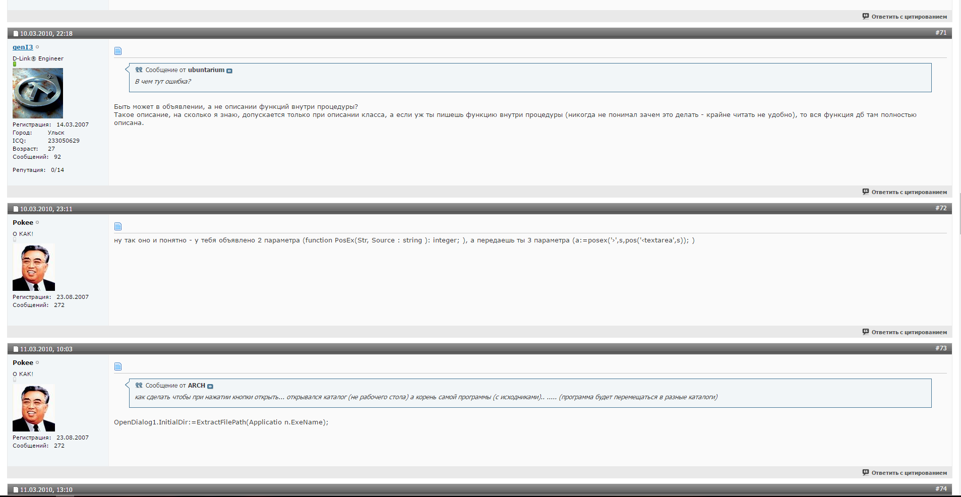
• Hidden (possibly important / interesting) comments from us, only extreme in the thread are shown.
Position on the page
Messages must fill the entire available space. Since they are the main goal for the user. Each of them should be easy to read (there should be no overlap). Access to the wrong page should be easy and intuitive.
Question-answer
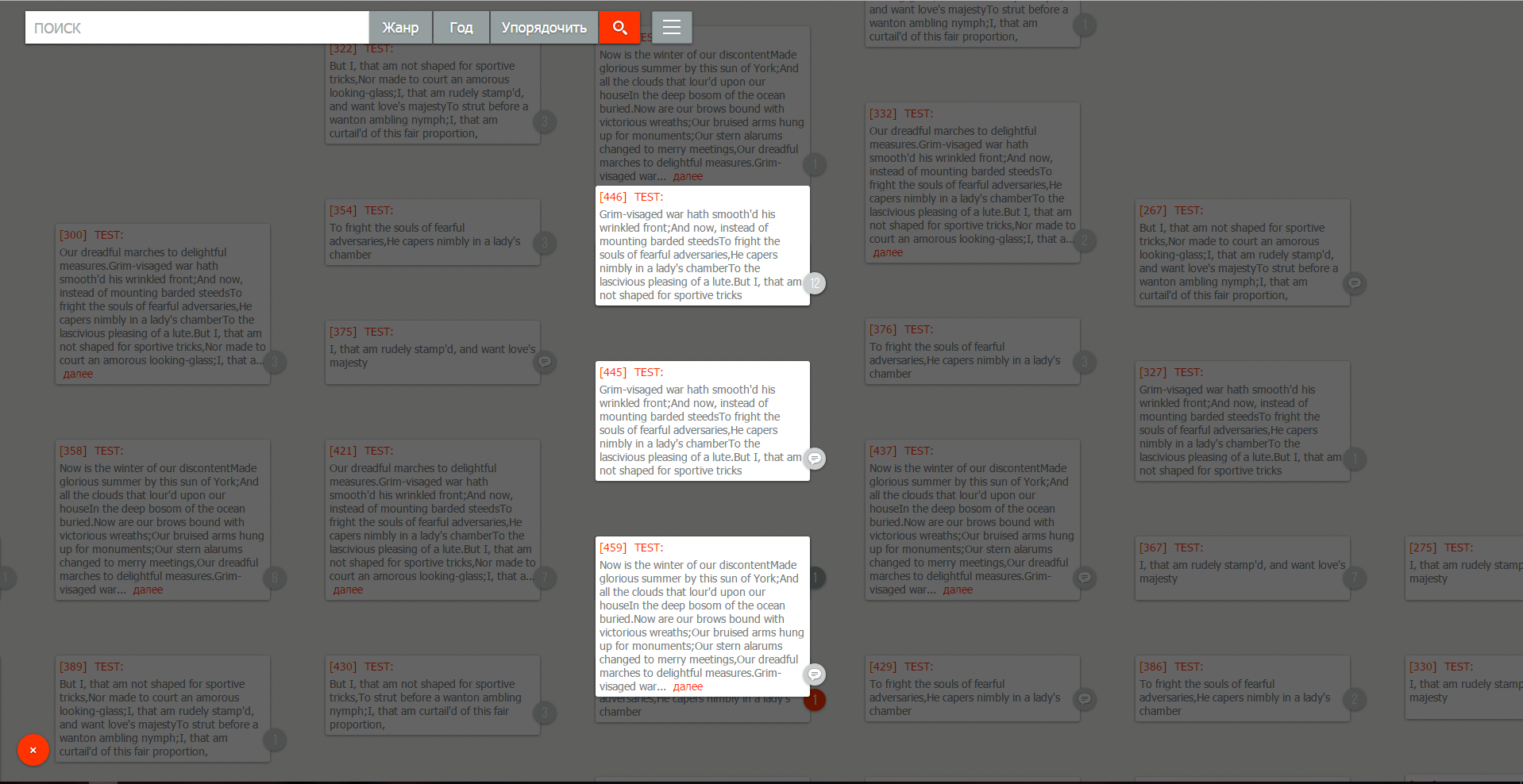
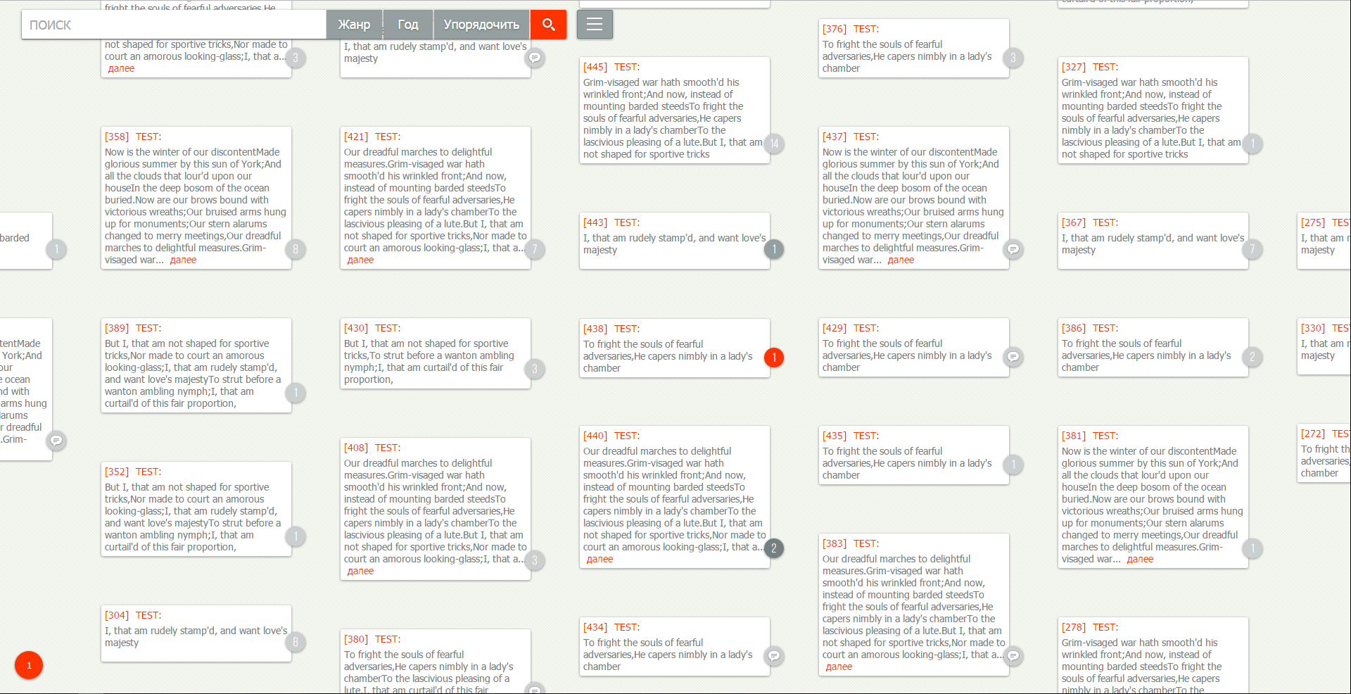
Corresponding to the dense filling of the page we must not forget about the connection between the messages, otherwise they will be useless for the user. Filling the page with tiles from the messages we lose the sequence between them, since for the sake of tighter placement we will be based on the size of the message. Therefore, we need that message sample in which the connection between them is not so important. The most logical representation of the message structure is the tree. For our representation from the tree, we can distinguish the first level child messages. The connection between them differs only on the time line; otherwise, we are indifferent to their position relative to each other.
Highlight user importance
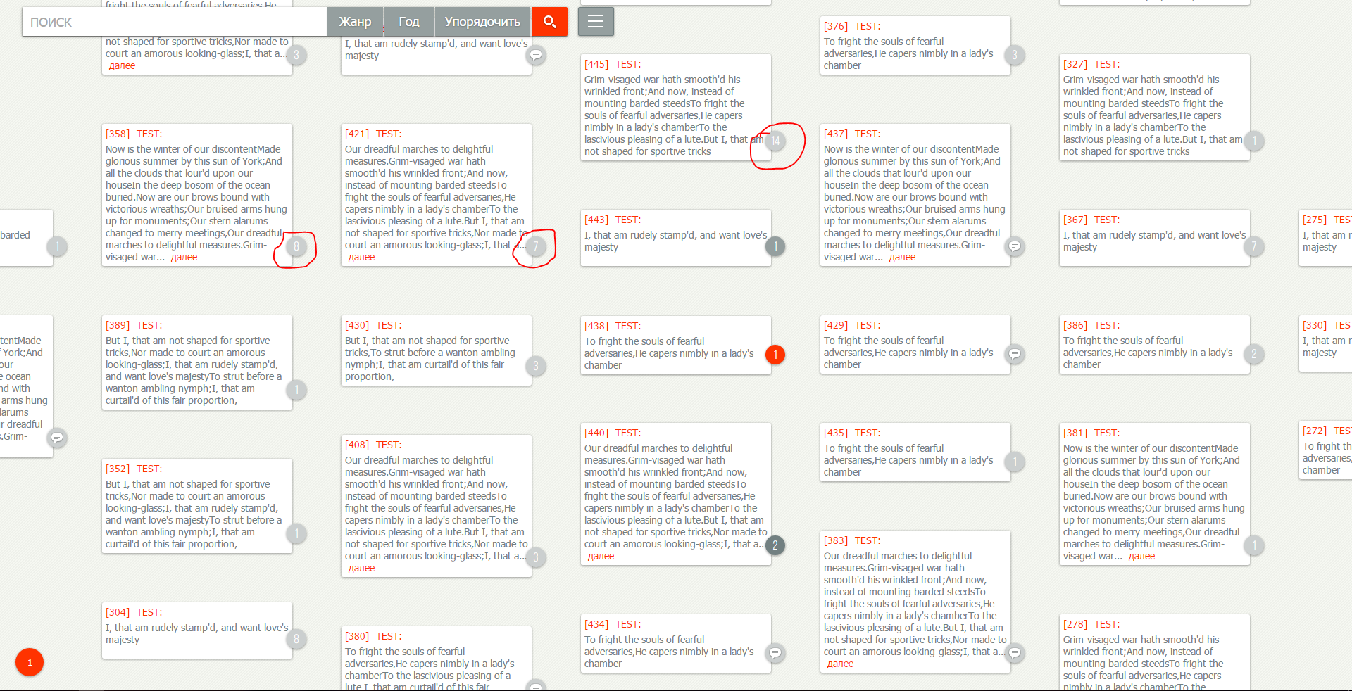
How does the reader choose which message he wants to read? Of course, there are those who read all the messages in a row, but I think most people prefer to read “between the lines” to save time. No wonder there appeared applets for accelerated reading. There are other options, for example: message rating - the number of likes and dislikes; the prevalence of one or the other can make the user pay attention to the message. This greatly reduces the user's time to key information among the rest of the screen. He seems to be going along the beaten path of the first comer, who has read and posted his opinion in the form of a rating or comment. Seeing how many replies a comment a user will be able to rate his priority for himself. But it is important to display the total number of responses in the branch.
Message size
It must correspond to the information weight. This does not mean that the size = content. For example, someone expounded his thoughts in accordance with the precepts of "war and peace", but this does not mean that they are just as valuable. Behind this, a mechanism for displaying the full message content is required. Based on the formats of newspaper and magazine publications, it is more pleasant for the reader to perceive the text divided into smaller columns. After reading a small line, a person quickly breaks it down into components for understanding. In the case of large-width text, after reading a line, it is necessary to keep it whole in memory, as well as a reading place, so that after understanding the information, return to the right place.
Conclusion
I believe that the "message" - as the main unit of information exchange should be given more attention. And the creation of a superior output format current in usability will be the starting point in the new development of site design.
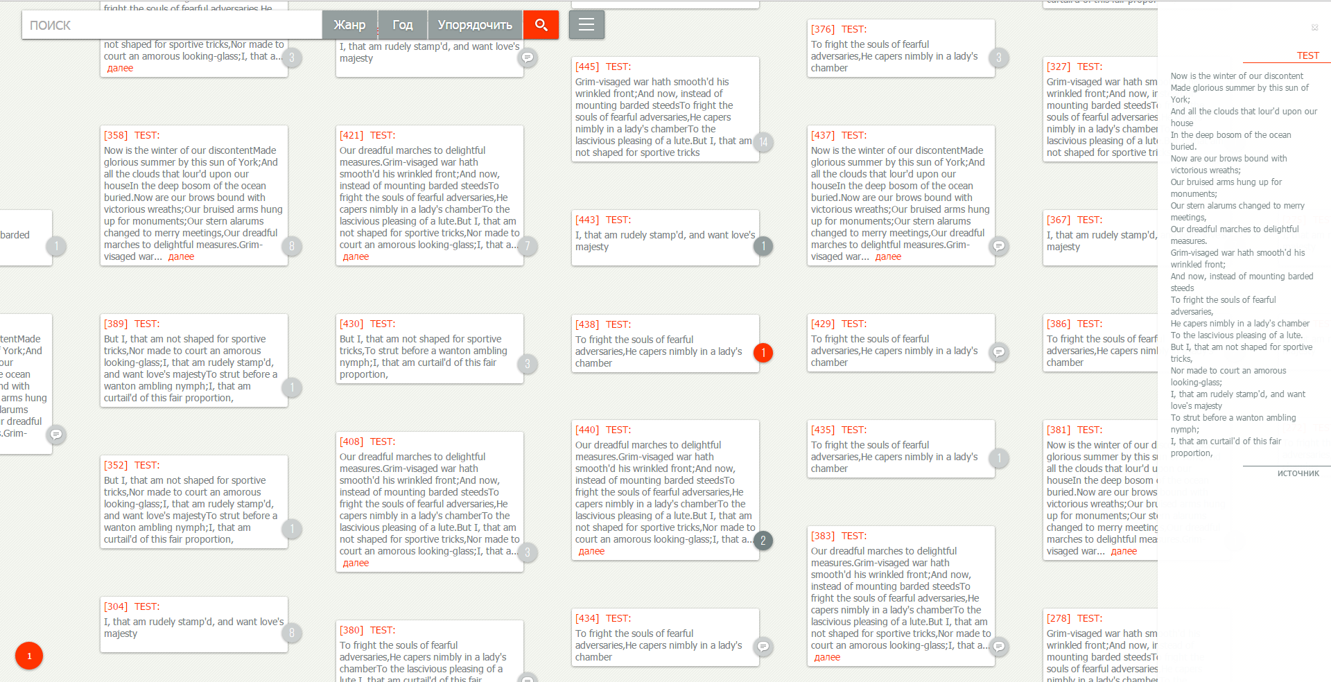
For example
Original comments
My version of the output
Back in 2004, when I just got the Internet and I registered on my first forum, the messages were rectangular blocks following one another.
')
Styles and objects of content changed, but the concept of displaying messages still remained rectangular blocks for the entire width of the site following one another. Until today, the most significant stage (in my opinion) was the design of the conclusion in the form of a tree, which allowed us to simplify the perception of the question-response relationship.
What is so bad about the established message output format?
I will give the shortcomings (in my opinion) on the example of popular sites
vk.com
• Large empty areas on the sides and this is not minimalism or the removal of “noise”, this is dictated by the format of the message output.
• With active communication of a group of people, understanding of the question-response relationship becomes more complicated.
reddit.com
• Non-productive use of space (if a message with a size of one word still consumes the entire width of the site.
youtube.com
• Comment takes up the entire line.
• Hidden (possibly important / interesting) comments from us, only extreme in the thread are shown.
I propose another concept, not radical, but having its own characteristics
Position on the page
Messages must fill the entire available space. Since they are the main goal for the user. Each of them should be easy to read (there should be no overlap). Access to the wrong page should be easy and intuitive.
Question-answer
Corresponding to the dense filling of the page we must not forget about the connection between the messages, otherwise they will be useless for the user. Filling the page with tiles from the messages we lose the sequence between them, since for the sake of tighter placement we will be based on the size of the message. Therefore, we need that message sample in which the connection between them is not so important. The most logical representation of the message structure is the tree. For our representation from the tree, we can distinguish the first level child messages. The connection between them differs only on the time line; otherwise, we are indifferent to their position relative to each other.
Highlight user importance
How does the reader choose which message he wants to read? Of course, there are those who read all the messages in a row, but I think most people prefer to read “between the lines” to save time. No wonder there appeared applets for accelerated reading. There are other options, for example: message rating - the number of likes and dislikes; the prevalence of one or the other can make the user pay attention to the message. This greatly reduces the user's time to key information among the rest of the screen. He seems to be going along the beaten path of the first comer, who has read and posted his opinion in the form of a rating or comment. Seeing how many replies a comment a user will be able to rate his priority for himself. But it is important to display the total number of responses in the branch.
Message size
It must correspond to the information weight. This does not mean that the size = content. For example, someone expounded his thoughts in accordance with the precepts of "war and peace", but this does not mean that they are just as valuable. Behind this, a mechanism for displaying the full message content is required. Based on the formats of newspaper and magazine publications, it is more pleasant for the reader to perceive the text divided into smaller columns. After reading a small line, a person quickly breaks it down into components for understanding. In the case of large-width text, after reading a line, it is necessary to keep it whole in memory, as well as a reading place, so that after understanding the information, return to the right place.
Conclusion
I believe that the "message" - as the main unit of information exchange should be given more attention. And the creation of a superior output format current in usability will be the starting point in the new development of site design.
For example
Original comments
My version of the output
Source: https://habr.com/ru/post/320114/
All Articles