Analyze it: how Skyeng chose a product analytics system for mobile apps

In order to develop products in the right (and profitable) direction, it is necessary to carefully monitor the behavior of users and their response to certain changes. We at Skyeng are paying a lot of attention to analytics, and in this article we will talk about how we monitor the performance of our mobile applications Aword and Words with the help of what.
Why do we need an analyst
In order to understand whether everything is in order with our products and whether they are developing correctly, we use a certain number of indicators (metrics), which we constantly follow. Metrics can be key and obvious (money for the Aword mobile application) or not so fundamental, but still important: the number of active users per week, the number of installations, the conversion into payment, the average check, the return of users, the frequency of use at different stages, etc. d. Any product has a set of metrics to determine if its development is moving in the right direction.
Now for us, Aword's product metrics are especially important ( iOS , Android ): this is a new product, it continues to actively develop, and we must keep our finger on the pulse. For example, we are doing an update - we are rolling out new algorithms, changing some screen, adding some feature - it is important for us to see how it worked, and if users understood and accepted the new product. Of course, we conduct user surveys, read requests from our customers, but we make a product for a huge number of people, with each of whom you will not speak. Therefore, for us, metrics are a kind of “objective indicator”, a certain number that you can confidently rely on. If we roll out some feature that we have spent a lot of time and resources on, and 2 percent of our audience have learned about it and started using it - this is very bad. This means that either we initially made the wrong product decision, and this innovation is not needed by anyone, or somehow it was incorrectly presented.
')
In the case of web applications, we already have experience gained with the Vimbox educational platform: we know how to monitor their effectiveness, we have a database of requests, we have internal statistics. When we started planning the organization of analytics on a mobile application, we quickly realized that this would not be so easy. We are faced with a dilemma: take the developer of analytics to the state, or use third-party resources. In the case of an emerging investment business, the second option is preferred; Our company's policy provides for the maximum use of third-party solutions, while there is such an opportunity. After all, commercial analytics systems have a team of cool developers, not just one person, as we would have. It is also important that they have support.
There are a lot of analytical systems for mobile applications, and they can quickly become confused. We did not know which ones are good, which are bad, which of them can be trusted, which are not worth it, how they track events, etc. I had to sit down and start to understand. We immediately put a bunch of systems - about a dozen - and compared their results. We consulted with experts. As a result, we came to the conclusion that we should always have at least two analytical systems, divided by scope of assessment.
Grocery : all meaningful user actions must create a calculated event. “Meaningful” actions can be different at different stages of the application’s development, but they should be enough to create a clear picture. The user clicked the "start" button - data is sent to us. Out of the application - the data is sent. Began training, finished - everything goes. Using this data, we draw conclusions on product solutions, make some changes: we change the size of the elements, the order of the screens and their number, colors, shadows, fonts, etc.
Marketing : a more complex scheme, allows you to see where the user came from, from which advertising campaign, whether he registered or not, paid for or not, you can evaluate the effectiveness of the advertising channels. It looks standard, as on the Web, but in fact it is not quite: there are unobvious things, complicated things, for understanding which we had to shovel a huge number of different analytical systems. But this is a topic for a separate article, which we will definitely write (and will accelerate if you write in the comments that you are interested in it).
Choosing a product analysis system
When choosing a tool for us it was important that it was inexpensive or free. Therefore, Mixpanel immediately disappeared, the famous product analytics system that does everything it needs is very good, but which at that moment did not have the most benign subscription conditions: after three months of trial, it became paid and expensive - in our case $ 999 / month.
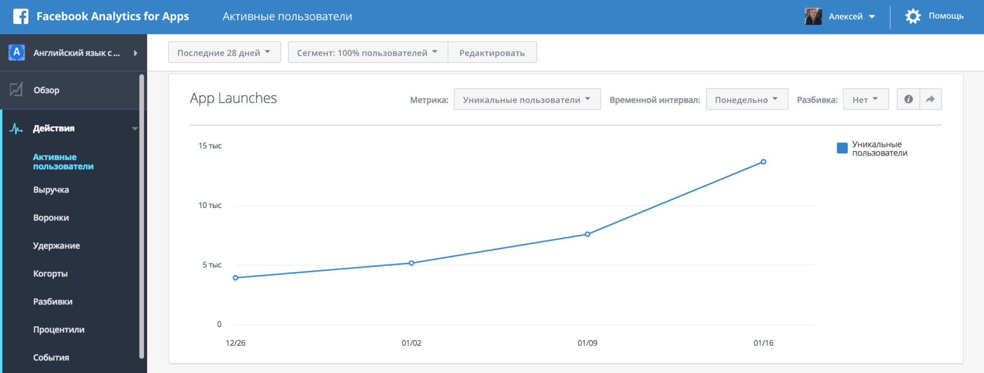
There are Facebook Analytics, AppMetrica, Amplitude and adjust.
 adjust quickly fell off, because it is more suitable for marketing analytics, does not allow to analyze small events: keystrokes, user actions; plus he has a limited time trial.
 Analytics AppMetrica was not very convenient for us. Since the first time we had several analytics in parallel, we had the opportunity to compare the data. When analyzing, a situation often arose when at first the indicators of all systems are about the same, and then for some event at AppMetrica a sudden discrepancy of 20-30%. Nevertheless, AppMetrica works with us as a spare combat. It does not load the system, is generally not bad, but not very customizable. We need to build funnels by events and by users, to know what each of them did - installed the application, launched it, started training, finished it, started another one, etc. In AppMetrica, we can see, for example, that the application was installed by 600 people and 200 launched. But we don’t know if the 200 are in the first 600, or they are old users. It is not possible to see if one number is a subset of another. But it is free, which is important for us.
 We more or less refused Facebook Analytics , because the data differed greatly from other analysts: the discrepancy for one event was 10-25%. Its advantage is that, if you track events by users, you can customize advertising campaigns in FB and Instagram on these events. You can, for example, run ads only on those users who have been trained exactly 3 times. Plus, there is an opportunity to lookalike - launch ads for people similar to our users (loves dogs, drives a car, watches "The Simpsons", in this spirit). This analytics is free, you can build funnels in it, track events and money, this is one of the few analysts who can work with product and marketing metrics. But we don’t really trust the numbers, and besides, it loads the system very much (which already transfers a lot of data to us).
 Finally, amplitude . Very cool tracks events, there is the possibility of integration with other systems: Optimizely , Slack, where it can send metrics, which is very convenient. But the most important thing is reliable numbers (based on our own database), a lot of customization options; in the paid form allows you to use your own sql queries. The key for us - there are funnels, exact numbers, you can measure money. We use this analytics both in the words free for students of the school and in the paid “external” Aword application, in one as the key metric the words under study are tracked, in the other - money, and we see the results in one system. Also in Amplitude, you can track not only events, but also data about users; having received this data, the system attributes it to all subsequent events. However, user information is sent from our database not immediately upon registration, but only after some time, so we do not always have the opportunity to segment their first steps by types of users.
As a result, we stopped on product analytics using Amplitude (in conjunction with Optimizely, see below) and on marketing in AppsFlyer . All analytics systems, if they are good, paid and expensive. Amplitude, for example, costs $ 2,000 per month, and this is not an enhanced version. However, she has a comfortable, which is very suitable for us. The trial version of Amplitude is not limited by the number of months of free work, but by the number of events that can be tracked inside the application for a certain period. Therefore, you can tack and choose which events to monitor. Due to this, we are almost always placed in the restriction of the free plan Amplitude (10 million events per month).
Experiments
 We start our experiments in two ways. The first, simple - through Optimizely . This is a cool tool, it is loved by developers, no need to bother much on the topic of code. You can easily create several solutions, whose efficiency should be compared: for example, you can make the same screen, but with buttons of different colors. The experiment goes in parallel, half of the users are sent to one version, the other to another. According to statistics, you can draw conclusions: for example, they returned more often from the red button, and from the blue one hung more in the application.
But these results are usually small, including us. We had to watch the user move through the funnel, what users did after they clicked on the conditional blue / red button. Therefore, we have a second method of experiments where Amplitude came in handy (these two systems are integrated into each other). We integrate data from the Optimizely experiment with the Amplitude analytics system, where we can see what happened next to users who saw a button of a certain color.
Optimizely is also not the cheapest tool, the trial ends in two or three months, we tried to fit the maximum number of experiments at this time. Theoretically, they can be implemented on their own backend by simply handing out the “red” or “blue button” property to each user, and then in Amplitude choose them to view statistics. With Optimizely, this can be done on the front end.
Examples
Subscription screen
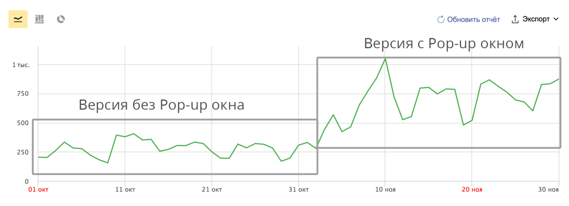
We had quite a long way for the user from the moment the application was installed until the purchase was made. Before he saw the screen with a proposal to choose a tariff for renewing a subscription, he had to go through several trainings, learn the words. We decided to shorten this path and allow the user to become familiar with the subscription options immediately after passing the first workout, showing a pop-up with the appropriate offer.
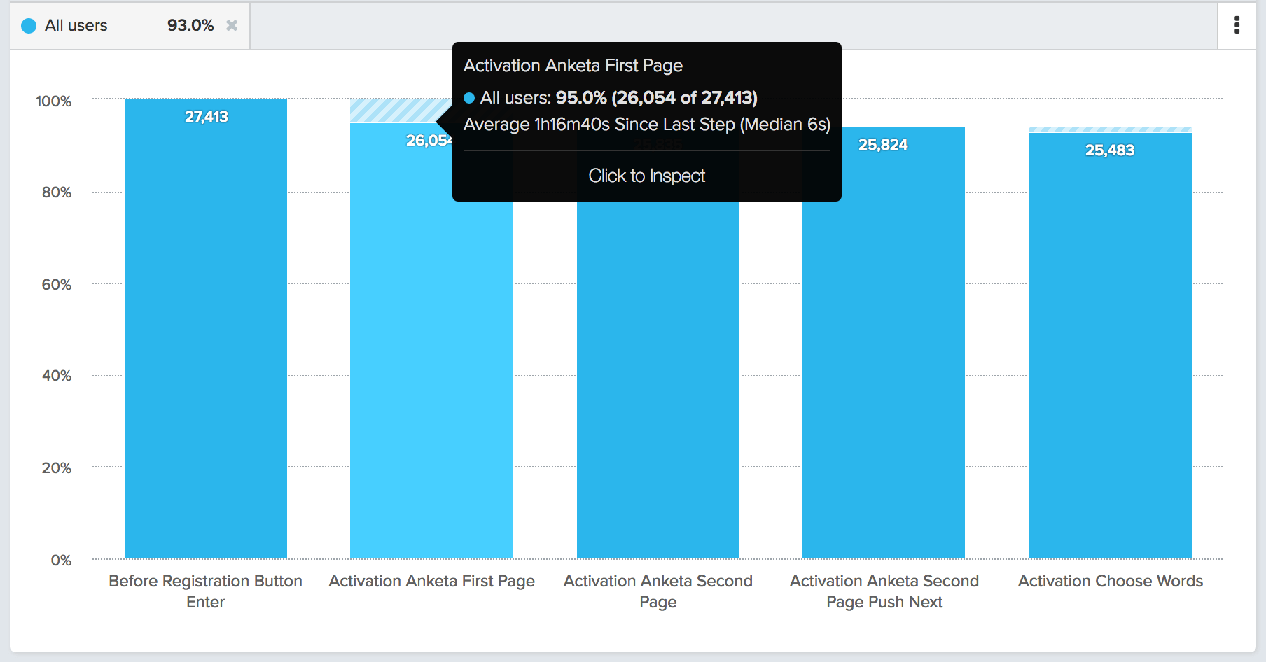
As a result, we have increased users' visits to this page by an average of 2 times and increased conversion into payment by a few percent. We checked the results using AppMetrika. After a successful experiment, it was decided to leave such a Pop-up.
Registration window
In the original version, we had a gray window for registering a new user. We did not pay special attention to this moment, shifting the focus to more important elements of the application. After some time, we returned to this issue and made a normal, bright version that bore fruit.
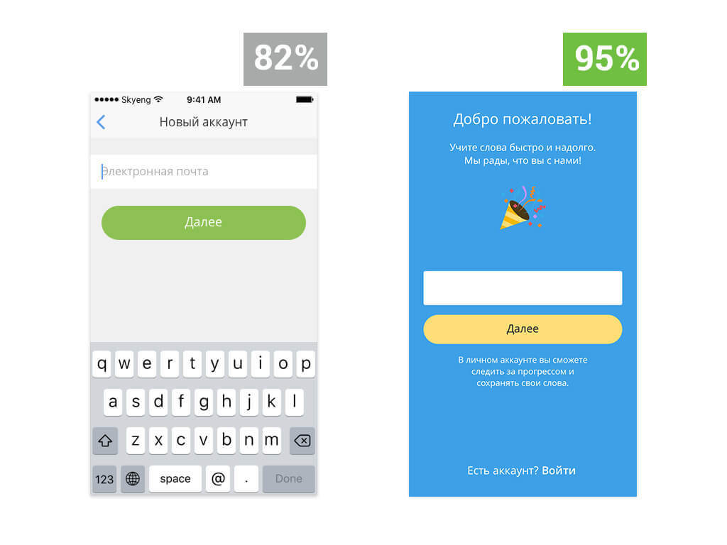
Conversion to registration increased by 13% to 95%. Measurements were performed using Amplitude.
findings
The use of analytical systems allows us to evaluate the results of changes made to the mobile application. To improve the application, you must have specific numbers; it is expensive to make new features, and it is impossible to find out how much they are needed (or proved to be justified) without analytics. Now we can look at the results of experiments launched in parallel, see the results of any feature that we post, and improve the quality of applications based on numbers from analytical systems.
Traditionally we remind that we have interesting vacancies. Especially now the position of the Full-Stack Developer is interesting - this is a dream job! Rather, rather throw us your resume!
Source: https://habr.com/ru/post/320024/
All Articles