Welcome aboard: application guidance tips
Making the user stay in the application for a long time is not an easy task. It takes time, effort and money, but even under these conditions, many applications lose their precious audience in the very first days after downloading.

Invest a lot of money in attracting users just to lose them after the first meeting? It sounds absurd. To prevent this from happening to your application, make sure that the user's acquaintance with him or onboarding is flawless and leaves a great first impression.
Onboarding is a term borrowed by UX designers from the recruitment industry. It means the process of familiarizing or adapting a user to an application. The most important thing in onboarding is to increase the likelihood that a new user will constantly use your product.
')
When you are working on this stage, think over all the details to make it as clear as possible to the user what you are doing, what the essence of the application is and how to use it.
Now almost all applications use tutorials when they first start: the user learns about the functions of the application, scrolling through several screens. The task of the tutorial is to explain why the application is needed by the user.
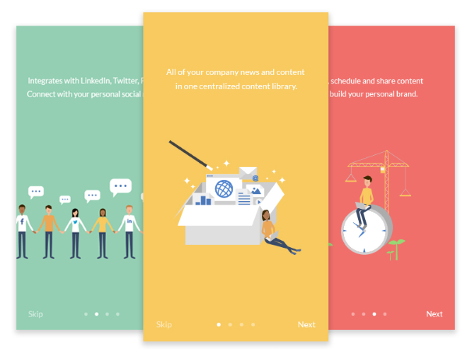
Static screens demonstrate the benefits of the application. Photo: Min
At the same time, such screens teach the user how to work with the application:
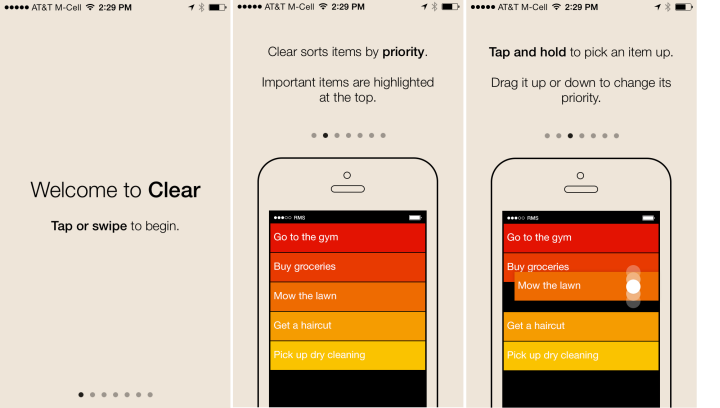
Clear, the to-do list for iOS, prompts the user to view 7 screens before starting work with the application .
However, when working with long tutorials, a couple of problems arise:
Starting tutorials have another problem: they require the user to work in advance and remember all the information at once. Even if the user reads all the instructions, he will forget a good half as soon as he closes the application. Unfortunately, our short-term memory is not able to hold a large amount of information.

Waiting for the user to remember all the functions of the application before using them is an obvious search.
Contextual (or timely ) onboarding operates on the principle of “everything has its time”, and this is a good alternative to static page-based tutorials. With this approach, the user becomes acquainted with the application gradually: you offer him help at the exact moment when it is needed, and show only the necessary information. This simple but powerful technique can be implemented in different ways:
The meaning of sites and applications lies in their content. Users come to you for content! If there is no content on the page - this is not a reason to leave it unattended. Your task is to show the user how to fill this page and what to expect from it further.
A blank page is a good starting point for onboarding, which will guide the user through your product. Instead of leaving it clean, use it wisely: direct, train, prompt.
Invite users to start using the product:
In Instagram, for example, the new user page is completely empty. Other profiles have photos, comments and likes, but the new user’s account is empty - no posts, no followers. To push for action, Instagram turns this “empty space” into a training page: where there should be a photo, it says “You have no posts yet. Click on the camera to share the first photo or video with a pointer to the camera button.

Instagram knows that the goal of the blank pages is to educate the user about interaction with the application.
Advice: tell and show. Show the user how the application screen will look like when it is filled with content, or tell them about it using text.
The moment when the user solves a certain problem with the help of the application is ideal for establishing an emotional connection between him and the product. Let him know that he is doing great, and praise him for his first victory . For example, MailChimp , a service for email newsletters, rewards for the first sent newsletter with cheering and funny stickers.
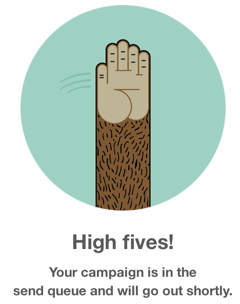
"High five! Newsletter is almost ready to be sent. ”
Advice: use these small victories to show your individuality.
Metrics are very important to understand how effective the current onboarding is, what are its strengths and what should be improved. Determine your activation point and be attentive to its changes. Before you begin to change the process of onboarding, ask yourself the question "How will these innovations affect the activation process?".
Good examples of onboarding can be found on the UserOnboard site from UX Designer Samuel Hick. His detailed step-by-step analysis of popular applications, flavored with jokes and funny comments, well demonstrate how the most successful applications keep users at their first meeting.
How Virgin America introduces the user to the app.
Onboarding can decide the fate of the application. Before engaging in this stage, determine what your first user experience should be. Think of boarding in terms of improving a person’s life . After all, you need not just to attract the audience and force them to press buttons, getting used to the interface, but to help users achieve their goals thanks to your service .
According to statistics, the average application loses 77% of daily active users during the first three days after installation.
Invest a lot of money in attracting users just to lose them after the first meeting? It sounds absurd. To prevent this from happening to your application, make sure that the user's acquaintance with him or onboarding is flawless and leaves a great first impression.
Onboarding is a term borrowed by UX designers from the recruitment industry. It means the process of familiarizing or adapting a user to an application. The most important thing in onboarding is to increase the likelihood that a new user will constantly use your product.
')
When you are working on this stage, think over all the details to make it as clear as possible to the user what you are doing, what the essence of the application is and how to use it.
Avoid long tutorials
Follow the simple rule “less words, more deeds”
Now almost all applications use tutorials when they first start: the user learns about the functions of the application, scrolling through several screens. The task of the tutorial is to explain why the application is needed by the user.
Static screens demonstrate the benefits of the application. Photo: Min
At the same time, such screens teach the user how to work with the application:
Clear, the to-do list for iOS, prompts the user to view 7 screens before starting work with the application .
However, when working with long tutorials, a couple of problems arise:
- They kill the initial impulse and erect an additional barrier between the new user and the application. Even if the tutorial is superbly made and easy to go through, the user will not always have enough patience to complete it. Why? Yes, because people are interested to understand on their own. They want to first examine the application and understand what it is about.
- Do not expect users to read the instructions thoroughly before starting work. People run the application not to deal with the interface - they just want to use the service. Do not make them feel in a computer literacy class.
Add context
Introduce the user in the course of affairs gradually and do not expect that he will instantly remember all the functions.
Starting tutorials have another problem: they require the user to work in advance and remember all the information at once. Even if the user reads all the instructions, he will forget a good half as soon as he closes the application. Unfortunately, our short-term memory is not able to hold a large amount of information.
Waiting for the user to remember all the functions of the application before using them is an obvious search.
New users have chosen your application not because they are interested in finding out how the UI works, but because you have promised them a certain product and cannot wait to use it.
Contextual (or timely ) onboarding operates on the principle of “everything has its time”, and this is a good alternative to static page-based tutorials. With this approach, the user becomes acquainted with the application gradually: you offer him help at the exact moment when it is needed, and show only the necessary information. This simple but powerful technique can be implemented in different ways:
- Sample data. The welcome screen (“Welcome Board”) is the first thing that the user sees in the application for running Trello projects. This screen contains ready-made to-do lists, where each element explains the functions of the application. It works much more efficiently than a static screen.

Trello quickly introduces you, showing how your screen will look in the future. - Point tips. They, for example, can be found in the YouTube app for Android. In it, the number of instructions is minimal, and the user's attention is focused on individual, important actions. For acquaintance with new elements, an additional transparent layer with a hint was used, but these hints appear only at the first launch and one at a time when the user reaches a certain action.
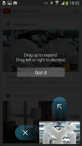
Actions should be marked as clear as possible, because users almost immediately close the tips. - In the interactive tour, prompts appear only as the user moves in the application, and not necessarily in the same order. Duolingo understands that learning through your own experience is the best way to learn something. Their application uses the gradual discovery method: it shows how the service works, prompting the new user to immediately pass a quick test in the selected language.

Duolingo offers a test illustrating how an application works.
Advice: visual content conveys the essence well and at the same time does not overload the user, unlike written instructions.
Use start pages
A blank start page when you first start the application is an important part of onboarding.
The meaning of sites and applications lies in their content. Users come to you for content! If there is no content on the page - this is not a reason to leave it unattended. Your task is to show the user how to fill this page and what to expect from it further.
A blank page is a good starting point for onboarding, which will guide the user through your product. Instead of leaving it clean, use it wisely: direct, train, prompt.
A blank start page sets the impetus for working with the application as a whole.
Invite users to start using the product:
- Help them get comfortable and tell how the page will look next.
- Tell us about the first possible action - it should be obvious.
In Instagram, for example, the new user page is completely empty. Other profiles have photos, comments and likes, but the new user’s account is empty - no posts, no followers. To push for action, Instagram turns this “empty space” into a training page: where there should be a photo, it says “You have no posts yet. Click on the camera to share the first photo or video with a pointer to the camera button.
Instagram knows that the goal of the blank pages is to educate the user about interaction with the application.
Advice: tell and show. Show the user how the application screen will look like when it is filled with content, or tell them about it using text.
Rejoice with the user
Give your users the joy of first-time application success
The moment when the user solves a certain problem with the help of the application is ideal for establishing an emotional connection between him and the product. Let him know that he is doing great, and praise him for his first victory . For example, MailChimp , a service for email newsletters, rewards for the first sent newsletter with cheering and funny stickers.
"High five! Newsletter is almost ready to be sent. ”
Advice: use these small victories to show your individuality.
Measure
Keep track of metrics.
Metrics are very important to understand how effective the current onboarding is, what are its strengths and what should be improved. Determine your activation point and be attentive to its changes. Before you begin to change the process of onboarding, ask yourself the question "How will these innovations affect the activation process?".
Look for inspiration
Good examples of onboarding can be found on the UserOnboard site from UX Designer Samuel Hick. His detailed step-by-step analysis of popular applications, flavored with jokes and funny comments, well demonstrate how the most successful applications keep users at their first meeting.
How Virgin America introduces the user to the app.
Conclusion
Onboarding can decide the fate of the application. Before engaging in this stage, determine what your first user experience should be. Think of boarding in terms of improving a person’s life . After all, you need not just to attract the audience and force them to press buttons, getting used to the interface, but to help users achieve their goals thanks to your service .
Source: https://habr.com/ru/post/319970/
All Articles