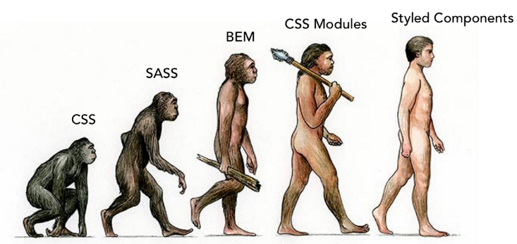
CSS evolution: from CSS, SASS, BEM and CSS modules to styled-components
From the very beginning of the history of the Internet, we needed styles for our sites. For many years, CSS has served us for this, evolving at its own pace. And here we look at the history of its development.
I think everyone will agree with this definition: CSS is used to describe the presentation of a document written in a markup language . Also, it will not be news for anyone that during the development of CSS has become quite a powerful tool and that additional tools are needed for use in a team.
Wild CSS
In the 1990s, we were fond of creating “awesome” interfaces, the wow factor was the most important. In those days, inline-styles were appreciated, and we didn’t care if any page elements looked different. Web pages were cute toys that we filled with funny gifs, running lines and other nightmarish (but impressive) elements, trying to attract the attention of visitors.
')
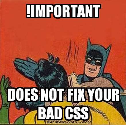
Then we started creating dynamic websites, but CSS remained a stronghold of lawlessness: each developer had his own idea how to make CSS. Someone struggled with specificity , which led to a visual regression when a new code appeared. We relied on ! Important , thus wishing to carve in the stone the symbol of our will for the interface elements to look in a certain way. But we soon realized:
With the increase in the size and complexity of projects, as well as the growth of development teams, all these techniques turned into more and more obvious and major problems. Therefore, the lack of patterns in the application of styles has become one of the main obstacles for experienced and inexperienced developers who have tried to find the right way to use CSS. In the end, we realized that there are no right and wrong ways. We just tried to make everything look decent.
SASS to the rescue
SASS turned CSS into a decent programming language, represented as a preprocessing engine that implements nesting, variables, mixins, extends, and logic in style sheets. So you can better organize your CSS files, and you have several ways to decompose large pieces of CSS code into smaller files. At the time, it was a great innovation.
The principle is as follows: the CSS code is taken, pre-processed, and the compiled file is placed in the common CSS package. Cool? In fact, not too much. After some time, it became clear that without strategies and applying the best techniques, SASS brings more problems than it solves.
Suddenly, the developers stopped delving into what the preprocessor was doing, and began to lazily rely on nesting for the sake of defeating specificity. But this led to a dramatic increase in the size of the compiled style pages.
Until BEM appeared ...
BEM and component concept
BEM has become a breath of fresh air. He allowed us to think more about reusability and components. In fact, this technology has brought semantics to a new level. Now we could be sure that className is unique and that using the simple Block, Element, Modifier agreement reduces the risk of a specific mapping.
Take a look at an example:
<body class="scenery"> <section class="scenery__sky"> <div class="sky [sky--dusk / sky--daytime] [sky--foggy]"> <div class="sky__clouds"></div> <div class="sky__sun"></div> </div> </section> <section class="scenery__ground"></section> <section class="scenery__people"></section> </body> If you analyze the markup, you will immediately see the work of the BEM agreement. There are two explicit blocks in the code:
.scenery and .sky . Each of them has its own blocks. Only sky has modifiers, because, for example, fog, day or sunset are all different characteristics that can be applied to the same element.For better analysis, take a look at the accompanying CSS containing some kind of pseudocode:
// Block .scenery { //Elements &__sky { fill: screen; } &__ground { float: bottom; } &__people { float: center; } } //Block .sky { background: dusk; // Elements &__clouds { type: distant; } &__sun { strength: .025; } // Modifiers &--dusk { background: dusk; .sky__clouds { type: distant; } .sky__sun { strength: .025; } } &--daytime { background: daylight; .sky__clouds { type: fluffy; float: center; } .sky__sun { strength: .7; align: center; float: top; } } } If you want to thoroughly understand the work of BEM, then I recommend reading the article written by my friend and colleague.
BEM is good for making components unique #reusabilityFtw. With this approach, some patterns became more apparent as the new agreement was introduced into our old style sheets.
But at the same time new problems arose:
- The procedure for selecting a className has become a painstaking task.
- With all these long class names, the markup has become bloated.
- You must explicitly extend each component of the interface with each reuse.
- The markup has become overly semantic.
CSS modules and local visibility space
Some problems could not be solved by either SASS or BEM. For example, in the logic of a language there is no concept of true encapsulation. Therefore, the task of choosing class names is assigned to the developer. It was felt that the problem could be solved with the help of tools, not agreements.
This is exactly what CSS modules did: they are based on creating dynamic class names for each locally defined style. This made it possible to get rid of visual regressions arising from the introduction of new CSS properties, now all styles were encapsulated correctly.
CSS modules have quickly become popular in the React ecosystem, and today they are used in many projects. They have their advantages and disadvantages, but in general this is a good, useful paradigm.
However ... The modules themselves do not solve the key problems of CSS, they only show us the way to localize style definitions: a smart way to automate BEM, so that we no longer have to deal with the choice of class names (or at least less often).
But modules do not reduce the need for a good and predictable style architecture, which is easy to expand and reuse, requiring the least amount of effort to manage.
Here’s what local CSS looks like:
@import '~tools/theme'; :local(.root) { border: 1px solid; font-family: inherit; font-size: 12px; color: inherit; background: none; cursor: pointer; display: inline-block; text-transform: uppercase; letter-spacing: 0; font-weight: 700; outline: none; position: relative; transition: all 0.3s; text-transform: uppercase; padding: 10px 20px; margin: 0; border-radius: 3px; text-align: center; } @mixin button($bg-color, $font-color) { background: $bg-color; color: $font-color; border-color: $font-color; &:focus { border-color: $font-color; background: $bg-color; color: $font-color; } &:hover { color: $font-color; background: lighten($bg-color, 20%); } &:active { background: lighten($bg-color, 30%); top: 2px; } } :local(.primary) { @include button($color-primary, $color-white) } :local(.secondary) { @include button($color-white, $color-primary) } This is just CSS, and its main difference is that all
className with the addition of :local will generate unique class names like: .app–components–button–__root — 3vvFf {} You can configure the generated identifier using the
localIdentName request localIdentName . Example: css–loader?localIdentName=[path][name]–––[local]–––[hash:base64:5] to facilitate debugging.Local CSS modules are based on a simple idea. They are a way to automate BEM notation by generating a unique
className that will not conflict with any other, even if the same name is used. Very convenient.Full CSS CSS injection with styled-components
Styled-components are visual primitives that act like wrappers. They can be tied to specific HTML tags that just wrap the child components using styled-components.
This code will help to understand the idea:
import React from "react" import styled from "styled-components" // Simple form component const Input = styled.input` background: green ` const FormWrapper = () => <Input placeholder="hola" /> // What this compiles to: <input placeholder="hola" class="dxLjPX">Send</input> It's very simple: styled-components use a template literal notation to describe CSS properties. It seems that the development team got to the point, combining the capabilities of ES6 and CSS.
Styled-components provides a very simple reusable pattern and completely separates the interface from the components of functionality and structure. An API is created that has access to native tags — either in the browser as HTML, or React Native is used natively.
Here's how custom properties (or modifiers) are passed to styled-components:
import styled from "styled-components" const Sky = styled.section` ${props => props.dusk && 'background-color: dusk' } ${props => props.day && 'background-color: white' } ${props => props.night && 'background-color: black' } `; // You can use it like so: <Sky dusk /> <Sky day /> <Sky night /> As you can see, the properties have unexpectedly become the modifiers received by each component, and they can be processed, resulting in different CSS lines. This allows you to use all the features of JS to process our styles, which remain consistent and ready for reuse.
The main interface can be reused by anyone.
It quickly became clear that neither CSS modules nor styled-components themselves were an ideal solution. Some kind of pattern is needed so that all this works efficiently and scaled. Such a pattern arose from the definition of what the component is and its complete separation from logic. This allowed us to create core components (core components), the only purpose of which is styles.
An example of the implementation of such components using CSS-modules:
import React from "react"; import classNames from "classnames"; import styles from "./styles"; const Button = (props) => { const { className, children, theme, tag, ...rest } = props; const CustomTag = `${tag}`; return ( <CustomTag { ...rest } className={ classNames(styles.root, theme, className) }> { children } </CustomTag> ); }; Button.theme = { secondary: styles.secondary, primary: styles.primary }; Button.defaultProps = { theme: Button.theme.primary, tag: "button" }; Button.displayName = Button.name; Button.propTypes = { theme: React.PropTypes.string, tag: React.PropTypes.string, className: React.PropTypes.string, children: React.PropTypes.oneOfType([ React.PropTypes.string, React.PropTypes.element, React.PropTypes.arrayOf(React.PropTypes.element) ]) }; export default Button; Here the component gets the properties that are bound to the child component. In other words, the wrapper component transfers all properties to the child component.
Now your component can be applied like this:
import React from "react" import Button from "components/core/button" const = Component = () => <Button theme={ Button.theme.secondary }>Some Button</Button> export default Component I will demonstrate a similar example of the full implementation of a button using styled-components:
import styled from "styled-components"; import { theme } from "ui"; const { color, font, radius, transition } = theme; export const Button = styled.button` background-color: ${color.ghost}; border: none; appearance: none; user-select: none; border-radius: ${radius}; color: ${color.base} cursor: pointer; display: inline-block; font-family: inherit; font-size: ${font.base}; font-weight: bold; outline: none; position: relative; text-align: center; text-transform: uppercase; transition: transorm ${transition}, opacity ${transition}; white-space: nowrap; width: ${props => props.width ? props.width : "auto"}; &:hover, &:focus { outline: none; } &:hover { color: ${color.silver}; opacity: 0.8; border-bottom: 3px solid rgba(0,0,0,0.2); } &:active { border-bottom: 1px solid rgba(0,0,0,0.2); transform: translateY(2px); opacity: 0.95; } ${props => props.disabled && ` background-color: ${color.ghost}; opacity: ${0.4}; pointer-events: none; cursor: not-allowed; `} ${props => props.primary && ` background-color: ${color.primary}; color: ${color.white}; border-color: ${color.primary}; &:hover, &:active { background-color: ${color.primary}; color: ${color.white}; } `} ${props => props.secondary && ` background-color: ${color.secondary}; color: ${color.white}; border-color: ${color.secondary}; &:hover, &:active { background-color: ${color.secondary}; color: ${color.white}; } `} `; A curious thing: the component turns out to be completely stupid and serves only as a wrapper for CSS properties attached to the parent component. This approach has an advantage:
This allows us to describe the API of the base interface, which can be changed at will, and at the same time all the interfaces within the application will remain consistent.
Thus, we can completely isolate design creation from implementation. If necessary, they will flow at the same time: one developer is engaged in the implementation of the feature, and the other polishes the interface, and all this with a full division of responsibility.
It sounds perfect. It would seem that you need to follow this pattern. Together with him, we began to look for other useful solutions.
Property Recipients
These functions listen for properties passed to a component. The holy grail of reuse and empowerment of any component. You can view this as a way to inherit modifiers Here is what I mean:
// Prop passing Shorthands for Styled-components export const borderProps = props => css` ${props.borderBottom && `border-bottom: ${props.borderWidth || "1px"} solid ${color.border}`}; ${props.borderTop && `border-top: ${props.borderWidth || "1px"} solid ${color.border}`}; ${props.borderLeft && `border-left: ${props.borderWidth || "1px"} solid ${color.border}`}; ${props.borderRight && `border-right: ${props.borderWidth || "1px"} solid ${color.border}`}; `; export const marginProps = props => css` ${props.marginBottom && `margin-bottom: ${typeof (props.marginBottom) === "string" ? props.marginBottom : "1em"}`}; ${props.marginTop && `margin-top: ${typeof (props.marginTop) === "string" ? props.marginTop : "1em"}`}; ${props.marginLeft && `margin-left: ${typeof (props.marginLeft) === "string" ? props.marginLeft : "1em"}`}; ${props.marginRight && `margin-right: ${typeof (props.marginRight) === "string" ? props.marginRight : "1em"}`}; ${props.margin && `margin: ${typeof (props.margin) === "string" ? props.margin : "1em"}`}; ${props.marginVertical && ` margin-top: ${typeof (props.marginVertical) === "string" ? props.marginVertical : "1em"} margin-bottom: ${typeof (props.marginVertical) === "string" ? props.marginVertical : "1em"} `}; ${props.marginHorizontal && ` margin-left: ${typeof (props.marginHorizontal) === "string" ? props.marginHorizontal : "1em"} margin-right: ${typeof (props.marginHorizontal) === "string" ? props.marginHorizontal : "1em"} `}; `; // An example of how you can use it with your components const SomeDiv = styled.div` ${borderProps} ${marginProps} ` // This lets you pass all borderProps to the component like so: <SomeDiv borderTop borderBottom borderLeft borderRight marginVertical> Example of using property recipients
This allows us not to hardcod borders for each specific component, which saves us a lot of time.
Placeholder / Mixin-like functionality
In styled-components, you can use the full potential of JS so that functions are not just property receivers and that different components can share code:
// Mixin like functionality const textInput = props => ` color: ${props.error ? color.white : color.base}; background-color: ${props.error ? color.alert : color.white}; `; export const Input = styled.input` ${textInput} `; export const Textarea = styled.textarea` ${textInput}; height: ${props => props.height ? props.height : '130px'} resize: none; overflow: auto; `; Layout components
We found that when working on an application, we first need a layout layout of interface elements. Therefore, we have identified components that help us in this task. They are very useful, as some developers (not familiar with CSS positioning techniques) often spend a lot of time creating the structure. Here is an example of these components:
import styled from "styled-components"; import { theme, borderProps, sizeProps, backgroundColorProps, marginProps } from "ui"; const { color, font, topbar, gutter } = theme; export const Panel = styled.article` ${marginProps} padding: 1em; background: white; color: ${color.black}; font-size: ${font.base}; font-weight: 300; ${props => !props.noborder && `border: 1px solid ${color.border}`}; width: ${props => props.width ? props.width : "100%"}; ${props => borderProps(props)} transition: transform 300ms ease-in-out, box-shadow 300ms ease-in-out, margin 300ms ease-in-out; box-shadow: 0 3px 3px rgba(0,0,0,0.1); ${props => props.dark && ` color: ${color.white}; background-color: ${color.black}; `} &:hover { transform: translateY(-5px); box-shadow: 0 6px 3px rgba(0,0,0,0.1); } `; export const ScrollView = styled.section` overflow: hidden; font-family: ${font.family}; -webkit-overflow-scrolling: touch; overflow-y: auto; ${props => props.horizontal && ` white-space: nowrap; overflow-x: auto; overflow-y: hidden; ` } ${props => sizeProps(props)} `; export const MainContent = styled(ScrollView)` position: absolute; top: ${props => props.topbar ? topbar.height : 0}; right: 0; left: 0; bottom: 0; font-size: ${font.base}; padding: ${gutter} 3em; ${props => props.bg && ` background-color: ${props.bg}; `} `; export const Slide = styled.section` ${backgroundColorProps} font-weight: 400; flex: 1; height: ${props => props.height ? props.height : "100%"}; width: ${props => props.width ? props.width : "100%"}; justify-content: center; flex-direction: column; align-items: center; text-align: center; display: flex; font-size: 3em; color: ${color.white}; `; export const App = styled.div` *, & { box-sizing: border-box; } `; The
<ScrollView /> component receives the width and height properties as well as the horizontal property for the scroll bar that appears at the bottom.Auxiliary components
They make life easier for us and allow us to actively engage in reuse. Here we store all commonly used patterns. Here are some of the useful auxiliary components for me:
import styled, { css } from "styled-components"; import { borderProps, marginProps, backgroundColorProps, paddingProps, alignmentProps, positioningProps, sizeProps, spacingProps, theme } from "ui"; const { screenSizes } = theme; export const overlay = ` position: fixed; top: 0; left: 0; right: 0; bottom: 0; display: flex; align-items: center; justify-content: center; background: rgba(0,0,0,0.5); `; // You can use this like ${media.phone`width: 100%`} export const media = Object.keys(screenSizes).reduce((accumulator, label) => { const acc = accumulator; acc[label] = (...args) => css` @media (max-width: ${screenSizes[label]}em) { ${css(...args)} } `; return acc; }, {}); // Spacing export const Padder = styled.section` padding: ${props => props.amount ? props.amount : "2em"}; `; export const Spacer = styled.div` ${spacingProps} `; // Alignment export const Center = styled.div` ${borderProps} ${marginProps} ${backgroundColorProps} ${paddingProps} ${alignmentProps} ${positioningProps} ${sizeProps} text-align: center; margin: 0 auto; `; // Positioning export const Relative = styled.div` ${props => borderProps(props)}; position: relative; `; export const Absolute = styled.div` ${props => marginProps(props)}; ${props => alignmentProps(props)}; ${props => borderProps(props)}; position: absolute; ${props => props.right && `right: ${props.padded ? "1em" : "0"}; `} ${props => props.left && `left: ${props.padded ? "1em" : "0"}`}; ${props => props.top && `top: ${props.padded ? "1em" : "0"}`}; ${props => props.bottom && `bottom: ${props.padded ? "1em" : "0"}`}; `; // Patterns export const Collapsable = styled.section` opacity: 1; display: flex; flex-direction: column; ${props => props.animate && ` transition: transform 300ms linear, opacity 300ms ease-in, width 200ms ease-in, max-height 200ms ease-in 200ms; max-height: 9999px; transform: scale(1); transform-origin: 100% 100%; ${props.collapsed && ` transform: scale(0); transition: transform 300ms ease-out, opacity 300ms ease-out, width 300ms ease-out 600ms; `} `} ${props => props.collapsed && ` opacity: 0; max-height: 0; `} `; export const Ellipsis = styled.div` max-width: ${props => props.maxWidth ? props.maxWidth : "100%"}; overflow: hidden; text-overflow: ellipsis; white-space: nowrap; `; export const Circle = styled.span` ${backgroundColorProps} display: inline-block; border-radius: 50%; padding: ${props => props.padding || '10px'}; `; export const Hidden = styled.div` display: none; `; Theme
A theme is a single source of true values that can be reused throughout an application. It is useful to store things such as a color palette or a general style.
export const theme = { color: { primary: "#47C51D", secondary: '#53C1DE', white: "#FFF", black: "#222", border: "rgba(0,0,0,0.1)", base: "rgba(0,0,0,0.4)", alert: '#FF4258', success: 'mediumseagreen', info: '#4C98E6', link: '#41bbe1' }, icon: { color: "gray", size: "15px" }, font: { family: ` -apple-system, BlinkMacSystemFont, 'Segoe UI', Roboto, Helvetica, Arial, sans-serif, 'Apple Color Emoji', 'Segoe UI Emoji', 'Segoe UI Symbol'`, base: '13px', small: '11px', xsmall: '9px', large: '20px', xlarge: '30px', xxlarge: '50px', }, headings: { family: 'Helvetica Neue', }, gutter: '2em', transition: '300ms ease-in-out' }; export default theme; Benefits
- All the power of JS in our hands, full interaction with the interface component.
- You do not need to bind components and styles using
className(this is done without your participation). - The great convenience of development, do not have to bother with the names of classes and their binding to the components.
disadvantages
- Still need to test on real projects.
- Created for React.
- The project is very young.
- Testing should be done through
aria-labelor usingclassName.
Conclusion
Whatever technology you use - SASS, BEM, CSS modules or styled-components - there is no substitute for a well-designed style architecture that allows developers to intuitively develop the code base, without long and painful thinking, without breaking or introducing new moving parts of the system .
This approach is necessary for proper scaling, and can be achieved even with the use of pure CSS and BEM. All that matters is the amount of work and the LOC required for each implementation. In general, styled-components can be called a suitable solution for most React-projects. It still needs to be actively tested, but the project looks promising.
Source: https://habr.com/ru/post/319956/
All Articles