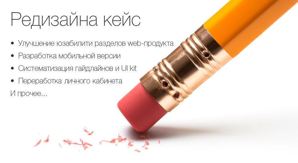
As I in one team did a redesign of a web product (cases!)
I started working with this team thanks to Habra. People read some of my posts and found me competent to solve their problems. I will describe further the small case, as the interface designer performed in stages different tasks for the web-product, the complexity of which increased as we worked. But I warn you in advance: if it turns out that a lot of material was written for one chapter, you will have to divide it into several ...
If you are a bit tired of flat-design, want to read about “overly understandable elements”, approve the physics of Material Design (and only), and just want to see pictures of simple and clear interfaces, then
I take this opportunity to tell the team thanks for the adequacy, the ability to trust my experience and my arguments. And do not forget to continue to invent complex tasks for me. We did not say goodbye.
')
So, there is a rather demanded product: a portal for young and future mothers Viline.tv. An interesting name, in which there is no hint of subject matter. Trend!
It performs very simple functions - any young mother or future mother can find the answer to her question. And they have a lot of questions, believe me! This is my wife told me that recently passed courses for expectant mothers. You can also download and watch audio / video courses. There are free, but there are paid. In general, the resource has long been working and certain metrics were available. There was knowledge of audience behavioral patterns; and so on. It was felt that my new team knew the future look of its product.
The client adopted a strategy with minimal risk for himself: first, I began to receive small tasks and we began to “get used to”:
As if at once “from the depths” began. First, I’ll tell you where the course on the resource comes from and what it represents. There is a lot of information for young mothers in the public domain, but something costs money. Any future mother can earn, if she has some knowledge. She records the course. Most likely immediately from the video. This is relevant. Laying out your information product on Viline, any mother, expectant mother, doctor or just an expert can earn. Growing sales courses - Viline flourishes as the right product. Here, I hope everything is clear.
It follows from the above that it is necessary to design the interface in such a way that nothing distracts from the desire to press the “Buy Course” button. OK, let's keep in mind! The plan for the course with the video is as follows: briefly give information about what it is, then we need to show the preview video; Upon completion, we show the "Buy" button. Everything is standard, logical, and in general I did not invent it: to push for sale after the video was over. But just need to be - it's + N% conversion .
If the video is interesting to the visitor, the purchase is likely to follow. If there is interest and doubt, then it will scroll below and there we will try to hold it with different widgets on the subject of its course or adjacent ones. Suddenly we can “spud”!
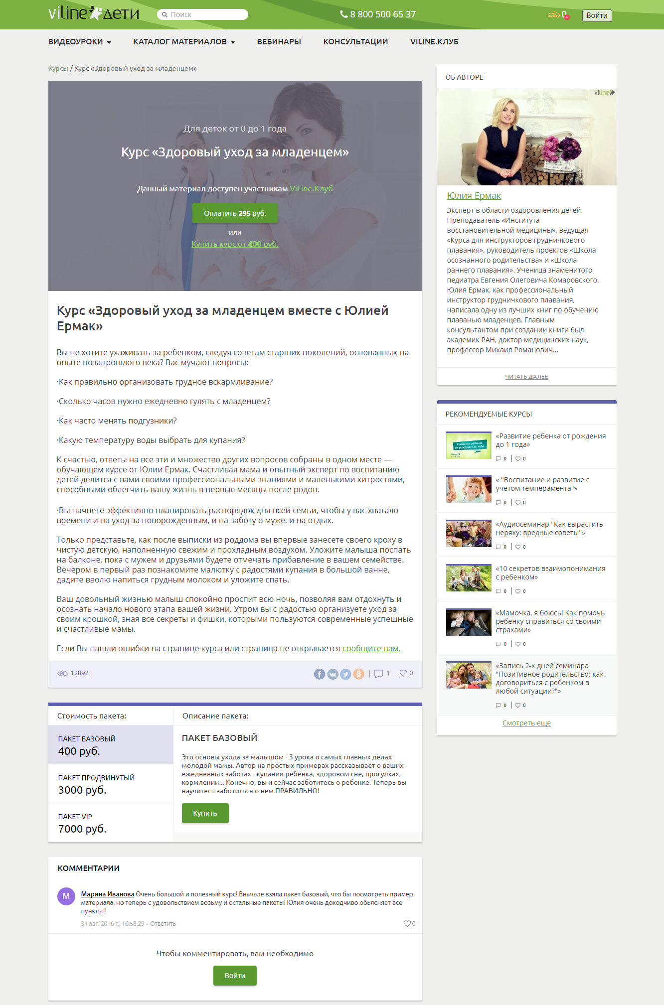
I will first show the old version, otherwise how to compare. Only the version with the course in the form of documentation has been preserved:
Zoom
In general, it is acceptable, the version is quite working, but there are inefficiencies. Green sale button is lost on gray fill. The ability to either pay or buy a course can be confusing. Much space is given to the description of the author of the course, although this is most likely not interesting to anyone yet. A textual description of the material, even if it is of interest, obliges you to wind it back, that is, upward. The lower unit with the cost of packages, they are also Plans, can be made more efficient.
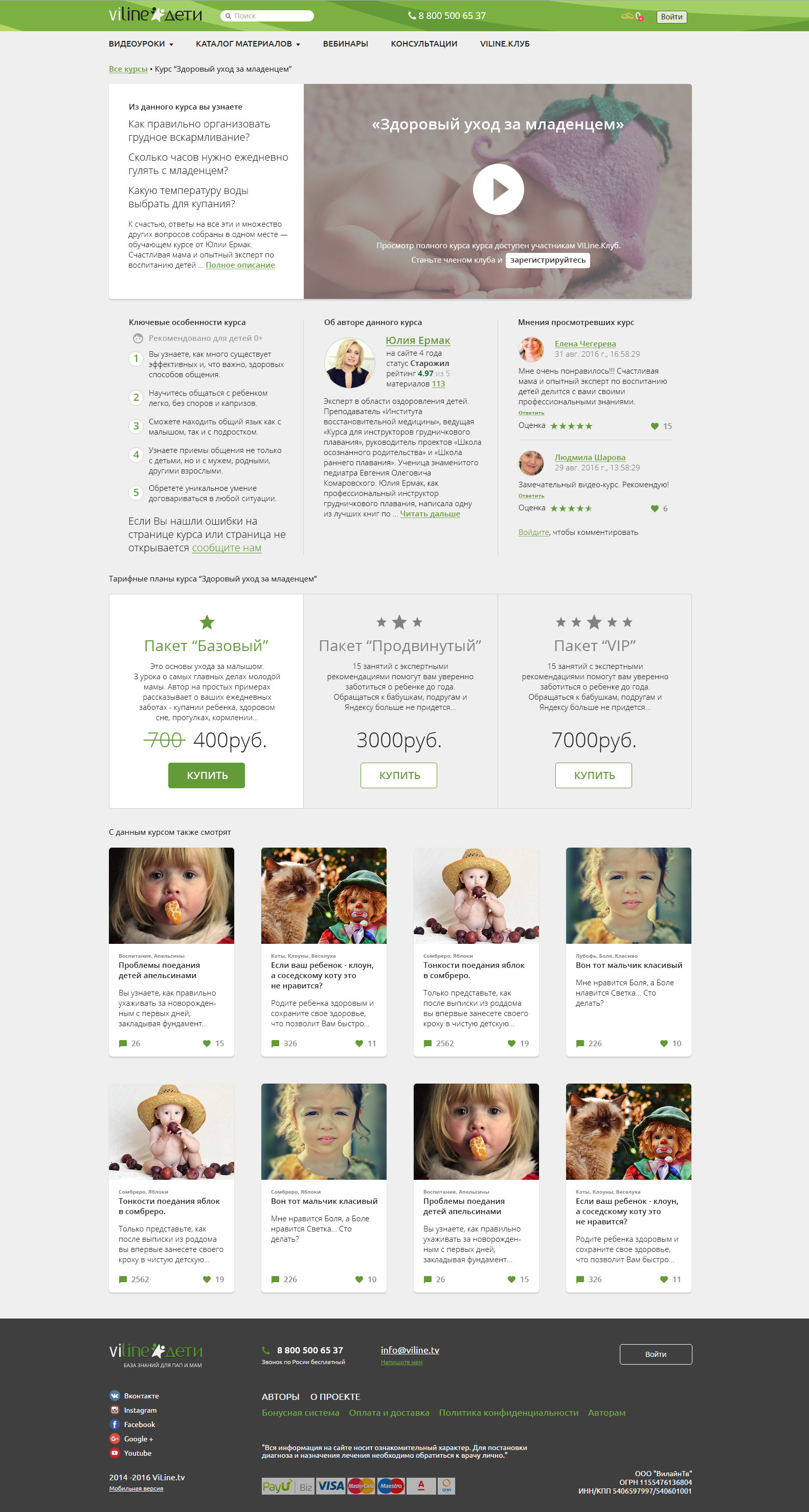
I started by reversing the contents a bit, leaving OpenSans for now, I did not interfere with header & footer:
Zoom
Below I want to tell you more about what I was guided by when I made decisions.
We combine the preview with a brief description in the form of a horizontal card. It will be on the left. We read from left to right mostly. Most likely the video will take away attention at once. Well, if so.

This is an example of a free course. Yes, there are such too! But you can see only after registration. So we do it more noticeably. Buttons in the foreground, everything else is secondary.
After viewing the thumbnails, if the material is free, then we call for registration:

If the material is paid, then the button will call for purchase.
Information block includes additional description, information about the author, comments of other participants. The block with the author should be somewhere close to the preview, but not have such a high priority. Therefore, I equate it with "features" and "opinions."

If there is interest, but there are doubts, then below we will try to take positive feedback from other people. Opinions of others may contribute to the determination to buy a course. Willy-nilly, the opinions of other people are often taken into account by us.
Next come the tariff plans in some more standardized form. Previously, to read the description of the tariff, you would first have to choose it by making a click - and this is unnecessary action. Standard drawing scheme Plans, apply:
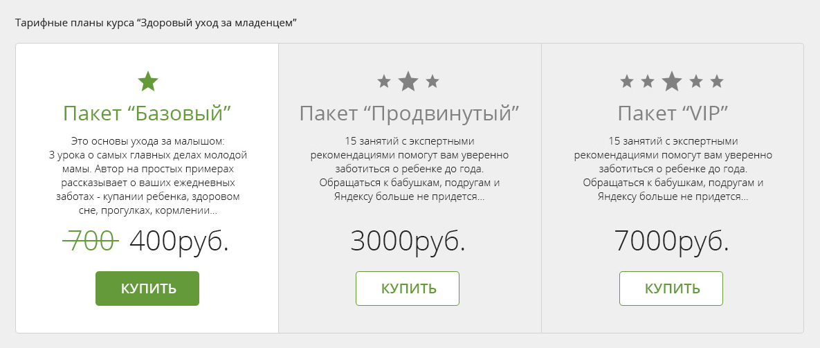
By the way, onchover, I offered to highlight the plan and show a discount. They saw the cost of the package “Advanced” 3000 r, put the mouse over - and there BAM and already 2300 price, and 3000 crossed out. Cool, well, and potential + N% to sales.
Plans, by the way, can be different in structure. Most of the possible options I also designed:
Zoom
Above everything related to a specific course and hints on paid material. Further and below, the last attempt to keep those who were uninteresting to the course. With the filing of cards, we are trying to engage other materials in viewing and retain the visitor. If this course is not for sale, maybe we can sell something from another topic:
Zoom
Not without a humor in some places, but still it is better to remain serious. And no lorem ipsum'ov. In our time, fish texts should be on the subject of the project being developed.
Since the types of materials may differ, I suggested other options for the layout of the course block. Here, for example, the structure of the upper part, if there is no video:

Thematic photo content, by the way, I take recently on pixabay.com . Everything is free for commercial use. The pictures are very cool, but the search algorithm leaves much to be desired. For cards, for example, photos with children are also from there.
Below I will show you more options for the arrangement that are offered. Something came up, something did not. We need to strive for such a pattern that would be suitable for all course options.


The most flexible option turned out to be, where the blocks consistently follow each other. Because for the course may not be comments. Or somewhere a great description, but somewhere just a few sentences. As a result, we stopped at it.
By the way, some hint follows from here: if a problem arises with a client in the development of a design, give him a choice. The choice of layout, the choice of font type, the choice of color. Almost always it works, some option is selected and then you can “finish”.
From the sequential layout follows the version for mobile devices. It makes no sense to invent anything here, we simply press the entire content in width and arrange the blocks in sequence. I kept the mobile version in mind from the very beginning of the interface design, so there were no difficulties with adaptation for the mobile web (I apologize for the long sheet, but nothing else):
Having plunged into the history of this task, in general, sometimes it seems to me that the design is one continuous manipulation. And over time, you understand how they are trying to deceive us everywhere. But in fact, the design simply can have its own purpose in each case. There may be several goals: sales, engagement, and informational support. Hence the need for all kinds of "receivers". And it is bad if the design does not fulfill the goals that the client sets. By the way, I always ask this question at the very beginning.
Thus, it turns out quite creative, but also practical, in terms of tight deadlines for the first introductory task. At the same time, the style of the product is beginning to take shape slowly. But he will continue to tolerate changes, and I will talk about this in the next chapter, which will cover topics on the specification of guidelines (Guidelines UI Kit), the grid and proportions, the Personal Account, why it’s still not flat and some other things I’m talking about I will try to remember ...
If you are a bit tired of flat-design, want to read about “overly understandable elements”, approve the physics of Material Design (and only), and just want to see pictures of simple and clear interfaces, then
By the way, if you use Figma , I recommend paying attention to our ready-made design systems . They help freelancers complete more orders per month, programmers can create beautiful applications on their own, and the Timlids run sprints faster using ready-made design systems for teamwork.
And if you have a serious project, our team is ready to deploy a design system within the organization based on our developments and tailor it to specific tasks using Figma. Web / desktop, and any mobile. We are also familiar with React / React Native. Write to T: @kamushken
I take this opportunity to tell the team thanks for the adequacy, the ability to trust my experience and my arguments. And do not forget to continue to invent complex tasks for me. We did not say goodbye.
')
So, there is a rather demanded product: a portal for young and future mothers Viline.tv. An interesting name, in which there is no hint of subject matter. Trend!
It performs very simple functions - any young mother or future mother can find the answer to her question. And they have a lot of questions, believe me! This is my wife told me that recently passed courses for expectant mothers. You can also download and watch audio / video courses. There are free, but there are paid. In general, the resource has long been working and certain metrics were available. There was knowledge of audience behavioral patterns; and so on. It was felt that my new team knew the future look of its product.
The client adopted a strategy with minimal risk for himself: first, I began to receive small tasks and we began to “get used to”:
Task one: "It is necessary to remake the course page"
As an introduction
As if at once “from the depths” began. First, I’ll tell you where the course on the resource comes from and what it represents. There is a lot of information for young mothers in the public domain, but something costs money. Any future mother can earn, if she has some knowledge. She records the course. Most likely immediately from the video. This is relevant. Laying out your information product on Viline, any mother, expectant mother, doctor or just an expert can earn. Growing sales courses - Viline flourishes as the right product. Here, I hope everything is clear.
It follows from the above that it is necessary to design the interface in such a way that nothing distracts from the desire to press the “Buy Course” button. OK, let's keep in mind! The plan for the course with the video is as follows: briefly give information about what it is, then we need to show the preview video; Upon completion, we show the "Buy" button. Everything is standard, logical, and in general I did not invent it: to push for sale after the video was over. But just need to be - it's + N% conversion .
If the video is interesting to the visitor, the purchase is likely to follow. If there is interest and doubt, then it will scroll below and there we will try to hold it with different widgets on the subject of its course or adjacent ones. Suddenly we can “spud”!
General form
I will first show the old version, otherwise how to compare. Only the version with the course in the form of documentation has been preserved:
Zoom
In general, it is acceptable, the version is quite working, but there are inefficiencies. Green sale button is lost on gray fill. The ability to either pay or buy a course can be confusing. Much space is given to the description of the author of the course, although this is most likely not interesting to anyone yet. A textual description of the material, even if it is of interest, obliges you to wind it back, that is, upward. The lower unit with the cost of packages, they are also Plans, can be made more efficient.
I started by reversing the contents a bit, leaving OpenSans for now, I did not interfere with header & footer:
Zoom
Below I want to tell you more about what I was guided by when I made decisions.
Block with preview video
We combine the preview with a brief description in the form of a horizontal card. It will be on the left. We read from left to right mostly. Most likely the video will take away attention at once. Well, if so.
This is an example of a free course. Yes, there are such too! But you can see only after registration. So we do it more noticeably. Buttons in the foreground, everything else is secondary.
After viewing the thumbnails, if the material is free, then we call for registration:
If the material is paid, then the button will call for purchase.
Information block
Information block includes additional description, information about the author, comments of other participants. The block with the author should be somewhere close to the preview, but not have such a high priority. Therefore, I equate it with "features" and "opinions."
If there is interest, but there are doubts, then below we will try to take positive feedback from other people. Opinions of others may contribute to the determination to buy a course. Willy-nilly, the opinions of other people are often taken into account by us.
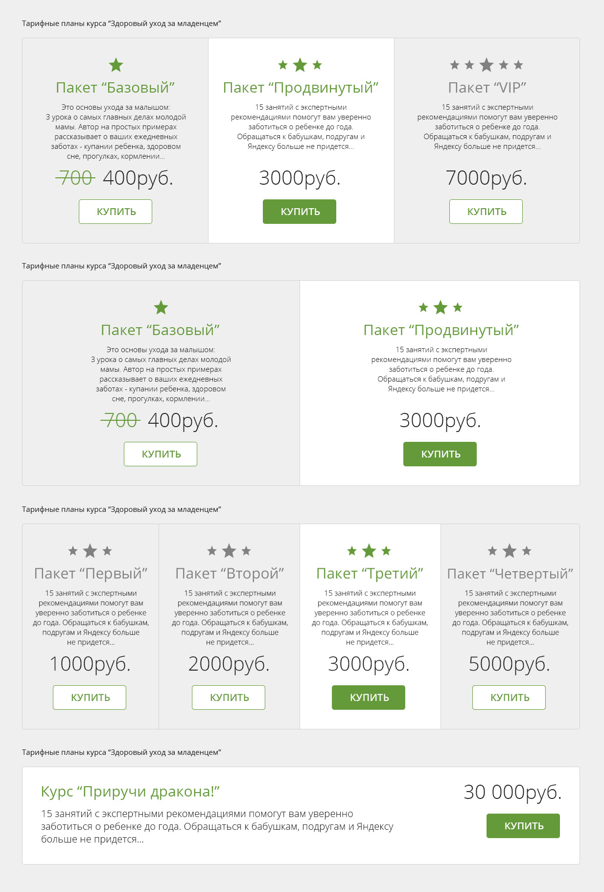
Tariff Plans
Next come the tariff plans in some more standardized form. Previously, to read the description of the tariff, you would first have to choose it by making a click - and this is unnecessary action. Standard drawing scheme Plans, apply:
By the way, onchover, I offered to highlight the plan and show a discount. They saw the cost of the package “Advanced” 3000 r, put the mouse over - and there BAM and already 2300 price, and 3000 crossed out. Cool, well, and potential + N% to sales.
Plans, by the way, can be different in structure. Most of the possible options I also designed:
Zoom
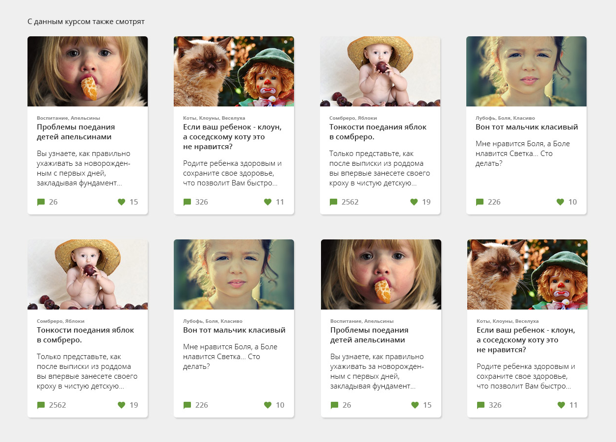
Creating engagement
Above everything related to a specific course and hints on paid material. Further and below, the last attempt to keep those who were uninteresting to the course. With the filing of cards, we are trying to engage other materials in viewing and retain the visitor. If this course is not for sale, maybe we can sell something from another topic:
Zoom
Not without a humor in some places, but still it is better to remain serious. And no lorem ipsum'ov. In our time, fish texts should be on the subject of the project being developed.
Different layouts
Since the types of materials may differ, I suggested other options for the layout of the course block. Here, for example, the structure of the upper part, if there is no video:
Thematic photo content, by the way, I take recently on pixabay.com . Everything is free for commercial use. The pictures are very cool, but the search algorithm leaves much to be desired. For cards, for example, photos with children are also from there.
Below I will show you more options for the arrangement that are offered. Something came up, something did not. We need to strive for such a pattern that would be suitable for all course options.
The most flexible option turned out to be, where the blocks consistently follow each other. Because for the course may not be comments. Or somewhere a great description, but somewhere just a few sentences. As a result, we stopped at it.
By the way, some hint follows from here: if a problem arises with a client in the development of a design, give him a choice. The choice of layout, the choice of font type, the choice of color. Almost always it works, some option is selected and then you can “finish”.
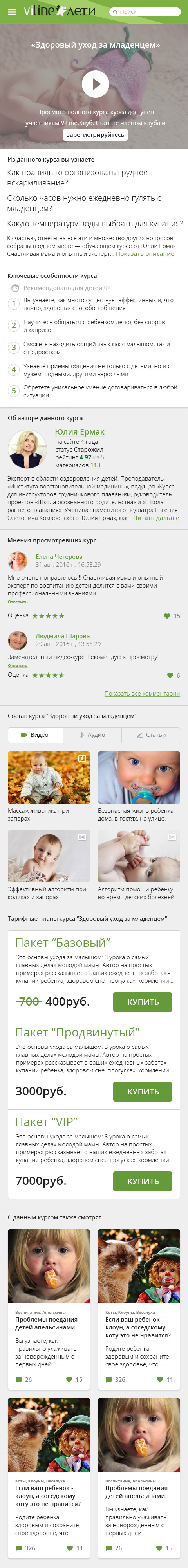
Mobile Interface Version
From the sequential layout follows the version for mobile devices. It makes no sense to invent anything here, we simply press the entire content in width and arrange the blocks in sequence. I kept the mobile version in mind from the very beginning of the interface design, so there were no difficulties with adaptation for the mobile web (I apologize for the long sheet, but nothing else):
In conclusion of the chapter
Having plunged into the history of this task, in general, sometimes it seems to me that the design is one continuous manipulation. And over time, you understand how they are trying to deceive us everywhere. But in fact, the design simply can have its own purpose in each case. There may be several goals: sales, engagement, and informational support. Hence the need for all kinds of "receivers". And it is bad if the design does not fulfill the goals that the client sets. By the way, I always ask this question at the very beginning.
Thus, it turns out quite creative, but also practical, in terms of tight deadlines for the first introductory task. At the same time, the style of the product is beginning to take shape slowly. But he will continue to tolerate changes, and I will talk about this in the next chapter, which will cover topics on the specification of guidelines (Guidelines UI Kit), the grid and proportions, the Personal Account, why it’s still not flat and some other things I’m talking about I will try to remember ...
Source: https://habr.com/ru/post/319838/
All Articles