Linkedin recently redesigned and I intend to discuss it.

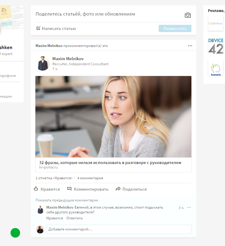
LinkedIn corporate business network recently changed its design. This was already done by the hands of the new owner, Microsoft. Absolutely timely and justified step on their part. The old design was both outdated and full of UX-bugs. Some scenarios simply could not be played from memory. Can you now remember how to get into the mode of recall sent invitations?
Sorry, that "in the forehead" asked. Perhaps many of you do not even have accounts there.
')
Well if you remembered, but there was complete chaos. There was no filtering by dates in the history as such. In addition, uploading old invitations worked crookedly.
In general, I, as a specialist in the search for usability of bugs (well, just like in the proverb “Blind eye in the eyes of others”), could not get past this update. Let's analyze this ...
By the way, if you use Figma , I recommend paying attention to our ready-made design systems . They help freelancers complete more orders per month, programmers can create beautiful applications on their own, and the Timlids run sprints faster using ready-made design systems for teamwork.
And if you have a serious project, our team is ready to deploy a design system within the organization based on our developments and tailor it to specific tasks using Figma. Web / desktop, and any mobile. We are also familiar with React / React Native. Write to T: @kamushken
How was "before"

How was "after"

We must begin by saying that we all will a priori be “against”. Well, we are arranged with you. There are a lot of examples: iOS transition to flat, VK redesign and so on (it’s scary to remember about Film Search and recall). We will most likely be “for” if “before” was frankly bad. With Linkedin, there was no such thing: a social network could be used more or less quickly at the required level. So, we keep in mind that we are “against” and I will begin to reason:
Guidelines
Somehow heavy. In fact, such intense boarders have long been out of fashion and create a lot of “noise”. Now, many visual divisions are generally made with text. Its intensity and shade. Unnecessary "sticks" just lose their meaning and duplicate the meaning. Added heavy shadows, which together with the heavy frames of each card add "dirt". At the exit, all the divisions added "weight" and distract.
An example from my recent task, when the extra separators would only duplicate the obvious:

In the photo below, I just made a print screen and painted over the borders, leaving the bottom shadow. An example of what the start page blocks look like after their redesign :

It seems that the focus on content has increased and the eye has become somehow “calmer”, after I painted over the borders of the blocks :
A professional designer is looking for any way to make the interface design even more inconspicuous, but these have a completely different opinion. If we consider this ideology on the example of the average card in the design, then its path is approximately as follows:

In my opinion, now we are somewhere in the middle.
Header
In general, the logic of alignment of elements was lost. The panel with icons left to the right. And the width of the input for the search seems to be taken from the ceiling. If only a little to move the elements, it seems to me it becomes more advantageous. The promotion of “Premium” access will more often be noticeable to the eye on the left, rather than closer to the block of advertising, where out of habit we no longer look.
Header after their redesign:

I moved the header a bit:

Search
This item absolutely suddenly follows from the item about the header. I managed to poke in the search input. Mde. What is this “reserve” of free space to the right of names and avatars? Listen, here I am an eccentric, but this is probably the layout "went." Perhaps tested poorly. Correct! And we will endure everything ...
Here is what I got on click:

But how can you kill two birds with one stone:

Do not wait! I already hear Linkedin’s voice: “Overlap advertising overlaps with oak ?!”
Notifications.
Previously, it was convenient: hovering the mouse on the "bell" and got the last action in the pop-up. It was convenient and no need to click. Now, according to the old habit, you direct, but in response, silence. Need a click! And we are being taken from the tape to an additional section, where more “And congratulations on this one ....” than real notifications. Why they were mixed after the redesign - I do not understand.
Profile

That popap found! Strange. The priority of the sections of the menu is the same, and by clicking we get a different result. Basically we are sent to a new page, but for some reason popup pops up. I would agree with this response, if the avatar is placed separately. By the way, once in profile and there we see something “go”:

Even in the old version there were no such blunders in my opinion. We shove the flaws in the localization ...
"I'm over it"
I do not even want to go further. To compare subjectively all user scenarios “before” and after redesign, you need to discover from scratch where they are buried. Since most of the logic is redone, it will take a lot of time to study.
By the way, if you have a story about how exactly LinkedIn has made you grow professionally or move up the career ladder (they called you on Google!) - tell us in the comments. Personally, I have nothing to boast. It has long been a couple of interviews with European HR'ami. In fact, boring! Hindus are constantly bursting as friends, and domestic headhunters continue to bomb the PM with standard outdated spam.
I do not dare to discourage you from using LinkedIn. Any total redesign is exciting. Surely they sit there and the stats will refresh once a minute by the entire board of directors. And this is a risk! Let time put everything in its place. Users will either get used or leave.
Poscriptum
Listen, well, maybe I do not understand anything? This is a market leader - a network of professionals! In the same place for certain professionals work. Perhaps they know better than me ... They probably spent months of UX-testing on focus groups of respondents, sat in coworkings and drew something on Kanban boards, specifically sprinting on ajail! ... And then they "issued" ...
Sorry to criticize again. It is necessary to tell about good examples, for example, from personal practice ... By the way, here the other day Facebook changed the design of the desktop messenger within the network. And there is also something to discuss.
Source: https://habr.com/ru/post/319506/
All Articles