Subscription form: how to effectively collect the address database
The subscription form is a good tool to attract to the newsletters, but they use it differently. A message to the front, like "give me your email", is unlikely to motivate people to leave their data. In return, you need to offer users value.
Next, we will talk about where to place the subscription form and give examples of the most effective lead magnets to engage in the newsletter.

Photo by Phillippe Put (Flickr)
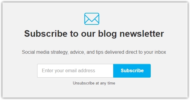
• Single opt-in
')
In the case of single opt-in, the user just needs to enter his email address in the form. The main advantage of this type of subscription is simplicity and time saving. But there is a small flaw in simplicity: if an email is entered with an error, it will still go to the address database and you will work with it. At least, until the first "rehabilitation" of the base.
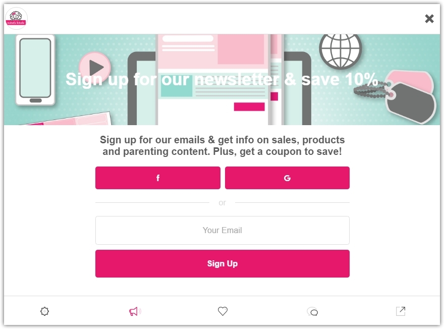
• Double opt-in (confirmation subscription)
Double opt-in is also called a confirmation subscription when an email arrives with a button or link that you need to follow to complete the subscription process. In this way, the correctness and activity of the postal address is checked.
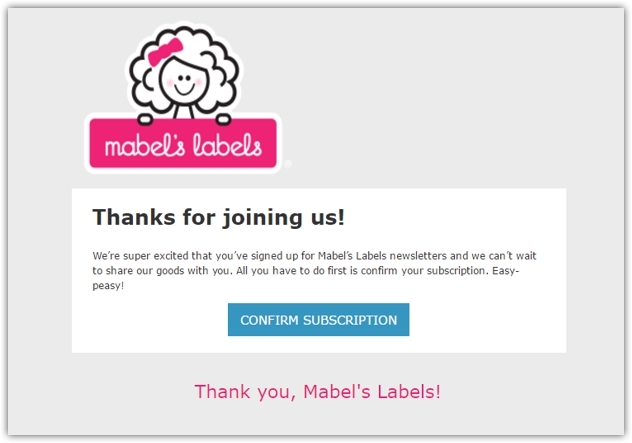
Online store Mabel's Labels offers a 10% discount for subscribing to the newsletter.
And in the confirmation letter Mabel's Labels also expresses gratitude for the subscription: “Thank you for joining us!”
Thus, only real and active addresses will come to your database, and therefore the level of response will be positive.
Details on how to create a subscription form in SendPulse read here .
• Homepage of the site
Users are unlikely to search the entire site, as if to leave you their email. It is in your best interest to take care that the subscription form is easy to find and that it does not interfere with the main content.
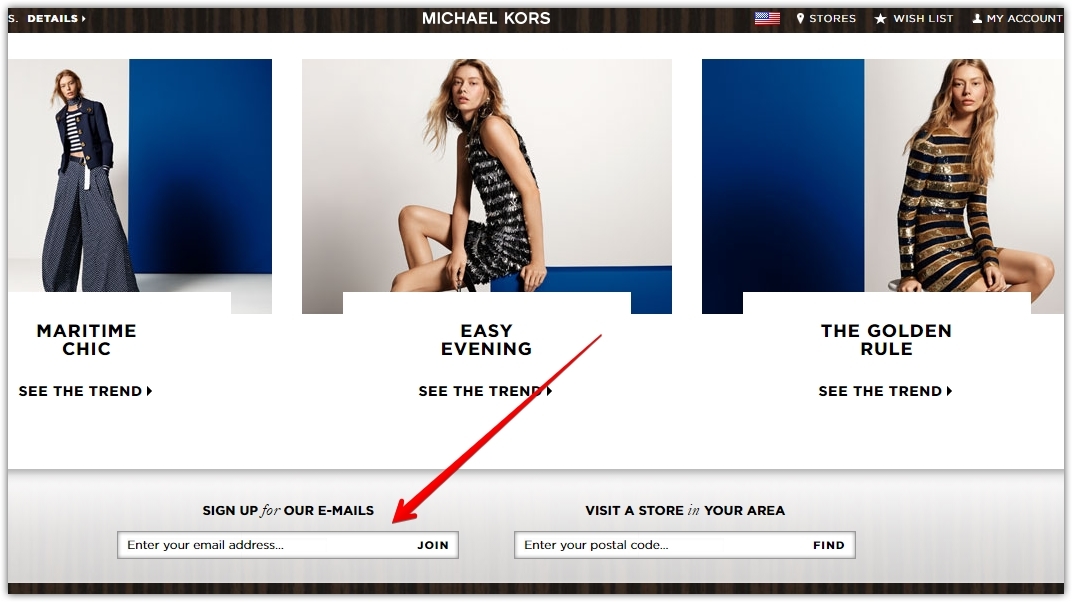
On the website of the famous clothing brand Michael Kors, the subscription form is just above the footer. This is an advantageous location, because in search of sections of the site the visitor will definitely notice it.
Some companies place a subscription form at the top of the home page, so you don’t have to scroll at all.
• Pop-up window
Pop-ups double the number of signatories through the site. This fact is hard to ignore, as is the fact that they annoy many users. Therefore, installing a pop-up window on your website, carefully test it to be easy to close from all devices. This is an unwritten rule of etiquette.
In most cases, a pop-up window with a subscription form is allowed in the first few seconds after entering the site. But sometimes the user is advisable to give the opportunity to evaluate the content before asking to subscribe to it.
If the reader comes to a blog article, you can show the window after he scrolls through the article and realizes if he is interested in it or not.
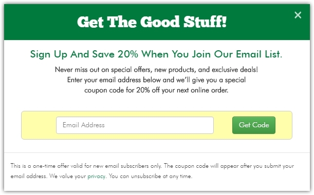
Below is an example of a popup window from True Lemon with a 20% discount on the next order.
If you have installed a pop-up window on your site, you should not add a pop-up chat. Such an "overload" is likely to cause irritation among users.
• Facebook Page
Give Facebook followers an opportunity to subscribe to your newsletter.
Do not isolate email marketing and social networks from each other. You will benefit if you allow these two ecosystems to work in conjunction.
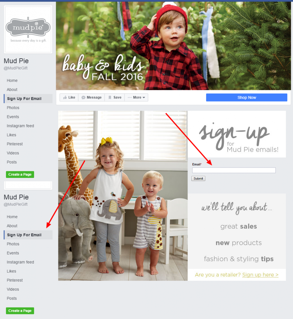
Take an example from the Facebook page of the online store Mud Pie.
• Landing page
A landing page for a subscription should serve only this purpose and be as simple and clear to users as possible.
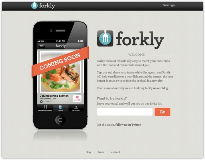
Forkly on the landing page offers to leave your email to like your favorite food in restaurants and receive information about delicious dishes in your city.
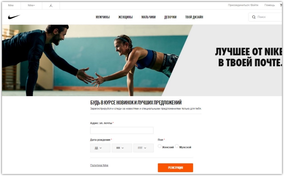
The Nike site has a separate landing page for the subscription, with pre-segmentation by gender and the date of birth.
Work with the base of addresses from the landing page with the help of the integration of SendPulse and LPGenerator .
• Inside video content
Place a useful video on your Youtube channel and paste the subscription form in the middle about.
Thus, to watch the video to the end, the user will need to leave your email.
1. Gift
Offer to leave an email in exchange for a gift to the first order.
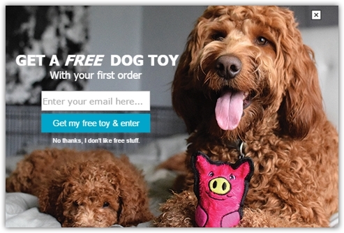
In the pop-up window of the site Outward Hound offers a free toy for a dog when you first order.
Pay attention to how the call-to-action is issued: “Get a free toy and enter”, and not just “register” or “enter”. Under the button it says: “No, thank you, I’m not interested in everything free”, which pushes me to the target action. And doggies cause positive emotions.
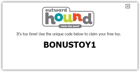
After subscription, a pop-up window appears with a bonus code for the toy.
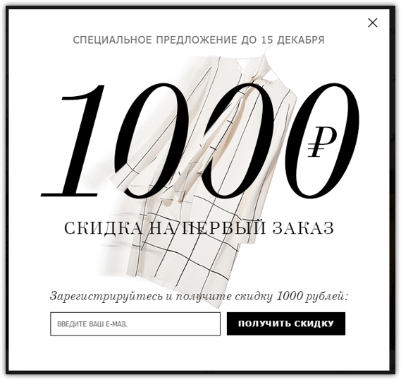
2. Discount
Discount in exchange for registration will be a good incentive.
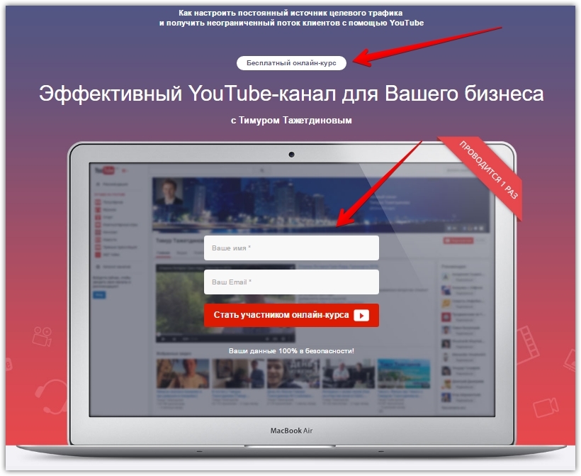
3. Free educational material
If you earn by learning, registering for a free lesson or course will help expand your address base.
Below is an example of a landing page from Timur Tazhetdinov.
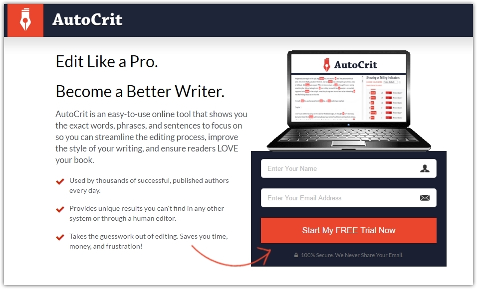
4. Free trial period
The creators of AutoCrit, programs for editing and improving text, on the landing page offer to register for a trial period for free.
5. Humor
Notes of humor in the subscription forms can not only cheer up, but also induce to subscribe.
Tim Urban's blog, Wait but Why, stands out for its original and ironic approach.
The pop-up window on the website Wait but Why says: "Nobody likes pop-up windows. Damn, but since you're already here, I will say this. If you like Wait but Why, give a chance to our newsletter. We will only send 2-4 letters a month and only after the release of new posts. "

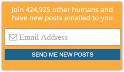
6. Social evidence
The subscription form of the site Wait but Why contains not only elements of humor, but also a psychological method of social proof: "Join 424, 925 other mortals and get our new publications."
The figure is dynamic and grows as new subscribers are added.
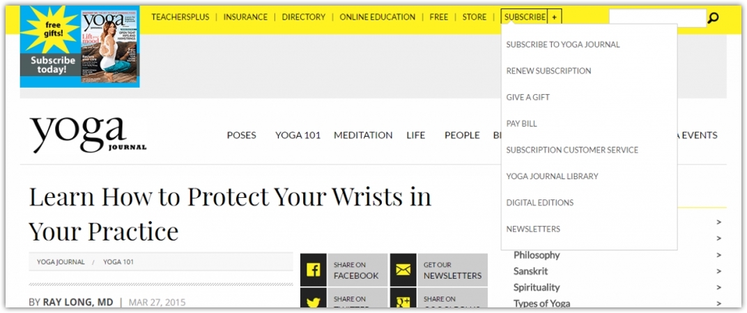
The home page of the Yoga Journal website contains a “subscription” section with a drop-down list where you can subscribe to the newsletter.
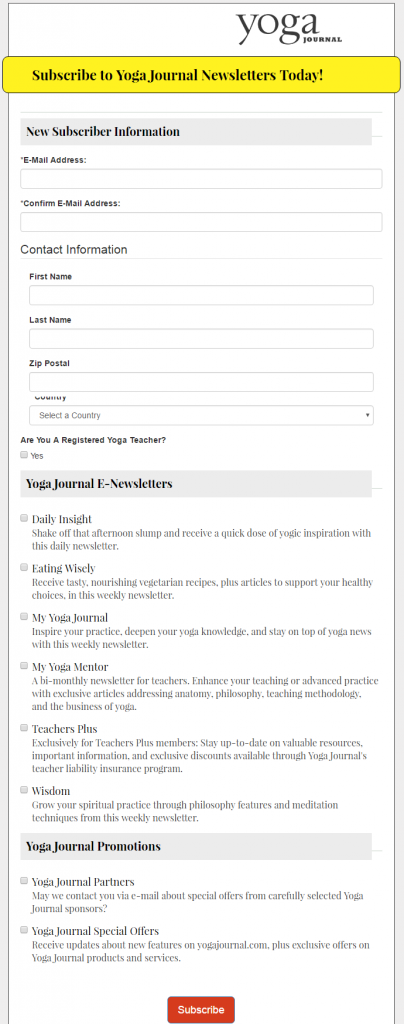
Choosing a newsletter, you will find yourself in the newsletter personalization room, where you will choose the material you are interested in.
Such personalization cabinets are the trend of 2017 and allow to segment the address base. We have written in detail about segmentation in our previous publications .
The site also has a pop-up window, which offers a subscription to the magazine and 4 PDF booklets as a gift.

The Yoga Journal page has a “subscribe to the newsletter” tab.
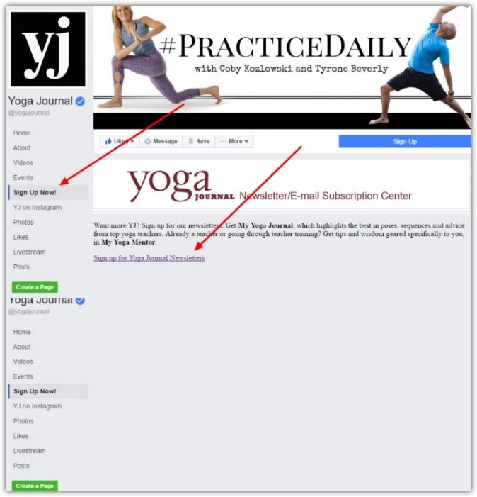
The Facebook Subscription tab goes to a similar newsletter personalization account.

Combine and test the work of various techniques for you. There is no unique effective solution here - there can be many combinations.
And remember that behind the email addresses are real people who demand respect. In pursuit of expanding the base, follow the measure and do not litter with unnecessary elements either your website or the heads of people.
Loyal to you subscribers and more!
Next, we will talk about where to place the subscription form and give examples of the most effective lead magnets to engage in the newsletter.
Photo by Phillippe Put (Flickr)
Subscription Types
• Single opt-in
')
In the case of single opt-in, the user just needs to enter his email address in the form. The main advantage of this type of subscription is simplicity and time saving. But there is a small flaw in simplicity: if an email is entered with an error, it will still go to the address database and you will work with it. At least, until the first "rehabilitation" of the base.
• Double opt-in (confirmation subscription)
Double opt-in is also called a confirmation subscription when an email arrives with a button or link that you need to follow to complete the subscription process. In this way, the correctness and activity of the postal address is checked.
Online store Mabel's Labels offers a 10% discount for subscribing to the newsletter.
And in the confirmation letter Mabel's Labels also expresses gratitude for the subscription: “Thank you for joining us!”
Thus, only real and active addresses will come to your database, and therefore the level of response will be positive.
Details on how to create a subscription form in SendPulse read here .
Where to place a subscription form?
• Homepage of the site
Users are unlikely to search the entire site, as if to leave you their email. It is in your best interest to take care that the subscription form is easy to find and that it does not interfere with the main content.
On the website of the famous clothing brand Michael Kors, the subscription form is just above the footer. This is an advantageous location, because in search of sections of the site the visitor will definitely notice it.
Some companies place a subscription form at the top of the home page, so you don’t have to scroll at all.
• Pop-up window
Pop-ups double the number of signatories through the site. This fact is hard to ignore, as is the fact that they annoy many users. Therefore, installing a pop-up window on your website, carefully test it to be easy to close from all devices. This is an unwritten rule of etiquette.
In most cases, a pop-up window with a subscription form is allowed in the first few seconds after entering the site. But sometimes the user is advisable to give the opportunity to evaluate the content before asking to subscribe to it.
If the reader comes to a blog article, you can show the window after he scrolls through the article and realizes if he is interested in it or not.
Below is an example of a popup window from True Lemon with a 20% discount on the next order.
If you have installed a pop-up window on your site, you should not add a pop-up chat. Such an "overload" is likely to cause irritation among users.
• Facebook Page
Give Facebook followers an opportunity to subscribe to your newsletter.
Do not isolate email marketing and social networks from each other. You will benefit if you allow these two ecosystems to work in conjunction.
Take an example from the Facebook page of the online store Mud Pie.
• Landing page
A landing page for a subscription should serve only this purpose and be as simple and clear to users as possible.
Forkly on the landing page offers to leave your email to like your favorite food in restaurants and receive information about delicious dishes in your city.
The Nike site has a separate landing page for the subscription, with pre-segmentation by gender and the date of birth.
Work with the base of addresses from the landing page with the help of the integration of SendPulse and LPGenerator .
• Inside video content
Place a useful video on your Youtube channel and paste the subscription form in the middle about.
Thus, to watch the video to the end, the user will need to leave your email.
What lead magnets to use?
1. Gift
Offer to leave an email in exchange for a gift to the first order.
In the pop-up window of the site Outward Hound offers a free toy for a dog when you first order.
Pay attention to how the call-to-action is issued: “Get a free toy and enter”, and not just “register” or “enter”. Under the button it says: “No, thank you, I’m not interested in everything free”, which pushes me to the target action. And doggies cause positive emotions.
After subscription, a pop-up window appears with a bonus code for the toy.
2. Discount
Discount in exchange for registration will be a good incentive.
3. Free educational material
If you earn by learning, registering for a free lesson or course will help expand your address base.
Below is an example of a landing page from Timur Tazhetdinov.
4. Free trial period
The creators of AutoCrit, programs for editing and improving text, on the landing page offer to register for a trial period for free.
5. Humor
Notes of humor in the subscription forms can not only cheer up, but also induce to subscribe.
Tim Urban's blog, Wait but Why, stands out for its original and ironic approach.
The pop-up window on the website Wait but Why says: "Nobody likes pop-up windows. Damn, but since you're already here, I will say this. If you like Wait but Why, give a chance to our newsletter. We will only send 2-4 letters a month and only after the release of new posts. "
6. Social evidence
The subscription form of the site Wait but Why contains not only elements of humor, but also a psychological method of social proof: "Join 424, 925 other mortals and get our new publications."
The figure is dynamic and grows as new subscribers are added.
Yoga Journal Strategy
The home page of the Yoga Journal website contains a “subscription” section with a drop-down list where you can subscribe to the newsletter.
Choosing a newsletter, you will find yourself in the newsletter personalization room, where you will choose the material you are interested in.
Such personalization cabinets are the trend of 2017 and allow to segment the address base. We have written in detail about segmentation in our previous publications .
The site also has a pop-up window, which offers a subscription to the magazine and 4 PDF booklets as a gift.
The Yoga Journal page has a “subscribe to the newsletter” tab.
The Facebook Subscription tab goes to a similar newsletter personalization account.
Conclusion
Combine and test the work of various techniques for you. There is no unique effective solution here - there can be many combinations.
And remember that behind the email addresses are real people who demand respect. In pursuit of expanding the base, follow the measure and do not litter with unnecessary elements either your website or the heads of people.
Loyal to you subscribers and more!
Source: https://habr.com/ru/post/319486/
All Articles