Texture Remastering for BioShock: The Collection
[All images are clickable, because Habr compresses images with a resolution greater than 1920]
Introduction
My name is Ana Rodriguez ( Ana M. Rodriguez ), I do computer graphics and specialize in textures and shaders. Currently I work as a freelancer at Blind Squirrel Games, my last project was the Bioshock game collection : The Collection . Before him, I worked on Castlevania: Lords of Shadows 1 and 2. I also managed to participate in the Castlevania: Mirror of Fate project for Nintendo 3DS.
')

Creating materials
When I face the challenge of creating a new “garment” for the environment, I usually start by studying examples, mostly real-life photos (sometimes concepts). Images of what you need to create are a great help to preserve details and variations, original shapes of changes and color gradients, types and shapes of spots, stains, etc. All this complements the image.
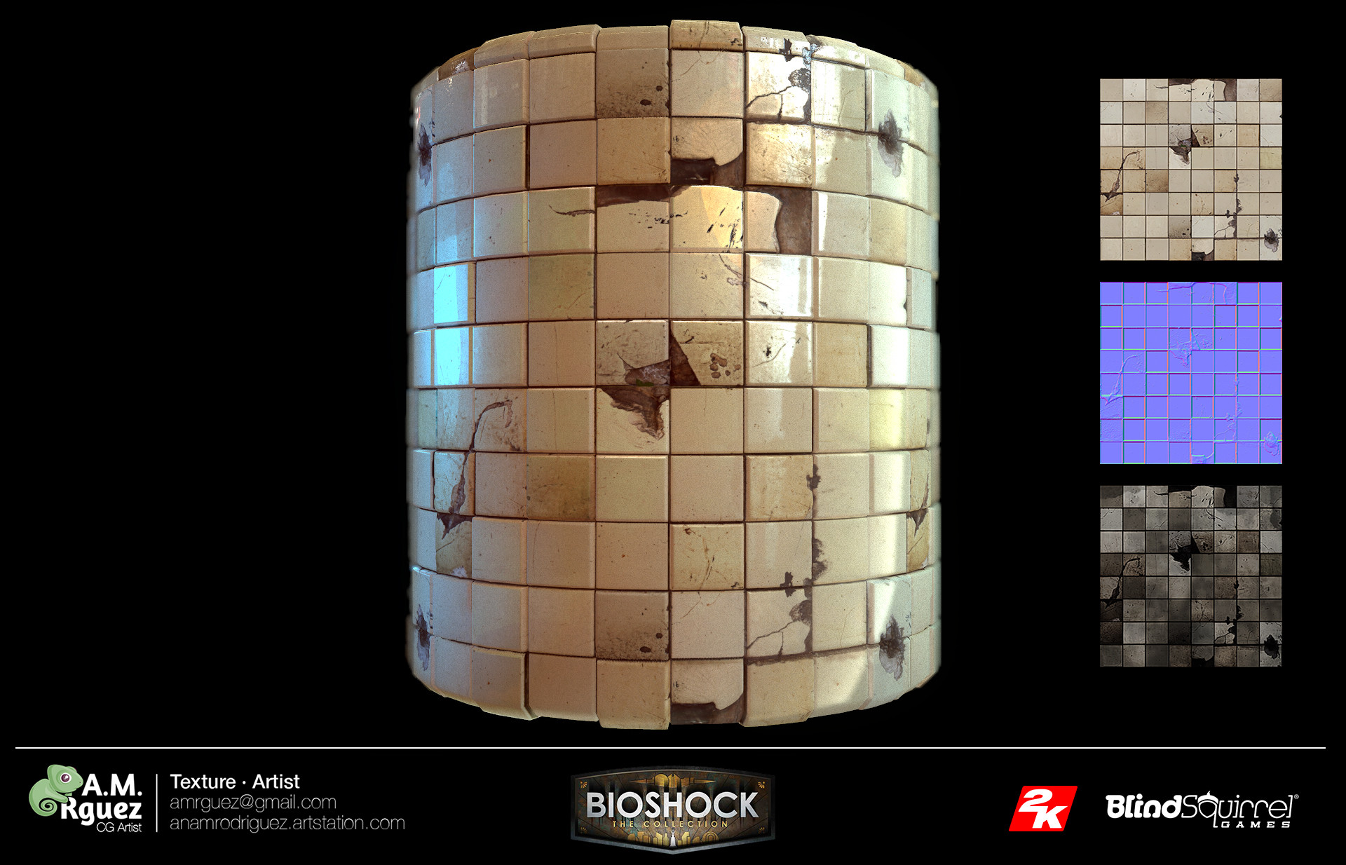
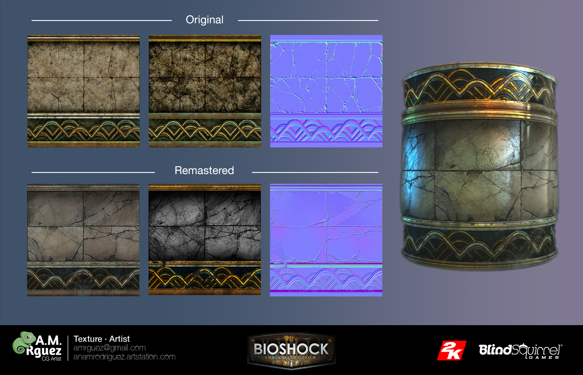
Ultimately, if you want to give artistic or stylized features, then you need to start with what you want to "imitate" from the real world (if such is the artistic task of the game). However, I had to start with existing textures in Bioshock, so the process was very different. I had to respectfully handle the original, follow the existing patterns (for example, in the case of a bathroom with tiles, it was necessary to repeat the number of tiles, their location and the type of dirt stains created in the original), trying to repeat the location of the dirt, while improving the texture and advantages of the new permit.
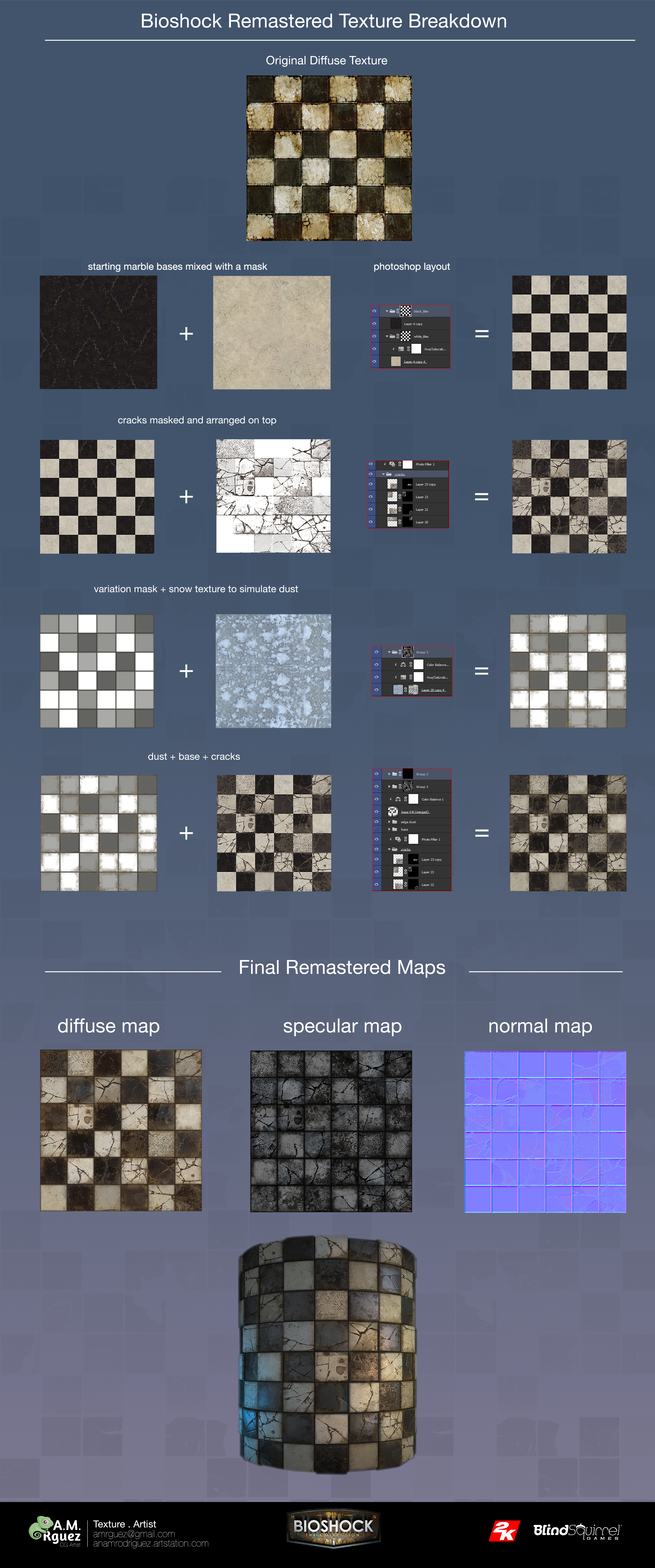
Many people are confused by the fact that the reworked texture looks “new” because it is clearer. Usually when remastered, textures start with a low resolution image. Small size means less detail to add in the next step. The ability to work with larger textures allows you to eliminate the noise that arose on the original texture due to compression, and add new details, but separating contaminated areas from the clean ones. Therefore, as a result, where the original was clean, the new version is even cleaner, and where it was dirty it is even dirtier. Thanks to a higher resolution, we can achieve visual clarity.
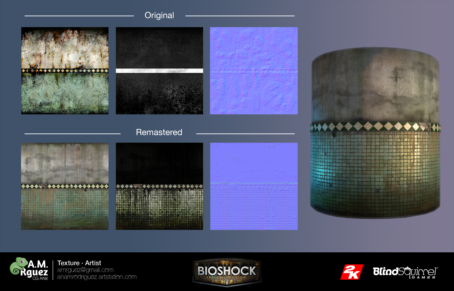
When working on remastering, you have to think about what the artist wanted to convey to you, but which sometimes was completely unsuccessful due to compression.
Difficulties in creating complex materials
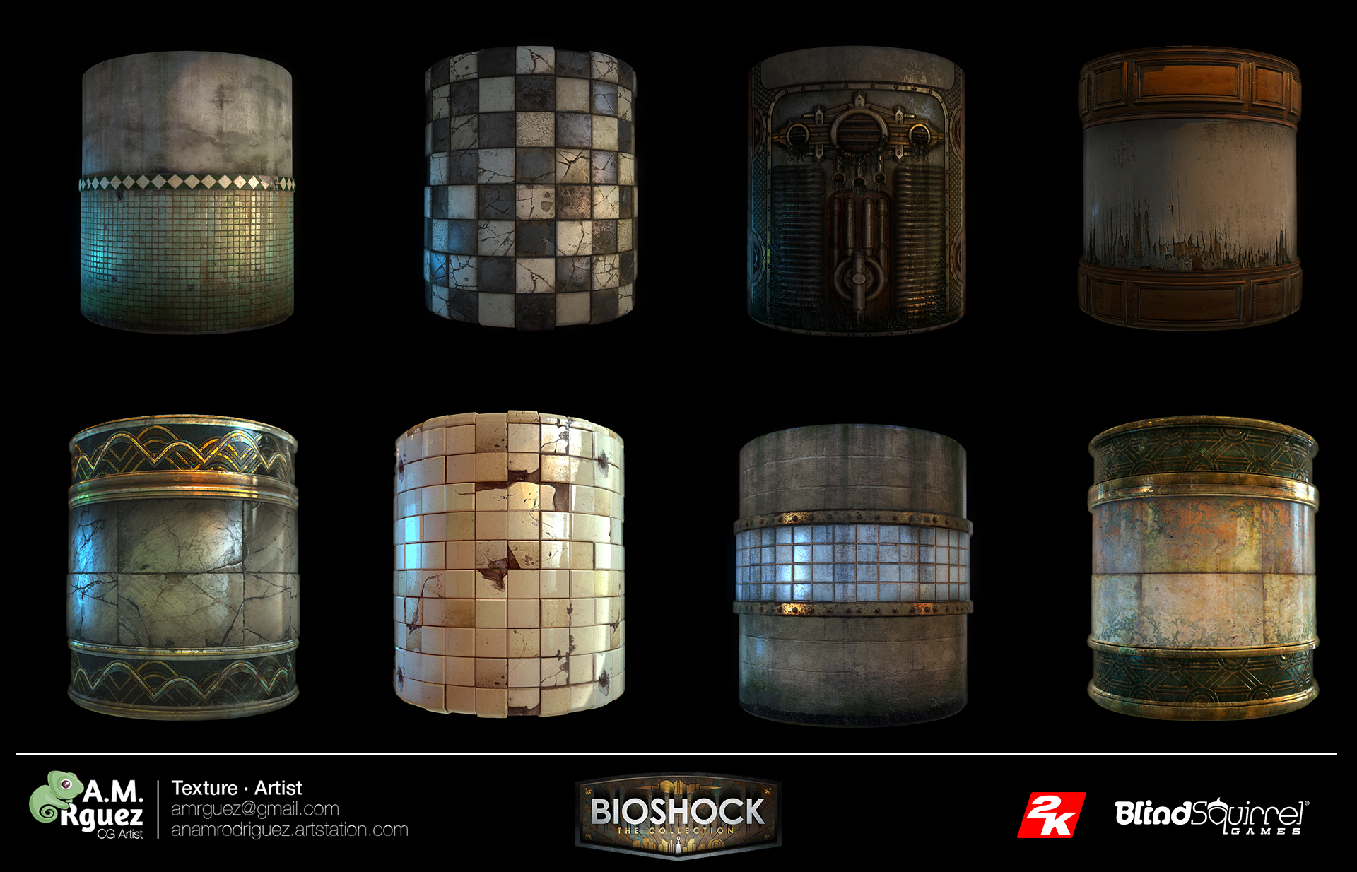
When creating textures, the biggest problem for me is to achieve the desired finishing (in the case of Bioshock, for example, this is a mixture of “realistic and stylized”), and to make the textures match the rest of the textures of the environment.
You need to understand that what you see is not a separate texture, but one of the elements of the environment, which should give a sense of the integrity of the whole level. When working on freelancing this is more difficult to achieve, because you are not aware of what the rest of the team is doing. But when you are involved in a team, this integration is much easier. So it was with me when working on the Castlevania series. A separate texture painting team is a huge advantage. It allows you to work as if you were all together - one brain. If we supplement the work with a clear artistic vision, all the textures will appear as a result created by one person. Such a workflow provides greater persuasiveness of the environment and the integrity of the artistic style.
Do not forget that I am talking about glossy / reflective (gloss / specular) texture materials. In the case of PBR, integration should now be easier, because the material follows its own settings (reflection of light by material, percentage of roughness, etc.). He reacts to lighting in a “physical” way, so it is easier to fit into any environment and he behaves correctly (if everything is done according to the required parameters).
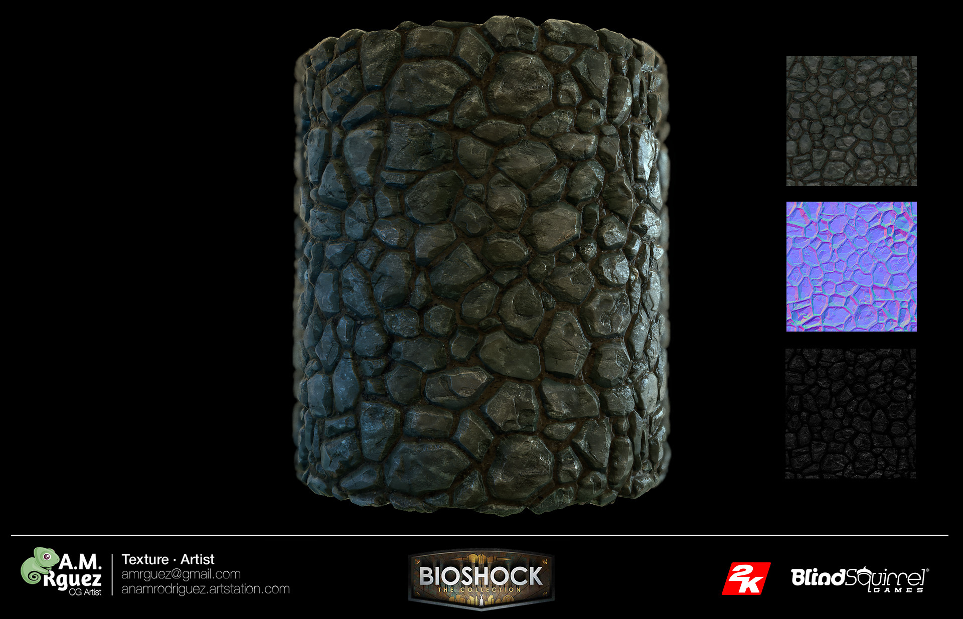
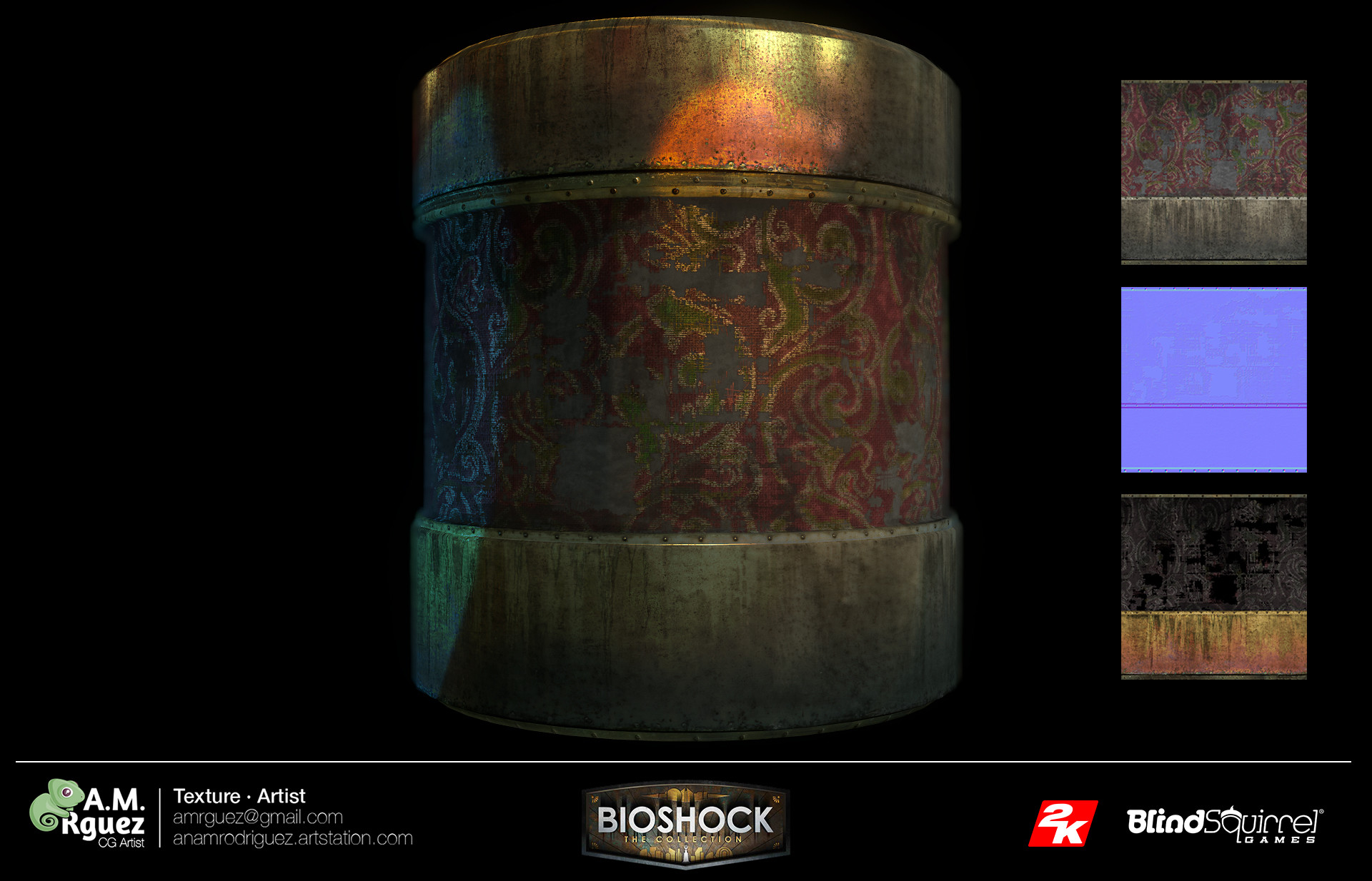
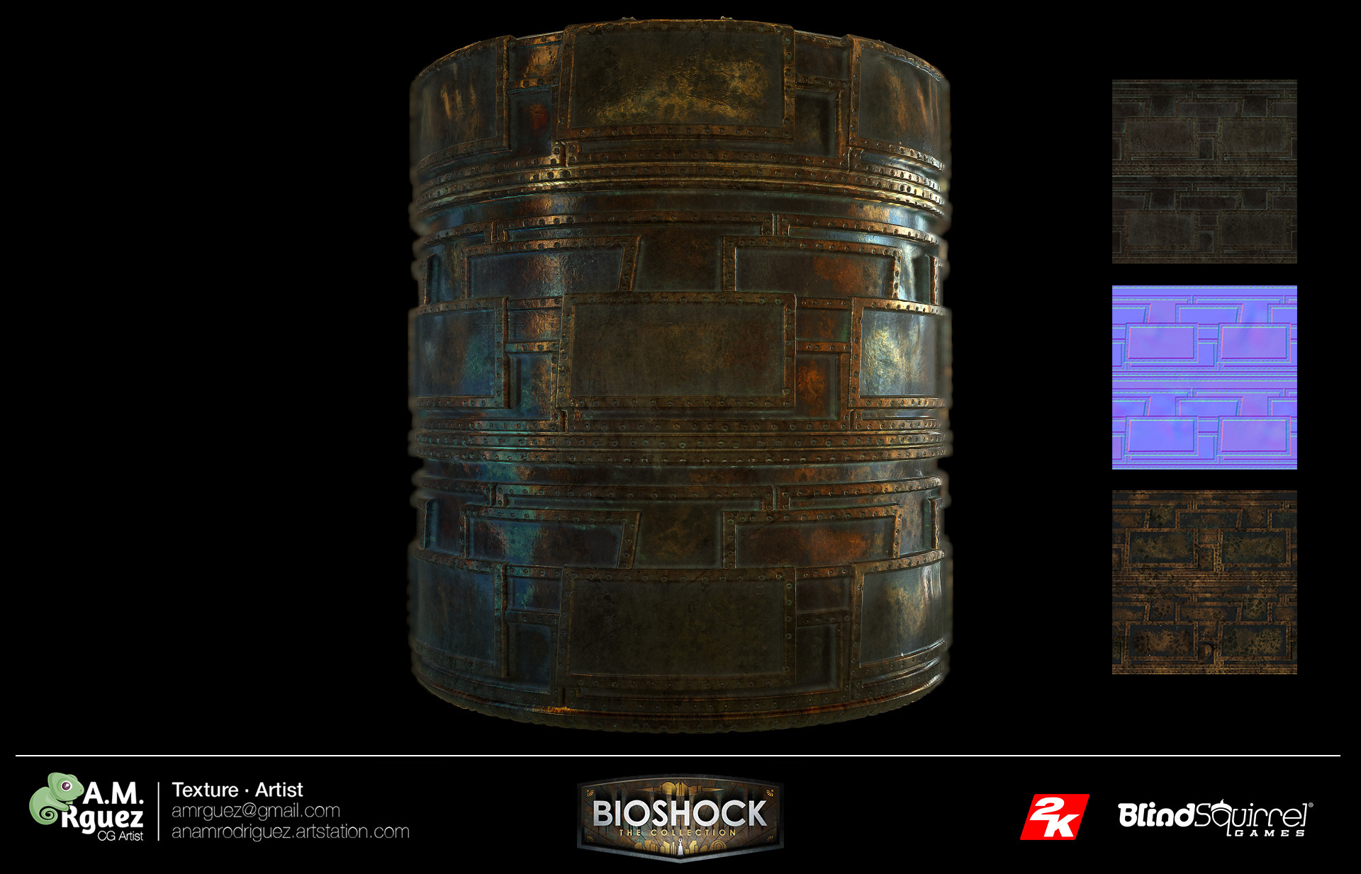
From the point of view of material efficiency, it is important to start with the simplest forms and complete the most complex ones. For example, in the case of the texture of stone blocks, you should start with the blocks, and finish by adding moss and mold. Always go from the general to the particular. I think this advice applies regardless of how you create textures (Photoshop, Quixel, Substance, etc.). Analyze what needs to be done roughly (large brick wall), and then go to the individual and characteristic details (frayed, riven, moss, spots, etc.). If you want to mix the texture with another or in the same texture with another element (for example, in the case of Bioshock, with a strip of decorative metal), you must take into account that the element is part of the wall itself, it grew old with it and was subjected to the same weather conditions: rain, humidity, dust, etc. Therefore, in order for the texture to be natural and complete, you need to understand this and perceive them not separately, but as a whole.
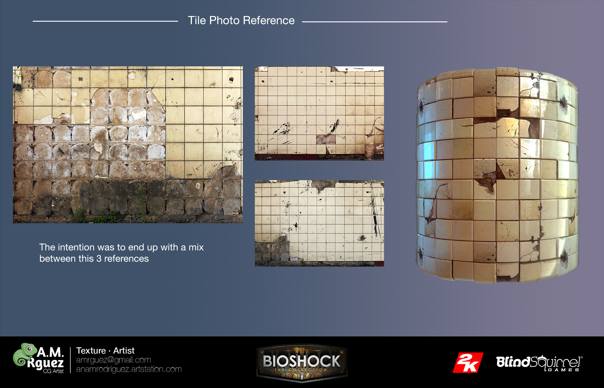
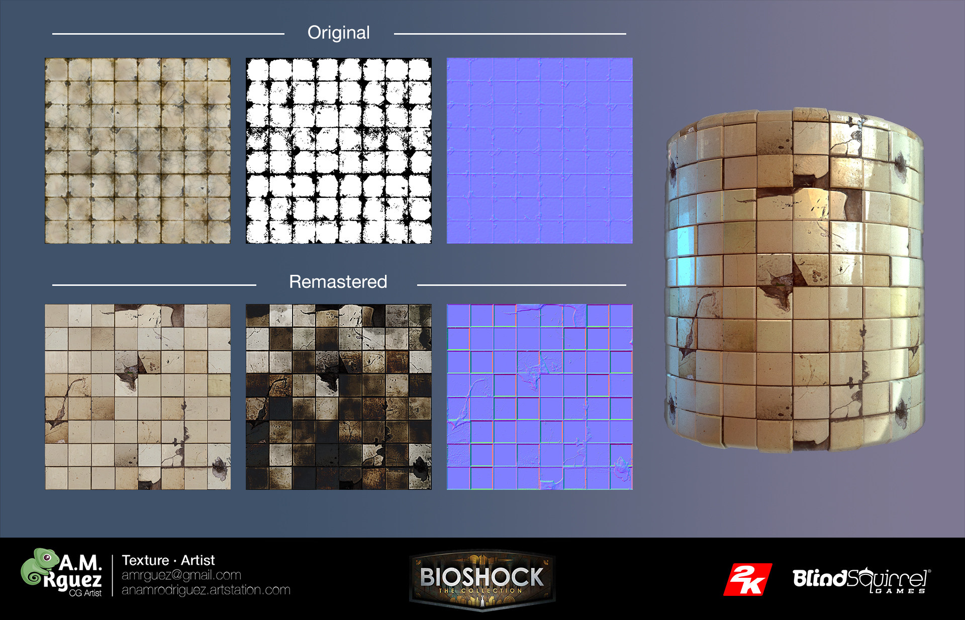
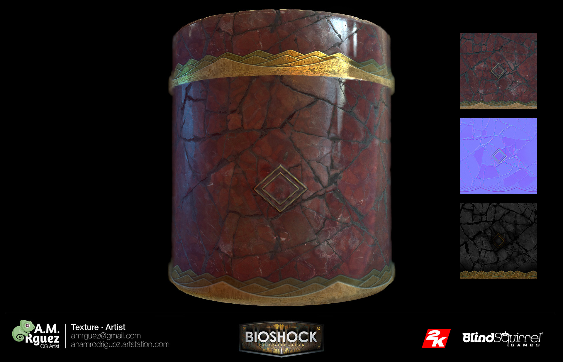
Adding damage to tiles
To obtain a texture rich in different tones, it is important to look at examples, to strive for the uniqueness of each individual tile, to study what makes them special and different from others (for example, what types of cracks occur during fracture), etc. Always try to match the example, but at the same time try to enrich the texture. When I talk about enrichment, I mean that it is not enough just to stamp or copy a photo. Here are some tips to get you started. Try to do something both plausible and interesting.
If the environment, which will become a part of the texture, should be stylized, you need to strive to create more interesting shades and details. Photographs of real-life textures with neutral lighting are perfect for this purpose. This means that they are very useful as a base texture or as a source of inspiration, but they are usually boring and monotonous. For this reason, working on textures is a constant introduction of artistic vision in order to go further and find shades that are not in the patterns and transfer them to textures. The following trick works for me: try to capture more details in the reflection map than there is in the diffuse map. For example, there may be a scratch on a tile that is not visible on a diffuse texture, but when light falls on a tile, the scratch becomes noticeable. This trick, creating light on a texture, will give much more saturation than if all the information is located on a diffuse map. In addition, in the case of a detailed diffuse map on a texture, there will most likely be too much noise, and you simply cannot appreciate the difference.
Aging effects
A very good technique for aging a texture is to use an image or several images of random dirt, which is completely irrelevant to the texture, and apply it with some layer blending mode (for example, soft light). For example, in the case of bathroom tiles, I chose an image of stains on the wall. She allows to make more yellow all texture of shades, without adding too much noise to the image. In addition, you can add another photo of the wall with stains or drips, make it a mask to cut off these rust stains and place them above the image, giving the feeling of water flowing down the wall. This is a good idea if you do not have the ability to use decals or mixing materials. Otherwise, the method will be completely different and you will need to avoid this type of detail on a basic tileable texture.
Reuse of materials
The key to creating reusable materials is the use of decals or mixing materials. When I talk about mixing materials, I mean a real-time shader that allows you to mix different materials (selected from a given library) using monochrome masks, vertex colors, height maps, etc.
The point is not to make the materials too unique. To create a good repeating texture in all directions, you should avoid adding horizontal or vertical parts that spoil the pattern (for example, vertical streaks). If you need to add stains, make sure that they are not too obvious and do not make the pattern too noticeable. If the cracks are exactly the same, try to make them more "organic."
The question with decals is that if it is permissible to use them, you need to strive to add all distinct variations to the decals or use other textures to blend. This will allow you to use the material as a base and create enough variations only with decals or mixed materials. During production, it will save you a lot of time, because you don’t have to create the same brick wall 3 times with minor changes.
For example, let the action level occurs in the swamp. Create a few spots of scuffed or stained spots or green moss on a pair of decals. Take a repeating brick wall and make a texture mixed with this moss, or take an alpha channel and use it as a decal. At the next level (for example, in the desert) you can use the same brick wall material. Simply replacing the decal of moss with the decal of sand, we will be able to create texture variations, saving a tremendous amount of time and, more importantly, reducing the amount of texture memory.
How to avoid artificial appearance
As I said before, in this particular case, the best choice would be the creation of a concrete wall and the location on it of these broken bricks with an alpha channel (or their diverse set). In this way, it is possible to avoid repetition and the feeling that the wall looks too artificial.
The board
For me, the most important thing when creating textures is to put your love and care in them, otherwise you will end up with a boring “standard” and flat texture. If while creating textures you use examples of photos, then, as I said earlier, you cannot just take a photo and copy it. When working with Zbrush, you risk focusing too much on creating an overly exaggerated normal map that negatively affects other channels, and as a result get ordinary and uninteresting material.
Today, due to PBR and all the possibilities that new software with pre-configured materials gives us, the same thing threatens us: mediocre, lifeless or repetitive materials. Therefore, rely on your vision, good taste and examples to make materials more attractive. Do not be conformists using random materials from the library, go on.


Materials must behave according to their properties. Yes, this is exactly what gives us PBR, but the artist is obliged to make them more interesting, rich in tones, shades and details. Pay attention to detail and discard the traditional and boring. Yes, it is possible that the mailbox you see is made of red paint on metal, but your duty is to notice the heterogeneity of the bubbles, add a few cracks to see the metal, or create rust along the edges due to the harsh weather.
Our duty is to breathe life into the object, into the wall, into the environment. And tell a story with them.
Source: https://habr.com/ru/post/319400/
All Articles