Layout online store: list of goods
Requirements for the layout of catalogs of online stores tend to be repeated from project to project. Therefore, I have developed a set of standard techniques that I want to share in this article.
Some techniques have already been discussed in various articles. However, I had a desire to combine them and illustrate them with separate demos. Hopefully, in this way, the designers will be useful for designers who often have to work on online stores.
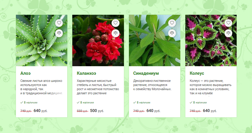
As an example, we will impose a list of products for the online store of indoor plants. The demo of the finished catalog can be viewed at the link . The result should be a list of plants with photos, descriptions and pop-up buttons. In addition, the list view can be switched: the goods will look either as a tile or as a table.
Adaptive Mesh
So let's start by creating adaptive tiles — future product cards. We will have 8 indoor plants:
<ul class="products clearfix"> <li class="product-wrapper"> <a href="" class="product"></a> </li> <li class="product-wrapper"> <a href="" class="product"></a> </li> <li class="product-wrapper"> <a href="" class="product"></a> </li> <li class="product-wrapper"> <a href="" class="product"></a> </li> <li class="product-wrapper"> <a href="" class="product"></a> </li> <li class="product-wrapper"> <a href="" class="product"></a> </li> <li class="product-wrapper"> <a href="" class="product"></a> </li> <li class="product-wrapper"> <a href="" class="product"></a> </li> </ul> The wrappers for the goods will be blocks that occupy 100% of the width of the parent on mobile devices.
.product-wrapper { display: block; width: 100%; float: left; transition: width .2s; } Now we use media queries to place two, three and four tiles in a row at high monitor resolutions.
@media only screen and (min-width: 450px) { .product-wrapper { width: 50%; } } @media only screen and (min-width: 768px) { .product-wrapper { width: 33.333%; } } @media only screen and (min-width: 1000px) { .product-wrapper { width: 25%; } } And we will set the styles of product cards.
.product { display: block; border: 1px solid #b5e9a7; border-radius: 3px; position: relative; background: #fff; margin: 0 20px 20px 0; text-decoration: none; color: #474747; z-index: 0; height: 300px; } Due to the fact that the cards have a margin-right equal to 20px , the entire list has an undesirable indent to the right.

Fix this with a negative margin-right value for the parent.
.products { list-style: none; margin: 0 -20px 0 0; padding: 0; } Now everything is all right. You can look at the resulting grid on the demo page. For clarity, the blocks in the demo are given a fixed height.
Product photos
The next interesting point is the layout of blocks with photographs of plants. The markup in this case will be as follows:
<div class="product-photo"> <img src="images/roses/1.jpg" alt=""> </div> Make the parent tag img square by using the padding-bottom property with a value of 100%. Here are all the styles for this block.
.product-photo { position: relative; padding-bottom: 100%; overflow: hidden; } In the specified block we will arrange the image so that at any size it does not go beyond the parent, and center it horizontally and vertically.
.product-photo img { position: absolute; top: 0; bottom: 0; left: 0; right: 0; max-width: 100%; max-height: 100%; margin: auto; transition: transform .4s ease-out; } It remains to slightly increase the photo when you hover.
.product:hover .product-photo img { transform: scale(1.05); } How it all works you can see the example of the demo .
Product description
 We need, first, to set the description of the goods in four lines, and second, to make the end of the last line slightly blurred.
The first problem can be solved by setting the height of a paragraph with a description equal to four line-heigth .
')
.product p { position: relative; margin: 0; font-size: 1em; line-height: 1.4em; height: 5.6em; overflow: hidden; } And the blur effect of the last letters of the fourth line will be achieved with the help of the pseudo-element :after with a linear gradient as the background.
.product p:after { content: ''; display: inline-block; position: absolute; bottom: 0; right: 0; width: 4.2em; height: 1.6em; background: linear-gradient(to left top, #fff, rgba(255, 255, 255, 0)); } Crossed out prices

To cross out the price with a line different in color from the text, set the block with the price to the color value equal to #ff3535 and text-decoration - line-through . At the same time set for nested items gray text.
.product-price-old b, .product-price-old small { color: #888; } Pop up buttons

As for the "Quick View" button, its implementation is relatively simple. The button is absolutely positioned relative to the block with the class .product-photo , hidden using opacity: 0 and slightly shifted downward due to transition: translateY(2em) . When you hover the cursor on the item card, the button styles change as follows.
.product:hover .product-preview { transform: translateY(0); opacity: 1; } The situation is somewhat more complicated with the “Add to cart” and “Buy in 1 click” buttons. Here, the outer container .product-buttons-wrap absolutely positioned in the .product block and is equal to the parent in width and height.
.product-buttons-wrap { position: absolute; top: 0; left: -1px; right: -1px; bottom: 0; visibility: hidden; opacity: 0; transform: scaleY(.8); transform-origin: top; transition: transform .2s ease-out; z-index: -1; backface-visibility: hidden; } Next, we stylize the .product-buttons-wrap:before pseudo .product-buttons-wrap:before element so that it displaces any block content down, below the lower boundary, of the parent block.
.product-buttons-wrap:before { content: ""; float: left; height: 100%; width: 100%; } Now you can add your own content - buttons, placed in the block .buttons .
.buttons { position: relative; top: -1px; padding: 20px; background: #fff; box-shadow: 0 0 20px rgba(0, 0, 0, .5); border: 1px solid #56bd4b; border-radius: 3px; } Thanks to the float: left rule for the pseudo .product-buttons-wrap:before element .product-buttons-wrap:before , the buttons are located below the main content, and the .buttons block covers the entire area of the card.
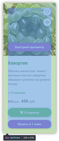
To better understand the buttons, you can watch this demo .
Switching the type of product cards
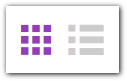
To switch between a tile and a tabular catalog view, we create two buttons.
<div class="layout-buttons"> <span class="active icon icon-list"></span> <span class="icon icon-table"></span> </div> By clicking on the buttons in the list of products, the class .table-layout is removed and added.
$productList.toggleClass('table-layout'); Thus, by writing styles for cards-child elements of the ul.table-layout block, we can “turn” the list into a table only with CSS, without reloading the page. To do this, set the width of cards equal to 100%. And the nested blocks will now occupy only part of the width of the card, for example:
.table-layout .product-main { width: 50%; float: left; background: #fff; } Further, absolutely positioned elements occupy their “natural” position. For example, this happens with buttons.
.table-layout .product-buttons-wrap { position: static; visibility: visible; opacity: 1; transform: scaleY(1); } This was the last moment to share with you. Happy Holidays and all the best.
Source: https://habr.com/ru/post/319280/
All Articles