Intuitive design against viral
The Snapchat interface confuses many users. There is a tendency not to be reproached to the older generation: people who have stepped over a certain age line, with great difficulty, understand the most basic functions of this application - replacing people, for example. I already lost count of how many people cried for me about Snapchat. “I don't understand anything,” they exclaim. "Why is everything so difficult?"
I am here to say: the incomprehensible Snapchat design is not a bug, but a feature. As in the case of Tinder, this is a design that aims to tighten the user and push him to share his experience with others. In fact, this is one of the key components of the great success of Snapchat .
Snapchat is one of the best examples of what I call “viral *” design. For those who grew up with the conviction that intuitive design is the highest ideal, such a new approach can get on your nerves. But if you understand how it works, everything falls into place.
* Translator's note
In the original, the author introduces a special designation for this type of design - “shareable”, the Russian equivalent of which is not easy to pick up. We considered such options as “joint”, “mutual learning”, “social”, “affordable”, “service design”. If someone from the readers comes up with a more accurate alternative translation, we will be glad to see your suggestions in the comments.
The intuitive design revolution
I do not want to say anything bad about intuitive design. On the contrary, when it first appeared in the 80s, it was a huge step forward compared to the previous generation of computer interfaces - complex, intuitive, and requiring lengthy training. Interfaces of that time were made with the expectation that the user would memorize a long list of commands and be able to recall any of them at the right moment. People were proud of how many commands and parameters they know by heart and can be used without looking at the manual (which is invoked by the man command).
')
GUI (graphical user interface) became a real breakthrough. Unlike specialists working on mainframe and minicomputer teams in special computer rooms, PC users were at home or in the office at work and tried to understand the computer and programs on their own. They did not have time to read manuals or go to class to learn how to use new software. They simply sat at the table, started the program (for example, to create spreadsheets) and, if they were lucky, mastered it. The products that companies created for this market had to be intuitive enough to be able to handle them on their own.
Microsoft, for example, spent a lot of time inventing ways to make program design more intuitive. One can argue about how successful the solutions were in terms of aesthetics, but Excel-type programs became successful because they gave the user a lot of opportunities to discover functions by simply pressing different buttons. That is why there were panels, menus and the like. They looked awful, but they worked well because of their (relative) intuition. Well, if it turned out to be too difficult, people could later buy books with step-by-step instructions. I worked as a summer intern at a company called Catapult Press, “testing” step-by-step guides from Microsoft , and eventually learned everything they said in the most tedious way - checking the text for errors.
During this period, Apple spent a lot of time trying to make its OS as intuitive as possible. In 1987, they published the book Human Interface Guidelines, which remained influential throughout the Macintosh era and even in the early stages of the Internet era.
All this work was done based on research conducted by outstanding software designers and other products in the 80s and 90s. “ The design of the usual things ” by Don Norman had a great influence on software designers, although the main theme of this work is industrial design (that is, the design of material objects). The Brands Laurel book The Art of Human-Computer Interface Design , published in 1990, is still on my bookshelf. These texts were truly revolutionary, their influence remains to this day.
With mobile devices, everything becomes material and social.
Everything changed in 2008, when the central place in the world of technology was transferred to mobile phones. Suddenly it turned out that designers should no longer focus on people who are sitting at a computer desk and working on their own. Now they create applications for users who open them from the mobile on the go, often surrounded by other people - friends, relatives, classmates and colleagues.
This shift marked the beginning of two complementary trends in interface design. The first is the transition to physical gestures. We interact with the smartphone with the touch of our fingers, and not through the mouse or keyboard, and this makes the whole process more “human” in sensations. Even children understand this: just watch the video where the baby clicks on the pages of the magazine and stretches them , trying to make it work on the same principle as the iPad. Scrolling, squeezing, stretching, clicking - all these manipulations of different types simulate the natural gestures of a person. A couple of years ago, I wrote in a blog about how the “ generation of touch ” is building relationships with products in a new way because of the habit of interacting with them directly.
The second change - and many designers still do not catch it - is that in reality people learn to perform certain actions while watching others. This is how eighteen-year-olds learn to work with an unfamiliar application — they watch what their friends are doing. After all, it is at hand, on the phone; A friend simply pulls out the device and shows them one or another action.
In fact, this is a return to the traditional learning model that the whole world has always used. Watching others you learned to throw a ball, take a mug, tie shoelaces and tear off doors. And when they grew up, someone probably showed you how to ride a bike and drive a car. If the software (applications) is now enhanced by the physical component, so why not master their functions by looking at other people?
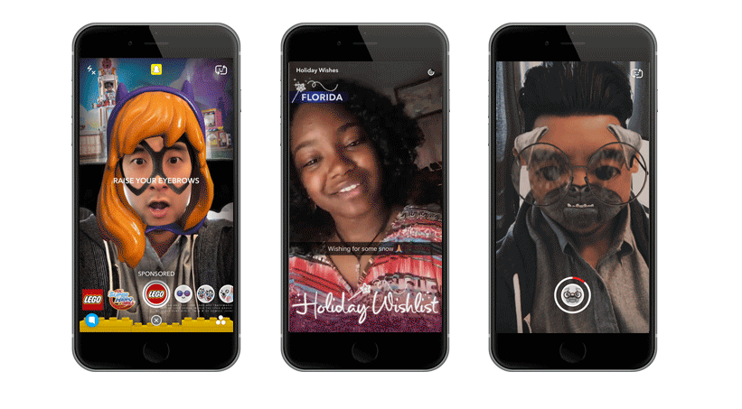
Want to understand how to use Snapchat? Paraphrasing Gaucho Marx's dictum, it is very simple - find a teenager, he will show you . A person who uses the application a lot can teach you everything: how to take photos, draw on them, apply filters, open secret handles (for example, black and white), change faces, add friends using a QR code and so on.
Viral design comes onto the scene
“Viral” design is based on an understanding of how the learning process is social in nature, and using the will of people to learn and teach.
Snapchat brilliantly copes with this task: in each of its seemingly sophisticated functions, there is an opportunity for the user to teach his friends about the cool thing. By showing your classroom something cool, you can strengthen your social position, and indeed it is pleasant. Whatever the reason, you want to do it! For Snapchat, this is extremely profitable: you begin to promote the product without even realizing it - because you are simply showing your friends something interesting.
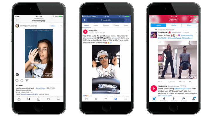
Sharing experience is possible not only in person. The Musical.ly app has entered the first round of popularity as a cool tool for creating fun videos with music. When people shared their work on Facebook and Instagram, under the posts you could often see comments from friends asking how they did it. So they had the opportunity to respond: "Oh, this is Musical.ly." Transferring from user to user, as well as the efforts of agents of influence, the application began to gain momentum quickly.
In addition to the incentive to share with others, this type of design provides two more benefits. First, it makes features especially memorable. If someone shows you on the iPhone how long to click on the name of the person to call the menu to add it to the contacts, this information will be remembered. It involves both physical and social memory, and therefore does not fly out of my head.
Another advantage of "viral" interfaces is that the functions do not clutter the screen. The screen of a mobile phone is rather small, respectively, the space that you can devote to the buttons and icons is small. Naturally, panels littered with buttons, like those of programs from Windows of the 90s, are no good here. But the “invisible” functions, which can be activated by long pressing, or by “strong” 3D pressing, or by navigating from the top to the bottom of the screen, do not occupy space at all.
We do not yet have good books about “viral” design, although some designers, for example, Luke Wroblewski , have written many sensible articles about the design of mobile interfaces in which this concept is affected. And, of course, there are a large number of applications and operating systems whose creators clearly share this philosophy. These include Snapchat, Prisma, the latest versions of iOS, and to some extent even Twitter.
I would be glad if more people were doing research and writing texts about viral design. This area of knowledge is very important and will become even more important as we dive deeper into the world of wearable gadgets, augmented reality and new types of mobile devices. If you have interesting examples, please tell us about them!
Source: https://habr.com/ru/post/319160/
All Articles