Analysis of the report of Baruch Sadogursky with JPoint 2015
Another analysis has matured, this time we look at the report of Baruch jbaruch Sadogursky “How to write asynchronous multithreaded http applications” from JPoint 2015:
Slides here .
About Java, only a parsed report, not the article itself.
The story of Baruch is dedicated to how the company JFrog made a rocker file in Java, and this is the technical, and not the organizational side of the process. Probably, on the way, the developers learned something unexpected and want to share it.
')
This is a very appreciative topic, and there are several reasons for this:
Suppose that I face a similar task, and I was about to solve it by naive methods, but suddenly I attended a conference. What should change for me after I listened to the report?
I look forward to seeing a set of practical tips gained in this project. What the developers at the beginning did not know, but at the cost of their sweat, blood and tears. I always advise you to repeat the most significant (those that cost the most) of these findings at the end of the report. In this case, they are not so grouped, but let's look for them in other places.
The very mention and comparison of the properties of the two libraries - NING and Apache HTTP components asyncclient) - can save people the time to learn (slides 34-49, excerpt from 14:30 to 21:30 ).
Further in the story several problem situations are listed, and not from each there is a clear conclusion.
The story with the length of the file ( fragment from 23:10 to 24:56 ) is potentially interesting. We now know that according to the http / 2 standard, even for a compressed file, you must specify the original length. We know that in order to implement file chunking, this is a problem. What we do not know is how this problem was solved at JFrog, but it would be logical to tell.
In contrast: the story with a redirect to CDN ( fragment from 24:57 to 26:26 ) and the start of downloading from scratch is fully covered, right up to the solution. It is always useful to remind you that when a redirect, heders are lost, if you don’t do anything with purpose. I would have told all the other pieces in the same spirit if my will.
Talking about the number of connections in http / 1.1 and http / 2 puzzled: what are the practical conclusions from this knowledge in general and in the context of our task? The http1.1 protocol asks not to open more than two, all browsers violate and open this recommendation, if I also break and open, what threatens me?
Further, there is still a rake, on which, obviously, the developers have walked, I will not dwell on each item in detail, but I will note that the problem situations are set out differently. It is not always clear what will happen if you do “as soon as it comes to your head,” and it is not always clear how the problem was solved, and whether it was decided at all, in the project that Baruch is talking about. I think this is an omission: rakes and ways to avoid them are the main thing that viewers should carry home from such a report.
In general, there is a benefit in the story, but it could be given even more clearly.
I note that here in many places you can apply the detective order of presentation, and the story would be better remembered. I will give only one example, so as not to inflate the post. As a naive viewer, I assume that at some point the code was written in the spirit of slide 67:
And on simple tests it, apparently, even worked for some time, and then broke. If it is somehow beautifully broken, you can tell about it, go from the symptoms to the investigation and only then to the “I have a question” type of slide. The fact is that “they fixed the problem, launched it, fell elsewhere” - a natural process for the developer, viewers will not have to spend energy to understand how the new question is related to the previous ones. And it is also useful to at least slightly make them think about why everything broke before giving a solution: it’s better remembered.
I want to draw attention to the fact that different classes of slides in the presentation are designed differently. It’s ideally nice when “official” statements differ from the rest of the text. This can be seen on slides 8, 13, 16, 18, etc .:
When a slide with such a background (at first empty) appears for the third or fourth time, we already understand that there will now be some next round of plot development, this greatly simplifies perception and saves the power to think about the content. A strongly different font is quite appropriate and serves the same purpose, especially since it is easy to read.
Lyrical digression, not related to the speech being analyzed: different design of the text depending on the role of the slide (requirements here, results here, problems here, etc.) can be especially recommended if all slides consist only of text. My experience in preparing speakers says that viewers get tired of seemingly identical slides, and often such reports get low marks even with objectively interesting content. It may be a little easier if you give people at least a surrogate for diversity.
Unfortunately, the font did not join in the laid out .pdf, therefore there these selected slides look worse. I often see overlays associated with the loss of a custom font. The unpleasant thing that often happens is that the letters cease to fit in the allotted place, and the whole beautifully formatted slide goes. Therefore, I will spend a couple more paragraphs of the text on the seemingly captain's recommendations.
I believe that the slides should have as few elements as possible. Useful exercise: look at each slide and think that you can throw it away without losing meaning. Even not so: at first to look, whether it is impossible to throw out the entire slide entirely, and if it is still impossible, then further minimize it. So, the fields around the picture are also an element of the slide, moreover, almost always superfluous. If you have essentially only a picture on the slide (the title or one short phrase does not change the essence ), there is no reason why it should not occupy the entire screen.
It happens that I want to stylize the slides (under the newspaper, under the family album, and you never know), and this may include some kind of framework, but then all the images should be decorated the same way. Pictures of different sizes, placed in different places of the slides, at different distances from the edge, look sloppy. A borderless slide almost always seems neater, compare (on the left is the original, on the right is my suggestion for improvement):
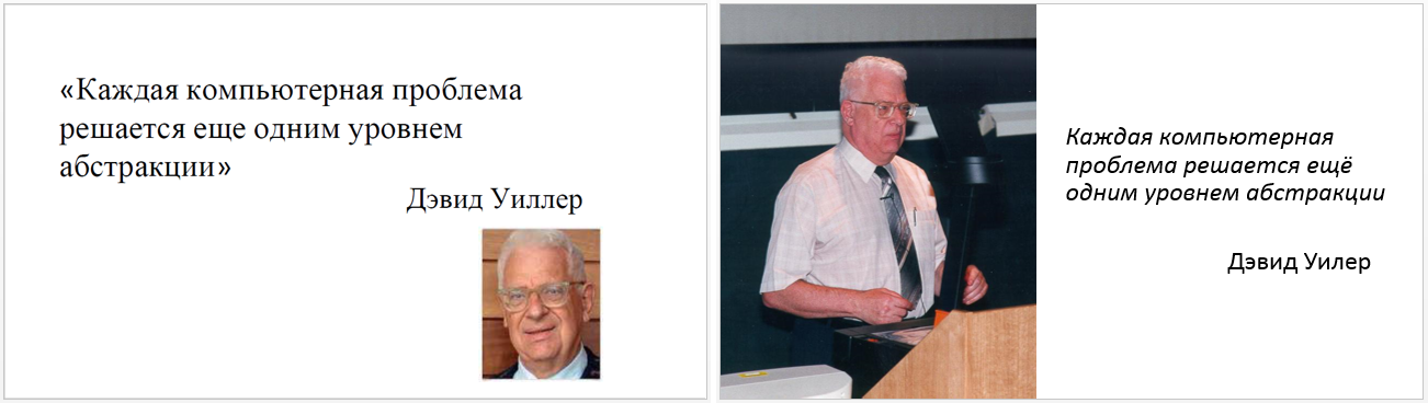
The picture in full screen will have to search in high resolution, the first one will not fit, but the real difficulty here is only a photo of Wheeler. In the same report, the report is very much visible in many pictures, even small ones. This reinforces the feeling of carelessness.
An evangelist for whom the speeches are bread may be worth knocking out a paid stock subscription from the employer. Many warn, and in the case, that one cannot take stock photos on the themes “office”, “cooperation”, “angry user in front of computer”, “call center employee” and the like, since they are the same and are already tired of everything. But there are many more untamed nuclear power plants and bears with raised paws, and when the bears run out, the pandas will remain. A person who does not act professionally, is unlikely to want to spend one hundred or two hundred dollars on the design of one presentation, which means you will have to google more.
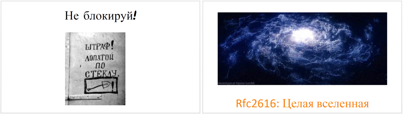
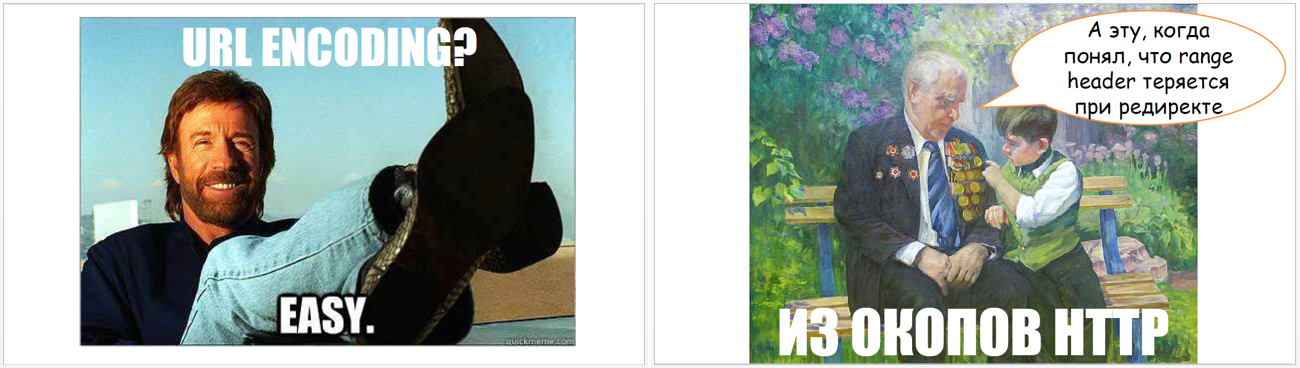
There is another aspect that adds to the feeling that the preparation was in a hurry. Well, when the design of the slides in the entire presentation has some kind of a common theme, a common idea. The narrower the concept, the more difficult it is to link it with the story: you will not express everything so easily, say, by characters from Star Wars. But it is possible to expand the concept, for example, to take not only Star Wars, but a wider set of cult science fiction films, these restrictions are easier to meet. But this, in any case, requires considerable thinking time. However, the images in the speech of Baruch came to us from very different worlds:
If you look closely, then even in the above examples, you can also notice that it is often not the meaning of what is being said that is illustrated, but only some particular word that occurs in speech. Bright, funny pictures people, of course, remember well, but this is not exactly what we need. We need them to remember the meaning.
Actually, I'm against screenshots on slides. Someday someone will substitute and offer a report with bad screenshots for analysis, then I will explain everything in detail. But here they are used to the place and decorated well, for example:
If you really want to add screenshots, then take an example from Baruch on three points:
If you want to get feedback on your performance, I’ll be happy to give it to you.
Slides here .
About Java, only a parsed report, not the article itself.
Plot
Theme
The story of Baruch is dedicated to how the company JFrog made a rocker file in Java, and this is the technical, and not the organizational side of the process. Probably, on the way, the developers learned something unexpected and want to share it.
')
This is a very appreciative topic, and there are several reasons for this:
- You can adhere to the chronology: where the task came from, how they chose the approach, what they tried, what they did, what mistakes they made. If the story is not a retrospective of the project, you often break your head, trying to arrange its components in the correct order.
- Similarly, there is a practical use, if it is not specifically hidden.
- It is easy to find reasons for self-irony, because, of course, even trivial things did not all work out on the first try.
Conclusions and benefits
Suppose that I face a similar task, and I was about to solve it by naive methods, but suddenly I attended a conference. What should change for me after I listened to the report?
I look forward to seeing a set of practical tips gained in this project. What the developers at the beginning did not know, but at the cost of their sweat, blood and tears. I always advise you to repeat the most significant (those that cost the most) of these findings at the end of the report. In this case, they are not so grouped, but let's look for them in other places.
The very mention and comparison of the properties of the two libraries - NING and Apache HTTP components asyncclient) - can save people the time to learn (slides 34-49, excerpt from 14:30 to 21:30 ).
Further in the story several problem situations are listed, and not from each there is a clear conclusion.
The story with the length of the file ( fragment from 23:10 to 24:56 ) is potentially interesting. We now know that according to the http / 2 standard, even for a compressed file, you must specify the original length. We know that in order to implement file chunking, this is a problem. What we do not know is how this problem was solved at JFrog, but it would be logical to tell.
In contrast: the story with a redirect to CDN ( fragment from 24:57 to 26:26 ) and the start of downloading from scratch is fully covered, right up to the solution. It is always useful to remind you that when a redirect, heders are lost, if you don’t do anything with purpose. I would have told all the other pieces in the same spirit if my will.
Talking about the number of connections in http / 1.1 and http / 2 puzzled: what are the practical conclusions from this knowledge in general and in the context of our task? The http1.1 protocol asks not to open more than two, all browsers violate and open this recommendation, if I also break and open, what threatens me?
Further, there is still a rake, on which, obviously, the developers have walked, I will not dwell on each item in detail, but I will note that the problem situations are set out differently. It is not always clear what will happen if you do “as soon as it comes to your head,” and it is not always clear how the problem was solved, and whether it was decided at all, in the project that Baruch is talking about. I think this is an omission: rakes and ways to avoid them are the main thing that viewers should carry home from such a report.
In general, there is a benefit in the story, but it could be given even more clearly.
The order of presentation
I note that here in many places you can apply the detective order of presentation, and the story would be better remembered. I will give only one example, so as not to inflate the post. As a naive viewer, I assume that at some point the code was written in the spirit of slide 67:
And on simple tests it, apparently, even worked for some time, and then broke. If it is somehow beautifully broken, you can tell about it, go from the symptoms to the investigation and only then to the “I have a question” type of slide. The fact is that “they fixed the problem, launched it, fell elsewhere” - a natural process for the developer, viewers will not have to spend energy to understand how the new question is related to the previous ones. And it is also useful to at least slightly make them think about why everything broke before giving a solution: it’s better remembered.
Slides
Text slides
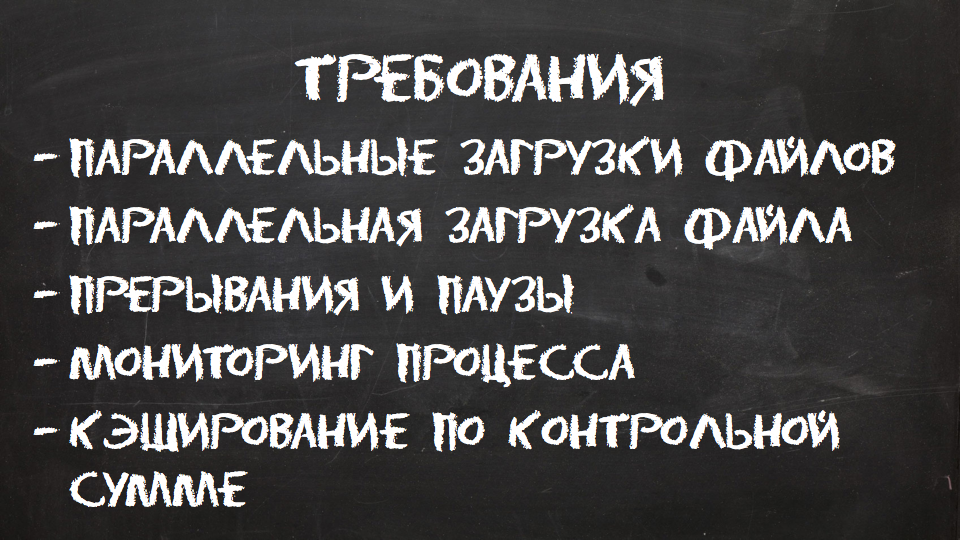
I want to draw attention to the fact that different classes of slides in the presentation are designed differently. It’s ideally nice when “official” statements differ from the rest of the text. This can be seen on slides 8, 13, 16, 18, etc .:
When a slide with such a background (at first empty) appears for the third or fourth time, we already understand that there will now be some next round of plot development, this greatly simplifies perception and saves the power to think about the content. A strongly different font is quite appropriate and serves the same purpose, especially since it is easy to read.
Lyrical digression, not related to the speech being analyzed: different design of the text depending on the role of the slide (requirements here, results here, problems here, etc.) can be especially recommended if all slides consist only of text. My experience in preparing speakers says that viewers get tired of seemingly identical slides, and often such reports get low marks even with objectively interesting content. It may be a little easier if you give people at least a surrogate for diversity.
Fonts
Unfortunately, the font did not join in the laid out .pdf, therefore there these selected slides look worse. I often see overlays associated with the loss of a custom font. The unpleasant thing that often happens is that the letters cease to fit in the allotted place, and the whole beautifully formatted slide goes. Therefore, I will spend a couple more paragraphs of the text on the seemingly captain's recommendations.
- If you use a non-standard font, then you should either speak from your computer, or distribute the presentation along with the fonts, or make a .pdf. In this case, it did not help, the conclusion: created by .pdf before distribution is useful to check.
- If you prepare slides on a corporate computer, then the fonts from the corporate brand book may be preinstalled and included by default, and you may not know at all that they are somehow non-standard. And then everything will break due to the fact that they are not in another place.
Pictures
I believe that the slides should have as few elements as possible. Useful exercise: look at each slide and think that you can throw it away without losing meaning. Even not so: at first to look, whether it is impossible to throw out the entire slide entirely, and if it is still impossible, then further minimize it. So, the fields around the picture are also an element of the slide, moreover, almost always superfluous. If you have essentially only a picture on the slide (the title or one short phrase does not change the essence ), there is no reason why it should not occupy the entire screen.
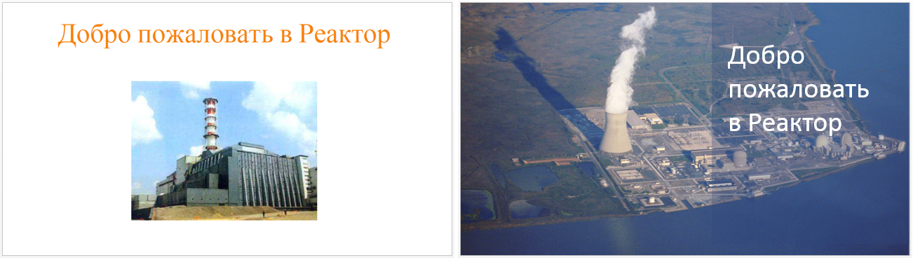
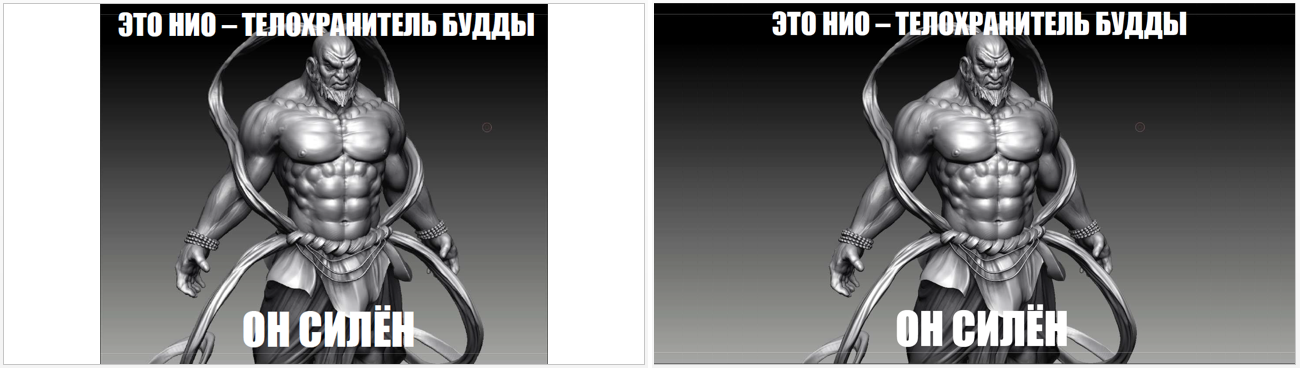
It happens that I want to stylize the slides (under the newspaper, under the family album, and you never know), and this may include some kind of framework, but then all the images should be decorated the same way. Pictures of different sizes, placed in different places of the slides, at different distances from the edge, look sloppy. A borderless slide almost always seems neater, compare (on the left is the original, on the right is my suggestion for improvement):
The picture in full screen will have to search in high resolution, the first one will not fit, but the real difficulty here is only a photo of Wheeler. In the same report, the report is very much visible in many pictures, even small ones. This reinforces the feeling of carelessness.
An evangelist for whom the speeches are bread may be worth knocking out a paid stock subscription from the employer. Many warn, and in the case, that one cannot take stock photos on the themes “office”, “cooperation”, “angry user in front of computer”, “call center employee” and the like, since they are the same and are already tired of everything. But there are many more untamed nuclear power plants and bears with raised paws, and when the bears run out, the pandas will remain. A person who does not act professionally, is unlikely to want to spend one hundred or two hundred dollars on the design of one presentation, which means you will have to google more.
There is another aspect that adds to the feeling that the preparation was in a hurry. Well, when the design of the slides in the entire presentation has some kind of a common theme, a common idea. The narrower the concept, the more difficult it is to link it with the story: you will not express everything so easily, say, by characters from Star Wars. But it is possible to expand the concept, for example, to take not only Star Wars, but a wider set of cult science fiction films, these restrictions are easier to meet. But this, in any case, requires considerable thinking time. However, the images in the speech of Baruch came to us from very different worlds:
If you look closely, then even in the above examples, you can also notice that it is often not the meaning of what is being said that is illustrated, but only some particular word that occurs in speech. Bright, funny pictures people, of course, remember well, but this is not exactly what we need. We need them to remember the meaning.
Screenshots
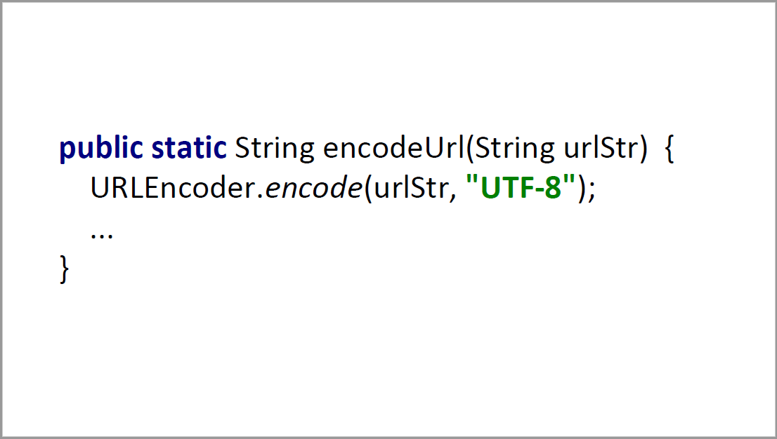
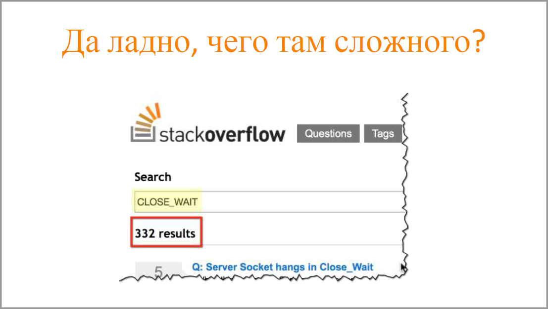
Actually, I'm against screenshots on slides. Someday someone will substitute and offer a report with bad screenshots for analysis, then I will explain everything in detail. But here they are used to the place and decorated well, for example:
If you really want to add screenshots, then take an example from Baruch on three points:
- Take screenshots of only known pages: search engines, stackoverflow, github, etc. Anyway, no one will understand your internal corporate cluster monitoring application, and it is ugly.
- Before you take a screenshot, zoom in on the browser and show only an important part of the screen. This is more correct than stretching the screenshot itself, because at least the text in the browser does not deteriorate.
- What you need to look at, circle around.
Regular Parsing
If you want to get feedback on your performance, I’ll be happy to give it to you.
What is needed for this?
All this needs to be sent to the habrauzer p0b0rchy , that is, to me. I promise that the review will be constructive and polite, as well as highlight the positive aspects, and not just what needs to be improved.
- Link to the video recording of the speech.
- Link to slides.
- Application from the author. Without the consent of the speaker himself, we will not analyze anything.
All this needs to be sent to the habrauzer p0b0rchy , that is, to me. I promise that the review will be constructive and polite, as well as highlight the positive aspects, and not just what needs to be improved.
Source: https://habr.com/ru/post/319074/
All Articles