"Pixel gallop - part four" - Animation of light and shadow
“Gallop pixel” - part 1 ( link )
“Gallop pixel” - part 2 ( link )
“Gallop pixel” - part 3 ( link )
“Gallop pixel” - part 4 ( link )
Good day to Habra and connoisseurs of pixel art, fans of square dots, adherents of limited permissions and colors. I am glad to present to your court another article from the “Gallop Pixel” cycle. I will not waste time justifying my long absence and, in view of the apparent presence, I will get to the bottom of this matter. Today we will continue to study animation. This time it will be an animation of light and shadow. Mostly on static objects. All remember - first base. First, the foundation. Simple at first. Well, difficult to fall into your door itself, after the kids.
')
In this article, we will look at the animation of light by planes, when we animate light with large fills and only then begin to detail it. Animation of light along the contour of the object, and the behavior of light on different surfaces, otherwise on objects with different materials. Three chapters. Three bullets. Hope in the goal.
The purpose of this article is to show how strong is the brother and sister duet, Light and Shadow in motion. We have already seen how they transform scenes in static. But the dynamics are not yet familiar to us. Let's correct this omission.
Spade in hand.

Where to begin? Of course with the silhouette. Determine the shape of the object and make it as expressive as possible so that the silhouette itself, even without light and shadow, is self-sufficient, declares itself as a full participant in any scene. In fact, the way it is. Silhouette decisions appeared quite a long time ago. Around the time when the distant ancestors of our fathers and grandfathers did not even think that Mother Earth and the descendants living on it would bring the long-suffering planet to the universal dimensions of the mess.
After the way that we have already passed, I consider you quite prepared to go straight into battle, without wasting time on theory and sly wisdom. Today we will not be stuck in the wilds of formulations, and we will not even turn to the help of the network. We have the knowledge gained in the previous parts of the "gallop", and I think that they will be enough to immediately reach the line and begin to consolidate there, because the battle will be hot.
However, before rushing into the trenches, I would like to give you a weapon and remind you how to use it. You remember that you have a silhouette, global illumination (at the start in the form of a background color), spot lighting (a local light source), reflected illumination (imitation of reflected light on the stage).
All this - your trunks. Your arsenal. Frozen poses are a matter of past articles, now you can still shoot. If you imagine the shots as cartridges, then the animation will be completely in line. Our animations today will be very different, and at six, and at eight, and God knows how many frames in the cage.
Let the light beats
- Let him become a source of courage, courage, a spring of vivifying optimism
who will never stop beating ...
- Better to say flowing.
- But the spring, he hits ...
Heinrich Ramkopf and Jacobin Munchhausen "That Munchhausen"
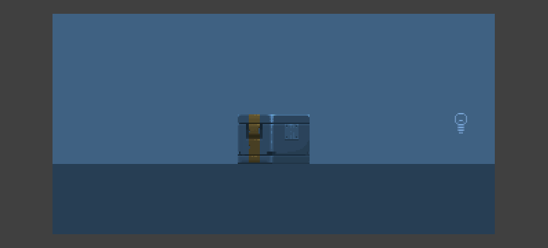
In order to avoid mistakes and misunderstandings, we start with fairly simple forms, making the scenes so that the main array of objects would be static. And let the first object on which we play the party of the world - will be a cube. But let this cube not be dull. Let this lesson not be filled with spheres and spheres, with bullet and the information that immediately plunges the reader into a dream. Let everything be as always. Fun and simple.
Everything can be simple. But sooner or later it becomes more difficult. Anyway. It seems to me that pixel art, like life, is in the habit of becoming more complex as you follow the path. There are many analogies here.
I like the one where you have a new car, and the first thousand kilometers you are moving at a good pace. But then the wheel may break, or something in the car. You will need money for gasoline. You will need funds for food, water and other necessities. Over time, your adventure can turn into a rather tangled tangle of threads, which will be difficult to understand, but first of all, the first step is important - get up from the sofa. Turn the ignition key. And it is easy. Sometimes it is worth doing. Despite the consequences. However, look back at first if there are any people around, let the consequences affect only you and your car.
Following the concept of simplicity, we will call for a cube. And it will be the starting point in our journey. So we will begin to study lighting and lighting animation. Suppose also that a light source is passing by. Will start moving to the right and will move to the left. And let's just figure out where he will be. At least approximately. To understand which of the faces of the cube will be highlighted. At what point in time, and with what intensity.
Let's take a couple of shots to do nothing, and a couple more on the “play of light”. Light will fall on the cube on the right and then on the left. Not every frame should tell the viewer the animation. But each frame, even without animation, should communicate information to the viewer. To simulate the illumination from a light source, we take rectangles identical to the planes that we would like to light. We take the color from the background as the brightest light on the stage. And set transparency to it. 47% of this layer on the left and right. Well, the delay in frames set 0.5 seconds.
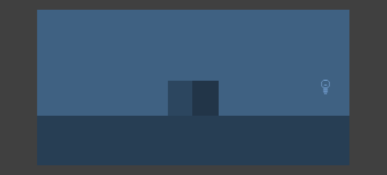
Does not pull on a masterpiece. I understand and accept. But everything starts from something. See the light bulb? She will show us where the light is coming from. Here we have four frames. Let's try to increase the number of frames? We introduce a little more smoothness in our animation. Let them be six.
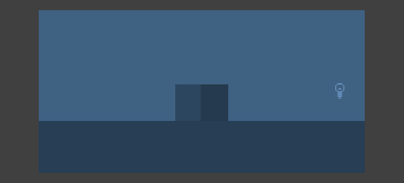
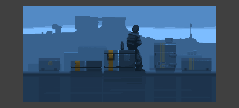
It seems to be better. Smoother more. But we remember that the whole play of light is achieved only by the background color, superimposed on top with different levels of transparency. Let's try to add to the stage, instead of our simple little cube, a good and high-quality futuristic container. I think that we are able to draw such a container after the cycle of articles we have already read.

Now we put our bottom drawn container under these layers of light.
As we can see, the illusion of illumination on the object has disappeared. Although, to tell the truth, it was not there. For now. Ask yourself a question. Why is this happening? Why does the light look like cotton, like a normal color from the top, not a bit like real lighting?
And we will answer ourselves - because on such a detailed object there must be another light. Taking into account the relief of the object, and taking into account the colors that are on it. And let's agree on one more. Light and Color are very similar words. But they are not the same.
To imitate the work of light on an object, we can manually make the colors lighter (this is the classic way where we draw the light ourselves), but we can also automate our work by putting on top those masks that we already used before. For our wool. Only by replacing that color with white with Overlay blending mode.
Much better. However, in this case, the light falls by plane on the whole object, without taking into account the shallow relief of the object. Just a few streaks of light on the longitudinal grooves will give a slight illusion of the volume of this object. Well, since we have become generous to several lines (and really lines, and not God knows what, like a good pixel art), then, perhaps, add to this box a few more containers and some character.
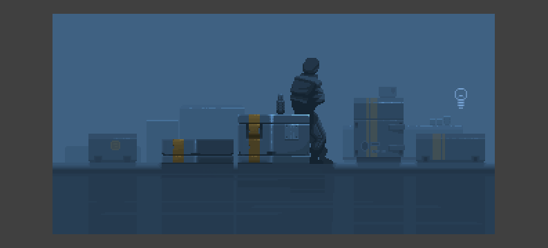
We cheated. They forced the silhouette works and set the overall composition on the stage. And now let's briefly digress from this scene, so that our eyes can rest and think about how we can animate the light, assuming that our object is not just a box, but something more embossed. Something voluminous. We need a complex object.
I promise you, we will definitely return to our boyfriend. True, with a new weapon. And be sure to finish it. We only remember that now we are "beaten with planes", i.e. made the animation, designed for lighting planes.
Let the light flow
- But the spring, he hits.
- Sometimes it hits, and sometimes it flows. In this case, it is better that it flowed.
Heinrich Ramkopf and Jacobin Munchhausen "That Munchhausen"
As always, we will outline future achievements in the form of a verbal algorithm, but unlike sofa theorists and experts in terminology, we will bring it to a logical end. In our case, it will not be arson of the sofa, for a sofa is not furniture, but a state of mind. We assume our logical end in the form of an animated miniature. In order not to complicate your life, we determine that the future miniature will include six frames and eight colors. Because the need is the engine of good pixel art. Only by being hungry, having crumbs of flowers, can we know hunger and can we be sincere. We can do small things.
Some people like to distort this statement. Say, more colors - more features. Lies. More colors - more ways to get confused. More colors - more opportunities to make a mistake. And so, by the way - more words means more such heretical texts filled with lewd wisdom instead of pixel art. More does not mean better, and this situation is true in many cases, from artistic and aesthetic to everyday-practical. Of course, after the knowledge of poverty and hunger, spurring our imagination, it would be nice to get rich, and then to spit and have fun, but only after.
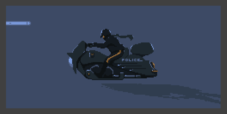
So. Let's start with a sketch. Or rather with a silhouette. We have done all this dozens of times and therefore today we will not spend more than a dozen minutes on this. Let it be a racer. On a motorcycle. And let it be the future. Just because reluctance to paint the wheels, and then animate them. Yes, one more "and." And let the light stream through our animation. Wraps the object around the edges, like that very stream.

The silhouette speaks for itself. At least you can understand that we are talking about a horseman. On something. Without wheels. According to our lazy introductory. Let's still denote the rider more clearly. And add silhouette readability. We will start not with light, but with a shadow, leaving the light at the most sweet.
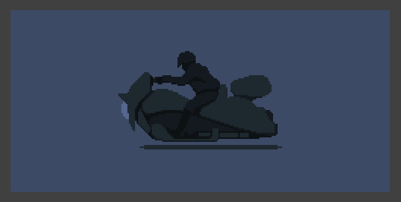
It seemed to me that the boots would fit him. But we will not stop there. There is a base here, and we need additional relief. It is here that our light will play in the future.
Boots ... when I painted the boots I thought that the character reminds me of the hero Robert Patrick. Terminator T-100 in police uniform. To complement this image is to add a number of details. Like the yellow strip on the pants, and the words “Police” on board our futuristic motorcycle. The inscription helps to identify the object, in the event that the artist's hands grow from places not intended for this. By a surprising coincidence, the inscriptions help to make any technogenic design more conscious, informing the viewer with technical information about the object, making it reliable.
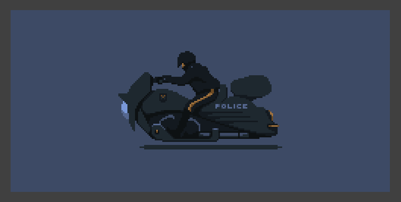
Already better. Some light. Some kind of shadow. But everything is static. Is dead. Still. How can we not strongly straining to designate a kind of movement on the stage? Let's do it in the spirit of an old movie. Where the characters are sitting in the car, and people running around with Christmas trees. In our case, the trees will be lights that will move behind the "rider". Well, since we have a movement here, let's draw a couple of pixels to the shadow so that it is ridiculously twitching.

We finally got to work. Everything else was a warm-up. The usual and routine business minus the creation of design for technology. Now begins what a number of readers call the "magic of ten minutes." This phenomenon usually occurs after several hours of work (not in this case, of course) when the viewer yawns on the stream and suddenly, towards the end, the image comes to life, and in the last ten minutes it is filled with interesting trifles and details. Phenomenon, fortunately not. This is called in other words. Work and natural result is directly proportional to the amount of labor invested. If you spent a few hours on the couch or fingered your nose, there will be no “magic of ten minutes”. The result is perhaps the magic of ten extra kilos, equally proportional to the number of hours and days spent in blissful inaction.
Light falls on our officer from behind. Therefore, he will only touch it on the edge, as if we were looking at the blade of a knife, being in a dark room, and the source of light in it would be an open door. The edge of the knife facing us would not reflect the light. But on the edge of the pointed blade there would be a noticeable play of light. In one or two millimeters. In our case, the light will be distributed over the object by a line of one pixel. Obviously, the greatest concentration of light will be in close proximity to the source of illumination. In order to understand this, you do not need to be a doctor of science, or study in a technical college. And in "slow motion" you can see how this light falls on the object.

Looking at an object at normal playback speed, we see that it is more or less similar to the work of light in reality. As much as the terms of reality in general can be applied to pixel art, when the working canvas occupies only 250x120 pixels.
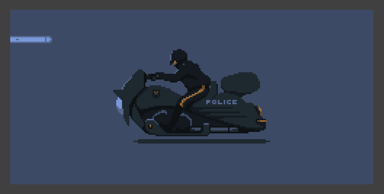
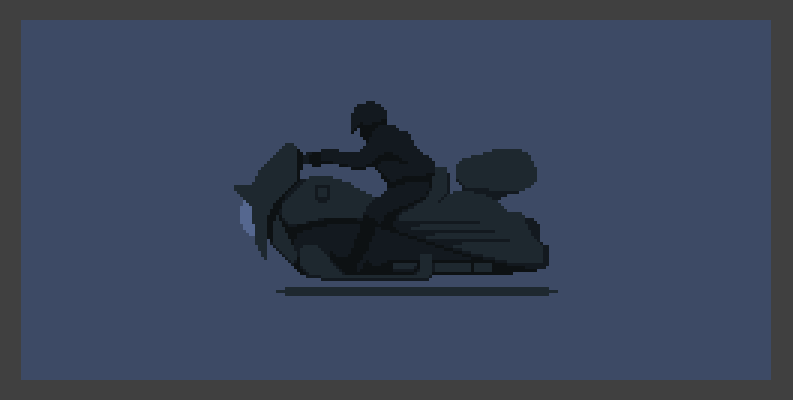
Now it is worth making the light much more voluminous than before. Remember that before that? Light animation on the edge. The tank is volumetric, and the light should be distributed differently. Yes, and another relief should also play as follows:
Now you need to mark the glare. Just one color. We have few of them. Designate so that they emphasize the play of light on the embossed parts of objects. Tubes, convex grooves are a little clear destination at the stern, and edges of objects.

Let's make in-depth examples of how the light works on bumps. If you look closely - everything is very simple. All information about the light is transmitted in only two colors. All information is transmitted at the expense of a small number of pixels. It is not so difficult.
Summarize the first two chapters. Although ... what nonsense? We can and should make this scene better. It lacks life. No speakers. I think that a waving scarf and an updated helmet will suit us much more than the transition to the results of the first two chapters. Let the light on the helmet play bright and proud, because after all it is closest to the source of light.

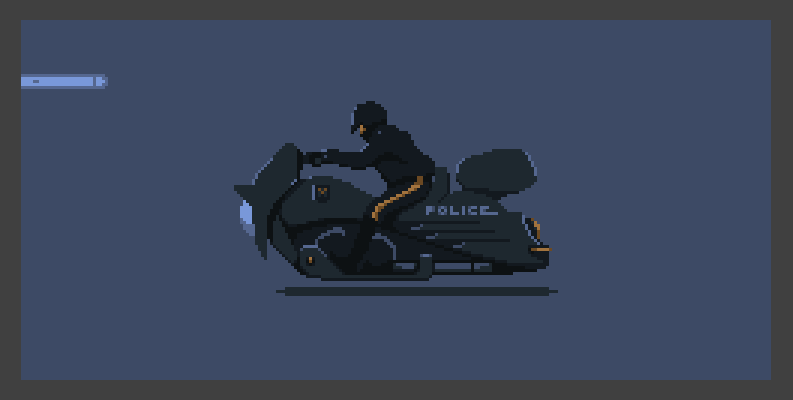
There is a dynamic, but it is still not enough. Let's rock our gentleman on a steel horse, up and down.

In general, better than it was. But ... still dry. And right. After all, we have an article about the play of light and shadow. Duet, as we stated earlier. And here I see only one thing. Solo.
The shadow is represented extremely poorly. Let's repeat the silhouette of our officer, paint it in one color and distort it so that the illusion is created that in each frame the shadow of the objects is in accordance with the position of the light source.
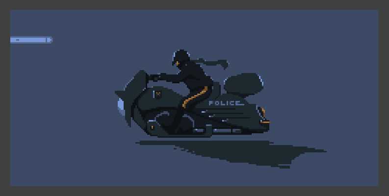
Already not bad. But there is one nuance. Feel the jerk in the first and eighth frames? There is no smoothness in the animation. The shadow abruptly disappears at the end of the eighth frame and appears no less sharply in the first. What to do? Transparency will come to the rescue. Closer to the starting and ending frame of the animation, the intensity of the shadow should be reduced. I even have a justification. As it moves away from the source of light, the shadow fades and fades, because the directional light source disappears and only one type of light remains. Global. As in cloudy weather. He does this, unfortunately, only in one direction, but ... these are sacrifices for which one has to go with animation for six frames. That's why we chose so few of them. Because this animation is a challenge to us. Challenge yourself. Learn to be concise.
Remember our boy from the first chapter? We promised to return to it. It would be wasteful to divert the third chapter so that the stream would beat and stream at the same time. We stopped at the fact that we made light animation for the box in the center of the scene. I think it is worth adding the object that actually exudes this light. It is not good for him to fly like a spirit. In addition, adding a car, we will hide some frames in our small animation. This will give us the opportunity to work with just a few frames. Those frames that can be called informative.

There is a car - let it go now.

"Kolchuzhka" was a bit short. Sometimes size does matter, so that people don't talk. First, let's remove the light icon, our flying icon helped us understand where the light is coming from. And let's extend the car. In animation, it feels like a short stump, and we need what is called “positive dynamics” on the stage.
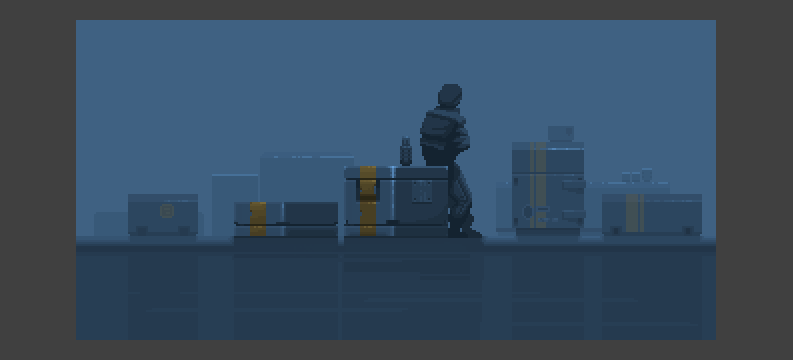
Already better. Add a reflection under the car. And add the sky. Just one color. Sometimes a couple of strokes are enough to make the image complete. True, this is not the case. Close to him, but not the one.

We got the air in our scene. And this is the point where we could complete our work in the first two chapters. However, there is always something to finish. And sometimes there is a case of the reverse described by the pair of lines above. When that same pair of strokes - not enough. Not enough for the good ... was finally good. This facet is thin and elusive. However, we will try to grope it. And only this can be done. Experienced way.
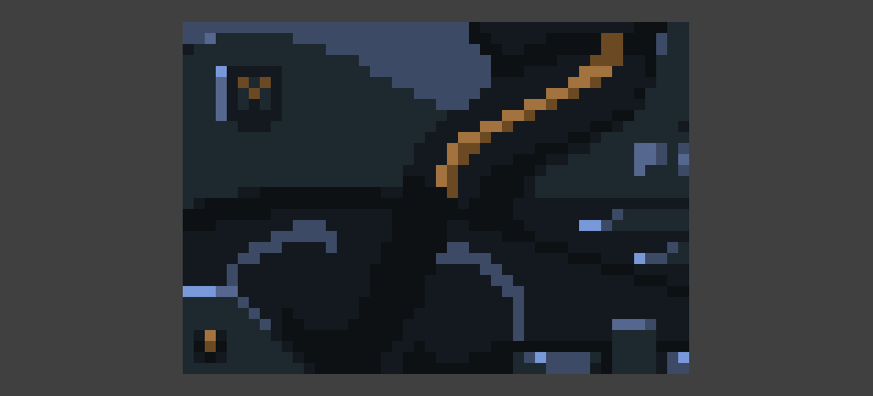
With other things added, we did not continue to work with the light. An exercise with an officer gave us an understanding of the power of backlight that flows around objects at the edges. It would be nice to add it here. To the animation planes on the faces of the cube, which we did before. We "break through" the edge of the containers, a thermos and the character itself. I promise not to dwell on it for a long time. We have things to do besides. Everything will be done in thin lines one pixel wide.
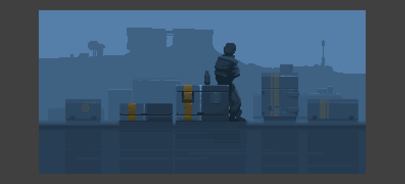
Now it is worth working with other bumps. Similarly, in one pixel. There are not so many frames when objects in the background are visible. If you make clear light accents on the edges of objects, bright and juicy, then due to the small number of frames on objects visible to us, these lines will be like flashes of lightning. You need to be careful and not “shine the viewer in the eye” more than necessary.
Therefore, now "break through" the paint on the containers. Also around the edge. Also, the containers have gaps, and therefore we denote them, as if the light ran along the edge of the steel.

Let's now process those edges of objects that have remained intact. Let the light live and move on them in advance, heralding the appearance of car headlights on the scene before it appears and seeing them off when the car is no longer on the scene. This is wrong in terms of the distribution of light over the surface, but sometimes (quite often) it is useful to deny the laws of reality. For the sake of the artistic image.

The last chord is special effects. A few frames of the "trace of light" from the headlights. As if all this was captured on video. Then a slightly brighter glow from the headlights, when the equipment gets to the center of the frame and a slightly brighter sky. Everything in bits. As if we were adding seasonings, pepper and salt to the dish.
That's all the effects. And, of course, the contrast. Most of the time I work with the image in subdued contrast. To protect the eyes. When you work with the image for many hours in a row, the eye is drawn not only in parts, but also in parts.
What conclusions can we draw from the first two exercises? Let's arrange them in the form of a list, which can then be used as a memo:
• Light has a radius, with points of maximum and minimum illumination. As the distance from the epicenter of light increases, its intensity decreases until the light disappears completely.
• When falling on an object, the light repeats its shape and emphasizes volume.
• Light does not have to be realistic. The essences of the real world are far from being as interesting as the essences are fictional, hypertrophied, or grotesquely multiplied. Just as in the case of grotesque forms, the light can be "exaggerated."
• As in the case of animation forms, the animation of light should be smooth, not annoying the viewer's eyes, except in special cases.
• To animate the light, as in the case of creating an image, it is better to start with basic light accents (light spots), and only after satisfactory work of the main accents it is worth moving in the direction of fine detail.
• In the case of a small number of frames and in the presence of a large object, it is worth considering on which parts of the object a finely detailed work of light will be located, which compensates for the overall coarseness of global light.
All is not gold that glitters
I really love our rich language for what they can play.You can play both with words and turns of speech, and interpret anything ... and in any way, giving the same expressions in context a variety of meanings.
The same is true for animation. You can play with shapes, objects, light, shadow and colors. As you please. And each party will be special. One pixel, just one dot can, and will, change the entire image as a whole, being placed in the right place. When I was writing an article, I had to finish the final part of it, but at that moment the electricity went out. I had no choice but to “write” it in my head, sitting in the twilight and cursing my manic attachment to the computer. Here is a text message I sent to my friend in response to concerns about the disappearance of my person from the network:
- Well I wrote an article! Take away my computer ... I'm nobody! And so, at least someone with a computer.
Just one letter changes the meaning of this depressive message. Similarly with pixels. And when the raw sketch takes shape, and the crumpled melody finds harmony, a few good points turn the image into what you need. Here it is important attention to detail. And I would like to talk about one of such trifles, summing up the next part of the “gallop”.
We all know that light is distributed differently on different surfaces. On rubber, the light is not particularly noticeable, on the metal it plays brightly as glare, if the metal is clean. It plays dimly, if the metal is not the first freshness (for example, is covered with rust). The play of light on different objects depends on the material from which they are made. The level of reflection of light from different materials is different. Glass and dirty glass, paper or clay, metal and plastic - they all take the lighting differently. With varying degrees of hospitality, and with different returns in the form of reflected light.
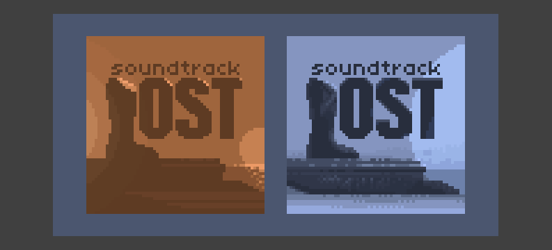
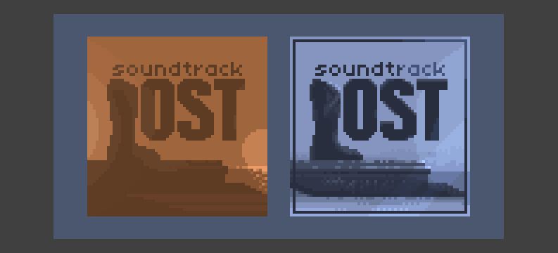
Let's try to arrange this in the form of a small mini-lesson. Imagine that on the table are two CDs with audio tracks for the TV series "Lost". And no, this is not a TV commercial. And “no” at number two, these are not CDs, but their covers, since the blanks usually look identical. Let it be their packaging. We assume that the right cover is a glossy material, but the left cover more resembles a matte surface that absorbs light and does not give bright reflections. The right cover has bruises on the edges, and the left one is made with a linear embossing, which further changes the appearance of the material.
Thus, we will try to imitate different materials in order to show that light can and should be distributed differently. I tell you honestly. Most pixel artists deny this item visualization. First, quite often the artists ignore the shadow within the object itself. Those.the object is immediately drawn with light and shade and only directional light is animated. Secondly, work with different materials within the same object is often ignored. It is expensive to manufacture, except when there is a glass or surface with a strong level of reflection somewhere on the object or character. In this case, a quick flare is drawn and deal with the end.
There are certainly reasons for this. The duration of our life is not so high to engage in deep aesthetics without good reason. Content for games is required to produce quickly, if possible without complicating your life. However, today we, as an educational material, still touch on this topic.
To begin, draw a "ball of light." Radius with a point of maximum brightness and a point of total absence of light. Something like a lantern on top, or an abstract light bulb. We are not up to aestheticism. We need to understand how to visualize different materials in pixel art. Well, in between times, also in the form of animation. So we don’t even drop aestheticism at the next stop. He just won't sit next to us. Immediately. And yes, it is racism. Of course.But today I am in a hurry. New Year is near. And I promised to release this article a few months ago. So the balls in hand.
Already familiar to us technique, when we impose a mask of light through the mode. And move it within nine frames so that the light moves more or less smoothly.

We agreed that the right cover is glossy, but the left is matte. So we, at least, should raise the light level on the right, and lower it on the left. According to the words of the duke from the film already mentioned today:
- Maybe it is worth, nevertheless, in this case raising the top from the top and lowering the bottom from the bottom?
Duke "the very Munchhausen"

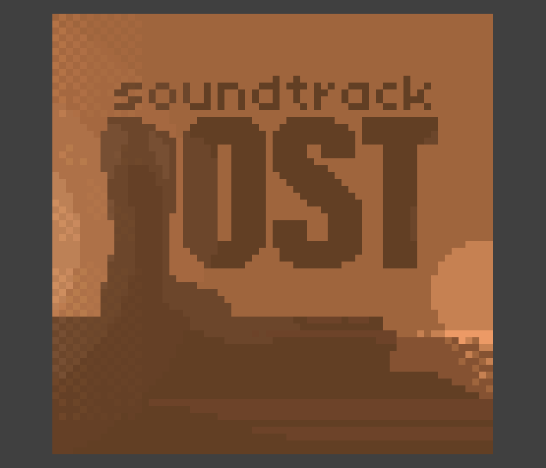
We assume that the dark on the covers is the paint applied to the cover. Paint, if not strange has the volume, if you look at the real objects. And old objects tend to deform over time because of what the light on them is unevenly distributed. Let's make this uneven distribution of light on the right cover.
The distortion of the form and the subsequent distortion of light is not noticeable everywhere. As in reality. Something is aging faster, something is slower. A drop of water got somewhere and the paper swelled, somewhere there was no moisture and this was a great blessing for the cover. Suppose also that the right disk was the most frequently used. And so the edge of the cover bent. Once this has happened, it is worth showing with light that the paper is curved. Therefore, the light on her stay for a while.
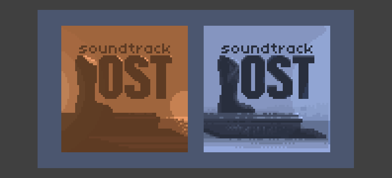
Cheated and enough. It was just an educational device. Let's provide the cover with a single-pixel border and add linear highlights to the right cover to be radically different from the left cover.
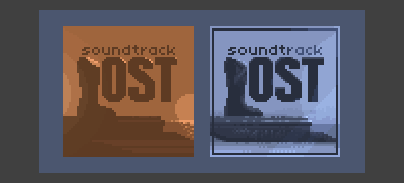
Let us now take the left disk. It is also embossed and embossed. Here we will have a full program. Let the light be walking around the perimeter of the screen image. Let's even scratch it somewhere. Let there be a light linear flare.
And let's make it so that the poor "leg" on the pedestal completely arched. Let there be a clear flare, and let the light play there most clearly.

No sooner said than done. Matte material suggests a wider illumination. Those.the plane should be illuminated more strongly than in the case of gloss. Let the cover flooded with light, like water.

And the final touch. The longest. We need to add textures on the edge frames. To give the illusion of the very stamping. And in addition, even at that moment when the light passes directly above the cover, a clearly visible linear stroke appears on it. The one that we could see in the first part of the gallop pixel, when I showed reception with worn metal. The fact is that hatching and patterns can also be used animations. In particular, in order to inform the viewer about a different character of the object's surface.
These experiments are very exciting. And sometimes, as I said earlier, the final touch transforms the picture radically. Agree that now they really look different. And this is the merit of the strokes, and not something else. Yes, we turned down the light, but we changed the radius of the illumination, but all this would be useless if we did not inform the viewer about the texture of our object.
Let's take a closer look at this object. To see those small details that may not be visible at first glance. This is what I call a good effect. See how the edges play texture? Cross-hatching is adjacent to linear shading, and in dynamics they give a rather amusing effect.
• We can transmit information about different materials due to the different degree of illumination of elements and the color of these elements, in case you want to get a more serious effect.
• The nature of the surface (texture) can be visualized through different hatching and patterns. It is enough to communicate the light information on a particular mask, or to draw this information manually.
I want to note one thing, and I consider it an important point. The effect or special effect is good only if the viewer does not see them. Perceives as something natural. Explosions, sparks and other pyrotechnics ... everything is beautiful. But true magic begins when the observer simply rejoices in the image and does not focus its attention on a single element of the image. This means that all elements of your scene are in harmony with each other.
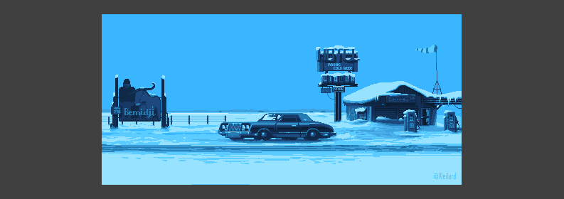
You don't have to go crazy and cover your entire scene with ultra light animation. You can choose an element and focus on it, leaving the rest of the stage filled with static, non-moving lighting, as I did in my little Bemidji Project based on the famous Fargo television series. Only one tablet plays in the light, but as I understood from the feedback from the public, this turned out to be quite enough. That is what I was trying to say. Sometimes the little things are enough to put the final touch on the job.
Epilogue
Here we will say goodbye. I hope that for a while. And I hope that the coming year will be richer for publication. I will not promise anything, but classically I will say a huge thank you to my patrons from the Patreon resource. Without them, this article would hardly have been possible. Like last time I’ll give you a list of wonderful people who dragged me to themselves through the long months of radio silence.
Igor Gritsenko, Matei “Retronator” Jan, Kalam, Hovey Day (Howie Day), Pavel Bartchuk, Gleb Rushashnikov, Alexander “La Bestia” Andreev, Ross Williams (Ross Williams), Paddle Po, Stas Galiunas, X-Rast (xRust ), Nikolay Izoderov, Anton Reshetnikov, Oleg and Fernando Ezra (Fernando Esra)
As a postscript, I note that the article again had to be cut in half. And it turns out that the second part of the article on the animation of light and shadow is to be. It will not necessarily be the next, but sooner or later the composition, lost in the way, will get to Habr. I have no doubt about that.
Thank you all for your attention, for your time and ... with the coming of you.
PS In the framework of the article was a stream. Unfortunately, this time we did not get to the animation, because there was little time. However, the world has become richer by one more pixel. A four-hour stream recording can be found here: www.twitch.tv/weilard/v/110577402
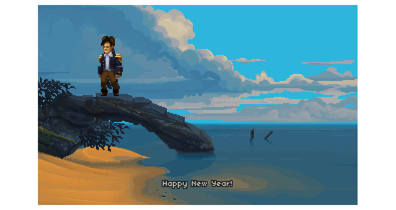
Well, the result is as follows. And now I'm really leaving you. See you after the New Year. For some comments, if they will, I will answer even today. Thanks again.
Bunker Herr Text
, .
, , . . , , , , . . . – . , - , … , , . .
, .
, . , . , , . . , , . . . Unfortunately. «Stellaris»…
, .
, . , «Westwood Studios», , . , , … — .
, .
- . .
, , . . , , , , . . . – . , - , … , , . .
, .
, . , . , , . . , , . . . Unfortunately. «Stellaris»…
, .
, . , «Westwood Studios», , . , , … — .
, .
- . .
Change History:
December 29, 2016, 6:18 MCK (editing typos)
Source: https://habr.com/ru/post/318678/
All Articles