Serious design serious sites. Part 2. Visualization
This is the second part of an article about designing large sites. In it we will tell about the visual part of the design, about the interfaces. If you have not read the first part, I recommend to do it here .
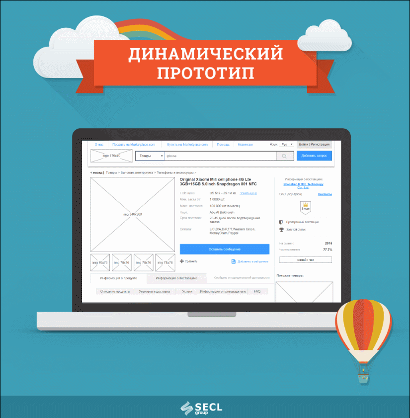
Fig. 9. Demonstration of a dynamic prototype for the “Marketplace” project.
At this stage, we are moving from analytics to interfaces, to the visual part. Based on the Mind map, it is necessary to design interfaces for each function and page. We will have many such interfaces, from several tens to several hundred unique prototypes, and there are storyboards where one page can have a number of states, pop-up windows, drop-down blocks, etc. In the process, all prototypes are combined into one large dynamic prototype and communicate with each other.
The article will be a lot of pictures. Habr, unfortunately, does not allow downloading large images, so they can be viewed in the full version of the article on our website .
')
At this stage, we are moving from analytics to interfaces, to the visual part. Based on the Mind map, it is necessary to design interfaces for each function and page. We will have many such interfaces, from several tens to several hundred unique prototypes, and there are storyboards where one page can have a number of states, pop-up windows, drop-down blocks, etc. In the process, all prototypes are combined into one large dynamic prototype and communicate with each other.
This is done using Axure RP or another program, there are quite a lot of them today, including online services. Although we have not found Axure better for many years. Some people try to design in Photoshop - these are mostly designers, not designers, who use the design methodology only partially. Photoshop and a number of other programs do not allow making dynamic prototypes, and it’s a trite long time to design in Photoshop. We need a speaker to think about each button and reference. I’d say right away that beautiful pictures, not assembled into a dynamic prototype, including just a design without design, are the first nail in the coffin of the project. We simply will not be able to test the work for logical errors before giving to the next stage, and we will have to redo it after. And the classics of development, probably, the most famous book “Perfect Code” shows us very clearly how at different stages error correction will increase from $ 1 to $ 10,000.
We need to systematically go through our Mind map and design page by page. Axure on the left can show a table of contents, there we call pages, we make nesting and we number everything in the format: "1.0.0", "2.0.0", "2.0.1", etc. It will not let us get confused when we have several dozen pages. It is also important to try to design in whole sections, rather than selectively several pages in one part of the project, and then several pages in another.
The most difficult to design the first layout. It makes some basic elements that will be visible throughout the site, for example, the header of the site, menu, basement, forms, etc. Such elements need to be designed first and driven to the master in Axure. You can start with these blocks, so it will be easier. Later, when we set up a modular grid and designed the first blocks, you can also design the main content of the page. To do this, we first write a list of blocks that will be on the page, then we roughly approximate their location on the page, and then we detail each of the blocks. There are many more usability rules that need to be taken into account; an experienced designer should know this. You should also think about the target audience, impose a Central Asian experience on each interface we design, because we do all of them for a specific group of people, not for ourselves.
Usually we start designing either from the main page, or from the product page, or from the user profile page. It all depends on what type of project we are doing. In any case, the page should be fundamental for the entire site, everything will revolve in the project around this page.
When designing any of the pages it is very useful to look at good usable sites with similar functionality and, of course, on competitors. They push a lot of useful ideas. On the one hand, people love what they are used to, and we will have to repeat some decisions from competitors, on the other hand, we cannot copy, because our task is to do better than theirs.
Interfaces we design in black and white for good reason, so as not to put the wrong accents. Color accents are a matter of designers, not designers. About the influence of color in the design, we wrote a separate large article: Manipulations of users of the site using colors . Also you should not use real photos, instead of them we put plugs of a certain size. The task of the designer is to place accents without auxiliary tools, exclusively by the convenience of the interface itself, its logical sequence. Many novice designers and designers often resort to using colors in design and can ruin everything with this idea.
All layouts need to be discussed with the product owner and team. Designer design layout has yet to draw, typesetter typeset, and programmer - to program. And the owner of the product from this project wants to make money. And everyone will have edits that will affect their work, often simplify and speed it up. It is for this reason that the internal approval of the team and the external owner of the product is important. By the way, it is often necessary to discuss with the owner of the product a project or its part with a team, having a lot of discussion on one or another idea.
After creating all the pages they need to connect them together. To do this, we make dynamics using the internal tools of Axure, connecting all pages with links, making pop-up windows, drop-down lists, etc. It is also important to score real content into the prototype in order to bring it as close as possible to the live site. So we revive the prototype, and we have the opportunity to check the logic of its work and even show the real users to get the first feedback. We showed an example of such a prototype in the article, which describes the design of the Alibaba.com analogue - more than 200 unique prototypes , and this is still a simplified version.
Adaptive design is separately designed so that the site is displayed correctly on all devices and screen resolutions. Today in the world, more than half of all users visit websites from mobile devices, so adaptive is not a fashion for a long time. In fact, adaptive is a few different versions of the site that are displayed to users depending on their device. The user does not know this, but technically we have to design several separate versions. There should be at least three: 320 px., 768 px. and 1200 px. Less often, options for 420 px are made. and 960 px. The smaller the screen, the less functionality should be in the prototype, that is, for small screens, we make simplified versions. As an alternative, you can not design an adaptive, but leave it to the layout stage, at the discretion of the layout designer - this is much cheaper, but the quality will suffer.
Examples of other large designed projects that we have done in the last 5 years, however, we show them without dynamics:
In general, over the past few years we have designed almost everything that is possible, this is not a complete list of projects. The design technology is universal and rather close to the ISO 9241-210 “Human-centered design for interactive systems” standard. In other words, this is something that is used throughout the world, and it works great!
To illustrate the words a few more prototypes of different projects:
Fig. 10. Prototype of a social network with e-commerce elements
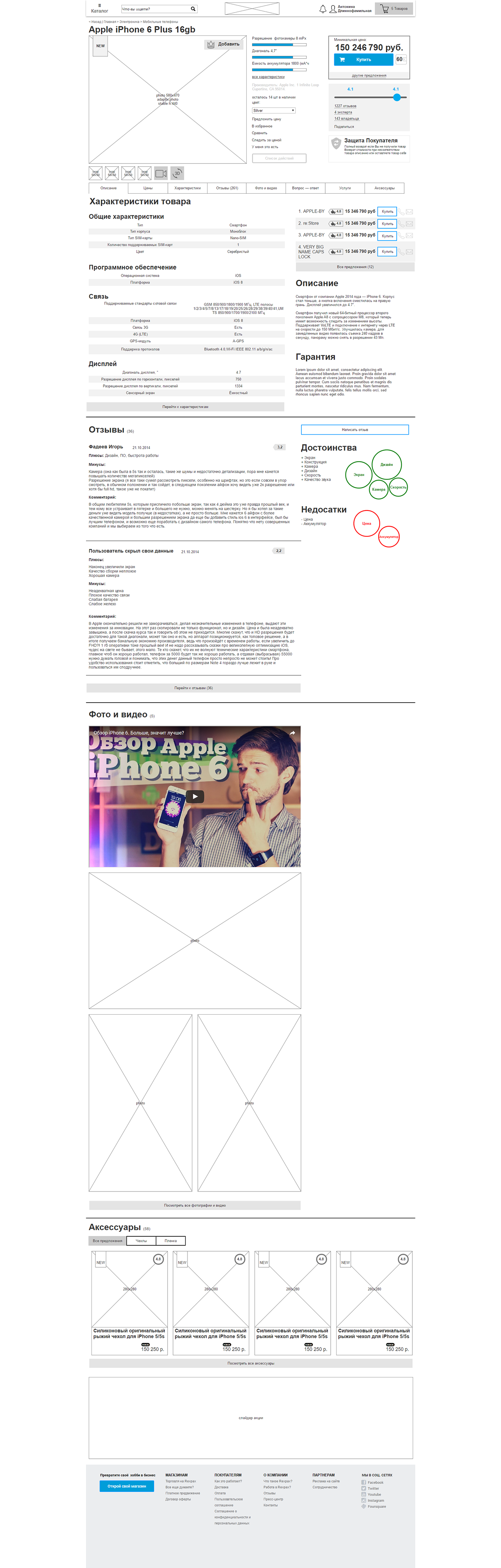
Fig. 11. Protopit Push service notifications
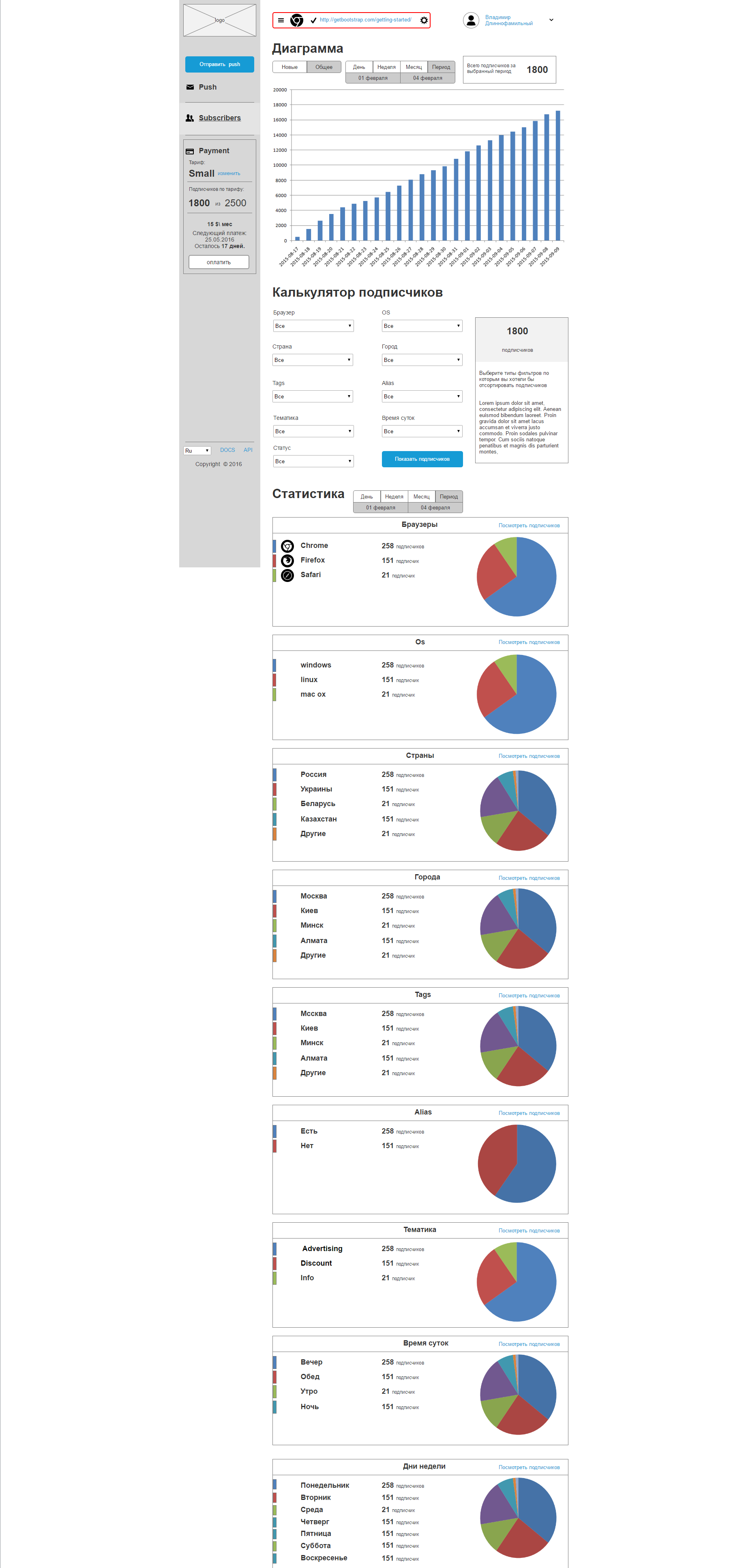
Fig. 12. Prototype educational service
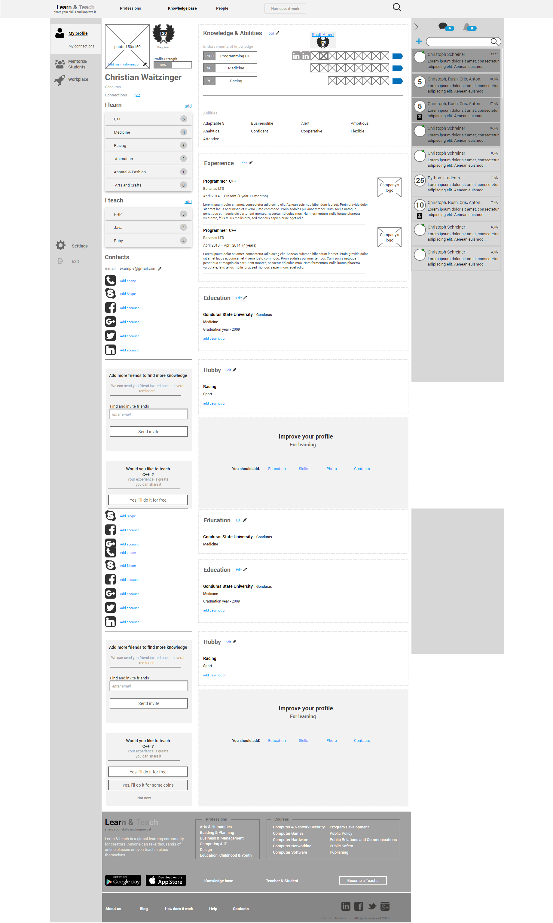
Fig. 13. The prototype of the call service.
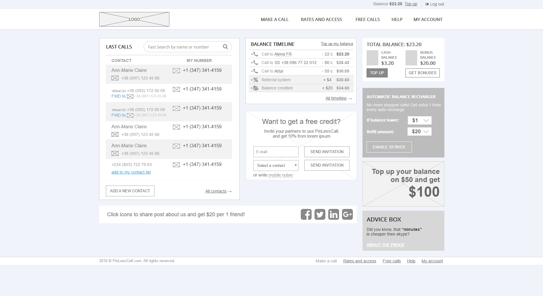
Fig. 14. Prototype automobile magazine.
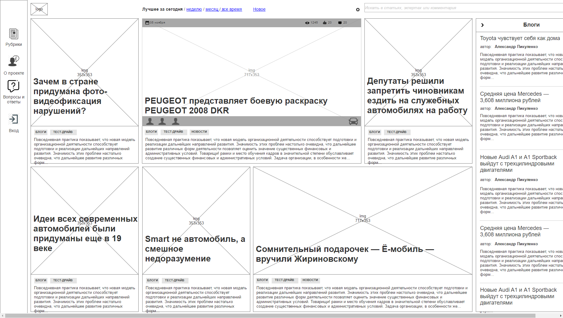
Fig. 15. Prototype marketplace.
An experienced designer always has a huge amount of developments in dynamics, so he can create such prototypes many times faster. These are whole libraries of elements, blocks and even standard pages.
At the end of this stage, we will get a full dynamic prototype of the site and will be able to test it to make sure that we have thought out everything correctly, and there are no logical holes in the project. Detailing all the interface layouts will save us from the endless rework in the following steps. This is the most voluminous stage of all.
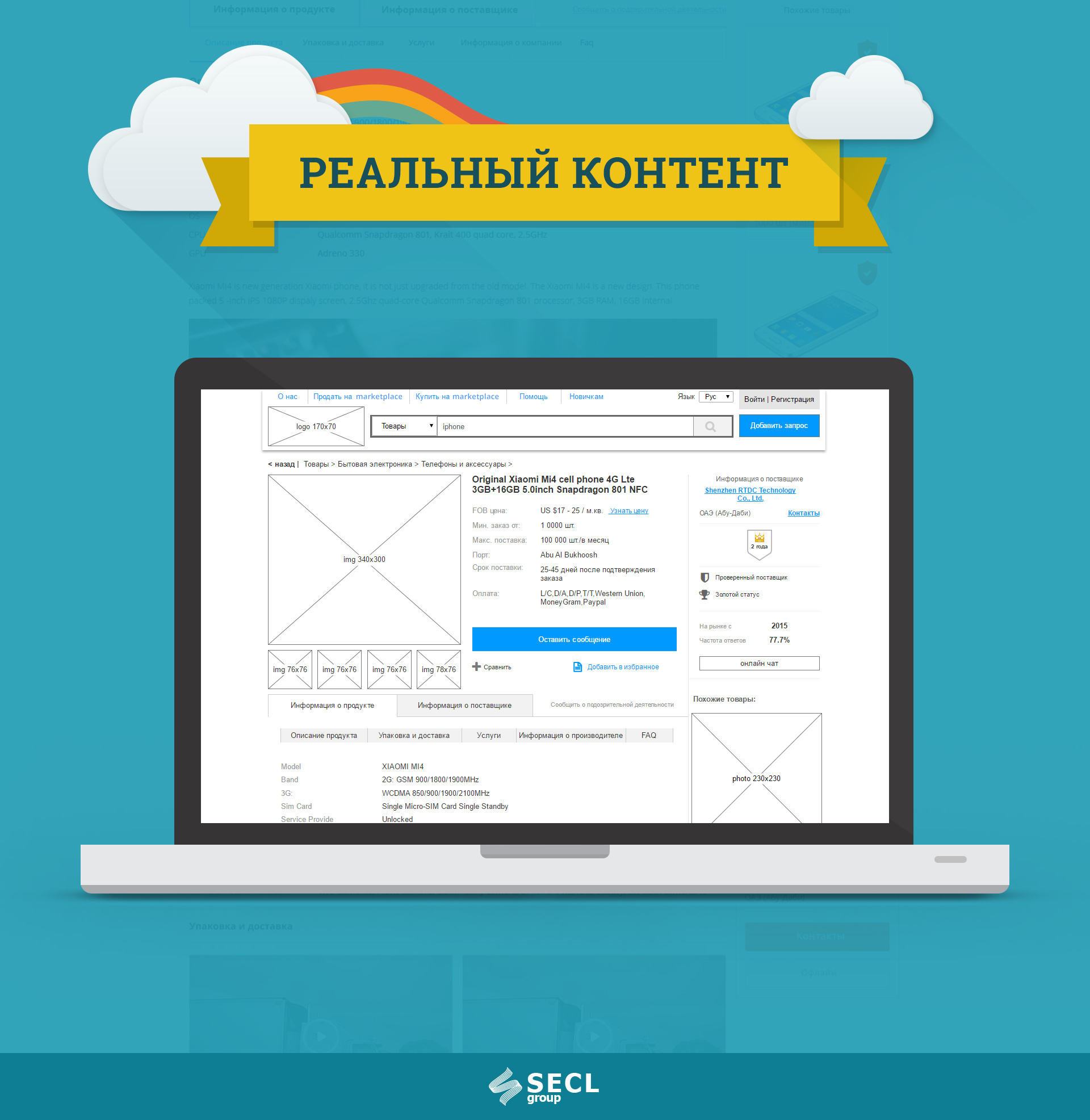
Fig. 16. Demonstration of real content for the project “Marketplace”.
Some well-known designers said: "Design is largely copywriting." When designing since 2007, I have been convinced of this many times by my own experience. It is not enough to make a beautiful picture and fill it with the template text “Lorem Ipsum”, since at the site filling stage we will begin to float blocks, the text does not fit, we want to insert something else, etc.
First you need to think about all the headers on each page, from the general title of the entire page to each small block. And they should be real, like on a live site. This makes the designer, although you can attract and copywriter. All titles should be simple, clear and short.
The second step is to fill the page with real text content that will be used on a live site. So we will make sure that everything fits and is taken into account. All texts should be developed by professional copywriters, the designer only inserts them. It is also worth approving every ready-made interface with a marketer.
You can go from any side: first content, then we change the design for it. Or, first, design, then we adjust the content for it. The main thing to take into account.
At the end of this stage, our prototype should look almost like a finished website, but without colors.
A prototype has been created, and it looks like a live site. But no matter how experienced a designer is, you won’t keep everything in your head, and in the prototype there will be errors, above all, implicit, logical errors. To find them, you need to develop scenarios of behavior and Customer Journey Map, and then drive out our dynamic prototype for them and find the main shortcomings.
The point is that the behavior of each person can be predicted. At least on the basic steps. For the main user groups, we must create scenarios of behavior on the site, which will show its main steps. Such scenarios can be as small as one page (Use Case) in order to test a separate piece of work for logical errors, or large, the solution of a problem within the site and its several pages. It is important to cover the whole site with such scenarios, all basic functions.

Fig. 17. Use Case for the project “Marketplace”.
Customer Journey Map is also a behavior scenario, its special type. In general, this is a marketing technology that is very convenient to use for design. We must plan and then track all the steps of the client before he gets to the site, and after he leaves. Really, each user comes to the site from different places and with different expectations. Someone is going to purposefully buy our product and knows everything about it, and someone accidentally hit the site from social networks. There is also the story of a person’s life after the site. For example, when he took advantage of our product, and he liked / did not like it, he can do something further depending on his experience. Having built such Customer Journey Map, we can prepare for any events before and after the site, we can make the user loyal and embed it in multi-channel communication with the project. We must do this for real clients, those who pay (will pay) us money. In principle, CJM can be prepared at the stage of analytics and take into account ideas before prototyping, and at this stage only recheck yourself.
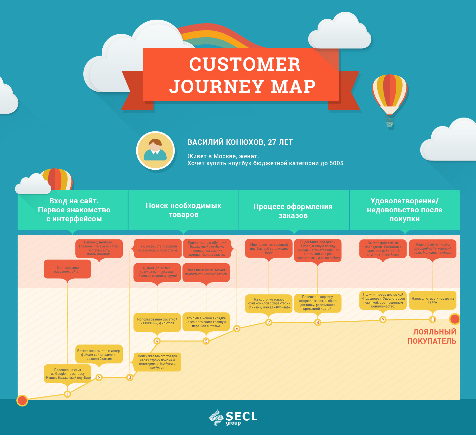
Fig. 18. Customer Journey Map for the Marketplace project.
The method is important not only at the design stage, but also in a live project. At the design stage, we can only guess, and already in a working project there is an opportunity to constantly ask questions to customers and know exactly their patterns of behavior. Also, do not forget that when developing a Customer Journey Map, you should take into account the sales funnel, define goals at each stage of the funnel, highlight interaction points, especially those that relate to or may touch the site, and highlight KPI to understand what we need to achieve from our customers , and at the end highlight problem areas and improve them. This is the weakest link, eliminating which, the whole system will work better. For example, our goal could be to increase the buyer’s average check by selling additional related services. Here he bought the TV, and it needs to be delivered, installed, configured, etc. 10 years ago, every customer did it himself, the online store did not offer him such a wide service. Today, many stores offer many additional services to the main product, and people buy it. How was it made up? The answer is obvious: someone started to watch the buyers and realized that they are in real life ordering additional services on the side, but this is not very convenient and you can offer a kit. And this function was born to increase the average bill, as well as many similar ideas in modern web projects.
Having created such scenarios, we take them and run them through our prototype, page by page. Again, they must be detailed and close to life, otherwise they will not reveal design errors to us. This stage should help us to find problems in logic and refine the interfaces on trifles. Customer Journey Map, in turn, will give a pool of new ideas for the project, often unique ones, which competitors will not have. All scenario runs are made with reference to previously developed characters, so that the designer thinks like a typical user of a future project.
At the end of this stage, we will correct a number of errors and finalize our prototype.

Few people know, but design has a separate QA stage. When a specially trained quality manager, with a very large user experience, starts asking uncomfortable questions to the designer. The task of this person is to view each designed page, evaluate all designed functions and make sure that everything is clear and of high quality.
It would seem - why? We made a dynamic prototype, drove behavior scenarios, found errors. In fact, the designer simply “blinks at the stage” to this stage, and a look from the outside will allow us to find some more mistakes and controversial solutions. In addition, QA immediately evaluates the feasibility of the designed system in the following steps.
Separately, you can conduct a full usability testing, in which to show the site to real people, future users of our project. You can also get an interesting fitback from them and take it into account; comments can be left directly in Axure, there is such a function there. However, with different tests and checks, too, you should not flirt. If we did everything right, then at this stage there should not be a lot of mistakes, the prototype should already be “licked out” almost perfectly.
At the end of the stage we will correct the last errors and can continue to work on the project. In particular, the project to this stage should have been actively designed, compiled and programmed for a long time. The development of such a prototype for large projects takes from 150-200 hours or more. Small projects for an experienced designer will be enough for several dozens of hours, but he will give a full guarantee that we will not forever redo and waste precious resources at later stages.

Fig. 19. An example of technical specifications for the project "Marketplace."
Having a full dynamic prototype we need to write an accompanying TK. In an amicable way, it should be written in the process of prototyping, after each approved layout. Despite the visibility of a living prototype, not everything will be clear from it. TK can be done in different ways: from the description of non-obvious prototype mechanics to hundreds of pages of project technical requirements. The main thing is not to write TK for the sake of it to be, and not to enter useless water there. We write only really important requirements for the project.
The structure of TK, again, is different. In addition to the description of the interface itself, we usually include such blocks:
Not all are working on these blocks at the design stage. But we remember that the later we start to form requirements, the more expensive will be the cost of changes. If you look at the vast majority of large projects, they did not form such requirements at the beginning. Recalling many different stories of different projects, I can identify a number of typical problems that appeared just because of the lack of development of these things right away. I think below many now recognize themselves.
What if you don't work through the requirements mentioned above?
As you can see, each item is quite important for the project, and some are critical. All this specification of requirements protects against alterations, thereby greatly saving time and money. Again, back to the beginning of the article, all this can be done by Agile, gradually forming the requirements as the project starts. The main thing is for the project manager to understand well the stages of design, when which stage can be started, and how they all relate to further development. Knowing all this, it is possible to plan in such a way that the zero stage will take only 2 weeks, and then the permanent work on all stages will begin at the same time, with a minimum of rework.
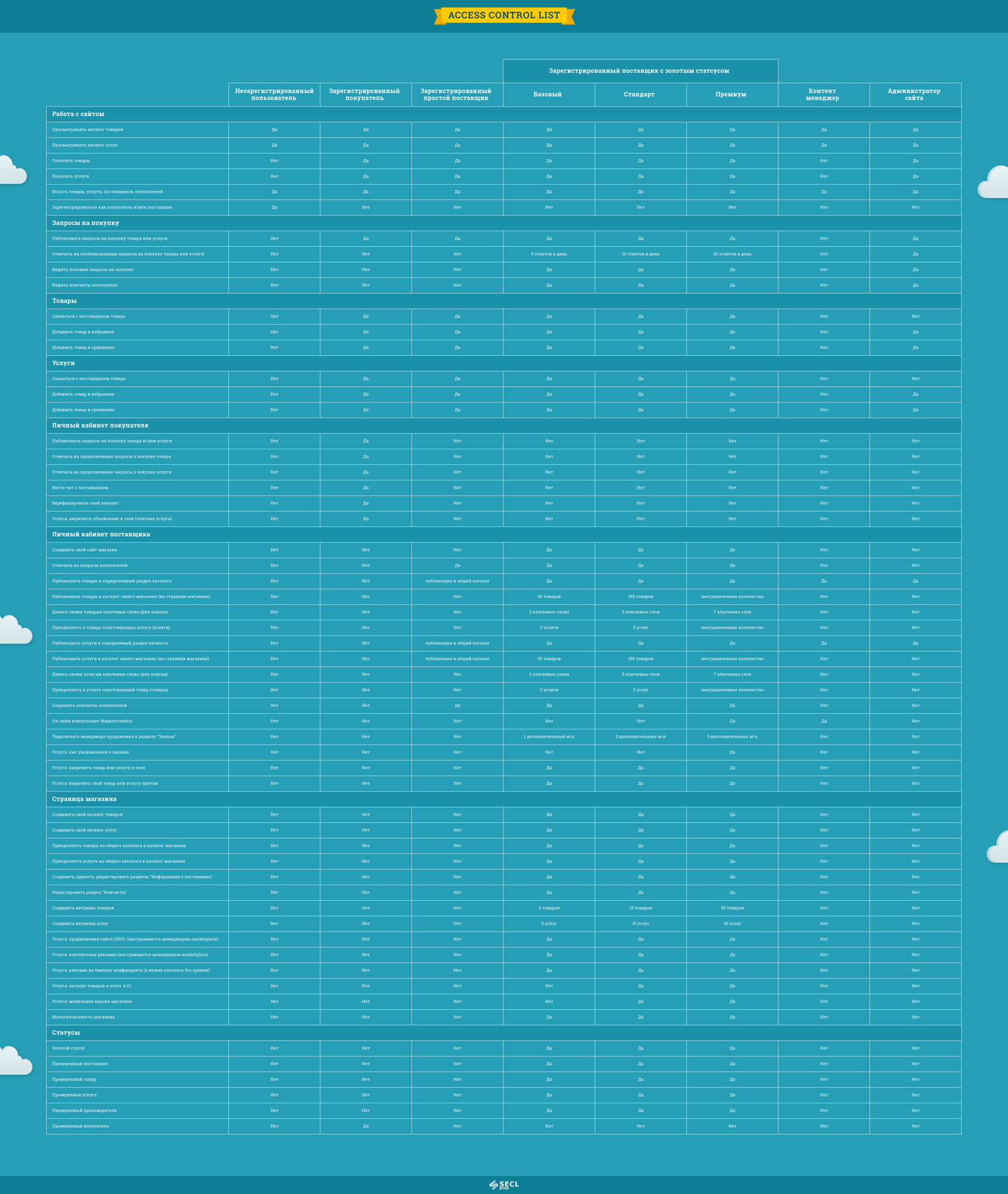
Fig. 20. Table with access rights for the Marketplace project.
TK is a rather voluminous document. For example, you can see part of the TZ, which we developed, in particular, the description of the prototype Marketplace . Two hundred pages of description. The description should be detailed and understandable. Inaccuracies and double interpretations should not be allowed. It is important to describe non-obvious places. For example, a user rating can be expressed in a single-digit design, and in fact hide a complex formula for calculating it. The document must contain links to specific pages of the prototype and cutting parts of the interface.
A part of the TK blocks for a designer may already be if he has previously done a similar project. They can be used with minor adjustments. True, there are not many. You can use the requirements for layout, micromarking and some other blocks, but the main part will have to be thought out from scratch. This again allows us to speed up work, which is why I always try to work only with designers with good experience.
At the end of this stage we will receive a complete project TOR, which should minimize the risks as much as possible, and you yourself understood from the article why.
In the article, I showed many examples from the “Marketplay” project, including a product card prototype, and gave a link to the full dynamic prototype. After designing, any project is transferred to the design. And this design project looks like this:
Fig. 21. Product page design for the Marketplace project.
Design is the foundation of any successful project. An integral and extremely important part. Many times I saw projects that were made without design, and almost always these were sad stories. Without design, we will at best come to endless processing and spend a lot of resources in vain, but more often than not, projects just die.
As you may have guessed, this is the stage that the whole team is doing. At a minimum, this is BI Analyst for the analytic part and UX / UI Designer for the graphic one. But as consultants at different stages, you need to involve guys like: Digital Marketing Manager - to work out the marketing component and work on the interfaces, System Administrator - to develop hardware requirements, QA Engineer - to check the prototype logic, Software Architect - to develop architecture, Web Designer - for consultations on the interface, Technical Writer - to develop a technical description of the project and a number of other experts.
Despite the many steps described here, in general, designing is not a very long and costly step, at least for an experienced designer. And if we evaluate it as a good and almost the only protection against alterations and errors, then in the end, the design saves a lot of time and money to the owner of the product. I would say that design has one of the largest ROIs in a project. Typically, design is applied to new projects, although it can also be applied to already completed projects in order to significantly improve the conversion and other basic project KPIs. True, for already working projects, the technology will be different, and this is the topic of a separate article. In any case, this is a whole complex science with its own rules and specialists. We have been studying this for the whole team for almost 10 years, and we are still learning, stuffing many cones on the way.
The technology described here is well suited for large sites. For small and medium-sized projects, it should be simplified, but it also works here. Recently, we are also doing mobile apps. Soon, wait for the article about the design of applications, there are many features and specifics, although the approaches are very similar.
PS The other day we started a design course from the authors of the article: Designing serious sites .You can also sign up for the course at a discount. To do this, write to info@digitov.com
PPS. To receive our new articles before others or simply not to miss new publications - subscribe to the SECL Group fan page: Facebook , VK , and Twitter .
Author:
Nikita Semenov
CEO
"Company SECL Group is »
Dynamic prototype
Fig. 9. Demonstration of a dynamic prototype for the “Marketplace” project.
At this stage, we are moving from analytics to interfaces, to the visual part. Based on the Mind map, it is necessary to design interfaces for each function and page. We will have many such interfaces, from several tens to several hundred unique prototypes, and there are storyboards where one page can have a number of states, pop-up windows, drop-down blocks, etc. In the process, all prototypes are combined into one large dynamic prototype and communicate with each other.
The article will be a lot of pictures. Habr, unfortunately, does not allow downloading large images, so they can be viewed in the full version of the article on our website .
')
At this stage, we are moving from analytics to interfaces, to the visual part. Based on the Mind map, it is necessary to design interfaces for each function and page. We will have many such interfaces, from several tens to several hundred unique prototypes, and there are storyboards where one page can have a number of states, pop-up windows, drop-down blocks, etc. In the process, all prototypes are combined into one large dynamic prototype and communicate with each other.
This is done using Axure RP or another program, there are quite a lot of them today, including online services. Although we have not found Axure better for many years. Some people try to design in Photoshop - these are mostly designers, not designers, who use the design methodology only partially. Photoshop and a number of other programs do not allow making dynamic prototypes, and it’s a trite long time to design in Photoshop. We need a speaker to think about each button and reference. I’d say right away that beautiful pictures, not assembled into a dynamic prototype, including just a design without design, are the first nail in the coffin of the project. We simply will not be able to test the work for logical errors before giving to the next stage, and we will have to redo it after. And the classics of development, probably, the most famous book “Perfect Code” shows us very clearly how at different stages error correction will increase from $ 1 to $ 10,000.
We need to systematically go through our Mind map and design page by page. Axure on the left can show a table of contents, there we call pages, we make nesting and we number everything in the format: "1.0.0", "2.0.0", "2.0.1", etc. It will not let us get confused when we have several dozen pages. It is also important to try to design in whole sections, rather than selectively several pages in one part of the project, and then several pages in another.
The most difficult to design the first layout. It makes some basic elements that will be visible throughout the site, for example, the header of the site, menu, basement, forms, etc. Such elements need to be designed first and driven to the master in Axure. You can start with these blocks, so it will be easier. Later, when we set up a modular grid and designed the first blocks, you can also design the main content of the page. To do this, we first write a list of blocks that will be on the page, then we roughly approximate their location on the page, and then we detail each of the blocks. There are many more usability rules that need to be taken into account; an experienced designer should know this. You should also think about the target audience, impose a Central Asian experience on each interface we design, because we do all of them for a specific group of people, not for ourselves.
Usually we start designing either from the main page, or from the product page, or from the user profile page. It all depends on what type of project we are doing. In any case, the page should be fundamental for the entire site, everything will revolve in the project around this page.
When designing any of the pages it is very useful to look at good usable sites with similar functionality and, of course, on competitors. They push a lot of useful ideas. On the one hand, people love what they are used to, and we will have to repeat some decisions from competitors, on the other hand, we cannot copy, because our task is to do better than theirs.
Interfaces we design in black and white for good reason, so as not to put the wrong accents. Color accents are a matter of designers, not designers. About the influence of color in the design, we wrote a separate large article: Manipulations of users of the site using colors . Also you should not use real photos, instead of them we put plugs of a certain size. The task of the designer is to place accents without auxiliary tools, exclusively by the convenience of the interface itself, its logical sequence. Many novice designers and designers often resort to using colors in design and can ruin everything with this idea.
All layouts need to be discussed with the product owner and team. Designer design layout has yet to draw, typesetter typeset, and programmer - to program. And the owner of the product from this project wants to make money. And everyone will have edits that will affect their work, often simplify and speed it up. It is for this reason that the internal approval of the team and the external owner of the product is important. By the way, it is often necessary to discuss with the owner of the product a project or its part with a team, having a lot of discussion on one or another idea.
After creating all the pages they need to connect them together. To do this, we make dynamics using the internal tools of Axure, connecting all pages with links, making pop-up windows, drop-down lists, etc. It is also important to score real content into the prototype in order to bring it as close as possible to the live site. So we revive the prototype, and we have the opportunity to check the logic of its work and even show the real users to get the first feedback. We showed an example of such a prototype in the article, which describes the design of the Alibaba.com analogue - more than 200 unique prototypes , and this is still a simplified version.
Adaptive design is separately designed so that the site is displayed correctly on all devices and screen resolutions. Today in the world, more than half of all users visit websites from mobile devices, so adaptive is not a fashion for a long time. In fact, adaptive is a few different versions of the site that are displayed to users depending on their device. The user does not know this, but technically we have to design several separate versions. There should be at least three: 320 px., 768 px. and 1200 px. Less often, options for 420 px are made. and 960 px. The smaller the screen, the less functionality should be in the prototype, that is, for small screens, we make simplified versions. As an alternative, you can not design an adaptive, but leave it to the layout stage, at the discretion of the layout designer - this is much cheaper, but the quality will suffer.
Examples of other large designed projects that we have done in the last 5 years, however, we show them without dynamics:
- Educational Service (2016)
- Universal Marketplace (2016)
- Shopping center site + store (2016)
- Logistics service (2016)
- Mobile application beauty spheres (2016)
- IP based call service (2016)
- Push notification service (2016)
- Corporate website of a helicopter company (2016)
- Markepleys Food Industry (2016)
- B2b online store of gadgets (2016)
- Online store contact lenses (2016)
- Real Estate Portal (2015)
- Social network + online store (2015)
- Online Gift Shop (2014)
- Pet Owners Social Network (2013)
- Social network of professional athletes (2013)
- Social Network of Photographers (2012)
- Mazda owners community in Russia (2012)
- Internet hypermarket of household appliances (2012)
In general, over the past few years we have designed almost everything that is possible, this is not a complete list of projects. The design technology is universal and rather close to the ISO 9241-210 “Human-centered design for interactive systems” standard. In other words, this is something that is used throughout the world, and it works great!
To illustrate the words a few more prototypes of different projects:
Fig. 10. Prototype of a social network with e-commerce elements
Fig. 11. Protopit Push service notifications
Fig. 12. Prototype educational service
Fig. 13. The prototype of the call service.
Fig. 14. Prototype automobile magazine.
Fig. 15. Prototype marketplace.
An experienced designer always has a huge amount of developments in dynamics, so he can create such prototypes many times faster. These are whole libraries of elements, blocks and even standard pages.
At the end of this stage, we will get a full dynamic prototype of the site and will be able to test it to make sure that we have thought out everything correctly, and there are no logical holes in the project. Detailing all the interface layouts will save us from the endless rework in the following steps. This is the most voluminous stage of all.
Real content
Fig. 16. Demonstration of real content for the project “Marketplace”.
Some well-known designers said: "Design is largely copywriting." When designing since 2007, I have been convinced of this many times by my own experience. It is not enough to make a beautiful picture and fill it with the template text “Lorem Ipsum”, since at the site filling stage we will begin to float blocks, the text does not fit, we want to insert something else, etc.
First you need to think about all the headers on each page, from the general title of the entire page to each small block. And they should be real, like on a live site. This makes the designer, although you can attract and copywriter. All titles should be simple, clear and short.
The second step is to fill the page with real text content that will be used on a live site. So we will make sure that everything fits and is taken into account. All texts should be developed by professional copywriters, the designer only inserts them. It is also worth approving every ready-made interface with a marketer.
You can go from any side: first content, then we change the design for it. Or, first, design, then we adjust the content for it. The main thing to take into account.
At the end of this stage, our prototype should look almost like a finished website, but without colors.
Customer Behavior Scenarios and Customer Journey Map
A prototype has been created, and it looks like a live site. But no matter how experienced a designer is, you won’t keep everything in your head, and in the prototype there will be errors, above all, implicit, logical errors. To find them, you need to develop scenarios of behavior and Customer Journey Map, and then drive out our dynamic prototype for them and find the main shortcomings.
The point is that the behavior of each person can be predicted. At least on the basic steps. For the main user groups, we must create scenarios of behavior on the site, which will show its main steps. Such scenarios can be as small as one page (Use Case) in order to test a separate piece of work for logical errors, or large, the solution of a problem within the site and its several pages. It is important to cover the whole site with such scenarios, all basic functions.
Fig. 17. Use Case for the project “Marketplace”.
Customer Journey Map is also a behavior scenario, its special type. In general, this is a marketing technology that is very convenient to use for design. We must plan and then track all the steps of the client before he gets to the site, and after he leaves. Really, each user comes to the site from different places and with different expectations. Someone is going to purposefully buy our product and knows everything about it, and someone accidentally hit the site from social networks. There is also the story of a person’s life after the site. For example, when he took advantage of our product, and he liked / did not like it, he can do something further depending on his experience. Having built such Customer Journey Map, we can prepare for any events before and after the site, we can make the user loyal and embed it in multi-channel communication with the project. We must do this for real clients, those who pay (will pay) us money. In principle, CJM can be prepared at the stage of analytics and take into account ideas before prototyping, and at this stage only recheck yourself.
Fig. 18. Customer Journey Map for the Marketplace project.
The method is important not only at the design stage, but also in a live project. At the design stage, we can only guess, and already in a working project there is an opportunity to constantly ask questions to customers and know exactly their patterns of behavior. Also, do not forget that when developing a Customer Journey Map, you should take into account the sales funnel, define goals at each stage of the funnel, highlight interaction points, especially those that relate to or may touch the site, and highlight KPI to understand what we need to achieve from our customers , and at the end highlight problem areas and improve them. This is the weakest link, eliminating which, the whole system will work better. For example, our goal could be to increase the buyer’s average check by selling additional related services. Here he bought the TV, and it needs to be delivered, installed, configured, etc. 10 years ago, every customer did it himself, the online store did not offer him such a wide service. Today, many stores offer many additional services to the main product, and people buy it. How was it made up? The answer is obvious: someone started to watch the buyers and realized that they are in real life ordering additional services on the side, but this is not very convenient and you can offer a kit. And this function was born to increase the average bill, as well as many similar ideas in modern web projects.
Having created such scenarios, we take them and run them through our prototype, page by page. Again, they must be detailed and close to life, otherwise they will not reveal design errors to us. This stage should help us to find problems in logic and refine the interfaces on trifles. Customer Journey Map, in turn, will give a pool of new ideas for the project, often unique ones, which competitors will not have. All scenario runs are made with reference to previously developed characters, so that the designer thinks like a typical user of a future project.
At the end of this stage, we will correct a number of errors and finalize our prototype.
QA and usability tests
Few people know, but design has a separate QA stage. When a specially trained quality manager, with a very large user experience, starts asking uncomfortable questions to the designer. The task of this person is to view each designed page, evaluate all designed functions and make sure that everything is clear and of high quality.
It would seem - why? We made a dynamic prototype, drove behavior scenarios, found errors. In fact, the designer simply “blinks at the stage” to this stage, and a look from the outside will allow us to find some more mistakes and controversial solutions. In addition, QA immediately evaluates the feasibility of the designed system in the following steps.
Separately, you can conduct a full usability testing, in which to show the site to real people, future users of our project. You can also get an interesting fitback from them and take it into account; comments can be left directly in Axure, there is such a function there. However, with different tests and checks, too, you should not flirt. If we did everything right, then at this stage there should not be a lot of mistakes, the prototype should already be “licked out” almost perfectly.
At the end of the stage we will correct the last errors and can continue to work on the project. In particular, the project to this stage should have been actively designed, compiled and programmed for a long time. The development of such a prototype for large projects takes from 150-200 hours or more. Small projects for an experienced designer will be enough for several dozens of hours, but he will give a full guarantee that we will not forever redo and waste precious resources at later stages.
Technical task
Fig. 19. An example of technical specifications for the project "Marketplace."
Having a full dynamic prototype we need to write an accompanying TK. In an amicable way, it should be written in the process of prototyping, after each approved layout. Despite the visibility of a living prototype, not everything will be clear from it. TK can be done in different ways: from the description of non-obvious prototype mechanics to hundreds of pages of project technical requirements. The main thing is not to write TK for the sake of it to be, and not to enter useless water there. We write only really important requirements for the project.
The structure of TK, again, is different. In addition to the description of the interface itself, we usually include such blocks:
- Site architecture - architect is working
- Requirements for loads - the architect and team lead
- Server and infrastructure - a system administrator, architect and team lead
- Security Requirements - Security Specialist and Team Lead
- SEO Requirements - SEO-Schnick and Internet Marketer are working
- Design requirements - the designer is working
- Layout Requirements - Layout Designer Working
- Micromarking - the layout designer is working
- UML, robustness diagrams - designed by designer and programmer
- Differentiation of access rights - the designer is working
Not all are working on these blocks at the design stage. But we remember that the later we start to form requirements, the more expensive will be the cost of changes. If you look at the vast majority of large projects, they did not form such requirements at the beginning. Recalling many different stories of different projects, I can identify a number of typical problems that appeared just because of the lack of development of these things right away. I think below many now recognize themselves.
What if you don't work through the requirements mentioned above?
- The architecture of the site - if it is not worked out, with a high degree of probability we will lay down the wrong architecture, this will lead to problems scaling the project, and it will have to be rewritten.
- Requirements for loads - usually make the project, and then separately test and optimize the load. But if there are no requirements, this is not provided in the architecture, then the site will sooner or later begin to fall with an increase in attendance, and this will happen at the most inconvenient moment.
- Server and infrastructure - the same thing, ill-conceived infrastructure will lead to the need for reconfiguration and the fall of the site.
- Security requirements - if we do not have security requirements, and no one will do this, it will inevitably lead to hacking, the consequences of which will be unpredictable: from data theft to completely erasing the site.
- SEO Requirements - How often have you heard from marketers that a website needs to be redone to SEO requirements? If you had at least one site that you are promoting, then with a probability of 90% heard. That's because they created it without SEO requirements, which should be laid at the design stage, and not later.
- Design requirements - if we do not work through these requirements, we have the risk of redesigning the design for a long time. This is generally the most slippery thing that can be, since everyone has different preferences, and everyone thinks they are designers. The only option to reduce the amount of design rework is to lay down requirements.
- Layout requirements - today Google takes into account many layout options. These are adaptability, W3C standards, download speed, and many other parameters. If we do not set the layout requirements, then our site will be poorly indexed and poorly displayed on users' mobile devices.
- Micromarking - if we do not make it, then we will have the layout at the subjective discretion of the layout designer, which means that the site will not be properly indexed.
- UML, robustness diagrams - this is more for programmers, so that they do not miss anything and again do not alter.
- Differentiation of access rights - the same thing, for programmers, so as not to redo it.
As you can see, each item is quite important for the project, and some are critical. All this specification of requirements protects against alterations, thereby greatly saving time and money. Again, back to the beginning of the article, all this can be done by Agile, gradually forming the requirements as the project starts. The main thing is for the project manager to understand well the stages of design, when which stage can be started, and how they all relate to further development. Knowing all this, it is possible to plan in such a way that the zero stage will take only 2 weeks, and then the permanent work on all stages will begin at the same time, with a minimum of rework.
Fig. 20. Table with access rights for the Marketplace project.
TK is a rather voluminous document. For example, you can see part of the TZ, which we developed, in particular, the description of the prototype Marketplace . Two hundred pages of description. The description should be detailed and understandable. Inaccuracies and double interpretations should not be allowed. It is important to describe non-obvious places. For example, a user rating can be expressed in a single-digit design, and in fact hide a complex formula for calculating it. The document must contain links to specific pages of the prototype and cutting parts of the interface.
A part of the TK blocks for a designer may already be if he has previously done a similar project. They can be used with minor adjustments. True, there are not many. You can use the requirements for layout, micromarking and some other blocks, but the main part will have to be thought out from scratch. This again allows us to speed up work, which is why I always try to work only with designers with good experience.
At the end of this stage we will receive a complete project TOR, which should minimize the risks as much as possible, and you yourself understood from the article why.
Small bonus
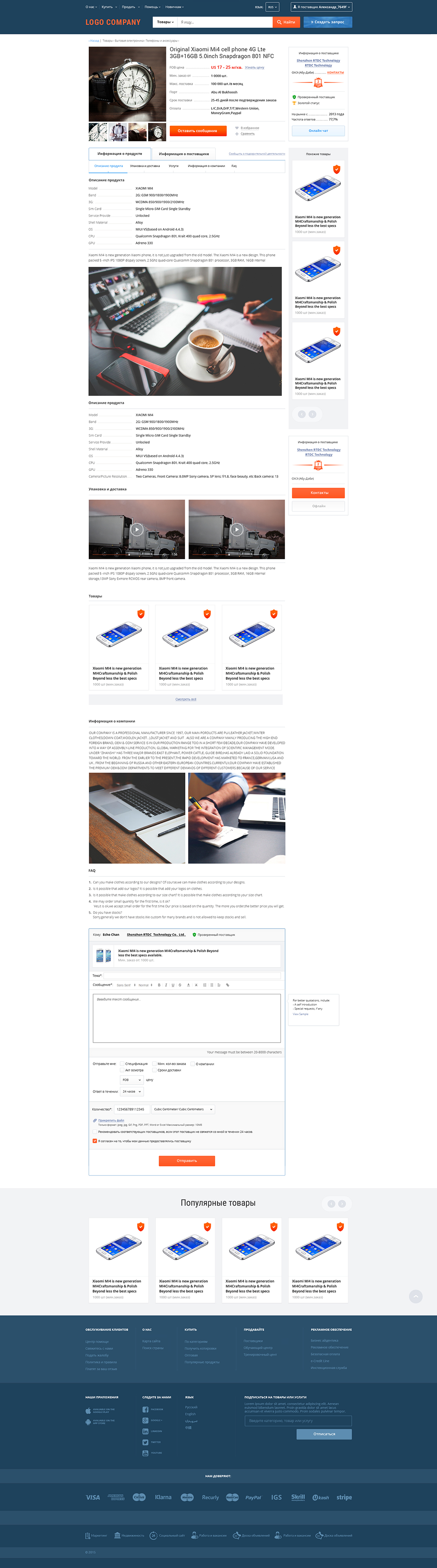
In the article, I showed many examples from the “Marketplay” project, including a product card prototype, and gave a link to the full dynamic prototype. After designing, any project is transferred to the design. And this design project looks like this:
Fig. 21. Product page design for the Marketplace project.
What should be the result?
Design is the foundation of any successful project. An integral and extremely important part. Many times I saw projects that were made without design, and almost always these were sad stories. Without design, we will at best come to endless processing and spend a lot of resources in vain, but more often than not, projects just die.
As you may have guessed, this is the stage that the whole team is doing. At a minimum, this is BI Analyst for the analytic part and UX / UI Designer for the graphic one. But as consultants at different stages, you need to involve guys like: Digital Marketing Manager - to work out the marketing component and work on the interfaces, System Administrator - to develop hardware requirements, QA Engineer - to check the prototype logic, Software Architect - to develop architecture, Web Designer - for consultations on the interface, Technical Writer - to develop a technical description of the project and a number of other experts.
Despite the many steps described here, in general, designing is not a very long and costly step, at least for an experienced designer. And if we evaluate it as a good and almost the only protection against alterations and errors, then in the end, the design saves a lot of time and money to the owner of the product. I would say that design has one of the largest ROIs in a project. Typically, design is applied to new projects, although it can also be applied to already completed projects in order to significantly improve the conversion and other basic project KPIs. True, for already working projects, the technology will be different, and this is the topic of a separate article. In any case, this is a whole complex science with its own rules and specialists. We have been studying this for the whole team for almost 10 years, and we are still learning, stuffing many cones on the way.
The technology described here is well suited for large sites. For small and medium-sized projects, it should be simplified, but it also works here. Recently, we are also doing mobile apps. Soon, wait for the article about the design of applications, there are many features and specifics, although the approaches are very similar.
PS The other day we started a design course from the authors of the article: Designing serious sites .You can also sign up for the course at a discount. To do this, write to info@digitov.com
PPS. To receive our new articles before others or simply not to miss new publications - subscribe to the SECL Group fan page: Facebook , VK , and Twitter .
Author:
Nikita Semenov
CEO
"Company SECL Group is »
Source: https://habr.com/ru/post/318660/
All Articles