MyOffice editors toolbar
Introduction
Our team has been working on MyOffice office applications since 2013. The product line includes a full set of applications for working with documents, mail, calendars and contacts on computers, mobile devices and web browsers, as well as a collaboration server, mail server and data storage system. In this article we want to tell you about the principles of the development of interfaces MyOffice for various platforms and devices.

“Simplicity and convenience on any device” is our approach to the interface. On the one hand, we decided to use concepts familiar to users for our control panel in editors. On the other hand, to significantly simplify work in editors.
A user who interacts with any product for a long time develops certain habits: working with various functions, pressing buttons in familiar places, etc. For example, all Windows users are accustomed to the “Home” button in the lower left corner and to what happened when you click on this button. When the button disappeared and then returned, but with a modified working principle, users experienced severe discomfort and lost in performance.
')
When working with office packages, their habits are formed. Take for example the toolbar in office editors. There are two main approaches to organizing the toolbar:
- Ribbon (Ribbon), when a large number of actions are distributed on different tabs:
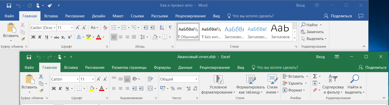
- Traditional, when a large number of actions is displayed on a single toolbar. And less important actions are transferred to the menu:

Users become accustomed to one scheme and the transition to another is often perceived "in hostility." Suffice it to recall the update of the MS Office package in 2007, when the ribbon interface replaced the traditional one.
We perfectly understood that we need to develop an interface that will support the existing habits of users. They will not have time and motivation for long-term learning something new, but they still need to solve daily tasks.
However, we also did not want to blindly copy other people's decisions, since saw in them a number of significant flaws:
- Typically, 80% of users need only 20% of the functionality of the variety that they see on the control panel.
- Some functions are contextual (i.e. depend on the objects selected in the document), some relate to the document as a whole. But at the same time functions can be on one tab.
- A number of functions are duplicated on different tabs, but the functions have different names.
- And many other small (and not so) features.
In addition, modern users during the work on the document can switch between different form factors and platforms: create a document on a laptop in an airplane, work together with colleagues in a browser, make edits from a mobile device. Not all office suites allow you to switch between devices smoothly (from the point of view of user interaction).
Below we describe the rules, approaches and features that we use in the control panel of MyOffice editors.
General concept
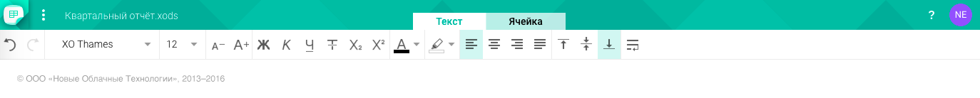
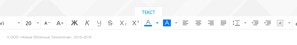
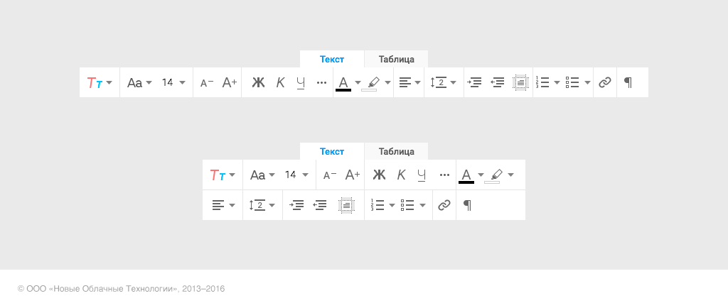
- In our toolbar, controls are distributed across several tabs:
"Text". Contains functions for working with text: font size, text color, line spacing, etc. - “Table” (or “Cell” for a table editor). It contains functions for working with table cells: inserting columns / rows, filling a cell, filtering values, etc.
- "Reviewing". Contains functions for working with changes in the document: accept / reject edits, enable / disable their display, etc.
In the near future there will be several more tabs, for example, “Image”.

At first glance, this is very similar to the "tape" approach. But in our implementation, various settings and system actions with the document (creating a copy, sharing, etc.) are transferred to the main menu. And the actions to add various objects are collected in one place:
- for web and desktop editors - the panel on the right side of the screen
- for mobile editors - action bar at the top of the screen

This solution allowed us to significantly reduce the number of controls on the panel. The panel has become easier to scan with a glance, which means the user will be able to quickly find the functions he needs. The height of the panel has decreased, more space is reserved for the document itself.
The result was a strongly focused toolbar, where the set of functions and the number of tabs are determined by the object with which the user is currently interacting. For example, when working in a text editor, a person in most cases sees only one “Text” tab, which contains text formatting actions. When you insert a table into a document and work with this table (that is, when you select cells or the table itself), a tab for working with an object automatically appears. As soon as the table loses focus, the tab disappears.
Such contextuality affects the set of controls on the panel. For example, in a text editor, when working with text in a table on the “Text" tab, actions for vertical alignment appear.

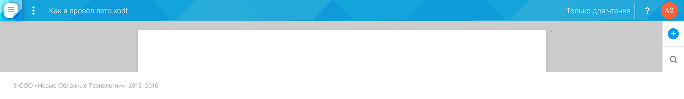
In the “Read only” mode, the toolbar may be absent altogether if the owner of the document has not enabled the recording of changes.
All functions of the control panel are duplicated in the main menu.

What the toolbar consists of
There are several types of controls:
1) Simple button
Pressing such a button performs a single action with the object. For example, it increases the font size or adds a column to the table.

2) Button on / off any property
For example, make the text bold. Such buttons always have two states.

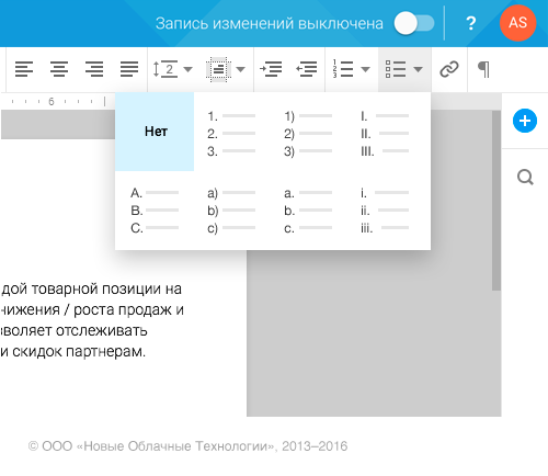
3) Drop-down list (or list-dialogue)
Allows you to select one of the formatting options. For example, the choice of text color or type of bulleted list.
4) Two-segment control
Allows you to either select one of the values (in the drop-down list), or perform some quick action. For example, the font size selection element. A person can choose a value from the list of presets or specify his own. This item is specific to Web / Desktop.

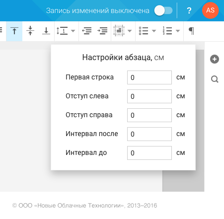
5) Complicated composite list (or dialogue)
A list or dialogue that allows you to perform multiple actions without closing. For example, format cell borders or customize a paragraph.
Rules for displaying panel elements
MyOffice editors work on a large number of platforms and form factors: from small phones with a screen diagonal of about 4 inches to large tablets like iPad Pro.
With this unification, it is important to understand how many controls will be available to the user and what size they will have when the screen size changes. Or, for example, according to what rule the toolbar will change when adding a new control, because the development of the product does not stop for a minute.
To solve this complex task, we have divided the entire area of the toolbar into cells of equal size. Each control can occupy one or more cells. This cellular structure allowed us to work out a number of rules for displaying elements on the panel.
1) Reducing the size of the item
If an element occupies more than two cells, its size may decrease with decreasing screen / window size. For example, the font selection element behaves this way.
For narrow screens or windows, we allow another element state - a new button one cell wide. This allows you to "minimize" the toolbar, without changing the order of the available commands.

2) Combining elements
A number of controls can be combined into one item of the “Drop-down list” type. Such a combination is possible for elements that have the same functionality. For example, elements for text alignment.

3) Several lines in the control panel
In web applications, additional lines may appear with a very small browser window size. This often happens when users reduce the window size to half the width of the screen and open two documents at once to copy from one to another or compare the contents.
On the plates, additional lines may appear when the device orientation changes.

For smartphones, the presence of several lines in the control panel is a standard situation. The width of the screen does not allow to fit in one line the entire set of controls (or you have to make this line with horizontal scrolling). But on the screen of smartphones, additional lines may appear or disappear as the orientation changes.

4) Hiding items in additional drop-down menu
On smartphones, we can display no more than 4 lines in the toolbar. Otherwise, the toolbar will occupy more than half the height of the screen. In this case, we can “donate” a number of items that are rarely used, and hide them in an additional drop-down menu.
Features of work on mobile devices
Toolbar Location
On smartphones, the toolbar is located at the bottom of the screen in both portrait and landscape orientation.

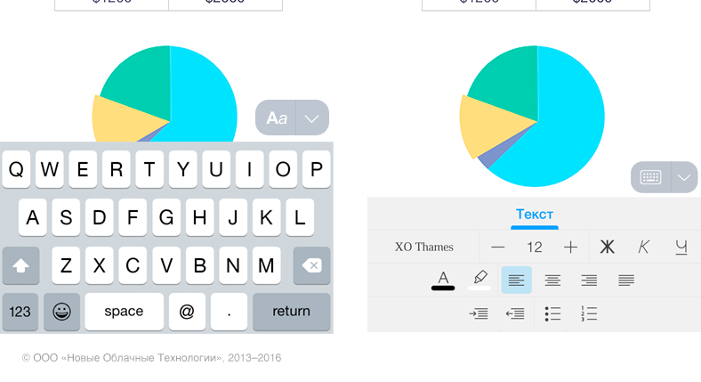
Here immediately arises complexity - while writing the text, a keyboard appears, which, of course, overlaps the toolbar. To solve this problem, we implemented a switch above the keyboard. It allows you to quickly hide either the keyboard or the toolbar.
On tablets, the toolbar is always located at the top of the screen in both portrait and landscape orientation.
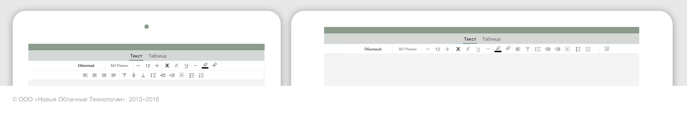
This allows you to always have on hand editing tools that do not overlap the on-screen keyboard. If a person does not plan to format the document, for example, he only studies the information, then you can hide the toolbar by clicking on the current active tab.
Features of controls
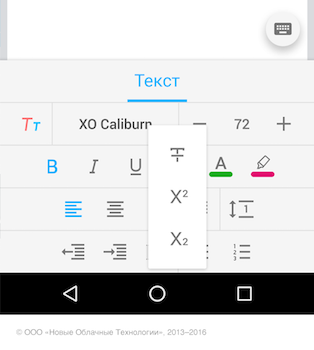
On the iPhone, we cannot show a drop-down list. Therefore, an additional level of navigation appears in the control panel. For example, a list of font sizes appears in the next level of navigation with the ability to go back.

Android-based smartphones do not introduce an additional level of hierarchy, and all drop-down lists and dialogs behave accordingly. Their size (width and height) depends on the information that is displayed in them.

Instead of conclusion
We understand that it is impossible to create the perfect interface “for centuries” and there are rough edges in our chosen approach. For example, you need to constantly switch between the virtual keyboard and the toolbar on smartphones. Therefore, we are constantly experimenting. Right now we are working on interesting solutions in terms of contextual formatting on both mobile platforms and desktop versions. Perhaps, after the introduction of this functionality, we will be able to further simplify the toolbar, which is the “heart” of any editor.
It would be interesting to read in the comments, and what do you highlight the disadvantages or, conversely, the advantages of office applications on different platforms? Do you edit texts or documents on your smartphone / tablet?
Source: https://habr.com/ru/post/318044/
All Articles