How to construct words (from an author who hates reading)
Honestly, I'm a writer. I get paid to write words. But there is a thing that most people do not know about me: I hate reading .
Now don't get me wrong - I'm still reading a little. I overcame books and blogs, new channels and magazines. But when authors become verbose, my eyes become blurred. I'm bored.

All I see is a sheet of words.
')
As a child, I thought that my aversion to reading was my weakness. This was so until years later I did not realize that this weakness helped me to become a good writer.
The fact is that, basically, I write texts for applications and sites. Here, brevity is better than a delightful style, every sign counts. And to write the text for the interface in many ways resembles a design - the design of words for people who hate to read.
Numerous studies show how people do not read online . This works for applications, games, and any screen with which you interact. Most just browse the page, snatching words from there and from here.

You will be surprised how many people clicked "Continue".
Are people lazy? Careless? Or do they just hate reading? Whatever theory is proposed, the results will be the same. People will not read your interface - no matter how amazing the words you have picked.
Based on this, you should not just write words and insert them into your design. As soon as you write the words, perhaps you will understand that you need to change it. If you cannot explain the action in a few words, this is a signal that your design is too complex.
Otherwise: you should not create a design with lorem ipsum (conditional, meaningless placeholder text).
Being an author for interfaces, I learned a few things that will help make the word easier to read. I hope these tips come in handy when writing and designing your own words.
The most important thing you can do to make your readers easier is to shorten your text. After writing a draft, cut it, then again and again. Throw out the details, use simple words and speak only in the case. Be ruthless.
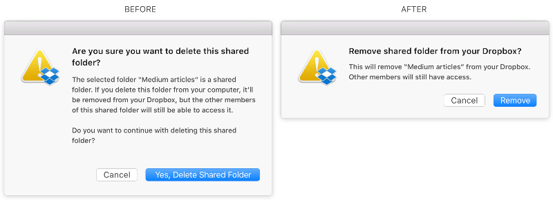
The shorter your text - the higher the likelihood that it will be read.
As a writer, I understand perfectly well how tempting it is to spread the thought over the tree and paint your ideas, but the interface is not the place for this. For this there isHabr Medium :).
Sometimes the text is no longer possible to cut. Then see if you can add a headline that conveys content in a few words. Use keywords that the user can search. They can always read about exactly what interests them.
With headlines easier to "scan" the text.
While viewing a page, our view usually moves up and down . Therefore, lists are indeed easier to read than paragraphs.
If you catch yourself using multiple words such as “and” or “also” inside a paragraph, try converting the text into a list format.
Some platforms, Medium, for example, are overloaded with content - there is nothing wrong with that. But sometimes it is not easy to read paragraph by paragraph.
I like to do lists.
When I need to write a lot, I use visual interruptions that make it easier to material - line breaks, pictures, headings, examples - everything that can break walls of words. It gives people a sigh, lets think and look around if they need it.
For example, in my posts in Medium, I try to write paragraphs from a small number of lines and alternate them with visual interruptions.
Some authors pay too much attention to the choice of words. The selection of words is important, but I think the form of the presentation of these words is no less important.
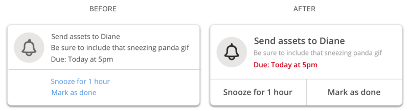
When you choose words, think about how to highlight the most important words on the screen and how to hide the most unnecessary. In design, this is called the visual hierarchy .
Think about the boldness of the font, size, color, contrast, capitalization, distance, proximity, alignment, movement - all these things have a big impact. It does not matter if people read your words or not. Customize, change attributes until you find the right balance.
What is easier to read?
When you are trying to explain to the user how to do something, it is tempting to simply put all the necessary information on one screen and hope that they will read it. But if your text is longer than several lines, then the chance that it will be read by many is minimal. What to do then?
Sometimes you can show a small piece of information in a certain period of time. In the language of the textbook, progressive disclosure is required, but I would call it a slow discovery (sounds more dramatic, doesn't it?). Try to break the information into parts and present it step by step.

Lots of text? Give it in parts.
Another thing you can use is to remove the detailed description from the text and make the detailed information a link.
Have you ever written something that looks good on paper, but in the final version comes out too long? This happens when you write to Google Docs, Dropbox Paper or any other of the applications.
When you write for an interface, the key is to see the entire context. You should know how your words will look with everything that surrounds them.
Therefore, I prefer to write not in documents, but in Mock objects - this is how I see the context of my words.
Words fill our world with meanings. They help us understand the world around us. True, the sad thing is that many simply do not like to read. If you work with words the same way I work with them, our goal should be to make reading as simple as possible. Help people understand the world around them.
The tips above are only part of what I use during the design of words. Have you come up with your own tips? Please share your ideas, stories and comments below.
And for those who hate reading, thanks for reading.
Translation: Liza Lamova
Publication support - Edison , which developed an electronic transfer service for prisoners and implemented a system for selling tickets to inter-city routes .
Now don't get me wrong - I'm still reading a little. I overcame books and blogs, new channels and magazines. But when authors become verbose, my eyes become blurred. I'm bored.
All I see is a sheet of words.
')
As a child, I thought that my aversion to reading was my weakness. This was so until years later I did not realize that this weakness helped me to become a good writer.
The fact is that, basically, I write texts for applications and sites. Here, brevity is better than a delightful style, every sign counts. And to write the text for the interface in many ways resembles a design - the design of words for people who hate to read.
People do not read your interface
Numerous studies show how people do not read online . This works for applications, games, and any screen with which you interact. Most just browse the page, snatching words from there and from here.
You will be surprised how many people clicked "Continue".
Are people lazy? Careless? Or do they just hate reading? Whatever theory is proposed, the results will be the same. People will not read your interface - no matter how amazing the words you have picked.
Based on this, you should not just write words and insert them into your design. As soon as you write the words, perhaps you will understand that you need to change it. If you cannot explain the action in a few words, this is a signal that your design is too complex.
Otherwise: you should not create a design with lorem ipsum (conditional, meaningless placeholder text).
7 word design tips
Being an author for interfaces, I learned a few things that will help make the word easier to read. I hope these tips come in handy when writing and designing your own words.
1. Reduce
The most important thing you can do to make your readers easier is to shorten your text. After writing a draft, cut it, then again and again. Throw out the details, use simple words and speak only in the case. Be ruthless.
The shorter your text - the higher the likelihood that it will be read.
As a writer, I understand perfectly well how tempting it is to spread the thought over the tree and paint your ideas, but the interface is not the place for this. For this there is
2. Add headers
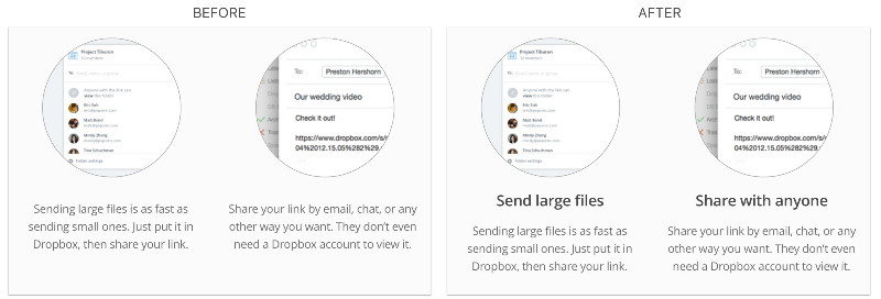
Sometimes the text is no longer possible to cut. Then see if you can add a headline that conveys content in a few words. Use keywords that the user can search. They can always read about exactly what interests them.
With headlines easier to "scan" the text.
3. Make lists
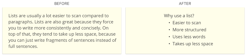
While viewing a page, our view usually moves up and down . Therefore, lists are indeed easier to read than paragraphs.
If you catch yourself using multiple words such as “and” or “also” inside a paragraph, try converting the text into a list format.
Some platforms, Medium, for example, are overloaded with content - there is nothing wrong with that. But sometimes it is not easy to read paragraph by paragraph.
I like to do lists.
4. Let's take a break
When I need to write a lot, I use visual interruptions that make it easier to material - line breaks, pictures, headings, examples - everything that can break walls of words. It gives people a sigh, lets think and look around if they need it.
For example, in my posts in Medium, I try to write paragraphs from a small number of lines and alternate them with visual interruptions.
5. Focus on words
Some authors pay too much attention to the choice of words. The selection of words is important, but I think the form of the presentation of these words is no less important.
When you choose words, think about how to highlight the most important words on the screen and how to hide the most unnecessary. In design, this is called the visual hierarchy .
Think about the boldness of the font, size, color, contrast, capitalization, distance, proximity, alignment, movement - all these things have a big impact. It does not matter if people read your words or not. Customize, change attributes until you find the right balance.
What is easier to read?
6. Not all at once
When you are trying to explain to the user how to do something, it is tempting to simply put all the necessary information on one screen and hope that they will read it. But if your text is longer than several lines, then the chance that it will be read by many is minimal. What to do then?
Sometimes you can show a small piece of information in a certain period of time. In the language of the textbook, progressive disclosure is required, but I would call it a slow discovery (sounds more dramatic, doesn't it?). Try to break the information into parts and present it step by step.
Lots of text? Give it in parts.
Another thing you can use is to remove the detailed description from the text and make the detailed information a link.
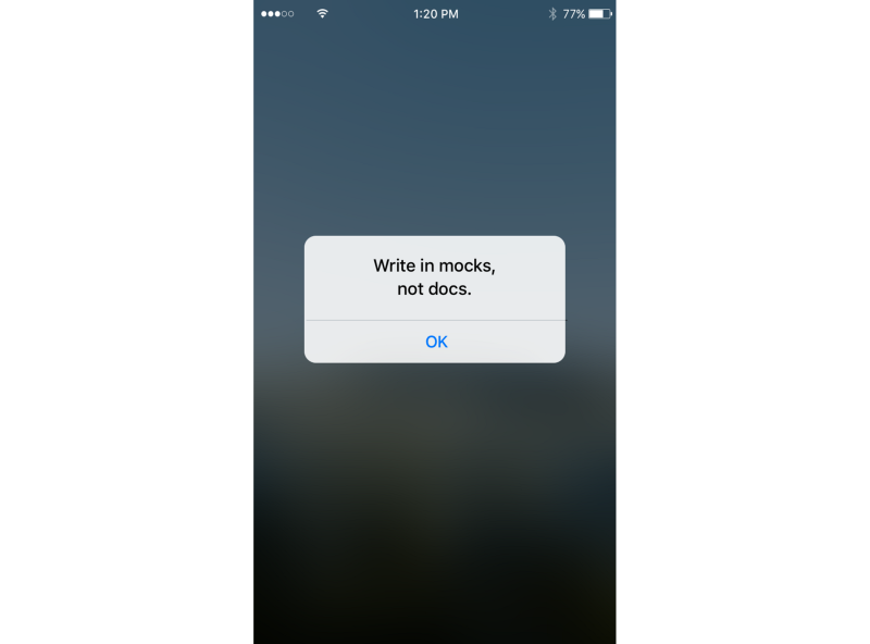
7. Write in mockups, not documents
Have you ever written something that looks good on paper, but in the final version comes out too long? This happens when you write to Google Docs, Dropbox Paper or any other of the applications.
When you write for an interface, the key is to see the entire context. You should know how your words will look with everything that surrounds them.
Therefore, I prefer to write not in documents, but in Mock objects - this is how I see the context of my words.
Parting words
Words fill our world with meanings. They help us understand the world around us. True, the sad thing is that many simply do not like to read. If you work with words the same way I work with them, our goal should be to make reading as simple as possible. Help people understand the world around them.
The tips above are only part of what I use during the design of words. Have you come up with your own tips? Please share your ideas, stories and comments below.
And for those who hate reading, thanks for reading.
Translation: Liza Lamova
Publication support - Edison , which developed an electronic transfer service for prisoners and implemented a system for selling tickets to inter-city routes .
Source: https://habr.com/ru/post/317698/
All Articles