Briefly about the optimistic UI. Optimistic interface in pictures
Not so long ago, an article by Denis Mishunov appeared on the Smashing Magazine website, with a translation which can be found on Habré .
Following this article came another - “ Optimistic UIs in under 1000 words ” by Igor Mandrigin, in which he touches on the same topic, complementing it and illustrating with a large number of examples. We offer you a translation.

Briefly about the optimistic UI. Optimistic interfaces in pictures.
')
Let's talk today about optimistic UI design.
In what sense is optimistic?
Optimistic interfaces do not wait for the completion of the operation. They immediately go to the final state, showing fake information while the operation is still in progress. In words, it all sounds rather confusing, so let's better turn to the first example. For clarity, we take the fictional messenger and call it Cotton Candy. There are two approaches to representing the process of sending a message:

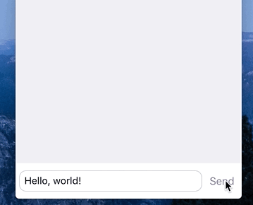
Not optimistic (left) versus optimistic (right)
So, the optimistic UI design shows the end state before the application actually finishes (or even starts) the operation.
So this is just a trick. Why then is it necessary?
The idea behind the intricate name is very simple. However, this can have a huge impact on your users' impression (or “customer satisfaction” if you are Apple). First, it creates the feeling that the application is running faster, as if “speeding up” your application. The user can do something else while the application loads a funny photo with a cat or sends an ironic comment to the discussion. Secondly, it simplifies interaction with the interface, removing unnecessary states and distractions. The app looks simpler and more accessible. Yes, and UI designers will have to bring fewer screens to the state of Pixel-Perfect.
Life examples
Optimistic interface is often used in instant messengers and social applications. Messages for iOS or MacOS resort to this concept when the user sends a message.

Immediate update of the interface in Messages on Mac.
Instagram uses the same solution to add comments:

Instagram comments. Pay attention to the progress indicator on the right.
Let's look at another example: Audible is an audiobook player on iOS. As soon as a small fragment of the record is loaded, the user can immediately start listening while the rest of the track is loaded.

As soon as part of the book is loaded, the inscription "Ready to play" appears. Optimism in its purest form.
Another example is Trello: when the user moves the map, it moves immediately, the interface does not wait for the server to finish its work.
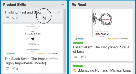
Optimistic UIs are key to Trello's fluency
Optimistic interfaces - a key feature of Trello convenience
The medium uses a similar technology when the user attaches a picture to a post.
Surely, this feature applies to your product.
Progress
Sometimes immediately show the final state is not enough. The user will feel less confused if you delicately let him know that the process is underway. This is especially important when an error occurs. But error messages are a separate topic, we will talk about them later.
Of course, the longer the operation takes, the more noticeable the indication should be. When the user clicks, the display is optional, but when uploading his favorite photo, the indicator demonstration will definitely be useful. Some applications show an indication of progress next to the already updated part of the interface.
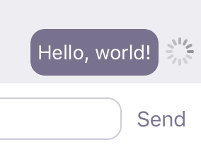
Display progress next to the message
Another way is to add a small icon or tab showing the status of sending a message next to it.

Status Icons (Facebook Messenger)
Messages on iOS in addition give a status indicator over the window. Especially he catches the eye when you upload a funny photo with a cat (one or many).

Indication of progress in the Messages application in iOS
Error messages
And if something went wrong? When designing an error message, pay attention to the following:
1. Visibility . The alert should be clearly visible, so that the user could not miss it (especially when loading data).
2. Causality . The user should be clear which of his actions caused the error. After all, the interface has already been updated, which means that the operation is perceived as completed.
Error messages are the most difficult task for the optimistic interface designer.
The simplest solution is, of course, the Good Old bLocking Error Message (GOLEM) - the good old blocking window.
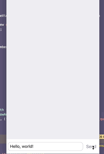
GOLEM in action!
It fits perfectly to the first item. The dialog window in the center of the screen is very difficult not to notice, but it roughly blocks all further interactions with the application. But this decision does not correspond to the second point: the user does not associate the error with what he had done before. The dialogue window appears on the screen completely unexpected, and even with such a formidable text.
Another common solution is to show a button or icon next to a message that could not be sent.
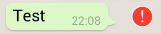
WhatsApp, do not be so!
When the user clicks on it, we show the GOLEM dialog or try to repeat the action without the dialog.
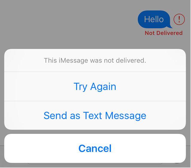
The GOLEM dialog is called by clicking on the error indicator (Messages application in iOS)
Here, on the contrary, everything is fine with cause-and-effect relationships (point 2), but, unfortunately, it is not quite noticeable. If the user has already switched to another screen or scrolled the conversation, leaving a message outside the screen, he will not see the alert.
The Messages application in iOS solves this problem by adding additional indicators in order to more intrusively report on the error status. The indicator is displayed directly on the application icon, so that the user will notice it, even if he completely leaves the messenger.

Messages hints to us that something went wrong.
To reduce the need to show the error status and not scare the user, sometimes it is enough to repeat the operation several times.
Conclusion
Optimistic UI can make working with your application faster, easier and more pleasant for users. It is also an excellent way out if your servers are rather slow (and the admin quit last week). But at the same time, optimism in optimistic interfaces must be justified.
If your servers are completely unreliable (damn this admin), an optimistic interface can be harmful. An endless queue of error messages will annoy users, and failure to see an alert in time can result in a loss of entered data.
So take all these considerations into account and use this solution wisely!
Following this article came another - “ Optimistic UIs in under 1000 words ” by Igor Mandrigin, in which he touches on the same topic, complementing it and illustrating with a large number of examples. We offer you a translation.
Briefly about the optimistic UI. Optimistic interfaces in pictures.
')
Let's talk today about optimistic UI design.
In what sense is optimistic?
Optimistic interfaces do not wait for the completion of the operation. They immediately go to the final state, showing fake information while the operation is still in progress. In words, it all sounds rather confusing, so let's better turn to the first example. For clarity, we take the fictional messenger and call it Cotton Candy. There are two approaches to representing the process of sending a message:
Not optimistic (left) versus optimistic (right)
So, the optimistic UI design shows the end state before the application actually finishes (or even starts) the operation.
So this is just a trick. Why then is it necessary?
The idea behind the intricate name is very simple. However, this can have a huge impact on your users' impression (or “customer satisfaction” if you are Apple). First, it creates the feeling that the application is running faster, as if “speeding up” your application. The user can do something else while the application loads a funny photo with a cat or sends an ironic comment to the discussion. Secondly, it simplifies interaction with the interface, removing unnecessary states and distractions. The app looks simpler and more accessible. Yes, and UI designers will have to bring fewer screens to the state of Pixel-Perfect.
Life examples
Optimistic interface is often used in instant messengers and social applications. Messages for iOS or MacOS resort to this concept when the user sends a message.
Immediate update of the interface in Messages on Mac.
Instagram uses the same solution to add comments:
Instagram comments. Pay attention to the progress indicator on the right.
Let's look at another example: Audible is an audiobook player on iOS. As soon as a small fragment of the record is loaded, the user can immediately start listening while the rest of the track is loaded.
As soon as part of the book is loaded, the inscription "Ready to play" appears. Optimism in its purest form.
Another example is Trello: when the user moves the map, it moves immediately, the interface does not wait for the server to finish its work.
Optimistic UIs are key to Trello's fluency
Optimistic interfaces - a key feature of Trello convenience
The medium uses a similar technology when the user attaches a picture to a post.
Surely, this feature applies to your product.
Progress
Sometimes immediately show the final state is not enough. The user will feel less confused if you delicately let him know that the process is underway. This is especially important when an error occurs. But error messages are a separate topic, we will talk about them later.
Of course, the longer the operation takes, the more noticeable the indication should be. When the user clicks, the display is optional, but when uploading his favorite photo, the indicator demonstration will definitely be useful. Some applications show an indication of progress next to the already updated part of the interface.
Display progress next to the message
Another way is to add a small icon or tab showing the status of sending a message next to it.
Status Icons (Facebook Messenger)
Messages on iOS in addition give a status indicator over the window. Especially he catches the eye when you upload a funny photo with a cat (one or many).
Indication of progress in the Messages application in iOS
Error messages
And if something went wrong? When designing an error message, pay attention to the following:
1. Visibility . The alert should be clearly visible, so that the user could not miss it (especially when loading data).
2. Causality . The user should be clear which of his actions caused the error. After all, the interface has already been updated, which means that the operation is perceived as completed.
Error messages are the most difficult task for the optimistic interface designer.
The simplest solution is, of course, the Good Old bLocking Error Message (GOLEM) - the good old blocking window.
GOLEM in action!
It fits perfectly to the first item. The dialog window in the center of the screen is very difficult not to notice, but it roughly blocks all further interactions with the application. But this decision does not correspond to the second point: the user does not associate the error with what he had done before. The dialogue window appears on the screen completely unexpected, and even with such a formidable text.
Another common solution is to show a button or icon next to a message that could not be sent.
WhatsApp, do not be so!
When the user clicks on it, we show the GOLEM dialog or try to repeat the action without the dialog.
The GOLEM dialog is called by clicking on the error indicator (Messages application in iOS)
Here, on the contrary, everything is fine with cause-and-effect relationships (point 2), but, unfortunately, it is not quite noticeable. If the user has already switched to another screen or scrolled the conversation, leaving a message outside the screen, he will not see the alert.
The Messages application in iOS solves this problem by adding additional indicators in order to more intrusively report on the error status. The indicator is displayed directly on the application icon, so that the user will notice it, even if he completely leaves the messenger.
Messages hints to us that something went wrong.
To reduce the need to show the error status and not scare the user, sometimes it is enough to repeat the operation several times.
Conclusion
Optimistic UI can make working with your application faster, easier and more pleasant for users. It is also an excellent way out if your servers are rather slow (and the admin quit last week). But at the same time, optimism in optimistic interfaces must be justified.
If your servers are completely unreliable (damn this admin), an optimistic interface can be harmful. An endless queue of error messages will annoy users, and failure to see an alert in time can result in a loss of entered data.
So take all these considerations into account and use this solution wisely!
Source: https://habr.com/ru/post/317664/
All Articles