Adaptive menu without javascript

In this post, I want to show one of the ways to implement an adaptive horizontal menu using Flexbox. This method of menu implementation is used on the Warface Hub site, but with a slightly different structure and more whistles.
Somewhere about a year ago, I got into one company, in which I was told a wonderful phrase: “First, we do everything with CSS, and then we just add JavaScript.” The advice seems to be good, and I followed it. But as it happens, I suffered. Now I am annoyed by the fact that not everything needs to be done with this approach.
And so, more to the point. I started to study and implement.
')
Goals
- get basic skills with Flexbox properties;
- develop a horizontal adaptive menu;
- The resulting solution is applied in the project.
Tools and documentation
- NPM - as a package manager (now we are actively moving to Yarn)
- Grunt - a tool to help build a project.
- Flexbox documentation (see Useful Links );
- SASS
You can use your tool kit.
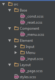
Structure
To organize the structure of styles for the menu, I used the concept described here . The author of this concept proposes to break all the descriptions of styles into several parts:
- layout - describes the position of components and elements on the page;
- component - describes the display and behavior of the elements that are included in the component;
- element describes the display and behavior of a single element;
Thus, my understanding of the concept led me to this structure:
- Base - description of constants, base styles (as in normalize.css )
- Component - description of the application components. In our case, the component "Menu"
- Element - style description for elements such as button, link, etc.
- Layout - description of the location of the blocks on the page
- style.scss - in this file we will put it all together
CSS and HTML tags input & label
Before starting to draw HTML markup, I would like to remind / show interesting CSS selector behavior, which is useful to us.
<label for="input-0" class="label"> 1</label> <input type="radio" name="input-trigger" id="input-0" class="input" /> <label for="input-1" class="label"> 1</label> <input type="radio" name="input-trigger" id="input-1" class="input" /> In this example, you can see that when you click on the label, you will receive the selected input. There is nothing special in this (see the documentation ), but the most interesting is happening from the side of CSS selectors.
.input:checked { border-color: red; } This CSS selector will only be processed when input is selected (see : checked )
The second thing to look out for in CSS selectors is the choice of the next element (see Adjacent sibling selectors and General sibling selectors ). That is, we can select the next item after the current one.
.input:checked + .label { color: red; } In this example, we got the following behavior: with the selected element with the input class, the element following it with the label class will be changed in accordance with the described styles.
Now all this can be combined together.
Single item menu structure
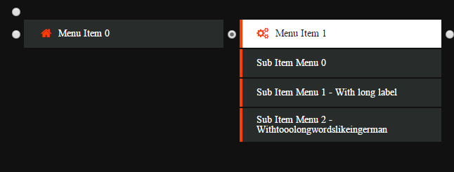
<input type="radio" name="menu-item-trigger" id="menu-close" class="input input-hidden"> <nav class="menu"> <input type="radio" name="menu-item-trigger" id="menu-item-0" class="input input-hidden" /> <div class="menu-item menu-item-trigger"> <label for="menu-close" class="menu-item-close"> </label> <label for="menu-item-0" class="menu-item-label"> <i class="fa fa-home"></i> <span class="menu-item-label-text">Menu Item 0</span> </label> <div class="menu-sub"> <li class="menu-item menu-item-sub"> <a href="#" class="menu-item-label"> <span class="menu-item-label-text">Sub Item Menu 0</span> </a> </li> <li class="menu-item menu-item-sub"> <a href="#" class="menu-item-label"> <span class="menu-item-label-text">Sub Item Menu 1 - With long label</span> </a> </li> <li class="menu-item menu-item-sub"> <a href="#" class="menu-item-label"> <span class="menu-item-label-text">Sub Item Menu 2 - Withtooolongwordslikeingerman</span> </a> </li> </div> </div> </nav> In this example, I added several input and label elements to get the following behavior:
- Each name = menu-item-trigger element, except for the first one, in the state: checked will change the visibility and position of the subsequent label.menu-item-close and div.menu-sub elements so that the label.menu-item-close element is completely overlapped the label.menu-item-label element, and div.menu-sub was displayed under the label.menu-item-label element. That is, we open the submenu and change the behavior when clicking on the main menu;
- The first element name = menu-item-trigger will be used only to undo all applied changes in the previous paragraph, that is, close the submenu;
No menu item selected:
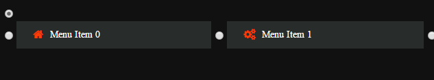
One menu item selected:
After such manipulations, it remains only to hide the input elements.
Flexbox
Now you need to add styles so that this menu is well displayed at different resolutions and different browsers. At the moment we have focused our efforts on supporting those browsers that are most used by visitors to our site. It turned out a small list: Chrome, Firefox, IE Edge, IE 11 and their mobile versions of the latest versions.
Support is provided by adding prefixes ( postcss ) and writing styles separately for a specific browser.
Flexbox adaptability is achieved very simply. It is enough to describe the container, but sometimes it will be necessary to solve problems with the content inside. For example:
- menu items with long words like knowledge base and its German translation of Wissensdatenbank. In this case, a wrapping element is added to the text, to which approximately the following styles are applied:
.label-text { // @link: http://htmlbook.ru/css/text-overflow overflow: hidden; text-overflow: ellipsis; width: 100%; display: inline-block; } - Images that need to be stretched to the width, but when setting the width: 100%; they crawl out of the parent box. Here box-sizing will help: border-box; for this item;
- There may also be problems with the fact that the child elements do not occupy the entire possible length or are not distributed evenly. Flex may help here: 1 1 auto.
In this example, the container for the elements is described as:
.menu { display: flex; align-items: center; flex-wrap: wrap; } For each element in the container, you need to set the styles so that it fills all possible space and aligns the content inside itself in the center vertically:
.menu-item { flex: 1 1 auto; display: flex; flex-direction: column; align-items: stretch; } 
A more beautiful display of the menu can be achieved with the help of media queries and more accurate sizes and positions of elements.
Total
After implementing this example, I have finalized it as part of a combat project, which now uses such an adaptive menu. The pros and cons of getting rid of Javascript in favor of CSS were also identified:
Pros:
- You do not need to wait for JavaScript to load. Most often, the menu is in the header of the site, so these styles can be put in core.css, which describes the main styles of elements that are visible to the user when the page is loaded;
- The menu will work even if something terrible happens in JavaScript and the menu script is not initialized.
Minuses:
- Limited CSS selectors, for example, it is not possible to change the parent element when the child changes;
- On iOS, a performance loss was noticed. I had to understand and put down the will-change properties;
- There is no possibility to hide under the menu N seconds after the loss of focus (implementation features);
- It's hard to figure out the HTML menu markup;
- Eyeball Flexbox Support in IE
useful links
- PCSS - description of the concept of building component CSS;
- Guide To Flexbox (EN) - Flexbox properties are well described here;
- Guide To Flexbox (RUS) - Flexbox properties in Russian are well described here;
- Mr. Froggy - helps you learn how to use the Flexbox
- Demo
- Github project
Source: https://habr.com/ru/post/317528/
All Articles