Manipulations of users of the site using colors
We live in a time when people are not accustomed to immerse themselves in some topic. This also applies to design. Today, everyone appreciates winning at various prestigious design competitions, or, at worst, evaluating personal “like / dislike”. We also have international design awards from Awwwards, Behance and other famous “appraisers” who dictate modern fashion in web design. But are they important? If you look at the essence of design, then it, like so much in our world, is based on the psychology of perception. And psychology is the basis of any successful design. You can win the design competition, but the site at the same time will be only a beautiful picture that absolutely does not reach the goal. In this article we will talk about the psychology and effectiveness of website design, in particular, having analyzed such an important aspect as colors in detail.
Color is one of the most important tools for manipulating people on the Internet, the importance of which almost everyone underestimates. And this happens because we do not notice it, the color remains in the background. We rate the site as a whole. But it is with the help of color that emotions, feelings are transmitted, the site atmosphere is created. Properly owning this tool, you can both excite the user and encourage him to action, such as purchasing a product, and create a peaceful and relaxed atmosphere on the site.
Color for a site is not just beauty, color changes a person's perception and is far from the last factor in business performance. Few people talk about this, but this is pure psychology, working with the conscious and subconscious. I do not know why everyone so often discusses the gradient of a button, rounded or sharp corners, block size or other trifles, while completely forgetting about the basics of human perception. After all, if the laws of basic perception are violated, then no “ryushechki” and “phishychki” will help to achieve a good conversion. In our company, we pay very great attention to psychology in design and color perception.
In this article I will tell you how to combine colors correctly, why you need a color wheel, sort out what color and how it affects human behavior. I will show with examples how the color schemes work and what emotions they cause. To top it off, I’ll give you some useful resources that will help you work more efficiently with colors.
')
In this article I will tell you how to combine colors correctly, why you need a color wheel, sort out what color and how it affects human behavior. I will show with examples how the color schemes work and what emotions they cause. To top it off, I’ll give you some useful resources that will help you work more efficiently with colors.
You can talk endlessly about color and mixing shades, but let's highlight the most important and focus on the basic information.
There are seven primary colors in the color wheel: red, orange, yellow, green, blue, blue, and purple (rainbow colors). The rest of the colors can be obtained by mixing, such colors are called additional or secondary, it is best to combine 2-3 primary colors and secondary shades.
The easiest way to choose a color is to turn your attention to the so-called color theory.
Immediately I would like to note, in order to describe the color and all its versatility, one article will be small. Therefore, we will select from this theory the basic concepts, such as:
Contrast (or complementary colors) is the opposite of the colors in the color wheel. Each color has an opposite color that contrasts it most. In order to find it, we just need to choose a color, and the contrast will be created by the one on the opposite side of the circle.
Such colors can be considered additional, because on the website they will have equal values. In most cases, they are used to focus on any element.
Example: Red and green, orange and blue.
Similar colors - these colors look very good together, they complement and emphasize each other, creating a feeling of coziness and comfort. It’s easy to find them: let's take the color we chose and take a look at the color next to it, in the color wheel, it will be the same.
Example: Purple, Blue, and Pink.
Warm and cold colors - this is the distinction between colors in mood and feeling.
There are colors that cause warm and tender feelings, prompting a person to act or buy (warm), but there are also those that, on the contrary, soothe him and appease (cold). This factor we need to take into account when creating a site, paying attention to what kind of reaction we expect from our user.
Example:
Warm - red, yellow, orange
Cold - blue, green, purple
So, we learned to find complementary and similar colors, we found out that they are cold and warm. Thus, we can apply different in mood colors on sites of various subjects.
For example, warm colors are best for creating New Year's websites, they will create a feeling of celebration, warmth and comfort that is so lacking in the cold winter days, an example of such a site is www.portablenorthpole.com , where the designer used red, festive color.
Warm colors are used on those sites where you need to cause a feeling of tenderness, delicacy and appetite. As an example, the site http://daguia.com.br is perfect - here are collected recipes of various sweets (cakes, cakes and desserts)
Cool colors on the site http://www.decibelblue.com - this is the depths of the sea and peace, which cause the user to immerse themselves in the site entirely. The designer chose blue color, and this is the right decision: he emphasizes the smoothness of the water and the beautiful coral reefs in the background.
Another example of cool colors http://thatgamecompany.com is the site of the game development company. The site is made in light cold shades, which gives it the effect of immersion and airiness, as if you are in weightlessness.
We gradually understand that the color on the website is not just a decoration, but a very important element, which, in turn, can determine the success of your enterprise.
Let's talk now about the combination of colors. After all, choosing a color is not everything - it is necessary that it harmonizes with the others, creating a complete picture in which each color should have its own meaning and be in its place.
A lot will depend on the right choice of color scheme: for example, the level of attendance, sales on the site. After all, a person should be comfortable and cozy, and that’s what we want to achieve.
There are many ways to combine colors, but let's look at those that are used most often and have gained the most popularity among designers.
The triad (tricolor) is a color scheme on which all the colors inside the color wheel form a triangle. It is the most balanced and reliable scheme. The second by the number of colors in the palette, it evokes a sense of interest, the colors shimmer like a rainbow, due to which a person receives a continuous outburst of emotions. As an example of a site with this system, one can cite http://drewwilson.com - on the site there are 3 primary colors and their shades, which give it an unforgettable and interesting design.
In order for us to get a triad, you only need to select 3 different colors located 120 degrees from each other.
Double complementary system - at the heart of the scheme are 4 colors that contrast the cross to cross with each other, forming a rectangle. The palette is the most saturated with colors and due to this it can be advantageous: it creates a feeling of joy and happiness. This color combination is rarely used, but it can be an interesting solution.
As an example, you can take a look at the site - http://www.enlighten-my-mind.com , dividing the profession by color, the site has become more lively
Consistent system - this system combines the colors that we previously called similar. Consistent arrangement of colors gives a feeling of comfort and peace, which is often lacking in many projects.
In order to choose colors for this system, select colors that are arranged one behind the other in the color wheel.
In addition to everything, you can learn from nature, since we have been surrounded by many colors and shades since childhood - these are sunsets, flowers, forests, oceans and deserts, if you properly break landscapes or paintings into colors that are pleasing to your eye, we will get shades that you can translate into a color scheme for our future site.
A couple of examples of such schemes in which we observe that the winter forest and the summer one have different colors and create a different atmosphere for each other:
It is natural and natural colors that are most easily perceived by man.
So, we have reviewed the theme of color combinations and learned that each color system is a unique solution and should be used for each specific task. It is equally important to take into account the harmony of colors in the creation of sites. Properly and clearly chosen scheme can affect the success of your site, as well as increase its attractiveness to the user. After all, the user must ultimately receive the best and positive emotions.
In order to easily choose a color scheme, there are many different sites that provide similar functions. And here are some of them:
Adobe Color CC
Paletton
In each culture, color plays its part and is perceived differently on an emotional level. But I would like to talk about Western culture. How does the process of the impact of color on human behavior, what exactly is pushing him to make a purchase or the desire to visit a resource more often?
This mechanism is of particular importance in e-commerce, this is where the largest percentage of purchases occurs on an emotional level, the right color and the reaction to it can greatly affect the conversion.
For example, we go to the product page of any popular online store, pay attention to the color solutions and the fact that it is more striking. These will be elements such as the "buy" button, a banner with a discount or a promotional offer, a dedicated promotional price for the product. It is these elements that force the user to buy.
Let's find out what color we use for these elements, considering each of them separately:
Red - has always been the color of the action, this warm color always causes an increase in the pulse of the users, with it is associated love, desire, gambling. Color causes a sense of power and importance. A button of this color on the site will always cause the most attention.
Let's take a look at the youtube10.withgoogle.com website, which uses game style, and the red color underlines all accents:
Orange - this color is desirable to use in those projects where you need to cause a feeling of joy or ease (these are the associations that orange causes). In addition, it creates a feeling of energetic movement and is often associated with the color of creativity.
For example, the company “Stickermule” for the implementation of its site chose the orange color, reflecting in the person’s subconscious that it is fun entertainment and interesting fun that can be purchased
Yellow is a very interesting color, depending on the shade can change a person's emotions, Bright yellow is the color of energy. Classic yellow causes a feeling of peace. Dark yellow fills the site with wealth and creates a feeling of comfort.
For example, the site of the company “Lapasta Fresca” is a vivid example: creating a feeling of warmth, a sunny day, comfort, it very successfully promotes its product to the market:
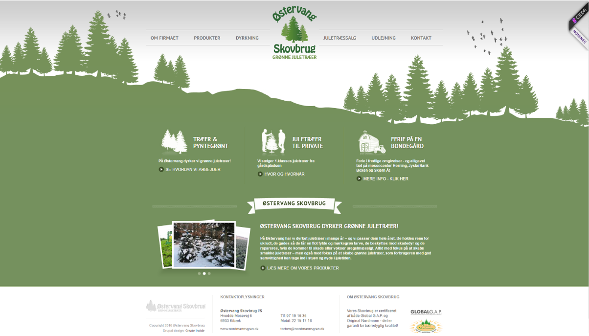
Green is the color of health and harmony with nature, this color is often associated with money, sometimes it can be caused by such associations as gambling or alcoholic beverages. In most cases, is well suited for sites with directions - a healthy diet, agriculture, medicine.
As an example, the company Oestervangskovbrug. The site is made in green color, which gives a sense of communion with nature
Blue is the color of reliability, tranquility, peace of mind, but as with yellow, its influence depends on what color it betrays, dark tones can even cause a feeling of sadness.
For corporate sites it is best to use blue color, it is also perfect for legal sites, but in darker colors.
For example, the site fork-cms.com uses the maritime theme, which in turn further enhances the blue color. The site looks corporate and causes a feeling of purity, trust and playfulness through the illustrations:

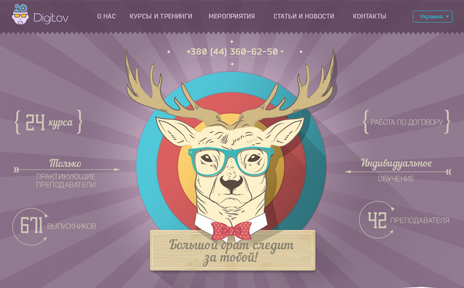
Purple is a magical and mysterious color, has long caused a sense of wealth and luxury, this color is very good if we want to sell something expensive, also good for fashionable and interesting products.
Here on the site Digitov purple color gives a feeling of something interesting and mysterious:
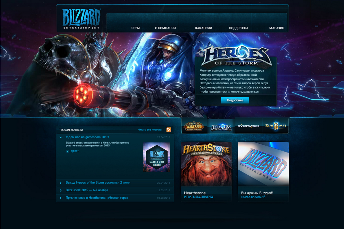
Black is a very strong color, it attracts attention entirely, with this color it is very important not to overdo it - if we want our site to evoke positive emotions, we cannot make black very intense. This color is often used as a background. For example, if we decide, by advertising, to sell computer games or 3D TVs, we can use this color to give the site depth.
Let's take a look at the site blizzard.com, as if it is immersed in itself (due to the black background), and bright, beautiful pictures attract the view of the user.
White - this color is the exact opposite of black: if black completely absorbs into itself, then white, on the contrary, gives a feeling of lightness and simplicity. With the white color of the space around it becomes visually larger. White is kindness and freshness. Very suitable for almost all types of sites, as the background color.
For example, the site that I saw on behance.net, clearly shows us that white color can work wonders:

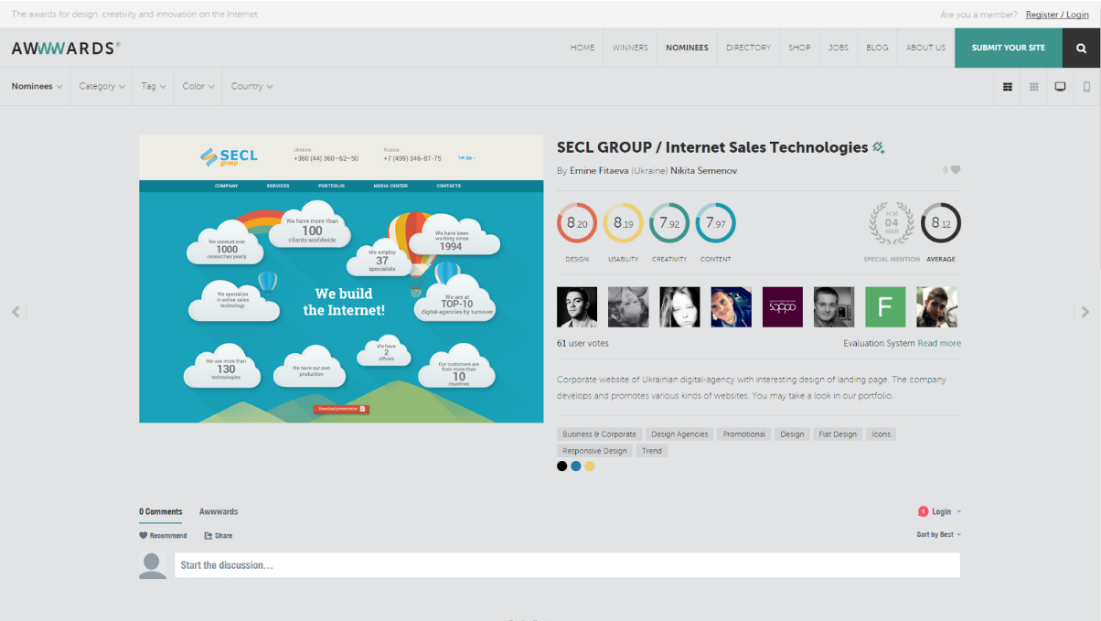
Gray - in fact does not create a special atmosphere and causes emotions - such as neutrality, non-participation. But, if you use the gray color and its shades correctly, you can complement the atmosphere of the site so that the visitor, being on it, feels like in a comfortable chair.
A striking example of such a site is awwwards.com. Here, the gray color does not create the emotion of indifference, but on the contrary, supplemented with bright pictures of beautiful works, gives a feeling of beauty and comfort:
Brown - this color is usually associated with the earth, it inspires confidence, stability, comfort. Sometimes in combination with gold, it can cause a feeling of high prices and wealth. If we, for example, need to sell expensive whiskey or expensive watches, you can use this color.
Let's take, as an example, the romanson.com website: the clock in the picture looks very expensive and of high quality; the site created an impression of comfort and confidence; It is this factor that makes people make a purchasing decision:
Pink is a delicate color that more attracts a female audience, causes such emotions as affection and romance. This color is very well suited, for example, for a women's clothing store, flowers, perfumes. But its individual shades (darker) may be associated with such areas as unusual music, food, drinks.
Here is a prime example: victoriassecret.com. The manufacturer and designer of women's underwear, chose a color scheme on the site, that the emphasis is on pink elements:
Additionally - to choose the color you can use, for example, such sites as: flatuicolorpicker.com and flatuicolors.com . Very comfortable to use, and you can visually look at the color and copy its code.
Summing up, I would like to say that color is the tool that is not always noticeable. The user does not think that the site is green or blue, he gets a set of emotions and impressions. The user will scroll, press the buttons, guided by some set of impressions, namely the accents that the designer has placed. For example, we buy Snickers, because it gives us energy, it charges us. In our country, this was postponed in the subconscious because of the advertisement we watched. The same with color in web design: we press a button because there is an impulse in the subconscious to press it. This is something that is not visible, something that is often ignored, but at the same time color is of great importance.
You need to think about color from the very beginning, when you are just creating a product (project). At the stage of creating a logo and corporate identity. However, even with the existing logo and colors, you can still play and try different options.
I want to give some tips that can help you make your site better and improve its efficiency:
However, these are just a few simple tips, but in general colors are a whole science, which is based on psychology. Do it right away right to get the most out of your sites.
Emotions that cause colors are the secret weapon. The whole world is built on emotions. The largest brands conduct entire research in order to understand how the colors of their product influence their purchasing decisions. No matter how cool and sophisticated the site is, it either causes positive emotions, and the user will want to continue to work with it and do the necessary actions on it, or it will cause negative emotions, and users will simply leave it. And no bounce rate shows you why your sales are low.
In general, work with professionals. Well, if you think that working with professionals is expensive, then try working with amateurs.
PS Many of you know that in addition to the core business of custom web development and web design, we also have our own educational project, Digitov Business School , where our staff conduct a number of courses. So, we decided to conduct an experiment and recently made an innovation - mentoring programs. You can contact us for consultants who can teach, suggest, evaluate quality, help with a complex issue, consult on development and many other useful things.
This can be useful in two cases:
We are ready to offer mentors in the following areas:
Separately, it is possible to discuss mentoring from top-level specialists who solve not applied tasks, but more global ones.
So far this is an experiment, but we have already started the first mentoring programs and it really works. Anyone can write to us at info@digitov.com and we will advise you in more detail.
PPS To receive our new articles before others or simply not to miss new publications - subscribe to the SECL Group's fan pages: Facebook , VK , and Twitter .
Author:
Vladislav Uzhin
Web Designer
SECL Group Company
Color is one of the most important tools for manipulating people on the Internet, the importance of which almost everyone underestimates. And this happens because we do not notice it, the color remains in the background. We rate the site as a whole. But it is with the help of color that emotions, feelings are transmitted, the site atmosphere is created. Properly owning this tool, you can both excite the user and encourage him to action, such as purchasing a product, and create a peaceful and relaxed atmosphere on the site.
Color for a site is not just beauty, color changes a person's perception and is far from the last factor in business performance. Few people talk about this, but this is pure psychology, working with the conscious and subconscious. I do not know why everyone so often discusses the gradient of a button, rounded or sharp corners, block size or other trifles, while completely forgetting about the basics of human perception. After all, if the laws of basic perception are violated, then no “ryushechki” and “phishychki” will help to achieve a good conversion. In our company, we pay very great attention to psychology in design and color perception.
In this article I will tell you how to combine colors correctly, why you need a color wheel, sort out what color and how it affects human behavior. I will show with examples how the color schemes work and what emotions they cause. To top it off, I’ll give you some useful resources that will help you work more efficiently with colors.
')
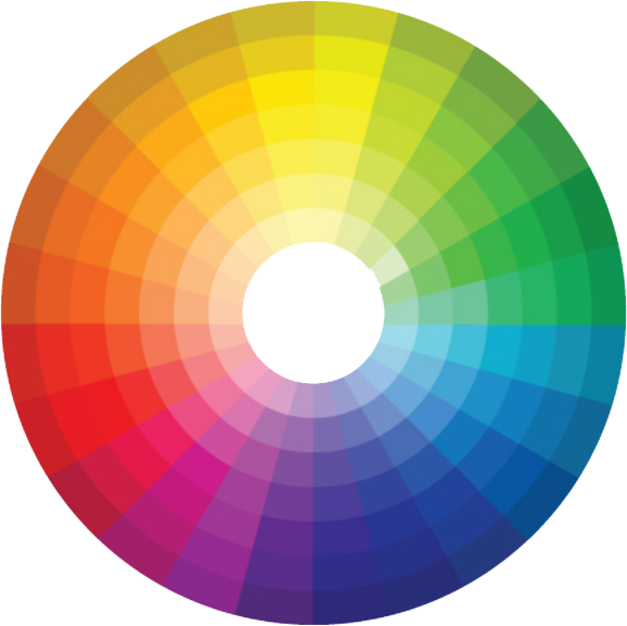
Color circle
In this article I will tell you how to combine colors correctly, why you need a color wheel, sort out what color and how it affects human behavior. I will show with examples how the color schemes work and what emotions they cause. To top it off, I’ll give you some useful resources that will help you work more efficiently with colors.
You can talk endlessly about color and mixing shades, but let's highlight the most important and focus on the basic information.
There are seven primary colors in the color wheel: red, orange, yellow, green, blue, blue, and purple (rainbow colors). The rest of the colors can be obtained by mixing, such colors are called additional or secondary, it is best to combine 2-3 primary colors and secondary shades.
The easiest way to choose a color is to turn your attention to the so-called color theory.
Immediately I would like to note, in order to describe the color and all its versatility, one article will be small. Therefore, we will select from this theory the basic concepts, such as:
Contrast (or complementary colors) is the opposite of the colors in the color wheel. Each color has an opposite color that contrasts it most. In order to find it, we just need to choose a color, and the contrast will be created by the one on the opposite side of the circle.
Such colors can be considered additional, because on the website they will have equal values. In most cases, they are used to focus on any element.
Example: Red and green, orange and blue.
Similar colors - these colors look very good together, they complement and emphasize each other, creating a feeling of coziness and comfort. It’s easy to find them: let's take the color we chose and take a look at the color next to it, in the color wheel, it will be the same.
Example: Purple, Blue, and Pink.
Warm and cold colors - this is the distinction between colors in mood and feeling.
There are colors that cause warm and tender feelings, prompting a person to act or buy (warm), but there are also those that, on the contrary, soothe him and appease (cold). This factor we need to take into account when creating a site, paying attention to what kind of reaction we expect from our user.
Example:
Warm - red, yellow, orange
Cold - blue, green, purple
So, we learned to find complementary and similar colors, we found out that they are cold and warm. Thus, we can apply different in mood colors on sites of various subjects.
For example, warm colors are best for creating New Year's websites, they will create a feeling of celebration, warmth and comfort that is so lacking in the cold winter days, an example of such a site is www.portablenorthpole.com , where the designer used red, festive color.
Warm colors are used on those sites where you need to cause a feeling of tenderness, delicacy and appetite. As an example, the site http://daguia.com.br is perfect - here are collected recipes of various sweets (cakes, cakes and desserts)
Cool colors on the site http://www.decibelblue.com - this is the depths of the sea and peace, which cause the user to immerse themselves in the site entirely. The designer chose blue color, and this is the right decision: he emphasizes the smoothness of the water and the beautiful coral reefs in the background.
Another example of cool colors http://thatgamecompany.com is the site of the game development company. The site is made in light cold shades, which gives it the effect of immersion and airiness, as if you are in weightlessness.
We gradually understand that the color on the website is not just a decoration, but a very important element, which, in turn, can determine the success of your enterprise.
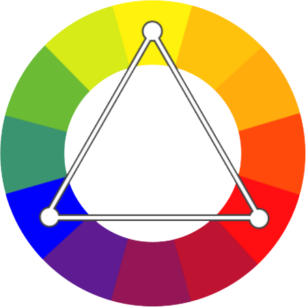
A color scheme
Let's talk now about the combination of colors. After all, choosing a color is not everything - it is necessary that it harmonizes with the others, creating a complete picture in which each color should have its own meaning and be in its place.
A lot will depend on the right choice of color scheme: for example, the level of attendance, sales on the site. After all, a person should be comfortable and cozy, and that’s what we want to achieve.
There are many ways to combine colors, but let's look at those that are used most often and have gained the most popularity among designers.
The triad (tricolor) is a color scheme on which all the colors inside the color wheel form a triangle. It is the most balanced and reliable scheme. The second by the number of colors in the palette, it evokes a sense of interest, the colors shimmer like a rainbow, due to which a person receives a continuous outburst of emotions. As an example of a site with this system, one can cite http://drewwilson.com - on the site there are 3 primary colors and their shades, which give it an unforgettable and interesting design.
In order for us to get a triad, you only need to select 3 different colors located 120 degrees from each other.
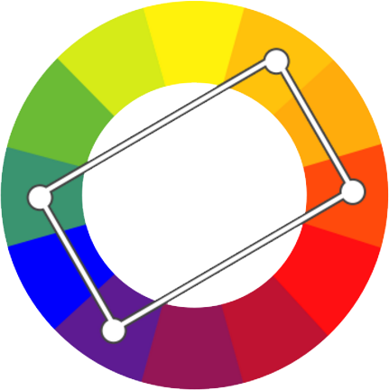
Double complementary system - at the heart of the scheme are 4 colors that contrast the cross to cross with each other, forming a rectangle. The palette is the most saturated with colors and due to this it can be advantageous: it creates a feeling of joy and happiness. This color combination is rarely used, but it can be an interesting solution.
As an example, you can take a look at the site - http://www.enlighten-my-mind.com , dividing the profession by color, the site has become more lively
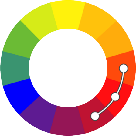
Consistent system - this system combines the colors that we previously called similar. Consistent arrangement of colors gives a feeling of comfort and peace, which is often lacking in many projects.
In order to choose colors for this system, select colors that are arranged one behind the other in the color wheel.
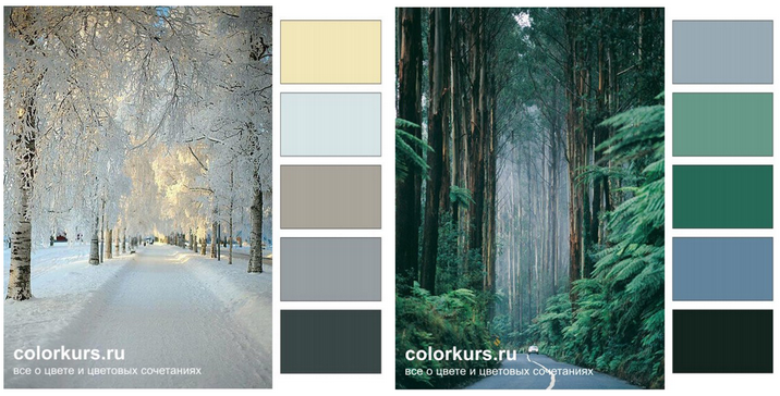
In addition to everything, you can learn from nature, since we have been surrounded by many colors and shades since childhood - these are sunsets, flowers, forests, oceans and deserts, if you properly break landscapes or paintings into colors that are pleasing to your eye, we will get shades that you can translate into a color scheme for our future site.
A couple of examples of such schemes in which we observe that the winter forest and the summer one have different colors and create a different atmosphere for each other:
It is natural and natural colors that are most easily perceived by man.
So, we have reviewed the theme of color combinations and learned that each color system is a unique solution and should be used for each specific task. It is equally important to take into account the harmony of colors in the creation of sites. Properly and clearly chosen scheme can affect the success of your site, as well as increase its attractiveness to the user. After all, the user must ultimately receive the best and positive emotions.
In order to easily choose a color scheme, there are many different sites that provide similar functions. And here are some of them:
Adobe Color CC
Paletton
Color perception on an emotional level
In each culture, color plays its part and is perceived differently on an emotional level. But I would like to talk about Western culture. How does the process of the impact of color on human behavior, what exactly is pushing him to make a purchase or the desire to visit a resource more often?
This mechanism is of particular importance in e-commerce, this is where the largest percentage of purchases occurs on an emotional level, the right color and the reaction to it can greatly affect the conversion.
For example, we go to the product page of any popular online store, pay attention to the color solutions and the fact that it is more striking. These will be elements such as the "buy" button, a banner with a discount or a promotional offer, a dedicated promotional price for the product. It is these elements that force the user to buy.
Let's find out what color we use for these elements, considering each of them separately:
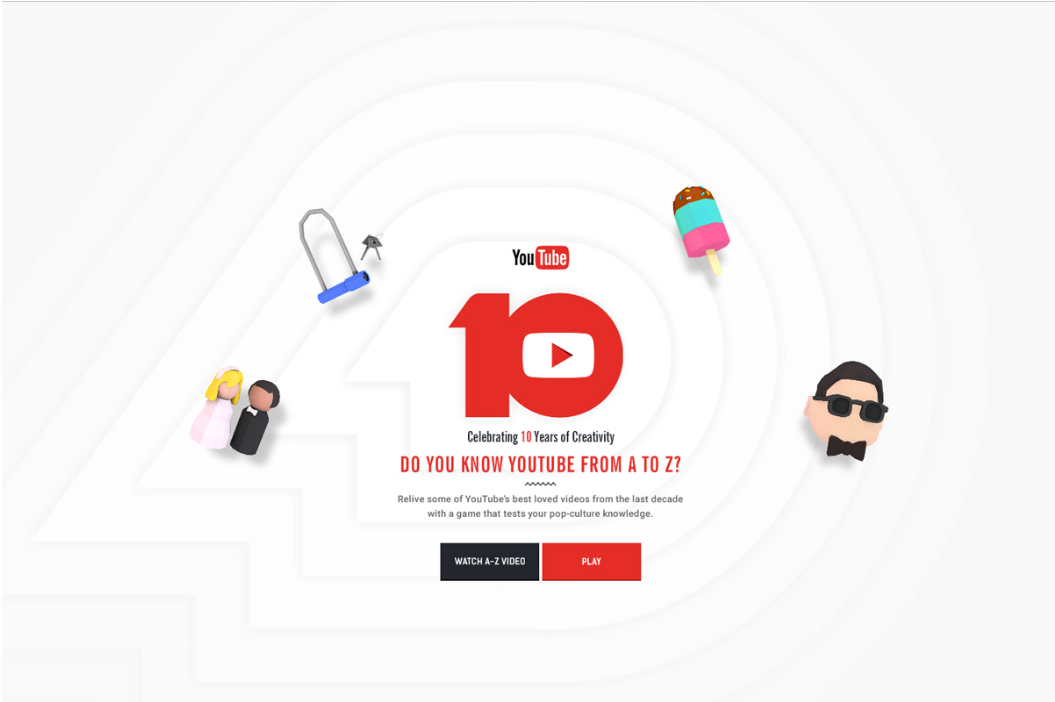
Red - has always been the color of the action, this warm color always causes an increase in the pulse of the users, with it is associated love, desire, gambling. Color causes a sense of power and importance. A button of this color on the site will always cause the most attention.
Let's take a look at the youtube10.withgoogle.com website, which uses game style, and the red color underlines all accents:
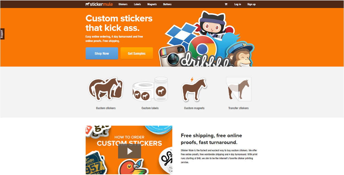
Orange - this color is desirable to use in those projects where you need to cause a feeling of joy or ease (these are the associations that orange causes). In addition, it creates a feeling of energetic movement and is often associated with the color of creativity.
For example, the company “Stickermule” for the implementation of its site chose the orange color, reflecting in the person’s subconscious that it is fun entertainment and interesting fun that can be purchased
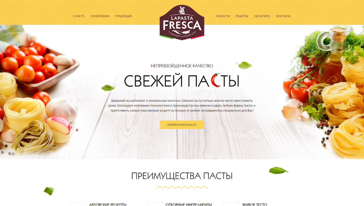
Yellow is a very interesting color, depending on the shade can change a person's emotions, Bright yellow is the color of energy. Classic yellow causes a feeling of peace. Dark yellow fills the site with wealth and creates a feeling of comfort.
For example, the site of the company “Lapasta Fresca” is a vivid example: creating a feeling of warmth, a sunny day, comfort, it very successfully promotes its product to the market:
Green is the color of health and harmony with nature, this color is often associated with money, sometimes it can be caused by such associations as gambling or alcoholic beverages. In most cases, is well suited for sites with directions - a healthy diet, agriculture, medicine.
As an example, the company Oestervangskovbrug. The site is made in green color, which gives a sense of communion with nature
Blue is the color of reliability, tranquility, peace of mind, but as with yellow, its influence depends on what color it betrays, dark tones can even cause a feeling of sadness.
For corporate sites it is best to use blue color, it is also perfect for legal sites, but in darker colors.
For example, the site fork-cms.com uses the maritime theme, which in turn further enhances the blue color. The site looks corporate and causes a feeling of purity, trust and playfulness through the illustrations:
Purple is a magical and mysterious color, has long caused a sense of wealth and luxury, this color is very good if we want to sell something expensive, also good for fashionable and interesting products.
Here on the site Digitov purple color gives a feeling of something interesting and mysterious:
Black is a very strong color, it attracts attention entirely, with this color it is very important not to overdo it - if we want our site to evoke positive emotions, we cannot make black very intense. This color is often used as a background. For example, if we decide, by advertising, to sell computer games or 3D TVs, we can use this color to give the site depth.
Let's take a look at the site blizzard.com, as if it is immersed in itself (due to the black background), and bright, beautiful pictures attract the view of the user.
White - this color is the exact opposite of black: if black completely absorbs into itself, then white, on the contrary, gives a feeling of lightness and simplicity. With the white color of the space around it becomes visually larger. White is kindness and freshness. Very suitable for almost all types of sites, as the background color.
For example, the site that I saw on behance.net, clearly shows us that white color can work wonders:
Gray - in fact does not create a special atmosphere and causes emotions - such as neutrality, non-participation. But, if you use the gray color and its shades correctly, you can complement the atmosphere of the site so that the visitor, being on it, feels like in a comfortable chair.
A striking example of such a site is awwwards.com. Here, the gray color does not create the emotion of indifference, but on the contrary, supplemented with bright pictures of beautiful works, gives a feeling of beauty and comfort:
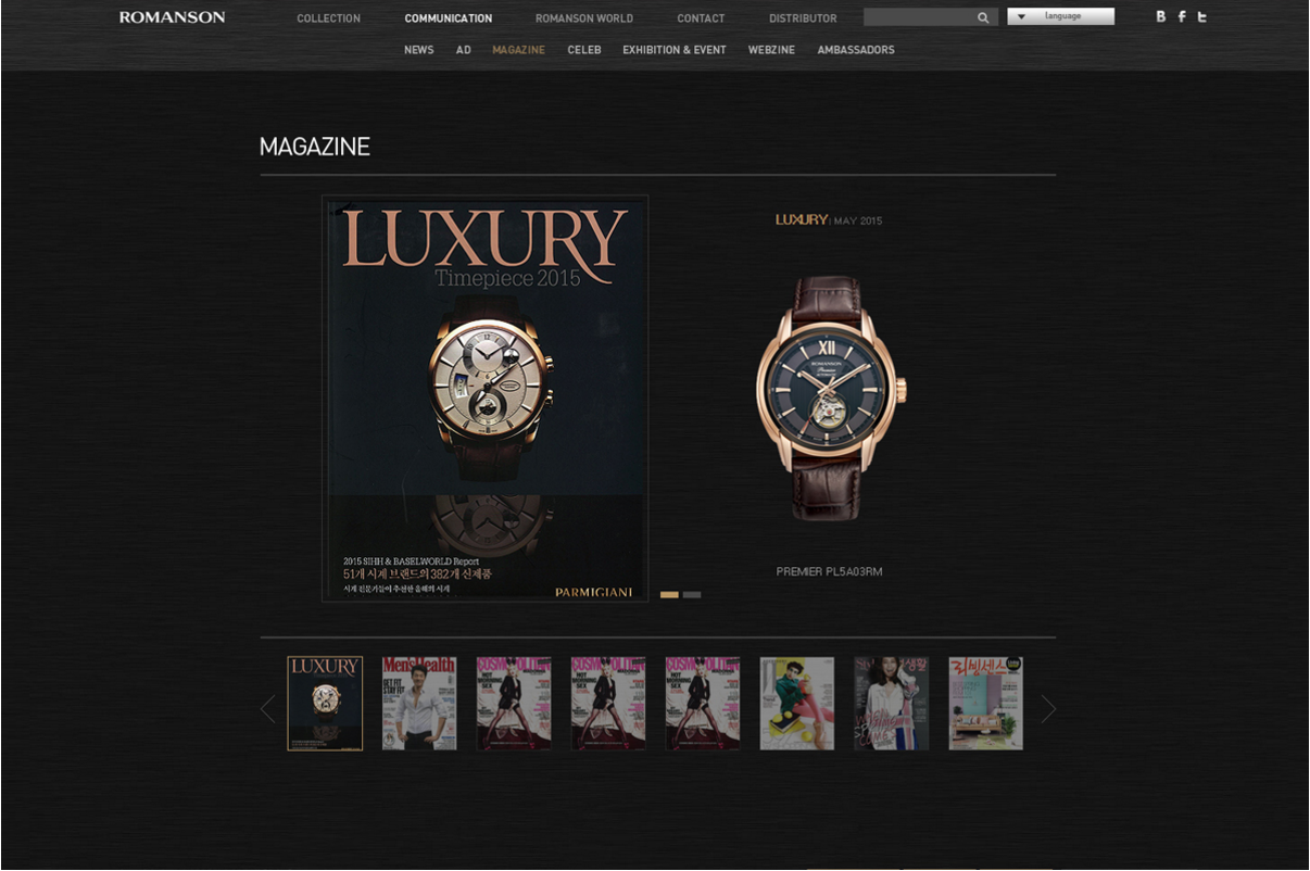
Brown - this color is usually associated with the earth, it inspires confidence, stability, comfort. Sometimes in combination with gold, it can cause a feeling of high prices and wealth. If we, for example, need to sell expensive whiskey or expensive watches, you can use this color.
Let's take, as an example, the romanson.com website: the clock in the picture looks very expensive and of high quality; the site created an impression of comfort and confidence; It is this factor that makes people make a purchasing decision:
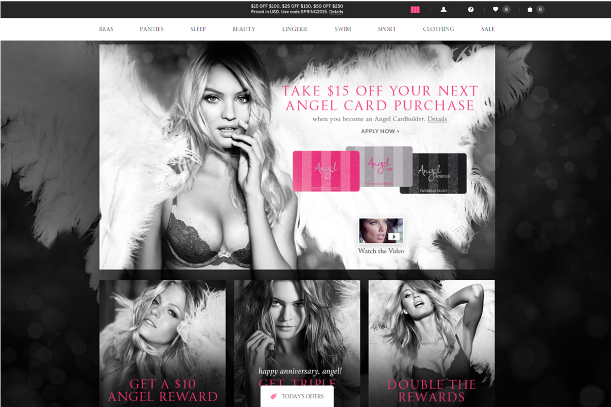
Pink is a delicate color that more attracts a female audience, causes such emotions as affection and romance. This color is very well suited, for example, for a women's clothing store, flowers, perfumes. But its individual shades (darker) may be associated with such areas as unusual music, food, drinks.
Here is a prime example: victoriassecret.com. The manufacturer and designer of women's underwear, chose a color scheme on the site, that the emphasis is on pink elements:
Additionally - to choose the color you can use, for example, such sites as: flatuicolorpicker.com and flatuicolors.com . Very comfortable to use, and you can visually look at the color and copy its code.
Conclusion
Summing up, I would like to say that color is the tool that is not always noticeable. The user does not think that the site is green or blue, he gets a set of emotions and impressions. The user will scroll, press the buttons, guided by some set of impressions, namely the accents that the designer has placed. For example, we buy Snickers, because it gives us energy, it charges us. In our country, this was postponed in the subconscious because of the advertisement we watched. The same with color in web design: we press a button because there is an impulse in the subconscious to press it. This is something that is not visible, something that is often ignored, but at the same time color is of great importance.
You need to think about color from the very beginning, when you are just creating a product (project). At the stage of creating a logo and corporate identity. However, even with the existing logo and colors, you can still play and try different options.
I want to give some tips that can help you make your site better and improve its efficiency:
- Creating a site, do not overdo it with the number of colors, otherwise the site will look like a circus. Conversely, if you have few flowers, the site will be boring, maybe even gray. Use the optimum number of colors, ideally 2-3 and their shades.
- Correct accents. For buttons, blocks and text that require increased attention, apply more intense colors in order to increase the emphasis on them.
- The text should always be well read, and best of all it will be visible on the color that will most contrast with the color of the text.
However, these are just a few simple tips, but in general colors are a whole science, which is based on psychology. Do it right away right to get the most out of your sites.
Emotions that cause colors are the secret weapon. The whole world is built on emotions. The largest brands conduct entire research in order to understand how the colors of their product influence their purchasing decisions. No matter how cool and sophisticated the site is, it either causes positive emotions, and the user will want to continue to work with it and do the necessary actions on it, or it will cause negative emotions, and users will simply leave it. And no bounce rate shows you why your sales are low.
In general, work with professionals. Well, if you think that working with professionals is expensive, then try working with amateurs.
PS Many of you know that in addition to the core business of custom web development and web design, we also have our own educational project, Digitov Business School , where our staff conduct a number of courses. So, we decided to conduct an experiment and recently made an innovation - mentoring programs. You can contact us for consultants who can teach, suggest, evaluate quality, help with a complex issue, consult on development and many other useful things.
This can be useful in two cases:
- Your project . If you have your own project and someone develops it, you can involve our specialists for expert assessment of quality, help in solving problems, tips for improvement, etc.
- Training Are you a specialist and want to learn from senior and team lead? Perhaps you do not have enough development in the current place of work? Or vice versa, do you want to develop employees of your company? By asking these questions to ourselves, we came up with such a service. A few hours a month you can get a reliable assistant who is always ready to come to the rescue and reach the supplied KPIs with you.
We are ready to offer mentors in the following areas:
- Project manager
- UX / UI Designer
- Web designer
- Team lead
- Software architect
- HTML / CSS Developer
- PHP / Python / Java / JS Developer
- QA Engineer
- System Administrator
- Digital marketing manager
Separately, it is possible to discuss mentoring from top-level specialists who solve not applied tasks, but more global ones.
So far this is an experiment, but we have already started the first mentoring programs and it really works. Anyone can write to us at info@digitov.com and we will advise you in more detail.
PPS To receive our new articles before others or simply not to miss new publications - subscribe to the SECL Group's fan pages: Facebook , VK , and Twitter .
Author:
Vladislav Uzhin
Web Designer
SECL Group Company
Source: https://habr.com/ru/post/316938/
All Articles