An easy way to present your UX solutions to a potential client.
This article is an example of understanding and presenting some of the working points from the UX practice of the designer. There was an understanding that when solving certain tasks I use some approach to the development of interface screens, which has already completely “settled down” and is used by me regularly. The approach is simple and straightforward! And most importantly, he effectively presents my ideas to a potential client ...

')
Somewhere in mid-2016, my articles began to slowly return to me the investment (exactly, I will describe in the soon planned digest post, which will be timed to the first anniversary of my stay on Habré). I was contacted by the owners of a wide variety of products with a wide variety of problems. Interesting questions and suggestions began to sound and interesting problems appeared. A lot of interesting cases have accumulated, but it’s impossible to tell about many of them right now: either NDA is in the way, or you need to wait for N months of development in order to read about the case and get the user experience. I am sure that whenever we clapped hands with a client, it was my way of demonstrating my readiness to solve his problems that contributed to this. Well, or at least he added me a better chance of success.
I would like to tell about this method below ...
First, briefly and in your own words, once again about the difference between UI and UX:
The first (UI) is always one or more pictures with an interface design that do not reflect the difference in states. For example, the layout of the product card in the basket. Or another dashboard, from which it is already silly. The second (UX) is a series of frames, scrolling through which shows the user's path from the beginning of the script to the end. As a rule, such a series has a single “foundation”, but certain states, the arrangement of elements, their color and style change from frame to frame.
I will try to reveal the topic of this post on one case from my daily practice. I did a redesign of the product, which is responsible for the interaction of the business and its customers. There everything revolves around the chat business with the client with a bunch of features that increase efficiency. I cannot disclose all the details, but I will tell you how I performed one of the tasks, based on my approach. Already it turns out that this method is applicable both in the framework of the first steps and in the stage of deep study of product screens.
The task was as follows: it is necessary to refine the current interface so that it becomes possible to distribute chats into folders.
What do we have at the start? Functional correspondence (chat rooms); subfolders where chats are scattered. You need to come up with an elegant and simple logic to redo everything that is done “to” to a minimum.
By the way, this is a classic situation and one of the most interesting types of tasks in the spirit of “Oh, everything seems to have been worked out, but we remembered here that we forgot something!”. Or when the product acquires features and functionality, and it somehow needs to be wedged into ready-made screens. However, this is no problem if you build the interface design according to your specific rules. In such cases, you can always “push” something and the new functionality will fit harmoniously and without user pain.
So ... How, interacting remotely, as accurately as possible to convey to the client your decision or show why you need to entrust the development to you and not to others? To begin with, we need something like a plan for this particular task! How to find it? If you turn on the imagination, then ready-made solutions may be nearby. Let's remember how and in which applications we move content or some entities. I immediately ask for the mail client. There we single out one letter, or several. We can delete or move to a folder. Seems fit!
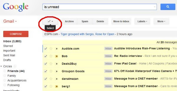
Now you can estimate a custom script. Schematically, on the fingers, a pen in a notebook - any option is suitable. By the way, I want to note that writing by hand will always have one important advantage: the quality of systematization of thoughts increases.
Schedule our starting point: we are in the chat, we see the binding to the contact, we see that this chat is in a folder. So, our approximate handwritten plan for the current task:
Already groped something! The plan is ... Now we calculate. There are at least 5 frames of various interface states. There may be a need for intermediate states. The zero frame must be considered the starting state of the screen at the beginning of the script. It turns out already 6. It is time to build an optimal user experience frame by frame. Sorry for the blur, but this is NDA, which means you have to smear the pictures. Let's finally move on to my design:
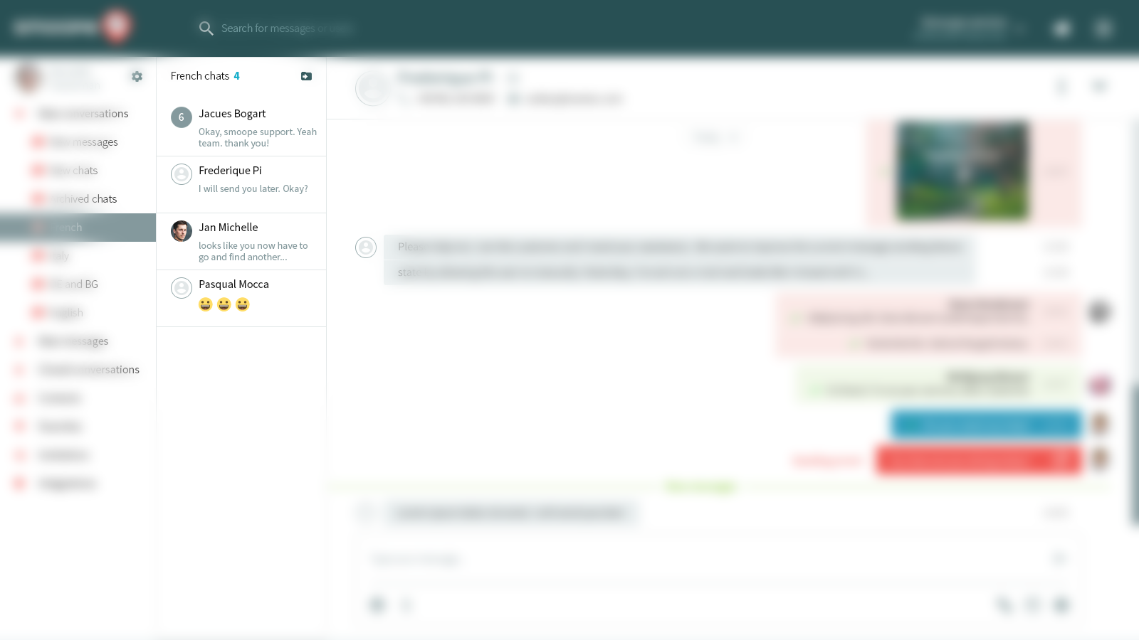
Now we are chatting. There are all the elements I mentioned above. In the block with contacts there is an icon of a folder and an arrow. This will be our chat movement switch. We click and get into ...

We see the phenomenon of new controls. Avatars have become round checkboxes! So you can choose. I think this is an elegant solution, in order not to produce extra checkboxes and not to think about how to cram something in the block. Select above is on, and the rest is inactive. So there will be a quest about how to activate them. We click on and call ...
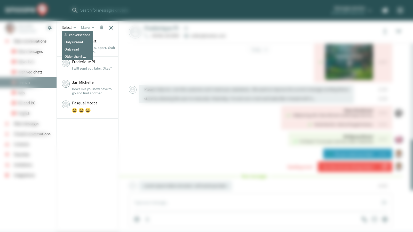
The client did not ask for this, but I myself am doing a “stock” of functionality. You never know what a difficult sample required. For example, there is a lot of unread in the folder and you need to sort the selection by it. Or trite mass select, so as not to click every check-box. By the way, hey, LinkedIn, can look into this post? After notifications about adding a contact have been duplicated in it, also in a personal - that's all, consider that there is no more personal. The necessary correspondence is lost in this garbage. Embed “choose only unread” LinkedIn not in a hurry. Sorry to be distracted. So, we with care gave users the opportunity of different choices. In our scenario, let him now click and execute ...
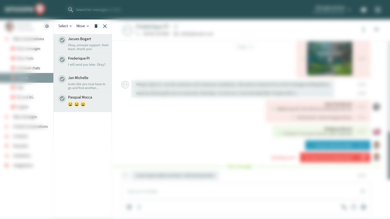
The user thus selects all the few contacts. Noticed how the top controls were activated? The little quest mentioned above has been successfully passed! Then click on the bottom contact and ...
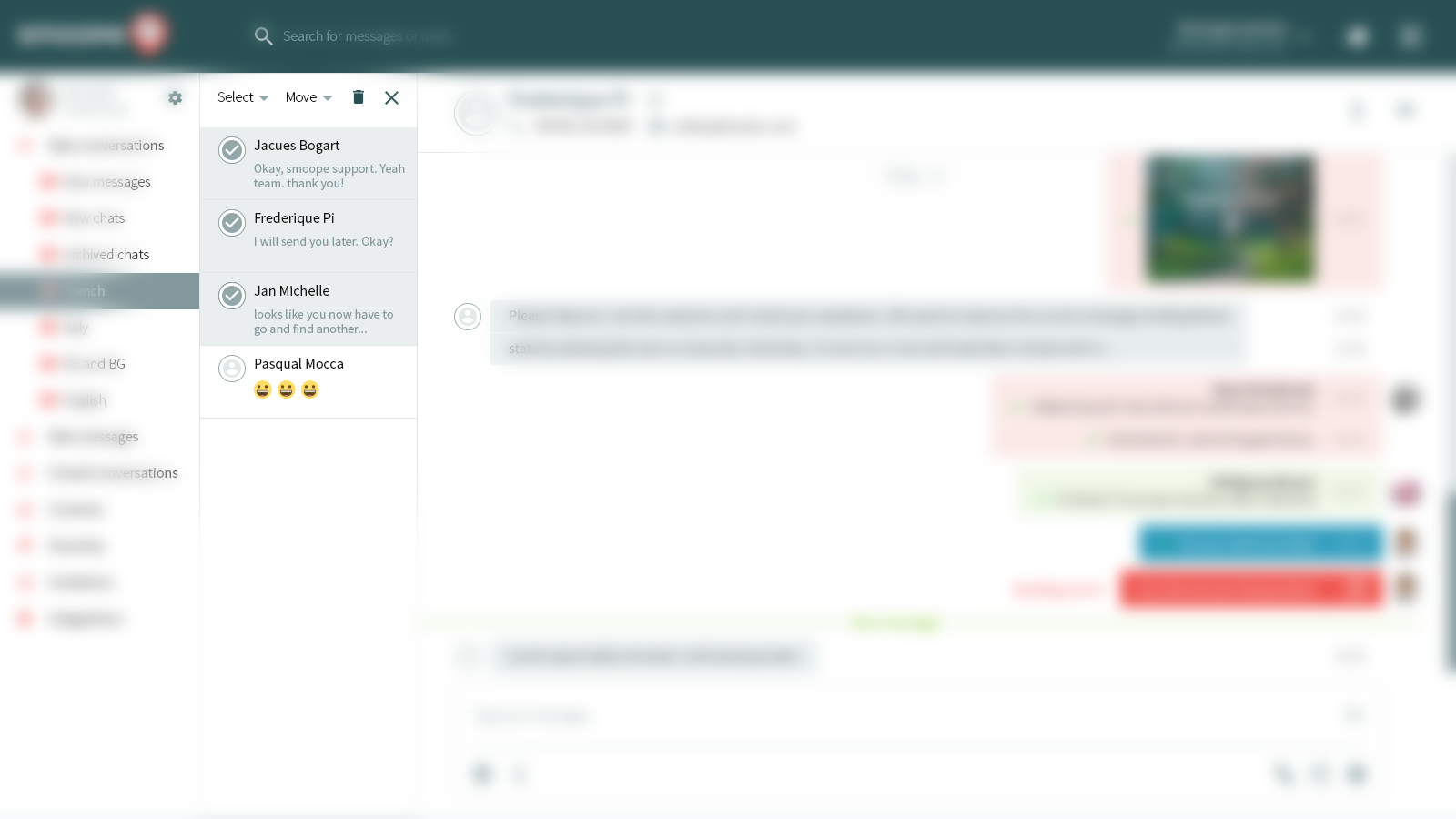
Disconnect him by showing us the “magic” of turning the checkbox into an avatar. Or rather, in the avatar cap, because The user has not yet added his photo. The next click is on the element “Move” and ...
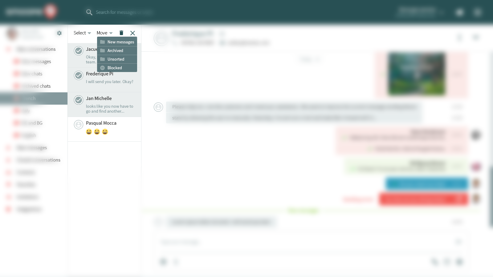
Our eyes appear popup with a list of folders. It remains to choose any where we want to move all the dialogues. It remains to show the frame where we tell the user that ...

Everything went well! The number of elements decreased, the successful user experience was confirmed by writing “Done!”. With care for him, we leave the opportunity to undo. What if a miss-click happened and the conversations “flew away” to the wrong folder? Reinsure not hurt. Let the pop-up disappears smoothly after a couple of seconds.

This is just to complete the picture. We return the state when the chats are moved, the pop-up has disappeared, and the mode of movement has turned off.
Now it remains to decide how to demonstrate the solution to the client. Nowadays, software has already been spawned enough to build an imitation of the interface from the storyboard. This allows you to make Axure, Invisionapp, Pixate, etc ... But firstly: you need to master any of these programs and spend time; and secondly: not the fact that it is worth it, because our task is not so global. I see two simple options here:
The first . Collect all frames in a simple GIF-animation and zaryotirovat in a circle. Tools for this abound and Photoshop copes with it perfectly. Minus only in the "callous" animation. Plus is the speed of creation and presentation. Here's what happened:

The second . A little more sophisticated and will require a little more time to implement. However, it simulates the real interface by almost 100%. The point is that a video is recorded from the screen, in which all the above frames are switched one after the other, and the mouse simulates the activity. The downside is that we need some skill and rehearsal of synchronous frame switching. Plus - it is almost impossible to distinguish from a working product:
That's all. The paragraph of the text to the letter as a description. Attachments files, links, videos, etc ... Well, if the client first sees the animation. Then, if you want, you can go through the frames and disassemble the details. This is often not superfluous.
I also usually stick to a few points that I think increase the chances of successfully completing a task:
I try to maximally deploy a user script in a separate task. The plan here helps a lot. In my example, I started with mass select, and then took a sample from the bottom contact. And you could stupidly shout them one by one from top to bottom ...
The ability to think broadly allows you to find and develop "chips" about which the client did not know. I try to put myself in the user's place - this helps me to find use-features and improve functionality. You can sometimes ask yourself "What else can a user need?".
I continue to subordinate all the new features to the rules and guidelines of the interface, with which each new development begins. Interface rules are what I describe in the documentation at the final stage of the project (styles, fonts, indents, colors, behavior and response of elements, etc.). Thus, any of your new use-feature will look holistic with the product. Most likely the client will approve it!
Perhaps now everything is exactly. I wish you to be on the same wavelength with your customers. Do a little more than what is required of you in a specific task and this will make you closer to success ...

By the way, if you use Figma , I recommend paying attention to our ready-made design systems . They help freelancers complete more orders per month, programmers can create beautiful applications on their own, and the Timlids run sprints faster using ready-made design systems for teamwork.
And if you have a serious project, our team is ready to deploy a design system within the organization based on our developments and tailor it to specific tasks using Figma. Web / desktop, and any mobile. We are also familiar with React / React Native. Write to T: @kamushken
')
Somewhere in mid-2016, my articles began to slowly return to me the investment (exactly, I will describe in the soon planned digest post, which will be timed to the first anniversary of my stay on Habré). I was contacted by the owners of a wide variety of products with a wide variety of problems. Interesting questions and suggestions began to sound and interesting problems appeared. A lot of interesting cases have accumulated, but it’s impossible to tell about many of them right now: either NDA is in the way, or you need to wait for N months of development in order to read about the case and get the user experience. I am sure that whenever we clapped hands with a client, it was my way of demonstrating my readiness to solve his problems that contributed to this. Well, or at least he added me a better chance of success.
I would like to tell about this method below ...
First, briefly and in your own words, once again about the difference between UI and UX:
The first (UI) is always one or more pictures with an interface design that do not reflect the difference in states. For example, the layout of the product card in the basket. Or another dashboard, from which it is already silly. The second (UX) is a series of frames, scrolling through which shows the user's path from the beginning of the script to the end. As a rule, such a series has a single “foundation”, but certain states, the arrangement of elements, their color and style change from frame to frame.
I will try to reveal the topic of this post on one case from my daily practice. I did a redesign of the product, which is responsible for the interaction of the business and its customers. There everything revolves around the chat business with the client with a bunch of features that increase efficiency. I cannot disclose all the details, but I will tell you how I performed one of the tasks, based on my approach. Already it turns out that this method is applicable both in the framework of the first steps and in the stage of deep study of product screens.
The task was as follows: it is necessary to refine the current interface so that it becomes possible to distribute chats into folders.
What do we have at the start? Functional correspondence (chat rooms); subfolders where chats are scattered. You need to come up with an elegant and simple logic to redo everything that is done “to” to a minimum.
By the way, this is a classic situation and one of the most interesting types of tasks in the spirit of “Oh, everything seems to have been worked out, but we remembered here that we forgot something!”. Or when the product acquires features and functionality, and it somehow needs to be wedged into ready-made screens. However, this is no problem if you build the interface design according to your specific rules. In such cases, you can always “push” something and the new functionality will fit harmoniously and without user pain.
So ... How, interacting remotely, as accurately as possible to convey to the client your decision or show why you need to entrust the development to you and not to others? To begin with, we need something like a plan for this particular task! How to find it? If you turn on the imagination, then ready-made solutions may be nearby. Let's remember how and in which applications we move content or some entities. I immediately ask for the mail client. There we single out one letter, or several. We can delete or move to a folder. Seems fit!

Now you can estimate a custom script. Schematically, on the fingers, a pen in a notebook - any option is suitable. By the way, I want to note that writing by hand will always have one important advantage: the quality of systematization of thoughts increases.
Schedule our starting point: we are in the chat, we see the binding to the contact, we see that this chat is in a folder. So, our approximate handwritten plan for the current task:
- it is necessary to switch to “chat mode” in order not to produce unnecessary functionality and not to clutter the screen.
- need to consider what criteria to select contacts to move
- need to set the sequence of the script to move the user to the desired path
- It is necessary to organize the selection of the folder to move, given that there may be 10 and 20, and possibly more
- you have to tell the user “exhale, everything ended well!”
Already groped something! The plan is ... Now we calculate. There are at least 5 frames of various interface states. There may be a need for intermediate states. The zero frame must be considered the starting state of the screen at the beginning of the script. It turns out already 6. It is time to build an optimal user experience frame by frame. Sorry for the blur, but this is NDA, which means you have to smear the pictures. Let's finally move on to my design:
Frame 0
“Starting Status”

Now we are chatting. There are all the elements I mentioned above. In the block with contacts there is an icon of a folder and an arrow. This will be our chat movement switch. We click and get into ...
Frame 1
“Move Mode”

We see the phenomenon of new controls. Avatars have become round checkboxes! So you can choose. I think this is an elegant solution, in order not to produce extra checkboxes and not to think about how to cram something in the block. Select above is on, and the rest is inactive. So there will be a quest about how to activate them. We click on and call ...
Frame 2
“Popup Opportunities”

The client did not ask for this, but I myself am doing a “stock” of functionality. You never know what a difficult sample required. For example, there is a lot of unread in the folder and you need to sort the selection by it. Or trite mass select, so as not to click every check-box. By the way, hey, LinkedIn, can look into this post? After notifications about adding a contact have been duplicated in it, also in a personal - that's all, consider that there is no more personal. The necessary correspondence is lost in this garbage. Embed “choose only unread” LinkedIn not in a hurry. Sorry to be distracted. So, we with care gave users the opportunity of different choices. In our scenario, let him now click and execute ...
Frame 3
“Mass-select”

The user thus selects all the few contacts. Noticed how the top controls were activated? The little quest mentioned above has been successfully passed! Then click on the bottom contact and ...
Frame 4
“Deselect”

Disconnect him by showing us the “magic” of turning the checkbox into an avatar. Or rather, in the avatar cap, because The user has not yet added his photo. The next click is on the element “Move” and ...
Frame 5
“Select Folders”

Our eyes appear popup with a list of folders. It remains to choose any where we want to move all the dialogues. It remains to show the frame where we tell the user that ...
Frame 6
“Success, old man!”

Everything went well! The number of elements decreased, the successful user experience was confirmed by writing “Done!”. With care for him, we leave the opportunity to undo. What if a miss-click happened and the conversations “flew away” to the wrong folder? Reinsure not hurt. Let the pop-up disappears smoothly after a couple of seconds.
Frame 7
“We return the state”

This is just to complete the picture. We return the state when the chats are moved, the pop-up has disappeared, and the mode of movement has turned off.
Script complete. What's next?
Now it remains to decide how to demonstrate the solution to the client. Nowadays, software has already been spawned enough to build an imitation of the interface from the storyboard. This allows you to make Axure, Invisionapp, Pixate, etc ... But firstly: you need to master any of these programs and spend time; and secondly: not the fact that it is worth it, because our task is not so global. I see two simple options here:
The first . Collect all frames in a simple GIF-animation and zaryotirovat in a circle. Tools for this abound and Photoshop copes with it perfectly. Minus only in the "callous" animation. Plus is the speed of creation and presentation. Here's what happened:

The second . A little more sophisticated and will require a little more time to implement. However, it simulates the real interface by almost 100%. The point is that a video is recorded from the screen, in which all the above frames are switched one after the other, and the mouse simulates the activity. The downside is that we need some skill and rehearsal of synchronous frame switching. Plus - it is almost impossible to distinguish from a working product:
That's all. The paragraph of the text to the letter as a description. Attachments files, links, videos, etc ... Well, if the client first sees the animation. Then, if you want, you can go through the frames and disassemble the details. This is often not superfluous.
I also usually stick to a few points that I think increase the chances of successfully completing a task:
Expanded user script
I try to maximally deploy a user script in a separate task. The plan here helps a lot. In my example, I started with mass select, and then took a sample from the bottom contact. And you could stupidly shout them one by one from top to bottom ...
Broad thinking equals use-features
The ability to think broadly allows you to find and develop "chips" about which the client did not know. I try to put myself in the user's place - this helps me to find use-features and improve functionality. You can sometimes ask yourself "What else can a user need?".
Compliance with its interface rules
I continue to subordinate all the new features to the rules and guidelines of the interface, with which each new development begins. Interface rules are what I describe in the documentation at the final stage of the project (styles, fonts, indents, colors, behavior and response of elements, etc.). Thus, any of your new use-feature will look holistic with the product. Most likely the client will approve it!
Perhaps now everything is exactly. I wish you to be on the same wavelength with your customers. Do a little more than what is required of you in a specific task and this will make you closer to success ...
Source: https://habr.com/ru/post/316808/
All Articles