The dangers of charming in design
A note on how charming girls lead to problems
The first association with the word “charming” is all those sweet things to the heart and the eye, from which warmth spreads all over the body. Plush toy. Cupcakes. Hugs.
But, such charming elements have side effects. It would seem a harmless joke can be offensive. Clever advertising can be misleading. A funny sound can literally drive you crazy.
')
In the design world, it is customary to praise pleasant details. But, as you will soon see, even the most charming elements can get you into trouble.
Charms interfere

When used carelessly, charming details get in the way of the usability of your product.
The design of the Morimoto website, named after the famous participant of the TV show Iron Chef, is an excellent example of an oversupply of attempts to charm the user, while neglecting convenience. Their page struggles to be charming, but everything that they do while doing so only hinders the user.
- The buttons are located at an angle of 45 °, because of which it is not so easy to hit them.
- Images float around the screen as you move the cursor, distracting the user and simply blinding the eyes.
- Music turns on automatically, no matter if you like it or not.
- All menus open and close through animation, so the user has to wait 5 seconds after each click.

Epic website Morimoto
Charms give voice to your brand. They “revive” your product.
But if you do not be careful with them, they will only interfere. The example of the Morimoto site shows how an overabundance of such details can become irritable. They only slow down the process.
Charms have a shelf life
In order to make a person smile, an element of surprise is needed. It is much easier to charm a user when something new and pleasant takes him off guard.
I remember very well that moment when I first turned on my Android phone and saw these circles:

When I saw how these circles transform into a logo, I was amazed. It was the most impressive loading animation in my memory.
But after a while, this animation began to seem boring and monotonous. Time after time, she lost her spell. The problem was that the element of surprise simply disappeared.
Over time, any such details will lose their charm. Charm has its expiration date, and even the sweetest and sweetest ones start to seem boring over time. One solution to this problem may be to continually redesign the same part.
Charms are subjective
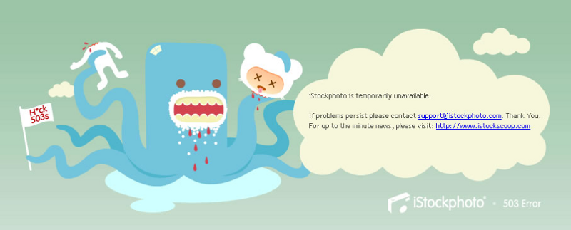
You probably have seen an error message more than once that is trying to make you smile. Of course, jokes and self-irony in a bad situation can be a very tempting solution, but when the user is desperate to save progress or finish a project, a funny error message may seem callous and offensive.
Each person has his own concept of a pleasant and charming, and there is no universal solution here.
Although this is done with the best of intentions, you can never know for sure how your user will meet such attempts to make him smile.
Charming cannot be estimated
The more users your product has, the harder it is to find this balance. Small companies are fairly easy to include jokes in the interface of their products. But when your audience includes users from all over the world, it becomes more and more difficult to please everyone.
Just compare the vocabulary used by big global brands (left) with the vocabulary in the interface of a lesser-known company (right):

"Welcome to Microsoft Teams, the new Office 365 chat-based platform."
vs "Messenger for teams that change the world!"

“Start right now. Docs are ready to work when you are ready to work. Create a document in your browser or download the application to your mobile device. ”Vs“ Trim the nonsense in your work. Pop our tires right now. Start us paying only when you love our product. ”

"Software for management and event planning." Vs "Turn your event into Rev-Gene (from the word Revolution) event."
Notice the trend? As a rule, the vocabulary used by global brands is straightforward and traditional, because it is easier to localize and it will be understandable to the user in any part of the globe.
The vocabulary used on the right seems to me more interesting. However, not everyone will understand it, but a user’s misunderstanding of the language in which your product speaks to him can immediately become a big problem.
When is it worth being charming?
At this point, you realize that with charming details you need to be careful. The design of these parts can be a risky business, but this does not mean that it should be avoided. The most difficult thing is to understand in what situations it is worth trying to charm the user.
From my own experience, the best place for such details is the screens that the user sees infrequently. For example:
- When you first start the application
- Immediately after registering an account
- When announcing new features
- Upon completion of an important action for the first time.
- When a user hits an empty page
All of the above screens, the user is likely to see only once, so using such details you do not risk getting tired or tired of the user trying to make him smile.
For this reason, charming pictures can most often be found in pop-up windows. The illustration below shows a recent example from Google Sites. Most of the interface is straightforward and traditional, but sometimes, in such pop-up windows once, Google is trying to surprise the user with such a nice illustration. The user sees it only once, which is why it is so charming.

Meet the new Sites
Honestly, I'm still trying to figure it out myself. Charm is subjective, so it’s almost impossible to create rules around it. My methodical brain tries to systematize the approach to such details, but it is more difficult than it seems at first glance.
Do you have any techniques for using charming interface details? If yes, you are welcome to unsubscribe below, where you can charm everyone with your comments.
Publication support is Edison , which is developing an SDK for tracking geographic objects and a system of online accounting for the Furniture for Home store chain .
Source: https://habr.com/ru/post/316574/
All Articles