Desktop control panel on JavaScript / Node.js for the robot on Arduin
Today we are doing a desktop application with a graphical interface for controlling a robot on Arduin via a serial port. In JavaScript on the Electron platform with widgets ReactJS + MaterialUI.
Now the control panel for your CNC machine is as easy as writing a saytik.
Previously:
')
- Part 1: Console in a robot on Arduin
- Part 2: Robot control on Arduino from the application on Node.js
Main links
- Library for the robot: babbler_h
- Library for Node.js: babbler-js
- Babbler Widgets for Node.js + ReactJS + MaterialUI: babbler-js-material-ui
- Sample applications for babbler-js: babbler-js-demo
Tool links
- Serial port in Node.js node-serialport: github.com/EmergingTechnologyAdvisors/node-serialport
- Electron platform: electron.atom.io
- ReactJS: facebook.imtqy.com/react
- Widgets (components) MaterialUI for ReactJS: www.material-ui.com/#
Additional links
- NWJS platform: nwjs.io
- Other widgets for React:
github.com/facebook/react/wiki/Complementary-Tools#ui-components
1. Stitch a sketch of babbler_json_io.ino from a previous story in Arduino
This firmware communicates in JSON format, can flash a light bulb, contains 4 commands: ping , help , ledon , ledoff
2. Download the control panel:
3. Start the control panel:
4. Click on the buttons, blink the light:
The task of the project is to launch the Babbler.js library to communicate with the robot in the Electron environment (running JavaScript applications in a separate window, based on Google Chrome code), connect the ReactJS with the MaterialUI widgets for the graphical interface. In general, everything is no more difficult for “Hello World” for the listed projects, but in the process of collecting all these libraries in one application several problems and nuances were identified, therefore I recommend using the source code of this example as a template.
Prerequisites: have node.js, npm, and (preferably) git installed on the computer.
Once again, download the source and go to the project babbler-js-demo / babbler-serial-react :
Project files
- package.json - project for npm (Node package manager): project settings, list of dependencies.
Thanks to him, we can install all the dependencies listed in package.json (including the Electron platform) by one team inside the project:
- main.js - the main file for the Electron application (taken from some hello world for an electron).
Content speaks for itself. The only interesting place is the command opening the panel with the development tools at the start of the application:
I recommend leaving this call when developing an application (open manually through the menu: View → Toggle Developer Tools) and delete / comment when released.
- index.html - the contents of the main screen of the Electron application.
Since for the formation of the graphical interface, we use React, everything that should be inside the body is a div element with id = "app-content"
We will not edit this file, the main code will be further.
- react-app-ui.js is the main application file, here is the main widget tree for the main screen (sent to index.html in the div with id = "app-content"), all user code, we only manage it.
- babbler-serial.sh - application startup script
Additional nuances
For note
- Problem with node-serialport and Electron
The node-serialport library did not want to work on the latest versions of the Electron platform (despite the fact that everything was fine on the naked Node.js).
Without going into details, I will note that the problem can be circumvented by rolling back to the old version of Electron 1.1.3 or (as they say in one of the discussions) rebuilding it from the sources.
The same problem is observed in the NWJS platform (an alternative to Electron), obviously, something broke in the Chrome engine, on which they are all based.
The working version of Electron is indicated in the project dependencies in package.json, so with a demo project everything is ok.
Messages in project trackers:
→ serial serial node
→ Electron
→ NWJS
Perhaps in one of the next releases the problem will be fixed, in which case Electron can be switched to a more recent version.
- Babel, JSX and ES6 syntax
The application and components of ReactJS use special JSX syntax - this is HTML-like XML to describe the structure of the control tree of the application directly in JavaScript code. Also within the application we will use the JavaScript extended syntax ES6 in places (this is a set of various language syntax constructs that are not yet included in the JavaScript standard or are included in it not so long ago, so they are not yet implemented even in the most recent browser versions). At first, I wanted to exclude ES6 constructs (all of them can be replaced with analogs from “classical” JavaScript), so as not to exclude unnecessary configurations in the project. But then he gave up, because Many examples on the Internet for ReactJS (and, in particular, for MaterialUI) are written using the ES6 syntax, and in this case, I would have to convert them all into the old JavaScript syntax.
In order to use non-standard syntax on the old JavaScript engine, use a special tool - Babel. He is able to convert non-standard constructions on the fly to their counterparts in ordinary JavaScript, if the project has the correct settings. Here begin crutches and garden. In the project template, all the necessary settings are already set, so I will not go into details, I will list the main points:
- package.json should contain a block with Babel settings:
- Similar settings should be specified in the .babelrc file if you import widgets from directories outside the current directory into the project (for example: babbler-js-meterial-ui / src / .babelrc ).
- To enable Babel's conversion in script blocks (type = "text / babel") in HTML files (we have index.html), in the same file you need to import browser.min.js script (local copy in the project: babbler- serial-react / script / browser.min.js , so as not to depend on the Internet).
- To enable the conversion of Babel in separate js-files, you need to load the module 'babel-register', and load the js-files themselves via require ('./ react-app-ui.js'); (see all the same index.html).
Maybe after some time, the innovations of ES6 will be moved to the main JavaScript branch in the Google Chrome variant (and from there to the Electron) and some of these props can be thrown out as unnecessary.
- For the MaterialUI widgets to work in index.html, you need to load the module 'react-tap-event-plugin' and execute injectTapEventPlugin ()
All useful user code is located in one file - babbler-js-demo / babbler-serial-react / react-app-ui.js
Here we create our component - a robot control panel with lights, as well as form a tree of controls for the main screen.
Basic React Objects:
MaterialUI Widgets - buttons, icons, tabs, panels:
Babbler widgets from the babbler-js-material-ui project — device interaction:
- BabblerConnectionPanel - connection panel: select devices from the drop-down list, connect / disconnect buttons (depending on connection status)
- BabblerConnectionStatusIcon - device connection status icon: disconnected, connected, connected
- BabblerConnectionErrorSnackbar - a panel that pops up at the bottom of the screen, indicating a disconnection and other connection errors
- BabblerDataFlow - full log in real time: adding a command to the queue, exchanging data with the device, etc.
- BabblerDebugPanel (not yet defined in the library, but inside the test project) - debug panel: sending commands to the device manually, help, ping buttons, log with BabblerDataFlow
Babbler.js to communicate with the device:
Style for buttons:
The panel is a common component of React: the button “Turn on the light bulb”, the button “Turn off the light bulb”, the status icon of the light bulb.
You should know about React components:
- The React component works as a state machine (state machine).
- The current state of the component is determined by two groups of values: the static properties of this.props and the dynamic states of this.state .
- The static properties of this.props : are passed through the parameters of the component tag when added to the screen.
- The dynamic states of this.state : change during the execution of the application, set at the right time with this.setState .
- State changes through this.setState lead to component redrawing.
- The component is redrawn in the render function, the appearance depends on the values of this.props and this.state.
- The appearance of the component inside render is defined using the syntax React JSX.
In our case:
- The BabblerDevice object falls into the component through the static parameter this.props.babblerDevice .
- Events babblerDevice change the dynamic state of the component (if connected, we make all the buttons active, if not connected, we make inactive).
- The buttons "Turn on the light bulb" and "Turn off the light bulb" send the commands ledon and ledoff to the device through the babblerDevice.
- In case of a positive answer “ok”, change the picture of the status of the light bulb by writing the value of this.state.ledOn property (true / false).
Create a BabblerDevice device to connect to the robot:
The final layout of the main screen of the application is the syntax ReactJS JSX (HTML-like XML inside JavaScript code). We draw a tree of controls, send it to index.html in a div with id = 'app-content'.
Here we have the device connection panel - the bar at the top, the blocks of communication with the robot - inside the tabs.
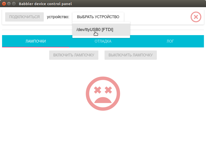
Choose a device:
Connect:

We wait:

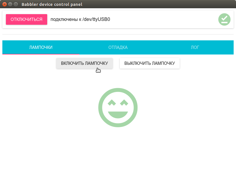
Turn on the light bulb:
Turn off the bulb:

We look at the log:

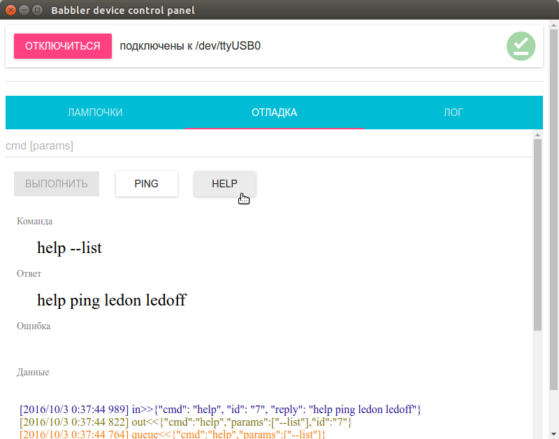
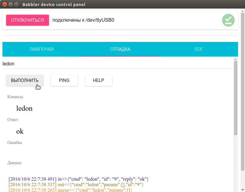
Helmet team in manual mode:
Now the control panel for your CNC machine is as easy as writing a saytik.
Previously:
')
- Part 1: Console in a robot on Arduin
- Part 2: Robot control on Arduino from the application on Node.js
Main links
- Library for the robot: babbler_h
- Library for Node.js: babbler-js
- Babbler Widgets for Node.js + ReactJS + MaterialUI: babbler-js-material-ui
- Sample applications for babbler-js: babbler-js-demo
Tool links
- Serial port in Node.js node-serialport: github.com/EmergingTechnologyAdvisors/node-serialport
- Electron platform: electron.atom.io
- ReactJS: facebook.imtqy.com/react
- Widgets (components) MaterialUI for ReactJS: www.material-ui.com/#
Additional links
- NWJS platform: nwjs.io
- Other widgets for React:
github.com/facebook/react/wiki/Complementary-Tools#ui-components
Fast start
1. Stitch a sketch of babbler_json_io.ino from a previous story in Arduino
This firmware communicates in JSON format, can flash a light bulb, contains 4 commands: ping , help , ledon , ledoff
2. Download the control panel:
git clone https://github.com/1i7/babbler-js-demo.git cd babbler-js-demo/babbler-serial-react npm install 3. Start the control panel:
./babbler-serial.sh 4. Click on the buttons, blink the light:
Project structure
The task of the project is to launch the Babbler.js library to communicate with the robot in the Electron environment (running JavaScript applications in a separate window, based on Google Chrome code), connect the ReactJS with the MaterialUI widgets for the graphical interface. In general, everything is no more difficult for “Hello World” for the listed projects, but in the process of collecting all these libraries in one application several problems and nuances were identified, therefore I recommend using the source code of this example as a template.
Prerequisites: have node.js, npm, and (preferably) git installed on the computer.
Once again, download the source and go to the project babbler-js-demo / babbler-serial-react :
git clone https://github.com/1i7/babbler-js-demo.git cd babbler-js-demo/babbler-serial-react Project files
- package.json - project for npm (Node package manager): project settings, list of dependencies.
Thanks to him, we can install all the dependencies listed in package.json (including the Electron platform) by one team inside the project:
npm install - main.js - the main file for the Electron application (taken from some hello world for an electron).
Content speaks for itself. The only interesting place is the command opening the panel with the development tools at the start of the application:
// DevTools. mainWindow.webContents.openDevTools(); I recommend leaving this call when developing an application (open manually through the menu: View → Toggle Developer Tools) and delete / comment when released.
- index.html - the contents of the main screen of the Electron application.
Since for the formation of the graphical interface, we use React, everything that should be inside the body is a div element with id = "app-content"
<body> <div id="app-content"></div> </body> We will not edit this file, the main code will be further.
- react-app-ui.js is the main application file, here is the main widget tree for the main screen (sent to index.html in the div with id = "app-content"), all user code, we only manage it.
- babbler-serial.sh - application startup script
#!/bin/sh ./node_modules/electron-prebuilt/dist/electron . Additional nuances
For note
- Problem with node-serialport and Electron
The node-serialport library did not want to work on the latest versions of the Electron platform (despite the fact that everything was fine on the naked Node.js).
Without going into details, I will note that the problem can be circumvented by rolling back to the old version of Electron 1.1.3 or (as they say in one of the discussions) rebuilding it from the sources.
sudo npm i -g electron-prebuilt@1.1.3 The same problem is observed in the NWJS platform (an alternative to Electron), obviously, something broke in the Chrome engine, on which they are all based.
The working version of Electron is indicated in the project dependencies in package.json, so with a demo project everything is ok.
Messages in project trackers:
→ serial serial node
→ Electron
→ NWJS
Perhaps in one of the next releases the problem will be fixed, in which case Electron can be switched to a more recent version.
- Babel, JSX and ES6 syntax
The application and components of ReactJS use special JSX syntax - this is HTML-like XML to describe the structure of the control tree of the application directly in JavaScript code. Also within the application we will use the JavaScript extended syntax ES6 in places (this is a set of various language syntax constructs that are not yet included in the JavaScript standard or are included in it not so long ago, so they are not yet implemented even in the most recent browser versions). At first, I wanted to exclude ES6 constructs (all of them can be replaced with analogs from “classical” JavaScript), so as not to exclude unnecessary configurations in the project. But then he gave up, because Many examples on the Internet for ReactJS (and, in particular, for MaterialUI) are written using the ES6 syntax, and in this case, I would have to convert them all into the old JavaScript syntax.
In order to use non-standard syntax on the old JavaScript engine, use a special tool - Babel. He is able to convert non-standard constructions on the fly to their counterparts in ordinary JavaScript, if the project has the correct settings. Here begin crutches and garden. In the project template, all the necessary settings are already set, so I will not go into details, I will list the main points:
- package.json should contain a block with Babel settings:
"babel": { "presets": ["es2015", "react", "stage-1"] } - Similar settings should be specified in the .babelrc file if you import widgets from directories outside the current directory into the project (for example: babbler-js-meterial-ui / src / .babelrc ).
- To enable Babel's conversion in script blocks (type = "text / babel") in HTML files (we have index.html), in the same file you need to import browser.min.js script (local copy in the project: babbler- serial-react / script / browser.min.js , so as not to depend on the Internet).
- To enable the conversion of Babel in separate js-files, you need to load the module 'babel-register', and load the js-files themselves via require ('./ react-app-ui.js'); (see all the same index.html).
Maybe after some time, the innovations of ES6 will be moved to the main JavaScript branch in the Google Chrome variant (and from there to the Electron) and some of these props can be thrown out as unnecessary.
- For the MaterialUI widgets to work in index.html, you need to load the module 'react-tap-event-plugin' and execute injectTapEventPlugin ()
We watch source codes
All useful user code is located in one file - babbler-js-demo / babbler-serial-react / react-app-ui.js
Here we create our component - a robot control panel with lights, as well as form a tree of controls for the main screen.
Preliminary preparations
Basic React Objects:
var React = require('react'); var ReactDOM = require('react-dom'); MaterialUI Widgets - buttons, icons, tabs, panels:
// MaterialUI import getMuiTheme from 'material-ui/styles/getMuiTheme'; import MuiThemeProvider from 'material-ui/styles/MuiThemeProvider'; import Paper from 'material-ui/Paper'; import {Tabs, Tab} from 'material-ui/Tabs'; import Divider from 'material-ui/Divider'; import RaisedButton from 'material-ui/RaisedButton'; import FontIcon from 'material-ui/FontIcon'; import {red200, green200} from 'material-ui/styles/colors'; import Subheader from 'material-ui/Subheader'; Babbler widgets from the babbler-js-material-ui project — device interaction:
- BabblerConnectionPanel - connection panel: select devices from the drop-down list, connect / disconnect buttons (depending on connection status)
- BabblerConnectionStatusIcon - device connection status icon: disconnected, connected, connected
- BabblerConnectionErrorSnackbar - a panel that pops up at the bottom of the screen, indicating a disconnection and other connection errors
- BabblerDataFlow - full log in real time: adding a command to the queue, exchanging data with the device, etc.
- BabblerDebugPanel (not yet defined in the library, but inside the test project) - debug panel: sending commands to the device manually, help, ping buttons, log with BabblerDataFlow
// Babbler MaterialUI import BabblerConnectionStatusIcon from 'babbler-js-material-ui/lib/BabblerConnectionStatusIcon'; import BabblerConnectionErrorSnackbar from 'babbler-js-material-ui/lib/BabblerConnectionErrorSnackbar'; import BabblerConnectionPanel from 'babbler-js-material-ui/lib/BabblerConnectionPanel'; import BabblerDataFlow from 'babbler-js-material-ui/lib/BabblerDataFlow'; import BabblerDebugPanel from './widgets/BabblerDebugPanel'; Babbler.js to communicate with the device:
// Babbler.js import BabblerDevice from 'babbler-js'; Style for buttons:
const btnStyle = { margin: 12 }; Finally, the most interesting part is communication with the robot, the control panel of the light bulb
The panel is a common component of React: the button “Turn on the light bulb”, the button “Turn off the light bulb”, the status icon of the light bulb.
You should know about React components:
- The React component works as a state machine (state machine).
- The current state of the component is determined by two groups of values: the static properties of this.props and the dynamic states of this.state .
- The static properties of this.props : are passed through the parameters of the component tag when added to the screen.
- The dynamic states of this.state : change during the execution of the application, set at the right time with this.setState .
- State changes through this.setState lead to component redrawing.
- The component is redrawn in the render function, the appearance depends on the values of this.props and this.state.
- The appearance of the component inside render is defined using the syntax React JSX.
In our case:
- The BabblerDevice object falls into the component through the static parameter this.props.babblerDevice .
- Events babblerDevice change the dynamic state of the component (if connected, we make all the buttons active, if not connected, we make inactive).
- The buttons "Turn on the light bulb" and "Turn off the light bulb" send the commands ledon and ledoff to the device through the babblerDevice.
- In case of a positive answer “ok”, change the picture of the status of the light bulb by writing the value of this.state.ledOn property (true / false).
// var BabblerLedControlPnl = React.createClass({ // http://www.material-ui.com/#/components/raised-button // http://www.material-ui.com/#/components/subheader getInitialState: function() { return { deviceStatus: this.props.babblerDevice.deviceStatus(), ledOn: false }; }, componentDidMount: function() { // this.deviceStatusListener = function(status) { this.setState({deviceStatus: status}); }.bind(this); this.props.babblerDevice.on(BabblerDevice.Event.STATUS, this.deviceStatusListener); }, componentWillUnmount: function() { // this.props.babblerDevice.removeListener(BabblerDevice.Event.STATUS, this.deviceStatusListener); }, render: function() { var connected = this.state.deviceStatus === BabblerDevice.Status.CONNECTED ? true : false; return ( <div style={{textAlign: "center"}}> <div> <RaisedButton label=" " onClick={this.cmdLedon} disabled={!connected} style={btnStyle} /> <RaisedButton label=" " onClick={this.cmdLedoff} disabled={!connected} style={btnStyle} /> </div> <FontIcon className="material-icons" style={{fontSize: 160, marginTop: 40}} color={(this.state.ledOn ? green200 : red200)} >{(this.state.ledOn ? "sentiment_very_satisfied" : "sentiment_very_dissatisfied")}</FontIcon> </div> ); }, cmdLedon: function() { this.props.babblerDevice.sendCmd("ledon", [], // onReply function(cmd, params, reply) { if(reply == 'ok') { this.setState({ledOn: true}); } }.bind(this), // onError function(cmd, params, err) { console.log(cmd + (params.length > 0 ? " " + params : "") + ": " + err); }.bind(this) ); }, cmdLedoff: function() { this.props.babblerDevice.sendCmd("ledoff", [], // onReply function(cmd, params, reply) { if(reply == 'ok') { this.setState({ledOn: false}); } }.bind(this), // onError function(cmd, params, err) { console.log(cmd + (params.length > 0 ? " " + params : "") + ": " + err); }.bind(this) ); } }); Application main screen
Create a BabblerDevice device to connect to the robot:
// Babbler, var babblerDevice1 = new BabblerDevice(); The final layout of the main screen of the application is the syntax ReactJS JSX (HTML-like XML inside JavaScript code). We draw a tree of controls, send it to index.html in a div with id = 'app-content'.
Here we have the device connection panel - the bar at the top, the blocks of communication with the robot - inside the tabs.
// ReactDOM.render( <MuiThemeProvider muiTheme={getMuiTheme()}> <div> <Paper> <BabblerConnectionPanel babblerDevice={babblerDevice1}/> <BabblerConnectionStatusIcon babblerDevice={babblerDevice1} iconSize={50} style={{position: "absolute", right: 0, marginRight: 14, marginTop: 5}} /> </Paper> <Divider style={{marginTop: 20, marginBottom: 20}}/> <Tabs> <Tab label="" > <BabblerLedControlPnl babblerDevice={babblerDevice1}/> </Tab> <Tab label="" > <BabblerDebugPanel babblerDevice={babblerDevice1}/> </Tab> <Tab label="" > <BabblerDataFlow babblerDevice={babblerDevice1} reverseOrder={true} maxItems={10000} timestamp={true} // filter={{ err: false, data: false }} // filter={{ data: {queue: false} }} // filter={{ err: {in: false, out: false, queue: false}, data: {in: false, out: false, queue: false} }} style={{margin: 20}}/> </Tab> </Tabs> <BabblerConnectionErrorSnackbar babblerDevice={babblerDevice1}/> </div> </MuiThemeProvider>, document.getElementById('app-content') ); Run
./babbler-serial.sh Choose a device:
Connect:
We wait:
Turn on the light bulb:
Turn off the bulb:
We look at the log:
Helmet team in manual mode:
Source: https://habr.com/ru/post/316194/
All Articles