Pro Rendering Optimization - With Optimism
I have a dream, and it is utopian: I want my web applications to work perfectly. JQuery, AngularJs, React, Vue.js - all promise performance. But the problem is not in frameworks and not in JavaScript. The problem is how the browser renders the page. And he does it very badly.
If the browser did a great job with rendering, then a tool like React Native would not have appeared. Under the hood, React Native is still the same JavaScript, and View is native, and the difference in performance between the native application and the application on React Native will not be noticeable for the average user. In other words, the problem is not in javascript.
If something to optimize, then just rendering. The tools that JavaScript and the browser API give us are not enough. For two years I have been trying to make the work of my products smooth and fast, but in vain. I am almost resigned to the fact that the web will remain so forever. In this article, I collected everything that I managed to learn about rendering optimization and apply it on projects I worked on and talk about my hopes for the near future. This is the future in which I want to rely on a solid foundation of standards and browser APIs, rather than CSS hacks and third-party repositories for optimizing performance.
')

I wrote applications with rather trivial functionality: news feeds with comments, categories and tags. They can watch videos, do a search for news, etc. Well, more push notifications. Nothing complicated. Because of the NDA, I can’t show you these projects, but in our company's blog we talk about the principles for choosing an approach to mobile development .
The development of hybrid applications is good. JavaScript completely suited me, completely suited me and interface elements that were generously provided by Framework7 and Ionic. Even plug-ins that allow the use of native functions, enough. Write one application and get ten at once - for all the platforms that you just invented. Dream and only. But now there will be a “but”, fat and putting an end to everything.
As soon as the application becomes more complicated than “Hello, world!”, Performance problems begin. The application works better than the mobile version of the site, but not nearly as good as a similar native application.

If someone is ready to put up with it, then for me it was a challenge. I needed to write a hybrid application so that it could not be distinguished from the native one. Then I rummaged a bit and came to one simple conclusion: everything is fine with js, the problem is rendering. I tried all the css hacks from “transform: translate3d (0,0,0)” (which soon stopped working) and before replacing png gradients with alpha channel. This, of course, did not solve the problem, but only slightly masked it. The links are several such hacks:
» Force Hardware Acceleration in WebKit with translate3d
» 60fps scrolling using pointer-events: none
» CSS box-shadow Can Slow Down Scrolling
After that I worked on other projects not related to mobile browsers and devices. And everything is not bad, there are no performance problems, because where do they come from in a car with a good iron. But if performance problems are not visible, this does not mean that everything is optimized.
On websites and in applications, we see endless tapes: Instagram, Facebook, Twitter, Medium - from these examples, perhaps, you can make your tape with the upload. And there is nothing wrong with that. Scroll allows you to move within one post and move between posts. You can scroll quickly, you can slowly. You add new items to the list as much as you like. I did it myself.

Let's do an experiment. Do you have a noisy cooler? Open Medium.com and go down. How soon will your cooler reach its maximum speed? My result is about 45 seconds. And this is not Chrome to blame. And not even that my laptop for many years. The problem is that no one is optimizing what we see in the viewport.
What happens when we shake a ribbon? Once at the bottom of the page, we get some more posts from the server, and they are added to the end of the list. The list grows endlessly. What does the browser do? Nothing. Posts at the beginning of the feed still exist and the browser still renders them. And “visibility: hidden” will not help here, even if we hang this property on every post that is outside of the viewport. By the way, such a useless optimization was noticed by me in Ionic. Seriously. But then they fixed it. If anyone is interested, here is the topic on the Ionic forum , which I created to discuss the problem.

What prevents to write good, optimized code? It’s disturbing that we don’t know so much about this process. Most of the knowledge came to us through trial and error, and articles with a title like "How the browser renders the page" tell us how HTML is combined with CSS and how the page is divided into layers. I don’t understand what happens when I add a new element to the DOM or add a new class to the element. What elements will be recalculated and rendered?
Here we will add a new item to the list. What's next?
And so on to the root of the DOM. As a result, we render the entire page.
Rendering in the browser works differently. Here is one of the many articles on this topic, where the author talks about the process of combining the DOM tree and the CSS tree and how the browser subsequently draws the resulting structure. Everything is very cool, but it’s not entirely clear what the developer can do to help the browser. There is an unofficial CSS Triggers resource that presents a table that allows you to determine which CSS properties call Layout / Paint / Composite processes in the browser, but since pages usually contain a large number of styles and elements, the only sensible solution is to try to eliminate everything. which can hit on performance.
In general, optimization consists of several points:
All this helps to speed up the rendering a bit, but what to do if you want more?

It seems to me that the only way that really works is to ensure that the page contains only those elements that the user really needs. Implementing this behavior is problematic.
Many people know about Virtual list / Virtual scroll / Grid View / Table View. The names are different, but the essence is the same: it is a component for efficiently displaying very long lists on a page. Mostly similar interface components are used in mobile development.
GitHub is full of js repositories a la virtual list, virtual grid, etc. Optimization is quite working, it is a fact. In the list of 10 thousand elements, you can create a container with a length of 10,000 px multiplied by the height of one element, then follow the scroll and render only the elements visible to the user plus a little more. The elements themselves are positioned using “translate: transformY (<element index> * <element height> px)”. I recently studied Vue.js 2.0 and wrote such a component in a couple of hours.
There are several options for implementation, and the difference between them is only in how we position the elements and divide them into groups, but this is not so important. The problem is that the scroll event under ideal conditions is triggered exactly as many times as the pixels were scrolled. That is a lot. Add to this the need to make calculations every time an event triggers. On mobile devices, the scroll event and the scroll mechanics itself work in different ways. The conclusion of this is quite simple: the scroll event is not well suited for such tasks.
Here it is worth mentioning another problem. All the components that I saw require that the size of the list items be the same or, at best, be known in advance for each item. This complicates implementation.

Now IntersectionObserver, the first ray of hope, which fell on the future that I described in the introduction, comes onto the scene. The feature is new, so here is information about browser support on caniuse.com . And here are some materials on it:
IntersectionObeserver reports when the element of interest appears in the viewport and when it leaves. Now you do not need to keep track of the scroll and count the height of the elements in order to understand which of them need to be rendered and which are not.
Now a little practice. I wanted to make a virtual scrolling with loading elements using IntersectionObserver. Something like this:
But what I understood while writing this component:
Content is divided into parts of 12 posts each. When the component is initialized, there is only one such part in the DOM. The first and last parts have a hidden element at the top and bottom, respectively. We monitor the visibility of these elements. When one of these elements falls on the screen, we add a new part and delete the already unnecessary. Thus, we have in DOM two parts of 12 posts at a time.
How is it easier to track the scroll? If the height of the posts is unknown, you have to look for an element in the DOM and recognize it. This is not very convenient and not very productive.
At the output, we get a component that can quickly render endless content of an unknown height in advance. You can use something like this not only for news feeds, but also for any content consisting of blocks.
Less words more action: here is a demo . And I ask you to pay attention to the fact that the goal here is to see the work of IntersectionObserver on a real example.
Here you can look at the FPS, if you scroll with the speed of a quick view of the tape (the image is clickable):

And as quickly as possible (the image is clickable):
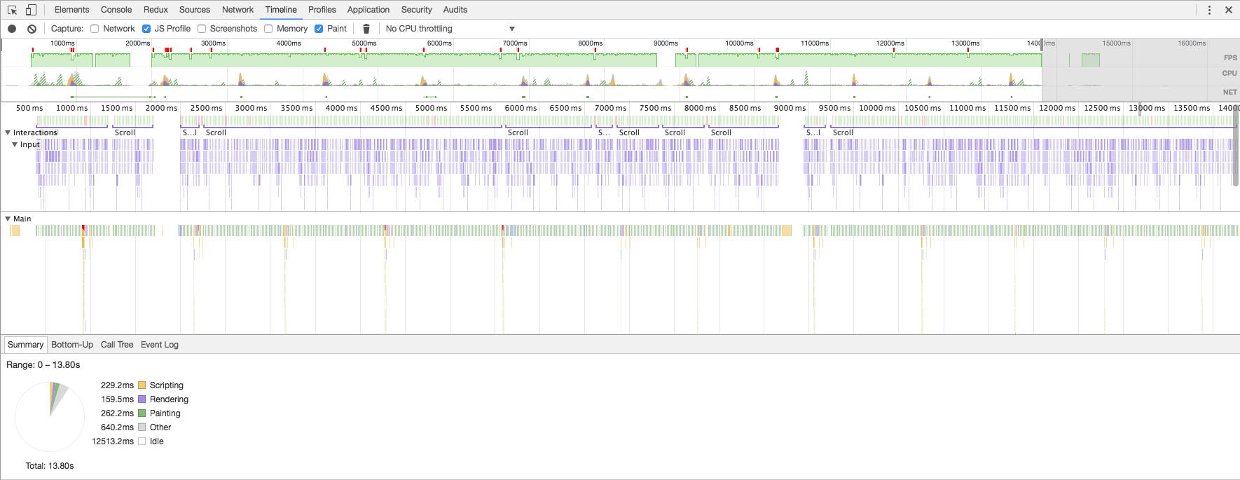
FPS very rarely falls below 60, but only a couple of frames and no less than 45. A good result, given that the browser does not know the size of the pictures and text in advance.
This is not the most impressive and useful example of using IntersectionObserver. It is much more interesting to try to use it in conjunction with React / Vue / Polimer components. Then, when the component is initialized, IntersectionObserver can be hung onto it and continue initialization only when it appears in the viewport. This opens up opportunities. It remains only to cross your fingers and believe that IntersectionObserver will receive its further development.
If the browser did a great job with rendering, then a tool like React Native would not have appeared. Under the hood, React Native is still the same JavaScript, and View is native, and the difference in performance between the native application and the application on React Native will not be noticeable for the average user. In other words, the problem is not in javascript.
If something to optimize, then just rendering. The tools that JavaScript and the browser API give us are not enough. For two years I have been trying to make the work of my products smooth and fast, but in vain. I am almost resigned to the fact that the web will remain so forever. In this article, I collected everything that I managed to learn about rendering optimization and apply it on projects I worked on and talk about my hopes for the near future. This is the future in which I want to rely on a solid foundation of standards and browser APIs, rather than CSS hacks and third-party repositories for optimizing performance.
')
Hybrid Applications and Performance
I wrote applications with rather trivial functionality: news feeds with comments, categories and tags. They can watch videos, do a search for news, etc. Well, more push notifications. Nothing complicated. Because of the NDA, I can’t show you these projects, but in our company's blog we talk about the principles for choosing an approach to mobile development .
The development of hybrid applications is good. JavaScript completely suited me, completely suited me and interface elements that were generously provided by Framework7 and Ionic. Even plug-ins that allow the use of native functions, enough. Write one application and get ten at once - for all the platforms that you just invented. Dream and only. But now there will be a “but”, fat and putting an end to everything.
As soon as the application becomes more complicated than “Hello, world!”, Performance problems begin. The application works better than the mobile version of the site, but not nearly as good as a similar native application.
If someone is ready to put up with it, then for me it was a challenge. I needed to write a hybrid application so that it could not be distinguished from the native one. Then I rummaged a bit and came to one simple conclusion: everything is fine with js, the problem is rendering. I tried all the css hacks from “transform: translate3d (0,0,0)” (which soon stopped working) and before replacing png gradients with alpha channel. This, of course, did not solve the problem, but only slightly masked it. The links are several such hacks:
» Force Hardware Acceleration in WebKit with translate3d
» 60fps scrolling using pointer-events: none
» CSS box-shadow Can Slow Down Scrolling
After that I worked on other projects not related to mobile browsers and devices. And everything is not bad, there are no performance problems, because where do they come from in a car with a good iron. But if performance problems are not visible, this does not mean that everything is optimized.
Medium, you have problems
On websites and in applications, we see endless tapes: Instagram, Facebook, Twitter, Medium - from these examples, perhaps, you can make your tape with the upload. And there is nothing wrong with that. Scroll allows you to move within one post and move between posts. You can scroll quickly, you can slowly. You add new items to the list as much as you like. I did it myself.
Let's do an experiment. Do you have a noisy cooler? Open Medium.com and go down. How soon will your cooler reach its maximum speed? My result is about 45 seconds. And this is not Chrome to blame. And not even that my laptop for many years. The problem is that no one is optimizing what we see in the viewport.
What happens when we shake a ribbon? Once at the bottom of the page, we get some more posts from the server, and they are added to the end of the list. The list grows endlessly. What does the browser do? Nothing. Posts at the beginning of the feed still exist and the browser still renders them. And “visibility: hidden” will not help here, even if we hang this property on every post that is outside of the viewport. By the way, such a useless optimization was noticed by me in Ionic. Seriously. But then they fixed it. If anyone is interested, here is the topic on the Ionic forum , which I created to discuss the problem.
Mysterious world of optimization
What prevents to write good, optimized code? It’s disturbing that we don’t know so much about this process. Most of the knowledge came to us through trial and error, and articles with a title like "How the browser renders the page" tell us how HTML is combined with CSS and how the page is divided into layers. I don’t understand what happens when I add a new element to the DOM or add a new class to the element. What elements will be recalculated and rendered?
Here we will add a new item to the list. What's next?
- A new item needs to be rendered and put in place;
- need to re-move the other elements of the list;
- need to re-render other list items;
- need to update the height of the "parent";
- the “parent” has been updated, and now it is not clear whether the neighboring elements have changed.
And so on to the root of the DOM. As a result, we render the entire page.
Rendering in the browser works differently. Here is one of the many articles on this topic, where the author talks about the process of combining the DOM tree and the CSS tree and how the browser subsequently draws the resulting structure. Everything is very cool, but it’s not entirely clear what the developer can do to help the browser. There is an unofficial CSS Triggers resource that presents a table that allows you to determine which CSS properties call Layout / Paint / Composite processes in the browser, but since pages usually contain a large number of styles and elements, the only sensible solution is to try to eliminate everything. which can hit on performance.
In general, optimization consists of several points:
- make it easier to CSS , make the styles readable for the browser;
- get rid of heavy rendering styles (shadows and transparency should be avoided altogether);
- reduce the number of DOM elements and make as few changes as possible in it;
- Work properly with the GPU.
All this helps to speed up the rendering a bit, but what to do if you want more?
Cutting off the excess
It seems to me that the only way that really works is to ensure that the page contains only those elements that the user really needs. Implementing this behavior is problematic.
Many people know about Virtual list / Virtual scroll / Grid View / Table View. The names are different, but the essence is the same: it is a component for efficiently displaying very long lists on a page. Mostly similar interface components are used in mobile development.
GitHub is full of js repositories a la virtual list, virtual grid, etc. Optimization is quite working, it is a fact. In the list of 10 thousand elements, you can create a container with a length of 10,000 px multiplied by the height of one element, then follow the scroll and render only the elements visible to the user plus a little more. The elements themselves are positioned using “translate: transformY (<element index> * <element height> px)”. I recently studied Vue.js 2.0 and wrote such a component in a couple of hours.
There are several options for implementation, and the difference between them is only in how we position the elements and divide them into groups, but this is not so important. The problem is that the scroll event under ideal conditions is triggered exactly as many times as the pixels were scrolled. That is a lot. Add to this the need to make calculations every time an event triggers. On mobile devices, the scroll event and the scroll mechanics itself work in different ways. The conclusion of this is quite simple: the scroll event is not well suited for such tasks.
Here it is worth mentioning another problem. All the components that I saw require that the size of the list items be the same or, at best, be known in advance for each item. This complicates implementation.
IntersectionObserver
Now IntersectionObserver, the first ray of hope, which fell on the future that I described in the introduction, comes onto the scene. The feature is new, so here is information about browser support on caniuse.com . And here are some materials on it:
- draft specification
- repository with draft specification, explanation with examples and polyfill
- featured article on google blog
IntersectionObeserver reports when the element of interest appears in the viewport and when it leaves. Now you do not need to keep track of the scroll and count the height of the elements in order to understand which of them need to be rendered and which are not.
Now a little practice. I wanted to make a virtual scrolling with loading elements using IntersectionObserver. Something like this:
- endless tape with posts that have a title, picture and text;
- the content of posts and their height are not known in advance;
- no stops for content uploading;
- 60 fps.
But what I understood while writing this component:
- need to reuse elements, producing a minimum of operations with DOM;
- You do not need to create IntersectionObserver for each item in the list, two is enough.
Principle of operation
Content is divided into parts of 12 posts each. When the component is initialized, there is only one such part in the DOM. The first and last parts have a hidden element at the top and bottom, respectively. We monitor the visibility of these elements. When one of these elements falls on the screen, we add a new part and delete the already unnecessary. Thus, we have in DOM two parts of 12 posts at a time.
How is it easier to track the scroll? If the height of the posts is unknown, you have to look for an element in the DOM and recognize it. This is not very convenient and not very productive.
At the output, we get a component that can quickly render endless content of an unknown height in advance. You can use something like this not only for news feeds, but also for any content consisting of blocks.
Less words more action: here is a demo . And I ask you to pay attention to the fact that the goal here is to see the work of IntersectionObserver on a real example.
Here you can look at the FPS, if you scroll with the speed of a quick view of the tape (the image is clickable):
And as quickly as possible (the image is clickable):
FPS very rarely falls below 60, but only a couple of frames and no less than 45. A good result, given that the browser does not know the size of the pictures and text in advance.
Conclusion
This is not the most impressive and useful example of using IntersectionObserver. It is much more interesting to try to use it in conjunction with React / Vue / Polimer components. Then, when the component is initialized, IntersectionObserver can be hung onto it and continue initialization only when it appears in the viewport. This opens up opportunities. It remains only to cross your fingers and believe that IntersectionObserver will receive its further development.
Source: https://habr.com/ru/post/316136/
All Articles