Features of multi-window mode on Android tablets
Hello! In this article I want to tell you what problems may arise with the advent of multi-window mode on tablet versions of applications. The Live Taiping Android development team encountered them when it adapted the ILE DE BOTE app for a tablet. Be prepared for the fact that you will have the same problems.
As you all know, at the end of August 2016, Android 7.0 was released, and one of its main features is multi-window support. This is a great feature that takes the convenience of Android to a new level. All users will be in the seventh heaven with happiness, but what is happiness for the user, can turn into pain for the developer. Unfortunately, with multiwindow on the tablets, this is exactly what happened. And it is on the tablets - on the phones, with her everything is just fine, I say in advance.
If you are making tablet versions of applications or you are simply not indifferent to the multi-window mode, then welcome to the article!
Suppose you are a developer who unexpectedly decided to make multi-window support in a telephone application. You did everything right, built up to 320dp in width and generally you are well done, and the mode, to your happiness, works just fine. Even if you are not quite well done, because you didn’t support small screens and type under 360dp or 480dp, it still remains in order. The worst thing that can happen to you is that the layout will float a little or here and there the text in the button does not fit in one line. But let's be frank, it's all the little things. A couple of hours, maximum day and voila, PROFIT! You are great again and you can add new multi-window features to your application.
')
But what if you have not only a phone version of the application, but also a tablet one?
You have problems. Perhaps quite big problems. Even, perhaps, the problems will be so huge that you will have to radically change the architecture of the application.
For simplicity, let's imagine that we have a layout for phones and a layout for 10-inch tablets. We will consider everything on the example of layout, that is, our resources will lie in the following folders:
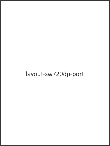
Let's start with the vertical orientation. Our application can occupy either the entire screen, and the layout from layout-sw720dp-port will be used:
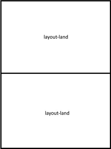
Either half of the screen, and resources will be taken from layout-land:
Either one-third or two-thirds, and the resources will be taken from layout-land and layout-sw720dp-land, respectively:

You expect land and port to simply swap places in landscape mode, but no. It's a bit wrong.
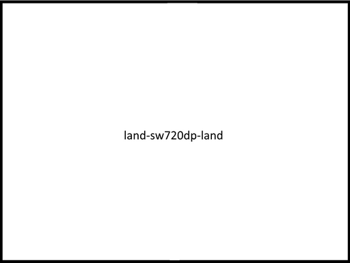
If the entire screen is busy, then layout-sw720dp-land is used:
If half of the screen, then layout-port:

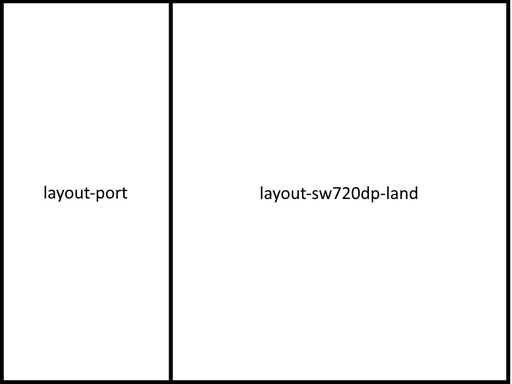
If one third or two thirds, then layout-port and layout-sw720dp-land respectively:
With the location we figured out. Many, probably, are already beginning to realize possible problems, but let's take it in order. First, let's imagine that you made an abstract application that works perfectly on Android 6, but which will have problems on Android 7. I ask you in advance not to find fault with how it is thought out, because it is thought out so specifically to demonstrate possible problems.
So, let the application be news and has three main entities: category, subcategory and news. The telephone version can only be in portrait orientation and has three screens, each of which is a separate Activity:


For the tablet, everything is arranged a little differently: there are only two screens that are also Activity:

The application has MVP architecture and each screen has a Presenter and View. As View, a custom ViewGroup like this is used . A completely different View and Presenter are used for the main screen and the news list screen. The news screens on the tablet and on the phone are absolutely identical to each other by logic, but because of the large differences in the visual part, we need something more than just different xml. Therefore, the implementation of the View is arranged as follows: the NewsView abstract class, which contains all the classes PhoneNewsView and TabletNewsView that are all common and inherited from it.
Now let's take a little more imagination and imagine that we launched our application on a 10-inch tablet running Android 7 and turned on the multi-window mode.
Submitted? Let's see what we got.

It doesn’t look very good, but that’s because you didn’t support landscape orientation in the telephone version. Therefore, it takes resources from shared resources. Although, in principle, everything is cool, the banner has drawn a little, but these are trifles. To celebrate, you poke at the first subcategory that you find and get to the news list screen, which is not so bad either.
Joy over the edge, and it dawns on you: “And what will happen if I re-deploy the application and go to the layout of the tablet? After all, this screen should not be in the logic of work on the tablet. " You are great, this is a very good idea. The following will happen: your screen will be displayed, which should not be here. Moreover, you will be shown its telephone version, which will spoil the look.
What are some solutions? Well, you can, for example, remake everything into fragments, in the telephone version put them on top of each other, and in the tablet version - side by side. Profit! But do not forget that this is easy to do only on our small abstract application, but in a real application you will have to make a lot of effort. Also in your application there may be confused navigation, which with the help of fragments cannot be realized due to the fact that they cannot save the state of their child fragments.
Suppose you remake our abstract application into fragments, but immediately remember the unusual features of the tablet - the ability to show all the news in all subcategories of any category.
What to do? We'll have to add this functionality to the phone version, or remove it from the tablet. As you understand, in real life there can be a lot of such functionalities, and, most likely, this will require a lot of approvals from you, which ultimately will result in shreds of torn out hair and full glasses of bitter tears. It is good that in our small abstract application it is a little bit, otherwise it would have to sweat.
Looks like the list of categories is fine. You have all debugged and corrected, you are definitely well done. You go to the screen of a separate news and try to go into multi-window mode, but - oops! - the application fell. What's the matter? And all because your PhoneNewsView and TabletNewsView have the same id. It turns out that onSaveInstanceState is done for one class, and onRestoreInstanceState is done for another.
How to get around this? You can just put them different id, but then immediately looms the problem with maintaining the state when the multi-window mode changes, namely that it will not be. There is a solution: make everything so that the code does not have any differences between the tablet and the phone version, except in XML. If there is an urgent need to add a new element in the tablet, it is better to just check it for null and only then do something with this element.
You have coped brilliantly with this problem, congratulations. Here you suddenly remember that on the same screen, in the telephone version, immediately under the picture of the news you read "If you have a tablet, then try our tablet version." Awful Well, in fact, compared to previous problems, it’s just flowers, but it’s still unpleasant.
In general, this is not problem number 4. Simply, I wanted to tell you how to take tablet resources, if an application, in theory, should take telephone ones.
So what to do? If you take resources from Application in multiwindow mode, then it will return them for the tablet; if from Activity, View, Fragment and everything else that is not Application, it will return for their size. That is, if you divide the screen in half, then Application will return tablet resources, and everything else - phone. I think this is due to the fact that, in theory, one application can be divided into several windows. Perhaps, many have conceived a tricky plan - to make setContentView in Activity not by id, but by “view” that you previously injected with Application. BUT! Do not do this. Otherwise, your application will look like this:
With Application, you have resolved a dilemma with an unnecessary line. Satisfied with yourself and the work done, you leaned back in your chair and thought about why Google introduced so many additional “cases” and how complicated the life of an ordinary Android developer is now.
In fact, Google’s multi-windowing is fine. Why are there problems with the tablet? Because in the Android SDK the concept of "tablet" does not exist. At all. There are small, medium, large screens ... But the concept of "tablet" is not. There should be no separate logic, there should be no additional functionality.
The problem is not that Google did everything badly, just as such, the “special application” for the tablet should not be in principle. From where does all mania make applications separately for a tablet? From iOS, but there really is the concept of the tablet and for him there is an opportunity to do everything differently.
Android applications, in my opinion, are more similar to the Web in this regard: you have a page and a certain set of data, and you need to make sure that everything looks good on all screens and in all browsers. Nothing like? Many types of screens and a very large fragmentation of devices, many of them with their own characteristics, is that all? It seems so to me.
The peculiarity of the problems I described is that they should not exist, but I hope that I helped you to deal with them if they arose or warned them of their occurrence. Take a look at Google Play: you can open it on any device, and it will look, maybe not great, but at least it’s good. This is because Google Play was originally created with the ability to be displayed on the screen of any size. Given that the data set is always the same.
This is a very good practice. You can change the number of columns, indents, the size of elements, hide or show some element and a whole lot more, but the overall logic and data set should remain unchanged. This, in my opinion, is the key to a cool app.
The topic is philosophical and, of course, controversial, so welcome to the comments. Bye everyone!
As you all know, at the end of August 2016, Android 7.0 was released, and one of its main features is multi-window support. This is a great feature that takes the convenience of Android to a new level. All users will be in the seventh heaven with happiness, but what is happiness for the user, can turn into pain for the developer. Unfortunately, with multiwindow on the tablets, this is exactly what happened. And it is on the tablets - on the phones, with her everything is just fine, I say in advance.
If you are making tablet versions of applications or you are simply not indifferent to the multi-window mode, then welcome to the article!
Root of all evil
Suppose you are a developer who unexpectedly decided to make multi-window support in a telephone application. You did everything right, built up to 320dp in width and generally you are well done, and the mode, to your happiness, works just fine. Even if you are not quite well done, because you didn’t support small screens and type under 360dp or 480dp, it still remains in order. The worst thing that can happen to you is that the layout will float a little or here and there the text in the button does not fit in one line. But let's be frank, it's all the little things. A couple of hours, maximum day and voila, PROFIT! You are great again and you can add new multi-window features to your application.
')
But what if you have not only a phone version of the application, but also a tablet one?
You have problems. Perhaps quite big problems. Even, perhaps, the problems will be so huge that you will have to radically change the architecture of the application.
Multi-window operation on a tablet
Screen orientation
For simplicity, let's imagine that we have a layout for phones and a layout for 10-inch tablets. We will consider everything on the example of layout, that is, our resources will lie in the following folders:
- layout-port
- layout-land
- layout-sw720dp-port
- layout-sw720dp-land
Let's start with the vertical orientation. Our application can occupy either the entire screen, and the layout from layout-sw720dp-port will be used:
Either half of the screen, and resources will be taken from layout-land:
Either one-third or two-thirds, and the resources will be taken from layout-land and layout-sw720dp-land, respectively:
You expect land and port to simply swap places in landscape mode, but no. It's a bit wrong.
If the entire screen is busy, then layout-sw720dp-land is used:
If half of the screen, then layout-port:
If one third or two thirds, then layout-port and layout-sw720dp-land respectively:
Demo application
With the location we figured out. Many, probably, are already beginning to realize possible problems, but let's take it in order. First, let's imagine that you made an abstract application that works perfectly on Android 6, but which will have problems on Android 7. I ask you in advance not to find fault with how it is thought out, because it is thought out so specifically to demonstrate possible problems.
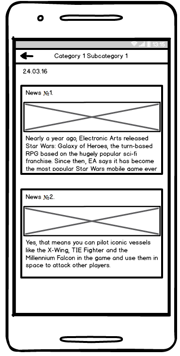
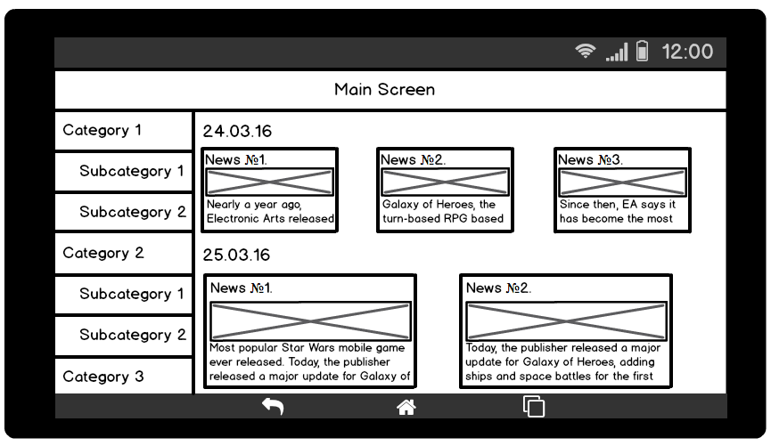
So, let the application be news and has three main entities: category, subcategory and news. The telephone version can only be in portrait orientation and has three screens, each of which is a separate Activity:
- Main screen. It has the main categories of news, which are presented in the top tabs. Inside each tab there is a banner with the most important news of the day. Below is a list of subcategories within this news category. When you click on this subcategory, we get to the screen with its contents.
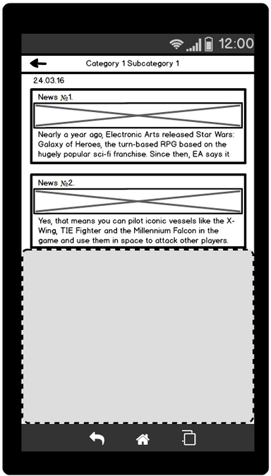
- News list screen. When you click on the news, we get on a separate screen of this news.
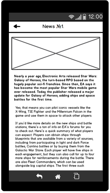
- Single news screen. Here we show the news in its entirety.
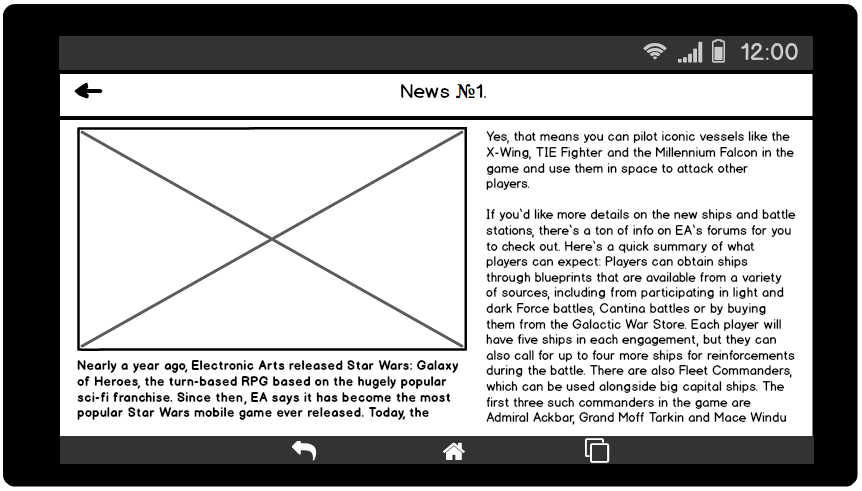
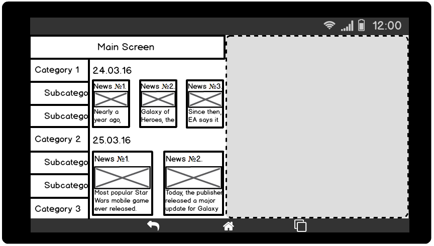
For the tablet, everything is arranged a little differently: there are only two screens that are also Activity:
- Main screen. On the left is a list of categories with nesting in the form of subcategories. On the right is a list of news. Also in the tablet appears a new chip: you can click on the category and see all the news on it.
- Single news screen. Here, in principle, everything is as before, the layout has just changed a little.
The application has MVP architecture and each screen has a Presenter and View. As View, a custom ViewGroup like this is used . A completely different View and Presenter are used for the main screen and the news list screen. The news screens on the tablet and on the phone are absolutely identical to each other by logic, but because of the large differences in the visual part, we need something more than just different xml. Therefore, the implementation of the View is arranged as follows: the NewsView abstract class, which contains all the classes PhoneNewsView and TabletNewsView that are all common and inherited from it.
Now let's take a little more imagination and imagine that we launched our application on a 10-inch tablet running Android 7 and turned on the multi-window mode.
Submitted? Let's see what we got.
It doesn’t look very good, but that’s because you didn’t support landscape orientation in the telephone version. Therefore, it takes resources from shared resources. Although, in principle, everything is cool, the banner has drawn a little, but these are trifles. To celebrate, you poke at the first subcategory that you find and get to the news list screen, which is not so bad either.
Joy over the edge, and it dawns on you: “And what will happen if I re-deploy the application and go to the layout of the tablet? After all, this screen should not be in the logic of work on the tablet. " You are great, this is a very good idea. The following will happen: your screen will be displayed, which should not be here. Moreover, you will be shown its telephone version, which will spoil the look.
Problems
Problem number 1: if the screen of the tablet version combines several screens from the telephone, then chaos will begin.
What are some solutions? Well, you can, for example, remake everything into fragments, in the telephone version put them on top of each other, and in the tablet version - side by side. Profit! But do not forget that this is easy to do only on our small abstract application, but in a real application you will have to make a lot of effort. Also in your application there may be confused navigation, which with the help of fragments cannot be realized due to the fact that they cannot save the state of their child fragments.
Suppose you remake our abstract application into fragments, but immediately remember the unusual features of the tablet - the ability to show all the news in all subcategories of any category.
Problem number 2: if the tablet version has functionality that is not in the phone version, and vice versa, then everything will be bad.
What to do? We'll have to add this functionality to the phone version, or remove it from the tablet. As you understand, in real life there can be a lot of such functionalities, and, most likely, this will require a lot of approvals from you, which ultimately will result in shreds of torn out hair and full glasses of bitter tears. It is good that in our small abstract application it is a little bit, otherwise it would have to sweat.
Looks like the list of categories is fine. You have all debugged and corrected, you are definitely well done. You go to the screen of a separate news and try to go into multi-window mode, but - oops! - the application fell. What's the matter? And all because your PhoneNewsView and TabletNewsView have the same id. It turns out that onSaveInstanceState is done for one class, and onRestoreInstanceState is done for another.
Problem number 3: if in the xml tablet version and the phone version different classes have the same id, then you will definitely get tired of correcting it.
How to get around this? You can just put them different id, but then immediately looms the problem with maintaining the state when the multi-window mode changes, namely that it will not be. There is a solution: make everything so that the code does not have any differences between the tablet and the phone version, except in XML. If there is an urgent need to add a new element in the tablet, it is better to just check it for null and only then do something with this element.
You have coped brilliantly with this problem, congratulations. Here you suddenly remember that on the same screen, in the telephone version, immediately under the picture of the news you read "If you have a tablet, then try our tablet version." Awful Well, in fact, compared to previous problems, it’s just flowers, but it’s still unpleasant.
In general, this is not problem number 4. Simply, I wanted to tell you how to take tablet resources, if an application, in theory, should take telephone ones.
So what to do? If you take resources from Application in multiwindow mode, then it will return them for the tablet; if from Activity, View, Fragment and everything else that is not Application, it will return for their size. That is, if you divide the screen in half, then Application will return tablet resources, and everything else - phone. I think this is due to the fact that, in theory, one application can be divided into several windows. Perhaps, many have conceived a tricky plan - to make setContentView in Activity not by id, but by “view” that you previously injected with Application. BUT! Do not do this. Otherwise, your application will look like this:
With Application, you have resolved a dilemma with an unnecessary line. Satisfied with yourself and the work done, you leaned back in your chair and thought about why Google introduced so many additional “cases” and how complicated the life of an ordinary Android developer is now.
An important detail about the Android SDK
In fact, Google’s multi-windowing is fine. Why are there problems with the tablet? Because in the Android SDK the concept of "tablet" does not exist. At all. There are small, medium, large screens ... But the concept of "tablet" is not. There should be no separate logic, there should be no additional functionality.
The problem is not that Google did everything badly, just as such, the “special application” for the tablet should not be in principle. From where does all mania make applications separately for a tablet? From iOS, but there really is the concept of the tablet and for him there is an opportunity to do everything differently.
Android applications, in my opinion, are more similar to the Web in this regard: you have a page and a certain set of data, and you need to make sure that everything looks good on all screens and in all browsers. Nothing like? Many types of screens and a very large fragmentation of devices, many of them with their own characteristics, is that all? It seems so to me.
The peculiarity of the problems I described is that they should not exist, but I hope that I helped you to deal with them if they arose or warned them of their occurrence. Take a look at Google Play: you can open it on any device, and it will look, maybe not great, but at least it’s good. This is because Google Play was originally created with the ability to be displayed on the screen of any size. Given that the data set is always the same.
This is a very good practice. You can change the number of columns, indents, the size of elements, hide or show some element and a whole lot more, but the overall logic and data set should remain unchanged. This, in my opinion, is the key to a cool app.
The topic is philosophical and, of course, controversial, so welcome to the comments. Bye everyone!
Source: https://habr.com/ru/post/315938/
All Articles