Analysis of the report of Sergey Kuksenko with JPoint 2016
Today we are opening a new rubric: analysis of technical presentations. If you take an overall good report from an IT conference and formalize in it those moments that make it good, then you can learn a lot in terms of speeches. And if in the same report to formalize more and moments that can be improved, then the benefit will be twofold. Those who are going to speak at conferences, it is useful. And for those who have been performing successfully there for a long time, this will not hurt either.
Today, your attention is invited to the report of Sergey Walrus Kuksenko at JPoint 2016 : "Quantum Performance Effects II: Beyond the Core".
→ Slides here
')
Disclaimer: about Java, only the report itself, if you have not seen it yet. The article under the cut - about the report.
Very much depends on the composition and quality of plot elements in the report, so we will begin with them.
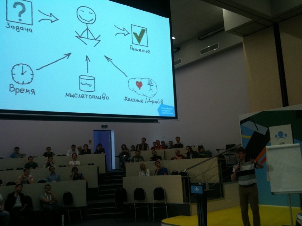
Very quickly (slides 5-9, time 02: 00-05: 00) Sergey uses a technique that can be considered his calling card (there is another person who uses it just as masterly, this is Alexey Shipilyov). I call this technique "detective order of presentation" and recommend it to everyone to learn and use. A good, valid order looks like this:
Obviously, such a plot construction, if you don’t delay too much, captures the attention of the audience, it’s interesting to listen, you can try yourself as a detective, and in general you want to know how it will all end. “To play detective” is a very important aspect, because we involve the audience and encourage it to think, and to think about the topic of our story. Sergey is well aware and regularly demonstrates.
The reverse order, when we first give a theoretical substantiation of the problem, and then give an example of its manifestation, in most cases it turns out to be more boring and involves the audience less. Of course, there are relatively successful works in this genre (does anyone remember Lieutenant Colombo? ..), but other things being equal, the “detective order” holds attention better. Just do not be deceived, the ease here is seeming. The code illustrating the unsolved problem so far needs to be written much more carefully than the code in which the problem is already known. It is difficult to dose hints without giving out the main secret ahead of time. During the preparation of conferences, I often offered speakers to remake the story in that order, but on the first attempt very few people deal with it. So there is a lot of work behind a simple detective story.
Note that almost all the examples in the report are built on the same principle.
But let's go further. After a couple of attention-grabbing examples, still somewhere at the beginning of the report, I expected to see a story that problems around the processor cache in an ordinary person’s life are more common than you might think (for example ...), and therefore know about they must be anyone who does not want, sooner or later, to seriously suffer from them. I suspect that there was no such story, because the average Java programmer (this, I remind you, JPoint) encounters processor cache problems much less than once in a lifetime. Usually the understanding that “this can happen to everyone” gives a little more attention to the audience. Sergey has practical references for the first time in the “Demo 6” section, starting at 33:20, slide 43, but by that time the report is already quite firmly perceived as a popular science exotic.
There are many (often contradictory) quotes on how many levels of abstraction a programmer's mind must penetrate down from the current one. Perhaps it was worthwhile to appeal to the authority of one of the great ones. In any case, at least some answer to the question of the hypothetical viewer “why this may be important for me personally” should be close to the beginning of each report, but there is no such answer here.
The ending is quite shock. There is also a list of specific problems that the viewer should know, and the ideological message: study the entire landscape, do not draw conclusions from the measurement results, until you have precisely figured out why they are. Here, I think, everything is fine.
Comments on the design of slides mainly relate to battery consumption. Imagine that every viewer has a battery in his head, which sits down as he thinks. He may agree or disagree with our idea, he may think about how to refute it, how to apply it in his work, how to retell it to his colleagues, what other issues related to the topic he He wants to ask, having caught the speaker on the sidelines - all these are useful thoughts, and the battery does not pity them. But never, under any circumstances, we want the viewer painfully trying to understand what our idea is. "What is written here? What line of the table is he talking about now? What did he mean? ”- unproductive wastes. The material of Sergey is not the easiest for the image, so there should have been a few places that can be improved. Well, there were, of course. And the charge saved by the audience is just enough to better understand how the cash lines are arranged.
But first of all I want to praise the code fragments that are found in the report. The code, as you know, is just writing simple, and reading is difficult. Therefore, it is necessary to invest a lot of work in the code snippets that we demonstrate: they should be simple and minimalist. In this case, they are exactly like that, and the work invested pays off.
Separately, I want to note that the code to demonstrate correctly on a white background:
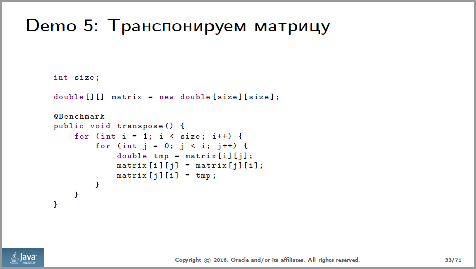
Of course, many people program invim in a different color, with a black background. You shouldn’t play it on slides: gray, red and dark blue on black can easily not be seen on the projector at all. It's amazing how much resistance I meet when I talk about this with the speakers I work with. The arguments from “I have already shown these slides, everything was visible” to “organizers should simply provide normal equipment”. In my opinion, this is the same thing as writing code that does not handle any errors, under pretexts like "just let them send valid data to the service to me" or "yes, it has been spinning normally for a week."
Sergey's code is simple and navigation is not required. But where navigation is required, a laser pointer is used. In my picture of the world, if you used it once per report, it is already one time more than necessary. It is very noticeable that those who watch the video suffer as we are. See the passage from 50:24 to 50:35. The problem is not in this record and in this reading, but in this record and in this reading. All clear, yeah.
Of course, it is necessary to work for people who came to the hall, they are more important than those who will watch the recording. But many of those who saw the report live were not lucky either. This is how the hall looks like in which everything happened. I circled people who hardly had a chance to see the pointer (the speaker used the pointer only on the screen to the left of himself):
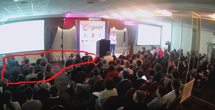
At the same time, the configuration with two duplicate screens is not exotic, it happens very often at conferences.
I’m in favor of once and for all putting up a laser pointer on clay on the clicker with clay and living as if it had never existed, and highlighting it with frames, arrows, sequential appearance of elements on the charts or color change. On slide 64, for example, there are arrows, and they normally perform their function:
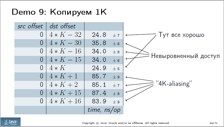
But on slide 64, as well as on several others, there are tables. It is more convenient for analytics (you can sort, make subsamples, etc.), but worse for demonstration. It’s necessary to immediately see what we want to show. The bars of different lengths are much easier to compare than numbers, moreover, they immediately show the ratio (so that you don’t have to divide in your head, how many times 86 are more than 35). I suppose, in many cases, tables can be redrawn in the form of diagrams, which makes them easier to decipher. Compare the two options for slide 46:
Original:
Redone:
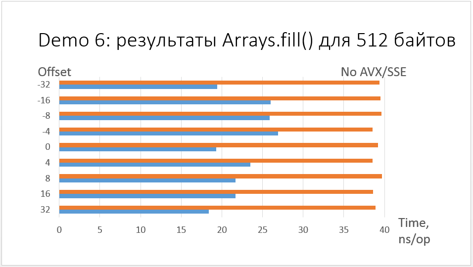
Of course, the diagram can be divided into two slides and first show the blue bars, and then add orange ones to them, as is done with the table in the original presentation.
If we talk about charts, then it is worth changing the graph from slide 26:
In the video, it appears at 13:41. Look at this place for about a minute: it seems to me that it takes some effort to figure out where the graph is a good case, and where it’s bad, because the slide has a lot of data and a difficult legend to read. Of course, you can figure it out, but it would be much easier to do this if the graphics did not appear all at once, but in turn, and each of them could be explained and commented separately at the time of the show.
It is better to sign the lines directly on the chart and get rid of the legend altogether. The fact that the legends are evil, I already wrote here , but I do not get tired of repeating.
Interesting from the point of view of perception is the scatter plot on slide 65, which appears on the video at 52:53. Here she is:
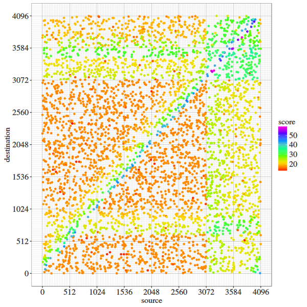
What's wrong with this picture? The colors on it are sorted in rainbow order, from red, which symbolizes a good case (fast copying), to violet, which corresponds to a bad one. However, sorting “by rainbow” occurs only on a conscious level, so in order to figure out which color is better, yellow or, for example, blue, you have to either run around the legend with your eyes or recall the story of the hunter and pheasant. This is not very difficult, but it can be made easier.
In the head, the colors are not automatically sorted, unless the ratio is lighter-darker. Having solved a simple task of social engineering, I received the source of the diagram and began to redraw it in one color. The number of shades had to be reduced to five (it is possible and to four, 50+ hardly deserves a separate color), but in the end we got an option that seems more visual to me (light is good, dark is bad):
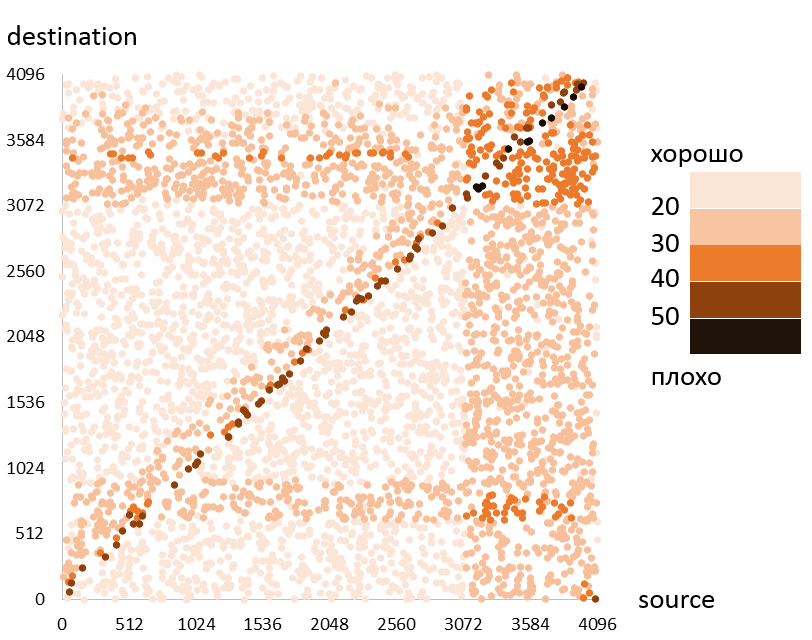
Of course, before the demonstration it is worth testing whether it will be visible on the projector.
If you want to get feedback on your performance, I’ll be happy to give it to you.
Today, your attention is invited to the report of Sergey Walrus Kuksenko at JPoint 2016 : "Quantum Performance Effects II: Beyond the Core".
→ Slides here
')
Disclaimer: about Java, only the report itself, if you have not seen it yet. The article under the cut - about the report.
Plot
Very much depends on the composition and quality of plot elements in the report, so we will begin with them.
Detective order
Very quickly (slides 5-9, time 02: 00-05: 00) Sergey uses a technique that can be considered his calling card (there is another person who uses it just as masterly, this is Alexey Shipilyov). I call this technique "detective order of presentation" and recommend it to everyone to learn and use. A good, valid order looks like this:
- We observe strange symptoms in the program (murder committed).
- We are trying to twist something and see what will change (the police collect evidence).
- It seems to have found a plausible explanation (we suspect the duchess).
- There is a new test that destroys our hypothesis (in the duchess of an alibi).
- Finally, the true cause of the problem becomes clear (the killer is the butler).
Obviously, such a plot construction, if you don’t delay too much, captures the attention of the audience, it’s interesting to listen, you can try yourself as a detective, and in general you want to know how it will all end. “To play detective” is a very important aspect, because we involve the audience and encourage it to think, and to think about the topic of our story. Sergey is well aware and regularly demonstrates.
The reverse order, when we first give a theoretical substantiation of the problem, and then give an example of its manifestation, in most cases it turns out to be more boring and involves the audience less. Of course, there are relatively successful works in this genre (does anyone remember Lieutenant Colombo? ..), but other things being equal, the “detective order” holds attention better. Just do not be deceived, the ease here is seeming. The code illustrating the unsolved problem so far needs to be written much more carefully than the code in which the problem is already known. It is difficult to dose hints without giving out the main secret ahead of time. During the preparation of conferences, I often offered speakers to remake the story in that order, but on the first attempt very few people deal with it. So there is a lot of work behind a simple detective story.
Note that almost all the examples in the report are built on the same principle.
Problematization
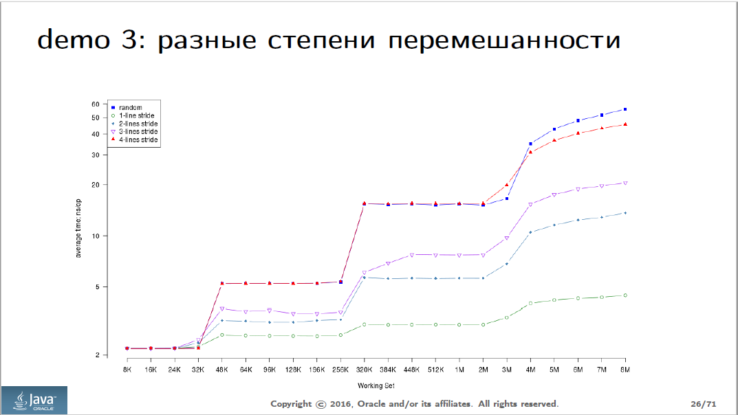
But let's go further. After a couple of attention-grabbing examples, still somewhere at the beginning of the report, I expected to see a story that problems around the processor cache in an ordinary person’s life are more common than you might think (for example ...), and therefore know about they must be anyone who does not want, sooner or later, to seriously suffer from them. I suspect that there was no such story, because the average Java programmer (this, I remind you, JPoint) encounters processor cache problems much less than once in a lifetime. Usually the understanding that “this can happen to everyone” gives a little more attention to the audience. Sergey has practical references for the first time in the “Demo 6” section, starting at 33:20, slide 43, but by that time the report is already quite firmly perceived as a popular science exotic.
There are many (often contradictory) quotes on how many levels of abstraction a programmer's mind must penetrate down from the current one. Perhaps it was worthwhile to appeal to the authority of one of the great ones. In any case, at least some answer to the question of the hypothetical viewer “why this may be important for me personally” should be close to the beginning of each report, but there is no such answer here.
findings
The ending is quite shock. There is also a list of specific problems that the viewer should know, and the ideological message: study the entire landscape, do not draw conclusions from the measurement results, until you have precisely figured out why they are. Here, I think, everything is fine.
Slides
Comments on the design of slides mainly relate to battery consumption. Imagine that every viewer has a battery in his head, which sits down as he thinks. He may agree or disagree with our idea, he may think about how to refute it, how to apply it in his work, how to retell it to his colleagues, what other issues related to the topic he He wants to ask, having caught the speaker on the sidelines - all these are useful thoughts, and the battery does not pity them. But never, under any circumstances, we want the viewer painfully trying to understand what our idea is. "What is written here? What line of the table is he talking about now? What did he mean? ”- unproductive wastes. The material of Sergey is not the easiest for the image, so there should have been a few places that can be improved. Well, there were, of course. And the charge saved by the audience is just enough to better understand how the cash lines are arranged.
Code
But first of all I want to praise the code fragments that are found in the report. The code, as you know, is just writing simple, and reading is difficult. Therefore, it is necessary to invest a lot of work in the code snippets that we demonstrate: they should be simple and minimalist. In this case, they are exactly like that, and the work invested pays off.
Separately, I want to note that the code to demonstrate correctly on a white background:
Of course, many people program in
Pointer
Sergey's code is simple and navigation is not required. But where navigation is required, a laser pointer is used. In my picture of the world, if you used it once per report, it is already one time more than necessary. It is very noticeable that those who watch the video suffer as we are. See the passage from 50:24 to 50:35. The problem is not in this record and in this reading, but in this record and in this reading. All clear, yeah.
Of course, it is necessary to work for people who came to the hall, they are more important than those who will watch the recording. But many of those who saw the report live were not lucky either. This is how the hall looks like in which everything happened. I circled people who hardly had a chance to see the pointer (the speaker used the pointer only on the screen to the left of himself):
At the same time, the configuration with two duplicate screens is not exotic, it happens very often at conferences.
And here is an example of exotic
Exotics is, for example, the Singapore Hall of the Skolkovo Business School, where RIT ++ and Highload ++ took place this year. There you won’t get a blaster anywhere, the hall is round, the speaker looks at the end of the paired screens:
I’m in favor of once and for all putting up a laser pointer on clay on the clicker with clay and living as if it had never existed, and highlighting it with frames, arrows, sequential appearance of elements on the charts or color change. On slide 64, for example, there are arrows, and they normally perform their function:
Tables and charts
But on slide 64, as well as on several others, there are tables. It is more convenient for analytics (you can sort, make subsamples, etc.), but worse for demonstration. It’s necessary to immediately see what we want to show. The bars of different lengths are much easier to compare than numbers, moreover, they immediately show the ratio (so that you don’t have to divide in your head, how many times 86 are more than 35). I suppose, in many cases, tables can be redrawn in the form of diagrams, which makes them easier to decipher. Compare the two options for slide 46:
Original:
Redone:
Of course, the diagram can be divided into two slides and first show the blue bars, and then add orange ones to them, as is done with the table in the original presentation.
If we talk about charts, then it is worth changing the graph from slide 26:
In the video, it appears at 13:41. Look at this place for about a minute: it seems to me that it takes some effort to figure out where the graph is a good case, and where it’s bad, because the slide has a lot of data and a difficult legend to read. Of course, you can figure it out, but it would be much easier to do this if the graphics did not appear all at once, but in turn, and each of them could be explained and commented separately at the time of the show.
It is better to sign the lines directly on the chart and get rid of the legend altogether. The fact that the legends are evil, I already wrote here , but I do not get tired of repeating.
Colors
Interesting from the point of view of perception is the scatter plot on slide 65, which appears on the video at 52:53. Here she is:
What's wrong with this picture? The colors on it are sorted in rainbow order, from red, which symbolizes a good case (fast copying), to violet, which corresponds to a bad one. However, sorting “by rainbow” occurs only on a conscious level, so in order to figure out which color is better, yellow or, for example, blue, you have to either run around the legend with your eyes or recall the story of the hunter and pheasant. This is not very difficult, but it can be made easier.
In the head, the colors are not automatically sorted, unless the ratio is lighter-darker. Having solved a simple task of social engineering, I received the source of the diagram and began to redraw it in one color. The number of shades had to be reduced to five (it is possible and to four, 50+ hardly deserves a separate color), but in the end we got an option that seems more visual to me (light is good, dark is bad):
Of course, before the demonstration it is worth testing whether it will be visible on the projector.
Regular Parsing
If you want to get feedback on your performance, I’ll be happy to give it to you.
What do I need to do?
All that needs to be sent to the habrayuzer p0b0rchy , that is to me. For my part, I promise that the criticism will be constructive and polite, as well as a focus on particularly successful elements, and not only on those that should be improved.
- Video presentations available on youtube, vimeo, etc.
- Slides
- Application from the author. Without the consent of the speaker will not disassemble anything.
All that needs to be sent to the habrayuzer p0b0rchy , that is to me. For my part, I promise that the criticism will be constructive and polite, as well as a focus on particularly successful elements, and not only on those that should be improved.
Source: https://habr.com/ru/post/315864/
All Articles