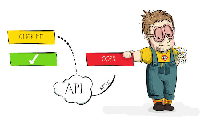
True lies optimistic interfaces
The article by Denis Mishunov, recently published in Smashing Magazine, seemed very interesting to us: it is devoted to an approach that many people still don’t think about, although it already surrounds us in the most popular services. With the permission of the author and the original source, we decided to translate this material for the community.
Three user interfaces go to the pub. First order a drink, then a few more. A couple of hours later, he asks for the bill and leaves the pub drunk. The second one orders a drink, pays for it immediately, orders another one, pays for it, continues in the same vein, and leaves the pub drunk in a couple of hours. And the third one goes to the pub already drunk - he knows how pubs work, and is effective enough not to waste time. Have you heard about this third? It is called "optimistic UI".
')
An optimistic approach to UI is not about looking at the web through rose-colored glasses - at least not just that.
Recently, discussing the psychological optimization of performance at a number of conferences devoted to both the frontend and UX, I noticed how little attention in the community was given to the topic of optimistic interfaces. Even the term “optimistic UI” is not well defined. In this article we will understand, on what concepts it is based, and look at the examples, as well as deal with its psychological justification.
But before we begin, we must admit: “optimistic UI” cannot be called anything concrete. Rather, it is the mental model behind the implementation of the interface. The optimistic UI has its own history and its own rationale.
Once upon a time — when the word “tweet” was used mainly for birds, Apple was on the verge of bankruptcy, and people placed fax numbers on their business cards — the web interfaces were rather ascetic. And the vast majority of them were deprived of even a hint of optimism. Interaction with a button, for example, could follow the following scenario:
In 2016, this may seem very inefficient, but, surprisingly, the same scenario is still used by a large number of web pages and applications, being an integral element of interaction for many products. The reason is that this type of interaction is predictable and more or less error-proof: the user knows that the action was requested from the server (the deactivated state of the button hints at it), and when the server responds, the updated page clearly indicates the end of the “client- server client. The problems with this type of interaction are pretty obvious:
Then came the so-called Web 2.0, providing new ways to interact with web pages. XMLHttpRequest and AJAX became their basis. These new methods were supplemented with “spinners”: the simplest form of indicating progress, the only task of which is to inform the user that the system is working on an operation. Now we didn’t have to reload the page after receiving the response from the server, we could just update a part of the already rendered page. Thanks to this, the web has become more dynamic, and user interaction has become smoother. A typical button interaction could now look like this:
This new model of interaction copes with one of the above problems of the previous method: updating the page is no longer accompanied by switching from one action to another, keeping the context for the user and involving him in the process much better than before.

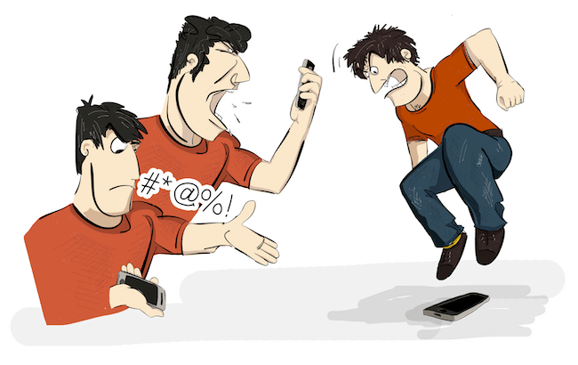
This interaction pattern is common everywhere. However, one problem remains: users still need to wait for a response from the server. Yes, we can make our servers work faster, but no matter how hard we try to speed up the infrastructure, users still have to wait. And they, to put it mildly, do not like this. For example, a study shows that 78% of consumers feel negative emotions due to slow or unreliable sites. Moreover, according to a Harris Interactive survey for Tealeaf, 23% of users admit that they curse their mobile devices, 11% shout at them, and as many as 4% literally hurl them when faced with problems when making an online transaction. Temporary delays are among such problems.
Today, even when, while waiting, you are showing some kind of progress indicator, unless you approached its creation extremely original , this may simply not be enough. In general, people are accustomed to the fact that spinners indicate slowness of the system. They became associated with passive waiting , when the user has no other choice but to wait for the server’s response or to close the tab / application completely. So let's try to further improve this interaction and look at the concept of an optimistic UI.
As already mentioned, an optimistic UI is nothing more than a way to handle user interaction with an interface. To understand his main ideas, we will continue to talk about the “user clicks a button” scenario. But the principle will remain the same for almost any interaction that you want to make “optimistic.” As the Oxford English Dictionary tells us:
Let's start with the “confidence in the future” part.
How do you think, how often does your server generate an error in response to a user action? For example, how often does your API do this when you click a button? Or when you click on the link? Honestly, I do not think. Of course, this depends on the specific API, the load on the server, the level of error handling and other factors that you as a frontend developer or UX specialist may not want to understand at all. But while the API is stable and predictable, and the frontend correctly conveys possible actions with the interface, the number of errors in response to user actions will be quite low. I would even suggest that it will not exceed 1-3%. This means that in 97-99% of cases, when a user clicks a button on a site, the server will respond successfully and without error. It is worth illustrating:

Just think for a second: if we are 97-99% sure of the success of a certain answer, then we can be confident in the future - well, at least to a much greater extent than Schrödinger's cat was confident of his own. Therefore, we can change the entire interaction script with a button to the following:
And that's it! At least from the user's point of view, there is nothing more - neither waiting nor needing to watch an inactive button, nor another annoying spinner. User interaction with the system is much more smooth, without reminding the system about itself.
From the point of view of the developer, the full cycle is as follows:
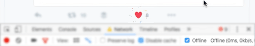
Let's look at examples of such optimistic interaction. You probably know the like buttons like the ones on Facebook and Twitter.
It all starts, of course, with the press of a button. But pay attention to her visual state after that. It is instantly displayed as successful!

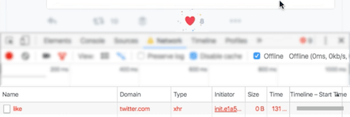
Let's see what happens at this point on the Network tab in the Developer Tools of our browser.
The tab indicates that the request to the server has been sent, but is still being processed. The "likes" counter has not yet been increased, and by changing the color, the interface already explicitly informs the user about success, even before receiving a response from the server.
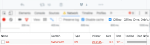
After a successful response, the counter is updated, but this transition is much less noticeable than the immediate color change. As a result, everything goes much more smoothly for the user: no one intervened, nothing had to wait.
Another example of optimistic interaction is Facebook with its like button. This is quite similar to the previous scenario, except that Facebook updates the counter right away, along with changing the color of the button, without waiting for the server to respond.
Something here should be noted. If we look at the response time of the server, we find that it is just over 1 second . This is quite long, given that the RAIL model recommends 100 milliseconds as the optimal response time to a simple user request. However, the user in this case does not feel any waiting time due to the optimistic nature of the interaction. This is another example of psychological performance optimization .
But let's admit: there is still a 1-3% chance that the server will generate an error. Or the user is simply offline. Or, more likely, the server will produce a response that is technically successful, but contains information that needs to be further processed on the client. As a result, the user will not receive an error indication, but we cannot consider it a success. To understand what to do in such cases, we first need to consider what psychological principles underlie optimistic UIs.
I have never heard anyone complain about the above optimistic interactions in popular social networks. Therefore, suppose that optimistic UIs work. But why do they work in terms of users? Just because people hate waiting. That's all! You can move on to the next part of the article.
But if you're still reading, you probably want to know why this is so. Let's look a little deeper psychological rationale for this approach.
An optimistic UI consists of two basic components that deserve our attention:
Speaking about the optimistic approach to the UI, we mean the optimal response time in the interaction of the user with the system. And recommendations for such interaction have existed since the distant 1968th. Then Robert Miller published his fundamental work “Response Time in Man-Computer Conversational Transactions” (PDF), where he identified as many as 17 different types of response that a user can receive from a computer. One of them, Miller, called the "response to the activation of control" - the delay between pressing a key and the visual response. Even then, in 1968, it should not exceed 0.1-0.2 seconds. Yes, the RAIL model was not the first to propose this - to the council for about 50 years. Miller notes, however, that even this short delay may be too slow for advanced users. This means that ideally the user should receive confirmation of his action within 100 milliseconds . This is close to one of the fastest unconscious actions that a human body can perform: blinking. For this reason, the 100-millisecond interval is usually perceived as instantaneous. "Most people blink about 15 times a minute, and each blink lasts an average of 100-150 milliseconds," says Deyvina Bristow of the Institute of Neurology at University College London, adding that "means that overall we spend at least 9 days year on blink.
Due to the instantaneous visual response (occurring before the response is received), an optimistic UI is one example of an early completion technique used in psychological performance optimization. But the fact that people love the interfaces that respond in the blink of an eye should not surprise most of us. And it is not so difficult to achieve. Even earlier, we deactivated the buttons immediately after clicking on them, and this was usually enough to demonstrate that “the system knows about the user’s actions”. But an inactive interface element means passive waiting: the user cannot do anything with it and does not control the process. And this is very annoying to the user. That is why in an optimistic UI, we skip the entire “inactive” stage entirely - we report a positive result instead of making the user wait.
Let's move on to the second interesting psychological aspect of optimistic UI - handling potential errors. There is a wealth of information and articles on how best to handle interface errors. And although later in the article we will consider this, the main thing in the optimistic UI is not how we handle errors, but when we do it.
The fact is that people tend to split their activities into subtasks, often called “train of thought” , “flow of thought” (PDF) or simply “flow” . This state of “flow” is characterized by a peak of pleasure, an energy focus and maximum concentration. The user in the "stream" is completely immersed in their activities. Tammy Everts tweet illustrates this well:

On the network, the duration of such periods of activity is usually much shorter. Let's go back to the work of Robert Miller. In the types of answers that he lists, there are:
All of them he links to the same 2-second interval during which the user must receive the appropriate type of response. Without going deeper, we note that this interval also depends on the working memory of the person (a period of time during which a person can hold a certain amount of information in the head and, more importantly, perform actions with this information). For us, developers and UX specialists, this means that within 2 seconds after interacting with the interface element, the user will be in the "stream" and focus on the answer that he expects. If the server generates an error during this period of time, the user can still be said to be in “dialogue” with the interface. It’s like a dialogue between two people in which you say something, and the other person gently objects to you. Imagine if the interlocutor nodded for a long time in agreement (the equivalent of a successful response in the UI), and then eventually said "no." It would be strange, right? So an optimistic UI should report an error to the user within 2 seconds of the “thread”.
Armed with psychological knowledge about error handling in an optimistic UI, let's finally get to these 1-3% failures.
The most common statement about optimistic UI, which I heard, is that this is an anti-pattern - if you will, deception of users. Probably, if you approach the question purely formally, then it is so. However, I consider this a technique of prediction or expression of hope. (Remember the definition of the word "optimistic"? So we got to "full of hope" in it.) The difference between "deception" and "expression of hope" is how you manage with these 1-3% responses with an error. Let's take a look at how the optimistic “like” button on Twitter behaves offline.
At first, in accordance with the optimistic UI-pattern, the button switches to the success state immediately after clicking - again, without waiting, just as if the user were online.
But since the user is offline, the request fails.
Therefore, error information should be communicated to the user as quickly as possible. Again, usually for this we have no more than 2 seconds while the user is in the "stream". Twitter reports this in the most unobtrusive way possible - simply returning the button to its original state.
A conscious reader here can say that in error handling, you can go further, directly notifying the user that his request could not be sent or an error occurred. This would make the system as transparent as possible. But there is a trick - or rather, a number of difficulties:
Here we can all agree that the situation is becoming too complicated. Despite the fact that such error handling would be appropriate, for example, for a large form on the site, for such a simple action as clicking a click, this is too much - both in terms of the necessary technical development and in the working memory of users.
So, yes, in an optimistic UI, we should be “transparent” with regard to errors and should report them as soon as possible so that our optimism does not turn into deception. But our actions in this case must fit the context. For a failed like button, simply returning it to its original state will most likely be enough - well, of course, except for the case when you like the status of your second half, then the system would always work better.
This question may arise: what happens if the user closes the browser tab after displaying success, but before the request returns from the server? The most unpleasant case would be if he closed it even before the request went to the server. But unless the user is extremely agile or has the ability to slow down time, this is hardly possible.
If the optimistic UI is used correctly, and this type of interaction is applied only to those elements that never wait for the server to respond for more than 2 seconds, then the user would need to have time to close the tab within these 2 seconds. It is not too difficult to do by pressing the keys; however, as we know, in 97-99% of these cases, the request would have been successful regardless of whether the tab was open (the answer simply would not have been returned to the client).
So the problem can only occur for those 1-3% who received a server error. How many people rush to close a tab in 2 seconds? Unless they participate in a contest for closing tabs for speed, their number is unlikely to be significant. But if you believe that this is in your particular case it can matter and lead to negative consequences, then use the tools to analyze user behavior; If the likelihood of such a scenario is high enough, limit the optimistic interaction to non-critical elements only.
I deliberately did not mention cases in which the server’s response was artificially delayed - this is usually outside the purview of the optimistic UI. Now that we have spent more than enough time on the pessimistic side of things, let's summarize a little about the proper use of the optimistic UI.
I sincerely hope that this article has helped you understand some of the main principles on which the optimistic approach to the UI is based. You might want to try it in your next project. In this case, here are some things you should pay attention to before starting:
As we have seen, the optimistic approach to the UI is neither an innovation, nor an advanced technique. This is just another way to help you manage the perception of the performance of your product. Based on the psychological aspects, an optimistic UI, when properly applied, can help create a positive and smoother user interaction with your system, while requiring minimal resources from you. But in order to achieve maximum efficiency from this technology and not to deceive users, we need to understand the principles of its operation.
Denis Mishunov , the author of this article (and her illustrations!), Will give a keynoat at HolyJS conference in Moscow on December 11 about how to “run a debugger” for yourself. In the summer at St. Petersburg HolyJS, he talked about the psychological perception of performance, and then his performance hit the top 3 most liked by the audience - so this time we should expect that it will be interesting.
Three user interfaces go to the pub. First order a drink, then a few more. A couple of hours later, he asks for the bill and leaves the pub drunk. The second one orders a drink, pays for it immediately, orders another one, pays for it, continues in the same vein, and leaves the pub drunk in a couple of hours. And the third one goes to the pub already drunk - he knows how pubs work, and is effective enough not to waste time. Have you heard about this third? It is called "optimistic UI".
')
An optimistic approach to UI is not about looking at the web through rose-colored glasses - at least not just that.
Recently, discussing the psychological optimization of performance at a number of conferences devoted to both the frontend and UX, I noticed how little attention in the community was given to the topic of optimistic interfaces. Even the term “optimistic UI” is not well defined. In this article we will understand, on what concepts it is based, and look at the examples, as well as deal with its psychological justification.
But before we begin, we must admit: “optimistic UI” cannot be called anything concrete. Rather, it is the mental model behind the implementation of the interface. The optimistic UI has its own history and its own rationale.
Once upon a time
Once upon a time — when the word “tweet” was used mainly for birds, Apple was on the verge of bankruptcy, and people placed fax numbers on their business cards — the web interfaces were rather ascetic. And the vast majority of them were deprived of even a hint of optimism. Interaction with a button, for example, could follow the following scenario:
- The user presses the button.
- The button changes the state to deactivated.
- The request is sent to the server.
- The response from the server is sent back to the page.
- Page reloads to display response results.
In 2016, this may seem very inefficient, but, surprisingly, the same scenario is still used by a large number of web pages and applications, being an integral element of interaction for many products. The reason is that this type of interaction is predictable and more or less error-proof: the user knows that the action was requested from the server (the deactivated state of the button hints at it), and when the server responds, the updated page clearly indicates the end of the “client- server client. The problems with this type of interaction are pretty obvious:
- User must wait. And we already know that even a small delay in response time negatively affects the user's perception of the whole brand, and not just a specific page.
- Each time a user gets an answer to his actions, it happens rather destructively (a new page is loaded instead of updating an existing page), which changes the context of the user task and can be confusing. Let the speech in this case is not necessarily about multitasking , any switching of the thinking context is unpleasant. So, unless the action itself implies an inevitable change of context (online payments are a good example of such a change), switching will set a negative tone for the user to communicate with the system.
Not-so-old-good times
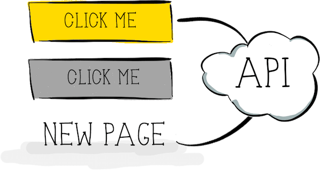
Then came the so-called Web 2.0, providing new ways to interact with web pages. XMLHttpRequest and AJAX became their basis. These new methods were supplemented with “spinners”: the simplest form of indicating progress, the only task of which is to inform the user that the system is working on an operation. Now we didn’t have to reload the page after receiving the response from the server, we could just update a part of the already rendered page. Thanks to this, the web has become more dynamic, and user interaction has become smoother. A typical button interaction could now look like this:
- The user presses the button.
- The button switches to inactive mode, and a spinner appears to show that the system is working.
- The request is sent to the server.
- The response from the server is sent back to the page.
- The visual state of the button and page is updated according to the status of the answer.
This new model of interaction copes with one of the above problems of the previous method: updating the page is no longer accompanied by switching from one action to another, keeping the context for the user and involving him in the process much better than before.
This interaction pattern is common everywhere. However, one problem remains: users still need to wait for a response from the server. Yes, we can make our servers work faster, but no matter how hard we try to speed up the infrastructure, users still have to wait. And they, to put it mildly, do not like this. For example, a study shows that 78% of consumers feel negative emotions due to slow or unreliable sites. Moreover, according to a Harris Interactive survey for Tealeaf, 23% of users admit that they curse their mobile devices, 11% shout at them, and as many as 4% literally hurl them when faced with problems when making an online transaction. Temporary delays are among such problems.
Today, even when, while waiting, you are showing some kind of progress indicator, unless you approached its creation extremely original , this may simply not be enough. In general, people are accustomed to the fact that spinners indicate slowness of the system. They became associated with passive waiting , when the user has no other choice but to wait for the server’s response or to close the tab / application completely. So let's try to further improve this interaction and look at the concept of an optimistic UI.
Optimistic UI
As already mentioned, an optimistic UI is nothing more than a way to handle user interaction with an interface. To understand his main ideas, we will continue to talk about the “user clicks a button” scenario. But the principle will remain the same for almost any interaction that you want to make “optimistic.” As the Oxford English Dictionary tells us:
op-ti-mis-tic , adj. hopeful and confident about the future.
optimistic - full of hope and confident in the future
Let's start with the “confidence in the future” part.
How do you think, how often does your server generate an error in response to a user action? For example, how often does your API do this when you click a button? Or when you click on the link? Honestly, I do not think. Of course, this depends on the specific API, the load on the server, the level of error handling and other factors that you as a frontend developer or UX specialist may not want to understand at all. But while the API is stable and predictable, and the frontend correctly conveys possible actions with the interface, the number of errors in response to user actions will be quite low. I would even suggest that it will not exceed 1-3%. This means that in 97-99% of cases, when a user clicks a button on a site, the server will respond successfully and without error. It is worth illustrating:
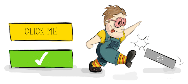
Just think for a second: if we are 97-99% sure of the success of a certain answer, then we can be confident in the future - well, at least to a much greater extent than Schrödinger's cat was confident of his own. Therefore, we can change the entire interaction script with a button to the following:
- The user presses the button.
- The visual display of the button immediately changes to "successful."
And that's it! At least from the user's point of view, there is nothing more - neither waiting nor needing to watch an inactive button, nor another annoying spinner. User interaction with the system is much more smooth, without reminding the system about itself.
From the point of view of the developer, the full cycle is as follows:
- The user presses the button.
- The visual state of the button immediately changes to successful.
- The request is sent to the server.
- The server response is sent back to the page.
- In 97-99% of cases, we already know that he is successful, so no need to distract the user.
- Only in case of an error the system makes itself felt. Do not worry about it now - we still will reach mistakes.
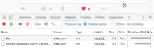
Let's look at examples of such optimistic interaction. You probably know the like buttons like the ones on Facebook and Twitter.
It all starts, of course, with the press of a button. But pay attention to her visual state after that. It is instantly displayed as successful!
Let's see what happens at this point on the Network tab in the Developer Tools of our browser.
The tab indicates that the request to the server has been sent, but is still being processed. The "likes" counter has not yet been increased, and by changing the color, the interface already explicitly informs the user about success, even before receiving a response from the server.
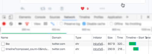
After a successful response, the counter is updated, but this transition is much less noticeable than the immediate color change. As a result, everything goes much more smoothly for the user: no one intervened, nothing had to wait.
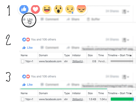
Another example of optimistic interaction is Facebook with its like button. This is quite similar to the previous scenario, except that Facebook updates the counter right away, along with changing the color of the button, without waiting for the server to respond.
Something here should be noted. If we look at the response time of the server, we find that it is just over 1 second . This is quite long, given that the RAIL model recommends 100 milliseconds as the optimal response time to a simple user request. However, the user in this case does not feel any waiting time due to the optimistic nature of the interaction. This is another example of psychological performance optimization .
But let's admit: there is still a 1-3% chance that the server will generate an error. Or the user is simply offline. Or, more likely, the server will produce a response that is technically successful, but contains information that needs to be further processed on the client. As a result, the user will not receive an error indication, but we cannot consider it a success. To understand what to do in such cases, we first need to consider what psychological principles underlie optimistic UIs.
Psychology behind optimistic UI
I have never heard anyone complain about the above optimistic interactions in popular social networks. Therefore, suppose that optimistic UIs work. But why do they work in terms of users? Just because people hate waiting. That's all! You can move on to the next part of the article.
But if you're still reading, you probably want to know why this is so. Let's look a little deeper psychological rationale for this approach.
An optimistic UI consists of two basic components that deserve our attention:
- Quick response to user input.
- Handling potential server, network, and so on errors.
Quick response to user actions
Speaking about the optimistic approach to the UI, we mean the optimal response time in the interaction of the user with the system. And recommendations for such interaction have existed since the distant 1968th. Then Robert Miller published his fundamental work “Response Time in Man-Computer Conversational Transactions” (PDF), where he identified as many as 17 different types of response that a user can receive from a computer. One of them, Miller, called the "response to the activation of control" - the delay between pressing a key and the visual response. Even then, in 1968, it should not exceed 0.1-0.2 seconds. Yes, the RAIL model was not the first to propose this - to the council for about 50 years. Miller notes, however, that even this short delay may be too slow for advanced users. This means that ideally the user should receive confirmation of his action within 100 milliseconds . This is close to one of the fastest unconscious actions that a human body can perform: blinking. For this reason, the 100-millisecond interval is usually perceived as instantaneous. "Most people blink about 15 times a minute, and each blink lasts an average of 100-150 milliseconds," says Deyvina Bristow of the Institute of Neurology at University College London, adding that "means that overall we spend at least 9 days year on blink.
Due to the instantaneous visual response (occurring before the response is received), an optimistic UI is one example of an early completion technique used in psychological performance optimization. But the fact that people love the interfaces that respond in the blink of an eye should not surprise most of us. And it is not so difficult to achieve. Even earlier, we deactivated the buttons immediately after clicking on them, and this was usually enough to demonstrate that “the system knows about the user’s actions”. But an inactive interface element means passive waiting: the user cannot do anything with it and does not control the process. And this is very annoying to the user. That is why in an optimistic UI, we skip the entire “inactive” stage entirely - we report a positive result instead of making the user wait.
Handling potential errors
Let's move on to the second interesting psychological aspect of optimistic UI - handling potential errors. There is a wealth of information and articles on how best to handle interface errors. And although later in the article we will consider this, the main thing in the optimistic UI is not how we handle errors, but when we do it.
The fact is that people tend to split their activities into subtasks, often called “train of thought” , “flow of thought” (PDF) or simply “flow” . This state of “flow” is characterized by a peak of pleasure, an energy focus and maximum concentration. The user in the "stream" is completely immersed in their activities. Tammy Everts tweet illustrates this well:
On the network, the duration of such periods of activity is usually much shorter. Let's go back to the work of Robert Miller. In the types of answers that he lists, there are:
- Answer list of information for a simple request
- Graphical response to a complex query
- The answer to "System, do you understand me?"
All of them he links to the same 2-second interval during which the user must receive the appropriate type of response. Without going deeper, we note that this interval also depends on the working memory of the person (a period of time during which a person can hold a certain amount of information in the head and, more importantly, perform actions with this information). For us, developers and UX specialists, this means that within 2 seconds after interacting with the interface element, the user will be in the "stream" and focus on the answer that he expects. If the server generates an error during this period of time, the user can still be said to be in “dialogue” with the interface. It’s like a dialogue between two people in which you say something, and the other person gently objects to you. Imagine if the interlocutor nodded for a long time in agreement (the equivalent of a successful response in the UI), and then eventually said "no." It would be strange, right? So an optimistic UI should report an error to the user within 2 seconds of the “thread”.
Armed with psychological knowledge about error handling in an optimistic UI, let's finally get to these 1-3% failures.
Pessimistic side of optimistic approach to UI
The most common statement about optimistic UI, which I heard, is that this is an anti-pattern - if you will, deception of users. Probably, if you approach the question purely formally, then it is so. However, I consider this a technique of prediction or expression of hope. (Remember the definition of the word "optimistic"? So we got to "full of hope" in it.) The difference between "deception" and "expression of hope" is how you manage with these 1-3% responses with an error. Let's take a look at how the optimistic “like” button on Twitter behaves offline.
At first, in accordance with the optimistic UI-pattern, the button switches to the success state immediately after clicking - again, without waiting, just as if the user were online.
But since the user is offline, the request fails.
Therefore, error information should be communicated to the user as quickly as possible. Again, usually for this we have no more than 2 seconds while the user is in the "stream". Twitter reports this in the most unobtrusive way possible - simply returning the button to its original state.
A conscious reader here can say that in error handling, you can go further, directly notifying the user that his request could not be sent or an error occurred. This would make the system as transparent as possible. But there is a trick - or rather, a number of difficulties:
- Any notification that is unexpectedly shown on the screen changes the context of the user's tasks, forcing him to analyze the cause of the failure, most likely presented in the error message.
- Like any other error message or notification, this message should direct the user in a new context, providing him with information on the basis of which actions can be taken.
- Such information, in turn, sets another context.
Here we can all agree that the situation is becoming too complicated. Despite the fact that such error handling would be appropriate, for example, for a large form on the site, for such a simple action as clicking a click, this is too much - both in terms of the necessary technical development and in the working memory of users.
So, yes, in an optimistic UI, we should be “transparent” with regard to errors and should report them as soon as possible so that our optimism does not turn into deception. But our actions in this case must fit the context. For a failed like button, simply returning it to its original state will most likely be enough - well, of course, except for the case when you like the status of your second half, then the system would always work better.
Extreme pessimism
This question may arise: what happens if the user closes the browser tab after displaying success, but before the request returns from the server? The most unpleasant case would be if he closed it even before the request went to the server. But unless the user is extremely agile or has the ability to slow down time, this is hardly possible.
If the optimistic UI is used correctly, and this type of interaction is applied only to those elements that never wait for the server to respond for more than 2 seconds, then the user would need to have time to close the tab within these 2 seconds. It is not too difficult to do by pressing the keys; however, as we know, in 97-99% of these cases, the request would have been successful regardless of whether the tab was open (the answer simply would not have been returned to the client).
So the problem can only occur for those 1-3% who received a server error. How many people rush to close a tab in 2 seconds? Unless they participate in a contest for closing tabs for speed, their number is unlikely to be significant. But if you believe that this is in your particular case it can matter and lead to negative consequences, then use the tools to analyze user behavior; If the likelihood of such a scenario is high enough, limit the optimistic interaction to non-critical elements only.
I deliberately did not mention cases in which the server’s response was artificially delayed - this is usually outside the purview of the optimistic UI. Now that we have spent more than enough time on the pessimistic side of things, let's summarize a little about the proper use of the optimistic UI.
Practical rules
I sincerely hope that this article has helped you understand some of the main principles on which the optimistic approach to the UI is based. You might want to try it in your next project. In this case, here are some things you should pay attention to before starting:
- First of all, make sure your API is reliable and returns predictable results. This is extremely important.
- The interface must find potential errors and problems before the request is sent to the server. Even better, completely get rid of something that could lead to an error with the API. The golden rule: the simpler the UI element, the easier it will be to make it optimistic.
- Apply optimistic patterns only to simple "binary" elements, from which nothing is expected except the answer about success or failure. For example, if a button assumes the options of a yes, no, and maybe server response (each of which can mean success to some extent), then it is better to leave such a button without an optimistic pattern.
- Know the response time of your API. This is critical. If you know that for a particular request, the response time is never less than 2 seconds, then start working on the API first. As we already figured out, an optimistic UI works best for a response time of less than 2 seconds. Going beyond these limits can lead to unexpected results and a large number of disgruntled users. I warned.
- Optimistic UI is not just about pushing buttons. This approach can be applied to various events in the page life cycle, including its loading. For example, skeleton screens follow the same principle: you hope that the server will respond successfully and fill the placeholders that are shown to the user as early as possible.
As we have seen, the optimistic approach to the UI is neither an innovation, nor an advanced technique. This is just another way to help you manage the perception of the performance of your product. Based on the psychological aspects, an optimistic UI, when properly applied, can help create a positive and smoother user interaction with your system, while requiring minimal resources from you. But in order to achieve maximum efficiency from this technology and not to deceive users, we need to understand the principles of its operation.
Links
- “ Response Time in Man-Computer Conversational Transactions ” (PDF), Robert B. Miller, Fall Joint Computer Conference, 1968
- “ Introducing RAIL: A User-Centric Model for Performance ”, Paul Irish, Paul Lewis, Smashing Magazine, 2015
- “ Mobile Web Stress: Emotional Engagement and Brand Perception ,” Tammy Everts, Radware Blog, 2013
- Mihaly Csikszentmihalyi, 2014
- “ Mobile Design Details: Avoid the Spinner ,” Luke Wroblewski, 2013
- “ Why Performance Matters, Part 2: Perception Management ,” Denys Mishunov, Smashing Magazine, 2015
Denis Mishunov , the author of this article (and her illustrations!), Will give a keynoat at HolyJS conference in Moscow on December 11 about how to “run a debugger” for yourself. In the summer at St. Petersburg HolyJS, he talked about the psychological perception of performance, and then his performance hit the top 3 most liked by the audience - so this time we should expect that it will be interesting.
Source: https://habr.com/ru/post/315806/
All Articles