15 great typography examples
British typography typography I Love Typography has published a list with examples of excellent typography . This list is based on the results of the II quarter. 2008 Previous "charts" can be found here and here .
Each example is accompanied by a brief comment, and clicking on the screenshot leads to the original site.
No flash, no pictures, no fuss; just a well-styled font and well-written text: real proof that you can get excellent results with just a font. I would like to see some more examples of this kind.

')
Great contrast between the title and the main content, plenty of clean space and good organization.
Nice logo, clear text and very nice colors. More information about the design can be read here .

Gorgeous ornate logo (does anyone know what kind of font?) And a lot of exquisite details.

Andy Rutledge is a designer who in practice applies the same principles that he promotes. I like the way the size of the size changes depending on the date of publication of the article, so the most recent text corresponds to the largest size.
Although the WordPress blogger platform is not based on a website, their website is displayed on thousands, if not millions, of our screens every day. I wish as many online and offline applications as possible looked just as good.
I really did not want to include this site in the review, because it uses flash. However, it does have some great fonts (and some of my favorites, I have to add).
Another site that is based simply on fonts in everything. A great example of hierarchy and markup. Who said “photography says more than a thousand words”? No, the font says better.
A lot of information without feeling cramped, plus the site is tied to a good grid.

Designers are not afraid of large blank areas and limited color gamut.
Well done. A design that speaks for itself.

Typographically rich, elegant and without chaos, but also a logo ... this is not a picture!
A lot of well-ordered information, and this is accompanied by a neatly matching color palette.

This site has been promoted in many contests. Here he got through good use of fonts.
Multicolored, organized and large font.
In the next article, “A detailed typography analysis for the web,” we will carefully review some of these sites.
Each example is accompanied by a brief comment, and clicking on the screenshot leads to the original site.
Seed conference
No flash, no pictures, no fuss; just a well-styled font and well-written text: real proof that you can get excellent results with just a font. I would like to see some more examples of this kind.
')
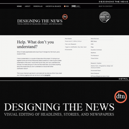
Designing the News
Great contrast between the title and the main content, plenty of clean space and good organization.
Omniti
Nice logo, clear text and very nice colors. More information about the design can be read here .
Designr.it
Gorgeous ornate logo (does anyone know what kind of font?) And a lot of exquisite details.
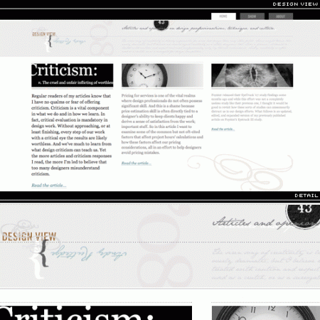
Design View
Andy Rutledge is a designer who in practice applies the same principles that he promotes. I like the way the size of the size changes depending on the date of publication of the article, so the most recent text corresponds to the largest size.
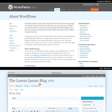
WordPress.org & WP 2.5.x Admin
Although the WordPress blogger platform is not based on a website, their website is displayed on thousands, if not millions, of our screens every day. I wish as many online and offline applications as possible looked just as good.
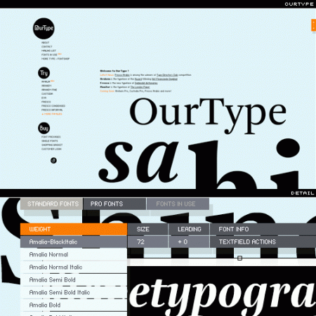
OurType
I really did not want to include this site in the review, because it uses flash. However, it does have some great fonts (and some of my favorites, I have to add).
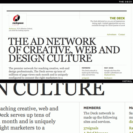
The deck
Another site that is based simply on fonts in everything. A great example of hierarchy and markup. Who said “photography says more than a thousand words”? No, the font says better.
Hell yeah dude
A lot of information without feeling cramped, plus the site is tied to a good grid.
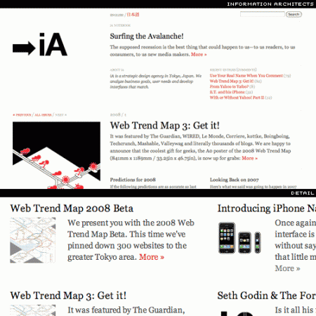
Information architects
Designers are not afraid of large blank areas and limited color gamut.
Naz Hamid
Well done. A design that speaks for itself.
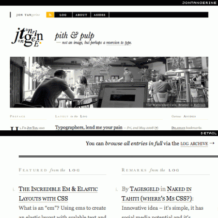
Jon tan
Typographically rich, elegant and without chaos, but also a logo ... this is not a picture!
Under consideration
A lot of well-ordered information, and this is accompanied by a neatly matching color palette.
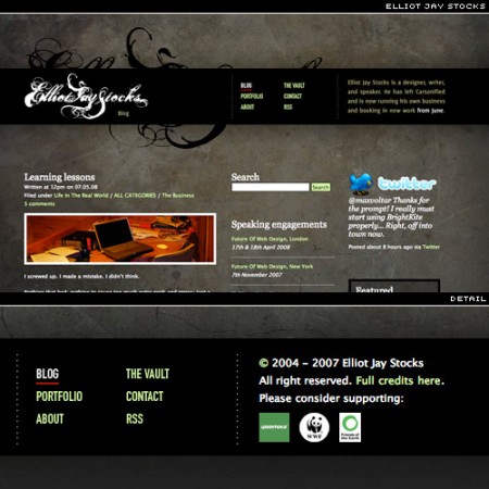
Elliot jay stocks
This site has been promoted in many contests. Here he got through good use of fonts.
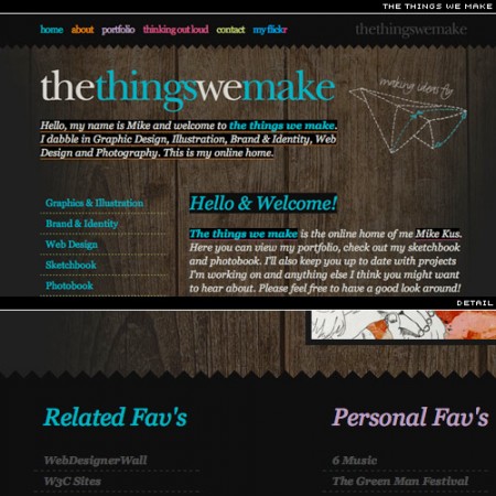
The things we make
Multicolored, organized and large font.
In the next article, “A detailed typography analysis for the web,” we will carefully review some of these sites.
Source: https://habr.com/ru/post/31571/
All Articles