Implementing a pull-down interface in an iOS application
In today's article we will talk about the techniques and tools that were used when working on the interface with a sliding panel, or, more simply, "curtain". Blinds - the optimal solution for applications in which the user interacts primarily with the main screen, but periodically needs quick access to additional information.

In our case, the interface was developed for the Vehicle Location Tracker utility, in which the main screen is a map with marked vehicle locations, and the pull-out menu allows the user to work with a specific location. Further, the whole process will be considered on the example of this application.
The main purpose of the curtain in the Vehicle Location Tracker is to display information about the selected parking lot. Depending on the immediate needs of the user, it can be hidden, can be displayed on the display as a top panel (normal or extended view), or can be fully extended, showing the entire set of editing tools.
')
It looks like this:


We began by cutting types into views and scattering them on separate XIBs. Further elements simply gathered as the designer. The task was facilitated by the fact that the possibility of changing the order of the position of the views was not implied, only a change in some distances.
The interaction was built between the main controller and its container, in which there was a curtain. The main controller had a link to the container controller. The reverse interaction was carried out through the delegate.
The logic of the shutter is as follows. There are four main window states:
- Adding new parking;
- editing existing;
- normal working condition with dedicated parking;
- a state when nothing is selected.
At the very same curtain a much more diverse set of states - a total of seven. The division of parking on the newly added and edited for the curtain is not carried out, but then the Normal and Edit modes, in addition to the basic versions, appear also extended. In addition, the “in motion” state is added with the “last fixed position” parameter:
Passing a state from MapState to MenuState is as follows:
The movement of the curtain itself was carried out by UIView.animateWithDuration and CGAffineTransformMakeTranslation.
Note that changing the state of the MenuState does not affect the MapState (and thanks for that). There is an automatic switching of states by changing the MenuState in the main controller, and there are internal changes to the curtain (via UITapGestureRecognizer or UIPanGestureRecognizer). At the same time, what happens “outside” has a higher priority by default.
Now a little about the work of the internal changes of the curtain. We add recliners:
and their implementation:
The next item on the program is the calculation of sizes and states. The tag panel and the standard state panel have a floating height, so for correct calculation of the dimensions of the item, the views on demand gave the desired value, calculated taking into account the amount and volume of content.
An example of calculating the height for collectionView content:
Not all dimensions need to be registered manually, in some places we have automated the process with the help of software.
In the work on the Vehicle Location Tracker, Sketchode is very useful to us - a tool that we learned about here on Habré . For those who have not read: this is a program that allows the developer to study and "parse" the layout of Sketch for their own needs, without making any changes to it. And the wolves are fed and the designer is calm.
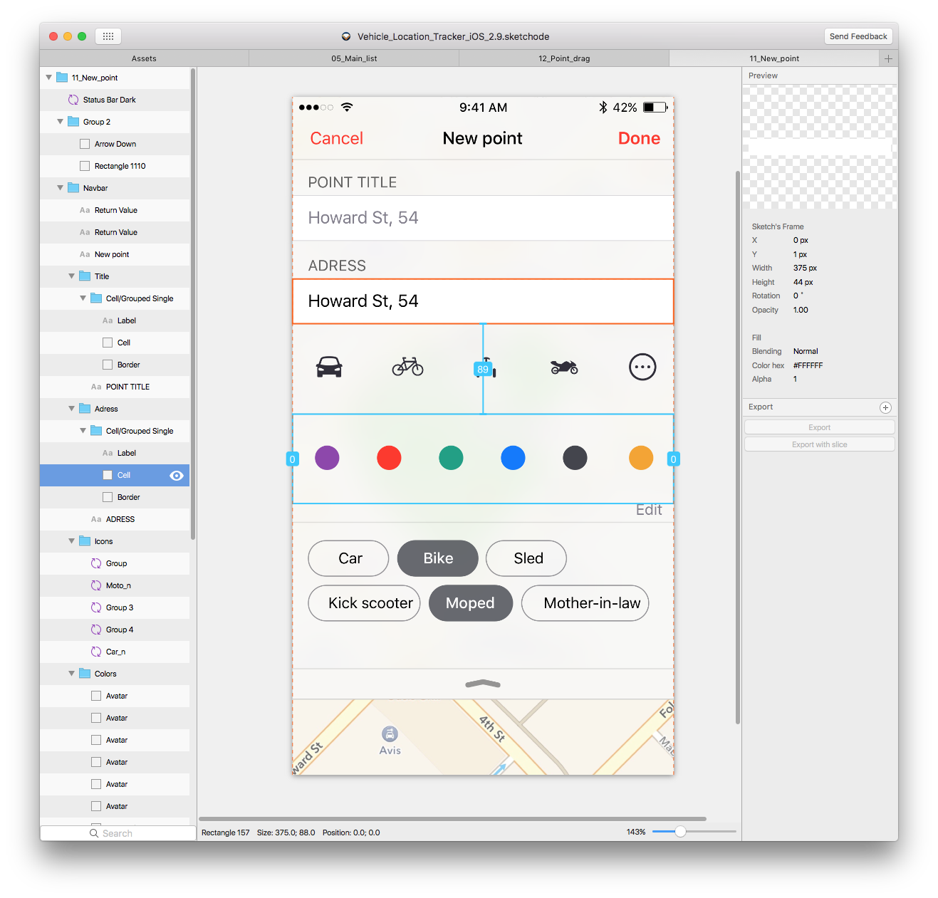
Sketchode was useful to us in two ways. First, it accurately and clearly shows the distance between any elements.
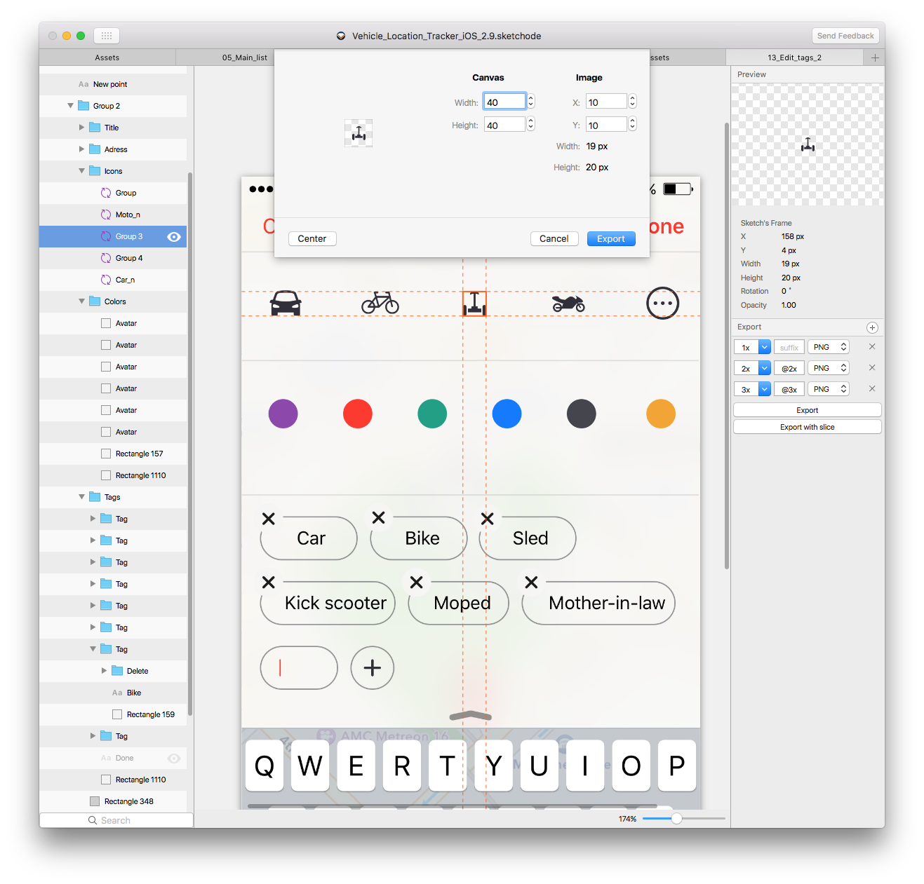
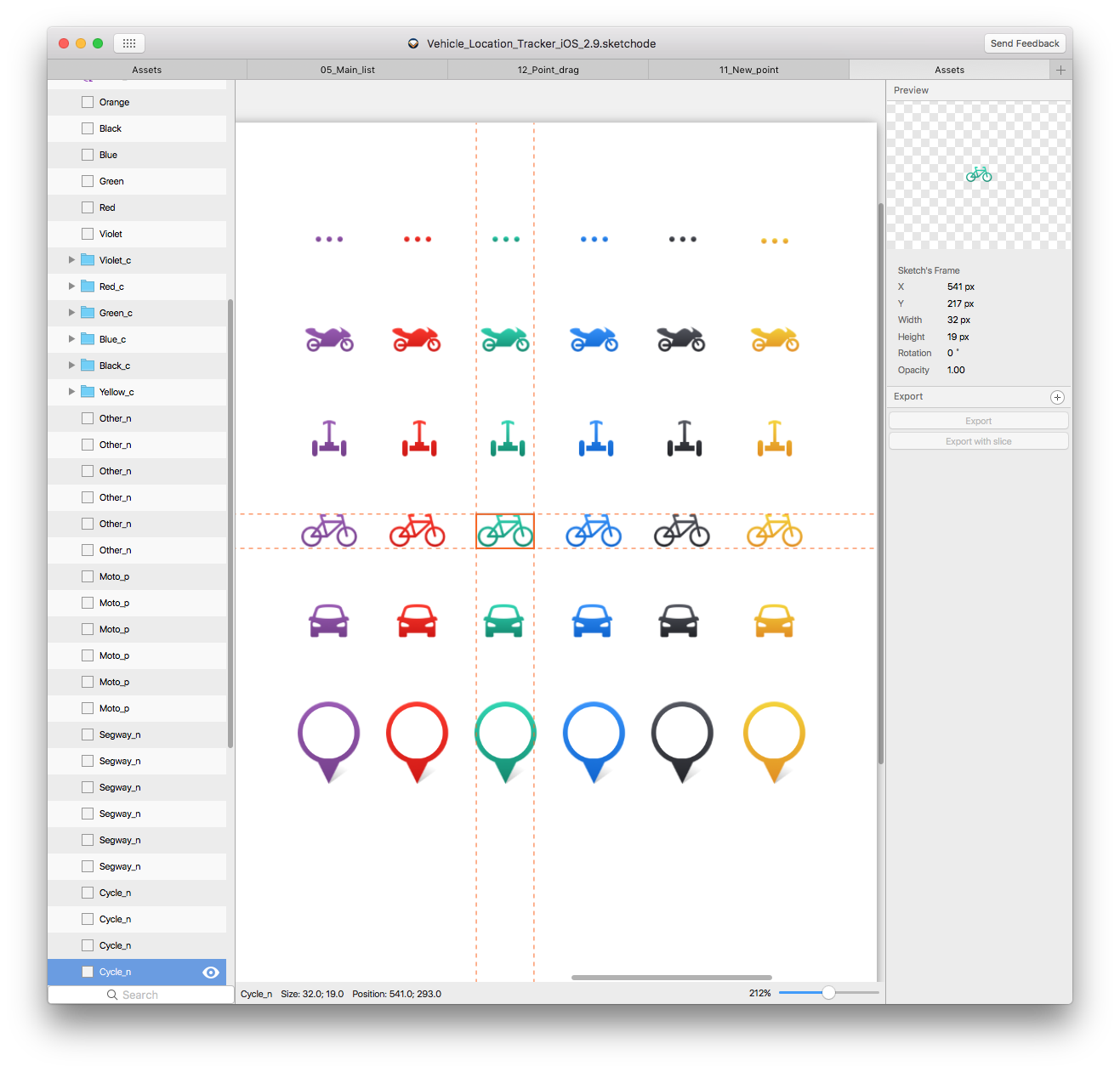
Secondly, the export of elements is very conveniently implemented. The icons of vehicles that were supposed to stand in the center of the canvas, we all turned out to be different in size, although they were used in the same view. The ability to set dimensions directly during export significantly saved us time to align.
In terms of the interface, winning is that you can open several windows with artboards and switch between them quietly, as you can see on the screenshot, no need to rush through the entire list of artboards in search of the one with which you have just interacted.
The main stages of working with the sliding panel, we have considered. Finally, a couple of little things that can be useful when working. In parallel, when developing both on obj-c and swift, we sometimes sincerely love what convenient things you can do on swift. For example:
- and all the possible states of the button are described, and enum will remember which mode the button was in if we forcibly block it:
And then there is beauty in general: we have placed both the associated UIColor and a piece of the name to upload the necessary pictures from assets to one enum. You can, of course, store all these names in one place, but then adding new ones will be inconvenient and ugly.
To avoid problems with the composition of names, we make the structure:
and call it:
Done!
These are the skills we have gained for ourselves during the first experience of creating a curtain. We hope our observations will be useful to other developers. Thanks for attention!
In our case, the interface was developed for the Vehicle Location Tracker utility, in which the main screen is a map with marked vehicle locations, and the pull-out menu allows the user to work with a specific location. Further, the whole process will be considered on the example of this application.
The main purpose of the curtain in the Vehicle Location Tracker is to display information about the selected parking lot. Depending on the immediate needs of the user, it can be hidden, can be displayed on the display as a top panel (normal or extended view), or can be fully extended, showing the entire set of editing tools.
')
It looks like this:
We began by cutting types into views and scattering them on separate XIBs. Further elements simply gathered as the designer. The task was facilitated by the fact that the possibility of changing the order of the position of the views was not implied, only a change in some distances.
The interaction was built between the main controller and its container, in which there was a curtain. The main controller had a link to the container controller. The reverse interaction was carried out through the delegate.
The logic of the shutter is as follows. There are four main window states:
- Adding new parking;
- editing existing;
- normal working condition with dedicated parking;
- a state when nothing is selected.
enum MapState : Int { case New case Edit case Normal case Empty } At the very same curtain a much more diverse set of states - a total of seven. The division of parking on the newly added and edited for the curtain is not carried out, but then the Normal and Edit modes, in addition to the basic versions, appear also extended. In addition, the “in motion” state is added with the “last fixed position” parameter:
indirect enum MenuState { case Empty case Hide(previous: MenuState) case Normal case Advanced case EditNormal case EditAdvanced case Motion(previous: MenuState) } Passing a state from MapState to MenuState is as follows:
class MapViewController: UIViewController { var currentState = StageMap.Zero { willSet { slideMenuVC.currentParentState = newValue } } } class SlideMenuViewController: UIViewController { var currentParentState = StageMap.Zero { willSet { switch newValue { case .Empty: updateVisibleOfViews(toState: .Empty) animateMove(toState: .Empty) case .Normal: updateVisibleOfViews(toState: .Normal) animateMove(toState: .Normal) case .New: updateVisibleOfViews(toState: .EditNormal) updateHeightOfTagsView() animateMove(toState: .EditNormal) case .Edit: updateVisibleOfViews(toState: .EditNormal) updateHeightOfTagsView() animateMove(toState: .EditNormal) } } } } The movement of the curtain itself was carried out by UIView.animateWithDuration and CGAffineTransformMakeTranslation.
Note that changing the state of the MenuState does not affect the MapState (and thanks for that). There is an automatic switching of states by changing the MenuState in the main controller, and there are internal changes to the curtain (via UITapGestureRecognizer or UIPanGestureRecognizer). At the same time, what happens “outside” has a higher priority by default.
Now a little about the work of the internal changes of the curtain. We add recliners:
func addGesturesToView() { let tapGesture = UITapGestureRecognizer(target: self, action: #selector(SlideMenuViewController.tapGestureHandler(_:))) actionView.addGestureRecognizer(tapGesture) let panGesture = UIPanGestureRecognizer(target: self, action: #selector(SlideMenuViewController.panGestureHandler(_:))) actionView.addGestureRecognizer(panGesture) } and their implementation:
func tapGestureHandler(recognizer:UITapGestureRecognizer) { var state = MenuState.Hide var canMove = true switch currentState { case .Hide(previous: .Normal), .Hide(previous: .UpNormalAdvanced): toState = .Normal case .Hide(previous: .EditNormal), .Hide(previous: .EditAdvanced): toState = .EditNormal case .Normal: toState = .Hide(previous: .Normal) case .Advanced: toState = .Normal case .EditAdvanced: toState = .EditNormal case .EditNormal: toState = .EditAdvanced case .Motion: canMove = false default: break } updateVisibleOfViews(toState: state) if canMove { animateMove(toState: state) } } func panGestureHandler(recognizer:UIPanGestureRecognizer) { switch recognizer.state { case .Began: currentState = .Moved(previous: currentState) case .Changed: // case .Ended, .Cancelled: // .Moved(previous: lastState) // , } } The next item on the program is the calculation of sizes and states. The tag panel and the standard state panel have a floating height, so for correct calculation of the dimensions of the item, the views on demand gave the desired value, calculated taking into account the amount and volume of content.
An example of calculating the height for collectionView content:
func getContentHeight() -> CGFloat { let amountOfItems = tagCollectionView.numberOfItemsInSection(0) guard amountOfItems > 0 else { return kDefaultCollectionHeight } let indexPath = NSIndexPath(forItem: amountOfItems - 1, inSection: 0) guard let attributes = tagCollectionView.collectionViewLayout.layoutAttributesForItemAtIndexPath(indexPath) else { return kDefaultCollectionHeight } let collectionViewContentHeight = attributes.frame.origin.y + attributes.frame.size.height return collectionViewContentHeight } Not all dimensions need to be registered manually, in some places we have automated the process with the help of software.
In the work on the Vehicle Location Tracker, Sketchode is very useful to us - a tool that we learned about here on Habré . For those who have not read: this is a program that allows the developer to study and "parse" the layout of Sketch for their own needs, without making any changes to it. And the wolves are fed and the designer is calm.
Sketchode was useful to us in two ways. First, it accurately and clearly shows the distance between any elements.
Secondly, the export of elements is very conveniently implemented. The icons of vehicles that were supposed to stand in the center of the canvas, we all turned out to be different in size, although they were used in the same view. The ability to set dimensions directly during export significantly saved us time to align.
In terms of the interface, winning is that you can open several windows with artboards and switch between them quietly, as you can see on the screenshot, no need to rush through the entire list of artboards in search of the one with which you have just interacted.
The main stages of working with the sliding panel, we have considered. Finally, a couple of little things that can be useful when working. In parallel, when developing both on obj-c and swift, we sometimes sincerely love what convenient things you can do on swift. For example:
indirect enum MapButtonStage { case Disable(previous: MapButtonStage) case Off case On } - and all the possible states of the button are described, and enum will remember which mode the button was in if we forcibly block it:
enum PinColor : Int { case Red case Violet case Green case Blue case Black case Yellow func getColor() -> UIColor { switch self { case .Violet: return UIColor.colorFromHexString("#8E44AD") case .Red: return UIColor.colorFromHexString("#FF3824") case .Green: return UIColor.colorFromHexString("#16A085") case .Blue: return UIColor.colorFromHexString("#0076FF") case .Black: return UIColor.colorFromHexString("#44464E") case .Yellow: return UIColor.colorFromHexString("#F5A623") } } var descriptionImage: String { switch self { case .Violet: return "_purple" case .Red: return "_red" case .Green: return "_green" case .Blue: return "_blue" case .Black: return "_grey" case .Yellow: return "_yellow" } } } And then there is beauty in general: we have placed both the associated UIColor and a piece of the name to upload the necessary pictures from assets to one enum. You can, of course, store all these names in one place, but then adding new ones will be inconvenient and ugly.
To avoid problems with the composition of names, we make the structure:
struct ImageName { var color: PinColor var category: PinCategory func imageName() -> String { return category.descriptionImage + color.descriptionImage; } } and call it:
let name = ImageName(pinColor: color, pinCategory: category).imageName() Done!
These are the skills we have gained for ourselves during the first experience of creating a curtain. We hope our observations will be useful to other developers. Thanks for attention!
Source: https://habr.com/ru/post/315406/
All Articles