CSS Lace Ornaments
Recently, I had the idea to please my friends with a page on the Internet devoted to their upcoming wedding. The festive theme seemed to me quite fertile in terms of experiments with various kinds of decorative elements - ribbons, frames, laces. At the same time, I set out to realize the maximum of such decorations on pure CSS, for the soul.
In this article I would like to share how I managed to “weave” lace patterns for a future site using radial and linear gradients.
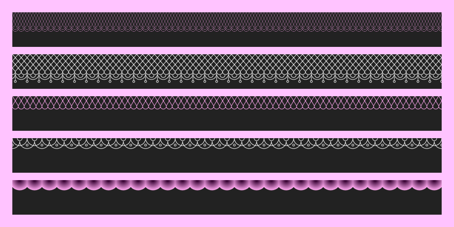
So let's start with the markup. For each type of lace, we need one element, there will be seven of them altogether.
<div class="lace one"></div> <div class="lace two"></div> <div class="lace three"></div> <div class="lace four"></div> <div class="lace five"></div> <div class="lace six"></div> <div class="lace seven"></div> We also write general styles for all elements with a lace class.
.lace { height: 70px; background: #222; margin-bottom: 15px; } The simplest ornament looks like a wavy line.

Such a pattern is created by repeating horizontally semicircles formed by a radial gradient.
.one { background-image: radial-gradient(circle at 10px 0, rgba(255,255,255,0) 9px, #fff 10px, rgba(255,255,255,0) 11px); background-repeat: repeat-x; background-size: 20px 11px; } By combining different colors when creating a gradient, you can achieve a fabric effect.

.two { background-image: radial-gradient(circle at 15px 0, #360031 2px, #fba5ec 20px, rgba(255,255,255,0) 21px); background-repeat: repeat-x; background-position: 0 0; background-size: 30px 21px; } Here, as in the other examples, the key is the background-repeat property with the value repeat-x , which gives a repetition of the elements of the ornament horizontally.
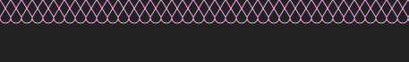
Combining circles and arcs formed by a radial gradient, you can get patterns of different complexity, reminiscent of lace. Here is an example.
.three { background-image: radial-gradient(circle at 15px 0, rgba(255,255,255,0) 14px, #fff 15px, rgba(255,255,255,0) 16px), radial-gradient(circle at 15px 0, rgba(255,255,255,0) 14px, #fff 15px, rgba(255,255,255,0) 16px), radial-gradient(circle at 15px 0, rgba(255,255,255,0) 4px, #fff 5px, rgba(255,255,255,0) 6px), radial-gradient(circle at 5px 5px, rgba(255,255,255,0) 1px, #fff 2px, rgba(255,255,255,0) 3px); background-repeat: repeat-x; background-position: 0 0, 15px 6px, 0 0, 25px 9px; background-size: 30px 21px, 30px 21px, 30px 21px, 30px 20px; } A real lace band often contains twisted yarns.
A linear gradient is well suited to imitate such a reticulated lace pattern. Let's look at a simple example.
The inclined lines forming the rhombus are drawn using two linear gradients of different directions - to right bottom and to left bottom . To complete the picture, I added semicircles along the edge using a radial gradient.
.four { background-image: linear-gradient(to right bottom, rgba(255,255,255,0) 9px, #fba5ec 10px, rgba(255,255,255,0) 11px), linear-gradient(to left bottom, rgba(255,255,255,0) 9px, #fba5ec 10px, rgba(255,255,255,0) 11px), radial-gradient(circle at 6px 0, rgba(255,255,255,0) 5px, #fba5ec 6px, rgba(255,255,255,0) 7px); background-repeat: repeat-x; background-size: 12px 20px, 12px 20px, 12px 11px; background-position: 0 0, 0 0, 0 20px; } However, in order to get a grid, you need to repeat the lines not only horizontally, but also vertically. Therefore, in the following example, we set the background-repeat property to repeat instead of repeat-x .
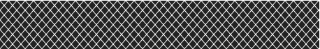
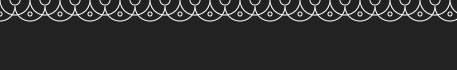
.five { background-image: linear-gradient(to right bottom, rgba(255,255,255,0) 8px, #fff 9px, rgba(255,255,255,0) 10px), linear-gradient(to left bottom, rgba(255,255,255,0) 8px, #fff 9px, rgba(255,255,255,0) 10px); background-repeat: repeat; background-size: 12px 14px, 12px 14px, 12px 11px; background-position: 0 0, 0 0, 0 20px; } Now let's try to draw a lace braid based on our mesh.
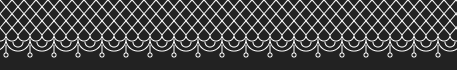
In this case, the mesh pattern will be conveniently placed in the .six .six:before pseudo- .six:before , whereas for the lace edge decor we use the background of the main div.six element, created by combining several radial gradients. The background is separated from the top edge of the element to a height equal to the height of the pseudo- .six:before , due to the background-position property.
.six { background-image: radial-gradient(circle at 6px 0, rgba(255,255,255,0) 5px, #fff 6px, rgba(255,255,255,0) 7px), radial-gradient(circle at 12px 0, rgba(255,255,255,0) 11px, #fff 12px, rgba(255,255,255,0) 13px), radial-gradient(circle at 12px 0, rgba(255,255,255,0) 4px, #fff 5px, rgba(255,255,255,0) 6px), radial-gradient(circle at 12px 12px, rgba(255,255,255,0) 1px, #fff 2px, rgba(255,255,255,0) 3px), linear-gradient(to left, rgba(255,255,255,0) 1px, #fff 2px, rgba(255,255,255,0) 3px); background-repeat: repeat-x; background-position: 6px 35px, 6px 39px, 6px 42px, -6px 43px, 8px 45px; background-size: 12px 12px, 24px 13px, 24px 12px, 24px 24px, 24px 8px; } .six:before { content: ""; display: block; height: 35px; background-image: linear-gradient(to right bottom, rgba(255,255,255,0) 8px, #fff 9px, rgba(255,255,255,0) 10px), linear-gradient(to left bottom, rgba(255,255,255,0) 8px, #fff 9px, rgba(255,255,255,0) 10px); background-repeat: repeat; background-size: 12px 14px, 12px 14px, 12px 11px; background-position: 0 0, 0 0, 0 20px; } And finally, let's experiment with thick lines to create a lace with a more realistic texture.
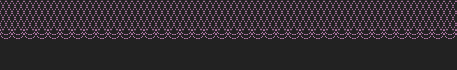
.seven { background-image: radial-gradient(circle at 6px 0, rgba(255,255,255,0) 5px, #fba5ec 6px, rgba(255,255,255,0) 6px), radial-gradient(circle at 6px 0, rgba(255,255,255,0) 5px, #fba5ec 6px, rgba(255,255,255,0) 6px); background-repeat: repeat-x; background-position: 0 29px, 0 33px; background-size: 12px 12px; } .seven:before { content: ""; display: block; height: 31px; background-image: linear-gradient(to right bottom, rgba(255,255,255,0) 5px, #fba5ec 6px, rgba(255,255,255,0) 6px), linear-gradient(to left bottom, rgba(255,255,255,0) 5px, #fba5ec 6px, rgba(255,255,255,0) 6px); background-repeat: repeat; background-size: 6px 12px, 6px 12px, 12px 11px; background-position: 0 0, 0 0, 0 20px; } This example is very similar to the previous one. The main difference is in the position of the gradient colors.
radial-gradient(circle at 6px 0, rgba(255,255,255,0) 5px, #fba5ec 6px, rgba(255,255,255,0) 6px) That's all for now. Here is a demo of ready-made ornaments. Dream and draw cute patterns with pleasure.
')
Source: https://habr.com/ru/post/315216/
All Articles