CSS Gateway Math

CSS-lock (CSS-lock) is a technique from responsive web design, which allows not to jump from one value to another, but to move smoothly, depending on the current size of the viewport. The idea and one of the implementations suggested by Tim Brown in the article Flexible typography with CSS locks . When I tried to figure out its implementation and create my own variants, I hardly managed to understand what was happening. I did a lot of calculations and thought it would be useful to explain all this math to others.
In the article I will describe the methodology itself, its limitations and the underlying mathematics. Do not worry: there is basically one addition and subtraction. In addition, I tried to break everything into stages and decorated them with graphs.
What is a CSS gateway?
Dependence on the size of the viewing area
In my latest projects, a full-width banner was used with a header and only desktop templates with large fonts. I decided that I needed small fonts for small screens and something for screens of intermediate sizes. So why not make the font size dependent on the width of the viewing area?
Previously, it was done like this:
')
h1 { font-size: 4vw; /* ! . */ } This approach has two problems:
- On very small screens, the text becomes tiny (12.8 pixels in height with a screen width of 320 pixels), on large ones - huge (64 at 1600);
- Custom font size settings are not taken into account.
CSS gateways get rid of the first problem. Remarkable CSS gateways will also try to accommodate user preferences.
CSS Gateway Idea
A CSS gateway is a special kind of calculation of a CSS value, where:
- there is a minimum and maximum value
- there are two control points (breakpoint) (usually depend on the width of the viewport),
- between these points, the value varies linearly from minimum to maximum.
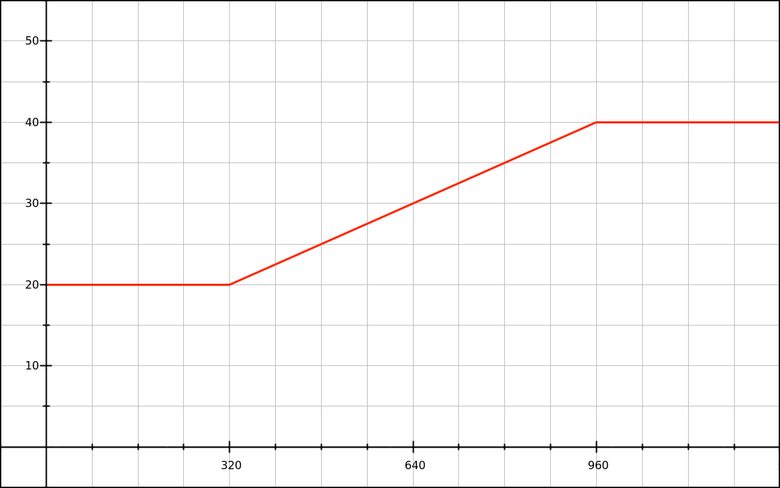
"With a width of less than 320 pixels, we will use 20px fonts, over 960 pixels - 40px, and between 320 and 960 - from 20px to 40px."
On the CSS side, this might look like this:
h1 { font-size: 1.25rem; } @media (min-width: 320px) { h1 { font-size: /* 1.25 rem 2.5 rem */; } } @media (min-width: 960px) { h1 { font-size: 2.5rem; } } The first task is to implement the magic value . A bit of fun for you and tell you right away that it looks like this:
h1 { font-size: calc(1.25rem + viewport_relative_value); } Here,
viewport_relative_value can be a single value (for example, 3vw ) or be a more complex calculation (based on the unit of measurement of the viewing area vw or some other unit).Restrictions
Because CSS gateways are tied to viewing area units, gateways have a number of important limitations. They can only take numeric values, use
calc() and take values in pixels .Why is that? Because the units of measurement of the viewing area (
vw , vh , vmin and vmax ) are always defined in pixels. For example, if the width of the viewport is 768 pixels, then 1vw is defined as 7.68 pixels.(In Tim's article there is an error: he writes that calculations like
100vw - 30em give the value of em . This is not the case. The browser counts 100vw in pixels and subtracts the value of 30em for this element and property from it.)Some examples of what does not work:
- The CSS gateway for the
opacityproperty, becauseopacity: calc(.5+1px)is an error; - The CSS gateway for most
transformfunctions (for example,rotate: the gateway cannot rotate based on the value in pixels).
So, we have a pixel limit. Maybe there will be brave men and calculate all the properties and techniques that can be used in CSS-gateways.
First, take the
font-size and line-height properties and see how you can create CSS gateways with control points based on pixels or em.CSS Gateways with Pixel Checkpoints
Demos
- CSS calc lock for font-size (rem + px, px MQ)
- CSS calc lock for line-height (% + px, px MQ)
- Combined font-size and line-height lock (px-based)
Next we look at how to get the CSS for each of these examples.
Font size as a linear function
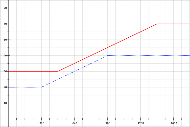
We need the font-size to increase proportionally from 20px with a width of 320px to 40px with a width of 960px. Reflect this on the chart:
The red line is a graph of a linear function. You can write it as
y = mx + b :yis the font size (vertical axis),xis the width of the viewing area in pixels (horizontal axis),mis the slope function (how many pixels do we add to the font size as the viewing area increases by 1 pixel),bis the font size before we begin to increase the size of the viewport.
We need to calculate
m and b . In the equation, they are constants.First, let's deal with
m . To do this, only the coordinates (x,y) are needed. This is similar to calculating the speed (distance traveled per unit of time), but in this case we calculate the font size depending on the width of the viewing area: m = font_size_increase / viewport_increase m = (y2 - y1) / (x2 - x1) m = (40 - 20) / (960 - 320) m = 20 / 640 m = 0.03125 Other form:
The total font-size increase is 20 pixels (
40 - 20 ).The overall reduction of the viewing area is 640 pixels (
960 - 320 ).If the width of the area grows by 1 pixel, how much will the font-size increase?
20 / 640 = 0.03125 px.Now we calculate
b . y = mx + b b = y - mx b = y - 0.03125x Since our function is tested using both of these points, we can use the
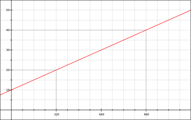
(x,y) coordinates of any of them. Take the first: b = y1 - 0.03125 × x1 b = 20 - 0.03125 × 320 b = 10 By the way, it was possible to calculate these 10 pixels simply by looking at the graph. But he is not always with us :-)
Now our function looks like this:
y = 0.03125x + 10 CSS conversion
y is the font-size, and if we want to perform basic operations in CSS, we need calc() . font-size: calc( 0.03125x + 10px ); Of course, this is a pseudo-CSS, because
x not a valid syntax. But in our linear function, x represents the width of the viewport, which in CSS can be expressed as 100vw . font-size: calc( 0.03125 * 100vw + 10px ); Now it’s working CSS. If you need to express more briefly, we will perform multiplication Since
0.03125 × 100 = 3.125 , then: font-size: calc( 3.125vw + 10px ); Now we will limit the width of the viewport to 320 and 960 pixels. Add some media queries:
h1 { font-size: 20px; } @media (min-width: 320px) { h1 { font-size: calc( 3.125vw + 10px ); } } @media (min-width: 960px) { h1 { font-size: 40px; } } Now our schedule looks as it should:
Nice, but I don’t really like the values in pixels when declaring a font-size. Is it possible to do better?
Apply custom settings
Virtually every browser allows users to set the default text size. Most often it is initially equal to 16 pixels, but sometimes it is changed (usually enlarged).
I want to insert custom settings into our formula and for this I will pay attention to the
rem values. For em and percentage values, the same principle applies.First, we check that the base (root) font-size is not assigned an absolute value. For example, if you use CSS from Bootstrap 3, there are quite a few of these:
html { font-size: 10px; } Never do that! (Fortunately, this is fixed in Bootstrap 4.) If you really need to change the value of the base em (
1rem ), use: /* * rem . * font-size 16 : * • 62.5% -> 1rem = 10px, .1rem = 1px * • 125% -> 1rem = 20px, .05rem = 1px */ html { font-size: 62.5%; } Nevertheless, let's leave the basic font-size alone, let it be 16 pixels by default. Let's see what happens if in our font-size-gateway we replace the pixel values with the
rem values: /* * : * • 0.625rem = 10px * • 1.25rem = 20px * • 2.5rem = 40px */ h1 { font-size: 1.25rem; } @media (min-width: 320px) { h1 { font-size: calc( 3.125vw + .625rem ); } } @media (min-width: 960px) { h1 { font-size: 2.5rem; } } If you run the code with the browser default settings, it will behave like the previous code that used pixels. Wonderful!
But since we did this in order to support changes made by users, we need to check how everything works. Suppose the user specified a font size of 24 pixels instead of 16 (50% more). How will the code behave?
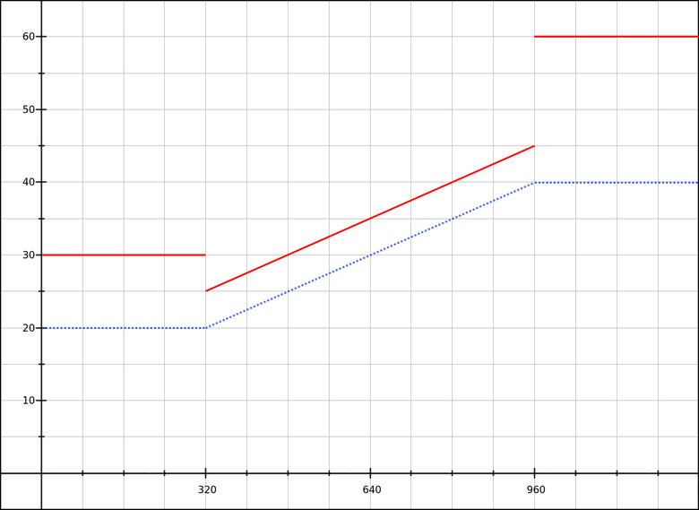
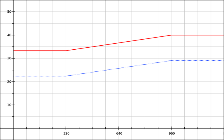
Blue line: the default font-size is 16 pixels.
Red line: the default font-size is 24 pixels.
As the area is increased, viewing to 320 pixels becomes smaller (from 30 pixels to 25), and when the second control point is reached it increases in steps (from 45 to 60 pixels). Oh.
The same user-adjusted baseline value for all three sizes will help fix this. For example, choose
1.25rem : h1 { font-size: 1.25rem; } @media (min-width: 320px) { h1 { font-size: calc( 1.25rem + 3.125vw - 10px ); } } @media (min-width: 960px) { h1 { font-size: calc( 1.25rem + 20px ); } } Pay attention to
3.125vw - 10px . This is our old linear function (as mx + b ), but with a different value b . Call it b′ . In this case, we know that the base value is 20 pixels, so we can get the value of b′ simple subtraction: b′ = b - baseline_value b′ = 10 - 20 b′ = 10 Another way is to choose a base value from the very beginning , and then look for a linear function describing the font-size increase (let's call it
y′ , so as not to be confused with the value of the font-size y ). x1 = 320 x2 = 960 y′1 = 0 y′2 = 20 m = (y′2 - y′1) / (x2 - x1) m = (20 - 0) / (960 - 320) m = 20 / 640 m = 0.03125 b′ = y′ - mx b′ = y′1 - 0.03125 × x1 b′ = 0 - 0.03125 × 320 b′ = -10 We got the function
y′ = 0.03125x - 10 , which looks like this:
With the base value in
rem and the additional values in vw and / or px we can finally create a full-fledged working gateway for the font-size. When the user changes the default font size, the system adapts to it and does not break.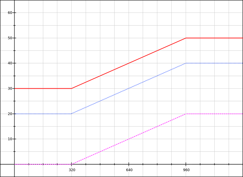
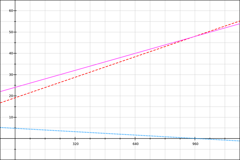
Purple line: font-size magnification.
Blue line: the default font-size is 16 pixels.
Red line: the default font-size is 24 pixels.
Of course, this is not exactly what the user requested: he wanted to increase the font by 50%, and we increased it by 50% in small viewing areas and by 25% in large ones. But this is a good compromise.
Creating a gateway for row height
In this case, we will have the following scenario: “I want paragraphs with a line height of 140% with a viewing area width of 320 pixels and 180% at 960”.
Since we will work with the base value plus a dynamically changing value, expressed in pixels , we need to know how many pixels are the coefficients of 1.4 and 1.8. That is, you need to calculate the
font-size for our paragraphs. Suppose the base font size is 16 pixels. We get:16 * 1.4 = 22.4pixels with lower viewport size (320 px)16 * 1.8 = 28.8pixels with top viewport size (960 px)
As a base value, we take
140% = 22.4px . It turns out that the overall font increase is 6.4 pixels. Let's use our linear formula: x1 = 320 x2 = 960 y′1 = 0 y′2 = 6.4 m = (y′2 - y′1) / (x2 - x1) m = (6.4 - 0) / (960 - 320) m = 6.4 / 640 m = 0.01 b′ = y′ - mx b′ = y′1 - 0.01 × x1 b′ = 0 - 0.01 × 320 b′ = 3.2 y′ = 0.01x - 3.2 Convert to CSS:
line-height: calc( 140% + 1vw - 3.2px ); Note : the base value must be expressed as 140% or
1.4em ; dimensionless 1.4 will not work inside calc() .Then we add media queries and check that all
line-height ads use the same base value ( 140% ). p { line-height: 140%; } @media (min-width: 320px) { p { line-height: calc( 140% + 1vw - 3.2px ); } } @media (min-width: 960px) { p { line-height: calc( 140% + 6.4px ); } } I remind you that for a large viewing area you cannot simply use
180% , we need the part expressed in pixels, which is added to the base value. If you take 180% , then with a basic font size of 16 pixels, everything will be fine until the user changes it.We will build a graph and check the operation of the code with different basic font-size values.
Blue line: the default font-size is 16 pixels.
Red line: the default font-size is 24 pixels.
Now that our
line-height formula depends on the element's own font-size, changing the font size will change the formula. For example, this demo shows a paragraph with an enlarged text defined as: .big { font-size: 166%; } This changes our control points:
16 * 1.66 * 1.4 = 37.184pixels with a lower viewport size (320px)16 * 1.66 * 1.8 = 47.808pixels with the top viewport size (960px)
We perform calculations and obtain the updated formula:
y′ = 0.0166x - 5.312 . Then combine this and previous stylesheets in CSS: p { line-height: 140%; } .big { font-size: 166%; } @media (min-width: 320px) { p { line-height: calc( 140% + 1vw - 3.2px ); } .big { line-height: calc( 140% + 1.66vw - 5.312px ); } } @media (min-width: 960px) { p { line-height: calc( 140% + 6.4px ); } .big { line-height: calc( 140% + 10.624px ); } } You can also assign calculations to CSS. Since we use the same control points and relative line-heights sizes as for the standard paragraph, we just need to add a factor of 1.66:
p { line-height: 140%; } .big { font-size: 166%; } @media (min-width: 320px) { p { line-height: calc( 140% + 1vw - 3.2px ); } .big { line-height: calc( 140% + (1vw - 3.2px) * 1.66 ); } } @media (min-width: 960px) { p { line-height: calc( 140% + 6.4px ); } .big { line-height: calc( 140% + 6.4px * 1.66 ); } } Union of font-size and line-height gateways
Now let's try to put everything together. Scenario: there is an adaptive text column (fluid column) with H1 and several paragraphs. We need to change the font-size and line-height using the following values:
| Element and property | Value at 320px | Value at 960px |
| H1 font-size | 24 pixels | 40 pixels |
| H1 line-height | 133.33% | 120% |
| P font-size | 15 pixels | 18 pixels |
| P line-height | 150% | 166.67% |
You will see that with the height of the line we do two things. There is a general rule: when the text increases, the height of the line needs to be reduced, and when the column becomes wider - to increase. But in our scenario at the same time both situations occur, contradicting each other! Therefore, you need to choose priorities:
- For H1, increasing the font-size will be more critical than increasing the width of the column.
- For paragraphs, increasing the width of a column will be more critical than a small increase in font-size.
Now select two control points - a viewing area of 320 and 960 pixels wide. Let's start by writing a font-size gateway:
h1 { font-size: 1.5rem; } /* .9375rem = 15px */ p { font-size: .9375rem; } @media (min-width: 320px) { h1 { font-size: calc( 1.5rem + 2.5vw - 8px ); } /* .46875vw - 1.5px 0 3px */ p { font-size: calc( .9375rem + .46875vw - 1.5px ); } } @media (min-width: 960px) { h1 { font-size: calc(1.5rem + 16px); } p { font-size: calc( .9375rem + 3px ); } } Nothing new here, only the values have changed.
Now we are calculating gateways for
line-height . It will be much more difficult than last time.Let's start with the element H1. For
line-height use the relative base value - 120%. Since we change the font size of the element, this 120% allows us to describe the dynamic and linear value defined by two points:24 × 1.2 = 28.8pxin the lower control point,40 × 1.2 = 48pxin the upper control point.
In the lower control point, we need to have a
line-height value of 133.33%, which is about 32 pixels.We find a linear function describing "what is added to the base value of 120%." If we remove these 120%, we get two modified values:
24 × (1.3333 - 1.2) = 3.2pxat the lower control point,40 × (1.2 - 1.2) = 0pxin the upper control point.
Should get a negative slope.
m = (y′2 - y′1) / (x2 - x1) m = (0 - 3.2) / (960 - 320) m = -3.2 / 640 m = -0.005 b′ = y′ - mx b′ = y′1 - (-0.005 × x1) b′ = 3.2 + 0.005 × 320 b′ = 4.8 y′ = -0.005x + 4.8 Convert to CSS:
h1 { line-height: calc( 120% - .5vw + 4.8px ); } Let's look at the chart:
Blue line: decrease line-height.
Red line: the basic value of line-height (120% font-size header).
Purple line: final line-height.
The graph shows that the resulting row height (the magenta line) is equal to the base value of 120% plus a decrease in the row height (the blue line). You can check the calculations yourself on GraphSketch.com .
For paragraphs, we will use a base value of
150% . Increase line-height: (1.75 - 1.5) × 18 = 4.5px. 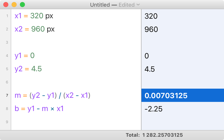
My calculator says that the formula will be as follows:
y′ = 0.00703125x - 2.25 To see the full CSS code, take a look at the source code of the demo, which combines font-size and line-height . Changing the size of the browser window, you make sure that the effect is, albeit weak.
I also recommend testing this demo by changing the default font size. Please note that here the line-height ratio will be slightly different, but quite acceptable. There is nothing wrong with the line-height becoming less than the base value.
Automation of calculations
In preparing this section, I did all the calculations manually or with the Soulver calculator. But it is rather laborious, and the probability of errors is high. To eliminate the human factor, it would be good to implement automation.
The first way is to transfer all calculations to CSS. This is a variant of the formula used in the examples with the font-size, when all values were sorted out in detail:
@media (min-width: 320px) and (max-width: 959px) { h1 { font-size: calc( /* y1 */ 1.5rem /* + m × x */ + ((40 - 24) / (960 - 320)) * 100vw /* - m × x1 */ - ((40 - 24) / (960 - 320)) * 320px ); } } But it turns out too many letters, you can write much more concisely:
@media (min-width: 320px) and (max-width: 959px) { h1 { font-size: calc( 1.5rem + 16 * (100vw - 320px) / (960 - 320) ); } } Coincidentally, Tim Brown used this formula in the article Flexible typography with CSS locks , but with pixels instead of
em in the variable value. This works for the combined version with font-size and line-height, but may not be so obvious, especially with a negative slope. @media (min-width: 320px) and (max-width: 959px) { h1 { font-size: calc( 1.5rem + 16 * (100vw - 320px) / (960 - 320) ); /* */ line-height: calc( 120% + 3.2 * (100vw - 960px) / (320 - 960) ); } } The second way is to automate calculations using the Sass plugin or PostCSS mixin.
CSS gateways with em control points
New demos
I took the first three demos and instead of the pixel values of the control points and increments I inserted values based on
rem .- CSS calc lock for font-size (rem + rem, em MQ)
- CSS calc lock for line-height (% + rem, px MQ)
- Combined font-size and line-height lock (em / rem-based)
In the next section, we will look at how specific syntax works in these demos.
The m × 100vw syntax for em-based media queries is not a good idea.
Above, we used the
m × 100vw (for example, calc(base + 2.5vw) ). It cannot be used with em based media queries.It's all in the context of media queries. The
em and rem units refer to the same thing: the base font size in the User Agent. And, as we have already seen several times, it is usually 16 pixels, but the value may be different. Why?- At the behest of the browser or OS (mainly in specific cases like TV browsers and readers).
- By the will of the user.
So if we have control points of
20em and 60em , they will correspond to the real CSS-width:- 320 and 960 pixels with a basic font size of 16 pixels,
- 480 and 1440 - with 24 pixels, etc.
(Note that these are CSS pixels , not hardware pixels . In the article, we do not consider hardware pixels, since they do not affect our calculations.)
Above are examples of code like this:
font-size: calc( 3.125vw + .625rem ); If in this syntax we replace all control points with the use of
em , assuming that in the media query 1 em is 16 pixels, we get: h1 { font-size: 1.25rem; } /* :((( */ @media (min-width: 20em) { h1 { font-size: calc( 1.25rem + 3.125vw - 10px ); } } /* . */ @media (min-width: 60em) { h1 { font-size: calc( 1.25rem + 20px ); } } This will work if the OS, browser and user never change the default font size. Otherwise it will be bad:
Blue line: the default font-size is 16 pixels.
Red line: the default font-size is 24 pixels.
What's going on here? When we change the base font-size,
em based control points are shifted to higher pixel values. The only true value for specific points would be 3.125vw - 10px !- At 320 pixels
3.125vw - 10pxis 0 pixels, as it should be. - At 480 pixels
3.125vw - 10pxis 5 pixels.
At high control points even worse:
- At 960 pixels
3.125vw - 10pxis equal to 20 pixels, as it should be. - At 1440 pixels
3.125vw - 10pxis equal to 35 pixels (15 more).
If you want to use
em based controls, you need to do otherwise.Again perform calculations
This technique is demonstrated in the article by Tim Brown . It implies that most calculations are done in CSS using two variable parts:
100vw- width of the viewing area;- lower checkpoint expressed in
rem.
We use the formula:
y = m × (x - x1) / (x2 - x1) Why her? . , font-size line-height :
y = mx + b CSS
x ( 100vw ). m b vw , , , , em , .m b , (x1,y1) (x2,y2) .b : b = y - mx b = y1 - m × x1 :
y = mx + b y = mx + y1 - m × x1 b !,
font-size line-height , , . y′ : y = y1 + y′ y′ = y - y1 y : y′ = mx + y1 - m × x1 - y1 y′ = mx + y1 - m × x1 - y1 + y1 - y1 ! y′ = m × x - m × x1 y′ = m × (x - x1) m : m = (y2 - y1) / (x2 - x1) Then:
y′ = (y2 - y1) / (x2 - x1) × (x - x1) :
y′ = max_value_increase × (x - x1) / (x2 - x1) CSS
CSS. « 20 40 »:
@media (min-width: 20em) and (max-width: 60em) { h1 { /* : ! */ font-size: calc( 1.25rem /* */ + 20px /* */ * (100vw - 20rem) /* x - x1 */ / (60rem - 20rem) /* x2 - x1 */ ); } } . , ,
calc() CSS , .100vw - 20rem . ., font-size — 16 , — 600 , 280 (
600 - 20 × 15 ). font-size — 24 , — 600 , 120 ( 600 - 20 × 24 ).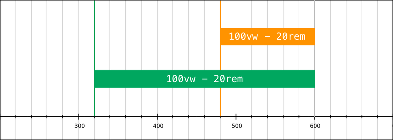
,
rem . em ? CSS- em font-size, font-size ( ) font-size ( font-size ).CSS — , . . —
rem , font-size, .CSS :
/* */ html { font-size: 10px; } /* */ :root { font-size: 16px; } /* , , 20rem/1.25, 40em/1.25 . . */ :root { font-size: 125%; } calc
60rem - 20rem . , (x - x1) / (x2 - x1) 0 1. n .16 600 :
n = (x - x1) / (x2 - x1) n = (600 - 320) / (960 - 320) n = 280 / 640 n = 0.475 , .
,
calc() - CSS-. . ??
calc((100vw - 20rem)/(60 - 20)) ?| — 16 | ||
| CSS | Result | |
| 20em (320px) | (320px – 16px × 20) / (60 – 20) | = 0px |
| 40em (640px) | (640px – 16px × 20) / (60 – 20) | = 8px |
| 60em (960px) | (960px – 16px × 20) / (60 – 20) | = 16px |
| — 24 | ||
| CSS | Result | |
| 20em (480px) | (480px – 24px × 20) / (60 – 20) | = 0px |
| 40em (960px) | (960px – 24px × 20) / (60 – 20) | = 12px |
| 60em (1440px) | (1440px – 24px × 20) / (60 – 20) | = 24px |
, (
20em 60em ) 0rem 1rem . !CSS
20px . .:
font-size: calc( 1.25rem + 20px * n ); n 0 1. - calc() 0 1.0rem — 1rem ; r .calc() . calc(a * b) , a b .r ( ), .20 . 20 —
1.25rem , 1.25 : font-size: calc( 1.25rem + 1.25 * r ); . ,
r :- 16 :
1.25 * r0 20 . - 24 :
1.25 * r0 30 .
CSS- , media-, :
h1 { font-size: 1.25rem; } @media (min-width: 20em) { /* (100vw - 20rem) / (60 - 20) 0-1rem, ( 20em 60em). */ h1 { font-size: calc( 1.25rem + 1.25 * (100vw - 20rem) / (60 - 20) ); } } @media (min-width: 60em) { /* rem. font-size: 2.5rem, rem, calc. */ h1 { font-size: calc( 1.25rem + 1.25 * 1rem ); } } , font-size, , 50%, 50%: , . 30—60 20—40.
: font-size 16 .
: font-size 24 .
, em .
line-height c em/rem
line-height 140% 180%. 140% , , font-size . p { line-height: 140%; } @media (min-width: 20em) { p { line-height: calc( 140% + .4 * (100vw - 20rem) / (60 - 20) ); } } @media (min-width: 60em) { p { line-height: calc( 140% + .4 * 1rem ); } } line-height rem-, (100vw - 20rem) / (60 - 20) 0rem 1rem .font-size 1rem , 40% .4rem . calc() -.line-height . line-height H1 133,33% 120%. , font-size ., :
24 × (1.3333 - 1.2) = 3.2px,40 × (1.2 - 1.2) = 0px.
120% , 3,2 0 . 16 , 3,2 = 0.2rem , .2 ., , :
h1 { line-height: calc( 120% + 0.2 * 1rem ); } @media (min-width: 20em) { h1 { line-height: calc( 120% + 0.2 * (100vw - 60rem) / (20 - 60) ); } } @media (min-width: 60em) { h1 { line-height: 120%; } } :
.2rem, font-size 24 40 . , .- ,
(100vw - 60rem) / (20 - 60)60em20em(). , 16-640px / -40. , ,0.2.
Conclusion
. CSS-:
- , ,
font-sizeline-height,- ,
em.
— . , ,
font-size . em . , .: media-
em , . font-size CSS-: @media (min-width: 20em) and (max-width: 60em) { selector { property: calc( baseline_value + multiplier * (100vw - 20rem) / (60 - 20) ); } } multiplier — , rem , . : 0.75 0.75rem .media- ,
font-size . . CSS-. em/rem -, : @media (min-width: 320px) and (max-width: 960px) { selector { property: calc( baseline_value + multiplier * (100vw - 320px) / (960 - 320) ); } } multiplier — , , . : 12 12px .. , , , :
@media (min-width: 320px) and (max-width: 960px) { selector { property: calc( baseline_value + 0.25vw - 10px; ); } } 0.25vw -10px , , Sass PostCSS.( mixin), .
Source: https://habr.com/ru/post/315196/
All Articles