Problems that we encountered when updating the PVS-Studio interface
 In the recently released new version of PVS-Studio 6.10, the graphical user interface of Visual Studio plug-ins and Standalone version has been significantly updated. The previous version of the interface, despite the constant evolution (new buttons and menu items were added and disappeared), existed for almost 6 years without significant changes, having first appeared in PVS-Studio version 4.0 in 2010.
In this article we want to tell you what caused us to think about the need to change the interface, and what problems we encountered in the process of working on it.
Problems of the old PVS-Studio interface, and why we decided to change it
First, a little history. A separate PVS-Studio window has appeared in the Visual Studio plugin since version 4 of the analyzer. Previous versions used the standard Error List window to display diagnostic messages, however, our requirements quickly outgrew the capabilities of this window. In addition to the inability to add our own filters, context menus, buttons, etc., the main reason that prompted us to implement our own window for PVS-Studio messages was the performance of the Error List. When recording at least several thousand messages into it, it became impossible to work with it - the studio hung up even just when trying to scroll through it.
')
Of course, you can say: the analyzer, which issues thousands of messages, is a bad analyzer. However, it should be borne in mind that our first diagnostics were errors in porting C ++ programs to a 64-bit platform, and, by their nature, such errors can be quite numerous, especially on real large projects. In secret, I can say that our “anti-record” was a report on ~ 250,000 messages! At the same time, I want to reassure our users - the modern version of PVS-Studio doesn’t usually do this to itself, especially now we have such concepts as “levels of importance” of errors and various ways to easily easily suppress or disable unsuccessful alarms (which are inevitably found in the framework of static analysis). However, back in 2010, all this was not yet there, and the interface “brakes” were more relevant than ever.
The first versions of our plug-in with a separate window supported Visual Studio versions 2005 and 2008. It must be said that modern Visual Studio also does not stand still, and the problem with displaying a large number of messages in the standard Error List is already possible and not so relevant, but the advantages of a separate “output window” are still obvious. It's funny here to draw a parallel with the built-in C ++ analyzer Visual Studio - for a certain period (it seems, on versions 2010 - 2012, but I could be wrong), this analyzer also used its own, separate output window to display the results of its work. However, in recent versions, Visual Studio has returned to displaying the results in the standard Error List window. The reasons why, in our opinion, the developers of Visual Studio have done this, I will tell you when I will describe our new window.
As I mentioned above, the first versions of the PVS-Studio window were made for the 2005 and 2008 versions of the Visual Studio environment. Thus, when developing the initial design of our window, we were guided by the design of the standard Error List from these versions of the IDE. This basically explains the style of icons that we adopted then. Despite the fact that in the modern versions of Visual Studio our window supported all the new-fashioned color themes, the icons have remained in it since that time. This is how the main components of our interface looked like before the “restyling”:
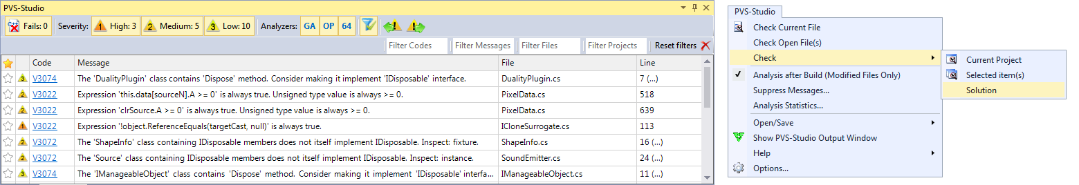
Figure 1 - old PVS-Studio interface in Visual Studio 2015 (output window and main menu)
What are the problems with our interface, in addition to the purely "aesthetic"? Probably our main problem, or rather the problem that causes inconvenience to our users, is the intuitiveness of the interface. Even such seemingly basic features, such as marking false positives through the context menu, or differentiating messages according to their importance, were often not obvious to our users and raised questions. Often there is a situation in which the user considers the most “dangerous” messages of the 3rd level. Another problem is general “bulkiness” - too many inscriptions, incomprehensible abbreviations and buttons, it is difficult to find something.
In the new interface, we tried to solve these problems, and how much we got it - you can learn more.
New design of the main window
Before starting to write code, we turned to a professional designer with the task of creating the concept of a new interface. As I mentioned earlier, our window repeated the concept of the standard Error List, and, accordingly, its central part was the classic “grid” - a table with columns and rows. We wanted to experiment and try to abandon the "classic" formula, especially now minimalism is in fashion, and Visual Studio itself is subject to these trends in its interface. As a new “inspiration”, we decided to try again using the elements of Visual Studio - the notifications window and the output window of the results of the embedded C ++ analyzer.
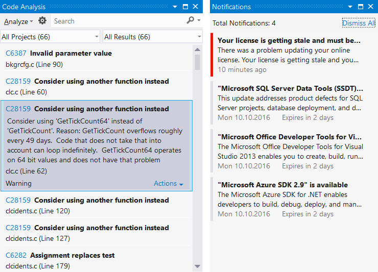
Figure 2 - the built-in static analysis window (Visual Studio 2012) and the notification window (Visual Studio 2013)
As you can see from the picture, both windows are as minimal as possible - they contain nothing but the message text and some identifier (code or color marker). There are also search / filter fields on the left window. Also, unlike the Error List, both windows are oriented more towards a vertical rather than a horizontal location.
And here I want to go back to what I already mentioned above - in 2015, the Microsoft developers for some reason abandoned their “trendy” new vertical window of static analysis (on the left) in favor of the “good old” Error List. Why did they do that? In my opinion, as well as from the experience of own use of this new window - simply because it was inconvenient to use this window. There were few messages on the screen in the vertical table, it was not possible to sort them by any criterion (for example, by code or file), and when the card was “opened” with a message, it sometimes took up the whole screen.
“Having played” with various design options, we finally came to the same conclusion - analyzer messages (like, for example, compiler warnings) are more convenient to view and analyze in the classic horizontal grid. Yes, the notification interface (in the picture it is on the right) is convenient when you need to issue two or three messages that require attention, but when the user needs to work with dozens (and sometimes hundreds or even thousands) of messages, the advantages of the table become obvious. Of course, after the initial setup, developers usually have to deal with several messages simultaneously on a new code, if, of course, the static analyzer is used correctly, i.e. regularly. But the initial setup stage is no less important, and often the success of further use of the analyzer depends on the correctness of its implementation. However, in the notifications window, we learned an interesting idea of visual differentiation of the “importance” of messages - using a color bar.
After we decided on the general direction, it was necessary to choose the technological basis for the interface. The previous version of our interface used the “good old” Windows Forms - this was due to the need to support Visual Studio 2005 and 2008. Given that the Visual Studio plugin itself is developed in C #, Visual Studio is not cross-platform and, probably, the main thing is that Visual Studio uses WPF technology, it seems the most logical to use the same WPF for the updated interface. Nevertheless, even despite the fact that all the internal logic of the plug-in and the data structures it uses are not directly tied to the interface, we decided in the current version to try first “redecorating”, i.e. simply “repaint” the current interface in accordance with the updated design, leaving all underlying components unchanged. Unfortunately, the real world dictates its own conditions, and sometimes you have to prioritize what you want to do and what you need to do. Moreover, such cosmetic repairs can be done by very small forces and in a short time.
We have to admit that the basic capabilities of WinForms are already beginning to be missed - even this seemingly small “cosmetic” edit required the implementation of several “crutches” in the code - not noticeable for users, but already complicating further support and development of the interface. For example, I had to “tinker” with new level buttons (with a color bar) when displayed on the toolstrip panel. The standard toolstrip in WinForms is responsible for drawing its elements, but when hosting a user control, the drawing of this control has to be shifted to itself (this was especially important for us in terms of supporting color schemes). Using WinForms also forces us to support color schemes with the rather archaic VS SDK interface of GetVSSysColorEx , and to color our components on our own, as well as to catch the moment when the color theme is switched. For WPF components, Visual Studio offers a more convenient mechanism for picking colors through dynamic resources, directly in the XAML markup.
As a result, I think we can say with a great degree of confidence that the next (after the current update) version of the PVS-Studio interface will be completely based on WPF. Now, our goal, as for the last iteration of the interface, was to preserve “authenticity” with respect to standard Visual Studio windows. The result we got can be seen below:
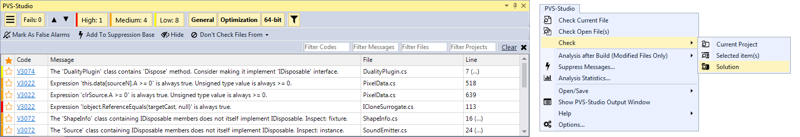
Figure 3 - the updated PVS-Studio interface (the output window and the main menu)
Menu items, icons and rakes
The old icons of the PVS-Studio plugin were far from ideal, or rather, from the standard “theme” in Visual Studio, so it was decided to replace them. The main requirement for new icons was their compliance with a single style and good contrast for all color schemes in Visual Studio.
Having defined the set of icons, we started to develop. The first problem we encountered was, strangely enough, the direct display of icons in the main Visual Studio menu. You say: “Wait, you have already shown your icons in this menu, starting from the first version of PVS-Studio!”. Indeed, this is so, but the method we used earlier was not suitable for our purposes. I’ll clarify that for setting icons we used a single mechanism of Visual Studio extensions for creating menu items - vsct files (you can read more about this here ). What did not suit us in this version? For a start, the icons could be set only once - when the plug-in was loaded by the studio. We wanted to imitate the behavior of standard studio icons, i.e. repaint them depending on the chosen color scheme (as it turned out later, this requirement was unnecessary - the studio is able to do it herself). Secondly, the vsct file does not know how (or perhaps we do not know how to use the alpha channel in the image of icons within the vsct file), which is why they looked very unattractive.
The question arose: how do we set the picture for the menu item's icon programmatically, and is it possible to do this at all? After a long search, we managed to find a third-party Visual Studio extension that could do it. A study of its source code has allowed us to find the answer to the question voiced above. Everything turned out to be extremely simple:
var commandBars = (CommandBars)DTE.CommandBars; var menuBar = commandBars[menuBarKey]; var pvsBar = menuBar.Controls["PVS-Studio"] as CommandBarPopup; ... cmdBtnControl.Picture = ImageHelper.BitmapToStdPicture(bmp); We also had a concern that such a method would “break down” if the user wants (and why not?) To rename the PVS-Studio menu item, because Visual Studio allows doing this. However, these fears turned out to be in vain - the internal name of the commandBar objects does not change.
Having solved the issue of the dynamic display of icons, we implemented an algorithm by which a monochrome icon would be painted in a color selected from the active theme of Visual Studio. We inverted all the icons in the resources of the plugin to white and wrote a simple conversion algorithm that multiplied the color of each pixel of the image to the one we need:
public static void Colorize(ref Bitmap img, Color color) { for (int x = 0; x < img.Width; x++) { for (int y = 0; y < img.Height; y++) { // // var pixel = img.GetPixel(x, y); var r = (byte)(((float)pixel.R) * ((float)color.R / 255f)); var g = (byte)(((float)pixel.G) * ((float)color.G / 255f)); var b = (byte)(((float)pixel.B) * ((float)color.B / 255f)); img.SetPixel(x, y, Color.FromArgb(pixel.A, r, g, b)); } } } At the exit, we got the following result:

Figure 4 - An example of the operation of the icon colorization algorithm.
However, we found unexpected behavior - in the case of choosing, for example, the “red” theme of Visual Studio, the icon was displayed correctly. Correctly, it was displayed in the "light" scheme. In the “dark” scheme, the icons remained black, rather than becoming white, as we expected. It turned out that the studio itself is able to invert certain colors of the picture, depending on the "brightness" of the background in the chosen color scheme - previous experiments with the colorization of icons were in vain. The studio did everything for us. Despite this, we still decided to leave the method of programming the icons described above, due to problems with the alpha channel.
Similarly, in our window of displaying PVS-Studio messages, we changed all the icons and icons to suitable ones from the same set. However, if the icons in the menu changed color depending on the color scheme of Visual Studio automatically, the icons in the plug-in window remained in their original form for all color schemes.

Figure 5 - Problems with the display of icons in the dark color scheme of Visual Studio.
We wondered if the Visual Studio SDK could be used to apply the color-coding studio algorithm for our icons. The result did not make us wait long. After a few minutes of searching, we stumbled upon the GetThemedBitmap method in the ImageThemingUtilities class of the Microsoft.VisualStudio.PlatformUI namespace. He did exactly what we needed!
Figure 6 - Correct display of icons in our window for the dark theme of Visual Studio.
Another problem that we encountered when changing icons was their blurring on a DPI other than 100%. This happened because all the icons had a size of 16x16 pixels. We managed to partially defeat this problem, initially using 64x64 icons. In this case, VisualStudio automatically compressed them to the desired size. But in this version, everything was not quite smooth. Now at 100% DPI a slight blur appears. As a result, it was decided to use images of 64x64 in size, since on DPIs other than 100% this gave the most acceptable result, and at 100% DPI, the blurring was almost not noticeable.
Also, at DPI at 115%, cutting off the right edge of the icon by several pixels was noticed. Attempts to programmatically add a few pixels to the right (so that the image was 64x68 in size) were also unsuccessful. The icons in Visual Studio shrank back to a square aspect ratio, and even though the circumcision was able to win, the blur increased significantly. As a result, we simply added a few empty pixels to each icon, leaving the size 64x64. This solution provided minimal blurring (almost imperceptible to the eyes) and eliminated the clipping of the right side of the icons.
Conclusion
Despite the seemingly significant external changes, the “under the hood” interface of PVS-Studio actually remained the same. We hope that for our old users the new interface will remain “familiar”, and for new users it will be more intuitive and pleasant. And of course, that it will be "more beautiful" in the eyes of all our users. As far as we got it - judge you.

If you want to share this article with an English-speaking audience, then please use the link to the translation: Ivan Kishchenko, Paul Eremeev. Issues we faced when renewing the PVS-Studio user interface .
Read the article and have a question?
Often our articles are asked the same questions. We collected answers to them here: Answers to questions from readers of articles about PVS-Studio, version 2015 . Please review the list.
Source: https://habr.com/ru/post/314968/
All Articles