React'ive Panel'i
What is a panel? This is a fairly simple component, dividing the visible area into 2-3 blocks:
- Cap. In the header is usually displayed the title and some (usually navigation) elements of the board.
- Body. Arbitrary content is displayed in the body of the panel. Often this block is made scrollable so that the cap does not go out of sight.
- Basement. Optional block. This usually displays information common to the contents of the panel and controls.
Despite the seeming simplicity, the implementation is usually not so simple. This is due to the fact that the options for its use are great.
The cap may or may not be:
- Headline In addition, he may have a subtitle.
- Bread crumbs. They can be part of a headline, but they can be a subtitle.
- Navigation links. Such as "back", "next" and TP.
- Buttons. Such as "open filters", "switch flag", "close window" and others.
In short, a hat can be almost anything. In the body, it should definitely be possible to display any content. In the basement content can also be arbitrary.
It turns out that the panel should have at least 3 parameters that take "complex content", that is, one that is not a flat text, but contains a hierarchy of nested blocks.
Next comes a review of those ready-made solutions that can be found in Google. For each is given the size of the implementation in lines of code (CLOS). Plus a bonus at the end, for those who get ;-)
ReactJS
wmira / react-panel - 180 CLOS
The header displays:
- Optional header icon.
- Actually the title.
- Optional set of clickable icons on the right side of the header.
Body sizes by default adjust to the content. A half-shaft is not supported.
Usage example:
return ( <Panel title={, !} titleIcon="icon-idea" toolbox={[ { className : "icon-close" , onclick : this.onClose.bind( this ) } ]} > <p> !</p> </Panel> ) Summary: the solution for a very special case, in the mess code, there is no documentation, only one dubious example of jQuery use.
react-bootstrap - 235 CLOS
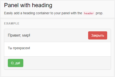
The cap and basement are calculated on the conclusion of a simple text, but there is an opportunity to bring there anything. The body adjusts to the size of the contents and can be collapsed to zero height through the flag.
Usage example:
return ( <Panel header={ <div> <span class="my-title">, !</span> <Button bsStyle="danger" onclick={ this.onClose.bind( this ) } > </Button> </div> } footer={ <Button bsStyle="success" onclick={ this.onSuccess.bind( this ) } > , ! </Button> } > <p> !</p> </Panel> ) Summary: in spite of crutches, wrapping the list of components in a div and stuffing a whole tree into an attribute can be used for almost everything. Unless "flapping" will often be just an extra burden, and when something special is needed, this implementation will most likely not be enough.
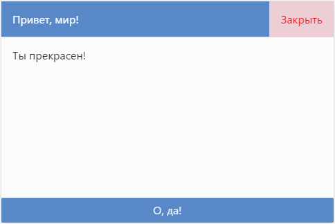
pivotal-cf / pivotal-ui - 173 CLOS

The cap is divided into two sections: the left (header) and optional right (actions), where you can display any content. The basement and the body have one section. For the body, you can turn on "scrollability" so that the panel does not crawl out of the viewing area.
Usage example:
return ( <Panel className="bg-neutral-10" header={ <h1>, !</h1> } actions={ <DangerButton onclick={ this.onClose.bind( this ) } > </DangerButton> } footer={ <PrimaryButton onclick={ this.onSuccess.bind( this ) }> , ! </PrimaryButton> } > <p> !</p> </Panel> ) Summary: all the same crutches, but the implementation is more compact, contains almost nothing superfluous and a bit more convenient to use.
Bicycle - CLOS 44
Somehow it is not convenient that the part of the layout is specified in the attributes, and the part in the body. Some functions are redundant, and to implement others, you have to rewrite the component. And since it is all the same, sooner or later, to rewrite, then let's try to rewrite it in such a way that it will work flexibly even without crutches.
function MyPanel({ className , ...props }) { return ( <div { ...props } className={ `my-panel-root ${ className || '' }` } /> ) } function MyPanelTitle({ className , ...props }) { return ( <h1 { ...props } className={ `my-panel-title ${ className || '' }` } /> ) } function MyPanelHead({ className , ...props }) { return ( <div { ...props } className={ `my-panel-head ${ className || '' }` } /> ) } function MyPanelBody({ className , ...props }) { return ( <div { ...props } className={ `my-panel-body ${ className || '' }` } /> ) } function MyPanelFoot({ className , ...props }) { return ( <div { ...props } className={ `my-panel-foot ${ className || '' }` } /> ) } The panel consists of 3 optional blocks: a hat, a basement body. Bonus: you can add multiple caps / bodies / basements. For blocks, you can use both standard components from the panel, as well as your own, and put anything into them.
True use is a bit more verbose, but there were no tags in attributes:
return ( <MyPanel className="my-panel-skin-pretty"> <MyPanelHead> <MyPanelTitle>, !</MyPanelTitle> <button onclick={ this.onClose.bind( this ) } ></button> </MyPanelHead> <MyPanelBody> <p> !</p> </MyPanelBody> <MyPanelFoot> <button onclick={ this.onSuccess.bind( this ) }>, !</button> </MyPanelFoot> </MyPanel> ) Summary: a relatively compact and very flexible solution, has a simple, understandable, though a few verbose (which is inherent in XML) interface.
$ mol_pager - 11 CLOS
The cap displays the caption by default. The contents of any block, like the blocks themselves, can be replaced with anything. The body is scrolled, and the position of the scroll is restored upon reboot.
The implementation is so compact that it is not scary to bring it right here:
$mol_pager $mol_viewer childs / < header $mol_viewer childs < head / < titler $mol_viewer childs / < title < bodier $mol_scroller childs < body / < footer $mol_viewer childs < foot / Usage example:
$my_app $mol_pager title \, ! head / < titler < closer $mol_clicker_danger eventClick > eventClose null childs / \ body / \ ! foot / < successor $mol_clicker_major eventClick > eventSuccess null childs / \, ! Summary: the implementation is an order of magnitude more compact, which nevertheless gives a high degree of flexibility, the use goes without crutches, but a rather unusual syntax that requires mastering is used. And yes, this is not React, but $ mol , where the interface is also built from components that aggregate other components in themselves, but the components are not recreated during each rendering, but cached. :-)
findings
In JSX, you can do it this way and that, but there will still be something wrong. Typical problems:
- Hard non-customizable code that forces you to cycle every time you need to add a pair of mother-of-pearl buttons.
- Extra functions in common components. The consequence of the high rigidity of the code.
- A weighty, inconsistent usage interface. Usually the contents of the body are transferred in a manner different from the contents of the other blocks.
- All programmers on the reactor program in different ways. Who as I understand it, he will do the same. And most likely not the way you need.
- JSX is similar to XML and JavaScript, but it is neither a super nor a set of either one or the other. So behind the apparent simplicity is the need to understand the features of a unique syntax.
- Even a simple component requires quite a lot of code. And the more flexible you want to make it, the more confusing the code will be.
- The structure of the component is spread over an even layer according to its logic. Mimicry for XML in this case becomes useless.
- Attracting a typesetter is possible only after an intensive course on JS ... after which he leaves and goes to work as a programmer. :-)
On the other hand, there is a simple and consistent view.tree syntax optimized for creating flexible components with a minimum of source code, and which can be taught to any typewriter in a matter of days, after which even its efficiency will increase significantly (it will not have to copy-paste huge html pieces or manually click on the required states of the components) and the efficiency of the programmer (he will not have to "pull" the layout on the logic each time the layout designer updates the layout).
Even if you handyman full-stack programmer who can both in patterns, semantics, and styles - your efficiency will all the same increase by reducing the amount of code and light and easy component creation (to create the simplest component you just need to create a file with the contents from one short line ).
How would you implement the Panel component on your favorite framework?
Ps. This is not an ad $ mol, this is an ad view.tree language. If you are not ready to exchange React for something else, but you are interested in the view.tree syntax, you can implement its translation into React. The idea of view.tree is simple: full control of components without leaving an extremely simple language. And scripts with logic on JS / TS are screwed on the side. In the $ mol implementation, the logic is screwed by inheriting and redefining the properties specified in view.tree.
')
Source: https://habr.com/ru/post/314752/
All Articles