4 ways to increase landing conversion and increase sales

Landing - selling page on which the user comes. The structure of the landing directly affects sales. We have compiled rules for creating a good landing page and examples of successful redesigns that helped increase the conversion of pages.
Key elements of a classic landing page:
- Clinging headline
- Call to Action (Call to Action or abbreviated CTA)
- Description of the product and its advantages
- Reviews of happy buyers
- Seller guarantees
We tell how to make these elements work.
')
4 rules of a good landing
One page - one goal
Attention ratio is the ratio between the number of hyperlinks on a page and page goals. A good landing attention ratio is 1: 1.
This means that the landing page and all its elements - from the title to design decisions - should be focused on achieving one specific goal - to prompt the user to take action: buy, download, subscribe.
Unbounce, which specializes in creating “selling pages”, conducted a split test and found out: reducing the number of hyperlinks on the landing page from 10 to 1 increases the CTR by 31% .
The formula “one page - one goal” pushes the user in the right direction. If the landing offers several different options for action, the visitor is difficult to make a choice.
On the contrary, if you offer a specific solution to a problem, you are helping your potential customers make that decision.
Here is a vivid example of a landing page that violates this commandment. Do not do it this way:

Show the goods
Use large images of high-resolution goods in the landing page. In those cases where this is appropriate, add a zoom function so that visitors can view the product in detail.
Company Mall.cz conducted a split test of two landing pages. Landing with larger product images increases sales by 9.46% .

Version 2 increased conversion by 9.46%
Video can also improve conversion. At the same time, the well-known online marketer Neil Patel advises to limit the duration of the video to a maximum of 5 minutes - there is still not enough for a larger user.
Gain user confidence
According to Dimensional Research, 90% of consumers decide to buy goods after reading reviews on the Internet .
Users trust the opinion of people who have already tried the service. Do not waste your visitors looking for reviews online, but place them on your landing page.
The British company Express Watches included reviews of "happy customers" in the landing. Landing sales conversion increased by 58.29% .
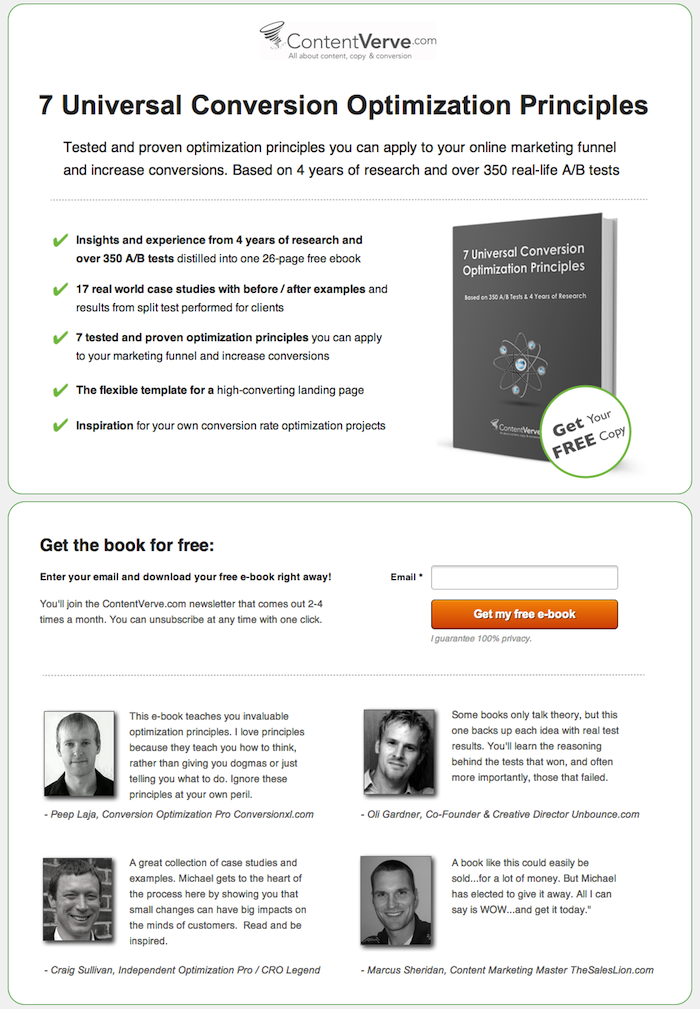
Another example is ContentVerve. The company was tasked with encouraging visitors to download a free book. They tested two landing options.
The initial version of the page looked like this:
This was the landing page after the changes:
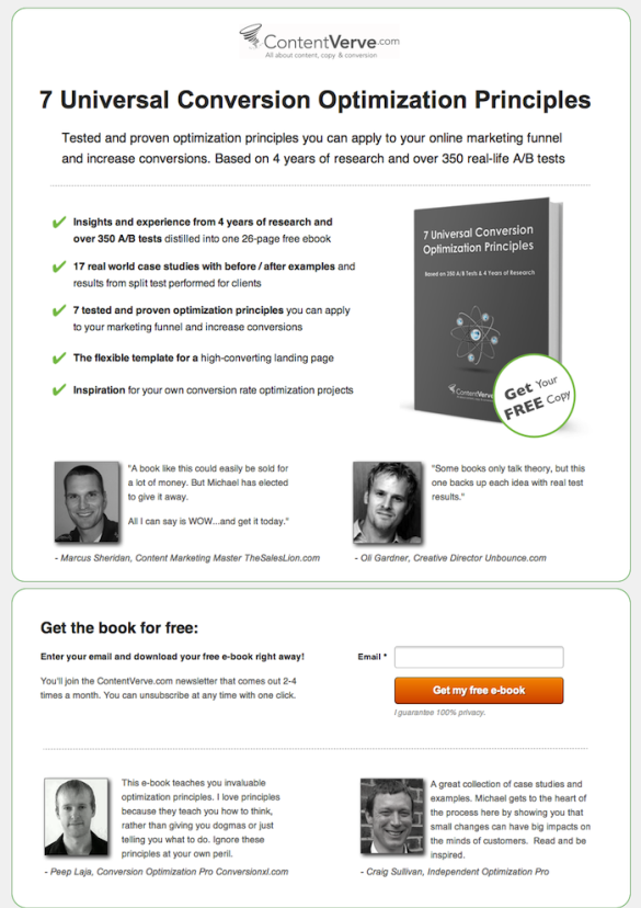
Two of the four reviews went up to the “first screen”. This almost cosmetic change led to an increase in the number of downloads of 64.53%.
The placement of information on awards, excerpts from publications in the press, and expert opinions on the selling page will help increase customer confidence in the company.
It is also important to convince the visitor of the authenticity of the goods sold. Express Watches, which sells Japanese brand Seiko watches, conducted a test that helped increase conversion by 107% .
The control page looked like this:

The same part of the page, after the changes:
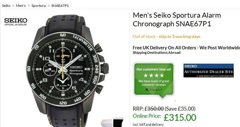
The only thing they did was: to the right of the product image, the plate with the promise of the best price was replaced with a blue-black one with the text “Authorized Seiko Dealer”.
As a result, the company received a fantastic increase in conversion.
Call to action
Landing element to which you can apply the rule “the more - the better” - a call-to-action button (CTA). It should stand out on the page and contain a clear and understandable appeal to the visitor.
Ideally, the CTA should match the advertisement or keywords in the search results for which the visitor came to the landing page.
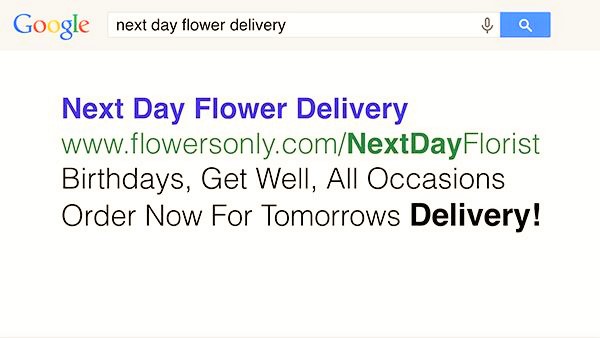
The author of the course on the creation of landing pages for Oli Gardner from Unbounce deals with an error with the CTA button using the example of a website for delivering flowers.
Advertisements site in Adwords:
Landing looks like this:
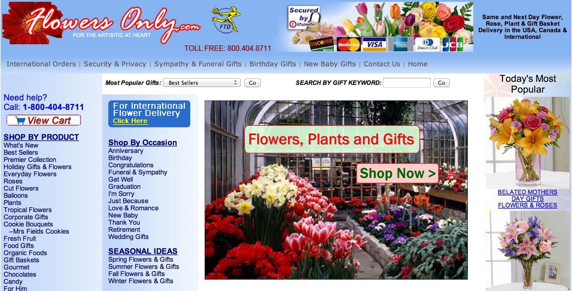
Oli Gardner draws attention to the “three magic words” that can be found in the company's advertisement: “next”, “day”, “delivery” (“next day delivery”). At the same time on the landing these words are not. Instead, we see “Flowers, Plants and Gifts”.
The message from the advertisement does not correspond to the message of the landing page. So a visitor who came from a search engine will spend a lot of time to find what he wants. Most likely, he will simply leave the site.
Here is how the correct landing page of this company should look like:
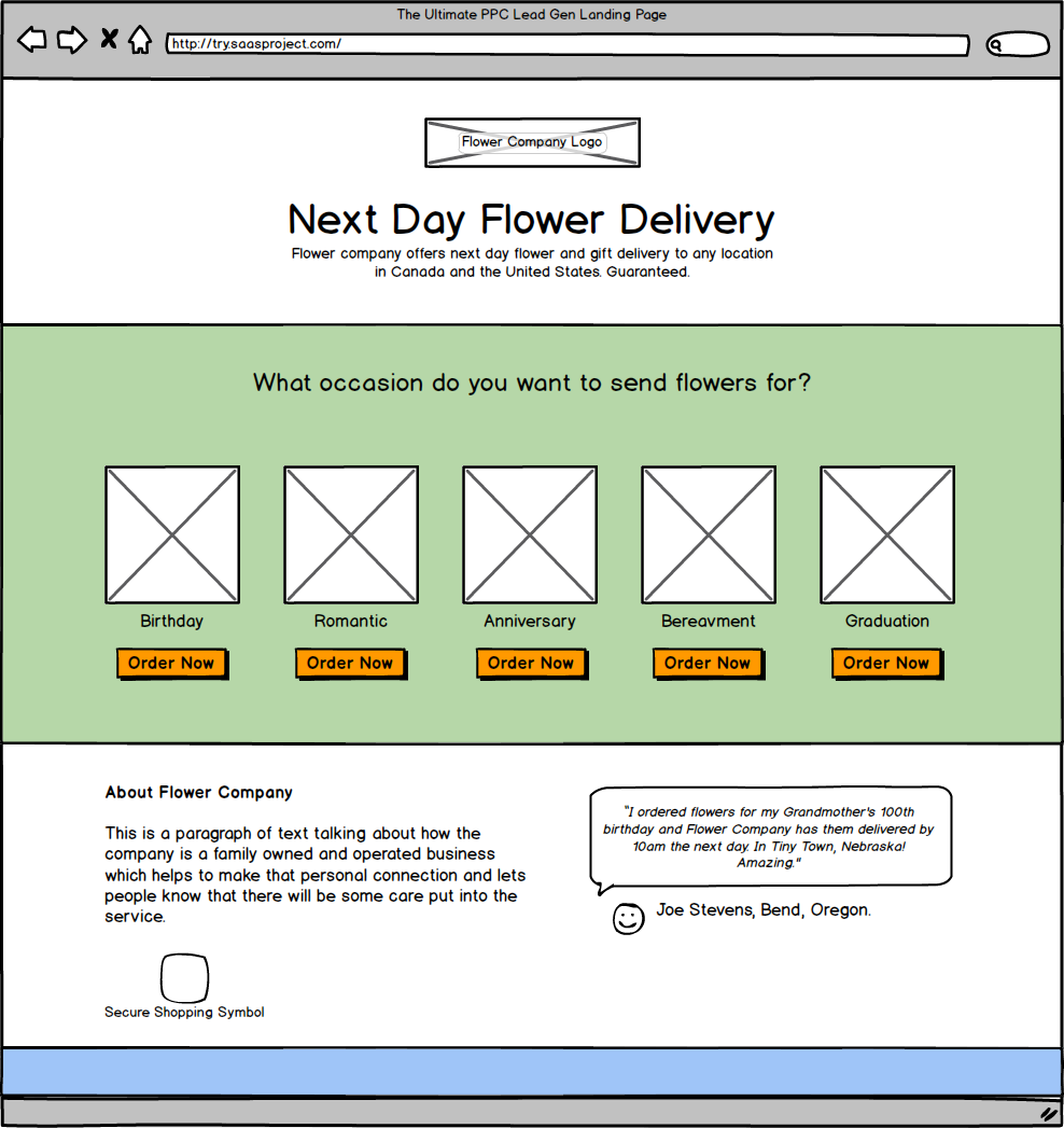
The main message now occupies a dominant position on the page. In addition, order buttons and customer reviews appeared.
How redesign increased conversion by 77%
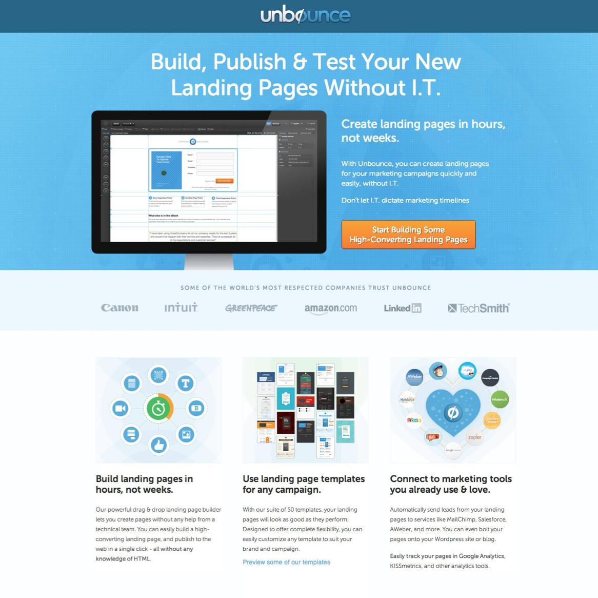
Another example from Olya Gardner is a redesign of a landing board selling a course on the art of landing.
Initially the page looked like this:
After redesign:
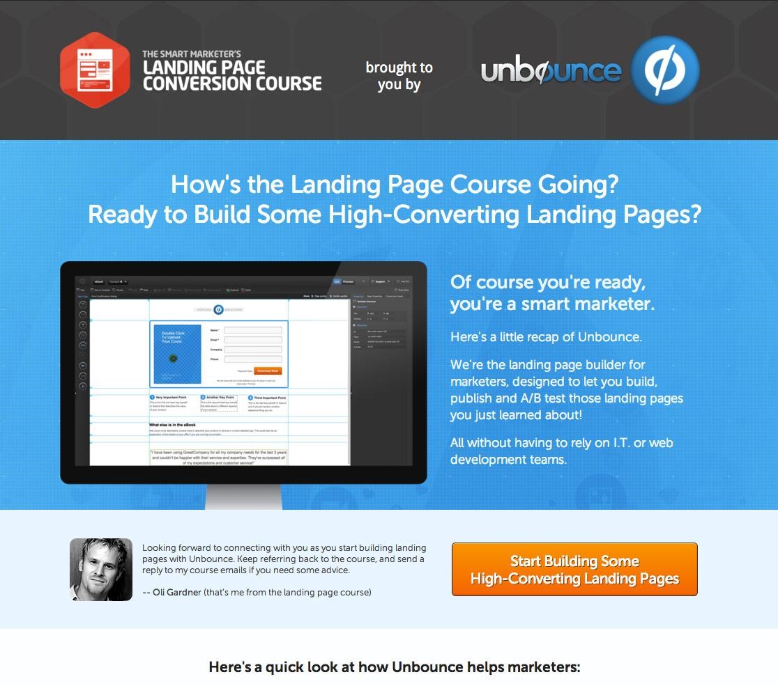
What changed:
- The top of the page has become multi-brand, which increases user confidence.
- The title refers directly to the visitor with a question that is answered below.
- Appeared a personal appeal to clients from the author of the course
As a result of these changes, page conversion increased by 77%.
Source: https://habr.com/ru/post/314580/
All Articles