Making your first opera widget.
In this article we will look at creating a simple widget for an opera.
What you need to get started:
The very first widget.
First you need to create an index.html file. This is what people will see when they open the widget.
')
Widget settings.
Next we look at how to add settings to our widget. All settings are written in a file called config.xml and contain information about the permanent properties of the widget. The main properties that should be described in this file are:
The name of the widget.
The size of the widget.
Information about the author.
Unique ID for the widget. The ID consists of three parts: Server name, widget name, and its last update date in YYYY-MM format (you can also use YYYY-MM-DD format if you plan to update the widget more than once a month).
It also optionally adds information about which domains the widget works with.
Create a new config.xml file in the same directory where you created index.html before. Paste this code there and save.
The first launch of your widget.
Drag the config.xml into the browser, or open it in the browser. As a result, we get something like this:

I can congratulate you. The first widget is ready.
Making the widget's face.
In this form, the background color of the widget is transparent, and the default style is used for styling. Not order. There is no need to give our widget its own look.
First of all, you need to add style declaration to your index.html. In the end, he should have become like this:
Now it's time to create a css file with widget styles. Create a folder “style”, where you will store the styles, and in it, the file - “helloworld.css”. Copy the presented code in this file.
You may have noticed that in this widget we use several background images. We need to add them to the widget folder. Images can be found in this zip file , they are in the images folder, copy this folder to the root folder of your widget.
All styles are in place, so try launching your widget again, in the same way as last time. It should look like this:
Notes on widget styles:
Try to make widgets not for beauty, but for users.
Add interactivity.
You now have a fully working widget, but it does nothing. Now we will add a button for setting and closing the widget.
Open index.html again and replace its content with:
We added:
Now you are required to update the style file and add javascript.
Style buttons close and change state.
Add the following code in helloworld.css, below the code that was there before. This code controls the display of control buttons.
Recommendations for the use of control buttons.
It is time to once again check the work of our widget. You should see something like this:
Add handler to buttons.
The next step is to add the functionality of the state change button so that the widget shows its different state when pressed, depending on the state of the button activated. This handler contains a bit of simple JavaScript code, and all you need is to put the code in the right place. Look in the resource file from which you copied the pictures, and copy from there to the root folder of the widget helloworld.js.
File Contents:
In this code, we put the functions of the widget in its object or namespace. Thus, the function will not be overridden if it already exists. We advise you to use the global scope as rarely as possible. The second half of the code is a function that runs when the widget starts, and installs handlers for objects.
Run the widget again and get the result as in the picture:
Widget packaging.
Widgets are packaged in a regular .zip file, the extension of which is changed to .wgt. All files used by your widget should be stored inside this archive.
Spread your widget
Your widget is already finished. The final step is to pack the widget and present it to other people. Instructions how to publish your widget here .
In this article, we looked at creating the simplest widget. And they made sure that it is not difficult at all. And also created our first widget.
P.S. I’ve cut the original a bit, but it’s too much water to translate.
What you need to get started:
- Basic understanding of web technologies.
- Text editor.
- Archiver that can create zip archives.
- The place where you can place the widget.
- Opera browser.
The very first widget.
First you need to create an index.html file. This is what people will see when they open the widget.
')
  <! DOCTYPE html>
 <html>
   <head>
     <title> Hello World! </ title>
   </ head>
   <body>
     <p> Hello World! </ p>
   </ body>
 </ html> </ code>
Widget settings.
Next we look at how to add settings to our widget. All settings are written in a file called config.xml and contain information about the permanent properties of the widget. The main properties that should be described in this file are:
The name of the widget.
The size of the widget.
Information about the author.
Unique ID for the widget. The ID consists of three parts: Server name, widget name, and its last update date in YYYY-MM format (you can also use YYYY-MM-DD format if you plan to update the widget more than once a month).
It also optionally adds information about which domains the widget works with.
Create a new config.xml file in the same directory where you created index.html before. Paste this code there and save.
 <? xml version = '1.0' encoding = 'UTF-8'?>
 <widget>
   <widgetname> Hello World! </ widgetname>
   <description> Demo widget from the Hello World tutorial. </ description>
   <width> 440 </ width>
   <height> 200 </ height>
   <author>
     <name> John Doe </ name>
     <email> john.doe@example.com </ email>
     <link> http://acme-widget.example.com </ link>
     <organization> Acme Examples, Inc. </ organization>
   </ author>
   <id>
     <host> example.com </ host>
     <name> HelloWorld </ name>
     <revised> 2008-01 </ revised>
   </ id>
 </ widget>
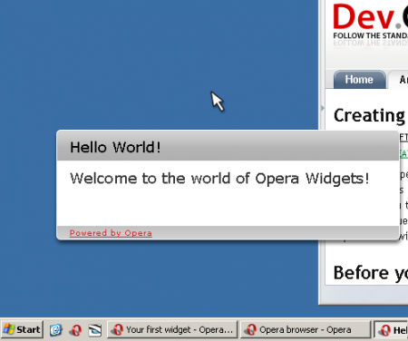
The first launch of your widget.
Drag the config.xml into the browser, or open it in the browser. As a result, we get something like this:
I can congratulate you. The first widget is ready.
Making the widget's face.
In this form, the background color of the widget is transparent, and the default style is used for styling. Not order. There is no need to give our widget its own look.
First of all, you need to add style declaration to your index.html. In the end, he should have become like this:
  <! DOCTYPE html>
 <html>
   <head>
     <title> Hello World! </ title>
     <link rel = "stylesheet" type = "text / css" href = "style / helloworld.css">
   </ head>
   <body>
     <div id = "container">
       <div id = "header">
       </ div>
       <div id = "content">
         <h1> Hello World! </ h1>
       </ div>
       <div id = "footer"> Powered by Opera </ div>
     </ div>
   </ body>
 </ html> </ code>
Now it's time to create a css file with widget styles. Create a folder “style”, where you will store the styles, and in it, the file - “helloworld.css”. Copy the presented code in this file.
  / ** Basic styles ** /

 body {
   font-family: Verdana, Helvetica, sans-serif;
   font-size: 16px;
 }

 h1 {
   margin: 0;
   font-size: 1.1em;
   padding: 7px 0 0 10px;
   font-weight: normal;
 }

 h2 {
     font-weight: normal;
     font-size: 1.1em;
     margin: 0px;
 }

 / ** Structure ** /

 #container {
   width: 429px;
 }

 #header {
   background-image: url (../ images / back_top.png);
   padding: 4px 10px 0px 10px;
   height: 35px;
 }

 #content {
   background-image: url (../ images / back_center.png);
   color: # 333;
 }

 .view {
     padding: 10px 10px 10px 20px;
     height: 60px;
     max-height: 60px;
     max-width: 393px;
     overflow: auto;
     -apple-dashboard-region: dashboardregion (control rectangle 0px 0px 0px 0px);
 }

 #footer {
   background-image: url (../ images / back_bottom.png);
   height: 23px;
   padding: 2px 0 0 20px;
   font-size: 0.6em;
   text-decoration: underline;
   color: # dd2222;
 }
 </ code>
You may have noticed that in this widget we use several background images. We need to add them to the widget folder. Images can be found in this zip file , they are in the images folder, copy this folder to the root folder of your widget.
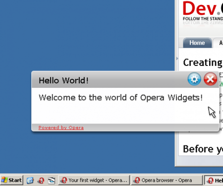
All styles are in place, so try launching your widget again, in the same way as last time. It should look like this:
Notes on widget styles:
Try to make widgets not for beauty, but for users.
Add interactivity.
You now have a fully working widget, but it does nothing. Now we will add a button for setting and closing the widget.
Open index.html again and replace its content with:
  <! DOCTYPE html>
 <html>
   <head>
     <title> Hello World! </ title>
     <link rel = "stylesheet" type = "text / css" href = "style / helloworld.css">
     <script type = "text / javascript" src = "script / helloworld.js"> </ script>
   </ head>
   <body>
     <div id = "container">
       <div id = "header">
         <div id = "controlbuttons">
           <button id = "flipbutton" class = "controlbutton" type = "button"> </ button>
           <button id = "closebutton" class = "controlbutton" type = "button"> </ button>
         </ div>
         <h1> Hello World! </ h1>
       </ div>
       <div id = "content">
         <div id = "front" class = "view">
           <h2 id = "hellotext"> Welcome to the world of Opera Widgets! </ h2>
         </ div>
         <div id = "config" class = "view">
           <h2> Hello World!  Configuration </ h2>
           <p>
              <label for = "frontlabel"> Text to display </ label>
              <input id = "frontlabel" type = "text" size = "25">
              <button id = "updatebutton" type = "button"> Update </ button>
           </ p>
         </ div>
       </ div>
       <div id = "footer"> Powered by Opera </ div>
     </ div>
   </ body>
 </ html> </ code>
We added:
- Declaring a script that controls the change in the state of the widget between the setting and the actual work of the widget.
- Button to change the state of the widget, and the close button.
- Making the widget settings.
Now you are required to update the style file and add javascript.
Style buttons close and change state.
Add the following code in helloworld.css, below the code that was there before. This code controls the display of control buttons.
  / * Hide the configuration view by default * /
 #config {
   display: none;
 }

 / ** Button styles ** /

 #controlbuttons {
   float: right;
 }

 .controlbutton {
   opacity: 0.0;
   overflow: hidden;
   height: 30px;
   width: 30px;
   background-position: left top;
   border: 0;
 }

 #flipbutton {
   background: transparent url (../ images / btn_config.png) scroll no-repeat 0 0;
 }

 #closebutton {
   background: transparent url (../ images / btn_close.png) scroll no-repeat 0 0;
 }

 / ** Button effects ** /

 #container: hover.controlButton {
   opacity: 0.3;
 }

 #container .controlButton: hover {
   opacity: 1.0;
 }

 #container .controlButton: active {
   opacity: 1.0;
   background-position: left bottom;
 } </ code>
Recommendations for the use of control buttons.
- The widget must always be equipped with a close button.
- Control buttons should only be visible when the mouse is in the widget’s space.
- They should become visible with a transparency of 0.3 when the mouse is in the widget’s space.
- When the mouse is in button space, the transparency value should be 1.0.
- When pressed, the control button should change to the clicked.
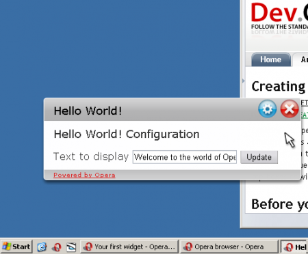
It is time to once again check the work of our widget. You should see something like this:
Add handler to buttons.
The next step is to add the functionality of the state change button so that the widget shows its different state when pressed, depending on the state of the button activated. This handler contains a bit of simple JavaScript code, and all you need is to put the code in the right place. Look in the resource file from which you copied the pictures, and copy from there to the root folder of the widget helloworld.js.
File Contents:
// create a namespace for the widget functions // to avoid clogging the global namespace var helloWorld = helloWorld || {}; // function for changing the state of the widget between setting and running helloWorld.flip = function (e) {var display = document.getElementById ('front'). style.display; if (display == 'block' || display == '') {document.getElementById ('front'). style.display = "none"; document.getElementById ('config'). style.display = "block"; } else {document.getElementById ('config'). style.display = "none"; document.getElementById ('front'). style.display = "block"; }} // initialize the widget window.addEventListener ('load', function (ev) {// add behavior to the flip button document.getElementById ('flipbutton'). addEventListener ('click', function (ev) {helloWorld.flip ();}, false); // handler of the close button document.getElementById ('closebutton'). addEventListener ('click', function (ev) {window.close ();}, false); // this button is not present, but just in case I left it. document.getElementById ('wocbutton'). addEventListener ('click', function (ev) {widget.openURL ('http://widgets.opera.com');}, false); / / handler for the button in the settings. Changes the text on the widget, and // returns the widget to the working state document.getElementById ('updatebutton'). addEventListener ('click', function (ev) {document.getElementById ('hellotext'). textContent = document.getElementById ('frontlabel'). value; helloWorld. flip ();}, false); // assigns the initial value to the text entry field in the document.getElementById ('frontlabel') settings. setAttribute ('value', document.getElementById ('hellotext'). textContent); }, false); In this code, we put the functions of the widget in its object or namespace. Thus, the function will not be overridden if it already exists. We advise you to use the global scope as rarely as possible. The second half of the code is a function that runs when the widget starts, and installs handlers for objects.
Run the widget again and get the result as in the picture:
Widget packaging.
Widgets are packaged in a regular .zip file, the extension of which is changed to .wgt. All files used by your widget should be stored inside this archive.
Spread your widget
Your widget is already finished. The final step is to pack the widget and present it to other people. Instructions how to publish your widget here .
In this article, we looked at creating the simplest widget. And they made sure that it is not difficult at all. And also created our first widget.
P.S. I’ve cut the original a bit, but it’s too much water to translate.
Source: https://habr.com/ru/post/31441/
All Articles