Create interactive charts with R and Highcharts
Sometimes, trying to solve simple problems come up with great ideas. This is especially true for developers who are willing to put a lot of effort into solving a simple problem to their fullest satisfaction. This story is about how Thorstein Hensi, the founder and SRO Highcharts, was looking for a simple graphing tool to put snow depth measurements on Wikafiellet, the local mountain where the family had a cottage, on their homepage. Disappointed with the usual flash-extensions and commercial solutions available at the time, he decided to create his own and, of course, share it.
To create beautiful graphs in this article, I will use the Joshua Kunst highcharter package , a shell for Highcharts and Shiny javascript libraries.
Please note that all products in this library are free for non-commercial use. For commercial projects and sites use this .
The highcharter package allows you to create Highcharts type graphics inside R.
')
There are two main functions in the package:
Graphs are constructed in the spirit of ggplot2 by layers, but they use the conveyor operator (%>%) instead of +.
Other useful features of the package:
We illustrate the functionality of this package and Highcharts as a whole with a number of visualization examples.
I was inspired by the article in FiveThirtyEight “Some are too superstitious to give birth on Friday, the 13th” . FiveThirtyEight kindly provides the data used in some articles in the repository on GitHub . Specifically, these are from here .
Our goal is to recreate this particular visualization . In order to do this, it is necessary to calculate the difference between the number of births on the 13th and the average for the 6th and 20th of each month, grouping these values by day of the week. Dplyr and tidyr will do just fine.
Download the necessary packages:
And the data:
We calculate the differences in the number of births, as described in the article, and save the results in a new data frame (data frame)
Which looks like this:
Please note that the calculated percentage of differences in percentage points (
Let's start with a simple highchart for this data using the
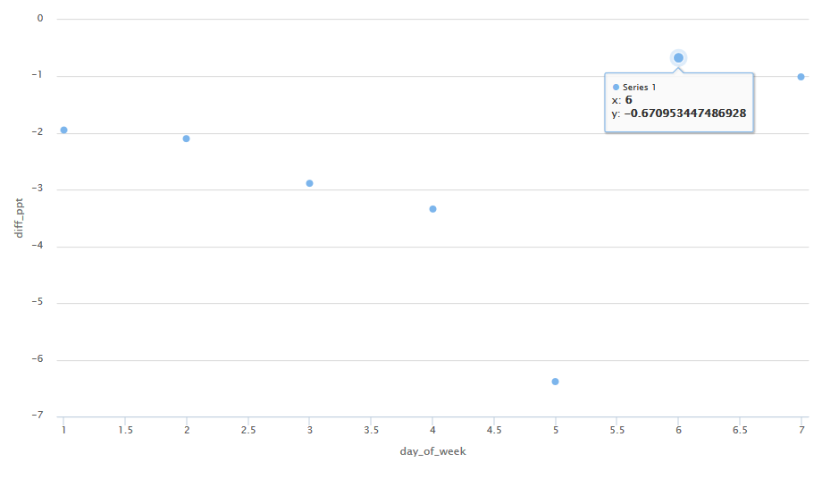
This graphic has a number of good properties. For example, if you hover your mouse over the points, you can see the actual values taken for construction. However, in order for the graph to look like in FiveThirtyEight, you will need a certain setting. This can be achieved using the

Title: The effect of Friday, the 13th
Subtitle: Difference in the number of births in the United States on the 13th of each month and the average number of births on the 6th and 20th, 1994 - 2004
Tags on the 0X axis: Monday, Tuesday, Wednesday, Thursday, Friday, Saturday, Sunday
Signature on the 0Y axis: Difference, in percentage points
A useful feature in this visualization is also a tooltip. Also, the themes make it easy to change the appearance of the graph (in this case, the theme
Since the highcharter package uses htmlwidlgets, it is also compatible with Shiny. In order to build a highchart inside an application on Shiny, use the
We wrote an application that extends the visualization created earlier and allows you to customize the range of years for which the data on the chart, its type and subject are taken. The screenshot is shown below, and the application itself and its source code can be viewed here .

The most attractive highcharts features are built-in and customizable tooltips and scaling. But whether these functions will be useful depends on each specific case.
For example, tooltips are not so good, if you build a graph according to a larger volume. Look at this schedule of delays on landings and departures of flights to Los Angeles in October 2013 at various airports in New York. The accumulation of points in the lower left of the graph makes the tooltips not so convenient.

But if you group the data a bit to reduce the number of points, this functionality can come in handy again. For example, below we group flights by 15-minute intervals in the departure delay and derive the median touchdown delay for these intervals.

Highcharts provides excellent quality web graphics with the ability to fine-tune, and the highcharter package enables R users to take full advantage of this. If you are interested in the functions available in the package, I highly recommend a look at the highcharter package page : there are many Highcharts, Highstock and Highmaps charts with code examples. Also, if you need to check the syntax of any settings, the page describing the Highcharts options is extremely useful.
To create beautiful graphs in this article, I will use the Joshua Kunst highcharter package , a shell for Highcharts and Shiny javascript libraries.
Please note that all products in this library are free for non-commercial use. For commercial projects and sites use this .
The highcharter package allows you to create Highcharts type graphics inside R.
')
There are two main functions in the package:
highchart(): creates a highchart object using htmlwidgets . The widget can be displayed on HTML pages created in R Markdown, Shiny or other applications.hchart(): useshighchart()to draw a graph for different classes of objects in R. with one simple command. In particular, these are: data frame, numeric, histogram, character, density, ts, mts, xts, stl, ohlc, acf, forecast, mforecast, ets, igraph, dist, dendrogram, phylo and survfit.
Graphs are constructed in the spirit of ggplot2 by layers, but they use the conveyor operator (%>%) instead of +.
Other useful features of the package:
- Theming: you can customize your graphics with built-in themes such as The Economist, Financial Times, Google, and FiveThirtyEight.
- Extensions: motion, drag points, fontawesome, url-pattern, annotations.
We illustrate the functionality of this package and Highcharts as a whole with a number of visualization examples.
Example 1: Born on Friday, the 13th, in the USA
I was inspired by the article in FiveThirtyEight “Some are too superstitious to give birth on Friday, the 13th” . FiveThirtyEight kindly provides the data used in some articles in the repository on GitHub . Specifically, these are from here .
Our goal is to recreate this particular visualization . In order to do this, it is necessary to calculate the difference between the number of births on the 13th and the average for the 6th and 20th of each month, grouping these values by day of the week. Dplyr and tidyr will do just fine.
Download the necessary packages:
library(highcharter) library(dplyr) library(tidyr) And the data:
births <- read.csv("data/births.csv") We calculate the differences in the number of births, as described in the article, and save the results in a new data frame (data frame)
diff13 : diff13 <- births %>% filter(date_of_month %in% c(6, 13, 20)) %>% mutate(day = ifelse(date_of_month == 13, "thirteen", "not_thirteen")) %>% group_by(day_of_week, day) %>% summarise(mean_births = mean(births)) %>% arrange(day_of_week) %>% spread(day, mean_births) %>% mutate(diff_ppt = ((thirteen - not_thirteen) / not_thirteen) * 100) Which looks like this:
## Source: local data frame [7 x 4] ## Groups: day_of_week [7] ## ## day_of_week not_thirteen thirteen diff_ppt ## <int> <dbl> <dbl> <dbl> ## 1 1 11658.071 11431.429 -1.9440853 ## 2 2 12900.417 12629.972 -2.0964008 ## 3 3 12793.886 12424.886 -2.8841902 ## 4 4 12735.145 12310.132 -3.3373249 ## 5 5 12545.100 11744.400 -6.3825717 ## 6 6 8650.625 8592.583 -0.6709534 ## 7 7 7634.500 7557.676 -1.0062784 Please note that the calculated percentage of differences in percentage points (
diff_ppt ) may not correspond to that given in the article FiveThirtyEight. There are two reasons for this:- Holidays are excluded in FiveThirtyEight, but not in this analysis.
- FiveThirtyEight provide two data files - for 1994-2003 and for 2000-2014, respectively. The number of births in intersecting years (2000-2003) in these files does not quite coincide. This application uses data from the Social Security Administration (SSA, Social Security Administration) for the respective years, but it is not clear what data the FiveThirtyEight used.
Let's start with a simple highchart for this data using the
hchart() function: hchart(diff13, "scatter", x = day_of_week, y = diff_ppt) This graphic has a number of good properties. For example, if you hover your mouse over the points, you can see the actual values taken for construction. However, in order for the graph to look like in FiveThirtyEight, you will need a certain setting. This can be achieved using the
highchart() function and some others. Notice we are separating the layers by the conveyor operator. highchart() %>% hc_add_series(data = round(diff13$diff_ppt, 4), type = "column", name = "Difference, in ppt", color = "#F0A1EA", showInLegend = FALSE) %>% hc_yAxis(title = list(text = "Difference, in ppt"), allowDecimals = FALSE) %>% hc_xAxis(categories = c("Monday", "Tuesday", "Wednesday", "Thursday", "Friday", "Saturday", "Sunday"), tickmarkPlacement = "on", opposite = TRUE) %>% hc_title(text = "The Friday the 13th effect", style = list(fontWeight = "bold")) %>% hc_subtitle(text = "Difference in the share of US births on 13th of each month from the average of births on the 6th and the 20th, 1994 - 2004") %>% hc_tooltip(valueDecimals = 4, pointFormat = "Day: {point.x} <br> Diff: {point.y}") %>% hc_credits(enabled = TRUE, text = "Sources: CDC/NCHS, SOCIAL SECURITY ADMINISTRATION", style = list(fontSize = "10px")) %>% hc_add_theme(hc_theme_538()) Title: The effect of Friday, the 13th
Subtitle: Difference in the number of births in the United States on the 13th of each month and the average number of births on the 6th and 20th, 1994 - 2004
Tags on the 0X axis: Monday, Tuesday, Wednesday, Thursday, Friday, Saturday, Sunday
Signature on the 0Y axis: Difference, in percentage points
A useful feature in this visualization is also a tooltip. Also, the themes make it easy to change the appearance of the graph (in this case, the theme
hc_theme_538() brings us very close to the original). You can also easily change the labels (for example, the names of the days) without making changes to the original data.Example 2: Born on Friday, the 13th, in the USA, interactivity
Since the highcharter package uses htmlwidlgets, it is also compatible with Shiny. In order to build a highchart inside an application on Shiny, use the
renderHighchart() function.We wrote an application that extends the visualization created earlier and allows you to customize the range of years for which the data on the chart, its type and subject are taken. The screenshot is shown below, and the application itself and its source code can be viewed here .
What to fear
The most attractive highcharts features are built-in and customizable tooltips and scaling. But whether these functions will be useful depends on each specific case.
For example, tooltips are not so good, if you build a graph according to a larger volume. Look at this schedule of delays on landings and departures of flights to Los Angeles in October 2013 at various airports in New York. The accumulation of points in the lower left of the graph makes the tooltips not so convenient.
library(nycflights13) oct_lax_flights <- flights %>% filter(month == 10, dest == "LAX") hchart(oct_lax_flights, "scatter", x = dep_delay, y = arr_delay, group = origin) But if you group the data a bit to reduce the number of points, this functionality can come in handy again. For example, below we group flights by 15-minute intervals in the departure delay and derive the median touchdown delay for these intervals.
oct_lax_flights_agg <- oct_lax_flights %>% mutate(dep_delay_cat = cut(dep_delay, breaks = seq(-15, 255, 15))) %>% group_by(origin, dep_delay_cat) %>% summarise(med_arr_delay = median(arr_delay, na.rm = TRUE)) hchart(oct_lax_flights_agg, "line", x = dep_delay_cat, y = med_arr_delay, group = origin) Conclusion
Highcharts provides excellent quality web graphics with the ability to fine-tune, and the highcharter package enables R users to take full advantage of this. If you are interested in the functions available in the package, I highly recommend a look at the highcharter package page : there are many Highcharts, Highstock and Highmaps charts with code examples. Also, if you need to check the syntax of any settings, the page describing the Highcharts options is extremely useful.
Source: https://habr.com/ru/post/314086/
All Articles