10 principles of effective web design
Usability and practicality, not visual design, determine the success or failure of any website. Since the user is the only one who clicks the mouse and thus makes all the decisions, one of the standard approaches for creating successful and profitable web designs was the “user-centric design”. In the end, if the user does not know how to use this or that function, it can be easily neglected.
In this article, we will not consider implementation details (for example, where you need to have a search field), but concentrate more on the main principles, heuristic methods and approaches to create effective web design, which, if used wisely, can lead to more accurate design decisions and simplify the process of perception of the proposed information.
First of all, in order to properly use the principles, we need to know how users interact with the website, what they think about and what their behavior patterns are.
')
In principle, the behavior of users on a website is not very different from their behavior in, say, a store. Users glance at each new page, look at excerpts of the text and click on the first link that caught their attention, or at least remotely similar to the one they were looking for. In fact, they won't even look at most of the page.
Many users are looking for something interesting (or useful) and “clickable”; as soon as a suitable “candidate” comes across, the user quickly clicks and follows the link. If the result did not meet his expectations, the user clicks “back” and continues the search.
Users appreciate the quality and truthfulness of the information. If the page contains high-quality material, users are ready to compromise with the presence of advertising on the page and its design. This is one of the reasons why sites with not very good design, but with high-quality content get a lot of traffic. The content is much more important than its framing design.
Users do not read, they "scan". When analyzing a web page, users look for fixed points, “anchors,” which will guide them through the content on the page.
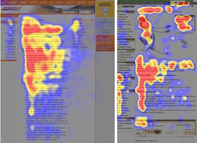
Users do not read, they scan. Pay attention to the jerky hot spots in the middle of the sentences. This is typical of the scanning process.
Users are impatient. A very simple principle: if the website can not meet the expectations of users, the design does not fulfill its function, and the company loses money. The less intuitive navigation, the stronger the user's desire to leave the website and find an alternative.
Users do not make optimal decisions. Users are not looking for the fastest way to search for desired information. They also do not crawl websites consistently, moving from one section to another. In fact, they choose the first most suitable, in their opinion, option. As soon as they see a link that can lead them to the desired goal, it is likely that the link will be instantly clicked.
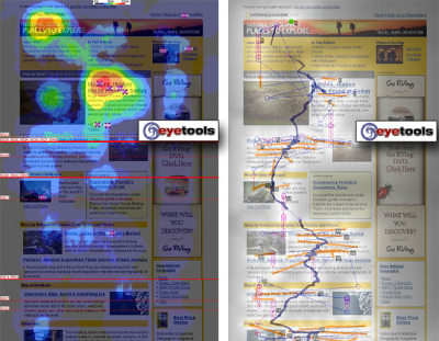
Both images show that sequential scanning does not work on the web.
Users operate intuitively. Most often, users simply browse, rather than read carefully what the designer has offered them. According to Steve Krug, the main reason is that users are indifferent. “If we find something that works, we will use it. We are not interested in how it all works, the main thing is to work correctly. If your audience sees what you have done as a bulletin board, then create a quality bulletin board design. ”
Users want to control. It is important for users to control the browser and rely on the correct transmission of data through the site. For example, they do not want pop-up windows that open unexpectedly, and they want to be able to return to the previous page by clicking the back button. From here, it is necessary to follow one of the most important practices - never open a link in a new browser window .
According to the first usability law of the Circle, the web page should be obvious . When you create a design, your main task is to get rid of the questions - all decisions should be made consciously, taking into account the pros, cons and alternatives.
If the navigation and site structure are not intuitive, the number of emerging questions increases and it becomes more difficult for users to understand how the system works and how to get from point A to point B. A clear structure, correct visual cues and easily recognizable links will help users find a way to their goal.
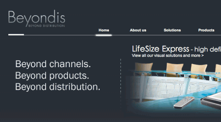
Let's take an example. Beyondis.co.uk state that they are “beyond channels, beyond products, beyond distribution”. What does this mean ? Since users are prone to exploring websites according to the “ F-model ” (“F-pattern”), the above statements will be the first element that users will see when they download the site.
Although the design is simple and intuitive, to understand what this page is about, users will need to look for answers. This is a prime example of unwanted questions . The task of the designer is to make the number of questions go to zero. The visual explanation is on the right. Even just swapping both blocks, we could increase usability.

ExpressionEngine uses the same structure as Beyondis, but avoids unnecessary questions. Moreover, the slogan has its own function, offering users to make a choice: try their service or download the free version.
By reducing the cognitive load, you simplify the perception of the idea by visitors. Once you have achieved this, you can explain how the system is useful and how users can benefit from it. People will not use your website if they cannot understand it.
In each project where you are going to offer your visitors any service, try to minimize user requirements. The less actions required from the user in order to try your service, the greater the likelihood that a casual visitor will actually try it in action. First-time visitors to the site want to try the service , rather than fill out long forms to create an account, which they may not use at all. Give users the opportunity to wander around the site and try to use your service without “pulling out” personal data from them.
As Ryan Singer, one of the developers of the 37Signals team, says, users will be happy to provide their email address if they are asked for them after they see how the service actually works. In other words, users will understand that they will receive “in return” their email.

An excellent example of this approach is Stikkit . Practically nothing is required for registration - it is quite convenient and simple. And this is how you want users to feel on your site.
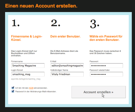
Mite needs more information when registering. However, the registration itself requires less than 30 seconds - because the form is horizontal, the user will not even have to scroll the page.
Ideally, remove all barriers and obstacles , do not require any registrations first. The registration procedure alone is reason enough to reduce the number of its potential users.
When a website contains both static and dynamic content, some aspects of the user interface attract more attention than others. It is quite obvious that pictures are more flashy than text - just as the sentences in bold are more noticeable than regular ones.
The human eye is a complex non-linear device and web users can instantly determine borders, patterns and movement . Therefore, advertising based on video or containing moving objects - incredibly annoying and distracting attention, but from the marketing side it performs its function - it attracts the user's attention.
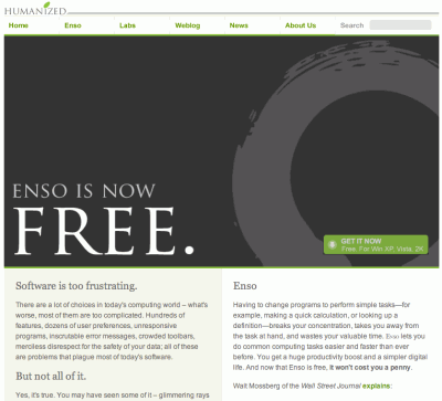
Humanized.com ideally uses the principle of focusing. The only element immediately visible to users is the word “free” (“free”), which immediately attracts, but is also completely uninformative. Subtle hints offer users enough information to learn more about the “free” product.
If you focus users on certain site objects (with the correct use of visual elements), you can help your users get from point A to point B without much thought about exactly how to do this. The fewer questions a visitor has, the more they are guided and the more they trust the company that the website represents. In other words: the less a user needs to think about the meaning of his actions, the better his impression of the site - which is the main principle of usability.
Modern web designs are often criticized for their approach to using “steps” (akin to 1-2-3-done!), Huge buttons, heaps of effects, etc. But in terms of design, such elements are not so bad. On the contrary, such elements are very effective , since they facilitate the transition of users between parts of the site.
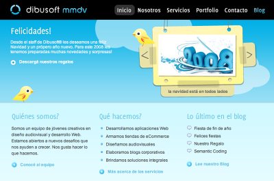
Dibusoft.com combines a nice design with a clear structure. The site has 9 main elements that are visible to the naked eye. Although perhaps the colors are too light.
Letting users know what features are available is the fundamental principle of successful design. It does not matter what way you will achieve it. What matters is how easily the content is perceived and how easy it is for users to work with the system.
The web is different from print; You must be able to adapt the style of writing to user preferences and browsing methods. Visitors will not read promotional texts. Large paragraphs without pictures, without bold or italic sentences will be skipped. Exaggerations will be ignored.
Speak on business. Avoid “cute” or witty names, specific names used internally, unfamiliar technical terms. For example, if you are describing a service and you want users to register, then “register” is better than “start now!”, Which in turn is better than “try our services”.
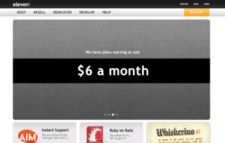
Eleven2.com goes straight to the point. No inviting speeches, no overestimations. Instead, they immediately indicate the price - all that visitors need.
The optimal solution for effective text compilation:
The principle “keep it simple” (keep it simple, KIS) should be the main goal of site design. Users rarely visit the site to simply enjoy the design. Moreover, in most cases they are looking for the right information, despite the design. Aim for simplicity, do not complicate.

Crcbus has a simple design. You may not understand what this site is about, because It is in Italian, but you define the navigation bar, title, content and copyright string exactly. Even icons convey their share of information. If you hover over them with your mouse, you will see more information.
From the point of view of visitors, the best is the most common text design, without ad units or any additional links “on the topic”. This is another reason why web pages should have a print version: such details improve the user experience of the website.

Finch clearly displays information about the site and gives users several links to choose from without overloading the visitor with unnecessary content.
In fact, it is very difficult to overestimate the function of empty space. It not only helps to reduce the cognitive load on visitors, but also makes it possible to perceive information on the screen. When a new visitor studies a design, the first thing he / she does is to scan the page and divide it into content regions and easy to understand pieces of information.
Complex structures are difficult to read, scan, analyze, and work. If you are faced with a choice, separate the two design elements with a visible line or empty space, it is better to make a choice in favor of the second. The hierarchical structure reduces complexity (Simon's Law): the better you can present users with a visual hierarchy, the easier it will be to perceive the content.

Empty space is good. Cameron.io uses empty space as the main design element. The result is an easily scanned markup that brings content to a deserved dominant level.
In his works on the effective visual presentation of information, Aaron Marcus points out three fundamental principles of using so-called. “Visual language” - the content that users see on the screen.
Traditional website design elements don't mean boring design at all. In fact, traditions are very useful , because they reduce the learning curve and the need to figure out what works and how. It would be a usability nightmare if all websites visualized the RSS feed differently. Design traditions are not much different from our traditions in everyday life: the way we used to organize data (folders) or make purchases (product layout).
Using traditional approaches, you will easily gain the trust of users, their confidence in you. Follow user expectations — understand what they expect from site navigation, text structure, search location, etc. (see Nielsen Usability Alterbox )
Steve Krug offers to invent something new only if you are sure that your idea is really good , otherwise it’s better to stick with traditional solutions.
This principle (TETO, “test early, test often”) should be applied to every web project, since usability tests often show all the biggest problems with a given design.
Often tests are performed too late or too rarely. Sometimes it is not tested at all what is needed. It should be understood that most design decisions are made locally; in other words, you cannot be sure that one markup is better than the other, because the decision is very dependent on which position you look at it (initial requirements, depositors' expectations, budget, etc.).
A few important points:
In this article, we will not consider implementation details (for example, where you need to have a search field), but concentrate more on the main principles, heuristic methods and approaches to create effective web design, which, if used wisely, can lead to more accurate design decisions and simplify the process of perception of the proposed information.
First of all, in order to properly use the principles, we need to know how users interact with the website, what they think about and what their behavior patterns are.
')
How do users think?
In principle, the behavior of users on a website is not very different from their behavior in, say, a store. Users glance at each new page, look at excerpts of the text and click on the first link that caught their attention, or at least remotely similar to the one they were looking for. In fact, they won't even look at most of the page.
Many users are looking for something interesting (or useful) and “clickable”; as soon as a suitable “candidate” comes across, the user quickly clicks and follows the link. If the result did not meet his expectations, the user clicks “back” and continues the search.
Users appreciate the quality and truthfulness of the information. If the page contains high-quality material, users are ready to compromise with the presence of advertising on the page and its design. This is one of the reasons why sites with not very good design, but with high-quality content get a lot of traffic. The content is much more important than its framing design.
Users do not read, they "scan". When analyzing a web page, users look for fixed points, “anchors,” which will guide them through the content on the page.
Users do not read, they scan. Pay attention to the jerky hot spots in the middle of the sentences. This is typical of the scanning process.
Users are impatient. A very simple principle: if the website can not meet the expectations of users, the design does not fulfill its function, and the company loses money. The less intuitive navigation, the stronger the user's desire to leave the website and find an alternative.
Users do not make optimal decisions. Users are not looking for the fastest way to search for desired information. They also do not crawl websites consistently, moving from one section to another. In fact, they choose the first most suitable, in their opinion, option. As soon as they see a link that can lead them to the desired goal, it is likely that the link will be instantly clicked.
Both images show that sequential scanning does not work on the web.
Users operate intuitively. Most often, users simply browse, rather than read carefully what the designer has offered them. According to Steve Krug, the main reason is that users are indifferent. “If we find something that works, we will use it. We are not interested in how it all works, the main thing is to work correctly. If your audience sees what you have done as a bulletin board, then create a quality bulletin board design. ”
Users want to control. It is important for users to control the browser and rely on the correct transmission of data through the site. For example, they do not want pop-up windows that open unexpectedly, and they want to be able to return to the previous page by clicking the back button. From here, it is necessary to follow one of the most important practices - never open a link in a new browser window .
1. Do not make users think
According to the first usability law of the Circle, the web page should be obvious . When you create a design, your main task is to get rid of the questions - all decisions should be made consciously, taking into account the pros, cons and alternatives.
If the navigation and site structure are not intuitive, the number of emerging questions increases and it becomes more difficult for users to understand how the system works and how to get from point A to point B. A clear structure, correct visual cues and easily recognizable links will help users find a way to their goal.
Let's take an example. Beyondis.co.uk state that they are “beyond channels, beyond products, beyond distribution”. What does this mean ? Since users are prone to exploring websites according to the “ F-model ” (“F-pattern”), the above statements will be the first element that users will see when they download the site.
Although the design is simple and intuitive, to understand what this page is about, users will need to look for answers. This is a prime example of unwanted questions . The task of the designer is to make the number of questions go to zero. The visual explanation is on the right. Even just swapping both blocks, we could increase usability.
ExpressionEngine uses the same structure as Beyondis, but avoids unnecessary questions. Moreover, the slogan has its own function, offering users to make a choice: try their service or download the free version.
By reducing the cognitive load, you simplify the perception of the idea by visitors. Once you have achieved this, you can explain how the system is useful and how users can benefit from it. People will not use your website if they cannot understand it.
2. Do not test the patience of users
In each project where you are going to offer your visitors any service, try to minimize user requirements. The less actions required from the user in order to try your service, the greater the likelihood that a casual visitor will actually try it in action. First-time visitors to the site want to try the service , rather than fill out long forms to create an account, which they may not use at all. Give users the opportunity to wander around the site and try to use your service without “pulling out” personal data from them.
As Ryan Singer, one of the developers of the 37Signals team, says, users will be happy to provide their email address if they are asked for them after they see how the service actually works. In other words, users will understand that they will receive “in return” their email.
An excellent example of this approach is Stikkit . Practically nothing is required for registration - it is quite convenient and simple. And this is how you want users to feel on your site.
Mite needs more information when registering. However, the registration itself requires less than 30 seconds - because the form is horizontal, the user will not even have to scroll the page.
Ideally, remove all barriers and obstacles , do not require any registrations first. The registration procedure alone is reason enough to reduce the number of its potential users.
3. Concentrate user attention.
When a website contains both static and dynamic content, some aspects of the user interface attract more attention than others. It is quite obvious that pictures are more flashy than text - just as the sentences in bold are more noticeable than regular ones.
The human eye is a complex non-linear device and web users can instantly determine borders, patterns and movement . Therefore, advertising based on video or containing moving objects - incredibly annoying and distracting attention, but from the marketing side it performs its function - it attracts the user's attention.
Humanized.com ideally uses the principle of focusing. The only element immediately visible to users is the word “free” (“free”), which immediately attracts, but is also completely uninformative. Subtle hints offer users enough information to learn more about the “free” product.
If you focus users on certain site objects (with the correct use of visual elements), you can help your users get from point A to point B without much thought about exactly how to do this. The fewer questions a visitor has, the more they are guided and the more they trust the company that the website represents. In other words: the less a user needs to think about the meaning of his actions, the better his impression of the site - which is the main principle of usability.
4. Aim to show the most significant things.
Modern web designs are often criticized for their approach to using “steps” (akin to 1-2-3-done!), Huge buttons, heaps of effects, etc. But in terms of design, such elements are not so bad. On the contrary, such elements are very effective , since they facilitate the transition of users between parts of the site.
Dibusoft.com combines a nice design with a clear structure. The site has 9 main elements that are visible to the naked eye. Although perhaps the colors are too light.
Letting users know what features are available is the fundamental principle of successful design. It does not matter what way you will achieve it. What matters is how easily the content is perceived and how easy it is for users to work with the system.
5. Write effectively
The web is different from print; You must be able to adapt the style of writing to user preferences and browsing methods. Visitors will not read promotional texts. Large paragraphs without pictures, without bold or italic sentences will be skipped. Exaggerations will be ignored.
Speak on business. Avoid “cute” or witty names, specific names used internally, unfamiliar technical terms. For example, if you are describing a service and you want users to register, then “register” is better than “start now!”, Which in turn is better than “try our services”.
Eleven2.com goes straight to the point. No inviting speeches, no overestimations. Instead, they immediately indicate the price - all that visitors need.
The optimal solution for effective text compilation:
- use short, concise expressions (to get to the bottom as soon as possible);
- use “scanned” markup (categorize content, use multi-level headings, visual elements and lists that break the flow of text blocks);
- use simple and objective language (promotional text should not sound like an advertisement; offer your users several reasonable and objective reasons why they should use your service or remain on your website).
6. Aim for simplicity
The principle “keep it simple” (keep it simple, KIS) should be the main goal of site design. Users rarely visit the site to simply enjoy the design. Moreover, in most cases they are looking for the right information, despite the design. Aim for simplicity, do not complicate.
Crcbus has a simple design. You may not understand what this site is about, because It is in Italian, but you define the navigation bar, title, content and copyright string exactly. Even icons convey their share of information. If you hover over them with your mouse, you will see more information.
From the point of view of visitors, the best is the most common text design, without ad units or any additional links “on the topic”. This is another reason why web pages should have a print version: such details improve the user experience of the website.
Finch clearly displays information about the site and gives users several links to choose from without overloading the visitor with unnecessary content.
7. Do not be afraid of empty space.
In fact, it is very difficult to overestimate the function of empty space. It not only helps to reduce the cognitive load on visitors, but also makes it possible to perceive information on the screen. When a new visitor studies a design, the first thing he / she does is to scan the page and divide it into content regions and easy to understand pieces of information.
Complex structures are difficult to read, scan, analyze, and work. If you are faced with a choice, separate the two design elements with a visible line or empty space, it is better to make a choice in favor of the second. The hierarchical structure reduces complexity (Simon's Law): the better you can present users with a visual hierarchy, the easier it will be to perceive the content.
Empty space is good. Cameron.io uses empty space as the main design element. The result is an easily scanned markup that brings content to a deserved dominant level.
8. Effective communication with content
In his works on the effective visual presentation of information, Aaron Marcus points out three fundamental principles of using so-called. “Visual language” - the content that users see on the screen.
- Organization: Give the user a clear and consistent structure. The sequence and placement of logical blocks, the relationship between them, the possibility of transition between these blocks are important points of organization. The same rules should apply to all elements.
- Savings: Try to make as much as possible with fewer visual elements. The four main points: simplicity, clarity, distinctiveness and expressiveness. Simplicity means the inclusion of only those elements that are most important for effective communication. Clarity : all components must have a design that does not confuse the visitor in the purpose of these elements. Distinctiveness : the most important properties of the elements should be easily noticeable. Expressiveness : the most important elements should be easily visually perceived.
- Interaction: the appearance must match the physical capabilities of visitors. The site should be clear, readable, with the correct typography, suitable colors, etc. Use no more than 3 fonts with 3 different sizes , as well as no more than 18 words or 50-80 characters per line of text.
9. Tradition - our friends
Traditional website design elements don't mean boring design at all. In fact, traditions are very useful , because they reduce the learning curve and the need to figure out what works and how. It would be a usability nightmare if all websites visualized the RSS feed differently. Design traditions are not much different from our traditions in everyday life: the way we used to organize data (folders) or make purchases (product layout).
Using traditional approaches, you will easily gain the trust of users, their confidence in you. Follow user expectations — understand what they expect from site navigation, text structure, search location, etc. (see Nielsen Usability Alterbox )
Steve Krug offers to invent something new only if you are sure that your idea is really good , otherwise it’s better to stick with traditional solutions.
10. Test early, test often.
This principle (TETO, “test early, test often”) should be applied to every web project, since usability tests often show all the biggest problems with a given design.
Often tests are performed too late or too rarely. Sometimes it is not tested at all what is needed. It should be understood that most design decisions are made locally; in other words, you cannot be sure that one markup is better than the other, because the decision is very dependent on which position you look at it (initial requirements, depositors' expectations, budget, etc.).
A few important points:
- Steve Krug believes that testing with one user is 100 times better than testing without user participation in general , and testing with one user at the beginning of a project is better than testing with 50 users at the end. In accordance with the first law of Boehm (Boehm's Law), errors most often occur during the initial stages of design and design; the later they are corrected, the more expensive it goes to the project.
- Testing is an iterative process . It works like this: you are creating, testing, correcting and testing something again. Perhaps you will find problems that went unnoticed during the first testing in the "garbage" of other errors.
- Usability tests always give useful results . You will either see current problems, or lack thereof. In any case, it is useful for the project.
- According to Weinberg's Law, developers are unable to test their code . This also applies to designers. After you have been working on the site for several weeks, your eyes are blurred and you can no longer look at the project in a new way. You know how it works from the inside and how it actually works - this knowledge is not available to independent testers and your users.
Source: https://habr.com/ru/post/31408/
All Articles