We are creating a news site using Flexbox
Note: This material is a free translation of Jeremy Thomas ’s article on how easy it is to work with Flexbox using the example of a news site template layout.
Believe me, there is no need for a detailed analysis of all aspects of working with the Flexbox if you want to start using it now. In this guide, the author is going to introduce you to some of the Flexbox properties and make a “news layout” like the one you could see on The Guardian website.
The reason why the author uses Flexbox is the large number of features that it provides:
- ease in creating adaptive columns;
- create columns of the same height;
- the possibility of pressing the contents to the bottom of the container.
')
Let's go!
1. Start by creating two columns.
Creating columns with CSS has always caused some difficulties. For a long time, floats and / or tables were widely used (and used) to perform this task, but each of these methods had (and has) its own drawbacks.
In turn, the Flexbox simplifies this process, with several advantages such as:
- writing a cleaner code: we just need to create a container with the display: flex rule ;
- flexibility: we can resize, stretch and align columns by changing a couple of lines of CSS;
- semantic markup;
- in addition, with the use of the Flexbox, there is no need to cancel the flow around in order to avoid the unpredictable behavior of the layout.
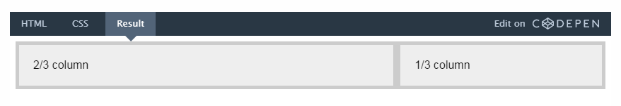
Let's start working with creating two columns, one of which will occupy 2/3 of the width of our container, and one more - 1/3 of its width.
<div class="columns"> <div class="column main-column"> 2/3 column </div> <div class="column"> 1/3 column </div> </div> There are two elements here:
- container columns;
- two child elements column , one of which has an additional class main-column , which we use later to make the column wider.
.columns { display: flex; } .column { flex: 1; } .main-column { flex: 2; } Since main-column has a flex value of 2 , this column will take twice as much space as the second.
Add a bit of visual design and, in the end, we get:
Click to view in action.
2. Make each column a flexbox container
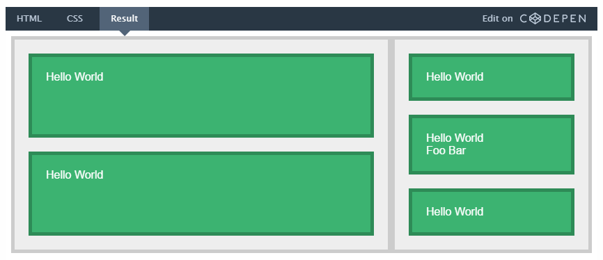
Each of the two columns will contain several vertically arranged articles; therefore, from these two elements, we, in turn, must also make flexbox-containers.
So we need the articles:
- placed vertically inside the column-container;
- occupied all available space.
The flex-direction: column rule specified for the container, along with the flex: 1 rule specified for the child element, allows the article to fill all the free space vertically, while the height of the first two columns will remain unchanged.
Click to view in action.
3. Making a container from the article
Now, to further expand our capabilities, let's present each article as a flexbox container. Each such container will contain:
- title;
- paragraph;
- Information panel with the name of the author and the number of comments;
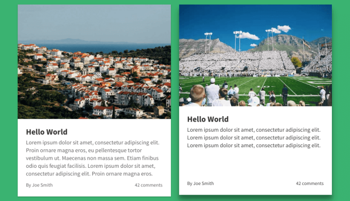
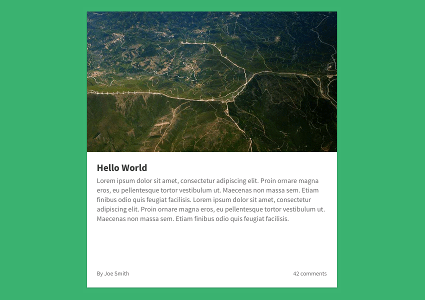
- some adaptive picture.
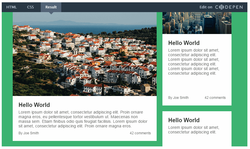
Here we use the Flexbox to “press” the information panel to the bottom of the element. Here, look what result we expect to get.
And here is the code itself:
<a class="article first-article"> <figure class="article-image"> <img src=""> </figure> <div class="article-body"> <h2 class="article-title"> <!-- --> </h2> <p class="article-content"> <!-- --> </p> <footer class="article-info"> <!-- --> </footer> </div> </a> .article { display: flex; flex-direction: column; flex-basis: auto; /* */ } .article-body { display: flex; flex: 1; flex-direction: column; } .article-content { flex: 1; /* , */ } Items inside the article are arranged vertically by using the flex-direction: column rule.
We also applied the flex: 1 property to the article-content element, thereby stretching it to the entire free space and pressing the article-info to the bottom. The height of the columns in this case does not matter.
Click to view in action.
4. Add a few nested columns
In fact, we need the left column to include several more columns. Therefore, we need to replace the second element in charge of the article with the columns container that we used earlier.
<div class="columns"> <div class="column nested-column"> <a class="article"> <!-- --> </a> </div> <div class="column"> <a class="article"> <!-- --> </a> <a class="article"> <!-- --> </a> <a class="article"> <!-- --> </a> </div> </div> Since we want the first nested column to be wider, we add the class nested-column to the element, and specify in CSS:
.nested-column { flex: 2; } Now this column will be twice as wide as the second.
Click to view in action.
5. Making the first article with a horizontal layout.
The first article is really big. In order to effectively use the space on the monitor, let's change its orientation to the horizontal.
.first-article { flex-direction: row; } .first-article .article-body { flex: 1; } .first-article .article-image { height: 300px; order: 2; padding-top: 0; width: 400px; } The order property in this case plays a big role, because it allows you to change the order of HTML elements without changing the HTML markup. In fact, the article-image in the code comes before the article-body element, but behaves as if it were after it.

Click to view in action.
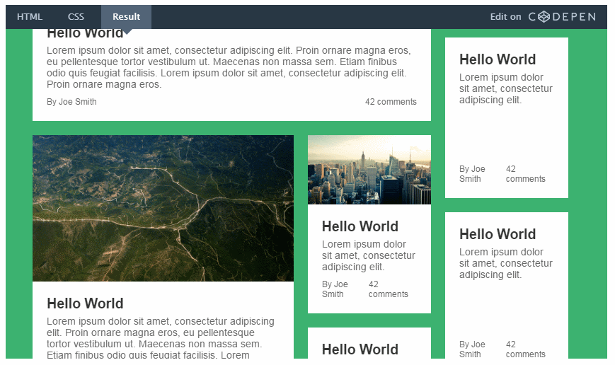
6. Making an adaptive layout
Now everything looks the way we wanted, albeit a bit flattened. Let's fix this by adding flexibility to our layout.
One of the great things about Flexbox is that it is enough to remove the display: flex rule in the container in order to completely disable it (Flexbox), while the rest of its properties (such as align-items or flex ) remain working.
As a result, we can activate an adaptive layout, using the Flexbox only when necessary.
So, we're going to remove display: flex from the .columns and .column selectors , instead packing them into a media query:
@media screen and (min-width: 800px) { .columns, .column { display: flex; } } That's all! On screens with a low resolution, all articles will be placed one above the other, and on screens with a resolution of more than 800 pixels - in two columns.
7. Add finishing touches
To make the layout look more attractive on large screens, let's add some CSS tweaks:
@media screen and (min-width: 1000px) { .first-article { flex-direction: row; } .first-article .article-body { flex: 1; } .first-article .article-image { height: 300px; order: 2; padding-top: 0; width: 400px; } .main-column { flex: 3; } .nested-column { flex: 2; } } The content of the first article is aligned horizontally: the text is located on the left side, and the picture - on the right. Also, the main column has now become wider (75%). The same applies to the nested column (66%).
And here is the final result!

Click to view in action.
Conclusion
Now you yourself can see that you can use Flexbox in your projects without even going into all its subtleties, and the new layout is a vivid example. At least the author really hopes for it.
Source: https://habr.com/ru/post/314034/
All Articles