GPU animations: doing it right
I think everyone already knows that modern browsers can draw some parts of the page on the GPU. This is especially noticeable in the animations. For example, an animation made using the CSS transform property looks much nicer and smoother than an animation made through top/left . However, the question “how to properly do animations on a GPU?” Is usually answered with something like “use transform: translateZ(0) or will-change: transform ”. These properties have already become something like zoom: 1 for IE6 (if you know what I mean;) to prepare a layer for animation on the GPU or composition (compositing), as browser developers prefer to call it.
However, very often animations that worked beautifully and smoothly on simple demos suddenly start to slow down on the finished site, cause various visual artifacts or, even worse, lead to browser crash. Why it happens? How to deal with it? Let's try to understand this article.
One big disclaimer
The most important thing I want to say before we start exploring the details of a GPU composition: it's all one huge hack . You will not find in the W3C specifications (at least for now) a description of the process of a GPU composition, methods of explicitly transferring an element to a separate layer, or even the mode of composition itself. This is just a way to speed up some typical tasks and each browser developer does this in his own way. Everything that you read in this article is by no means an official explanation, but the results of experiments and observations, seasoned with common sense and knowledge of the work of some browser subsystems. Something may be wrong, but something will change with time - I warned you!
How composition works
In order to properly prepare a page for a GPU animation, it is very important not so much to follow the tips found on the Internet or in this article, but to understand how it works inside the browser.
Suppose we have a page with elements A and B that have position: absolute and a different z-index . The browser will draw the entire page on the CPU, send the resulting image to the GPU, and from there it will get to us on the screen.
<style> #a, #b { position: absolute; } #a { left: 30px; top: 30px; z-index: 2; } #b { z-index: 1; } </style> <div id="#a">A</div> <div id="#b">B</div> 
We decided to animate the movement of the A element via the CSS left property using CSS Animations:
<style> #a, #b { position: absolute; } #a { left: 10px; top: 10px; z-index: 2; animation: move 1s linear; } #b { left: 50px; top: 50px; z-index: 1; } @keyframes move { from { left: 30px; } to { left: 100px; } } </style> <div id="#a">A</div> <div id="#b">B</div> 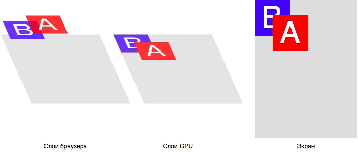
In this case, for each frame of the animation, the browser from the CPU side recalculates the geometry of the elements (reflow), draws a new image with the current page state (repaint), also sends it to the GPU, after which it is displayed on the screen. We know that repaint is a rather expensive operation, but all modern browsers are smart enough to redraw not the entire image, but only the changed parts. And they do it quickly enough, but the animations still lack smoothness.
Recalculation of geometry and redrawing, albeit partial, of the entire page for each step of the animation: looks like a very time-consuming operation, especially on large and complex sites. It would be much more effective to draw two images once: element A and the page itself without element A , and then simply move these images relative to each other. In other words, you need to make a composition of cached images of elements. And this is exactly the task that the GPU does best. Moreover, he knows how to do it with sub-pixel precision , which gives the very smooth animation.
To apply composition optimization, the browser must be sure that the CSS properties to be animated:
- do not affect the flow of the document;
- do not depend on the flow of the document;
- will not require redrawing the element itself.
From the side it may seem that the top and left properties together with position: absolute/fixed do not depend on external factors, but this is not so. For example, the left property can take values in percent, which depend on the size of the .offsetParent , as well as the units em , vh , etc., which depend on the environment. Therefore, it is the CSS properties transform and opacity fit the description.
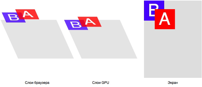
Let's remake our animation: instead of left we will animate the transform :
<style> #a, #b { position: absolute; } #a { left: 10px; top: 10px; z-index: 2; animation: move 1s linear; } #b { left: 50px; top: 50px; z-index: 1; } @keyframes move { from { transform: translateX(0); } to { transform: translateX(70px); } } </style> <div id="#a">A</div> <div id="#b">B</div> Pay attention to the code. We declaratively described the entire animation: its beginning, end, duration, etc. And this allows the browser to determine which CSS properties of the element will change even before the animation begins. Having seen that among these properties there are no those that affect reflow / repaint, the browser can apply optimization with composition: draw two images and transfer them to the GPU.
The advantages of this optimization:
- Very smooth animation with sub-pixel anti-aliasing : it is now engaged in a graphics processor, specially optimized for such tasks.
- The animation does not depend on the CPU: even if at this moment we perform very intensive calculations, the animation will continue to be smooth, as it is performed entirely on the GPU.
It would seem that everything is simple and clear, what problems may arise? Let's take a look at what this optimization actually does.
Perhaps for some it will be a discovery, but the GPU is a separate computer . Yes, an integral part of all modern devices is actually an independent subsystem with its own processors, memory and information processing methods. And the browser, like any other program or game, is forced to communicate with the GPU just as with a separate device.
To better understand this, just remember AJAX. For example, you need to register a user by the data that he entered in the authorization form. You cannot tell the remote server “hey, take the data from these fields here and that variable and save it in the database” because the server does not have access to the browser’s memory. Instead, you collect the necessary data from the page into some kind of payload with a simple data format (for example, JSON) and send it to the server.
The same thing happens during composition. Since the GPU, in fact, is a remote server, the browser on the part of the CPU is forced to first prepare a special payload, and then send it to the device. Yes, the GPU is very close to the CPU, but if 2 seconds to send and receive a response via AJAX are often quite acceptable, then an extra 3-5 milliseconds to transfer data to the GPU can seriously degrade the quality of the animation.
What is the payload for a GPU? As a rule, these are images of layers and additional instructions that determine the sizes of layers, their location relative to each other, instructions for animation, etc. Here is how the process of creating the load and its transfer to the GPU looks approximately:
- Render each composite layer into a separate image.
- Preparation of data on layers (location, size, transparency, etc.).
- Shader preparation for animation (if using CSS Transitions or Animations).
- Sending data to the GPU.
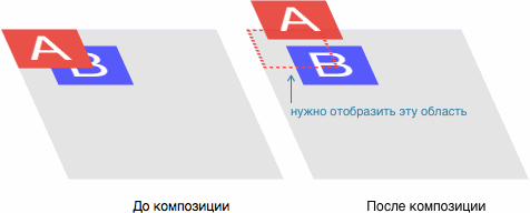
Thus, each time you add a magical transform: translateZ(0) or will-change: transform element, you start this whole process. You already know that repaint is quite a resource-intensive task. But in this case everything is still worse: quite often the browser cannot use the incremental repaint and redraw only the changed part. It must re-draw those parts that were hidden by the new layer:
Implicit composition
Let's go back to our example with elements A and B Previously, we animated element A , which is on top of all other elements on the page. The result was a composition of two layers: a layer with A and a layer with B and the background of the page.
Now let's change the task: we will animate the element B ...
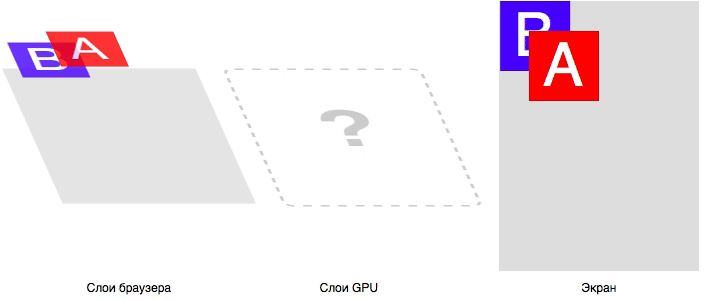
... and we have a logical problem. Element B must be on a separate composite layer, the final composition of the image that the user sees occurs on the GPU. But the element A , which we don’t touch at all, should visually be on top of the element B
We recall One Big Disclaimer - in CSS there is no special mode for a GPU composition, this is just an optimization for solving specific problems. We must get the elements A and B exactly in the order that was given through the z-index . What should the browser do in this case?
Exactly: it will transfer element A to a separate composite layer! Adding another heavy repaint:

This is called implicit composition : one or more non-composite elements that are above the composite element in the z-index also become composite, that is, they are drawn into a separate image, which is then sent to the GPU.You will encounter implicit composition much more often than you think: the browser places an element on the composite layer for many reasons:
- 3D transformations:
translate3d,translateZ, etc. - The elements
<video>,<canvas>,<iframe>. - Animation
transformandopacityviaElement.animate(). - Transform and
opacityanimation via CSS Transitions and Animations. position: fixed.will-change.filter.
Read more in the CompromitingReasons.h file of the Chromium project.
At first glance, it may seem that the main problem with GPU animations is unexpected, heavy repaint. But it is not. The biggest problem is ...
Memory consumption
And again, we remember that the GPU is a separate computer. The rendered images of the layers need not only be transferred to the GPU, but also stored there in order to animate beautifully later.
How much does the image of one layer weigh? Let's take an example. Try to guess the size of a regular rectangle, 320 × 240, filled with solid color #ff0000 .
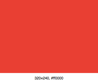
Usually web developers think like this: “this is a single-color image ... I’ll save it to PNG and check the size, it must be less than a kilobyte”. And they will be right: this image really weighs only 104 bytes in PNG.
But the problem is that PNG (like JPEG, GIF, etc.) is a format for storing and transferring data. To draw such an image on the screen, the computer must unpack it and present it as an array of pixels . Thus, our image in the computer memory will occupy 320 × 240 × 3 = 230,400 bytes . That is, we multiply the width of the image by its height - so we get the number of pixels. Then the number of pixels is multiplied by 3, since the color of each pixel is described by 3 bytes: RGB. If the image were translucent, we would be multiplied by 4, since we need another byte to describe the value of transparency (RGBA): 320 × 240 × 4 = 307,200 bytes .
The browser always draws composite layers to RGBA images: apparently, there is not a sufficiently fast and efficient way to automatically determine if the DOM element being drawn has transparent areas.
Consider a typical example: a carousel of 10 photos of size 800 × 600. You decided to make a smooth change of images in the carousel, so in advance of each photo, you will-change: transform , and then use JS to animate transitions to the user's action, for example, dragging. Let us calculate how much additional memory is required to simply display such a page: 800 × 600 × 4 × 10 ≈ 19 MB .
19 MB of additional memory was required to render just one control per page. And considering the love of modern developers for SPA-pages with a lot of animated controls, parallax effects, retina-images and other visual pieces, an additional 100–200 MB per page is far from the limit. Add to this an implicit composition (admit it, haven't you even thought about it before? :) and we’ll get a very sad picture.
Moreover, quite often this additional memory is wasted, just to display the exact same result:
And if for desktop clients it is still not so strongly noticeable, then for mobile devices this problem is particularly acute. First, almost all modern devices use screens with a high pixel density: we multiply the image layers by another 4–9. Secondly, on such devices quite a bit of memory , compared with desktops. For example, the still-not-so-old iPhone 6 has only 1 GB of memory, and it’s common for RAM and VRAM (memory for the GPU). Considering that, at best, a third of this memory will be used by the system itself and background processes, another third by the browser and the current page (and this is on condition that you do not use dozens of frameworks and optimize everything very much), then for GPU special effects will remain about 200-300 MB. Moreover, the iPhone 6 is an expensive high-end device, on more affordable devices, memory is much less.
You may have a reasonable question: is it possible to store pictures on the GPU in PNG format to save memory? Yes, technically it is possible, but the feature of the GPU is that each layer is drawn pixel-by-pixel . This means that in order to draw one pixel on the screen, you will need to re-decode the PNG image each time to get the desired color. In this case, the speed of the simplest animation is unlikely to rise above 1 fps.
It is worth noting that GPUs have their own image compression formats , but they are not even closely comparable to PNG or JPEG in terms of compression, and the possibility of using them, including limited support for the GPU itself.
Pros and cons
Now that we have reviewed the theoretical part of the work of animations on the GPU, let us, for convenience, gather all the pros and cons of using them.
Behind
- Very smooth animations with sub-pixel accuracy and speed of 60 fps.
- Properly made animations work in a separate thread and are not blocked by heavy JS operations.
- "Cheap" 3D-conversion.
Vs
- To remove an element on the composite layer, an additional repaint is required, sometimes it can be very slow (full drawing of the element instead of incremental).
- The drawn layer must be transferred to the GPU: the more layers and the larger their size, the more time is required for transmission. On medium and weak mobile devices, you can notice a "blink" when the element disappears and immediately appears.
- Each composite layer takes up additional memory. Memory is a very limited resource on mobile devices. Excessive memory consumption can lead to browser crash!
- Implicit composition: if you do not follow it, the time for repaint increases, memory consumption and chances to “drop” the browser increase.
- Visual artifacts: drawing text in Safari, disappearing or distorted page fragments.
As you can see, for all its unique virtues, GPU-animation has a number of very significant drawbacks, the main of which are repaint and memory consumption. Therefore, all of our optimizations will be linked precisely with these two points.
Customize the environment
Before we begin to optimize the site for high-quality animations, we need to stock up on special tools that will not only show us the result of optimizations, but also problem areas.
Safari
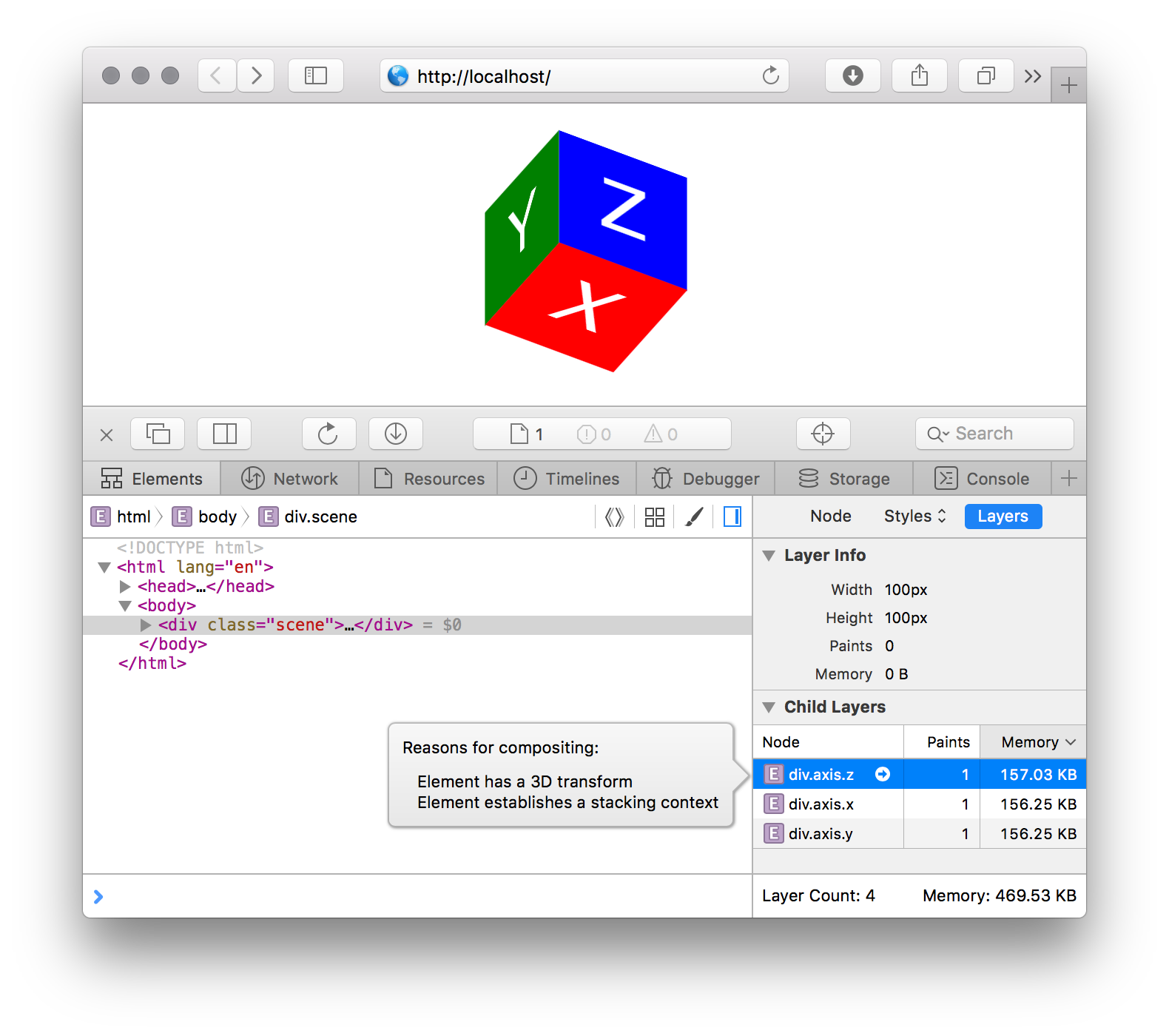
Safari Web Inspector has a great tool built in that allows you to see all the composite layers on the page, the memory they use, and also - which is no less valuable - show the reason for moving the item to a separate layer . To see this tool:
- In Safari, open Web Inspector with ⌘⌥I. If it does not work, try in Preferences> Advanced enable the Show Develop Menu in menu bar option and try again.
- In the Web Inspector, open the Elements tab and select Layers in the right column.
- Now, when you click on the elements in the main part of the Elements tab, on the right you will see information about the composite layer for this element (if it exists), as well as a list of all child elements with their own layers.
- If you click on the child layer, the reason for the composition is displayed - why the browser decided to move the element to a separate composite layer.
Google chrome
DevTools also has a similar tool, but to enable it you need to set a special flag:
- In your browser, go to
chrome://flags/#enable-devtools-experimentsand enable the Developer Tools experiments flag. - Open DevTools using ⌘⌥I (Mac) or Ctrl-Shift-I (PC), click on the icon
 in the upper right corner and go to the Settings section.
 - Select the Experiments section in the menu and turn on the Layers panel.
- Close and reopen DevTools: you will see the Layers panel.
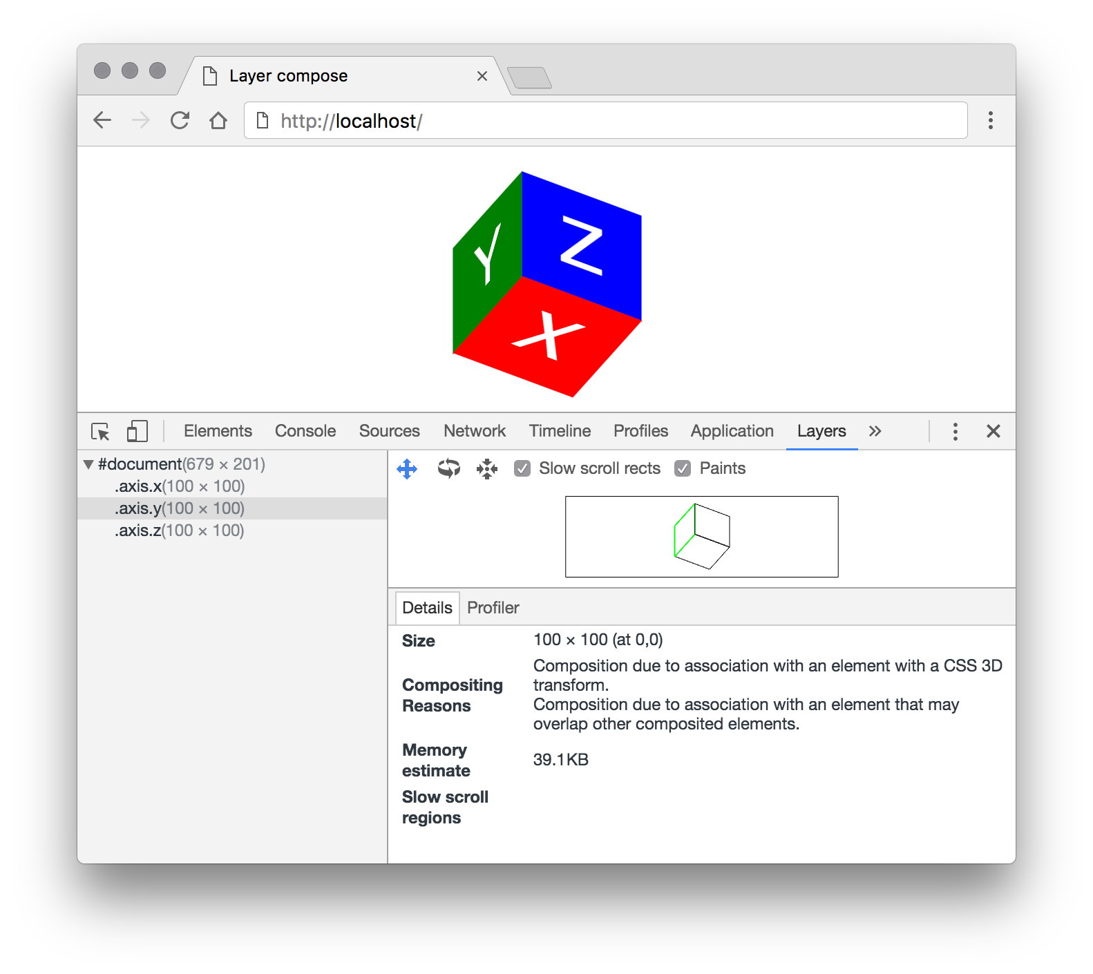
This pane displays all active composite layers of the page as a tree. If you select a layer, information about it will be available: size, amount of memory used, the number of redraws, as well as the reason for moving to the composite layer.
Optimization
So, we set up the environment and now we can proceed directly to the optimization. We have already identified two main problems with the use of composite layers: an extra repaint, after which the image of the layer needs to be transferred to the GPU, and memory consumption. Therefore, all our optimizations will be aimed at reducing redraw cycles and reducing memory consumption.
Avoid implicit composition
Very simple, obvious, but the most important optimization. Let me remind you that an implicit composition is the removal of elements onto a separate composite layer only in order to correctly link it onto the GPU with another, explicit composite layer (video, CSS animation, etc.). Especially strongly this problem can be felt on mobile devices at the start of the animation.
Consider a small example.
We have the element A , which we want to animate by user action. If you look at the page using the Layers tool, we will see that there are no additional layers on it. However, immediately after clicking on the Play button, several composite layers will appear, which will disappear by the end of the animation. Timeline, , repaint :

, .
- , , . — .
- Play
A— CSS Transitiontransform. ,z-indexAB. . - repaint. -, - , - — . .
- GPU, , . , , GPU . «» : .
A. , , –AB. , ( repaint) GPU. , .4, «».
, :
z-index.<body>. , - , DOM- . , ,<body>.- , , CSS-
will-change. ( !) . , .
transform opacity
, , GPU. , , , , , , 3D-. .
: . , :
<div id="bg-change"></div> <style> #bg-change { width: 100px; height: 100px; background: red; transition: background 0.4s; } #bg-change:hover { background: blue; } </style> CPU, repaint . GPU: :
<div id="bg-change"></div> <style> #bg-change { width: 100px; height: 100px; background: red; } #bg-change::before { background: blue; opacity: 0; transition: opacity 0.4s; } #bg-change:hover::before { opacity: 1; } </style> , . - .
. ?

, 40 000 (39 ), — 100 , 400 . Why? :
<div id="a"></div> <div id="b"></div> <style> #a, #b { will-change: transform; } #a { width: 100px; height: 100px; } #b { width: 10px; height: 10px; transform: scale(10); } </style> , #a — 100×100 (100×100×4 = 40 000 ), #b — 10×10 (10×10×4 = 400 ), 100×100 transform: scale(10) . #b - will-change , transform GPU .
: width height , transform: scale(…) . , . , , , 5–10% : , .
CSS Transitions Animations
, transform opacity CSS Transitions Animations GPU. JS, , , , : translateZ(0) transform , will-change: transform, opacity , .
JS- ,requestAnimationFrame.Element.animate()CSS-.
CSS Transitions/Animations , — JS , CSS, .
? , JS - ?
CSS- : GPU . , , GPU. JS , — . 60 ( JS ) GPU, . , , CSS-, :
, , JS . CSS- , ( ), JS .
CSS, . , JS.
, Chaos Fighters . - . , , GPU, , . iPhone 5 — Apple — . .
, , .
, - . : CSS-. — : , <img> CSS- :
. — .
. , , . , . , .
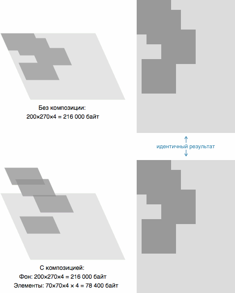
: .sun , ; .
, , . : 500×500×4 ≈ 977 .
, 500×500 , , ( ) , 3000×3000×4 = 36 ! …
Layers . : . , GPU. - (), — .
, , ! , .
, : GPU , . , :
- : 500×500×4 ≈ 977
- 12 : 250×40×4 × 12 ≈ 469
2 . , , . , GPU, .
, CSS , . transform . 360˚. , @keyframes , .
JS-, , ..
, 2 .
But that's not all. — , , . . , . c GPU , : .
10%. 250×0.9 × 40×0.9 = 225×36 . , 250×20 , 250/225 ≈ 1.111.
: background-size: cover; .sun-ray , , transform: scale(1.111) .
, , PNG- . , , , PNG-.
GPU 225×36×4 × 12 ≈ 380 ( 469 ). 19% , downscale . 0.1 , , , , 977 / 380 ≈ 2.5 !
, , : CPU, JS-. , , . , GPU, . .
Lessons learned
, Chaos Fighters, . :
- , . .
- Layers, .
- , . ,
position: fixed,<iframe>,<video>. - , . (. Layer Squashing ) — , . : , . ,
translateZ(). :translateZ(0.0001px),translateZ(0.0002px).. , . transform: translateZ(0)will-change: transform, . GPU , . : . — «» .
One Big Disclaimer : GPU- -. , . , Google Chrome CPU GPU, , . Safari (, background-color ) CPU GPU , .
, GPU .
')
Source: https://habr.com/ru/post/313978/
All Articles