Small design algorithms against large decay

It is never too late to drink Borjomi. Even if it seems that RGB will never become brighter, users will not begin to understand you with a half-pixel, and no one is going to return the “VKontakte” wall. There is a way out - you have to run!
The product of a small studio is an excellent training for running at short distances. In just 3 months from 💩, sticks and a pinch of creativity, you can collect quite a decent project. Yes, it will be a one-day butterfly - beautiful, impressive, completely healthy, and to be buried tomorrow. Sometimes the rate plan includes resuscitation services, rental of an artificial respiration unit, adrenaline injections. Anyway, it is better to make a will in advance.
')
The product of a large company is a real Olympic marathon . All Inclusive. Symptoms: malaise, fatigue, nausea, toxic verbal discharge of a dark yellow color, blurred vision, tinnitus, acute allergic reactions to the product or related components.
“Run, I'll hold them up.”
By all the rules, points are located on the marathon route, offering runners water, energy drinks, food, inexhaustible cookies, as well as a young and friendly team in a dynamic company . All this at first relieves the symptoms and gives strength, but after running at least 1/3 of the distance, the following happens:
- The leg to run is no longer possible.
- Begin to overcome doubts that he chose the university, profession, goals in life. Regret that did not go to vocational school.
- Smooth immersion in the phase “not for you, my rose blossomed”.
- The meaning of further movement dissolves in memories of past youth and lost opportunities.
- It is time to stop. "Mom, give birth to me back."
In the end: the frontal crash test balance of mental balance with a concrete lack of end and edge ends in failure.
However, the essence of the marathon is not to come running first. The main thing is to keep moving. This is a victory. Small, personal, but a victory. But small. But with a capital “P”.
To continue the movement, you need to somehow love the product. After all, not only the product is obliged to love you with salary, gym and LCA, but in return it must be cherished, cherished and improved.
There is one thing but.

In real life, it is very difficult for a specialist to love Sasha Gray wholeheartedly (the girls themselves will choose an analogue without any problems). Everyone knows who it is, everyone wants to work with her, but family and children - come on, bye. The knowledge that you are not the first, and the confidence that not the last, come first to put out the fire of love.
In HeadHunter, we found how to deceive the body and make it re-experience this forgotten feeling. That feeling, when the execution of marital debt occurs on their own.
The ritual is as follows:
- Imitating the terminal stage of sadness, we go to the product. Patients do not beat.
- With the eyes of a Shrekov cat, please set aside time for the functions that are
far from being alwaysneeded by users, hiding completely personal motives to the last. - We are waiting for the fire of retribution to go out.
- We get permission to spend half the time we wanted.
- Five minutes party - and for work.
A small example from life.
Normal Monday is Wednesday. We sit each on his own lawn, tearing up weeds, planting “Canada Green”. Soul hurts, the heart is crying, and here you are here:
Nikit, you forgot to specify the highlight color of the button. Time has gone.
So as not to sprinkle all with incomprehensible letters, and myself with obscene language - I will clarify what this is about. Interfaces should always give the user feedback from his actions. Somewhere barely noticeable, somewhere like fireworks on May 9th, depending on the context and budget of the holiday. The user notices him and understands that he pokes not into a brick, but into a living organism.
“Your call is very important to us! The operator will answer in 40 minutes. ” “The subscriber is switched off or is out of network coverage”. Understanding that the system is functioning, the request is being processed, the pedals are spinning - better than African American silence in response.
Fidbeck is a universal tranquilizer of hatred and misunderstanding. For some, it is a loose change, but “The user's life consists of trifles, and not only of funnels, conversions, and collutekshenov”. Confucius

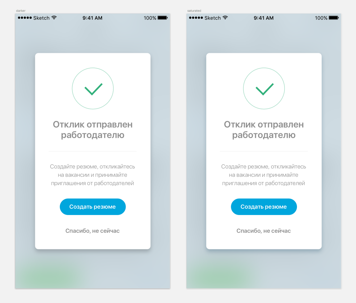
So here. One of the components of the feedback - highlighted (Fig. May 8) - the state of the control at the time of touch, designed to embellish the event and take care.
At first I went to pick up the missed color, when I suddenly remembered that in life there is nothing better than to look at fire, water and how your work is done for you. Solution - an algorithm that will generate the desired shade?
Moreover, I have already done something similar, campaigning for anonymous authors to create a resume. Then it was in the shadow of a pop-up window.
The eye noticed (noticed?), If you take the background color and just make it darker - it turns out very bad music. But darker and richer - already Bieber. I want to throw underwear on the screen.

With standard iOS tools, you can only do darker - boring and visually and professionally. Fortunately, the whole team has a well-developed sense of beauty: they even noticed a difference in the screenshot in Slak, and even a barely noticeable improvement was confirmed. Terrible shades will be punished.
The product was respected, the developer was intrigued. We decided to punish everything that required punishment in the framework of this algorithm. We were captured on the one hand - laziness, on the other - the desire to stretch the gray matter.
Reade set Go! Three hours - and you're done! A piece of love successfully integrated into the heart of the product.
Hey! This is where it works for 3 hours? Are you crazy there or something?
Good good. In fact, we did the algorithm in an hour:
1. In the first 30 minutes I picked up the shades to the colors from the guides, tested them on various elements, revealed the dependency and described it to the developer in a low-level design language: here it is, like him, this is the type here, and this is the type here.

2. In the last 30 minutes, Dima turned it into a working class, ready for work and defense, connected it to all kinds of controls in a test build - it looks cool, it works like a clock.
And in the two-hour interval - the informational Sahara, where we were looking for a translator from the abstract language to the formalized one.
Sorcery with RGB values did not work. That blue turned into green, then a man into a monkey. The algorithm did not go out in any way, I had to do a cesarean. Let's go to the web to read the works of smart people.
It turned out that the designer is not real!
Internet surfing confirmed: inquisitive pay more. There are not only RGB (for screens) and CMYK (for printing) in the world, but also many different color models, the existence of which I guessed, but there are definitely no ways of using them.
Our savior is HSB (Hue / Hue, Saturation / Saturation, Brightness / Brightness). Only two parameters fulfill any one specific desire. We take a shade, we translate RGB to HSB, we add a saturation (S + x), we remove brightness (By), we convert back to RGB. End of the lesson.

And I did not know that colors can be cruel.
Then someone who knows nervously will cry out “Loch is fate!”, Someone nostalgically “Stalin is not on you!”, And someone will discover nano-America, and there is nothing shameful about it.
After all, even the smallest knowledge is such, non-punctual. On a visit not in a hurry. And that means - willpower in a fist and on the hunt. Thousands of kilometers of off-road networks, hundreds of hours in complete ambush, dark nooks of articles and encyclopedias, false prophets and just fanatics - anything for a long-awaited meeting. Otherwise, you can sit your whole life, wait: the glade is covered, the kettle is boiling - but no one.
The secret of the universe, of course, will not reveal. But he will tell you in which direction to look for the next riddle. There is no map, topographical cretinism exists, but it is enough introductory for further adventures. Otherwise, which of us is Holmes?
Conclusion: # think_ as_designer_act_ as_inventor. Morale is not. But to be smart and well read is awesome!
Sorry for the attention.
Source: https://habr.com/ru/post/313970/
All Articles