Nine secrets about UX from practicing experts
Antoine Valot, an expert on user experience from Switzerland, in his blog on Medium , published a very good article, most consonant with my practical experience. Having decided to adapt this text, I specifically provided it with my own thoughts and corrections on Russian realities, so that the article would not be a literal translation, but rather a new joint work, revealing some of the secrets of the UX profession.

Yes, today it is difficult to surprise anyone with a new “next article on usability”, in which for the hundredth time all the same obvious conclusions will be made: love your user, you will have no other arguments than test results, make yourself an idol from Jobs ...
But the revelations from the real practitioner who have been researching and analyzing for years, and are not shy about admitting their own mistakes, are not yet so many. Antoine Valot does not hesitate to admit that he frankly messed up a bunch of times during his professional career, but it was the mistakes made, their adoption and deep subsequent analysis that allowed him to grow and develop as an expert, which would not have happened if he was silent about hiding problems. And now we have a unique opportunity to learn for free from the mistakes of others.
')
1. Color does not matter. No
Users do not understand your color coding. Green can mean “positive” for you, but to someone else on the other side of the screen, it can mean “unreadable text” or “goose droppings” or “Let's all save the planet from the oil oligarchs”.
Each person sees each color in a completely different way, and for several years at the very beginning of life, he learns to accurately hang the necessary verbal label “green” - on all those things with a certain property that his parents have taught him to recognize.
People love some colors, and hate others, and this is completely unpredictable. Playing in colors - you can never win.
Color is not a mathematical term, not a clear wording, but only an irrational perception. Without context and emotion, all color coding itself does not make the slightest sense.
Here are real examples of how people evaluate all your color solutions:
2. Location is most important
Since ancient times, it was the good location of individual cities or states at the crossroads of world trade routes - it became for them a ticket to a happy comfortable life. And now it is the location of the elements in the interface that determines its quality. Users do not care about your icons, labels and button colors - you can change their appearance and rounding quality, at least every day, completely painless (and without a particular positive effect).
But changing the location, moving the most important blocks, disappearing (hiding) any elements will be the most unforgivable mistake. People use their natural positional memory to remember how to use a site or application. Moving the key elements of the interface, changing the usual positions is perceived by all, as the most sophisticated form of human torture of the so-called "muscle memory".
If you want to know what a pure unfiltered burning hate is, start moving elements in an already running interface.
3. No one reads
Most likely, you will not even continue to read this paragraph, because it is still so clear and obvious. Yes, you heard this thesis a thousand times, saw slides, heard webinars, and don’t want to lose precious seconds of your only life for the next chewing of this banalism.
“Damn Captain obvious, I’m also a guru, I’ll better go pouring coffee” - isn't it?

So if this is true, why do we constantly write explanatory text? Why do we allow long paragraphs to be written in our interfaces? Why do we pretend that hints, user guides, and frequently asked questions are the right solution for usability problems?
4. Navigation implies a bad interface.
A long time ago, I personally already wrote a similar article on Habré , and it is extremely pleasant to see consonant confirmation of my thoughts on blogs with Western colleagues.
So, never be proud of your navigation, or beautiful menus. If your application has a critical need to create navigation at all, you're already on your way to failure. Guide give only in labyrinths.
Your initial task is to help the user achieve his goal. In the most natural way - not checking the map, not determining your location by the sun and compass, not asking the way from passersby, not waiting for a blizzard under the open sky - just immediately put into your hand all that would be due to him at the finish of a difficult and dangerous journey across all your screens and pop-ups.
If you have done your job correctly, then any interface will perform all the necessary operations consistently and seamlessly, in accordance with a clear and thoughtful algorithm, automatically switching screens. And best of all, when a person can achieve his goal immediately on the first screen (ideally, without any screens at all).
But, seeing the next menu, I clearly understand that you were not able to create a single inseparable user script and chose to regularly pull it out of the “stream” just for the sake of doing all the work for you.

Ideally, the design should make all the choices for the user. That is what determines its quality.
Not all things are equally important. There are some things you should do first, some things you should do as much as you can, and some things you can completely ignore.
Here's how to endure the hierarchy of action for importance:
5. Content is good, interface is bad
The content of the interface itself is the solution. If you do not design the content itself, predetermining its dimension, emotional intensity, the rhythm of the narration, then you are simply developing nonsense.
Every time you create frames with Lorem Ipsum, you insult your future users, and abuse the trust of your client. Do you create wooden frames without paintings inside and hope that someone will come to praise you for your efforts? They are thrown on the kindling - and rightly so.
6. Procrastination relieves you of difficulties
Whatever you are designing now - make the sitemap and navigation last. Best of all - do not do them at all. It is not joke.
Immediately grasp the central screen, the one that will fully and inextricably solve the main need of the user. It is better to spend all the time, all the forces and the entire budget of the project on this section \ page, but make sure by 200% that it ideally meets the expectations and aspirations of people. Focus on every detail there, give the reason for existence and meaning for each pixel on this key page.
Later, when the deadlines are almost over, and your boss will start demanding from you all the remaining 250 secondary pages and screens (aka News, About the Company, Contacts, Registration ...) with which they were going to take out the brain to the user - just pretend to be a deaf and dumb idiot. To explain that you did not do all this garbage just because it is not needed at all, to quote: “The best interface is the complete lack of interface” is useless.
Just be proud, you solved the main problem of the user and saved him from seeing tons of virtual garbage. Monk William Ockham in heaven will pray for all of us for the fact that we did not produce an army of superfluous and useless entities.
7. User Testing Kills Babies
No, wait, of course, testing the interface on ordinary people is good, and this is an indisputable and well-known fact. No matter how amazingly smart you are, or how great your user interface is, but ten minutes of user testing in the early stages of the process will surely save you from further degrading setbacks.
However, such testing does not exempt you from responsibility and unnecessary effort. Still, you need to be wise and sensitive, work through all the details, and go through the crazy, tortuous way of the design process on your own. You still have to be a genius, especially when it comes to revolutionary projects not previously familiar to users. It is also necessary to constantly keep in mind that among people there are regularly narrow-minded, short-sighted, vain, lazy and just stupid. And realizing this, you will continue to devote your whole life to help and optimize the lives of everyone else.
When you have a great new idea, it will begin its life in the form of a barely viable and fragile germ. It needs nurturing and tender care in order to turn into a fully formed solution that can stand on its own feet and withstand casual handling of ordinary users.
And here the early testing of a new idea on unsuspecting users will look like a test of a predatory wolf of fresh lamb. With a slightly predictable result.
So do not let your interface go into production without checks, but check only when your idea is fully formed and ready.
It would be logical now to ask: "Well, how do you know when the interface will be ready?"
Antoine Valot believes that only when you have worked on it long enough to see for yourself the first significant shortcomings, such as the internal problems of matching the original goals and objectives, with the solution you proposed.
It is not so important as it will look visually together, but you must be sure that your solution can really achieve the right goals even with the most incompetent user. Only after this steady feeling and it is worth sending the solution to user testing - only in order to strengthen your confidence (or destroy it to pieces in 95% of real cases).
Sometimes you may think that the way coders disfigure your interface is already beyond your competence. Maybe so, but you can still manage this process. If your interface solution turned out to be incomprehensible or too complicated for your own development team - what will happen to the end user?
Developers are essentially your first auditors. Of course, coders are not quite ordinary people, just like you are. Ordinary ordinary people do not drink smoothies and do not consider the game in the console - for serious and difficult work. But you should take care of all without exception. And here are some practical secrets about how to help your colleagues:
8. Coders learn from the worst examples.
Medium-hand developers rarely explore well-designed applications and sites to learn about the best features and solutions. No, they begin their training at demonstrations and manuals that attempt to explain complex programming concepts using far-fetched, and often simply ridiculous, examples. However, the same absolute isolation from the world can be found in any test task for a designer’s job.

First, designers create fictional people who never lived on Earth in the form of Characters and compose the most absurd problems and needs for them, then the developers (who know the basics of their profession through overly simple, poorly designed, stupid scripts) build their application on the basis of several inconclusive frames. And then it all crashes into a cake about the real world.
No one ever thinks about the real economic benefits of these training examples, no one tests when assessing the "correctness" of the next test design solution. Fictional world, fictional people, non-existent problems. That is why everything is so bad.
So maybe you should be a little more specific with your specifications?
9. Programmers love absurdity and automation.
Programmers in the course of work will have to worry about things about which no normal person would ever think. You simply drag the “Last Name” field from the panel in Axure to the center of the future page, without thinking about it. But your coder already has a hundred alarms related to this:
For any ordinary person, all these questions are absurd. But for coders, they make sense. And so, in order to learn how to think like a simple user, first learn to reason like a programmer sitting in the same room with you, and learn to foresee his fears.
And best of all - please him for its automation of everything and everyone. Make the bed weed itself - and this will give you a bunch of respects and social bonuses from the entire development team.
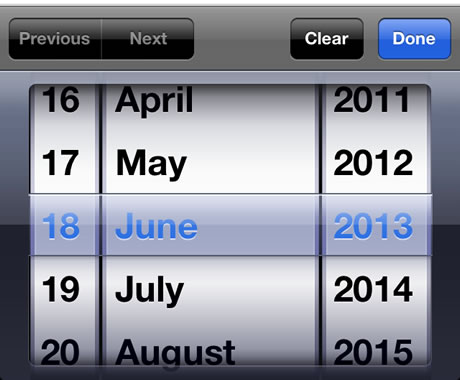
For example, instead of the idiotic select field with the choice of the year of birth with infinite scrolling - ask the user simple questions about the knowledge of the era. For example, “who is Konstantin Ustinovich Chernenko”.
Well, if the lad is so cool that in his 15 really knows who it is - to hell with it, the type of tits on your site will definitely not make him worse.

These are uncomplicated advice, which took years and years of hard work to understand.
All great rakhmet and enjoy the ride.
Yes, today it is difficult to surprise anyone with a new “next article on usability”, in which for the hundredth time all the same obvious conclusions will be made: love your user, you will have no other arguments than test results, make yourself an idol from Jobs ...
But the revelations from the real practitioner who have been researching and analyzing for years, and are not shy about admitting their own mistakes, are not yet so many. Antoine Valot does not hesitate to admit that he frankly messed up a bunch of times during his professional career, but it was the mistakes made, their adoption and deep subsequent analysis that allowed him to grow and develop as an expert, which would not have happened if he was silent about hiding problems. And now we have a unique opportunity to learn for free from the mistakes of others.
')
And for starters, "Four common truths about design":
1. Color does not matter. No
Users do not understand your color coding. Green can mean “positive” for you, but to someone else on the other side of the screen, it can mean “unreadable text” or “goose droppings” or “Let's all save the planet from the oil oligarchs”.
Each person sees each color in a completely different way, and for several years at the very beginning of life, he learns to accurately hang the necessary verbal label “green” - on all those things with a certain property that his parents have taught him to recognize.
People love some colors, and hate others, and this is completely unpredictable. Playing in colors - you can never win.
Color is not a mathematical term, not a clear wording, but only an irrational perception. Without context and emotion, all color coding itself does not make the slightest sense.
Here are real examples of how people evaluate all your color solutions:
Any color: - Oh, this thing has a color.
Other color: - Nichosi, this thing is not similar to other things.
Gray: - Apparently, this thing is broken.
Red: - The designer hates all of us and wants to beat out.
2. Location is most important
Since ancient times, it was the good location of individual cities or states at the crossroads of world trade routes - it became for them a ticket to a happy comfortable life. And now it is the location of the elements in the interface that determines its quality. Users do not care about your icons, labels and button colors - you can change their appearance and rounding quality, at least every day, completely painless (and without a particular positive effect).
But changing the location, moving the most important blocks, disappearing (hiding) any elements will be the most unforgivable mistake. People use their natural positional memory to remember how to use a site or application. Moving the key elements of the interface, changing the usual positions is perceived by all, as the most sophisticated form of human torture of the so-called "muscle memory".
If you want to know what a pure unfiltered burning hate is, start moving elements in an already running interface.
3. No one reads
Most likely, you will not even continue to read this paragraph, because it is still so clear and obvious. Yes, you heard this thesis a thousand times, saw slides, heard webinars, and don’t want to lose precious seconds of your only life for the next chewing of this banalism.
“Damn Captain obvious, I’m also a guru, I’ll better go pouring coffee” - isn't it?
So if this is true, why do we constantly write explanatory text? Why do we allow long paragraphs to be written in our interfaces? Why do we pretend that hints, user guides, and frequently asked questions are the right solution for usability problems?
4. Navigation implies a bad interface.
A long time ago, I personally already wrote a similar article on Habré , and it is extremely pleasant to see consonant confirmation of my thoughts on blogs with Western colleagues.
So, never be proud of your navigation, or beautiful menus. If your application has a critical need to create navigation at all, you're already on your way to failure. Guide give only in labyrinths.
Your initial task is to help the user achieve his goal. In the most natural way - not checking the map, not determining your location by the sun and compass, not asking the way from passersby, not waiting for a blizzard under the open sky - just immediately put into your hand all that would be due to him at the finish of a difficult and dangerous journey across all your screens and pop-ups.
Moving through the interface, downloading applications, filling out forms, searching for results - will never be the real goals of a live user.
If you have done your job correctly, then any interface will perform all the necessary operations consistently and seamlessly, in accordance with a clear and thoughtful algorithm, automatically switching screens. And best of all, when a person can achieve his goal immediately on the first screen (ideally, without any screens at all).
But, seeing the next menu, I clearly understand that you were not able to create a single inseparable user script and chose to regularly pull it out of the “stream” just for the sake of doing all the work for you.
Ideally, the design should make all the choices for the user. That is what determines its quality.
We now list three practical revelations about the design process itself:
Not all things are equally important. There are some things you should do first, some things you should do as much as you can, and some things you can completely ignore.
Here's how to endure the hierarchy of action for importance:
5. Content is good, interface is bad
The content of the interface itself is the solution. If you do not design the content itself, predetermining its dimension, emotional intensity, the rhythm of the narration, then you are simply developing nonsense.
Every time you create frames with Lorem Ipsum, you insult your future users, and abuse the trust of your client. Do you create wooden frames without paintings inside and hope that someone will come to praise you for your efforts? They are thrown on the kindling - and rightly so.
Without ready for 100% content - any prototype is not ready and at 1%. By the way, a whole chapter was devoted to the first Russian UX Textbook.
6. Procrastination relieves you of difficulties
Whatever you are designing now - make the sitemap and navigation last. Best of all - do not do them at all. It is not joke.
Immediately grasp the central screen, the one that will fully and inextricably solve the main need of the user. It is better to spend all the time, all the forces and the entire budget of the project on this section \ page, but make sure by 200% that it ideally meets the expectations and aspirations of people. Focus on every detail there, give the reason for existence and meaning for each pixel on this key page.
Later, when the deadlines are almost over, and your boss will start demanding from you all the remaining 250 secondary pages and screens (aka News, About the Company, Contacts, Registration ...) with which they were going to take out the brain to the user - just pretend to be a deaf and dumb idiot. To explain that you did not do all this garbage just because it is not needed at all, to quote: “The best interface is the complete lack of interface” is useless.
Just be proud, you solved the main problem of the user and saved him from seeing tons of virtual garbage. Monk William Ockham in heaven will pray for all of us for the fact that we did not produce an army of superfluous and useless entities.
7. User Testing Kills Babies
No, wait, of course, testing the interface on ordinary people is good, and this is an indisputable and well-known fact. No matter how amazingly smart you are, or how great your user interface is, but ten minutes of user testing in the early stages of the process will surely save you from further degrading setbacks.
Interface testing rules consist of 1 paragraph: If you do not do this, you are an idiot.
However, such testing does not exempt you from responsibility and unnecessary effort. Still, you need to be wise and sensitive, work through all the details, and go through the crazy, tortuous way of the design process on your own. You still have to be a genius, especially when it comes to revolutionary projects not previously familiar to users. It is also necessary to constantly keep in mind that among people there are regularly narrow-minded, short-sighted, vain, lazy and just stupid. And realizing this, you will continue to devote your whole life to help and optimize the lives of everyone else.
In short, testing completely new ideas - sucks. If you do this, you are an idiot.
When you have a great new idea, it will begin its life in the form of a barely viable and fragile germ. It needs nurturing and tender care in order to turn into a fully formed solution that can stand on its own feet and withstand casual handling of ordinary users.
And here the early testing of a new idea on unsuspecting users will look like a test of a predatory wolf of fresh lamb. With a slightly predictable result.
So do not let your interface go into production without checks, but check only when your idea is fully formed and ready.
It would be logical now to ask: "Well, how do you know when the interface will be ready?"
Antoine Valot believes that only when you have worked on it long enough to see for yourself the first significant shortcomings, such as the internal problems of matching the original goals and objectives, with the solution you proposed.
It is not so important as it will look visually together, but you must be sure that your solution can really achieve the right goals even with the most incompetent user. Only after this steady feeling and it is worth sending the solution to user testing - only in order to strengthen your confidence (or destroy it to pieces in 95% of real cases).
And finally, two truths about coders
Sometimes you may think that the way coders disfigure your interface is already beyond your competence. Maybe so, but you can still manage this process. If your interface solution turned out to be incomprehensible or too complicated for your own development team - what will happen to the end user?
Developers are essentially your first auditors. Of course, coders are not quite ordinary people, just like you are. Ordinary ordinary people do not drink smoothies and do not consider the game in the console - for serious and difficult work. But you should take care of all without exception. And here are some practical secrets about how to help your colleagues:
8. Coders learn from the worst examples.
Medium-hand developers rarely explore well-designed applications and sites to learn about the best features and solutions. No, they begin their training at demonstrations and manuals that attempt to explain complex programming concepts using far-fetched, and often simply ridiculous, examples. However, the same absolute isolation from the world can be found in any test task for a designer’s job.
People always learn from the worst and most abstract examples.
First, designers create fictional people who never lived on Earth in the form of Characters and compose the most absurd problems and needs for them, then the developers (who know the basics of their profession through overly simple, poorly designed, stupid scripts) build their application on the basis of several inconclusive frames. And then it all crashes into a cake about the real world.
No one ever thinks about the real economic benefits of these training examples, no one tests when assessing the "correctness" of the next test design solution. Fictional world, fictional people, non-existent problems. That is why everything is so bad.
So maybe you should be a little more specific with your specifications?
9. Programmers love absurdity and automation.
Programmers in the course of work will have to worry about things about which no normal person would ever think. You simply drag the “Last Name” field from the panel in Axure to the center of the future page, without thinking about it. But your coder already has a hundred alarms related to this:
What if a person does not have a last name?
What if their last name is expressed as a mathematical equation?
What if their last name is longer than 255 characters?
What if their last name contains tabs, multiple paragraphs, non-breaking spaces, emoticons, parentheses, commas, single and double quotes?
What to do if their surname is a variable value and changes over time, even in the period when it is entered in this field?
For any ordinary person, all these questions are absurd. But for coders, they make sense. And so, in order to learn how to think like a simple user, first learn to reason like a programmer sitting in the same room with you, and learn to foresee his fears.
And best of all - please him for its automation of everything and everyone. Make the bed weed itself - and this will give you a bunch of respects and social bonuses from the entire development team.
For example, instead of the idiotic select field with the choice of the year of birth with infinite scrolling - ask the user simple questions about the knowledge of the era. For example, “who is Konstantin Ustinovich Chernenko”.
Well, if the lad is so cool that in his 15 really knows who it is - to hell with it, the type of tits on your site will definitely not make him worse.
These are uncomplicated advice, which took years and years of hard work to understand.
All great rakhmet and enjoy the ride.
Source: https://habr.com/ru/post/313718/
All Articles