Dribbble review number 2 - the most interesting interface designs for the last 2 weeks
Hello. Passed a couple of weeks since the previous review . Alas, during this time Dribbble piggy bank replenished sluggishly. Although, in general, it was replenished steadily, but the material that is worth your attention is extremely small. So let's rewind the timer again, now for two weeks and look at the various concepts of UX / UI artists from around the world. As an independent reviewer, I chose 10 works and arranged them in order of increasing quality of performance.

')
First, a few words about what is generally useful in this? I think this is a good approach when you learn from the mistakes of others. Therefore, if you and I notice any errors in the design of interfaces, then we identify them and try to remember “how not to do”. And for me personally, this is an excuse to once again look into the depths of the design community, in order to look after the direction of trends.
How is the distribution in places? First of all, I “miss” each candidate through my own set of professional filters that have been acquired by practice. I wrote about many of them in “ My design rules for a good interface ” (+51) . The main criteria are not so many: a selection of colors, font order, balanced indents, the use of a grid without errors, the placement of accents.
By the way, let me remind you that clicking on the picture translates into the entire design, where you can see the layouts in full screen. Accordingly, my comments relate to the fact that the link, and not on the thumbnail.
Enough of the lyrics, let's see what's worth our attention today ...
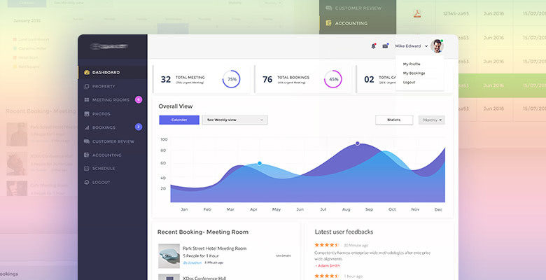
Tenth place. Without any enthusiasm, to be honest, I include this work in the list. Rather, even because of the need to score exactly ten. So, when you need to fill your portfolio with work, each designer draws what? Right! Dashboard. Alas, the header and buttons in the header eat up a lot of space. Non-ergonomic layout of elements. I will add to the list also because the last place in my review can be safely given to an amateur.

Ninth. A boring job. On the one hand, everything is in its place. On the other hand, the designer brings some carelessness to the details. For example, the headings of the table “jump”. And “search” is completely lost somewhere. Or is it not active yet, but if something happens, will it darken? But nevertheless, there is at least an excess here, although there is imperfection.

Eighth. Not a very successful "inversion." An example of a viable concept, where the whole idea was ruined by the color scheme. Although the grid is in perfect order, all the padding is normal. Particular pain is white popups and navigation ... on the right. This procedure contradicts slightly the perception of information. First click on the section, and to the right is the content. Or maybe these are some kind of filters? Then it is permissible :)

Seventh. Too fashionable for a system that people should use. Included in the lowest positions only at the expense of full-screenshots. For us, this is an opportunity to see the parts in good quality. Thank! Although I believe that such decisions will not be able to settle down in the real world. Perhaps this is the first attempt at writing for this team on the way to some concepts. The name TUBIK studio is familiar to me and this is a rather strange work that shows their level is not the best.

The sixth. Category "uninvited design". Of course, Linkedin can never afford such gorgeous indentations. Which, by the way, in this case is so impressive that in some places the separation of one block from another seems to occur. Eye overcame a long distance, and the information received is scarce. In short, it is not viable, but if it was done with the aim of replenishing the portfolio, it will play a positive role for the employer. And maybe more than once. I beat my hands with a ruler only for the fact that again the paleness in the text.

The fifth. More successful this time "inversion". In the guidelines there are hints on ios10. I like this approach. In fonts now more intense. The line between phone interfaces is blurring. Therefore, in this work there is a freshness, relevance and perspective. It is a pity there are no full-screen frames, and even this slope. But still good. I'm here asking for some kind of graphics in the background, and under the cards iphone blur!

Fourth. Yes, this is again the BrothersBaklanov Balkanov, which I recalled in the first review ... I have some questions about the grid first of all. And the search bar from above lives its life as if. Or does it only seem that way because of align = center? Again we see these deep shadows. This is a straightforward viral idea on dribbble lately. Catch each other tirelessly. If only I could calm down finally :) This is all that I had the audacity to find fault with, because the work is generally positive!
Bronze for the 3rd place goes all the same team mentioned above. The team is working tirelessly. Everything is still on the level, but in some places it seems that there is not enough contrast. Somewhere content is lost due to paleness. But, if they continue to continue in the same spirit, they will soon begin to clone themselves. It does not feel the diversity guidelines, based on the objectives of the product. Everywhere Roboto, everywhere the same buttons, etc ... We want freshness! But despite all this, attention to detail strongly pulls them to the top of the charts.
Second place! It looks like the next "uninvited design". Clean, smooth, nothing extra. But since the whole world is used to card dividers, and I in particular, it looks a bit crowded. Although I confess that I am carping. The only drawback is that navigation is scarce, and the effective place disappears. Can try the menu horizontally? But nevertheless it already pulls on silver! And yes, I will always have such works on the top lines. Often a man in the street will ask, “So what’s the big deal?”. I will answer that “Absolutely nothing! Nothing that would prevent users from effectively using a system with a similar design. ”

And finally, the best work in this review! High-quality study of details and states. Everything is thought out. You can simply take and pull on any wireframe and it will be cool and relevant! He himself recently made a similar project to his client. It was interesting to design the UI kit, which is subject to some logic. By the way, you can look at this designer in profile and see other trims from the same project. They did not get here, because there are no solid screens, but you can expand the horizons.
It's all. Thanks for attention! I think I will come back to you with the next review in about a month. We must enable the dribbble community to accumulate quality work ...
By the way, if you use Figma , I recommend paying attention to our ready-made design systems . They help freelancers complete more orders per month, programmers can create beautiful applications on their own, and the Timlids run sprints faster using ready-made design systems for teamwork.
And if you have a serious project, our team is ready to deploy a design system within the organization based on our developments and tailor it to specific tasks using Figma. Web / desktop, and any mobile. We are also familiar with React / React Native. Write to T: @kamushken
')
First, a few words about what is generally useful in this? I think this is a good approach when you learn from the mistakes of others. Therefore, if you and I notice any errors in the design of interfaces, then we identify them and try to remember “how not to do”. And for me personally, this is an excuse to once again look into the depths of the design community, in order to look after the direction of trends.
How is the distribution in places? First of all, I “miss” each candidate through my own set of professional filters that have been acquired by practice. I wrote about many of them in “ My design rules for a good interface ” (+51) . The main criteria are not so many: a selection of colors, font order, balanced indents, the use of a grid without errors, the placement of accents.
By the way, let me remind you that clicking on the picture translates into the entire design, where you can see the layouts in full screen. Accordingly, my comments relate to the fact that the link, and not on the thumbnail.
Enough of the lyrics, let's see what's worth our attention today ...
Analytics Dashboard
by Raaz Das
Tenth place. Without any enthusiasm, to be honest, I include this work in the list. Rather, even because of the need to score exactly ten. So, when you need to fill your portfolio with work, each designer draws what? Right! Dashboard. Alas, the header and buttons in the header eat up a lot of space. Non-ergonomic layout of elements. I will add to the list also because the last place in my review can be safely given to an amateur.
interface
by shan zi
Ninth. A boring job. On the one hand, everything is in its place. On the other hand, the designer brings some carelessness to the details. For example, the headings of the table “jump”. And “search” is completely lost somewhere. Or is it not active yet, but if something happens, will it darken? But nevertheless, there is at least an excess here, although there is imperfection.
Dashboard
by Alexandr Ivchenko
Eighth. Not a very successful "inversion." An example of a viable concept, where the whole idea was ruined by the color scheme. Although the grid is in perfect order, all the padding is normal. Particular pain is white popups and navigation ... on the right. This procedure contradicts slightly the perception of information. First click on the section, and to the right is the content. Or maybe these are some kind of filters? Then it is permissible :)
Health care app
by TUBIK
Seventh. Too fashionable for a system that people should use. Included in the lowest positions only at the expense of full-screenshots. For us, this is an opportunity to see the parts in good quality. Thank! Although I believe that such decisions will not be able to settle down in the real world. Perhaps this is the first attempt at writing for this team on the way to some concepts. The name TUBIK studio is familiar to me and this is a rather strange work that shows their level is not the best.
Linkedin profile
by Grégoire Vella
The sixth. Category "uninvited design". Of course, Linkedin can never afford such gorgeous indentations. Which, by the way, in this case is so impressive that in some places the separation of one block from another seems to occur. Eye overcame a long distance, and the information received is scarce. In short, it is not viable, but if it was done with the aim of replenishing the portfolio, it will play a positive role for the employer. And maybe more than once. I beat my hands with a ruler only for the fact that again the paleness in the text.
Web Sales Platform Dashboard
by Ramotion
The fifth. More successful this time "inversion". In the guidelines there are hints on ios10. I like this approach. In fonts now more intense. The line between phone interfaces is blurring. Therefore, in this work there is a freshness, relevance and perspective. It is a pity there are no full-screen frames, and even this slope. But still good. I'm here asking for some kind of graphics in the background, and under the cards iphone blur!
Tellius - Chart Creation Process
by Balkan Brothers
Fourth. Yes, this is again the Brothers
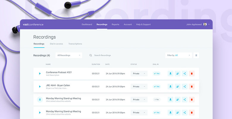
Conference Calling - Recordings
by Balkan Brothers
Bronze for the 3rd place goes all the same team mentioned above. The team is working tirelessly. Everything is still on the level, but in some places it seems that there is not enough contrast. Somewhere content is lost due to paleness. But, if they continue to continue in the same spirit, they will soon begin to clone themselves. It does not feel the diversity guidelines, based on the objectives of the product. Everywhere Roboto, everywhere the same buttons, etc ... We want freshness! But despite all this, attention to detail strongly pulls them to the top of the charts.
Community App Dashboard
by Bilal Ck
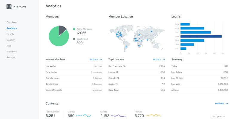
Second place! It looks like the next "uninvited design". Clean, smooth, nothing extra. But since the whole world is used to card dividers, and I in particular, it looks a bit crowded. Although I confess that I am carping. The only drawback is that navigation is scarce, and the effective place disappears. Can try the menu horizontally? But nevertheless it already pulls on silver! And yes, I will always have such works on the top lines. Often a man in the street will ask, “So what’s the big deal?”. I will answer that “Absolutely nothing! Nothing that would prevent users from effectively using a system with a similar design. ”
Tapdaq - UI Overview
by Jan Losert
And finally, the best work in this review! High-quality study of details and states. Everything is thought out. You can simply take and pull on any wireframe and it will be cool and relevant! He himself recently made a similar project to his client. It was interesting to design the UI kit, which is subject to some logic. By the way, you can look at this designer in profile and see other trims from the same project. They did not get here, because there are no solid screens, but you can expand the horizons.
It's all. Thanks for attention! I think I will come back to you with the next review in about a month. We must enable the dribbble community to accumulate quality work ...
Source: https://habr.com/ru/post/313384/
All Articles