Elections 2016. Part 2 is amazing nearby and it is allowed
The first part of the article on the 2016 elections dealt with the results in 225 constituencies. This time we will consider the data on the results of voting by the precinct election commissions (PECs), of which there were just under 100 thousand. This level of detail allows you to see unexpected phenomena and surprising patterns in the voting results.

Data
We will consider only the election results on party lists - the proportional component of the vote. Information on the voting results for each PEC is provided by the CEC in a somewhat scattered form. Aggregated data is collected and disseminated by Sergey Shpilkin (link) .
The total number of polling stations in this election was 96871. The data for each PEC provides data on the number of voters who voted for the parties that participated in the elections. Instead of the number of voters, we turn to the percentage representation of the results of the parties with an accuracy of 0.01%. The sum of the results in each PEC for all batches, taking into account the percentage of spoiled ballots, should be exactly 100.00%. To round off the percentage of results, we use the method of the largest remainder — the most well-known approach. The CEC uses another method of rounding off the percentage results, the information about which I did not find. And at least this method does not coincide with any of the algorithms presented in the sfsmisc library. Therefore, in some cases, the percentage results used may differ from the CEC data by 0.01%, but this does not play a fundamental role. The turnout results are also expressed as a percentage with an accuracy of 0.01% (normal rounding was used).
Spot
We display the data obtained on scatterplots, in which the points are - PECi.
The graph below shows the results of the turnout and the United Russia party for all PECs.
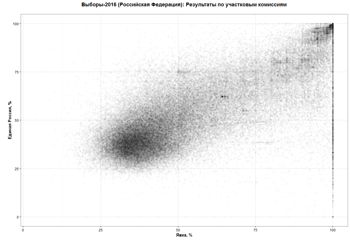
The black dot in the turnout area with 65 percent and the United Russia result at about 60 percent draws attention to this diagram. This point means a high concentration of PECs with very close results on these two axes of the graph.
For two diagrams with axes "Turnout - the Communist Party of the Russian Federation", "Turnout - LDPR" we still see a black dot with the same turnout.

')

And even for non-parliamentary parties, for example, for the "Communists of Russia" this point continues to shine.

However, for the other parties, this phenomenon can also be observed. Next - more, let's see what these plots are. Let's set the range more precisely - turnout in the range from 64.26% to 64.33%, the result of United Russia is from 62% to 62.5%. In the specified boundaries falls 60 PECs. And, what an unexpected coincidence, they are all from the Saratov region!
This phenomenon was discovered before the approval of the election results. Unfortunately, representatives of the CEC, including its chairman, were quick to say that there is nothing surprising in this phenomenon. Therefore, the test for this case was not conducted.
Linear dependencies
On charts with the axes of the "Communist Party of the Russian Federation - LDPR", straight lines of the form y = x and y = 2 * x can be traced.

More clearly linear dependencies with integer coefficients are visible, for example, for the pair "The Communists of Russia - Yabloko".

This is not to say that this is the contribution of any particular region (there are too many points on these lines). But you can feel some difference on the example of Moscow and the Moscow region.

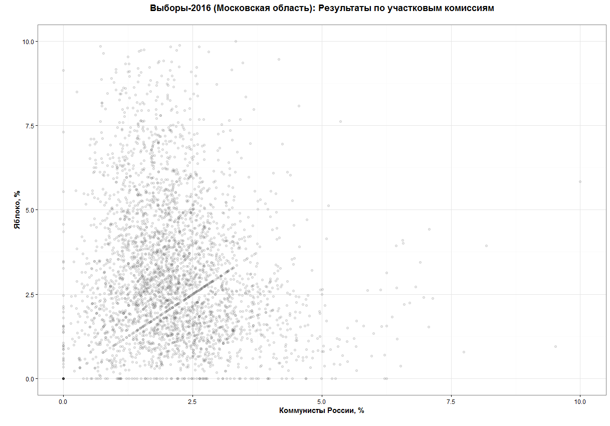
Or here's a graph for the pair "Communists of Russia - Fair Russia" in a square of 10% to 10% with the series y = x, y = 2 x, y = 3 x and x = 2 * y

For what reason are these linear dependencies with integer coefficients distinguished?
I do not come to mind any logical explanation for these patterns in the voting results.
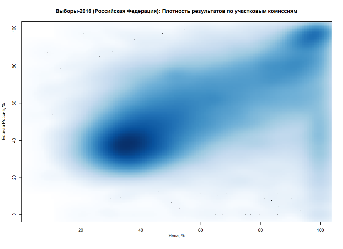
Bimodality
This characteristic of the results of the voting in the State Duma is well known from the previous elections. High voter turnout at the polling station, as a rule, testifies to the high result of United Russia. This is especially pronounced at the point (100%, 100%). This unique combination of civic responsibility and the unanimity of voters in these polling stations does not cease to attract attention.
Below are two graphs of the smoothed density of points for the United Russia and LDPR parties.

“Beautiful” turnout numbers
In the 2011 elections, the number of PECs with a turnout of 60, 70, 80 percent increased sharply compared with other polling stations (and a turnout of less than 100%). At the elections of 2016 such sharp distortions are not observed, except for the turnout of 50%. On the graph below, the bin is 0.1%, the result of 100% turnout is 2813 plots, excluded for clarity of the remaining data.

How to work with charts yourself
All graphics are built in R using the shiny and ggplot2 . This is an example of an application page.

If you have R installed, then by downloading the shiny and pacman libraries, you can start the application with the command:
shiny::runGitHub("e-chankov/elections_2016_uik") Or just take R-scripts from GitHub .
UPD: I will add that I agree with AllexIn - any graphics and calculation are needed in order to draw attention to unexpected results. But they do not allow to assert that there were facts of falsification of results. Representatives of the CEC should deal with suspicious cases and post the results of inspections. I can not imagine what the CEC can do to quickly analyze situations with bimodality or linear dependencies. Whereas, I believe, the consideration of the phenomenon in the Saratov region was an observable task. The CEC immediately expressed the opinion that there is nothing surprising in this phenomenon. It is disappointing.
UPD2: The presence of lines on the graphs has a natural origin. Examples and details in the skyramp comment and my answer below.
UPD3: As ikashnitsky rightly noted , the publication turned out without any references. This was done without malicious intent. Here, alexkuku presented a brief overview and links to the analysis of election results in 2011. In the blog of Sergey Shpilkin you can find a lot of various graphs and details about the voting results for both 2016 and previous years.
Source: https://habr.com/ru/post/313372/
All Articles