Elections 2016. Part 1 - Results and Comparisons
In September, elections to the State Duma of the VII convocation were held. When voting, the entire territory of Russia was divided into 225 districts. In which districts did each of the parties get high (or low) results? What values did voter turnout take and how did it influence the results of the parties? Answers to these questions and a number of other observations are presented in this publication.

About constituencies
Elections to the State Duma in 2016 were held on a mixed system - 225 parliamentary seats were distributed according to party lists, the remaining 225 seats in single-mandate constituencies. Further everywhere there will be a speech about proportional (according to party lists) a component of voting. The boundaries of the constituencies were determined by the CEC. It is curious that the so-called “petal” model (or jerrimending) of the formation of districts was used, in order to combine the urban and rural population in one district. This way of defining districts can influence the final results only in the majority, but not proportional, component of the elections.
Data sources
Information on the results of voting is provided by the CEC of the RF. A variety of digits broken down by county are available on this page . Geodata from all constituencies prepared by Mikhail Kalenkov and his colleagues from the GIS-LAB community. Details here . Maps compiled in the projection EPSG: 3857.
Geographic Maps
At the forefront was the fast drawing of maps. Therefore, geodata with the most simplified geometry of the districts were used - 0.1% of the original data. In addition, I chose between two libraries to work with geographic maps - leaflet and highcharts . It turned out that for a used leaflet on my laptop, it builds a map with 225 districts for 200-300 ms. In highcharts, it takes about 6 times longer to display the same card. Although, for my taste, highcharts cards look more aesthetic compared to leaflet library cards. To draw the constituencies of Moscow and St. Petersburg, a more detailed file was used with a simplification of up to 30% of the original data. In leaflet it is more convenient to work with shape files, so the original geojson files were converted to the required format.
Display voting results
I used R and shiny to present the results of the voting in the constituencies. If you have R installed, then you can run the application shown below on your computer. To do this, you need to download the shiny and pacman libraries - the install.packages(c("shiny", "pacman")) command install.packages(c("shiny", "pacman")) , and launch the application with the shiny::runGitHub("e-chankov/elections_2016_districts") . For viewing was used Firefox 49.0.2 in full screen mode.
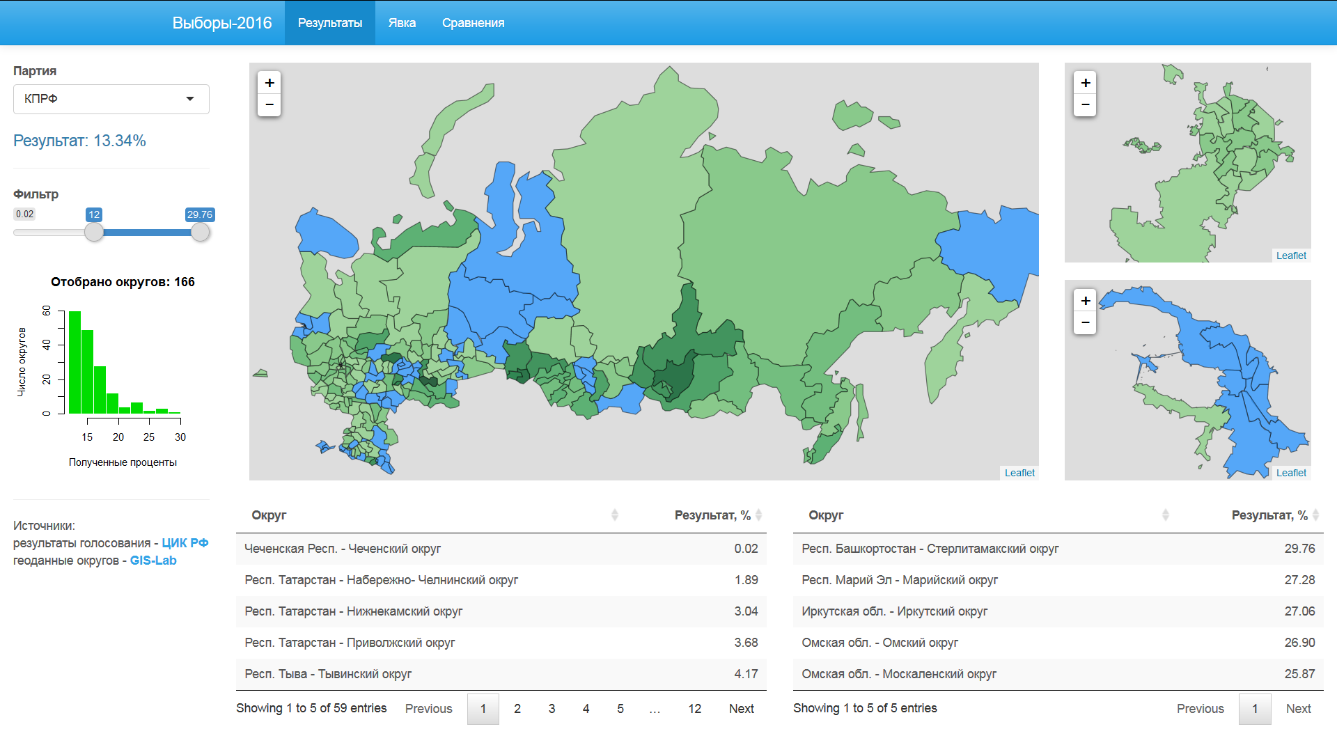
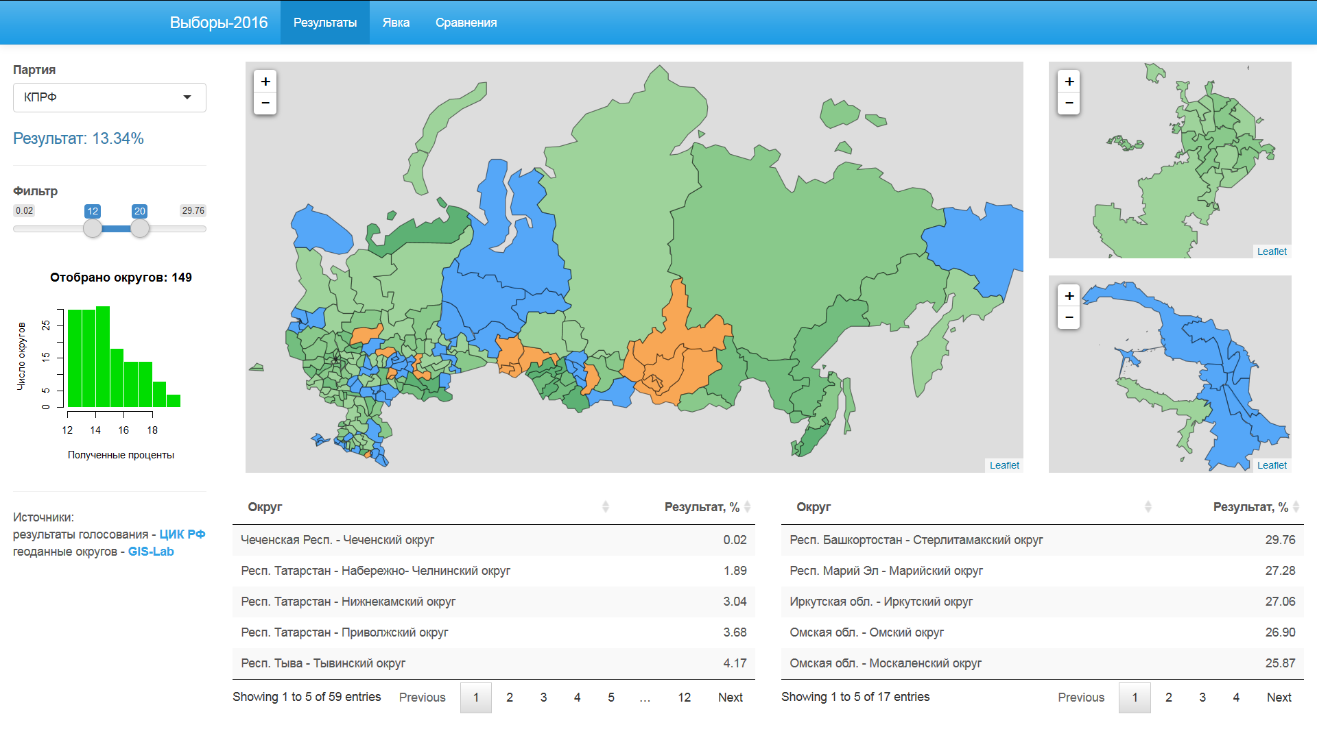
Party Results
Three snapshots below show the results of the United Russia, the Communist Party and the GROWTH parties.


')

The filter allows you to select districts that do not fall within the specified range. Blue color - results less than the lower border of the filter, orange color - results above the upper border of the filter.
Turnout
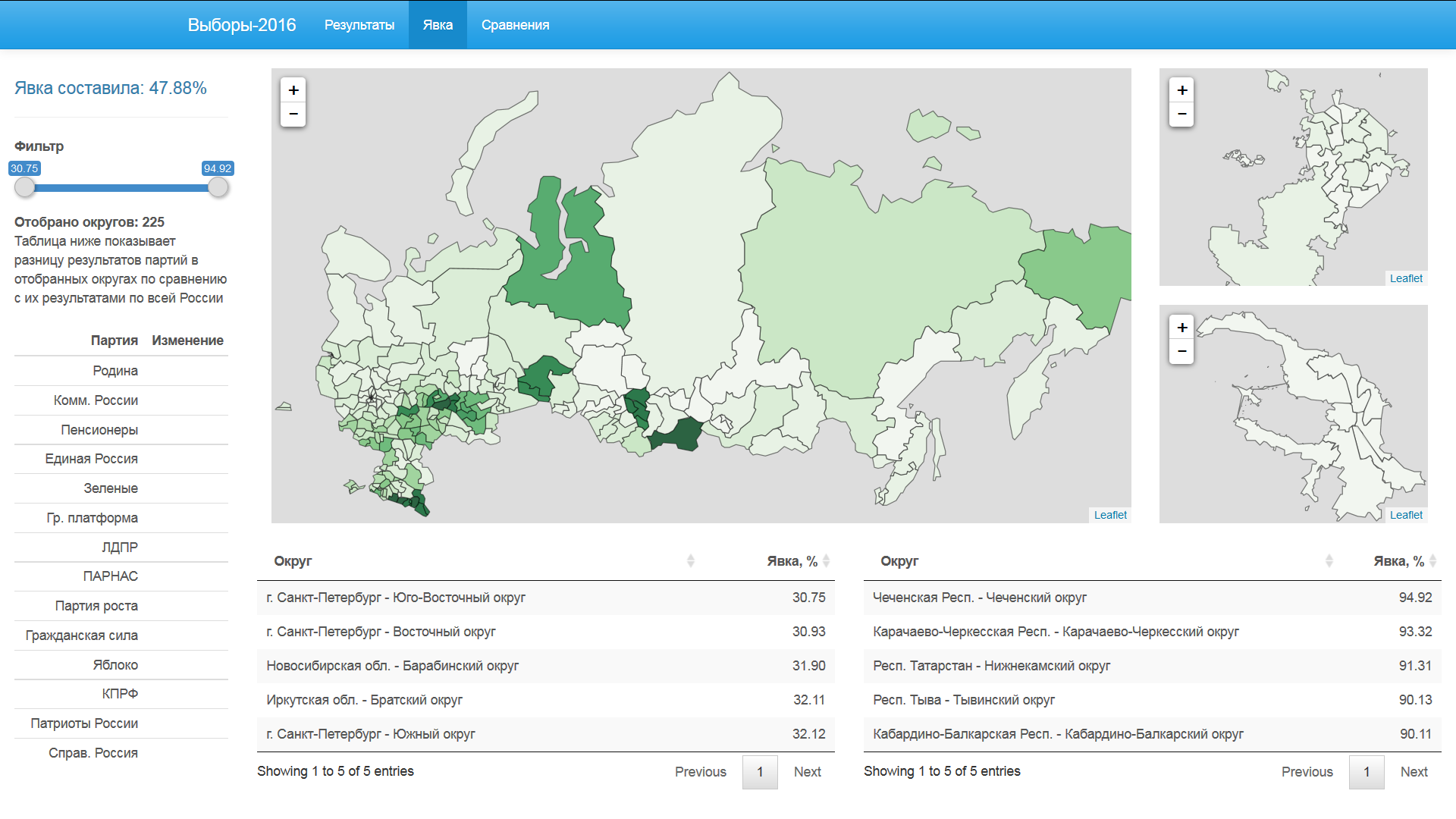
As in the previous tab, defining the turnout limits the districts outside the established framework. For those districts that satisfy the filter condition, the percentage results of the batches are calculated and compared with the typed values for all the districts.

United Russia loses more than 10% of its total result, if we consider only the districts with a turnout of up to 48%. Most of all acquires "LDPR" - 3.5%.

The picture is reversed if the districts with a lower turnout are cut off. Only the percentage change is not as strong as with the exclusion of districts with a high turnout. At these limits, Apple loses the most.
Comparison of batch results
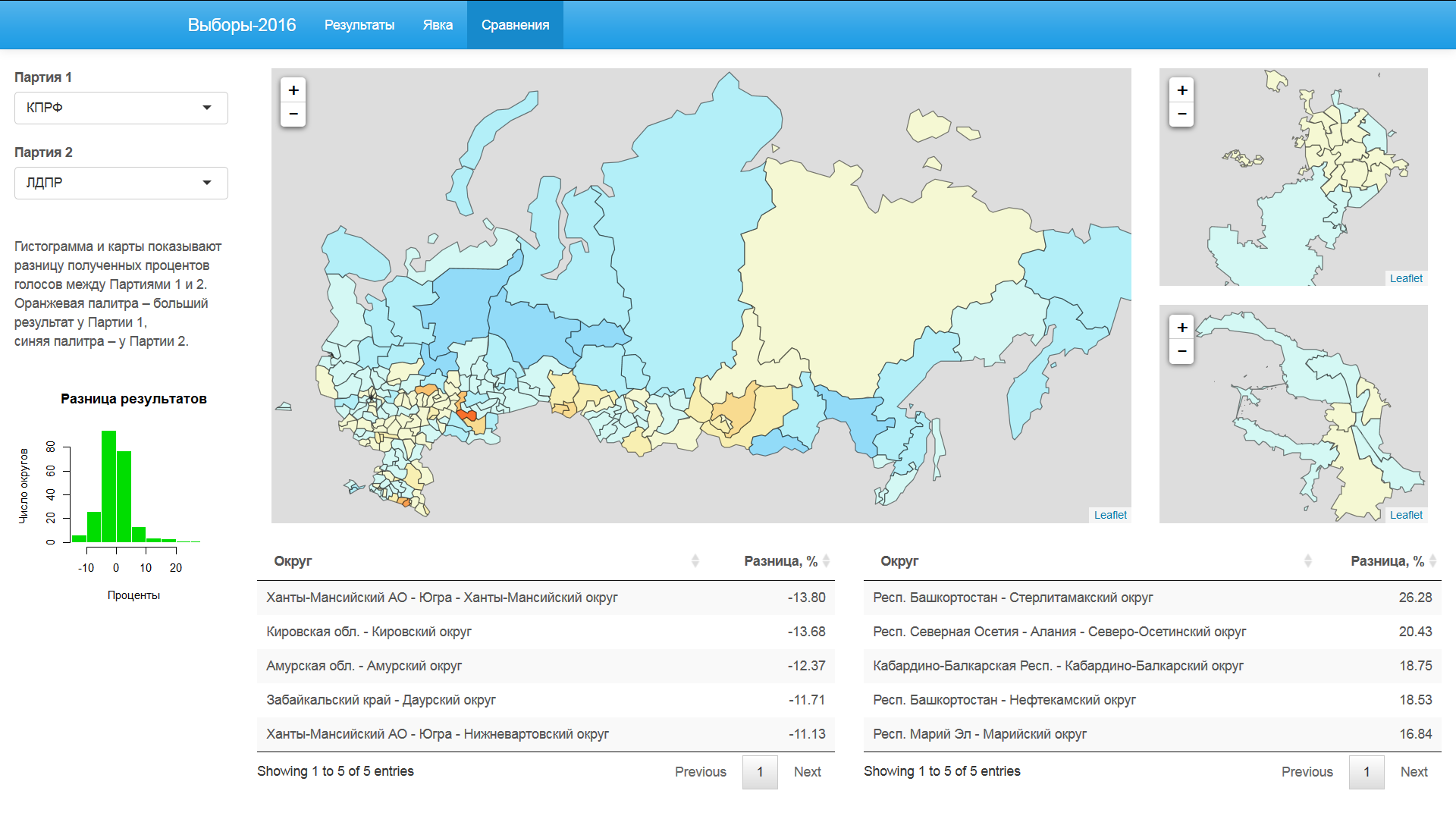
In "LDPR", compared with the "Communist Party", an advantage in the Far East and northern Russia.

Yabloko is clearly superior to the Communists of Russia in Moscow and St. Petersburg. In most of the other regions, the “Communists of Russia” have an advantage over Yabloko.
Data, R-script with data preprocessing and R-scripts for shiny applications are available on GitHub .
In the second part of the article you will find charts with the results of voting on district commissions.
These graphs show unusual patterns in the studied data.
Source: https://habr.com/ru/post/313270/
All Articles